







Classroom Wall Decor: The Map of Zones That Truly Motivate Students
8 min read · by Walensky
SCHOOL PAINTING
Eight hours a day, a student's gaze keeps drifting over the same walls. The back of the room during a test, the back wall during an exam, the door while waiting for the bell. Those walls are working whether we like it or not — so let them work for you too.
Most teachers think of wall decor the way one fills an empty space: a poster here, a print there, as the mood strikes. Yet every zone of the classroom plays a different role in the student's gaze, and therefore has a different psychological effect depending on what is hung there. Inspiring classroom wall decor for motivating students isn't planned by square metre, it's planned by zone.
- The wall facing the students must stay visually calm: it is the concentration zone, not a place for stimulation.
- The back of the room can support bright colours and dynamic compositions, since it falls outside the field of vision during individual work.
- Orange tones boost energy, blue soothes, gold enhances without distracting.
- No drilling required: solutions exist for schools that are rented.
Why the position of a painting changes its effect on motivation
The same painting, hung in two different places, never produces the same effect on a student. It isn't a matter of taste, it's a matter of field of vision: what the eye catches during a concentration task does not play the same role as what it catches during a break.
Facing the students, an overly busy decor competes directly with the blackboard or the projector. At the back of the room, however, the same decor becomes a visual breather, something the student looks at when lifting their head between exercises. Applying colour psychology at school is therefore not about choosing "a nice colour", but choosing the right colour in the right place.
A wall is never neutral: it motivates, soothes or distracts, depending on what it shows and when the student looks at it.
The Montessori approach, which has worked extensively on the environment as a "third teacher", rests on this principle: a tidy space organised by zones frees a child's attention instead of scattering it. This logic can be adapted without adopting the whole pedagogy: you simply need to map your classroom.
Mapping your classroom into 4 motivational zones
Before buying any wall decor, mentally sketch your room's layout in four zones: the entrance, the wall facing the students, the back of the room, and the reading or independent work corner. Each calls for a different visual register.
The wall facing the students: concentration and calm
This is the wall students look at the longest, often without even realising it. It must therefore stay simple: soothing lines, blues or neutral tones, few details that catch the eye during a grammar lesson or an exercise correction.
A painting with geometric arches in warm but controlled tones can work here, provided it stays at the periphery of the direct visual field — never placed right next to the blackboard itself.
The back of the room: energy and creativity
Conversely, the back of the room escapes notice during individual work phases. It is the place where you can dare dynamic compositions, vivid colours, shapes in motion. It is also the first thing students see on entering, before they sit with their back to this wall.
In key stages 2 and 3, the back of the room often displays students' work. Reserve one strip of wall for educational displays and a smaller one for a fixed artwork that sets the overall tone of the room.

Which colour palette for which desired effect
Orange stimulates, blue soothes, gold enhances: these are the three most reliable levers for inspiring classroom wall decor to motivate students, provided you don't mix them everywhere.
- Orange and rust : energising, perfect for the back of the room or a corridor, to avoid right in front of the blackboard.
- Blue and cool tones : soothing, useful near the teacher's desk or in a calm-down corner.
- Gold and ochre yellow : uplifting without being garish, suited to the reading corner or a welcoming entrance.
- Green and neutral shades : a compromise between dynamism and calm, often underestimated in classrooms.
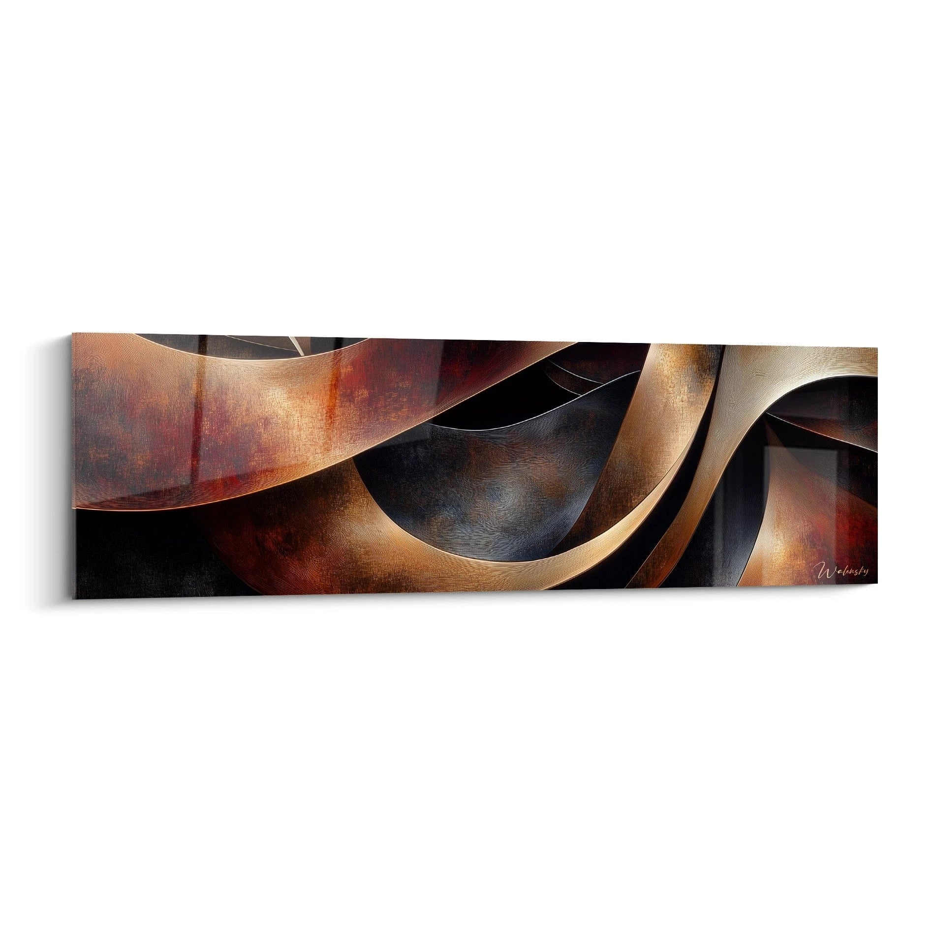
The Warm Currents Orange painting, with its waves of red and orange, illustrates this energising register well: it calls more for the back of the room or a school corridor than for a concentration wall. Conversely, a visual with more geometric lines and golden tones, like the harmonious spiral presented above, finds its place in an area where you want to inspire without agitating.

This proportion rule also applies in the classroom: an L format (120x70 cm) suits a medium-sized back-of-room wall, while a panoramic format adapts better to a corridor or a long, narrow space, like our panoramic motivational quote paintings for school corridors.
— Our selection


Layout examples by school level
In nursery, wall decor supports imagination more than it motivates in the strict sense: a colourful train, animals, round shapes are enough to anchor the child in a reassuring world.
In key stages 2 and 3, the balance shifts: students begin to associate certain zones with specific tasks (reading, arithmetic, group work). This is the moment to install a soothing atmosphere near the reading corner and a stimulating atmosphere near the collaborative workspace. To go further on this breakdown by key stage, our article on educational wall decor for a key stage 2 classroom details concrete examples of displays and matching furniture.
In secondary school, the register changes again: teenagers respond better to abstract compositions than to childish worlds. A geometric painting in contrasting colours, such as a dynamic composition in red and blue, works well at the back of an art room or a study hall. To explore this school level further, our guide to inspiring quote paintings for secondary school usefully complements this zone-based approach.
For specific subjects, some decor plays a dual pedagogical and motivational role — this is the case with a wall map of France for a geography classroom, which structures the space while remaining a reassuring visual reference day to day.
— Also to discover


Installing without damaging walls: practical solutions
Logistical constraints hold back many teachers, especially in rented premises where drilling isn't allowed. Strong adhesive fixings and drill-free hook systems now exist to hang a lightweight painting like those printed on Alu Dibond, leaving no trace when removed.
For a complete overview of drill-free solutions, our full guide to the classroom painting details the options depending on wall type. The principle remains the same: logistics should never dictate the aesthetic choice, they should simply adapt to it.

In the same spirit
Incandescent Orange Sun Painting - abstract flowers edition
From €228.90
Discover this painting →Frequently asked questions
Which decor colour motivates students most in the classroom?
Orange and rust energise attention, useful at the back of the room; blue soothes and is better suited near the desk or a calm corner. There is no universal colour, only the right colour for the right zone.
Where should you place a motivating painting in a classroom?
The back of the room and the entrance tolerate bright colours and dynamic compositions, since they escape notice during concentration phases. The wall facing the students must stay simple.
How do you decorate a classroom without drilling the walls?
Adhesive fixings and marks-free hooks let you hang a lightweight painting without drilling, provided you check the weight supported for the chosen format.
What wall decor suits a secondary school classroom?
Teenagers respond better to abstract, geometric compositions in contrasting colours than to childish worlds, particularly in art rooms or study halls.
A classroom is not a wall to fill, it is a visual journey students walk through from morning to evening. Thinking about each zone separately — entrance, wall facing them, back of the room, reading corner — turns inspiring classroom wall decor for motivating students into a true teaching tool, not mere display. To compose your own zone plan, head to the classroom painting collection, where every format and palette finds its precise place on your walls.
Explore our collections


