







Large format or small painting for a bookshelf wall: how to choose?
July 19, 2026 · 9 min read · by Walensky
You've been looking at this bookshelf wall for weeks. The books are there, neatly arranged (or nearly so), the shelves do their job — but something is missing. A painting, perhaps. Except that facing a wall already filled with dozens of colorful spines, the question large format or small painting for a bookshelf wall is anything but trivial. Too big, and it overwhelms. Too small, and it gets lost. The answer depends on very concrete criteria: the available wall space, the configuration of your shelves, and the style you want to impose on the room.
- A bookshelf wall is visually busy: the painting must dialogue with the books, not ignore them.
- Beyond 80 cm of free wall width, a large format becomes a natural focal point.
- In a tight space or a floor-to-ceiling bookcase, a composition of 2 to 4 small pieces is often more effective.
Why the bookshelf wall is a decorating case of its own
A bookshelf wall is not a blank wall. It is already a decor, dense, lively, sometimes chaotic — and that is precisely what makes choosing a painting so delicate.
A wall already "inhabited": the issue of visual overload
Books form a mosaic of colors, textures and formats. Bright yellows sit beside deep blacks, gilding brushes against kraft paper. Before you have hung anything, your wall already tells a story.
Adding a painting to this environment means introducing a new voice into an already lively conversation. If the painting shouts too loudly, it clashes with the books. If it whispers, it disappears. Visual balance is the number one challenge.
A painting facing books should not win the battle for attention — it should organize it.
The different configurations of wall bookcases
Not all bookcases are alike, and each configuration calls for a different response:
- Floor-to-ceiling built-in bookcase (full wall, floor to ceiling): free space for a painting is nearly nonexistent. You will work with the gaps or the space above.
- Partial bookcase (half height or across half the wall): it frees a clean wall area, ideal for a large format.
- Scattered floating shelves : they create "windows" between the modules, perfect for slipping in small formats or a composition.
The key criteria for choosing between a large format and a small painting
Before falling for a particular painting, three questions come up. The answers almost automatically point to the right choice.
Available wall surface: measure before choosing
Get out the tape measure. Measure the width and height of the wall area that is actually free — that is, not occupied by shelves or protruding books.
Below 80 cm of available width, a large painting risks looking cramped, squeezed between two shelves. Beyond that, it can breathe and create that famous decorative focal point that structures the entire room.
Decorative style: minimalist, vintage, contemporary
The style of your bookcase also shapes the choice of motif. An oak bookcase with antique bindings calls for a different painting than a white lacquered one with colorful paperbacks.
- Minimalist style (sparse shelves, few books) → a large graphic or abstract format fits perfectly. For a refined black-and-white approach, see our guide to black and white painting for a bookshelf in a minimalist interior.
- Vintage or classic style → a painting in warm tones, ochre or sepia, in a small or medium format.
- Eclectic contemporary style → a composition of several small pieces, with a coherent palette but varied motifs.
Chromatic harmony takes priority over everything. Identify the 2-3 dominant colors of your books and choose a painting that echoes them or deliberately contrasts with them — never by accident.

When to opt for a large painting facing a bookshelf
There are situations where a large format is not a choice — it is obvious.
The large format as a focal point: creating a visual anchor
Imagine a low bookcase set against the lower half of the wall. Above it, two meters of bare wall. That is exactly where a large geometric or abstract painting makes perfect sense: it fills the empty space, dialogues with the bookcase below, and gives the whole room a visual backbone.
The same logic applies to a side bookcase (on one section of wall) with a free adjacent wall: a large format placed beside it creates balance through contrast, like two figures facing each other.
For large spaces, paintings with structured patterns — contemporary abstract art, artistic mosaic, geometric compositions — hold their own better against the visual richness of books than a photograph or an overly figurative motif. They impose a rhythm without competing with the titles and colors of the volumes.
If you want to go further on placement, our guide learn more about how to position a large painting when the bookcase o details the hanging rules for each configuration.
— Also to discover


When to prefer a small painting (or a composition) for a bookshelf
The small format has a bad reputation. Unjustly. In certain contexts, it is the only sensible answer.
The small-format composition: a wall gallery around the books
A floor-to-ceiling bookcase running the full wall? No point trying to force a large painting onto it — there is no room. However, the spaces between modules, above rows of books, or on an adjacent wall offer opportunities for a composition of paintings (gallery wall).
Two to four small formats, aligned horizontally or staggered, create a gallery effect that enriches the space without overwhelming it. The rule: keep a regular spacing of 5 to 10 cm between each piece, and choose works that share at least one common element — palette, style or theme. If you want to turn this space into a true relaxation area, our guide on how to create a reading corner with a bookshelf wall painting will give you all the keys.
To explore this approach in detail, bookshelf painting: our advice will give you further ideas.
Integrating a small painting between the shelves: the golden rules
Placing a small painting in front of books, leaning on a shelf, is a deliberate decorating trend. A few rules apply:
- Choose a format that slightly exceeds the height of the books it is placed in front of — otherwise it drowns in the mass.
- Opt for a simple motif : a stylized bird, a minimalist tree, a simple geometric shape. Fine details disappear in this context.
- Respect chromatic coherence : the painting should pick up a color already present in the surrounding books, not introduce a new one arbitrarily.
— In the same spirit


Our selection of paintings suited to a bookshelf wall
Two profiles, two answers. Here is how to orient your choice according to your setup.
For large spaces: structured, graphic paintings
Facing a partial bookcase or a generous wall area, a geometric painting or one with a mosaic pattern is the right call. Its strong graphic structure creates a counterpoint to the organic, random shapes of the books. explore our XXL large-format paintings if you are looking for formats that truly make a statement.
For small or busy spaces: pared-back, stylized paintings
Dense bookcase, constrained space? Go for a minimalist motif — a stylized bird, a tree in silhouette, a simple abstract form. The painting breathes where the books crowd together, and that very contrast is what makes its impact.
To go further in your reflection, which painting to choose to decorate a living room bookcase: our tips explores the selection criteria according to the overall atmosphere of the room.

Other selected pieces
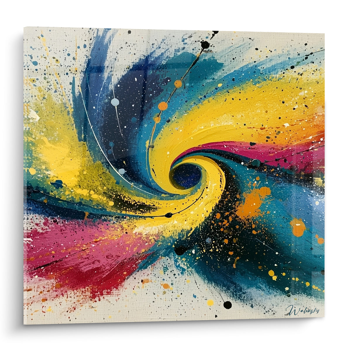
Cosmic Metamorphosis Painting - abstract spiral edition
€233.90
Discover this painting →Frequently asked questions
What painting size to choose for a bookcase wall?
If the free wall area exceeds 80 cm wide and 60 cm high, a large format (from 80 × 80 cm) is relevant. Below that, favor a medium format (40 × 60 cm) or a composition of two small formats. Ceiling height also matters: with more than 2.50 m, a large vertical painting can impose itself elegantly.
Can you hang a painting directly on a bookcase?
Yes, in two ways. Either resting on a shelf (painting placed in front of the books, slightly projecting) — practical and without drilling. Or hung on the wall in a free space between two modules. In both cases, make sure the painting doesn't hide books you consult regularly.
Which painting style best harmonizes with colorful books ?
Geometric patterns and contemporary abstract art work particularly well: their clear visual structure contrasts with the colorful chaos of book spines without competing. Conversely, avoid highly figurative or photographic paintings, which get lost in the surrounding visual density.
Is it better to have one large painting or several small ones for a wall bookcase?
The honest answer: it depends on your wall. A large format is needed when the free space is generous and you want a strong focal point. Several small formats are needed when the bookcase occupies most of the wall. To decide definitively, everything about whether to favor a single large format or a composition will give you a complete decision grid.
Conclusion
The dilemma of large format or small painting for a book-filled bookcase wall is always resolved the same way: by really looking at your wall. Not imagining what it could be — measuring what it is. Free surface, shelf height, book density: these three data points are enough to guide the choice in nine cases out of ten.
What doesn't change, whatever the configuration: the painting must enter into dialogue with the books, not ignore them. It must organize the gaze, not scatter it. And it must make you want to stay in this room a little longer than planned.
If you want a concrete starting point, our guide on vintage antique book paintings for a wooden bookcase explores a particularly successful stylistic direction in this context. And for our full selection designed specifically for this type of wall, explore our bookcase book paintings — you'll find what it takes to transform that wall that has been taunting you for too long.
Explore our collections


