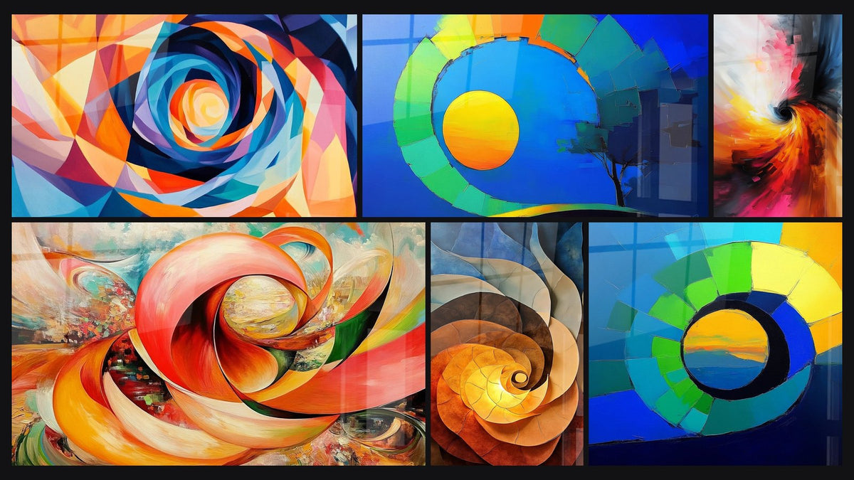
Large orange spiral painting in an adult bedroom: can an energizing colour be compatible with sleep?
8 min read · by Walensky
ORANGE ABSTRACT SPIRAL PAINTING
You fell for an orange spiral, large format, for the wall facing the bed. Then doubt caught up with you at the moment of clicking: what if this sunny colour kept you from closing your eyes? The question isn't absurd — it deserves a real answer, not a simple "do what feels right".
The direct answerYes, a large orange spiral painting can perfectly coexist with a restful adult bedroom, provided you choose a warm shade rather than a neon one (terracotta, burnt orange, coral) and surround it with neutral or cool tones in bedding and walls. Orange stimulates energy and creativity, but it is not an insomnia-inducing colour in itself: saturation, contrast and placement are what shift a room from uplifting to overstimulating.- Orange does not keep you awake: saturation and contrast tire the eye, not the hue itself.
- Large format amplifies the effect of a colour: the more surface it covers in the field of vision, the more a soft shade is needed.
- Terracotta, burnt orange and coral balance better in a bedroom than vivid or neon orange.
Orange, a double-edged colour in the bedroom
Orange is the colour of sunsets and wood fires: it warms, it stimulates, it makes you want to move. In colour therapy it is associated with vitality, extraversion and creativity — the exact opposite of what one usually seeks in order to fall asleep. That is why it worries so many people furnishing an adult bedroom: they have been told that blue soothes and red excites, and orange finds itself caught between the two, suspect by association.
Yet colour psychology is never that binary. Dark, desaturated, earthy orange has nothing in common with a neon orange like a construction sign. The former evokes clay, leather and charred wood; the latter wakes you up. Classic bedroom feng shui does recommend avoiding overly vivid tones in the sleeping space, but it does not ban orange — it invites you to dose it.
A colour never makes a room stimulating on its own: its saturation, its surface area and its contrast with the surroundings are what decide.
Why large format changes the energy equation
A small orange frame above a chest of drawers makes a touch. A large orange spiral painting, on the other hand, becomes an actor in the room: you no longer look at it, it imposes itself on the field of vision as soon as you enter the bedroom.
Covering surface vs small decorative touch
The usual proportion rule holds that a painting should occupy 60 to 75% of the width of the furniture or wall on which it hangs. Applied to an orange spiral of 140x80 cm or 160x90 cm, this surface no longer plays the role of a colourful accent: it becomes the dominant source of the room's chromatic atmosphere, on a par with the wall paint or the bedding.
This is precisely what rightly causes concern: the larger the orange surface, the greater its energetic impact. Hence the value of choosing the shade carefully before aiming for large format, not after.
The visual immersion effect on waking and going to bed
A large hypnotic spiral creates a visual absorption effect: the eye follows the circular movement, especially in the evening dimness or the raking light of the morning. This effect can be a creative breath on waking — or an overstimulation just before closing your eyes, depending on the chromatic intensity chosen and its position in the room.
A spiral's hypnotic effect depends mainly on the contrast between the colours that make it up. An orange spiral on a midnight blue background, for example, creates more visual tension than a spiral made only of orange gradients.

How to balance a large orange spiral painting with the rest of the bedroom
Working with orange is a bit like dosing a strong spice: the right amount enhances a dish, too much overwhelms it. In a bedroom, everything comes down to two levers — the shade chosen, and what surrounds it.
Orange shades to favour (terracotta, coral, burnt orange)
- Terracotta orange: a clay-like tone, almost brown in places — the most soothing of the oranges, perfect for a cocooning night-time atmosphere.
- Coral orange: pinker and softer, it tempers the energy of pure orange without distorting it.
- Burnt orange: deep, almost coppery, it brings warmth without the aggressiveness of a saturated orange.
Conversely, a neon or highly saturated orange — even magnificent in a living room or creative studio — struggles to find its place in a rest space in very large format.
Pair with neutral or cool tones in bedding and walls
Chromatic contrast plays a balancing act here. An orange wall with orange bedding simply adds up the energy. A painting, however, set against a charcoal grey or sandy beige wall, with off-white, natural linen or very desaturated grey-blue bedding, lets the work breathe without saturating the room.
In this spirit, the Prisme Orbital painting pairs its orange with blue, which naturally tempers the overall intensity of the composition thanks to the chromatic contrast between the two shades.
If you prefer a spiral where orange dominates without being alone, the coloured vortex painting Spirale d'énergie cosmique also combines orange and blue within a single movement, for a less monochrome and visually more breathable result.
— Our selection


Where to place the painting to maximise energy without disturbing sleep
Placement matters as much as the shade. Facing the bed, at close range, a large orange spiral will be the first thing you see on waking and the last before closing your eyes — a sensible choice if you are precisely seeking that morning momentum, less advisable if you tend to ruminate at bedtime.
A side wall, perpendicular to the bed, offers an interesting compromise: the work remains visible and present in the room, but it does not capture the gaze at the precise moment of falling asleep. It is often the most comfortable placement for a large, intensely coloured spiral.
Another option, less often mentioned: hang the painting in the bedroom's entrance corridor or on the wall opposite the door. The energy of orange welcomes without imposing itself in the direct field of vision of the sleeping area — a good compromise if you love the piece but still hesitate about its proximity to the bed.
— Also to discover


Our orange spiral models suited to an adult bedroom
Not all orange spirals are equal in intensity. Some rely on orange tempered by blue, others embrace a warmer, dominant hue, like a fire vortex.
For a softer atmosphere, the rainbow coloured spiral painting Harmonie circulaire dilutes the orange within a broader colour range, which mechanically reduces its visual dominance on the wall. Conversely, the Kaleidoscope Tournant openly features a bolder mix of red, purple and orange — best reserved for a bedroom whose bedding and walls remain resolutely neutral to counterbalance the intensity.

These creations are printed in Italy, exclusively for the shop, on acrylic glass for a glossy finish and very vibrant colours, or on Alu Dibond for a matt and softer version, ideal if your bedroom receives a lot of natural morning light.
For bedrooms where natural light is abundant from morning onwards, it is better to favour Alu Dibond: its matt surface avoids reflections that would further heighten the stimulating effect of orange on waking. If you want to compare several intensities before choosing, the collection of orange abstract spiral paintings brings together the different shades available, from soft coral to the fire vortex.

In the same spirit
Energy Vortex Painting - Spiral of Light - Abstract Spiral Edition
From €273.90
Discover this painting →Frequently asked questions
Is orange a good colour for a bedroom?
Yes, provided you choose a warm, desaturated shade rather than a vivid orange. Terracotta, coral and burnt orange work well in an adult bedroom, especially paired with neutral tones.
Which orange shade should you choose to avoid overstimulating an adult bedroom?
Favour earthy, deep oranges over neon or very bright tones. An orange mixed with blue or purple in the composition, as on a multicoloured spiral, also naturally softens the perceived intensity.
Can a large painting in vivid colours disturb sleep?
The painting itself does not disturb sleep, but a large, highly saturated piece placed directly facing the bed intensifies visual stimulation at bedtime. A side placement or a softer shade usually solves the problem.
How do you pair an orange painting with neutral bedding?
Opt for off-white, natural linen, taupe grey or very desaturated grey-blue: these neutral tones let the orange of the painting play its role as an energetic accent without visually saturating the room.
If the subject also interests you for a teenager's bedroom, where the energy sought is not the same, our guide to multicoloured spiral paintings for a teen's bedroom details other composition ideas.
Orange is not the enemy of sleep — it is a misunderstood energetic ally, often judged too hastily. Well chosen in shade, well surrounded by colours, a large orange spiral painting can perfectly energise a bedroom without waking its occupant at the wrong moment. What remains is to find the spiral that suits you, the one that makes you want to get up in the morning without keeping you from closing your eyes at night.
Explore our collections