

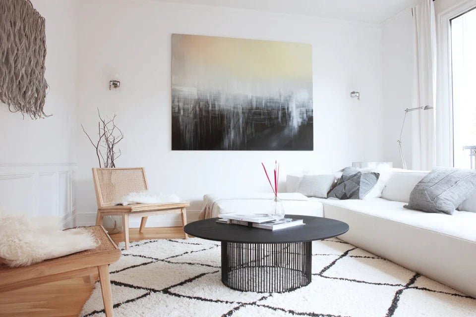
You've just finished your living room in a perfect Scandinavian style - streamlined furniture, neutral colors, natural materials - but your walls remain desperately bare. Every time you look at this space, you feel that muted frustration: something is missing to truly complete the atmosphere.
You imagine that feeling of hygge fulfillment when morning light caresses a wall adorned with an artwork that perfectly captures the Nordic essence. That visual harmony which transforms a functional room into a true cocoon of well-being.
You may have already tried some paintings, but they clashed with your carefully considered decor. Too colorful, too busy, or conversely too cold - nothing seemed to capture that authentic Scandinavian essence you are looking for.
Rest assured, it's not a matter of taste on your part. The real difficulty lies in the subtlety of Nordic codes: you must understand that Scandinavian style is not just about neutral tones, but cultivates a delicate balance between simplicity and expressiveness.
By the end of this article, you will know exactly what types of paintings to choose to create that authentic Scandinavian atmosphere, and you will already visualize your living room transformed into a true Nordic haven of peace.
Why wall art makes all the difference in a Scandinavian interior?
Scandinavian wall art is not just a decorative element - it's the soul of your interior revealed. Without it, even the most beautiful Nordic furniture remains cold and impersonal. It’s like a tasty dish without seasoning: technically perfect, but lacking that spark that awakens emotions. The opportunity you risk missing? That instant transformation which takes your interior from "pretty" to "extraordinary".
🏠 Inspiring testimonial: Marie, an interior architect, says: "I had this client who invested €15,000 in high-end Scandinavian furniture. Her living room was technically perfect, but when you entered it, you felt like you were in a showroom. Three carefully chosen hygge paintings were enough to transform the space into a true family cocoon where you wanted to settle down with a plaid and tea."
💬 Conversation with a decor expert
The Scandinavian secret: wall art creates the emotion that furniture cannot express: Like an authentic accent that reveals the personality behind aesthetic perfection. Result observed: your guests naturally linger in your living room and compliment you on this "so soothing atmosphere". Count 48 hours maximum to feel this difference yourself.
Understand why your previous choices didn't work
Do you recognize yourself in these three situations? You cracked on a colorful artwork that spoke to you, but once hung, it screamed in your minimalist living room. Or you opted for strict black and white, thinking it was "Scandinavian", but the atmosphere became cold and impersonal. Maybe you even chose trendy geometric patterns, but they totally broke the serenity of your space.
What's really happening? You are experiencing the confusion between authentic Nordic style and decorative clichés. The problem is not your artistic sensitivity, but a lack of knowledge of the real codes of Scandinavian design, which are much more subtle than you think.
It's like wanting to cook Japanese food by only having sushi: you miss out on all the philosophy that enriches this aesthetic.
The first hidden cause: confusing minimalism and coldness
Contrary to what is believed, authentic Scandinavian style does not exclude color - it doses it intelligently. The difference? It favors natural and soothing tones rather than pure and saturated colors.
It's exactly like the difference between a Nordic sunset (soft, nuanced, deeply moving) and a neon sign (shouting, artificial, tiring for the eyes).
Impact on your decor: you deprive yourself of all this emotional richness that ochres, forest greens, powder blues can bring. This understanding will revolutionize your approach: you will finally be able to choose works that warm up the atmosphere without betraying the Nordic aesthetic.
🔍 Revelatory test: Watch natural light in your living room at different times of the day. Observe how the "neutral" tones of your walls change subtly. It's exactly this soft variation that your Scandinavian wall art should capture.
Many think that Scandinavian style is limited to colors and shapes, but it ignores the fundamental tactile dimension of this aesthetic. The real Nordic secret? Wall art must dialogue with the materials in your interior.
It's like wanting to tune a piano by only looking at the black and white keys, without listening to the harmonies they create together.
Why did your previous choices seem "flat"? Because they didn't create any textural resonance with your wood paneling, textiles, and natural materials. The solution? Choose artworks that evoke organic textures even in their representation.
The third hidden cause: neglecting Nordic scale and proportions
Here's the factor almost no one notices: the relationship to space in Nordic culture. Concrete example: you choose a perfect small-sized artwork, but in a Scandinavian living room, it gets lost and breaks the overall harmony.
How to spot this at home? Your artworks seem to "float" on the wall instead of structuring the space. or conversely, they dominate the room instead of integrating naturally into the architecture.
Daily impact: your eye is constantly searching for a point of balance that doesn't exist, creating an unconscious visual tension that disrupts the sought-after serenity.
🎯 The 3 alarm signals to watch out for:
- The "too small" syndrome: Your artwork visually disappears when you step back two meters - it's like whispering in a cathedral.
- The "exclamation point" effect: The work immediately attracts the gaze and keeps it captive - equivalent to a horn in a library.
- Loss of cohesion: You no longer know where to focus your eyes in your living room - sign that the visual proportions are unbalanced.
The trigger element: understanding Nordic light
Here's what really makes a difference: Nordic light has unique qualities (soft, changing, precious) that completely transform the appearance of your artworks. It’s a real leverage effect: the right artwork in this special light becomes magical, the wrong one becomes dull. Tips for identifying it at home: observe how natural light sculpts your volumes and reveals materials. Your future artworks should be designed to sublimate these variations in light rather than ignore them.
Golden rule of Nordic choice: a successful artwork changes expression according to the daylight: It must be living and evolving like nature itself. Immediate verification: look at your current artworks at dawn, midday, and sunset. Those that move you differently depending on the time are in the right spirit.
| ❌ Misconceptions about Nordic art | ✅ Authentic reality | 💡 Why it works | 🎯 Concrete benefit |
|---|---|---|---|
| Everything must be in black and white | Natural tones warm up the space | Nordic nature is not monochrome | Welcoming and soothing atmosphere |
| The more minimal, the better | Emotion takes precedence over simplicity | Hygge cultivates positive feelings | Space that nourishes the soul daily |
| Absolutely avoid patterns | Organic patterns enrich | Reference to traditional textiles | Visual richness without clutter |
| A single large artwork is enough | The composition creates harmony | Dialogue between artworks and space | Visual balance and lasting serenity |
The 3-step method to choose your perfect Scandinavian artworks
Rassurez-vous, maintenant que vous comprenez les vrais enjeux, choisir devient un processus logique et plaisant. Je vais vous guider étape par étape, comme un architecte d'intérieur qui construit d'abord les fondations avant de peaufiner les détails. À la fin, vous aurez cette satisfaction profonde de contempler un espace qui vous ressemble vraiment.
🗺️ Overview of your transformation: Step 1 - Analyze your light and space (the foundations), Step 2 - Select authentic themes and colors (the structure), Step 3 - Compose and balance the whole (the finishing). Logic: each step nourishes the next, result at each step: a finer understanding of your personal style.
Step 1: Decipher your light and define your impact zones
Starting with light analysis is absolutely crucial because it will reveal or ruin your future choices. Like a professional photographer who first studies his lighting, you will discover the secrets of your space. The satisfaction? Finally understanding why some areas of your living room are so photogenic and others not.
🔍 Tools for analysis needed
- Your smartphone: Integrated camera to capture light variations + "portrait" mode to test depth effects + access to local sunrise/sunset times + weather app to anticipate seasons + avoid automatic filters that distort real colors + quality criterion: sharp photos even in low light
- A simple notebook: Support for noting your observations + principle: trace the evolution of light hour by hour + quality index: pages white enough to evaluate reflections + impact: objective reference for your future artistic choices
- Neutral color samples: Basic color cards (white, beige, gray) + role: reveal hidden undertones of your natural lighting + benefit: discover if your light tends towards warm or cool depending on the time
Let's move on to practice, step by step:
🌅 Systematic observation phase
Photograph at key times: Take 3 photos of the same wall at crucial moments (8am, 2pm, 6pm) + reason: Nordic light changes dramatically in intensity and color + technical detail: keep the same angle and distance to objectively compare + rest assured: even with a basic phone, the differences will be obvious
⏱️ Time: 15 minutes spread over a day | ✅ Successful when: You clearly see that your wall "lives" differently depending on the time | ⚠️ Attention: Avoid days with heavy clouds masking variations - wait for a normal day
Test reflections with your samples: Place your neutral cards against the wall and observe how they "react" + objective: detect if your light has hidden color tones + technique: move the samples over 2-3 different areas of the wall + probable discovery: what you thought was "white" reveals unsuspected nuances
⏱️ Time: 10 minutes | ✅ Successful when: You identify if your light is rather golden, rosy, or bluish | ⚠️ Attention: Artificial lighting distorts everything - do this only in natural light
Identify your "magnetic zones": Locate the 2-3 places where your eye naturally rests when entering the room + principle: these areas benefit from privileged lighting or a strong architectural position + method: ask someone to tell you where they look first upon entering + bonus: these areas are your priority locations for wall art
⏱️ Time: 5 minutes | ✅ Successful when: You have identified 2-3 visual "hot spots" in your living room | ⚠️ Attention: Don't confuse "cluttered zone" and "attractive zone" - we sometimes look by default at what sticks out
✅ Validation of step 1: Your notebook contains the light variations of your space + you know the "colored personality" of your natural lighting + you have mapped your priority impact zones. In case of doubt: repeat the exercise on a different day to confirm. Congratulations! You now have solid foundations to choose with confidence.
OUR RECOMMENDED PRODUCTS
Step 2: Selecting Authentic Themes and Color Palettes
Now that you master your lighting environment, you will access the next level: choose artworks that intelligently dialogue with your space. What changes? You no longer suffer from your crushes, you consciously orchestrate them. This step is particularly rewarding because you will discover artistic affinities that you suspect nothing about, creating a snowball effect on your decorative confidence.
🎨 References and necessary resources
- Scandinavian reference catalogs: Authentic sources of inspiration (Danish, Swedish, Finnish magazines) + role: understand aesthetic codes in their cultural context + access: specialized libraries, Nordic cultural websites + quality criterion: prioritize lived interiors over commercial setups + avoid decor blogs that mix all "Nordic" styles
- Extended natural color palettes: Specialized nuance charts for organic tones + principle: go beyond basic beige/white/grey + where to find: high-end paint stores, artist studios + quality index: colors inspired by Nordic nature (moss, bark, winter sky) + impact: significantly expand your creative possibilities
- Scandinavian material samples: Tactile references (raw wood, linen, wool) + importance: sensory coherence with your future artistic choices + benefit: understand why certain works perfectly match the Scandinavian ambiance
🎯 Strategic thematic selection
Identify your authentic motifs: Explore traditional Nordic themes (forests, lakes, auroras, geometries inspired by ancient textiles) + objective: go beyond clichés to touch the cultural essence + technique: look for works that evoke these elements without representing them literally + example: prefer abstractions evoking morning mist to landscape photos
⏱️ Time: 30 minutes of research | ✅ Successful when: You identify 3-4 thematic universes that speak to you | ⚠️ Attention: Avoid "Viking" or folkloric motifs which are tourist stereotypes
Build your personalized palette: Associate the dominant colors of your natural light with authentic Nordic colors + method: mentally overlay your lighting observations with Scandinavian natural tones + key discovery: some colors you thought were "impossible" become perfectly coherent + result: a unique palette that suits you
⏱️ Time: 20 minutes | ✅ Successful when: You have 5-6 colors that work with your specific lighting | ⚠️ Attention: Mentally test each color in your worst lighting of the day - it must still look beautiful
You are now reaching the level of mastery where you think like a true atmosphere creator. The difference between amateur and connoisseur? You are now orchestrating the overall effect rather than collecting isolated pieces. The final result you can visualize: a living room that tells a coherent story and which you will be deeply proud because it expresses your refined personality.
🎼 Orchestration of visual harmony
Create dialogues between artworks: Plan how your paintings will "talk" to each other across the space + principle: chromatic echo and repetition of shapes at a distance + technique: a secondary color in painting A becomes dominant in painting B + magic: the eye naturally travels from one work to another, creating a fluid visual journey
⏱️ Time: 25 minutes of planning | ✅ Success when: You visualize a coherent "circuit" in your living room | ⚠️ Attention: Avoid overly obvious repetitions that create monotony rather than harmony
Balance visual masses: Distribute the "weights" of the artworks according to the Nordic rule of proportions + objective: visual serenity without stagnation + method: alternate vertical and horizontal formats, dense and airy works + observable result: a feeling of natural balance, like in a well-composed Nordic landscape
⏱️ Time: 15 minutes | ✅ Success when: No area of your living room "weighs" more than others visually | ⚠️ Attention: Perfect balance can seem artificial - keep a small natural asymmetry
Nordic progression rule: each addition must enrich the whole without distorting it: Objective criterion: the new element makes reveal the beauty of the previous ones instead of competing with them. Recommended patience: live with each new addition for a few days before the next one. Healthy ambition: aim for harmony rather than accumulation.
Congratulations! You now master the expert subtleties that make the difference between an applied decoration and an authentically Scandinavian atmosphere. These nuances give you a decisive advantage: you now know how to create this Nordic magic that everyone feels without being able to explain it.
🎨 Professional secret: Nordic decorators use the "rule of three lights": each artwork should be beautiful in morning light (soft), afternoon light (contrasting) and artificial nighttime lighting (warm). Why is it so effective? Because it guarantees that your wall art lives and evolves with the natural rhythm of your days. Concrete example: a watercolor with powdery tones that reveals itself differently depending on the time, creating a renewed daily spectacle.
🤔 Frequent question from our readers
"I'm tempted by a painting, but I'm afraid it will be too bold for my Scandinavian style..."
I completely understand this hesitation - it’s a sign that you are demanding about the consistency of your interior, and that's perfectly fine. Here's the reassuring explanation: Scandinavian boldness exists, but it expresses itself through emotional depth rather than visual exuberance. Practical tip to dispel any doubt: ask yourself if this artwork evokes a Nordic feeling (contemplation, serenity, connection with nature) rather than just a visual pleasure. Final encouragement: trust your instinct - if a work touches you deeply, it will find its place in your authentic universe.
💡 Action to reassure you: Place the image of the artwork (on a tablet or printed) temporarily where it’s intended and live with it for 48h. Guaranteed result: you will intuitively know if it nourishes your well-being daily or if it creates tension.
The 5 mistakes that sabotage Scandinavian harmony
I want to protect you from the most frequent traps that can ruin months of decorative efforts. These mistakes are perfectly normal - even professionals made them at the beginning - but they are totally avoidable with the right reflexes.
- ⚠️ Choosing in store under artificial lighting: It’s tempting to decide quickly under neon lights, but your natural light will completely transform the colors. Consequence: guaranteed disappointment once you're home. Alternative: always ask to see the artwork in natural light or demand a trial period. Reassure yourself: all enthusiasts make this mistake at first.
- 🎯 Wanting everything to match perfectly: The obsession with coordination kills Nordic spontaneity. Consequence: interior that looks like a catalog rather than a lived-in home. Corrective action: leave 20% of the unexpected in your choices, it’s what creates personality. Very common mistake among perfectionists.
- 📏 Underestimating the impact of proportions: It's tempting to play it safe with “standard format”, but this creates a repetitive effect. Consequence: living room that lacks visual rhythm. Solution: deliberately vary the formats and dare to use a large statement format. Classic trap for cautious beginners.
- 🏃♂️ Rushing on "good deals": Tempting to give in to promotions without thinking about consistency, but this creates a disparate collection. Consequence: accumulation of artworks that don't dialogue. Different approach: first establish your vision, then look for the pieces that serve it. Natural reflex that needs to be learned.
- 🔄 Copying inspirations without adapting them: Reproducing an atmosphere exactly as seen on Pinterest ignores your unique context. Consequence: flat result that doesn't reflect you. Method: draw inspiration from the spirit rather than the letter. Understandable mistake in the age of all-visuals.
🛡️ Your error prevention system: Before any purchase, check: Does the artwork work in your worst lighting? + Does it integrate into your overall vision? + Does it evoke an authentic Nordic feeling? + Does it remain beautiful after 3 days of reflection? Warning signs: impulsive purchase + forced rational justification + need to convince those around you.
🎁 Special offer for readers
Because you took the time to inform yourself, enjoy 10% discount on your first order:
⏰ Valid 72h after reading • Applicable to all our products
Your expert questions about Scandinavian wall art
For a standard-sized living room, allow between 300€ and 800€ for 2-3 quality artworks that will really transform the atmosphere. Optimization: start with a masterpiece (200-400€) then gradually add secondary works. Concrete example: Marie invested 450€ over 6 months and created a living room that all her guests admire.
The visual impact is immediate, but perfect harmony develops over 2-3 months as your eye gets used to it and you adjust the details. Tip: photograph your living room before/after to objectively measure progress. The emotional satisfaction, however, begins within the first 48h.
For standard artworks (less than 5kg), you can perfectly manage with the right tools: laser level, wall anchors, safety hook. However, for heavy or valuable pieces, the intervention of a professional (80-120€) guarantees a secure and aesthetic hanging. Rule: if you hesitate, delegate to sleep soundly.
Failproof indicator: you no longer notice individual artworks but the overall atmosphere. Practical test: your guests spontaneously comment on "the so soothing ambiance" rather than this or that painting. Warning sign: if your eye is constantly looking for something, it's still missing an element of balance.
Absolutely! The secret is to keep the Nordic philosophy (simplicity, naturalness, serenity) as a guiding thread while integrating contemporary works. Successful example: abstract art in Nordic colors in a refined Scandinavian living room. Validation criterion: the modern work must contribute to the characteristic feeling of well-being of hygge.
Your Scandinavian transformation: from inspiration to reality
In a few weeks, when you contemplate your transformed living room, you will feel that deep satisfaction of harmony regained. Your space now tells your personal story through the refined prism of Nordic aesthetics. Every morning, while drinking your coffee in front of your carefully chosen works, you will savor that feeling of fulfillment that a truly coherent environment provides. Loved ones will immediately notice this evolution towards refinement and ask for your advice for their own interiors.
Beyond simple decoration, you have developed an expert eye on art and atmospheres. This aesthetic skill will serve you in all your future decorative projects, professional or personal. More importantly: you have gained creative confidence and the ability to make choices that reflect who you are.
Remember: understanding the codes was the most complex step, now that it is acquired, the hardest part is behind you. First concrete action? Take out your phone and photograph your living room in different lighting - your transformation begins now. The Scandinavian universe awaits your personal touch to reveal all its magic in your daily life.
🌟 Your moment of decision has arrived: You have all the tools to create the Scandinavian atmosphere of your dreams - you just need to take action and give yourself this daily gift of an interior that resembles you. Your perfect living room awaits!


