

You've just moved into your new apartment and you’re frozen in front of that pristine white wall in your living room. You dream of a decor that exudes elegance, but every painting you look at online seems either too loud, too bland, or simply out of budget.
You imagine hosting your friends in an interior that impresses without being ostentatious, where every detail is a testament to your refined taste. But how do you create this sophisticated atmosphere without falling into extravagance? How do you find that elusive balance between prestige and restraint?
You've probably already tried the "cheap decor" paintings from big retailers, thinking a gilded frame would do the trick. The result: your living room looks like an impersonal hotel room. Or you splurged on an expensive artwork that monopolizes all the attention and throws off your space.
Rest assured, it’s not a lack of taste on your part. The problem is that no one has explained to you the codes of understated luxury. True elegance isn't shouted; it's whispered through subtle and thoughtful choices.
By the end of this article, you will perfectly master the art of creating a chic minimalist luxury decor with a sophisticated wall painting, and you will know exactly how to transform your interior into a showcase of silent refinement that will inspire admiration from all your guests.
Why understated luxury has become the essential lifestyle trend of 2025?
In a world saturated with images and visual stimuli, minimalist luxury now represents the pinnacle of refinement. Unlike previous decades when opulence was synonymous with accumulation, modern elegance is defined by the careful consideration of every choice. It's like choosing a perfume: a signature fragrance is better than a blend of scents that assaults the senses.
🏡 Customer testimonial: "When Marine, a Parisian interior architect, discovered our collection of wall paintings in neutral tones, she had been searching for months for the centerpiece for her client's living room, a business leader. 'I wanted something that commands respect without shouting,' she confided to us. The chosen painting - a geometric abstraction with nuances of matte beige and gold - transformed the space into a cocoon of luxurious serenity."
💬 Conversation with a decor expert
The "less but better" principle revolutionizes your perception of luxury: A single, perfectly chosen artwork will create more impact than three mediocre pieces, just as a quality jewel will enhance your outfit better than several ordinary accessories. You will observe this transformation from the first glance at your renewed space.
What's really behind your decor hesitations
You may recognize yourself in these situations: you go around in circles in stores without ever finding THE piece that suits you, you constantly postpone the purchase of that artwork you want, or you change your mind every week about the style of your living room.
What you are experiencing is nothing unusual. Behind these hesitations lies a legitimate fear of an expensive mistake and a lack of clear benchmarks in the accessible luxury universe. Your instinct tells you that there's a difference between "expensive" and "luxurious," but no one has given you the keys to distinguish it.
It’s exactly like learning how to recognize good wine: without the right references, you get lost between labels and prices, unable to trust your own taste.
First revelation: luxury is not measured by price but by emotion
Contrary to popular belief, a luxurious wall art is not defined by its price but by its ability to create an atmosphere. The real difference lies in the attention paid to detail: the quality of the support, the depth of colors, the finish of edges.
Imagine the difference between putting on a basic t-shirt and slipping a silk shirt onto your skin. Even from afar, the eye instantly perceives this difference in quality and refinement.
This revelation will completely change the way you choose your wall art. You will no longer look at prices first, but you will learn to feel the emotion that each piece conveys.
🔍 Instant test: Look at the artworks you currently have in your home. Which one naturally attracts your gaze when you enter the room? This one already possesses this emotional quality, even if you hadn't noticed it consciously.
Many think that sober means "without character" or “neutral by default”. In reality, sobriety in luxury requires a superior technical mastery: every nuance, every texture, every proportion must be perfectly balanced.
It’s like the difference between a chef who impresses with complex flavors and a master who sublimates a simple ingredient. The latter demands infinitely more talent and subtlety.
When you integrate this logic, you will discover that your guests will spend more time contemplating a clean artwork than analyzing one loaded with details.
Third revelation: harmony is born from controlled contrast
Here's the secret most amateur decorators miss: elegance doesn’t come from uniformity but from the creative tension between seemingly opposing elements. A piece with clean lines on a textured wall, warm tones in a cool universe.
Observe your current space: the zones that feel "flat" are probably those where everything is too matched. Conversely, the corners that naturally draw you combine subtle different textures or color temperatures.
This awareness will transform your approach to decoration. You’ll now seek to create visual dialogues rather than repetitions.
The 3 signals of a truly luxurious space:
- The eye instantly finds an anchor point: This means that a centerpiece naturally guides the eye, like a lighthouse that orients without blinding Visual silence allows for contemplation: The space breathes, each element has its defined place, creating an immediate feeling of calm Personality shines through effortlessly: Your choices tell a coherent story that resembles you, without needing explanation
The trigger element: the rule of 3 dimensions of luxury
What really makes the difference is the coherence between three dimensions: aesthetics (what pleases the eye), emotional (what touches the heart) and symbolic (what expresses your identity). A truly luxurious piece activates these three levels simultaneously, creating a resonance effect comparable to a perfect musical chord. You’ll recognize it immediately: it's the one you stop in front of for longer, the one that makes you smile without reason.
Golden rule of understated luxury: If you have to explain why your piece is beautiful, it’s not beautiful enough. The obvious imposes itself, without demonstration.
| ❌ Ostentatious luxury | ✅ Understated luxury | 💡 Key difference | 🎯 Perceived benefit |
|---|---|---|---|
| Impresses at first glance | Reveals itself over timeDepth vs. spectacleLasting satisfaction vs. boredom|||
| Attracts all eyes | Naturally soothesAggression vs. invitationVisual rest vs. fatigue|||
| Costs a fortune | Prioritizes qualityPrice vs. valueInvestment vs. expense|||
| Follows trends | Transcend erasFashion vs. styleTimeless vs. outdated
Your step-by-step guide to mastering the art of luxurious wall art
Now that you understand the mechanisms of understated luxury, I’m going to accompany you in a progressive and reassuring approach. Think of this method as learning an instrument: we'll first lay solid foundations, then gradually enrich your expertise until you develop your own decorative signature. At the end, you will possess that quiet confidence that characterizes true connoisseurs.
📋 Your journey in 3 steps: We will start by defining your personal style (like choosing a color palette), then we will select your signature artwork (like a chef chooses his main ingredient), and finally we will integrate it harmoniously into your space (like a Michelin-starred chef composes his plate).
Step 1: Revealing Your Personal Decorative Signature
Before choosing your artwork, you need to understand what truly attracts you. This fundamental step is like establishing the foundations of a house: invisible but essential. Once completed, you will feel that deep satisfaction of someone who finally knows themselves and embraces their tastes.
The tools for your decor introspection
- A visual reference notebook: You don't need to buy anything, just use your phone to photograph everything that attracts you: a wall, a color, a texture. This method reveals your unconscious patterns much better than generic magazine questionnaires. The natural lighting of your space: Observe how the light evolves in your room at different times of the day. An artwork can enhance beautifully in the morning but become dull in the evening under artificial lighting. This knowledge will avoid costly disappointments.
- Your three key emotions: Identify the three sensations you want to feel when you come home: serenity, inspiration, cocooning? These emotions will guide all your future choices with remarkable precision.
Your decor diagnosis in 15 minutes
Create your instant moodboard: Take 10 photos of details that you like in your current home - a color, a material, an object. Then add 5 images found on Pinterest that make you vibrate. This technique reveals your natural aesthetic common thread, the one you carry within you without knowing it.
⏱️ Time: 15 minutes | ✅ Successful when: You identify 2-3 dominant colors and a consistent overall atmosphere | ⚠️ Attention: Select only what really makes you feel something, not what seems "pretty" intellectually
Test the lighting of your space: Observe your main wall at 9am, 2pm and 8pm. Note how the colors evolve and which areas remain in shadow. This knowledge will determine the type of artwork that will truly enhance your space.
⏱️ Time: 5 minutes x 3 moments | ✅ Successful when: You know if your wall is rather "warm" or "cold" depending on the hours | ⚠️ Attention: Many forget artificial lighting in the evening, yet crucial for the atmosphere
✨ Signature validation: You've found your style when you can describe in 3 words the atmosphere you want to create. If you’re still hesitating, that's normal - restart the exercise by focusing on your feelings rather than your thoughts. You are now ready to choose your artwork with confidence.
OUR RECOMMENDED PRODUCTS
Step 2: Selecting your signature artwork with the eye of an expert
Now that you know your style, the next step is to identify THE piece that will perfectly embody your vision. This is the most exciting moment: you're going from "someone looking" to "someone who knows." This new confidence will completely transform your relationship with decoration.
The criteria for expert choice
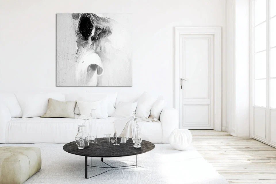
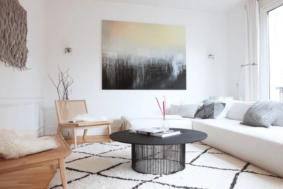
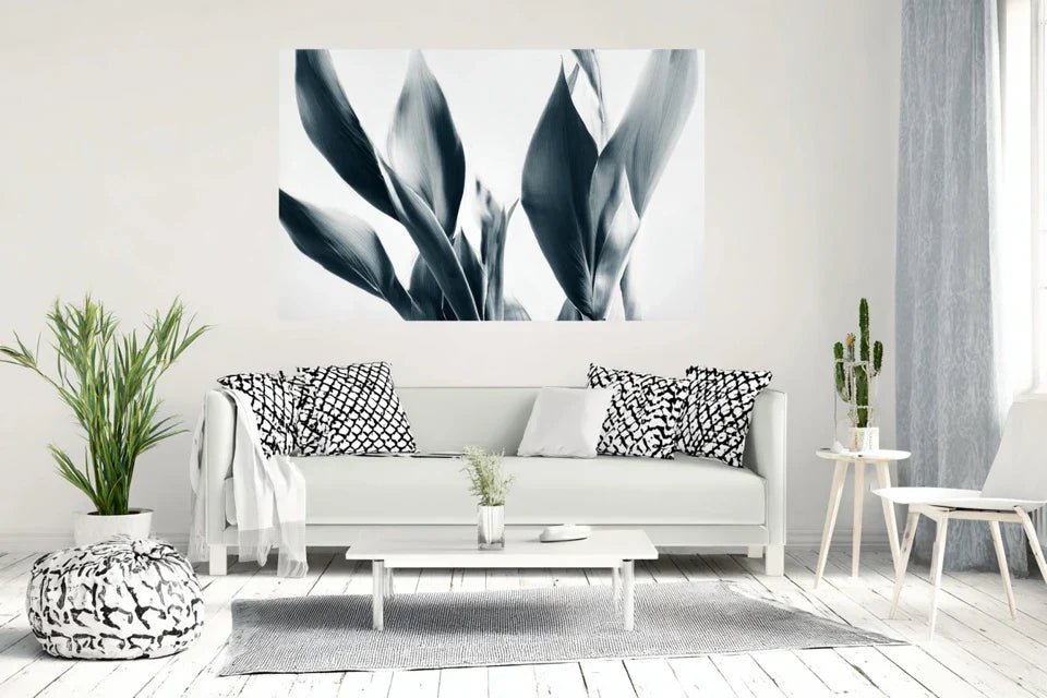
- The rule of golden proportions: Your artwork should occupy between 60% and 75% of the width of your reference piece of furniture (sofa, console, bed). This natural proportion instantly creates a visual harmony that reassures the eye.
- Material consistency: Opt for noble materials like high-quality canvas or brushed aluminum. Just as with a suit, it's the quality of the fabric that makes the difference, not necessarily the complexity of the pattern.
- Chromatic balance: Your artwork should contain at least one color present in your space, while bringing a new nuance. This technique creates a subtle visual dialogue between the elements.
The infallible selection process
Apply the "love at first sight" rule: Browse a selection of artworks and note those that stop you instinctively in the first 3 seconds. Your subconscious recognizes what really suits you faster than your mind.
⏱️ Time: 20 minutes | ✅ Success when: You have identified 3-5 artworks that "speak" to you | ⚠️ Attention: Resist the temptation to analyze rationally at first
Test compatibility with your space: For each selected artwork, imagine it in your room at different times of the day. Which one makes you smile even in thought? That one is likely to satisfy you in the long term.
⏱️ Time: 10 minutes per artwork | ✅ Success when: One artwork stands out from the others | ⚠️ Attention: Be wary of works that are too "perfect" and leave no room for imagination
Step 3: Integrate your work with the finesse of a set designer
This final step transforms your purchase into a true decorative element. You will learn to stage your artwork so that it reveals its full potential. This is the difference between exhibiting a work and making it shine in your living space.
The secrets of professional hanging
Master the ideal height: The center of your artwork should be 1.60m from the floor, or 15-20cm above your reference furniture. This height naturally corresponds to eye level for a standing person, creating a natural visual conversation.
⏱️ Time: 10 minutes | ✅ Success when: You can comfortably admire the artwork without tilting your head up or down | ⚠️ Attention: Many people hang too high for fear of "getting in the way" - this is the most common mistake
Create a flattering lighting: Add an indirect light source (table lamp, spotlights) that reveals the texture and nuances of your artwork. Light transforms an ordinary work into an exceptional piece.
⏱️ Time: 15 minutes | ✅ Success when: Your artwork "lives" differently depending on the lighting | ⚠️ Attention: Avoid direct lighting that creates disturbing reflections
Connoisseur's progression rule: You know your integration is successful when your guests naturally stop in front of your artwork without you having to mention it. True art asserts itself by its obviousness, not by demonstration.
You are now equipped with the codes of understated luxury and professional integration techniques. But allow me to share with you some expert subtleties that will make the difference between a beautiful hanging and a true staging worthy of the most beautiful interiors.
🎯 Professional decorator tip: Create a "force triangle" by placing three elements of different heights (your artwork, a plant, a decorative object) within a radius of 2 meters. This technique used by set designers subconsciously creates a perfect visual balance that retains attention without tiring it.
💭 Frequent reader question
"I don't have much budget, can I still create a luxurious effect?"
Absolutely, and that’s where the beauty of understated luxury lies! Your budget does not determine your ability to create a refined atmosphere. A €200 artwork perfectly chosen and beautifully displayed will impress tenfold more than an expensive work hung randomly. The secret lies in the right choice and the quality of integration, not the price. Start with a reasonable investment that really excites you - you can always evolve towards more ambitious pieces once you master the codes.
💡 Actionable advice: Set yourself a comfortable budget (the cost of a good dinner for two) and focus entirely on your favorite. A loved artwork at €150 will bring you more daily satisfaction than a suffered artwork at €500.
The pitfalls to avoid absolutely (even experts fall into them)
After helping hundreds of people find the perfect artwork, I've identified recurring mistakes that ruin even the most beautiful projects. These obstacles are so classic that knowing them will help you avoid 90% of disappointments.
- ⚠️ The trap of the moment's trend: It is tempting to choose a "very 2025" style seen everywhere on Instagram. But in 2 years, you risk getting tired of it. Instead, prioritize what resonates with your deep personality - your personal style transcends fleeting trends.
- ⚠️ The perfect assortment error: Many people look for a painting that exactly matches the colors of their cushions. The result is a bland ensemble without character. Dare to use a complementary color or a deeper shade that will create that subtle contrast so sought after.
- ⚠️ The empty space syndrome: You find a wall too bare and immediately fill it without reflection. Take the time to live in your space before deciding. Sometimes, restraint is more elegant than accumulation.
- ⚠️ Underestimating lighting: Buying a magnificent painting and then discovering it dull at home due to inadequate lighting. Always check the exposure of your wall before finalizing your choice.
- ⚠️ Approximate hanging: Neglecting the height, alignment or fixing due to lack of time. These technical details make all the difference between an amateur and a professional rendering.
🔍 Your safety check points: Before buying, ask yourself: "Do I see this painting in my room in 5 years?" If the answer is not an enthusiastic "yes", wait. A painting should be a lasting crush, not an impulsive purchase. Also watch out for these warning signs: persistent hesitation, need to justify your choice, excessive search for other people's opinions.
🎁 Special reader offer
Because you took the time to inform yourself, enjoy 10% discount on your first order:
⏰ Valid 72h after reading • Applicable to all our products
Your essential questions about understated luxury
Allow between €150 and €400 for a quality piece that will truly transform your space. This price includes a noble support, colors that do not fade and a careful finish. To optimize, focus on the quality of the support rather than the size: a 60x40cm painting perfectly executed will impress more than a large low-end canvas. Think investment rather than expense - a good painting will satisfy you for decades.
In a small space, understated luxury becomes even more powerful! Choose ONE statement artwork rather than several small pieces. Favor light tones that visually expand the space and clean subjects that don't overwhelm. The trick: opt for a horizontal format that widens the perception of the room.


