

You've been staring at that blank wall behind your bed for weeks, maybe even months. Every morning when you wake up, the emptiness jumps out at you. Every night as you go to sleep, this feeling of incompleteness accompanies you until slumber.
You may have already tried something: a small photo frame lost in the immensity, a shelf that only accentuates the imbalance, or worse, you gave up saying "after all, you don't see it when you sleep".
Yet, you know that a bed head artwork could completely transform the atmosphere of your bedroom. But how to choose without risking creating an imbalance? How to avoid your wall decor above the bed being either too discreet or overwhelming?
It's not your fault if your previous attempts didn't work. Most decorating advice ignores the unique specifics of the space above the bed: the required intimacy, the visual balance from different angles, the harmony with the bedding that changes.
By the end of this article, you will know exactly how to choose the perfect artwork for your headboard - the one that will transform your bedroom into a personal sanctuary and give you that feeling of accomplishment each time you cross the threshold.
Why is choosing your bed head artwork so crucial now?
The bedroom is the first space you see when you wake up and the last before you fall asleep. A bad artistic choice will accompany you in your most intimate moments for years. It's like wearing uncomfortable shoes: you end up getting used to them, but the discomfort remains.
🏠 Decor expert testimonial: "Marie, an interior architect, recently confided in me that she had lived with a too-small artwork above her bed for 3 years. Every morning, this imbalance frustrated her unconsciously. The day she replaced it with a work of art with the right proportions, she finally felt that 'at home' feeling she created for her clients."
💬 Conversation with a decor expert
The golden rule of visual harmony: A well-chosen artwork creates a natural balance that instantly soothes the eye. Like a good perfume, you don't think about it, but you feel its beneficial effect every day.
Why haven't your previous attempts worked?
Do you recognize yourself? You chose a painting that was too small and gets lost in the space. Or you opted for something nice in a store, but it seems out of place once hung. Maybe you even gave up, discouraged by these repeated failures.
The real thing happening is that you are applying general decoration rules to a very specific space. The area above the bed has its own codes: it must be soothing without being soporific, present without being overwhelming.
It's like trying to cook a soufflé with a chocolate cake recipe. The ingredients are similar, but the technique is completely different.
First hidden cause: The proportion error
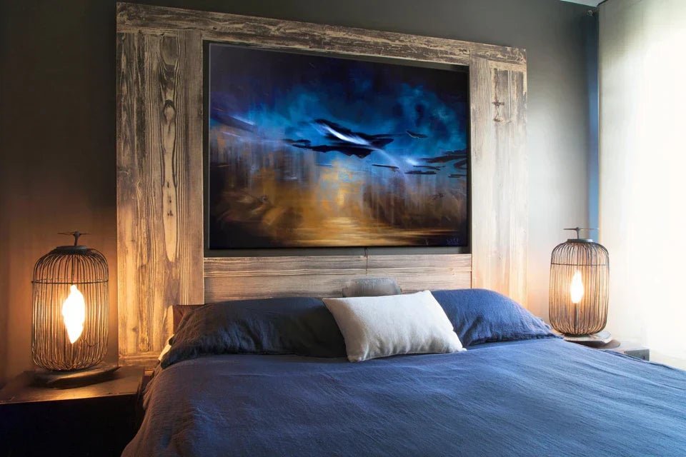
Contrary to what one might think, it’s not the beauty of the painting that counts first, but its harmonious relationship with your bed. A 30cm masterpiece above a king-size bed will create the same imbalance as a small bouquet in a large vase.
Imagine your bed as a sofa and your painting as a window. You wouldn't put a skylight above a large corner sofa!
This disproportion creates an unconscious visual tension that prevents you from truly feeling relaxed in your bedroom. Your eye is constantly searching for the balance it cannot find.
🔍 Quick test: Look at your bed from the entrance of your bedroom. If your gaze doesn't naturally go from the bed to the wall, then the balance isn’t there. A good headboard painting gently attracts the eye, without forcing it.
The illusion of perfect color
Many people think that you absolutely must match the colors of the painting with those of the bedroom. In reality, this approach often creates a bland and predictable ensemble, like a dish without seasoning.
Great decorators work on values and contrasts rather than exact colors. It's like in music: harmony comes from complementarity, not unison.
As a result, you miss out on magnificent paintings that could have transformed your bedroom, simply because they didn’t perfectly “match” your bedding.
The trap of the moment's trend
Instagram and Pinterest are full of perfect bedrooms with their trendy paintings. But these spaces are designed to be photographic, not to be lived in daily for years.
You can spot this influence if you find yourself looking for “the painting you must have” rather than the one that moves you. The clues: you hesitate between several very different styles, you change your mind according to the accounts you consult.
This pursuit of trends makes you forget the essential thing: your personal feeling towards the artwork that will adorn your most intimate space.
3 signs that you are under trend influence:
- You're looking for “the style of the moment”: You type “2024 headboard painting” instead of starting from your personal tastes
- You're torn between opposing styles: Minimalist in the morning, bohemian in the afternoon - a sign that you follow different influences
- You wonder "what will people think": If this question crosses your mind, you’re decorating for others, not yourself
The trigger factor: The forgotten viewing angle
Here's what almost no one notices: a bed head artwork isn’t just viewed standing up facing the bed. You see it lying down, from the door, from the window, in the dim light of waking up. Every angle must work. It's the kaleidoscope effect: a work that reveals different facets depending on your position in the room.
The multiple angles rule: A good bed head artwork remains captivating when viewed from all angles of your bedroom. Test it virtually from at least 3 different positions before making your choice.
| ❌ Classic approach | ✅ Thoughtful approach | 💡 Why it works | 🎯 Daily benefit |
|---|---|---|---|
| I choose based on the color of my walls | I choose based on my emotions | Emotion transcends decor changes | Lasting pleasure even when changing style |
| I take the proposed "standard" size | I calculate based on my furniture | Proportions create visual harmony | Feeling of balance and serenity |
| I follow Pinterest trends | I start from my personality | Authenticity resists time | Pride in your unique space |
| I only look at it facing the bed | I test all viewing angles | The bedroom is experienced from every angle | Constant visual pleasure in the room |
The 3-step method for choosing your perfect artwork
Now that you understand the real rules of the game, let's move on to practice. This method follows the logic of architecture: first the foundations (dimensions), then the structure (style), and finally the finishing touches (integration). Each step builds on the previous one to create a harmonious whole that resembles you.
🎯 Overview of your transformation: Step 1 = Calculate the right proportions (you finally visualize balance) → Step 2 = Identify your intimate style (you find your signature) → Step 3 = Achieve perfect integration (you create your personal sanctuary)
Step 1: Mastering the art of perfect proportions
Let's start with the foundations, because without proper proportions, even the most beautiful artwork in the world will seem out of place. It’s like building a house: if the foundations aren’t solid, everything else collapses. Once you master this step, you’ll immediately feel that sense of visual balance you were missing.
What you need to calculate
- A measuring tape: Not a flexible sewing tape measure, but a rigid DIY meter that will give you precise measurements. You'll find it in any hardware store. A laser measure is even better as it avoids reading errors. Accuracy to the nearest centimeter makes the difference between perfect balance and "almost good".
- Kraft paper or newspaper: To create a full-size template - much more reliable than imagining proportions. The principle is simple: your eye cannot assess dimensions in space, but it instantly recognizes harmony when it's there. Avoid white paper which reflects too much light and distorts perception.
- Repositionable masking tape: To temporarily fix your template without damaging the wall. Choose good quality as it will need to hold for several days while you think about it. The advantage is that you can adjust until you find the perfect position.
Now let's move on to putting this golden rule into practice
How to calculate ideal dimensions
Measure the width of your headboard: Place your meter from one end to the other of the headboard (not the mattress). This measurement gives you your basic reference. Your painting should be between 60% and 80% of this width to create a natural balance. Below 60%, it will seem lost; above 80%, it will overwhelm the whole.
⏱️ Time: 2 minutes | ✅ Successful when: You have an accurate measurement to the nearest centimeter | ⚠️ Attention: Don't measure the mattress which may protrude - it is the headboard that counts visually
Calculate optimal height: The height of your painting should represent approximately 40% to 60% of its width to respect the golden ratio which naturally pleases the eye. This proportion creates an instinctive harmony. For example, for a 100cm wide painting, aim for 40 to 60cm high.
⏱️ Time: 1 minute | ✅ Successful when: Your calculations give a harmonious rectangle | ⚠️ Attention: A painting that is too tall will create an impression of narrowness in the room
Test with a full-size template: Cut out a rectangle of paper to the calculated dimensions and fix it to the wall with masking tape. Step back, look from different angles. This visualization avoids 90% of purchase errors. The template immediately reveals whether the proportions work in your real space.
⏱️ Time: 10 minutes | ✅ Successful when: The template seems naturally balanced from all angles | ⚠️ Attention: Don't neglect this step - it will save you hundreds of euros by avoiding bad purchases
✅ Step 1 Validation: Your template should create a harmonious set where the eye detects no visual tension. Test by closing your eyes for 5 seconds then opening them again: if your gaze naturally goes from the bed to the template, it's perfect. If you feel an imbalance, adjust before moving on to the next step.
OUR RECOMMENDED PRODUCTS
Step 2: Identify Your Authentic Intimate Style
Now that you have mastered proportions, it's time for personalization. This step is more rewarding as you will discover your true decor signature - the one that truly corresponds to you, not the one dictated by magazines. The snowball effect begins: once your style is defined, all your future decor choices will become more obvious and consistent.
Decor Introspection Tools
- Your smartphone with Pinterest or Instagram: To create a secret board where you pin only the artworks that make you vibrate, without thinking about style. The idea is to let your instinct speak before your reflection. Create a private folder to avoid outside influence. After 20-30 pins, recurring patterns will naturally appear.
- A notebook or notes on phone: To note your emotions towards different styles - "soothing", "energizing", "nostalgic", etc. These words reveal what you are really looking for in your intimate space. Avoid technical decor terms, prioritize sensations: "makes me want to dream", "reminds me of my childhood".
- A photo of your current bedroom: Taken under different lighting conditions to understand the existing atmosphere and what is missing. This photo will serve as a basis for visualizing the impact of different artwork styles. The photographic objective often reveals details that the accustomed eye no longer sees.
Discovering Your Personal Signature
Take the 3 Ambiances Test: Imagine yourself in your bed facing a soothing artwork (soft landscape, muted colors), then energizing (colorful abstract, dynamic shapes), then contemplative (portrait, still life). Note which one makes you want it most when you wake up. This preference reveals what your psyche needs in this intimate space.
⏱️ Time: 15 minutes | ✅ Success when: One ambiance clearly stands out from the others | ⚠️ Attention: Don't choose based on what is "good" but on what truly attracts you
Analyze Your Spontaneous Favorites: Look at your Pinterest pins without thinking and identify the common points: dominant colors, drawing styles, subjects represented. Your subconscious has already done the sorting. These recurrences reveal your personal emotional palette, more reliable than generic advice.
⏱️ Time: 20 minutes | ✅ Successful when: 2-3 common characteristics clearly appear | ⚠️ Attention: Ignore the "I like" to keep only the "wow, I love”
Test consistency with your lifestyle: Does a very colorful painting suit someone who likes to read in bed at night? Does a complex abstraction go well with your need for simplicity after a busy day? The artwork should support your habits, not contradict them. Your bedroom is your refuge; art must reinforce this function.
⏱️ Time: 10 minutes | ✅ Successful when: You can concretely visualize the work in your daily routines | ⚠️ Attention: A beautiful painting but unsuitable for your lifestyle will end up annoying you
🎨 Validation of step 2: You must be able to describe your style in a maximum of 3 words (e.g., “modern and warm”, “poetic and refined”). If you are still hesitating between several directions, it means that you have not explored your true preferences enough. Take the time - this clarity will save you hours of research.
Step 3: Achieve perfect integration into your world
The final step transforms your choice into a true masterpiece. You are going from amateur to connoisseur level: your painting will no longer be just a decorative element but the focal point that reveals the personality of your bedroom. It is here that magic happens and you create that “je ne sais quoi” that makes us feel immediately good in a space.
Technical elements for integration
- Level bubble or smartphone app: The eye immediately perceives a tilted painting, even by a few millimeters. This technical precision is the difference between an amateur and a professional hanging. Smartphone apps are precise enough for this purpose and always available. A perfectly straight painting brings a reassuring feeling of stability.
- Additional lighting or reading lamp: To test the impact of the work under different lights - daylight, soft evening light, gentle awakening. A good painting reveals different facets depending on the light. Plan how the artwork will be lit: direct, indirect, natural or artificial light.
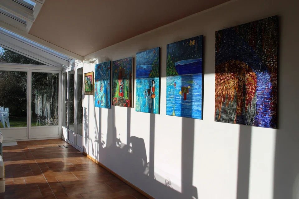
- Rule of 3 or 5 for spacing: If you opt for a multiple composition, these odd numbers create a more dynamic natural balance than even numbers. The human eye instinctively prefers balanced asymmetrical compositions. This rule also applies to spacing with other decorative elements.
Create the final harmony
Determine the optimal hanging height: Place the center of your artwork at 145-150cm from the floor, slightly above eye level when standing. This height works for all viewing angles in the room. Adjust according to your height: if you are taller than 1m80, raise it to 155cm. The goal is that the painting appears visible and harmonious from both your standing and lying position.
⏱️ Time: 5 minutes | ✅ Success when: The artwork seems naturally placed from all angles | ⚠️ Attention: Too high, it seems to float; too low, it overwhelms the bed
Harmonize with existing lighting: Observe how natural and artificial light reveals your artwork at different times of the day. A painting with warm tones thrives in subdued light, while a work with fine details requires good lighting. Adjust ambient lighting if necessary to reveal all the beauty of your choice.
⏱️ Time: 24 hours of observation | ✅ Success when: The artwork remains captivating from morning to evening | ⚠️ Attention: A magnificent painting in daylight can become dull with artificial lighting
Create visual links with the rest of the room: Identify a color, texture or shape element in your artwork that you can subtly recall elsewhere: a cushion, a throw, a decorative object. These subtle echoes unify the space without creating redundancy. The art of decoration lies in these delicate reminders that create an unconscious coherence.
⏱️ Time: 30 minutes | ✅ Success when: The whole seems naturally coordinated | ⚠️ Attention: Avoid excess: 2-3 recalls are enough, more becomes artificial
🏡 Final validation: Your success is measured by this feeling: when entering your bedroom, you immediately feel that "everything is in its place". The eye no longer searches, it rests. The artwork is an integral part of the atmosphere, neither too discreet nor overwhelming. This is a sign of perfectly successful integration.
The rule of natural progression: You can move on to the next step when the previous one seems obvious and acquired. Resist the temptation to skip steps - each phase consolidates the following. Patience in this method avoids costly mistakes and regrets.
Congratulations! You now master the subtleties that only professional decorators know. These expert nuances give you a considerable advantage: you not only know what to choose, but why it works. This understanding will serve you for all your future decor projects.
💎 Professional decorator's secret: The ultimate trick is to choose your artwork first in black and white (or by visualizing the grayscale values). If the composition works without colors, it will be magnificent with. This technique reveals the true strength of a work: its structure, its contrasts, its balance. Colors are just the icing on the cake.
🤔 Reader question
I perfectly understand this hesitation - that's exactly how I would have felt in your place. But think about it: you are going to see this artwork every day for years. Divide its price by the number of days it will bring you pleasure, and you will see that a good artistic investment costs less than a daily coffee. A painting that makes you vibrate will transform your relationship with your room for a long time.
💡 Practical advice: If the budget is really tight, look for works by emerging artists or quality art prints. The essential thing is that the work moves you and respects your calculated proportions. Perfect technique with a "correct" artwork is better than an exceptional artwork poorly integrated.
The 5 mistakes that can ruin your project (and how to avoid them)
After supporting hundreds of people in their choices, I have identified recurring pitfalls. These errors are human and understandable, but they can turn your dream project into a source of frustration. Fortunately, they are all avoidable when you know them.
- ⚠️ Choosing based on the website photo: Screens distort colors and proportions. What seems perfect on your computer can be disappointing in reality. It's tempting to order impulsively, but the screen never faithfully reproduces nuances and texture. Always ask for samples or visit galleries to see similar works in person. ⚠️ Neglecting frame thickness: A frame that is too thick can visually double the size of your artwork and unbalance your entire composition. Conversely, a frame that is too thin can make the work appear fragile. Calculate the total width painting + frame in your proportions. This mistake is common because we focus on the image forgetting its setting. ⚠️ Hanging too quickly after receipt: Excitement leads to immediate hanging, but take the time to live with the artwork placed in the room for a few days. You might discover that it works better slightly offset or at a different height. This patience avoids multiple holes in the wall and finds the perfect placement. ⚠️ Following contradictory opinions from those around you: Your family and friends have their own tastes, not necessarily compatible with your intimate universe. It's normal to want to share your enthusiasm, but artistic tastes are very personal. Listen politely, but stay on course. You are the one who will live with this work every day. ⚠️ Last-minute change of heart: The "what if I took..." syndrome often strikes just before purchase. This hesitation usually reveals that you haven't clarified your criteria enough beforehand. Review your notes from step 2 to find your clear direction again. Indecision costs more than thorough reflection.
🛡️ Pre-purchase verification system: Verify that you can answer "yes" to these 4 questions: 1) Do the proportions respect my 60-80% rule? 2) Does the artwork correspond to my style defined in step 2? 3) Can I concretely visualize this artwork in my daily routines? 4) Am I ready to live with it for at least 5 years? If an answer is "no", investigate before ordering.
🎁 Special offer for readers
Because you took the time to inform yourself, enjoy 10% discount on your first order:
⏰ Valid 72h after reading • Applicable on all our products
Your most frequently asked questions about headboard paintings
Allow 2-3 weeks for a thoughtful choice: 1 week to apply the method and define your criteria, 1 week to compare and choose, plus delivery times (3-10 days depending on origin). You can speed up by preparing your measurements and Pinterest board before starting your research. The upfront time investment saves you months of potential regrets.
For a painting that will accompany you for years, allow between €150 and €800 depending on the size and technique (art print, original painting, photograph). Good value for money is around €300-€400 for an 80x60cm. Think cost per year of use: €300 over 10 years = €30/year of daily pleasure. Prioritize quality over quantity - better one beautiful painting than a collection of average works.
Always use fasteners suitable for the weight and type of wall (plasterboard, concrete, brick). For paintings weighing more than 2kg, provide at least 2 fixing points spaced 30-40cm apart. Test the solidity by pulling gently before hanging. If you are not handy, do not hesitate to call a professional - safety is priceless. A falling painting can cause serious injuries.
Yes, but respect the overall proportion rule: the total number of paintings should represent 60-80% of the width of your headboard. Use identical or harmonious frames and leave 5-10cm between each artwork. Limit yourself to a maximum of 3 or 5 pieces (odd numbers). This approach requires more technique but can create a very personalized effect if mastered.
Choose artworks with clear and contrasting colors that capture and reflect the available light. Avoid very dark tones or fine details that would disappear. Consider adding additional lighting (wall lamp, reading lamp) that will reveal your painting in the evening. Abstract works with bright colors work particularly well in poorly lit spaces as they create their own luminosity.
Your room transformed: the pride of a perfectly mastered choice
In a few weeks, when you step through the doorway of your bedroom, your gaze will naturally fall on this perfectly integrated painting that reveals the personality of your space. Every morning upon waking up, you will feel that subtle but profound satisfaction of having created an environment that truly resembles you. Your guests will immediately notice the harmony of the whole without being able to put their finger on what makes the atmosphere so soothing.
This transformation goes beyond simple decoration. You have developed an expert eye for proportions, an instinctive understanding of what works in a space, and above all the confidence to make assumed aesthetic choices. These skills will naturally extend to all your future decor projects, saving you time and money while creating interiors that truly resemble you.
The method is now in your hands. Your first step? Take out your measuring tape and calculate those famous proportions that will change everything. Within the next hour, you can create your template and finally visualize the perfect balance you were looking for. Your personal sanctuary awaits - it's up to you to reveal it.
🌟 Your new decor adventure begins now: You have all the tools to succeed where so many others fumble. Trust your method, your calculations, and above all your emotions towards art. Your perfect room is just a few informed decisions away.


