

As you open your front door, you feel that familiar discomfort: your guests scan the space, which is bland and impersonal, and doesn't reflect who you are. Their polite smile barely hides this disappointing first impression.
That moment of silence stretches on, their gaze searching for something interesting to comment on, the feeling that your entrance lacks character when it should be your most eloquent calling card.
You've already tried a few solutions: a generic mirror, a commonplace console, maybe even a green plant. But nothing works; the effect remains flat, without relief, without that spark that transforms a hallway into a true welcome area.
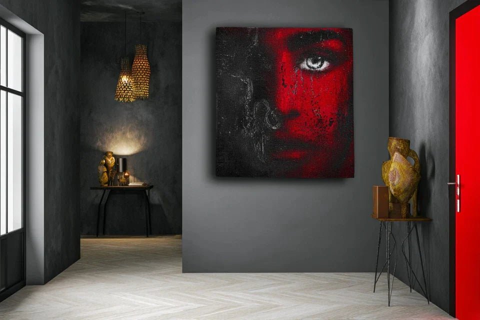
Rest assured, it's not a matter of taste or budget. It’s simply that most people underestimate the power of a well-chosen painting in this strategic 3-meter square space that conditions the entire visit.
By the end of this article, you will know exactly what type of painting will transform your entrance into a memorable and welcoming space, and your guests will leave with a lasting impression of your interior.
Why your entryway deserves the most impactful artwork in your home?
Imagine: 7 seconds is all it takes for a visitor to form a definitive opinion about your interior. Waiting to decorate this space is like leaving your resume in a drawer during a job interview. Every day that passes, you miss the opportunity to create that instant emotional connection that transforms a simple visit into a memorable experience.
🏠 Revealing testimonial: Marie, an interior architect, says: "I visited two identical apartments on the same day. In the first, an IKEA reproduction hung limply above the console. In the second, an abstract canvas with warm colors immediately caught the eye. Which one do you think I remembered? Yet both had exactly the same size and brightness."
💬 Conversation with a decor expert
The golden rule of a memorable entrance: Your painting should tell a story in 3 seconds, create a positive emotion, and make people want to discover more. Observable result: your guests consistently give a compliment before even taking off their coats.
Why haven’t your previous attempts worked?
Do you recognize yourself in these situations? Your guests glance quickly and immediately move to the living room, no one comments on your entrance decor, or worse, you avoid looking at that space when you come home.
What’s really happening is that your entryway suffers from the “passageway syndrome”: it's treated as a hallway rather than a room in its own right. The problem isn't your taste, but your approach to choosing art.
It’s like trying to make a good impression at dinner with a “safe” outfit: technically correct, but totally forgettable.
First mistake: choosing a format that's too small for the desired impact
Contrary to what one might think, a small painting in an entryway gets lost in the space instead of structuring it. The reality? The human eye needs a focal point large enough to create a strong impression in a transitional space.
Imagine a drop of perfume in a cathedral: even if it’s high quality, it won't have any impact. Your entryway demands an artistic presence proportional to its welcoming role.
Result: you continue to feel this frustration of missing out on your decor every time you pass through, and your guests don’t even notice your efforts. The solution? Opt for a format that confidently assumes its decorative function.
🎯 Quick test: Stand at the entrance to your living room and look towards your entryway. If your current painting doesn’t immediately capture your attention, it's too understated for this strategic space.
Second mistake: prioritizing neutrality over personality
Many people think that an entryway should remain neutral to “suit all tastes”. Monumental error! Your entryway should instead affirm your personality at first glance.
It’s like wearing a beige suit to your own wedding: no one will remember you, even if it's technically correct.
Direct consequence: your interior lacks narrative coherence, your guests don’t grasp your decorative universe, and you miss the opportunity to create that emotional connection that makes a place memorable.
Third mistake: neglecting the lighting of the painting
Here's the invisible factor that almost no one considers: a beautiful painting in a poorly lit entryway becomes insignificant. It’s like trying to read a captivating book in dim light.
Revealing clues in your entryway: your painting seems dull in the evening, the colors appear muted, or the artwork blends into the wall. Your artistic investment is wasted by unsuitable lighting.
Impact on your daily life: you never fully appreciate your own decor, and the “love at first sight” effect you were looking for never occurs with your guests.
The 3 warning signs to watch out for:
- The phone test: Your Instagram entry photos never do justice to reality, a sign that the visual impact is not working
- The hallway syndrome: Your guests walk through the entrance without slowing down, proof that the space creates no contemplative pause
- The chameleon effect: Your painting "disappears" depending on the time of day, revealing a problem with light integration
The trigger factor: understanding the "golden triangle" of the entrance
What really makes the difference is understanding the domino effect of visual perception: your painting influences the perception of space, which influences the visitor's mood, which influences their receptivity to everything else in your interior. Like a conductor who sets the tempo for the entire symphony. The clues to identify it at home: observe where the gaze naturally settles when entering, note the natural visual trajectory, and spot existing light anchor points.
The universal rule of a successful entrance: Your painting should create a contemplative pause of 2-3 seconds minimum as soon as you enter. Immediate test: ask someone close to cross your threshold and observe their eye behavior.
| ❌ Common approach | ✅ Successful approach | 💡 Why it works | 🎯 Visible benefit |
|---|---|---|---|
| Small "discreet" format | Bold, assumed format | The eye seeks strong anchor points | Immediate impact, structured space |
| Safe neutral colors | Consistent personalized palette | Personality creates connection | Engaged guests, spontaneous conversations |
| General ambient lighting | Lighting directed at the artwork | Light reveals details and textures | Living painting, change of atmosphere |
| Choice by elimination | Choice by infatuation | Authentic emotion is transmitted | Memorable space, personal pride |
The 3 circles method to choose your perfect entrance painting
Rassurez-vous, we will simplify this approach in 3 logical steps. Imagine building your decorative identity like an architect: first the foundations (your style), then the structure (the dimensions), finally the finish (integration). At each step, you will feel a growing satisfaction as you see your vision take shape.
🎨 Overall view of the transformation: Circle 1 (Define your visual signature), Circle 2 (Master the impact proportions), Circle 3 (Create luminous harmony). Each circle brings you closer to an entrance that resembles you and naturally impresses.
Circle 1: Define your visual signature (the emotional foundation)
Let's start with the basics because your visual signature determines everything else. It’s like choosing the land before building a house: this decision influences all the following ones. Once you master this step, you will feel that satisfaction of knowing exactly what you are looking for.
Your personal discovery tools
- Your emotional "moodboard": Gather 10 images that make you vibrate (not necessarily paintings). It resembles a personal collage revealing your deep tastes. Find them in your travel photos, magazines, or Pinterest. Quality criterion: each image must provoke an immediate positive emotion. Avoid "pretty but nothing more" images that dilute your personality. Your instinctive color palette: Observe the colors that appear in your favorite clothes, tableware, accessories. The principle: your spontaneous choices reveal your natural color harmony. Quality indicator: these colors enhance you and reassure you. Impact: immediate visual consistency with your personality. Your decorative "temperature": Do you prefer warm atmospheres (warm tones, textures) or soothing ones (cool tones, clean lines)? Principle: your temperament influences your decorative needs. Test: what type of hotel do you feel most comfortable in? Benefit: a painting that matches your nature brings you lasting satisfaction.
- The visual rule of thirds: Your painting should occupy about 1/3 of the width of the main wall in your entrance. Resembles a photographic composition rule applied to decor. Find this measurement with a classic tape measure. Criterion: the artwork must structure the space without overwhelming it. Alternative to avoid: timid formats that get lost in space.
- Natural eye-level height: The center of your painting should be between 1.50m and 1.65m from the floor (depending on your height). Principle: alignment with the average visitor's line of sight. Method: mark this height with a pencil before hanging. Impact: immediate visual comfort and optimal highlighting of the artwork.
- Breathing space: Leave at least 20cm between your painting and any furniture or decorative element. Function: allows the artwork to express itself without visual competition. Quality index: the eye must be able to "go around" the painting without obstacles. Benefit: tenfold impact of your artistic investment.
Now, let's move on to practical discovery
Your personal diagnosis in 3 steps
The "love at first sight" exercise: Visit 3 online gallery websites and note the 5 works that stop you dead. The goal is to identify your unconscious preferences without external influence. Important detail: don't think, let your instinct guide your selection. Rest assured, there are no wrong choices.
⏱️ Time: 15 minutes | ✅ Successful when: You have 5 works that make you smile | ⚠️ Attention: Avoid censoring yourself for fear of "what will they say" - it's your entrance, not your guests’
The existing harmony test: Photograph your current entryway and identify the 3 dominant colors (wall, floor, furniture). Reason: your new painting must dialogue with this existing one. Technique: use a color pipette app to be precise. Difficulty: it's easier than it seems.
⏱️ Time: 10 minutes | ✅ Successful when: You have your basic palette | ⚠️ Attention: Don't forget the natural lighting that changes colors depending on the time
Emotional projection: Imagine yourself returning home after a difficult day. What emotion would you like to feel when looking at your painting? Objective: define your deep decorative intention. Method: concretely visualize this moment of transition. Importance: your painting becomes your daily "emotional reset".
⏱️ Time : 5 minutes | ✅ Successful when: You have a clear emotion in mind | ⚠️ Warning: Stay authentic - your true personality, not the one you think you should have
✨ Validation of your signature: You must be able to describe in a sentence the style of painting that suits you: "I am looking for a [style] artwork with [colors] tones that conveys a feeling of [emotion]". If it's blurry, retake the crush exercise. Encouragement: this clarity will transform all your future decor choices!
OUR RECOMMENDED PRODUCTS
Circle 2: Mastering the proportions of impact (the visual structure)
Now that you know your signature, let's move on to the technical dimension that transforms a pretty painting into a true statement of intent. This is the difference between an accessory and a design element. This step will give you the satisfaction of seeing your space visually structured.
Your sizing references
Your precise measurement plan
The survey of your space: Measure the width, height and depth of your entrance, then identify the main wall (the one facing the front door). Purpose: to determine the maximum possible dimensions. Technical tip: use a laser measure for greater accuracy. Simplicity: even those who are not handy can do it.
⏱️ Time : 10 minutes | ✅ Successful when: You have the 3 dimensions + the optimal wall | ⚠️ Warning: Check for obstacles (switches, radiators) that limit available space
The visual proportion test: Cut a rectangle of paper to the calculated dimensions and temporarily attach it to the wall. Objective: validate the visual impact before purchase. Method: use masking tape, less invasive. Revelation: you will immediately see if the format is right.
⏱️ Time: 15 minutes | ✅ Successful when: The rectangle creates the desired "wow" effect | ⚠️ Attention: Test at different times of the day to validate the effect with natural light
📐 Dimensional validation: Your paper format should create a noticeable presence without unbalancing the space. Test: ask someone nearby for their impression when entering. If they notice and appreciate it, you've won! In case of doubt: reduce slightly rather than risk visual overload.
Last step, and not insignificant: reveal the beauty of your artwork with adapted lighting. It's like makeup for an actress: it enhances what already exists. Mastering this step will give you the pride of seeing your entrance transformed into a true personal gallery.
Your adapted lighting solutions
- Directional lighting: Opt for an adjustable LED spotlight or picture light. Resembles a miniature projector that reveals details. Find them in hardware and decor stores. Quality criterion: 3000K color temperature (warm white) to enhance colors. Avoid cold lights that distort the tones. Complementary ambient lighting: Add an indirect light source (table lamp, hidden LED). Principle: create a warm atmosphere that highlights without dazzling. Method: indirect light brings out reliefs and textures. Impact: your entrance becomes welcoming even in the evening. Dimmer switch: Install a dimmer to adapt the lighting according to the time of day and mood. Function: modulate the emotional impact of your artwork. Advantage: energy savings and visual comfort. Benefit: your work lives differently depending on the time of day.
Your optimal lighting installation
The lighting angle test: With a flashlight, test different lighting angles on your artwork (45°, 30°, frontal). Objective: identify the angle that best reveals colors and textures. Technique: the ideal angle avoids reflections while creating relief. Ease: immediate experience of different renderings.
⏱️ Time: 10 minutes | ✅ Successful when: You have identified the optimal angle | ⚠️ Attention: Avoid direct frontal lighting that creates annoying reflections
Installing your lighting solution: Install your spotlight or picture light at the optimal position you identified. Reason: to concretize your vision of ambiance. Method: wall mounting or rail according to your choice. Reassurance: most solutions are plug-and-play.
⏱️ Time: 30 minutes | ✅ Successful when: Your artwork is highlighted without glare | ⚠️ Attention: Respect the safety distances indicated on your lighting
💡 Ambiance validation: Your artwork should be the natural focal point of the entrance, visible and enhanced at all times. Final test: take a photo of your illuminated entrance - it should make people want to be there. Encouragement: mastering this lighting will transform your approach to all your decor!
💡 Rule of progression for your success: Move on to the next circle only when the previous one fully satisfies you. Objective criteria: circle 1 (you have defined your style), circle 2 (proportions are harmonious), circle 3 (lighting reveals your work). Patience and ambition: each mastered circle permanently transforms your perception of decoration.
Congratulations! You now master 💡 the subtleties that separate a mundane entrance from a memorable welcome space. These techniques give you a decisive advantage: your guests will immediately feel the attention to detail, even without understanding exactly why your entrance marks them so much.
🎯 Professional decorator's secret: Create a "visual echo" by subtly echoing a color from your artwork in a small accessory elsewhere in the entrance (cushion, vase, book). This technique visually connects the elements and gives an impression of worked coherence. Example: if your painting contains petrol blue, add a small object of this shade on your console.
💭 "But what if I choose the wrong style and get tired of it?"
"I'm afraid of making too strong a choice and regretting it in a few years..."
This fear is perfectly normal and reveals your good sense! 💡 But here's the reassuring reality: tastes evolve, certainly, but true artistic emotions remain. A painting that touches you deeply today will continue to speak to you, even if your decor evolves around it. It's like a song we love: it accompanies us through the years. To reassure yourself, start with a painting that vibrates within your comfort budget, and observe how it transforms your daily life.
🛡️ Anti-regret strategy: First choose a painting for your bedroom or office, a more intimate space. Observe for 3 months how it influences your mood. This experience will give you confidence for your entrance choice!
The 5 mistakes to absolutely avoid for your entrance artwork
Now that you have the method, 💡 let's protect your investment from these costly errors that even enlightened amateurs commit. These traps are pernicious because they sabotage a good choice with details of execution.
- 🚫 The reference photo trap: Buying only based on a picture without seeing the actual colors. Why it's tempting: saving time and having a wide choice online. Consequence: disappointment upon receipt, colors different from expectations. Solution: always request a sample or return guarantee. Rest assured: this is a standard precaution in art. 🚫 The hasty hanging mistake: Fixing the artwork without preparation or level. Why it happens: impatience to see the final result. Result: tilted artwork, multiple holes in the wall. Alternative: prepare the hanging with paper template and level. Normality: even professionals use these tools. 🚫 The instant collection syndrome: Wanting to create a gallery wall right from the start. Attractive because: spectacular decor effect on Pinterest. Consequence: visual overload, loss of impact for each artwork. Method: start with a statement piece, add gradually if necessary. Common mistake and recoverable. 🚫 Forgetting seasonality: Choosing an artwork very linked to a season or period. Tempting because: the emotion of the present moment. Problem: rapid fatigue, mismatch with the seasons. Solution: opt for timeless works that evolve with the light. Frequency: very common among beginners. 🚫 The unbalanced budget trap: Spending all the budget on the artwork and neglecting the framing/lighting. Apparent logic: the artwork is the most important thing. Reality: a beautiful artwork poorly presented loses 50% of its impact. Balance: distribute 70% artwork, 20% presentation, 10% lighting. Recoverable in stages.
🔍 Your checklist before finalizing: Verify that your artwork still moves you after 24 hours of reflection, that the dimensions correspond to your paper test, that the lighting reveals the colors well, and that the whole harmonizes with your existing furniture. Warning signs: persistent doubt, desire to justify your choice to others, or feeling that "something is wrong" without being able to specify what.
🎁 Special readers offer
Because you took the time to inform yourself, enjoy 10% discount on your first order:


