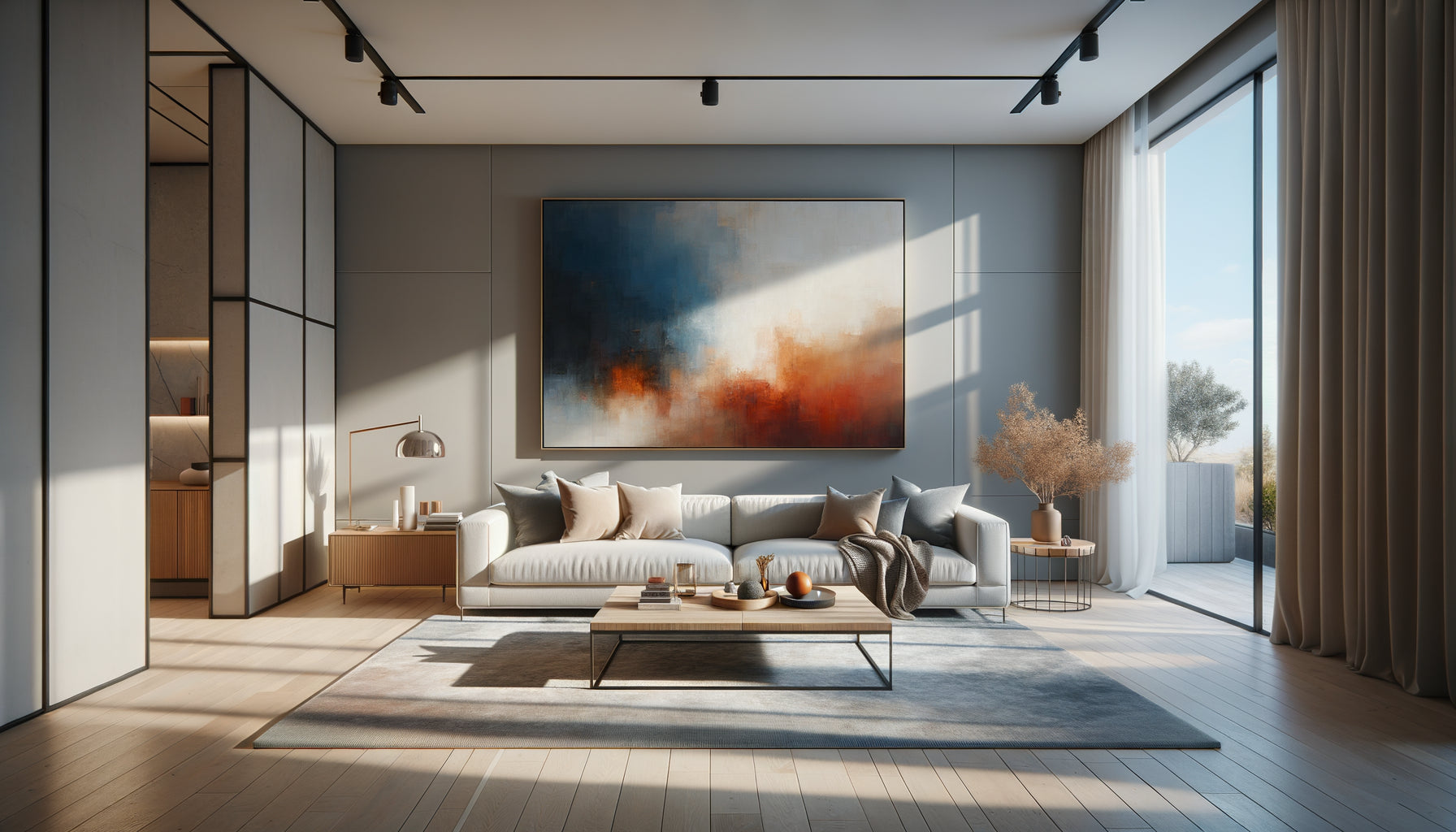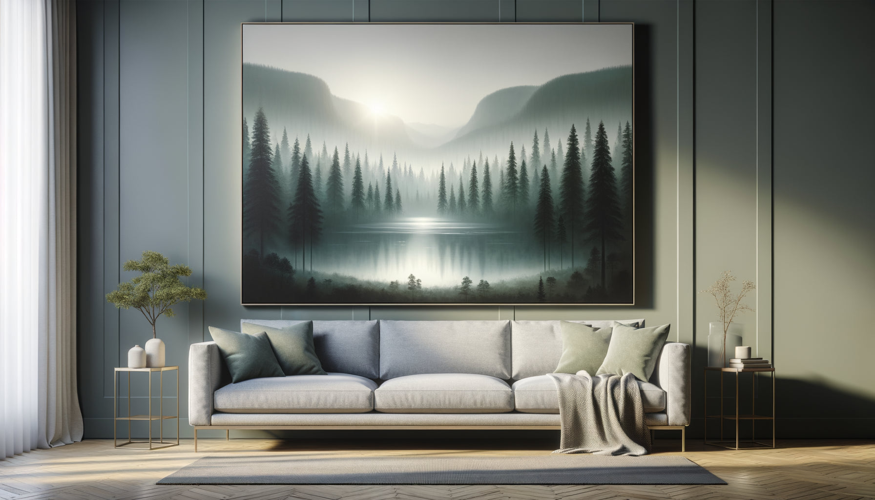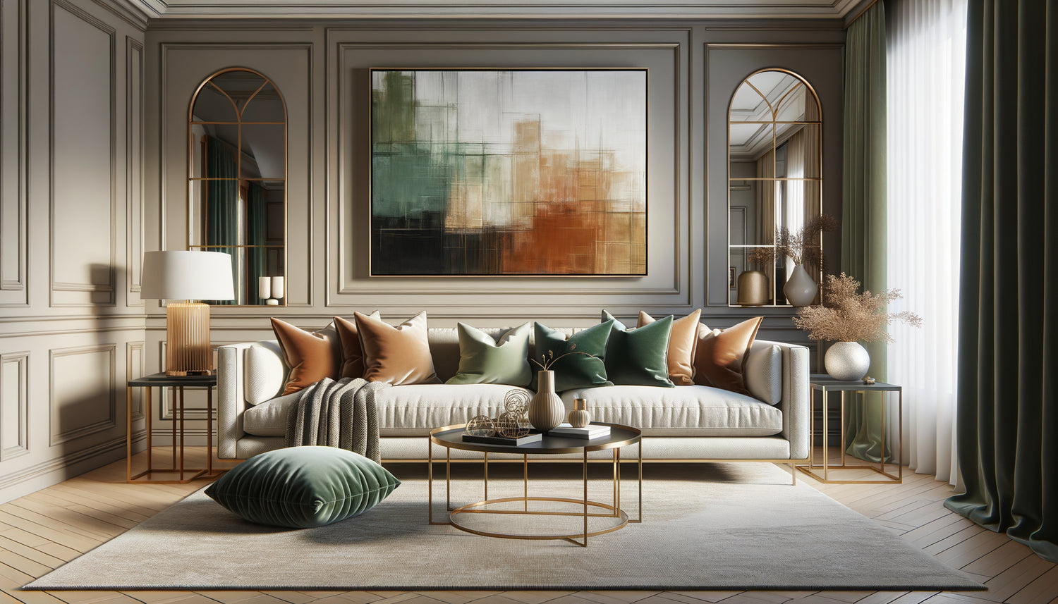
This morning again, while visiting a client's studio, I observed this scene that I know by heart: a magnificent contemporary painting leaning against the wall, wrapped for three weeks. "I don't know where to put it, I'm afraid it will clash with the rest," she confided in me. Yet, this canvas with ochre and terracotta nuances would have sublimated her living room with neutral tones.
Harmonizing a painting with your existing decor instantly transforms your living room into a coherent and sophisticated space. This approach brings three major benefits: it creates visual continuity that soothes the eye, it reveals the personality of your interior without overwhelming it, and it enhances both the artwork and the surrounding furniture. Each element then dialogues with the others in an elegant conversation.
Too often, we fear a decorative faux pas. This expensive work that would transform the living room into a disconnected art gallery. This inherited painting that would seem out of place among contemporary furniture. Or worse: this impulsive purchase that remains in its packaging for lack of knowing how to integrate it harmoniously.
Rest assured, harmonizing a painting with your living room decor requires neither a degree in art history nor an excessive budget. This skill is acquired by understanding a few fundamental visual principles and observing your space with a fresh eye. In the minutes that follow, you will discover how to create this natural coherence that characterizes successful interiors.
The dialogue of colors: creating subtle visual bridges
Harmonization always begins with the chromatic analysis of your living room. Observe the dominant colors: those of your sofa, curtains, rug, cushions. Also note the secondary tones that appear punctually. A harmonious painting does not necessarily have to reproduce all these shades, but establish at least two or three colored connections with what already exists.
Imagine a living room in beige and pearl gray tones, punctuated by touches of teal in the textiles. An abstract painting combining ivory nuances, graphite and a hint of petrol blue would instantly create this chromatic coherence sought after. The visitor's eye naturally circulates from the painting to the cushions, then to the rug, without jolts or breaks.
Monochromatic paintings or those with restricted palettes greatly facilitate this harmonization. A black and white photograph integrates into practically all decorative universes. Likewise, works in neutral tones – beige, taupe, gray, off-white – bring sophistication without risking a visual clash.
The rule of complementary accents
Here's a technique I consistently apply: a painting can introduce a color absent from the living room, provided it is present in small quantity. This unexpected touch will energize the whole without creating dissonance. For example, in a living room with warm tones (terracotta, ocher, honey wood), a work featuring a hint of emerald green brings freshness and modernity, especially if you add some foliage or a cushion of the same shade.
The frequent mistake is to search for a perfect match, almost identical. This approach often produces a flat and predictable effect. Harmony rather arises from variation on a theme color: different shades of blue that respond to each other, greens evolving from sage to forest, pinks from powdery to terracotta.
The balance of styles: dare unexpected marriages
Contrary to popular belief, harmonizing a painting with the living room does not mean reproducing exactly the same decorative style. The most successful interiors skillfully mix eras and aesthetics. This strategy of controlled contrast brings depth and character to decoration.
A contemporary painting with clean lines enhances a classic living room with old moldings, creating a fascinating visual tension between tradition and modernity. Conversely, a figurative 19th century canvas brings soul and history to a minimalist interior with rigorous lines. The secret lies in dosage: one strongly contrasting element in a coherent environment creates interest without confusion.
Also observe the guidelines of your furniture. A living room with rounded shapes (curved sofa, round coffee table, organic luminaires) will beautifully welcome a work with flowing curves or circular motifs. Conversely, furniture with straight and geometric lines naturally harmonizes with structured paintings, orthogonal abstract compositions or architectural photographs.
Respect the general atmosphere
Each living room has a particular ambiance: zen and soothing, energetic and colorful, sophisticated and muffled, bohemian and eclectic. The painting must respect this emotional identity of the space. A canvas with vibrant colors and dynamic brushstrokes will disrupt a living room designed for relaxation. Conversely, a too wise work will seem bland in a daring and expressive interior.
Ask yourself what feeling you are looking for when entering your living room. Calm and serenity? Opt for soothing landscapes, minimalist abstractions, contemplative photographs. Energy and conviviality? Prefer warm colors, dynamic compositions, lively scenes that invite conversation.

Proportions and Placement: The Art of Spatial Balance
A chromatic and stylistic harmony can nevertheless disrupt the living room if its dimensions or location are unsuitable. The size of the artwork should be in dialogue with that of the wall and adjacent furniture. On a large wall above a three-seater sofa, a small 16x24 inch canvas will seem lost and insignificant.
The empirical rule I apply: the artwork should occupy about two thirds of the width of the furniture it surmounts. A 79-inch sofa therefore calls for a work (or composition of several artworks) approximately 59 inches wide. This proportion creates a solid visual anchor without overwhelming the furniture.
For very large spaces, don't hesitate to create a gallery wall rather than searching for a single immense artwork. This technique allows you to harmonize several works of varying styles and formats by creating a unified composition. The trick: maintain a constant (identical frames, or common color palette, or shared theme) that ensures the coherence of the whole.
The Ideal Hanging Height
A poorly positioned artwork breaks the overall harmony, regardless of its intrinsic beauty. The center of the artwork should be at eye level, or about 49 to 51 inches from the floor for a standing observer. In a living room where you are mainly seated, you can lower this height slightly.
Above a sofa, leave 6 to 10 inches between the back and the bottom of the frame. This breathing space avoids the “stuck” effect that visually weighs down the whole. The artwork and furniture then form two distinct entities that complement each other rather than a single, massive block.
Lighting: Revealing Harmony Through Light
Harmonizing an artwork does not end with its hanging. Lighting radically transforms the perception of colors and the integration of the work into the space. A canvas with warm tones under a cold LED light will lose all its depth and seem dull, disconnected from the living room bathed in golden natural light.
Observe the natural luminosity of your living room at different times of the day. A south-facing wall, flooded with light, can accommodate works with darker or more saturated tones. Conversely, a dark corner requires brighter artworks that capture and reflect available light, creating a natural point of light.
Adjustable spotlights or dedicated wall lights significantly enhance the artwork while reinforcing its integration. Directed lighting creates a gallery effect that highlights the work without artificially isolating it. Choose a color temperature (in Kelvin) close to that of your ambient lighting to maintain consistent luminosity in the living room.

Textures and materials: creating a tactile conversation
Beyond colors and shapes, harmony also comes from the dialogue of materials. A thick impasto oil painting brings a rich tactile quality that resonates beautifully with velvety textiles, a corduroy sofa or crumpled linen cushions. This correspondence of textures enriches the sensory experience of the space.
The frame plays a crucial role in this material harmonization. A raw or aged wood frame echoes the natural elements of the living room: an oak coffee table, a walnut bookcase, a rattan basket. A gilded or copper metal frame elegantly responds to brass lighting fixtures, golden furniture handles, and metallic accessories scattered throughout the room.
For canvas works mounted on a stretcher without a frame, this contemporary presentation is particularly well suited to minimalist interiors with clean lines. It visually lightens the space and is perfect for large formats that would be too imposing when framed.
Coordinate with other decorative works
A painting never lives alone in a living room. It coexists with mirrors, family photographs, decorative objects, plants. Overall harmonization requires thinking of these elements as a whole. If you already have a large baroque gilded mirror, a painting with a similar frame will create a beautiful continuity. If your shelves display a collection of blue ceramics, a painting incorporating this shade will reinforce the decorative coherence.
However, avoid excessive coordination that would produce an impersonal “showroom” effect. A few controlled breaks – an unexpected color, a slightly offbeat style – breathe life and authenticity into the decoration.
Transform your living room into a harmonious and inspiring space
Discover our exclusive collection of wall art for Living Room that naturally integrates into all decorating styles.
Visualize before hanging: foolproof techniques
Before permanently drilling into the wall, several methods allow you to test the harmonization of the artwork with your decor. The simplest: cut a piece of cardboard to the exact dimensions of the work and temporarily fix it with masking tape. Live for several days observing the overall balance, the flow of gaze, the impact on lighting.
Take photos of your living room with the artwork in place. The camera's objective often reveals details that the accustomed eye no longer perceives: a color dominance that is too strong, a lack of volume balance, a stylistic break. These images also allow you to consult the opinion of loved ones with more perspective.
For tech enthusiasts, some applications allow you to virtually project works of art onto your walls using augmented reality. Although imperfect in terms of color rendering, these solutions provide a first useful impression of the artwork's spatial integration.
Evolving harmony over time
The harmonization of an artwork with the living room decor is never fixed. Our interiors evolve: new cushions, changing curtains, acquisition of a rug. Each modification affects the overall balance and may require subtle adjustments. A perfectly integrated painting can suddenly seem out of place after a change of sofa.
This fluidity represents a creative opportunity rather than a constraint. Dare to move your paintings, test new locations with the seasons. An artwork with fresh and bright tones can migrate to the living room in summer, while a canvas with warm colors takes its place in winter, subtly changing the atmosphere of the room.
Also consider the option of interchangeable paintings to create different harmonies according to your desires. A few complementary works, stored and alternated regularly, renew the decoration without major investment or radical transformation.
Harmonizing a painting with the existing decor of the living room is ultimately more about listening than pure technique. Listen to your space, observe how light flows through it, feel the emotion it generates. The harmonious painting is one that amplifies this unique identity rather than contradicting it. Tomorrow morning, look at your living room with new eyes. Identify its dominant colors, its underlying style, its particular atmosphere. The ideal painting will then appear obvious to you: the one that reveals and magnifies what already exists, while adding that touch of personal magic that transforms a room into a true home.
Frequently asked questions
Do you absolutely need the colors of the artwork to match those of your living room?
No, this constraint would significantly limit your choices. The key is to establish chromatic connections, even subtle ones. An artwork can introduce new colors as long as at least two or three shades harmonize with what already exists. Neutral tones (gray, beige, white, black) greatly facilitate this harmonization because they integrate into practically all decorative universes. Also consider variations in nuances: a navy blue can beautifully respond to touches of sky blue already present, creating chromatic richness rather than strict correspondence. Harmony arises from these subtle color echoes, not exact reproduction.
Can you mix a modern artwork with a classic living room?
Absolutely, and it's even recommended to create a personalized interior! Controlled contrasts between tradition and modernity produce the most interesting decors. A contemporary artwork brings freshness and dynamism to a living room with antique furniture, avoiding a frozen museum effect. The reverse also works: a classic or figurative work softens a very minimalist interior by giving it depth and history. The key is dosage: limit these strong contrasts to one or two elements to maintain overall coherence. Also ensure that chromatic or material bridges connect these pieces from different eras, creating a natural visual transition.
How to choose between a large single artwork or several small ones?
This decision depends on your space and decorative style. A large artwork creates a powerful focal point, ideal above a sofa or on an imposing blank wall. It immediately brings character and sophistication, simplifying decoration. Several small artworks in composition (gallery wall) are better suited to eclectic spaces, heterogeneous collections, or walls of medium size. This option offers more flexibility: you can evolve the composition over time. To harmonize a multiple composition, maintain a unifying constant: similar frames, common color palette, or shared theme. If in doubt, start with a structuring large artwork, which is easier to harmonize than a complex set.