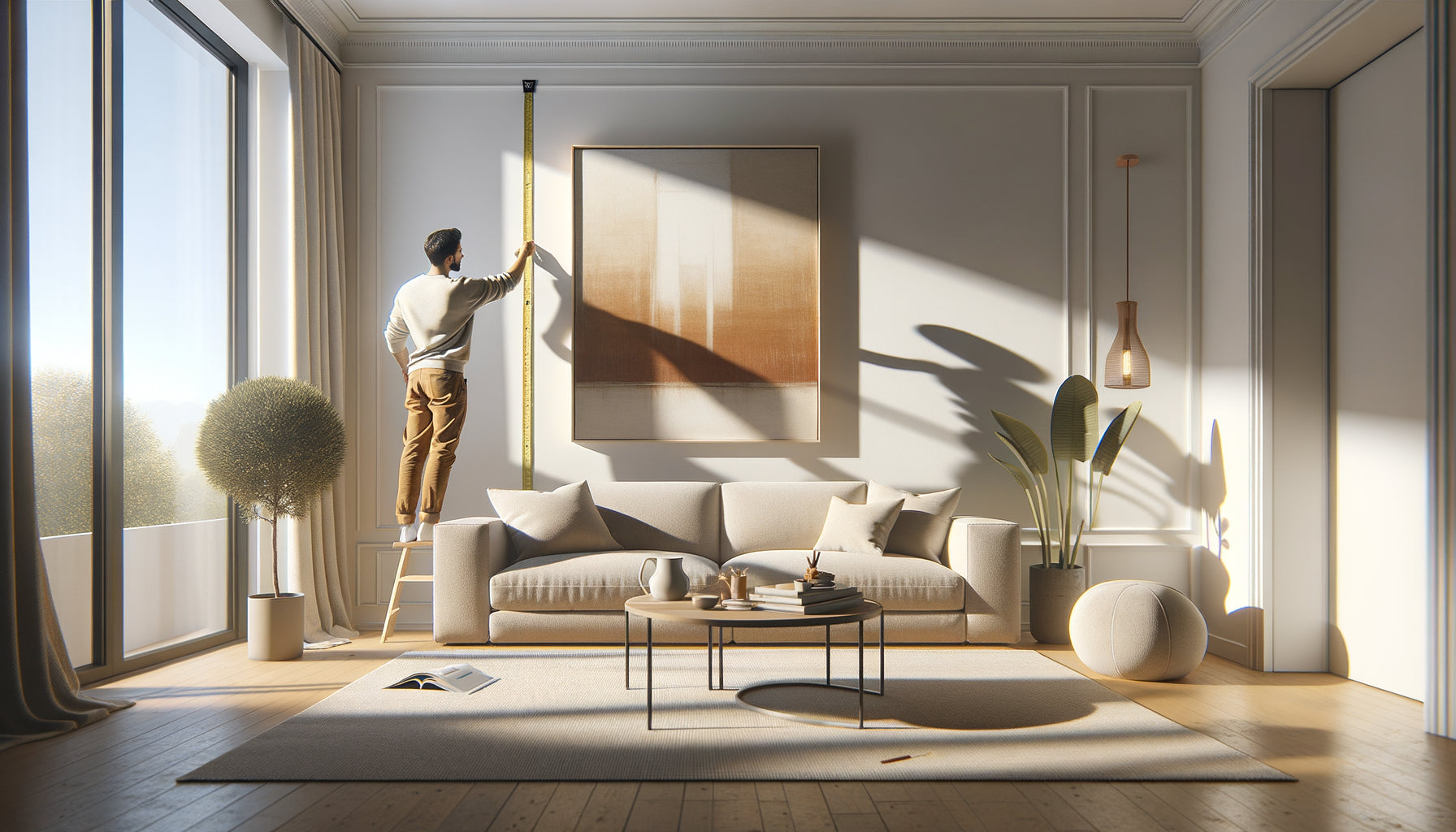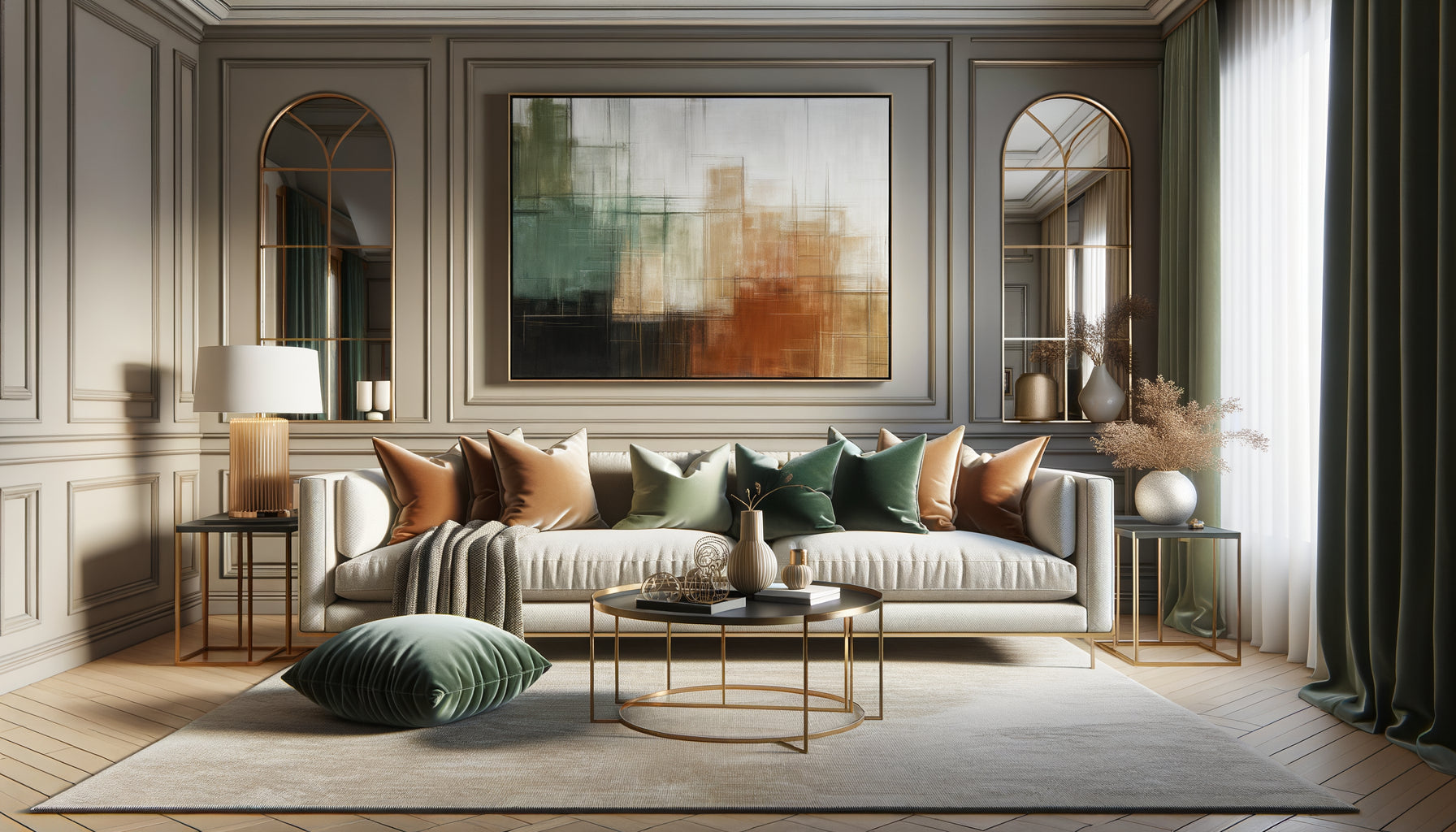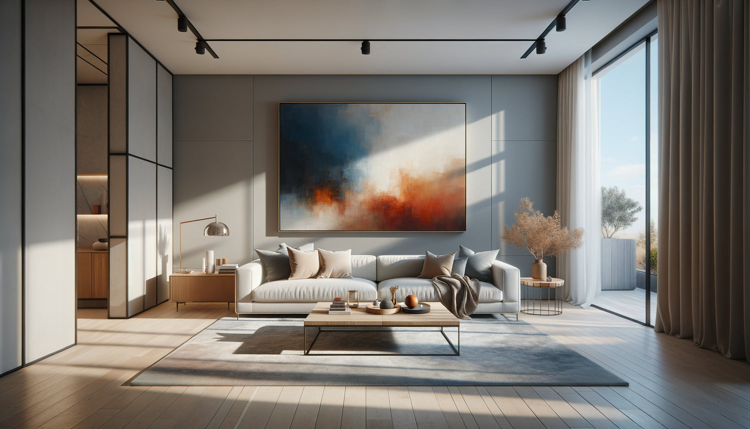
Three months ago, a client opened the door to her Parisian apartment with a resigned sigh. "Look," she said, sweeping her gaze across her immaculate living room. It's beautiful, but it's dead." Linen écru sofa, off-white walls, beige carpet: the harmony was perfect, almost too much. The space breathed elegance, but seemed to hold its breath. We hung three colorful paintings – an abstract work with burnt ochres, a vibrant Mediterranean landscape, and a bold geometric composition. The transformation was immediate.
The living room came alive.
Here's what colorful paintings bring to a neutral-toned living room: they create magnetic focal points, infuse personality without compromising balance, and reveal an unsuspected depth in the surrounding neutral shades. This visual alchemy transforms an elegant but static space into a living place that breathes with you.
You have probably invested in this neutral decor for its timeless sophistication. Perhaps you listened to advice advocating restraint in color, that famous Scandinavian or minimalist palette which promises serenity and elegance. And it's true: neutral tones offer a refined backdrop. But here is something missing. That little spark that makes you enter a room and feel
alive. You hesitate to take the step towards color, fearing of breaking this fragile balance.
Rest assured: introducing colorful paintings into a neutral-toned living room is not a risky bet, it's a natural evolution. It’s even one of the safest strategies to energize an interior without undertaking work. Paintings act like guest stars: they bring their energy without disrupting the established order. The neutrality of your base then becomes an asset, a setting that sublimates each color nuance you introduce.
In this article, I'll take you on a journey to discover how colorful paintings truly transform a neutral living room, what rules to follow to create this magic, and how to choose the works that will make the heart of your space beat.
The revealing effect: when color awakens neutrality
Observe a completely neutral living room: beige, gray, white, taupe. The eye glides over the surfaces without really stopping. It's soothing, of course, but also strangely flat.
Colorful paintings create what I call “visual anchors” – points where the gaze naturally comes to rest, to relax, to marvel.
This dynamic works according to a fascinating optical principle: neutral tones amplify the intensity of bright colors. A vermilion red will appear even more vibrant on an off-white wall than it would surrounded by other saturated shades. Your neutral living room becomes a theater scene, and colorful paintings are its main actors under the spotlights.
I’ve noticed a recurring phenomenon among my clients: after installing colorful artworks, they rediscover their living rooms. “I never realized that my wall had these shades of gray,” one of them confided in me. Color doesn't just exist on its own; it dialogues with its environment, revealing chromatic subtleties previously invisible. A painting with deep blues will highlight the cool undertones of your wall paint, while a work with vibrant yellows will instantly warm up the atmosphere.
The power of controlled contrast
The strength of colorful artworks lies in their ability to create contrast without violence. In a living room with neutral tones, even a modest touch of color produces a considerable visual impact. A 32x32 inch painting with touches of terracotta and sage green is enough to transform the energy of a 100 sq ft room. It's this controlled contrast that energizes without assaulting, that stimulates without tiring.
Neutral living rooms sometimes suffer from what designers call the “hotel room syndrome”: impeccable but impersonal. Colorful artworks inject identity, history, and emotion. They say something about you, your travels, your dreams, your sensitivity. This personalization is essential for a space to truly become a home.
What palette should I choose to energize without destabilizing?
The question I hear most often: “What colors can I introduce without risking a misstep?” The answer is more liberating than you imagine. In a living room with neutral tones, you have exceptional chromatic freedom. Almost anything works, provided you respect a few harmonic principles.
Warm colors – ochres, rusts, terracotta, amber yellows – bring immediate warmth. They compensate for the potential coolness of grays and whites, creating a welcoming and enveloping atmosphere. I’ve found that these shades work particularly well in north-facing living rooms, where natural light lacks that golden warmth.
Deep blues and greens offer contemporary sophistication. A painting with marine or emerald hues on a white wall creates a striking visual depth, like a window open onto a soothing elsewhere. These colors add dimension to a flat space, giving the impression that the walls breathe and unfold.
Touches of dusty rose, coral, or burgundy introduce an unexpected softness. These shades, often considered delicate, gain remarkable intensity when framed by neutrals. A large abstract painting combining antique rose and anthracite gray creates a deliciously contemporary visual tension.
The art of chromatic composition
To truly energize your living room, think in terms of a "family of paintings" rather than an isolated artwork. Three colorful paintings arranged in a constellation create a richer visual narrative than a single large canvas. Vary the intensities: a dominant piece with saturated colors, accompanied by two works with softer hues. This gradation creates a visual rhythm that guides the eye through the space.
However, be mindful of overall saturation. In a neutral living room, less is often more. Two or three well-chosen colorful paintings produce a greater impact than an overloaded gallery. The breathing room around each work amplifies its power. Let the neutral walls play their supporting role.

Strategic placement: where to hang to maximize the effect
A colorful painting is not just a decoration; it's an interior architecture tool. Its location determines how it dialogues with the space and its occupants. In a living room with neutral tones, certain locations generate tenfold impact.
The wall behind the sofa is the classic but remarkably effective location. It's the first focal point when entering the room, and a colorful painting immediately captures attention. For a 220 cm sofa, aim for a total width of approximately 150-180 cm for your composition (a large painting or several small ones). This proportion creates a harmonious visual balance.
The perpendicular wall, often overlooked, offers fascinating possibilities. A colorful painting placed on the side creates a visual surprise. The artwork is gradually discovered as you settle into the living room, which energizes the perception of space. This strategy works particularly well for bold artworks that you want to reveal gradually.
Above a low piece of furniture – console, buffet, chest of drawers – colorful paintings create a secondary area of interest that enriches the visual flow. This arrangement also allows you to play with multi-tiered compositions where decorative objects on the furniture dialogue with the colors of the painting.
The ideal height for optimal impact
A golden rule that I consistently apply: the center of the painting should be between 145 and 155 cm from the floor. This height corresponds to the eye level of an average-sized person and creates a natural interaction with the artwork. In a living room where you are often seated, you can lower it slightly, to 140 cm, so that the painting remains comfortably within your field of vision.
For large vertical compositions, the sense of verticality energizes the space by visually stretching the walls. A diptych or triptych in height accentuates volumes, particularly effective in living rooms with standard ceilings to create an impression of height.
The styles of paintings that transform the atmosphere
The choice of artistic style profoundly influences the created atmosphere. A neutral living room accepts all aesthetic registers, but each produces a different dynamic.
Contemporary abstract offers a stimulating freedom of interpretation. Broad gestures, superimposed colors, apparent textures create a visual movement that contrasts beautifully with the restraint of neutral tones. I have observed that abstract paintings in bright colors work like emotional windows – everyone projects their own feelings onto them, and the artwork seems to change according to mood and light.
Vibrant landscapes – turquoise sea, lavender fields, flamboyant sunsets – bring a narrative dimension. They transport the living room to another place, creating an instant mental escape. These works energize the space by introducing depth of field, a perspective that opens up the walls.
Geometric art and pop art inject a punchy graphic energy. Sharp shapes, saturated color blocks, rhythmic compositions create a striking contrast with the softness of neutrals. This approach is particularly suitable for living rooms with a modern or Scandinavian aesthetic, where it adds a touch of controlled boldness.
Dare the large format
In a spacious living room with neutral tones, a colorful painting in a large format produces a spectacular impact. A 120x150 cm canvas becomes the undisputed star of the room, an artistic statement that defines the identity of the living room. This boldness works wonderfully in minimalist interiors, where every element must count.
Conversely, in more compact spaces, a gallery of small colorful paintings creates a dynamic collection, a visual mosaic that gradually enriches. This approach also allows you to evolve over time, adding pieces as discoveries and crushes are made.

How to harmonize the colors of paintings and decorative elements
Colorful paintings do not float in a vacuum; they are part of a decorative ecosystem. To ensure that revitalization is consistent rather than chaotic, create subtle chromatic echoes between your works and other living room elements.
The color recall technique involves picking up a shade from the artwork in a cushion, throw blanket, vase or rug. There's no need to match everything – three or four recalls are enough to weave a visual thread. A painting with blue-green hues finds an echo in celadon cushions, creating harmony without monotony.
This strategy is particularly effective in a neutral-toned living room as it allows for precise dosing of the overall color intensity. You control the chromatic “temperature” of the room by adjusting the number and intensity of recalls. Too many recalls and the living room loses its neutral character; too few and the paintings seem disconnected from the rest.
Metals and materials also play their part. A painting with warm tones (rust, ochre, gold) enhances accents in brass or copper. Works with cool tones (blue, grey-green, silver) dialogue with chrome and brushed steel. These color-material chords create a subtle sophistication that enriches the overall perception.
Lighting, Revealer of Colors
A detail often overlooked: lighting radically transforms the impact of colorful paintings. In a neutral-toned living room, where surfaces uniformly reflect light, directed lighting on the works creates a striking theatrical effect. Track spotlights or adjustable wall lights make colors vibrate, creating zones of variable intensity that energize the space according to the time of day.
The color temperature of the bulbs also influences perception. Warm lighting (2700-3000K) enriches reds, oranges and yellows in paintings, while a more neutral light (4000K) preserves the fidelity of blues and greens. In a neutral living room, I often recommend a combination: warm ambient lighting for general comfort, neutral spotlights to reveal colorful paintings.
Ready to revitalize your neutral-toned living room?
Discover our exclusive collection of living room art that will transform your space into a place vibrant with personality and energy.
Visualize the transformation of your living room
Close your eyes for a moment. Imagine your living room as it is now: elegant, soothing, but perhaps a little too wise. Now visualize it with that artwork you had spotted – those deep ocean blues, those passionate reds, those vibrant emerald greens. See how the eye is immediately drawn, how the space seems to breathe differently, how your personality finally unfolds on these walls.
Colorful paintings don't just aesthetically liven up a neutral-toned living room; they transform your daily experience of the space. You will enter your living room with a new perspective, invite loved ones with renewed pride, and settle in with a sense of completeness.
This transformation begins with a first step: choosing the painting that speaks to you, that resonates with your sensibility. Don't look for absolute perfection; look for the work that makes your heart beat a little faster. It is this that will authentically energize your living room, as it will carry your own energy.
So, which colorful painting will you start with to awaken your neutral living room? The canvas is blank, the opportunity is there, and your space awaits that touch of color that will make it vibrate.
Frequently Asked Questions
How many colorful paintings do you need to liven up a neutral living room?
The ideal quantity depends on the size of your living room, but the general rule is "less is more." For a 20-25 m² living room, one or two medium-sized colorful paintings (60x80 cm to 100x120 cm) are sufficient to create the desired visual impact. The common mistake is to overload the walls, diluting the power of each work. In a neutral space, each colorful painting should have enough breathing room – at least 30-40 cm of neutral margin around it – so that its effect is maximized. If you opt for a multiple composition, prioritize a thoughtful arrangement: a triptych or an asymmetrical gallery rather than a rigid alignment. Start with one painting, live with it for a few weeks, then add if necessary. This progressive approach allows you to adjust the color intensity according to your real feeling.
Should I match the colors of the paintings with my cushions or other accessories?
Total matching is a common decorative mistake that produces an artificial and frozen effect. The goal is not to coordinate everything perfectly, but to create subtle chromatic dialogues. The most elegant technique is to pick up one or two secondary colors from the painting in your accessories, not the dominant ones. If your painting features a dominant deep blue with touches of terracotta, pick up the terracotta in some cushions rather than duplicating the blue everywhere. This approach creates a sophisticated coherence without falling into the “too matched.” Leave about 70% of your living room in its neutral tones, and use the remaining 30% for these color accents. Also think about variations in textures: a velvet cushion in a shade present in the painting adds a tactile dimension that enriches the visual harmony. The goal is for the eye to naturally circulate between the painting and other elements, creating a fluid visual journey rather than an inventory of identical colors.
What colors of paintings to avoid in a living room with neutral tones?
Contrary to popular belief, there aren't really any forbidden colors in a neutral living room – that’s precisely its strength, as it welcomes all shades. However, some approaches deserve caution. Neon or fluorescent colors, very trendy in contemporary art, can create a visually tiring tension over time in a relaxation space. If these tones appeal to you, opt for modest formats or works where they are tempered by neutral areas. Paintings with too much pure black can darken the atmosphere of a bright living room; prefer anthracite grays or deep navy blues that provide contrast without weighing it down. Be also vigilant with very heterogeneous color combinations (six or seven different saturated shades in the same work): in a neutral environment, this abundance may seem chaotic rather than dynamic. The ideal remains a painting with two to four major colors, allowing each one to fully express itself against your soothing backdrop. Trust your intuition: if a work gives you a feeling of positive energy rather than visual aggression, it's probably the right choice to harmoniously energize your living room.