Three weeks ago, a client called me in a panic. She had just hung a beautiful abstract painting above her sofa. Initially, she was delighted. But something felt off. The artwork seemed to float in the void, too small, too high, completely disconnected from the rest of the space. She took it down that very evening, frustrated at having invested 800 euros in what now seemed like a beginner's mistake.
Here’s what a well-chosen painting above your sofa brings: it visually anchors your living room space, it reveals your personality without saying a word, and it transforms a bland white wall into a magnetic focal point. Yet, between proportions, colors, styles, and hanging heights, this decision can quickly become a puzzle. You're afraid of making a mistake, wasting your budget, or worse: living with a choice you’ll regret every time you look at it.
Good news: choosing the right painting isn't about luck or innate talent. It's a method, a series of logical decisions guided by a few simple principles. In the next few minutes, I will show you exactly how to select the artwork that will transform your sofa into the epicenter of your decor. Without stress, without error, without regret.
The Two-Thirds Rule That Changes Everything
Let's start with the mistake I see in 70% of living rooms: a painting that’s too small and lost above a large sofa. This disproportion creates an immediate visual imbalance, as if the artwork is afraid to take its place. Your eye instinctively seeks harmony, and when proportions are wrong, the entire space feels unstable.
The golden rule: your painting should cover between two-thirds and three-quarters of the width of your sofa. For a 200 cm sofa, aim for an artwork (or a set of artworks) between 130 and 150 cm wide. This proportion creates a natural visual dialogue between the furniture and the art, as if they were designed for each other.
If you love a smaller painting, don't give up: create a wall composition by pairing it with other frames, mirrors, or decorative objects. The ensemble should respect this famous two-thirds rule. I recently helped a couple transform three 40x40 cm canvases into a triptych above their Scandinavian sofa. Spaced 10 cm apart, they create a total width of 140 cm: perfect for their 180 cm sofa.
The Art of Chromatic Conversation
Your painting doesn't live in isolation. It dialogues with the cushions, the rug, the walls, and the light that streams through your windows. Ignoring this conversation is risking a discordant monologue.
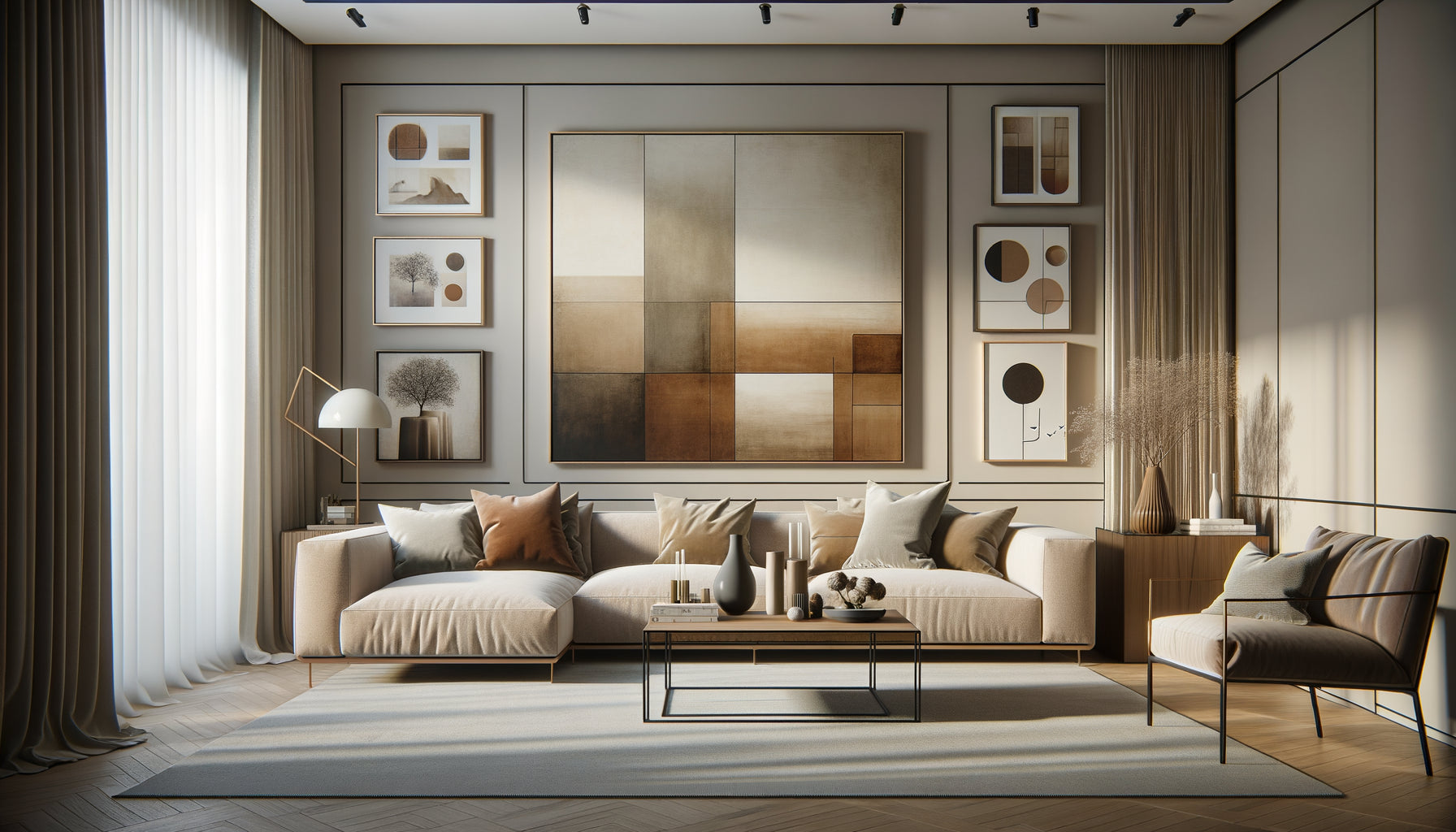
Two approaches work beautifully. Tonal harmony: you choose a painting that picks up on the dominant colors of your living room, creating a soothing continuity. If your space features beiges, terracotta, and sage greens, an artwork in those tones will reinforce the cozy atmosphere. This approach works wonderfully in minimalist or Scandinavian interiors.
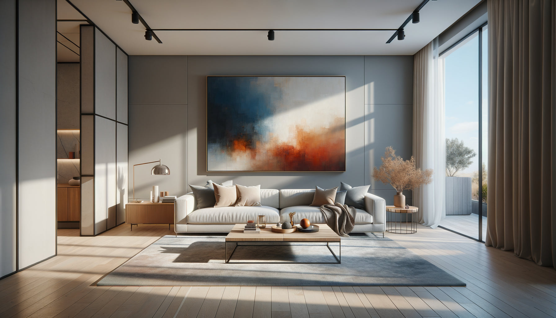
Then there's the contrasted accent : your artwork becomes the visual exclamation point. In a living room with neutral tones (gray, white, beige), a vibrant work in cobalt blue or mustard yellow creates an elegant shock that electrifies the space. I’ve seen a simple blood-red abstract painting transform an entirely gray living room into a memorable place. But be warned: this approach requires courage and true conviction.
My advice? Take a photo of your sofa with your current cushions. Then go choose your artwork with that photo. You'll immediately see if the colors sing together or fight each other.

Decoding the secret language of styles
Your artwork tells a story about you. The question isn't what style is « trendy », but which resonates with your personality and naturally integrates into your world.
Abstract works are the chameleons of the art world. They adapt to almost all contemporary interiors, from industrial lofts to modernized Haussmann apartments. Their advantage? Everyone projects their own interpretation onto them. They create an atmosphere without imposing a subject, leaving your imagination to wander. Perfect if you like creative freedom.
Black and white photographs bring timeless elegance. Urban architectures, intimate portraits, dramatic landscapes: they work particularly well in minimalist or industrial interiors. Above a cognac leather sofa, a large black and white photo creates a sophisticated contrast that never ages.
Landscapes and figurative scenes tell more literal stories. A misty forest, a beach at sunset, a Mediterranean alleyway: these works create an imaginary window in your living room. They are suitable for romantic souls who want to escape without leaving their sofa. However, be careful not to fall into clichés: prioritize original compositions over images that have been seen too much.
The hanging height that no one masters
You've found the perfect artwork. Now don’t ruin it by hanging it in the wrong place. It’s the final mistake I see everywhere: beautiful works lost under the ceiling like escaped balloons.
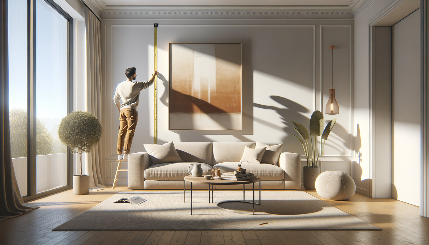
The professional rule : leave between 15 and 25 cm of space between the top of your sofa and the bottom of your artwork. This distance creates a visual connection without the work « literally » resting on the furniture. Too much space (40 cm or more) and your artwork flies towards the ceiling, disconnected. Too little (less than 10 cm) and it seems crushed, deprived of its breath.
Another crucial reference point: the center of your artwork should be at eye level, or approximately 145-150 cm from the floor for an average height person. But since your sofa imposes a lower constraint, adjust slightly: the center can drop to 130-140 cm. Test with painter's tape before drilling: draw the outline of your future artwork on the wall, step back, sit on the sofa. Live with this simulation for 24 hours.

Framed or unframed: the question that divides
A nude artwork on canvas exudes a raw modernity, almost like an art gallery. The painted edges are part of the work, creating a three-dimensional object that plays with shadows on your wall. This option works beautifully in contemporary interiors, lofts, or minimalist spaces.
But a frame transforms a canvas into an event. It defines, enhances, protects. A thin black frame brings discreet elegance that works with almost anything. A natural wood frame warms and creates a bridge with Scandinavian or rustic furniture. A gold frame (be careful, only if your interior can accommodate it) lends classic nobility to any work.
My personal rule: if your artwork is a print or poster, the frame is non-negotiable. It adds credibility, structure. If it's an original painting on a thick canvas, you can afford modern nudity. Between the two? Trust your instinct and consistency with your existing furniture.
The lighting that takes your artwork from good to sublime
A detail that 90% of people neglect: lighting. Your perfect artwork, hung at the right height with the right proportions, can die in the shadows if you don't think about light.
Ideally, install dedicated lighting: an adjustable wall lamp or a discreet LED strip mounted above the frame. This directional light creates depth, makes colors vibrate, and transforms your work into a true focal point, even at nightfall. In contemporary interiors, track spotlights offer maximum flexibility.
If electrical installation is not feasible, position your sofa so that natural light from your windows illuminates the artwork indirectly (never directly to avoid discoloration). In the evening, a strategically placed floor lamp can create ambient lighting that enhances your artistic choice.
Ready to transform your living room into an exceptional space?
Discover our exclusive collection of living room wall art that respects all the rules of proportions and adapts to all sofa styles.
Your living room, your signature
In six months, you will no longer remember the anguish of choice. You will only remember the moment when you sank into your sofa, looked up at this painting, and thought: “That’s it.” That feeling of obviousness, of perfect coherence between a piece of furniture, a work of art, and your personality.
The painting above your sofa is not an accessory. It's the visual punctuation of your living space, the silent reflection of what moves you, inspires you, defines you. You now have all the keys: proportions, colors, style, height, frame, lighting. There’s only one thing left to do: choose the work that will make your heart beat a little faster each time you come home.
Start this weekend. Measure your sofa, photograph your space, and set out in search of the painting that awaits you somewhere. It's there, ready to transform your living room into a unique place. It’s up to you to find it.
Frequently Asked Questions
Can we put several small paintings instead of one large one above the sofa?
Absolutely, and it's even an excellent solution if you like visual dynamics. The key is to treat the whole as a single composition. Always respect the rule of thirds: the total width of your arrangement (including the spaces between the frames) should cover about two-thirds of your sofa. For a harmonious result, maintain a regular spacing of 5 to 10 cm between each frame. You can align the paintings horizontally for a modern gallery effect, or create a more artistic asymmetrical composition. The professional trick? Cut paper templates the size of your paintings, attach them to the wall with tape, and test different configurations before drilling. This technique has saved me from countless mistakes with my clients.
What size painting for a standard 3-seater sofa?
A three-seater sofa typically measures between 180 and 220 cm wide. To respect the ideal proportions, aim for a painting (or composition) with a width of 120 to 160 cm. Specifically, for a 200 cm sofa, a 140 cm wide painting creates a perfect balance. If you opt for a vertical or square format, keep in mind that the width remains the determining criterion. A painting that is too narrow (less than 100 cm for a 200 cm sofa) will look lost and visually unbalance your space. Conversely, a painting that exceeds the width of the sofa gives the impression that the furniture is crushed. If you are hesitating between two sizes, always choose the larger one: a generous painting asserts its presence and structures the space better than a timid work.
How to choose the colors of the painting if my living room is neutral?
A neutral living room is a fantastic blank canvas: you have two winning strategies. First option, the soothing continuity: choose a painting in natural tones (beiges, warm grays, off-white, soft terracotta) that extends the serene atmosphere of your space. This approach creates a sophisticated cocooning ambiance, perfect if you are looking for relaxation. Second option, more daring: the strategic color pop. A painting with touches of dark blue, emerald green, ocher or rust becomes the visual accent that electrifies a neutral interior without overwhelming it. My practical advice? Choose one or two dominant colors in your painting and repeat them subtly elsewhere: a cushion, a vase, a throw. This repetition creates a visual coherence that proves your choice is not an accident, but a thoughtful decision. And above all, trust your instinct: if a color makes you smile when you look at it, it's probably the right one.