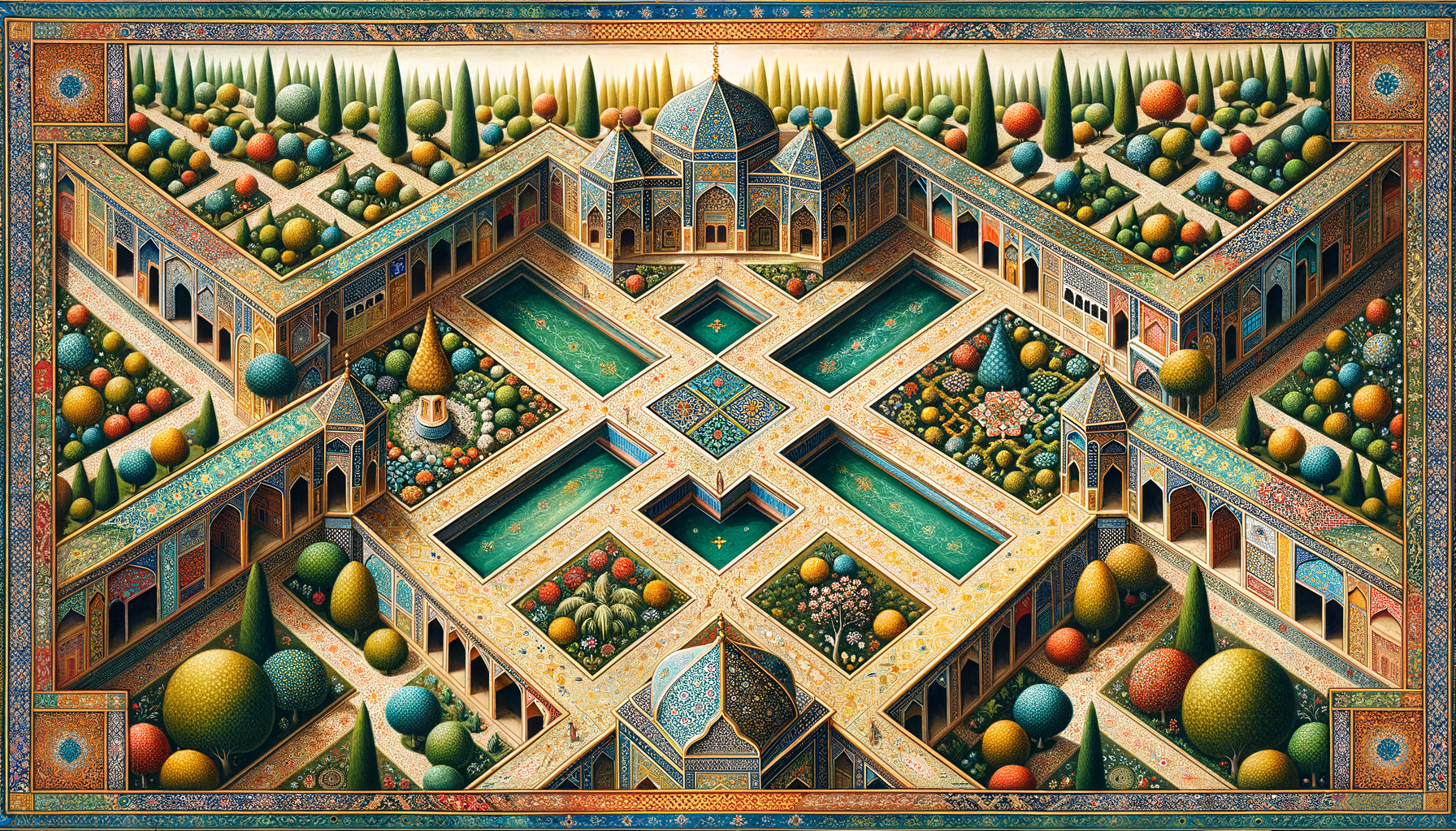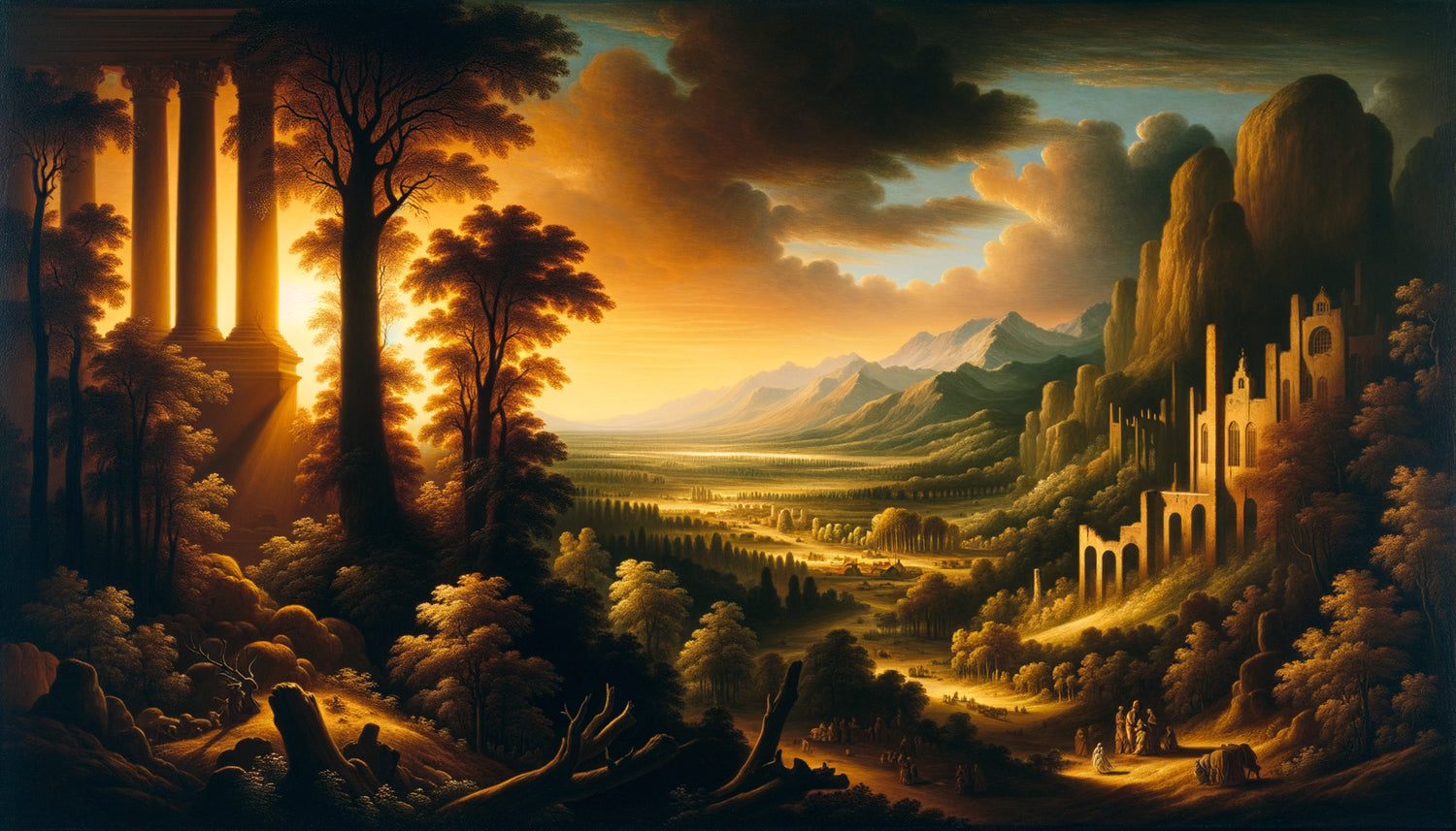
In the workshop of a 17th-century Flemish master, a tree in the foreground changes everything. This dark trunk, this tangle of branches that frames the scene is not there by chance. It's a repoussoir, this ingenious technique that transforms a simple view into a window open onto infinity. When you understand this mechanism, you never look at a painting the same way again—and especially, you discover how to organize your own interior with this visual intelligence from the great masters.
Here's what repoussoirs bring to Flemish landscapes: spectacular depth that draws the gaze towards the horizon, perfect balance between foreground and distance, and this unique ability to create a contemplative intimacy while opening up space. Three benefits that are still revolutionizing our way of living and decorating today.
Faced with a beautiful painted landscape, many feel this frustration: why do some works immediately captivate us while others remain flat, decorative but without magic? Why do certain paintings create the sensation of being a real window when others look like simple photographs hung on the wall?
The answer lies in a compositional secret that Flemish masters borrowed from the Italians before perfecting it: the repoussoir. This millimeter-perfect technique that orchestrates the gaze is not reserved for art historians. It speaks directly to our perception, to our need for anchoring and perspective. And once you understand it, you have a key to choosing your works, arranging your space, creating depth in any room.
I invite you on a journey through the workshops of Antwerp and Bruges, with a detour via Rome and Venice, to understand how this ingenious invention still structures our gaze on art and space.
The Italian invention: when the gaze needed a guide
It all begins in the Italian workshops of the Renaissance. Venetian and Roman painters of the 16th century face a major challenge: how to represent depth on a flat surface? Architectural colonnades, mathematical perspectives work for urban scenes, but what do you do with the immensity of a landscape?
This is where the first repoussoirs appear: dark elements deliberately placed in the foreground to create contrast with the bright background. A tree, a ruin, a rock—any vertical or oblique element that pushes back literally the gaze towards the bottom of the painting. The term comes from French: to push back, to direct inwards.
Titian uses architectural columns. Tintoretto plays with dark figures at the edges of his compositions. These Italian masters create a frame within a frame, an infinite regression that gives their landscapes astonishing depth. The viewer no longer contemplates a scene: they enter it, guided by these elements that create a threshold, a passage from the real world to the universe of the painting.
This technique is not only a matter of virtuosity. It responds to our natural way of perceiving space: we need close anchor points to measure distance. Without a foreground element, a landscape becomes abstract. With it, it becomes habitable.
The Flemish Revolution: perfecting the art of the foreground
When Flemish painters discover this Italian technique at the beginning of the 17th century, they completely transform it. In Flanders, landscapes are not Mediterranean, architectural, classical. They are misty countryside, twisted trees, muddy paths. Foreground elements become organic, natural, almost wild.
Paul Bril, a Fleming based in Rome, bridges the two traditions. He brings back to the North this science of the foreground, but adapts it to the climate, the grey light, the local vegetation. His trees in the foreground are no longer decorative elements: they become characters in their own right, gnarled, living, expressive.
Then come the great masters. Jan Brueghel the Elder builds his compositions on complex foreground elements: entire groves, tangles of branches that create a true vegetal architecture. The eye must make its way between the trunks, along the foliage, before reaching those characteristic bluish distances of Flemish landscapes.
David Teniers the Younger perfects the technique with his peasant scenes. His foreground elements are inhabited: a peasant near a tree, a cart against a ruin. The foreground becomes a living space that contrasts with the contemplative serenity of the horizon. This duality — close intimacy, distant reverie — defines the soul of the Flemish landscape.
The science of contrasts
The Flemish go further than the Italians in mastering contrasts. Their foreground elements are not only dark: they play on texture (rough against smooth), temperature (warm brown against cold blue), sharpness (precise detail against atmospheric blur). A tree trunk in the foreground of a painting by Rubens or his collaborators is never uniform: cracked bark, greenish moss, silvery lichens create a tactile richness that makes the distance even more airy.
This multi-layered approach transforms the foreground element into a true visual score. The eye travels from rough to velvety, from near to far, creating a perceptual depth that goes far beyond simple Italian linear perspective.

Anatomy of a pusher: how it really works
Understanding the mechanics of a pusher changes our way of looking at art and organizing space. It is a technique that relies on three fundamental principles, all derived from our natural perception.
First principle: dark mass. An effective pusher occupies about one-third of the composition, generally on one side or both edges of the painting. This dark mass creates maximum contrast with the bright center where the main subject is located. In a typical Flemish landscape, the trees on the sides almost form a frame that focuses the gaze on the illuminated valley in the center.
Second principle: dynamic oblique. The best pushers are never perfectly vertical. A tilted tree, a diagonal of terrain, an angled ruin - these oblique lines literally guide the eye towards the bottom. Flemish masters love branches pointing to the horizon, creating natural arrows in the composition.
Third principle: decreasing detail. The pusher in the foreground is painted with microscopic precision. Each leaf, each stone, each texture is rendered with photographic sharpness. Then, gradually, the detail fades into the background. This gradation creates an atmospheric perspective that simulates natural mist and distance effects.
Look at a landscape by Josse de Momper: his rocks in the foreground are sculpted, almost palpable. Then the eye glides towards the hills which become soft, blurred, before reaching these fantastic mountains that seem to float in the blue air. The pusher is not an obstacle: it is a visual springboard.
Why does this technique still fascinate decorators?
In a contemporary interior, the lesson of Flemish pushers remains absolutely modern. Because it doesn't just talk about painting: it talks about perception of space, balance, circulation of the gaze.
Hanging a Flemish landscape with pushers in a room is like installing a window that creates depth. Interior designers know this: in a confined space, a work that opens onto a distance transforms the perception of volume. Where a contemporary abstract painting remains on the surface, a landscape with pushers recesses the wall, adds virtual square meters.
But the technique also inspires the very arrangement of space. Placing a strong element in the foreground of a room—a large vase, an architectural plant, a sculpture—creates exactly the same effect as a pictorial repoussoir. The living room becomes deeper, the gaze travels, the space is organized into successive planes rather than a single surface.
Interior architects use this principle without always naming it: a side curtain framing a view, shelves creating a frame around a reading corner, tall plants structuring an open space. All heirs to Flemish landscapes and their mastery of the foreground.
The repoussoir as a creator of intimacy
An often overlooked aspect: the repoussoir not only creates depth, but also generates intimacy. By framing the landscape, it transforms the viewer into a protected observer. One is not exposed to immensity: one contemplates it from a shelter, behind the tree, from the ruin.
This psychological dimension explains why these paintings work so well in private interiors. They offer simultaneously openness and protection, escape and cocooning. A visual paradox that responds to our contradictory need for space and security.

Identifying a true repoussoir: the connoisseur's criteria
Faced with a painting, how to distinguish a real repoussoir worked from a simple element of composition? Experts look for five distinctive signs that do not deceive.
The extreme tonal contrast first. A genuine repoussoir creates a dramatic opposition between darkness and light. In quality Flemish works, the foreground can be almost black while the horizon remains bright, almost white. This maximum tonal amplitude is the signature of a master.
The structural complexity next. A simplistic repoussoir is a beginner's flaw. Great painters give their foregrounds a wealth of shapes, textures, and details that make them fascinating in themselves. One could extract them and make a still life out of them.
Narrative narrative integration also. The best repoussoirs tell something: this tree split by lightning speaks of time and natural violence, this ruin evokes history, this shepherd creates a human scale. The repoussoir is never purely formal: it enriches the meaning.
The luminous coherence as well. Even in darkness, the repoussoir receives the same light as the rest of the scene. We see reflections, illuminated areas, a lighting logic that unifies the composition. Flemish masters excel in these details that give credibility and realism.
Finally, the compositional breathing. A good repoussoir leaves passages for the eye, gaps in the foliage, spaces between elements. It guides without imprisoning, structures without stifling. This intelligence of visual circulation distinguishes masterpieces from applied works.
Let your gaze wander into infinity
Discover our exclusive collection of landscape paintings that open your space to unsuspected horizons.
Composing with repoussoirs in your interior
Now that you understand the mechanics, how do you use it concretely at home? Beyond choosing a work, several strategies allow integrating this visual intelligence into your decoration.
The focal wall strategy. Place your Flemish landscape on a wall you see when entering the room. The depth created by the repoussoirs immediately gives a feeling of space. Avoid overloading this wall: let the painting create its own window. A simple, classic frame that does not compete with the internal complexity of the work.
Dialogue with architecture. If your room has structural elements — a beam, a pillar, an alcove — use them as real repoussoirs that echo those in the painting. This correspondence between real space and painted space creates a sophisticated harmony. Your living room becomes the continuation of the landscape.
Directional lighting. A spotlight directed from the side of the painting, like sidelight in Flemish landscapes, reinforces the sense of depth. Avoid frontal lighting that flattens. Prefer a light source that creates shadows, highlights the reliefs of the frame, makes contrasts vibrate.
Counterpoint furniture. A low sofa in front of a large vertical landscape creates an additional layer, a real repoussoir that dialogues with those in the painting. Or conversely, a high console under a horizontal landscape whose lines you extend. Think successive planes, eye movement, orchestration of depth.
Experienced collectors go further: they create staging where real objects and painted elements respond to each other. A branch in a vase echoes the trees of the repoussoir. Old books evoke the culture of Flanders. A stone texture recalls the ruins of the foreground. The apartment becomes a cabinet of curiosities, a space where reality and representation mutually contaminate each other.
This approach transforms decoration into a total art, each element reinforcing the others in an overall composition that goes beyond the simple accumulation of beautiful objects. That's exactly what the Flemish masters did: create coherent universes where every detail contributes to the global effect.
The contemporary legacy of a centuries-old technique
Believing that repoussoirs belong to the past would be an error. This technique crosses the centuries and still irrigates contemporary creation, from photography to cinema, from architecture to virtual reality.
Landscape photographers constantly use repoussoirs: a branch in the foreground of a sunrise, a rock at the edge of a waterfall, a character facing a panorama. Ansel Adams, master of American landscape, structures many of his compositions according to this principle directly inherited from the Flemish. His twisted trees of Yosemite work exactly like those of Paul Bril.
In cinema, repoussoirs create narrative depth of field. A character filmed from behind a door frame, a scene framed by blurred elements in the foreground - all the visual grammar of the seventh art rests on this spatial intelligence invented during the Renaissance and perfected in Flanders.
Even video game and virtual environment designers are rediscovering these principles. To create immersion, they place detailed elements in the foreground that guide the player towards open horizons. The technique of repoussoir responds to constants of perception that transcend eras and mediums.
In contemporary architecture as well, this logic can be found. Sunshades framing a view, gardens structured in successive planes, perforated facades creating multiple frames - all modern variations on the theme of the repoussoir. Architect Peter Zumthor excels in these games of foreground and distance that owe everything to Flemish landscapes.
Imagine your next Sunday morning. You settle down with a coffee facing this new landscape hung this week. Your gaze glides along the gnarled trunk in the foreground, weaves between the branches, crosses the luminous valley and gets lost in those blue mountains on the horizon. The apartment hasn't changed size, but suddenly it breathes differently. You have added depth, created a window to elsewhere, installed a repoussoir that structures space and soothes the gaze.
This sensation is not magical: it is perfected visual science for centuries. It is the intelligence of the Flemish masters who understood, before neuroscience, how our brain constructs depth and simultaneously desires anchorage and escape.
Start simply. Observe the landscapes that touch you, identify their repoussoirs, understand why they work. Then look at your interior with these new eyes: where is there a lack of depth? Where could a foreground create structure? What artwork could become this window you dreamed of?
Flemish pushers are not art history details reserved for specialists. They are living tools to live better, see further, create space in space. A technique from Italy, perfected in Flanders, and waiting only for you to continue its journey.
Frequently asked questions about pushers in Flemish landscapes
How to recognize a pusher in a landscape painting?
A pusher is recognized by three immediate signs: it occupies the foreground (usually on the sides), it is noticeably darker than the rest of the composition, and it creates a strong contrast with the center of light in the painting. In Flemish landscapes, pushers often take the form of detailed trees, rocks or ruins placed laterally. If you feel that your eye is guided from the edges towards the center and depth of the landscape, then a pusher is doing its job. This technique is not subtle: it must be visible and effective to work. Flemish masters sometimes even used double pushers, one on each side, creating a real vegetal or architectural frame around the main subject. A good test: mentally cover the dark foreground of the painting - if it immediately loses its depth and becomes flat, you were indeed dealing with structuring pushers.
Why did Flemish painters use this Italian technique so much?
The Flemings adopted the Italian pushers because they perfectly responded to their specific challenge: representing the misty landscapes of the North with their characteristic depth. Unlike Italians who painted architectural and Mediterranean landscapes bathed in clear light, Flemish artists had to render these humid atmospheres, cloudy skies, distances that blend into the mist. The dark pusher in the foreground created the necessary contrast to highlight these delicate and vaporous backgrounds. Moreover, the Flemish tradition valued meticulous detail - and the pusher offered just this space for technical virtuosity in the foreground, where the painter could show his talent in rendering textures, bark, moss, leaves. Finally, this technique was in tune with the Nordic worldview: man contemplating nature from a shelter, protected but open to immensity. The pusher created this mediation between the intimate and the infinite, perfectly in phase with the spirituality and philosophy of Flanders in the 17th century.
Does a landscape with pushers suit all interior styles?
Absolutely, and that is precisely the timeless strength of this technique. A Flemish landscape with pokerwork remarkably works in a classic interior, where it naturally finds its place among the woodwork and antique furniture. But it also creates a sophisticated contrast in a minimalist contemporary space: its richness of detail and depth bring exactly the complexity and warmth that can be lacking in modern, streamlined interiors. In an industrial style, the dramatic aspect of dark pokerwork echoes metal structures and raw materials. Even in a light Scandinavian interior, a landscape with pokerwork becomes that dark focal point which anchors the space and prevents it from being bland. The key is to choose a format and frame adapted: a large format for an empty contemporary wall, a medium format in a subdued gold frame for a classic interior, a matte black frame for a more current style. The principle of pokerwork — creating depth through contrast — is universal and transcends decorative trends.