

Stepping into your living room, office, or windowless bedroom, you immediately feel a sense of suffocation. The walls seem to close in, the space feels cramped, and you feel like you're in a closed box rather than a living area.
Even with optimal lighting, something is off: your eye finds no vanishing point, no visual escape that would give the illusion of a larger space. You reorganize furniture, change colors, nothing works.
You've probably tried mirrors, light colors, maybe even wallpaper with perspective tricks. But the result is still disappointing: your room retains this confined atmosphere that makes you uncomfortable.
That’s normal! The problem isn't your sense of decor, but the absence of a key element: visual depth. Without a window to naturally create this perspective, your eye needs an intelligent substitute.
By the end of this article, you will master the art of depth wall art to transform your windowless room into an airy and breathable space, thanks to simple but remarkably effective visual techniques.
Why does your windowless room stifle your creativity?
Without a window, your brain loses its usual spatial landmarks. The lack of natural perspective creates a feeling of confinement that directly impacts your well-being and productivity. It's like trying to breathe in a plastic bag: technically possible, but deeply uncomfortable.
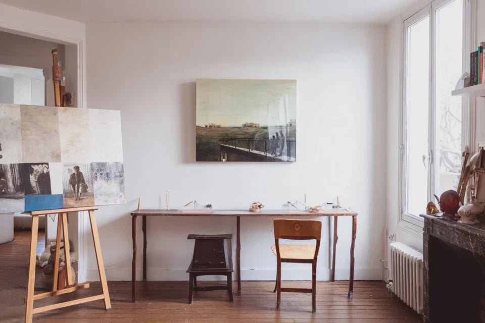
🏠 Customer testimonial: "My attic office had no windows. I felt oppressed, my concentration dropped after 30 minutes. I installed a large painting depicting a forest in perspective. The change was immediate: my workspace finally breathed!"
💬 Conversation with a decor expert
The golden rule of spatial illusion: a well-chosen painting acts as an artificial window, instantly creating the missing depth. Visible result immediately after hanging, complete transformation of the atmosphere in 24 hours.
What really happens in your brain when facing a bare wall
Does your situation remind you of those moments? Do you subconsciously avoid this room, feel an inexplicable fatigue in it, or do your guests seem eager to leave. These reactions are not in your head.
In reality, your brain is desperately searching for clues of depth to reconstruct the three-dimensional space. Without these landmarks, it goes into "confinement alert" mode, generating stress and discomfort.
Imagine your eye as a camera: without a vanishing point in the frame, the image appears flat and lifeless. Your room is experiencing the same phenomenon.
🔍 The real reason for this feeling of suffocation
Contrary to what one might think, it's not the size of the room that counts, but the perception of depth. A small room with perspective seems larger than a large space without visual relief.
It’s exactly like the difference between looking at a photo and looking out a window: a photo is flat, a window offers successive planes that give volume to your gaze.
This understanding will revolutionize your approach: you are no longer trying to enlarge, but to create relief. A nuance that changes everything in the choice of your wall decor.
✨ Quick test: Close your eyes for 10 seconds in your room, then open them. Does your gaze automatically seek a vanishing point? If so, that's exactly where you should place your artwork!
💡 The perspective error that kills the desired effect
Many believe that a large painting is enough to create depth. False! It’s the type of perspective represented that counts, not the size. A small painting with a real vanishing point surpasses a flat large format.
Think about the difference between a brick wall painted in trompe-l'oeil and a real brick wall: the magic works thanks to the illusion of recession, not the surface covered.
As a result, you invest in an expensive large format that does not solve your confinement problem. The solution is more subtle and often more affordable.
🎨 The trap of soothing colors
You have surely been advised pastel tones to "visually enlarge". But in a room without windows, soft colors can paradoxically accentuate the feeling of enclosure.
You can easily observe this: in your room, check if the brightest areas attract the eye without creating an escape. This is a sign that color alone is not enough.
This revelation explains why your previous attempts have only yielded mixed results. You need to play on perspective, not just brightness.
🎯 3 signs that your decor lacks depth:
- The gaze goes around the room without stopping: no element captures attention permanently, a sign of absence of a strong focal point
- The feeling of space changes with the lighting: without fixed perspective, the atmosphere becomes unstable and dependent on artificial light
- Photos of the room look flat: the device reveals the lack of relief that your eye naturally compensates for
🚀 The game-changing trigger
The secret lies in vanishing lines. Just as an architect draws the perspective of a building, your artwork should contain lines that guide the eye towards a horizon, instantly creating this feeling of escape. It's the visual domino effect: once depth is perceived, all space automatically restructures around this new reference point.
Rule of active perspective: your artwork must "draw" the gaze towards a background, like a window looks outwards. Simple test: if you can "enter" the painting visually, you've got it!
| ❌ Classic approach | ✅ Perspective method | 💡 Why it works | 🎯 Immediate benefit |
|---|---|---|---|
| Choose according to the wall colors | Choose according to vanishing lines | The eye naturally follows perspectives | Sense of space at first glance |
| Prioritize large formats | Prioritize represented depth | Perception is more important than dimension | Maximum effect with controlled budget |
| Avoid strong contrasts | Play on visually contrasting planes | Contrast reveals the different levels | Immediate relief and dynamism |
| Center perfectly on the wall | Place according to the optimal viewpoint | The viewing angle influences perspective | Natural integration into the space |
Your 3-step method to create an artistic window
Rest assured, creating depth with a painting doesn't require any particular talent. It's like learning to tie a tie: intimidating at first, obvious once the technique is understood. By following this logical progression, you will transform your room step by step, with visible results from the first intervention.
🗺️ Your visual roadmap: first analyze your space to identify the optimal point (like choosing the location of a window), then select the painting according to precise perspective criteria, finally optimize the hanging to maximize the depth effect. Each step amplifies the next.
Before any purchase, you must understand how your eye naturally navigates through space. This is the foundation of the entire process: like an architect studies the terrain before building. This analysis will avoid costly mistakes and give you the satisfaction of perfectly mastering your project.
🔍 Your spatial analysis tools
- Natural eye test: observe where your eyes naturally settle when entering - this is your natural visual strength zone. Avoid smartphone apps that provide theoretical data: your feeling is more accurate than any measurement
- Principle of the 3 impact zones: identify the foreground (entrance to the room), the middle ground (living area) and the background (backdrop wall). The magic happens when the artwork creates a 4th virtual plane beyond the physical wall
- Directional light evaluation: locate where your main lighting comes from - the artwork should be illuminated to reveal its perspective, not backlit which would flatten it
Now let's move on to practical application with your actual room
🚀 Practical Application in Your Space
Map your visual circulation: position yourself at the entrance and mentally note the path of your gaze. It reveals the strength axes of your room where the impact will be maximal. Mark 2-3 zones where your eye naturally stops with a post-it note - it's reassuring, it just takes observation
⏱️ Time: 5 minutes | ✅ Successful when: you clearly identify 2-3 gaze stop zones | ⚠️ Attention: don’t rely on classic decor logic (center of the wall), rely on your spontaneous feeling
Test for missing depth: use your hand outstretched at arm's length as a “frame window” aiming at each identified zone. This simulates the effect of a painting and reveals which area lacks perspective the most. The area that seems “dead” in your hand frame is your absolute priority
⏱️ Time: 3 minutes | ✅ Successful when: one zone clearly stands out as being “flatter” than the others | ⚠️ Attention: stay at a normal walking distance, not glued to the wall
Measure light impact: test the lighting of your candidate zones at different times (morning/evening if natural light, with/without artificial lighting). The zone that remains well lit in all configurations will be the most valuable for your artistic investment
⏱️ Time: 10 minutes spread over a day | ✅ Successful when: you identify the zone that is consistently highlighted | ⚠️ Attention: a very bright zone occasionally can be disappointing the rest of the time
✅ Validation of step 1: you have identified THE priority zone that combines natural gaze stop and good constant lighting. If you are hesitating between 2 zones, choose the one visible from the entrance - the impact will be immediate for you and your guests. Bravo, you now master spatial analysis!
OUR RECOMMENDED PRODUCTS
🎨 Step 2: Selecting your "artistic window" according to precise visual criteria
With your zone defined, you enter the most rewarding creative phase. Forget random purchases: you know exactly what to look for. This step transforms you from consumer to expert, capable of instantly spotting artworks with a strong potential for depth.
🔬 Your infallible selection criteria
- Visual escape test: the artwork must contain lines that "recede" into the background - winding road, perspective corridor, marine horizon. Avoid frontal patterns even if very beautiful: they do not open up space
- Principle of 3 visual planes: look for a sharp foreground, a middle ground and a blurred background - exactly like your natural vision. This photographic/pictorial technique automatically creates the feeling of depth
- Scale proportion control: the artwork must represent a space larger than your actual room - landscape, monumental architecture, urban perspective. The scale effect amplifies the feeling of escape
🎯 Your optimized artistic shopping
Apply the "I can enter" test: facing the artwork, literally imagine yourself entering the scene depicted. If it's natural and obvious, it's the right choice. If you remain "in front" of the image, look for something else. This infallible test eliminates 90% of classic decorative artworks
⏱️ Time: 30 seconds per artwork | ✅ Successful when: you physically feel the desire to "move forward" in the image | ⚠️ Attention: do not let yourself be influenced by pretty colors if perspective is lacking
Check scale compatibility: mentally measure whether the space represented seems larger than your room. A painted living room will not make a "window" in your living room, but a large landscape will. The illusion works by contrast of scale
⏱️ Time: immediate visualization | ✅ Successful when: the space of the artwork seems to you "liveable" and larger | ⚠️ Attention: beware of seductive but perspective-less close-ups
Test visual fatigue resistance: look at the artwork for 2-3 minutes straight. A good depth artwork gradually reveals its background details and maintains interest. If you "go around" it in 30 seconds, move on
⏱️ Time: 3 minutes of contemplation | ✅ Successful when: you discover new details after 2 minutes | ⚠️ Attention: do not confuse complexity and depth - look for simplicity perspective
✅ Step 2 validation: your chosen artwork passes the 3 tests (I can enter + higher scale + visual resistance). If a single test fails, continue your search - it's better to take the time than regret it. You now hold your future "window"!
🔧 Step 3: Optimize hanging for a perfect "window" effect
This final step reveals your newly acquired expertise. Hanging is no longer just fixing to the wall, but a precise adjustment that multiplies the depth effect. You go from amateur status to that of an expert who masters the subtleties of maximum visual impact.
🛠️ Your professional hanging kit
- Adjustable fixing system: prefer rails or hooks allowing micro-adjustments - 2cm of offset can divide the perspective effect by 2. Avoid definitive nails: the final precision is measured in millimeters
- Laser level or smartphone app: perfect horizontality is crucial for the credibility of the illusion. A tilted artwork immediately breaks the "natural window" effect you are trying to create
- Directional accent lighting: adjustable LED spotlight to reveal depth without creating reflections. Lighting literally sculpts perspective by revealing different planes
🎯 Precision settings for maximum effect
Position at natural eye level: the center of the artwork at 1m65 from the floor to correspond to your standing line of vision. This height automatically optimizes the perspective vanishing effect. Not too high (dominant effect), not too low (crushing effect)
⏱️ Time: 15 minutes with adjustments | ✅ Successful when: you naturally look "into" the artwork without tilting your head up or down | ⚠️ Attention: adjust if your height differs significantly from 1m70
Adjust the optimal viewing angle: test 2-3 positions by slightly offsetting the artwork laterally. The perspective changes depending on the angle: look for the position where the vanishing lines "draw" your gaze best. Trust your physical sensation of visual attraction
⏱️ Time: 10 minutes of tests | ✅ Successful when: one position clearly stands out due to its "attracting" effect | ⚠️ Attention: the optimal effect may not correspond to the geometric center of the wall
Calibrate revealing lighting: orient your light source to create a slight gradient on the artwork - brighter in the foreground, slightly darker in the background. This naturally amplifies the feeling of depth through the shadow/light play
⏱️ Time: 5 minutes of fine adjustments | ✅ Successful when: the lighting seems to "enter" the artwork rather than illuminating it evenly | ⚠️ Caution: avoid direct reflections that create an anti-perspective "glass wall"
✅ Final validation: step back to the entrance of the room and observe the overall effect. Your gaze should be naturally drawn to the artwork then "pulled" into its perspective. If the effect is immediate and convincing, congratulations: you master the art of creating depth!
Rule of mastered progression: move on to advanced optimization only when the basic effect is perfectly stabilized. Micro-adjustments then happen naturally according to your daily feeling. Patience and precision are better than haste.
You now have expert techniques! Now let's discover the subtleties that separate a good result from a spectacular effect. These professional tips give you that edge that makes your guests say: "How spacious your room seems!"
💎 Professional decorator tip: create a "visual echo" by placing a discreet mirror on the opposite wall, which partially reflects your artwork. This technique multiplies the depth effect by creating an infinite game of perspectives. Result: your room seems to have several interconnected "windows"!
🤔 "And if my style changes, won't my artwork become outdated?"
"I’m projecting myself in 5 years and I’m afraid of getting tired of this big investment..."
This concern is perfectly legitimate! Here's the crucial difference: you are not buying a decorative painting, but a "spatial tool". Just like a beautiful window remains beautiful even if you change your curtains, an artwork chosen for its perspective remains effective even if your style evolves. Visual depth is timeless, unlike fashion effects.
💡 Anti-regret test: choose a universal subject (natural landscape, classic architecture) rather than a current trend. You will get a lasting investment that will cross all your decor evolutions!
⚠️ The 5 mistakes that ruin your depth effect
Attention, these traps are tempting but destructive! I reveal the most common mistakes to avoid frustration and wasted budget. Recognizing these pitfalls already places you in the top 10% of enlightened enthusiasts.
- 🚫 Choosing according to the colors of your current decor: it's natural to want to match, but this drastically limits your perspective options. Result: a pretty painting but without spatial effect. Always prioritize perspective over color harmony - you can adapt your decor, not the other way around
- 🚫 Placing multiple artworks on the same wall: the sense of depth requires a single focal point. Multiplying works creates visual confusion and cancels out the window illusion. A single, well-chosen artwork surpasses a gallery of several average pieces
- 🚫 Hanging too close to the ceiling: a classic mistake to "enlarge" the room, but which places the artwork outside your natural field of vision. The sense of depth only works if you look "into" the artwork, not "at" the artwork
- 🚫 Neglecting specific lighting: even the best perspective artwork becomes flat under uniform lighting. Depth is revealed by light contrasts, not by the general lighting of the room
- 🚫 Giving in to the ease of horizontal format: automatically preferring the "landscape" format out of habit, when a vertical format can create spectacular depth perspective (hallway, slender architecture). Test both orientations according to your space
🛡️ Your safety check points: immediate effect upon hanging, feeling of spaciousness maintained after 1 week, spontaneous positive comments from visitors, desire to spend more time in the room. Warning signs: need to "get used" to the artwork, effect diminishes over time, room seems smaller than before.
🎁 Special offer for readers
Because you took the time to inform yourself, enjoy 10% discount on your first order:
⏰ Valid 72h after reading • Applicable to all our products
❓ Frequently asked questions about depth wall decor
The sense of depth is immediate upon hanging, but complete psychological adaptation takes 7 to 10 days. Your brain gradually integrates this new "window" into its perception of space. To optimize: spend 5 minutes per day contemplating your artwork - this accelerates cognitive integration.
Between €150 and €500 for an effective format (minimum 80x60cm) depending on the artistic technique chosen. The investment is worth it by improving your daily well-being - calculate the cost per day of use over 10 years: less than 15 cents! Prioritize perspective over artist notoriety for this type of spatial use.
Absolutely, with the right fixings! Use Molly anchors or suspension rails distributing the weight. A 3-4 kg artwork can be perfectly fixed to drywall with suitable anchors. Pro tip: distribute across 2-3 fixing points rather than a single central one for perfect stability.
Both work excellently if perspective is well mastered. Photography offers more realistic details, painting more freedom in depth effects. Choice criterion: your personal feeling towards the artwork. An authentic crush always amplifies the desired spatial effect.
It's even where it's most spectacular! The smaller the actual space, the more striking the visual escape effect. Simply adapt the size: 60x80cm is enough for 10m². Just avoid oversizing - the desired effect is harmony, not visual domination.
🌟 Your spatial transformation begins now
In 3 weeks, you won't recognize your room. Where you felt confinement, you will discover an airy and inspiring space. Your guests will spontaneously ask you how you "expanded" the room, and you will savor this discreet expertise that makes all the difference. Never again that feeling of suffocation which made you avoid your own space.
Beyond aesthetics, you will have acquired a transferable skill: the art of reading and transforming a space through visual perspective. This new vision will serve you in all your future decor decisions, saving you mistakes and regrets. Your confidence in interior design will be permanently strengthened.
The most difficult part - understanding the mechanisms - is now behind you. All that remains is action: analyze your room according to the method, select your perspective artwork, and hang it precisely. Your new "artistic window" awaits you to transform your daily life!
🚀 Your first transformation gesture: identify today your optimal impact zone with the natural gaze test. In 5 minutes, you will know exactly where to focus your efforts. Your room already breathes better, you will feel it immediately !


