

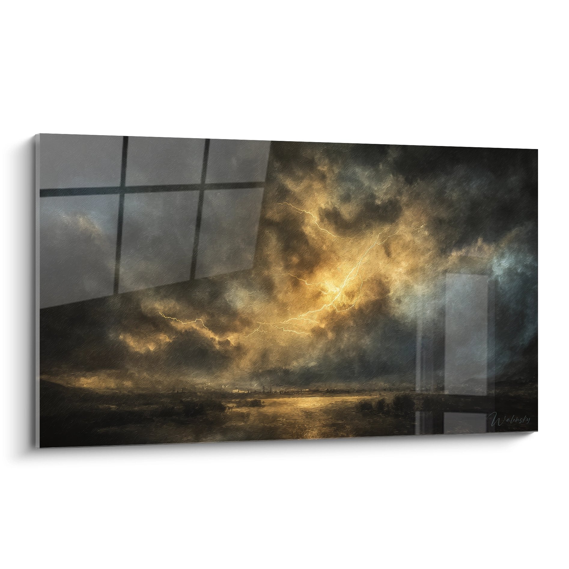






How to harmonize multiple wall artworks in a hotel hallway without creating visual cacophony?
November 10, 2025 · 8 min read · by Walensky
A hotel hallway is a necessary passage, but how many times have I seen these endless spaces transformed into chaotic galleries where each artwork seemed to shout louder than its neighbor? One morning, walking through the corridor of a Parisian boutique-hotel, I had this revelation: three abstract paintings of different sizes, perfectly spaced, created a visual symphony that accompanied me to my room. The wall harmony in hotel hallways is not a matter of chance, it's a poetic science.
Here's what a mastered wall composition brings to your establishment: it transforms a simple passage into a memorable experience, instantly enhances your visual identity, and naturally guides the gaze of your clients towards their destinations. Yet, many hoteliers accumulate paintings without a clear strategy, creating this famous visual cacophony where the eye doesn't know where to settle. Rest assured: harmonizing several wall paintings in a hotel hallway is based on accessible principles that I will reveal to you. By the end of this reading, you will know exactly how to transform your corridors into coherent galleries that sublimate the customer experience.
The secret of a successful hallway gallery: the invisible thread
Each hotel hallway tells a story, and your wall paintings are its chapters. The first principle I systematically apply is to identify the common thread that will unite all the works. It can be a dominant color palette – muted tones of blue and gray for a coastal hotel, ochres and burnt earth for a Mediterranean establishment. But this link can also be thematic: a black and white photographic series on local architecture, botanical illustrations for a spa hotel, geometric abstractions for a contemporary venue.
The fatal error? Mixing styles without clear intention. I have seen hallways where a classic still life bordered urban street art and animal photography, creating mental confusion in the visitor. Harmonizing paintings begins with this crucial decision: what visual universe do you want to deploy? Once this choice is anchored, each new acquisition becomes obvious. You thus create a visual signature that reinforces the identity of your establishment.
The golden rule of positioning: rhythm and breathing
In my projects for hotels, I always measure three essential parameters before hanging the slightest wall painting. The hanging height: the center of each work should be located at 160-165 cm from the ground, the average height of the human gaze while moving. Your clients will not stop to admire – they will appreciate as they walk. This consistency already creates a first visual coherence.
Horizontal spacing is just as crucial. For a hotel hallway, I recommend 40 to 60 cm between each artwork for tight compositions, up to 80-100 cm for a more airy and contemporary effect. But here's the secret: maintain this spacing consistently throughout the corridor. This regularity creates a reassuring visual rhythm, like the beats of a metronome accompanying the walk.
Alternating formats: the visual breath
A hallway lined with identical wall artworks generates a hypnotic monotony. Conversely, a succession of anarchic formats fatigues the eye. The solution? Create an alternating sequence: large format, small format, medium format, then repeat the pattern. Or alternatively: two vertical works, one wide horizontal, two verticals again. This controlled variation maintains visual interest without creating clutter. I applied this principle in a Brussels hotel with a 30-meter hallway: the effect was striking, every client spontaneously mentioned the beauty of the route.

Our favourite
Energetic Red and Blue Spiral Painting - Passion Vortex - Abstract Spiral Edition
232,90€
Discover this artworkUnified framing: the discreet hero of harmony
We systematically underestimate the unifying power of the frame. Even with heterogeneous artworks, a consistent frame instantly creates a visual family. For hotel hallways, I prefer three approaches depending on the desired atmosphere.
The unified monochrome framing: all wall artworks share the same type of frame – light natural wood for a Scandinavian ambiance, matte black for a contemporary style, discreet gilding for a chic classic establishment. This uniformity absorbs stylistic differences between the works and imposes a coherent overall reading.
Framing by group: if your hallway is divided into zones (entrance, central section, room area), you can vary the framing by sector while maintaining homogeneity within each zone. This creates visual chapters that rhythm the movement. I used this technique in a converted convent hotel: antique gold frames for the historic part, thin metal frames for the modern extension.
— Our selection


When light becomes your best ally
Lighting wall art dramatically transforms its perception in a hotel hallway. A poorly lit corridor, even with exceptional artworks, will remain dull. Conversely, strategic lighting enhances modest pieces. My recommendation: adjustable LED spotlights on rails, positioned at 30-40° from the wall, creating grazing light that highlights textures and reliefs without creating reflections.
To avoid visual cacophony, ensure that the luminous intensity remains constant from one artwork to another. Nothing is more destabilizing than an overexposed work followed by another plunged into darkness. Use LEDs of the same color temperature (2700-3000K for a warm atmosphere, 4000K for a neutral and contemporary rendering) throughout the corridor. This luminous consistency is as important as the chromatic consistency of the artworks themselves.

The narrative composition: telling a linear story
The most beautiful hotel corridors I have designed did not simply present paintings – they told a story. The narrative layout transforms the walk into a journey. For a seaside hotel, imagine a progression: works with nocturnal tones and deep blues at the entrance of the corridor, gradually evolving towards dawn then full sun at the end of the route. The customer unconsciously experiences a metaphor for sunrise.
This approach works with all universes. An urban establishment could deploy a photographic sequence starting from global aerial views to intimate architectural details. A spa hotel could orchestrate a vegetable progression, from roots to flowers. Harmonize several wall art becomes an exercise in visual storytelling where each work prepares the next, creating a subtle anticipation that makes movement captivating.
Strategic focal points
In any hotel corridor, certain locations naturally attract the eye: the wall facing the elevator, the corner turn, the area in front of reception. These focal points deserve your most impactful wall art – larger, more colorful, bolder. They serve as visual anchors that structure the entire composition. Intermediate works can then be more discreet, creating a breathing rhythm between highlights and smooth transitions.
Transform your hallways into memorable experiences
Discover our exclusive collection of wall art for luxury hotels that instantly creates the visual harmony sought after by exceptional establishments.
— You may also like


The fatal mistakes to absolutely avoid
After fifteen years designing hotel spaces, I immediately identify recurring pitfalls. Oversizing: wanting to fill every centimeter of wall creates a stifling visual saturation. A hallway is not a storage room. Let your walls breathe – the emptiness around a wall art is as important as the artwork itself.
Chromatic inconsistency kills harmony. If your hallway has pearl gray walls and light wood floors, avoid paintings with baroque gold frames and garish colors. Respect the existing palette or undertake a complete renovation. Halfway through, you will always get a cacophony.
Finally, neglecting maintenance: dusty paintings, faulty lighting, or crooked hangings instantly sabotage the desired effect. A monthly audit of your wall installations should be as systematic as cleaning the rooms. Hotel excellence is read in these seemingly minor details that, combined, create the overall experience.

In the same vein
The Silk of Whispers Wall Art - Abstract Relief Edition
233,90€
Discover this artwork →Visualize the transformation
Imagine tomorrow morning: a guest exits the elevator and, instead of mechanically crossing your hallway, slows down imperceptibly. His gaze naturally glides from one painting to another, captivated by this harmony he cannot name but feels deeply. He arrives at his room with a diffuse feeling of well-being, convinced without knowing why that your establishment is different, better, more attentive.
This transformation is not due to chance or a colossal budget. It is born from a clear intention, an assumed guiding thread, a methodical implementation. Harmonizing multiple wall artworks in a hotel hallway is within the reach of any establishment that agrees to consider its walls not as surfaces to be decorated, but as pages of a story to tell. Start modestly: choose a pilot hallway, apply these principles, observe reactions. Then gradually deploy this visual consistency throughout your establishment. Your customers may not tell you they noticed your paintings – but they will recommend your hotel without being able to explain exactly why. It is precisely there that lies the magic of mastered visual harmony.
Frequently asked questions about harmonizing artworks in a hotel hallway
How many wall artworks should you plan for a 20 meter hallway?
There’s no magic number, but rather a principle of balance. For a 20-meter hotel hallway, I generally recommend between 8 and 12 artworks depending on their format. The goal is to create a comfortable visual rhythm: if you space your works 80 cm to 1 meter apart (center to center), you will achieve a pleasant density without saturation. Start by mentally positioning your focal points – entrance, middle, exit – then fill in the intervals. It’s better to start with fewer perfectly harmonized artworks than to saturate the space with a heterogeneous collection. You can always gradually enrich your hallway gallery while respecting the established guiding principle.
How to choose between identical and varied artworks?
The answer depends on the desired effect and your hotel’s identity. Identical series – the same artwork reproduced or variations on a unique theme – create a minimalist and contemporary atmosphere, perfect for design hotels or establishments seeking a strong visual signature. It's reassuring and elegant, but potentially monotonous over long distances. Varied collections offer more visual richness and are better suited to hotels with character, boutique-hotels or heritage establishments. The trick to avoid cacophony: maintain at least two constants (color palette + frame style, or theme + format). This hybrid approach allows you to vary the artworks while preserving an obvious coherence. My advice: test a limited area first before generalizing throughout the establishment.
Should you prioritize original artworks or reproductions for a hotel hallway?
This question comes up systematically, and my pragmatic answer often surprises: visual coherence is more important than authenticity in a hotel hallway. Your clients pass through these spaces quickly – they perceive the overall harmony, rarely the details of authenticity. High-quality reproductions, perfectly framed and lit, will create a greater impact than heterogeneous originals poorly showcased. That said, if your budget allows, a few original artworks at strategic focal points (facing elevator, reception) add an incomparable soul. The optimal approach? A base of high-quality reproductions ensuring coherence, punctuated by a few carefully selected originals. This strategy makes it possible to control costs while cultivating artistic authenticity where it really matters. And above all, it facilitates replacements and evolution of your decoration without compromising the overall harmony.
Explore our collections


