

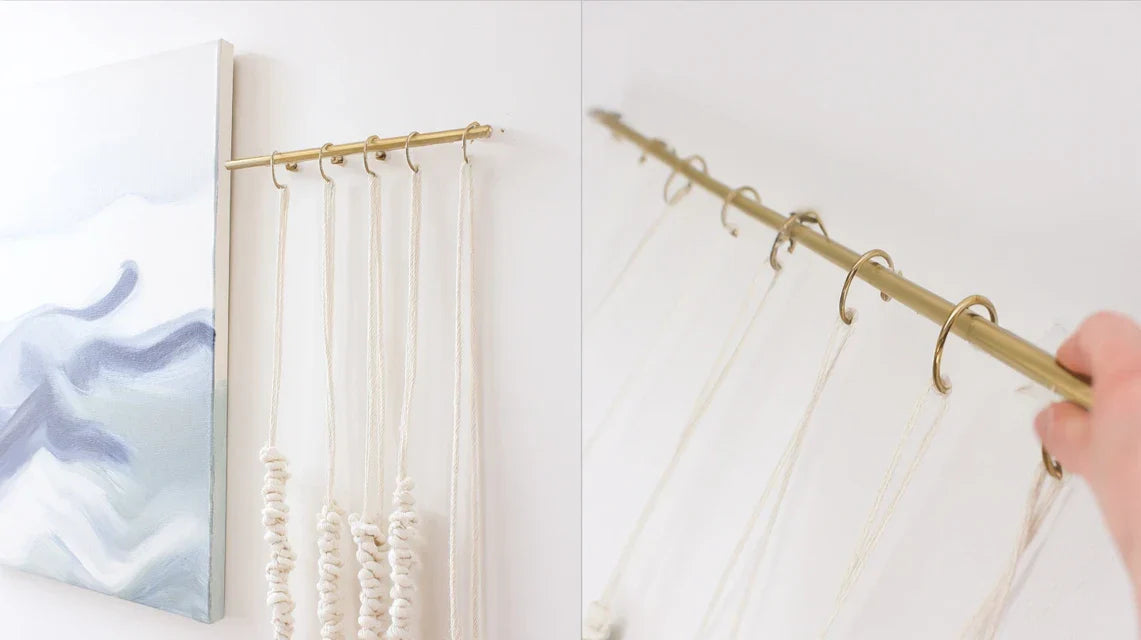
You just moved and your bare walls are getting you down, but as soon as you try to hang your various paintings and decorative objects, the result looks like a jumble rather than the harmonious interior you dreamed of.
You look at your living room where your modern abstract canvas, your framed travel photos, and that pretty vintage engraving from your grandmother coexist. Each element is beautiful individually, but together they create a visual cacophony that hurts your eyes.
You've already tried grouping them by size, by color, or even spacing them differently. But each time, you get either an overloaded wall that gives you a headache, or a bland arrangement that completely lacks personality.
Rest assured, this is not a lack of taste on your part. The problem comes from the fact that you have always been told that you had to choose a single style or respect strict symmetry rules. But modern decoration now favors mastered eclecticism.
By the end of this article, you will know how to create wall compositions that blend multiple styles with elegance, transforming your walls into true personalized galleries that tell your unique story.
Why doesn't your current mix decor work?
Most people think that having beautiful objects is enough to create a beautiful decoration. It’s like believing that you only need good ingredients to succeed in a dish: without the right recipe and proportions, even the best products can result in a disappointing outcome. If you wait any longer, you risk getting used to this visual chaos and missing out on the opportunity to create the interior that truly resembles you.
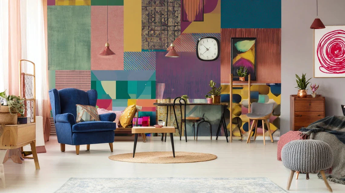
🏠 Customer testimonial: Sarah, a 34-year-old architect, owned a magnificent collection of artworks: watercolors from her trip to Japan, art deco lithographs, and black and white photos of her father photographer. For 2 years, she couldn't display them together without her living room looking like a flea market. Today, her guests think she hired a professional decorator.
💬 Conversation with a decor expert
The golden rule of a successful mix: It’s not about standardizing your artworks, but creating visual bridges. Like an orchestra conductor who harmonizes different instruments, you will learn to orchestrate your decorative elements so they complement each other instead of competing. The result will be visible from your first composition, in less than an hour.
Discover what’s behind your decorating failures
Do you recognize these situations? You bought a painting that was love at first sight but it clashes with the rest of your decor. You spend hours moving your frames without ever being satisfied with the result. Or, your guests never notice your most beautiful pieces because they get lost in the whole.
What’s really happening is that you are applying classic decorating rules to a modern lifestyle. Your problem isn't a lack of taste, but using an unsuitable method. It’s like trying to drive a car with riding rules: the basics are good, but the context has changed.
Think about your wardrobe: you don’t only wear black or white, yet you manage to create harmonious outfits by mixing colors, textures and styles. Your wall decoration works exactly the same way.
The first hidden cause: you reason in "collection" instead of "composition"
Here’s what no one tells you: the human eye doesn't perceive objects in isolation, but in their relationship to each other. When you look at your wall, your brain automatically searches for connections, rhythms, balances. If it doesn't find them, it classifies the whole as "chaotic".
It’s exactly like listening to an orchestra where each musician plays his score without listening to the others. Each melody can be beautiful individually, but the overall result is an unbearable cacophony.
This revelation will completely change your approach: instead of choosing your artworks one by one, you will learn to think of them in dialogue. This will allow you to integrate any new crush into your existing decor, without having to start over.
✨ Immediate test: Look at your main wall and blink quickly 3 times. Does your gaze naturally settle on a specific point, or does it wander aimlessly? If it’s the second case, your composition lacks visual structure.
The second cause: you are suffering from the "store display effect"
Many people think that displaying all their finest pieces together will create a "wow" effect. This is the classic mistake of a novice collector. In reality, too many strong elements in one place creates a visual competition where no piece really stands out.
Imagine a restaurant where all the dishes were main courses: even if each is delicious, you would have indigestion. The same goes for decor: your eye needs "side dishes" to fully appreciate your "main courses".
This realization will revolutionize your approach: you will discover the power of transition elements and learn to create a visual hierarchy that naturally guides the gaze towards your favorite pieces.
The third cause: you ignore "background effect"
Here's a factor that 90% of people completely neglect: the empty space around your artworks is as important as the artworks themselves. It’s like the silences in music, which give all their impact to the notes. Without these "visual breaths", even the most beautiful compositions seem stifling.
You can check this at home: if you can slide an A4 sheet between each element of your wall, it means that you are giving your eye the space needed to appreciate each piece. If not, your artworks "cannibalize" each other.
This discovery will transform your walls from "decor object stocks" into real personal galleries where each element has its place and role in the story you tell.
🔍 The 3 signals of a successful composition:
- The gaze immediately finds an anchor point: Your eye instinctively identifies the main element and is naturally drawn to it, like a magnet
- The visual journey is fluid: Your gaze wanders from one element to another without jolts or confusion, like following a path in a garden
- The whole tells a coherent story: Despite the diversity of styles, a clear personality emerges, revealing who you are and what you love
What really makes the difference between an amateur and a connoisseur is the mastery of linking codes: these subtle elements that create bridges between your different pieces. It’s like the butterfly effect in decor: a small detail well placed completely transforms the overall harmony. You can identify them by looking for repetitions of shapes, colors, materials or themes that subtly return in your composition.
The rule of 3 connections: For a mix to work perfectly, each new piece must share at least 3 subtle points in common with the existing ensemble (color, shape, era, material, theme...). Test this rule on your current composition: you will immediately understand why some elements "fit" and others don't.
| ❌ Limiting belief | ✅ Modern reality | 💡 Simple explanation | 🎯 Concrete benefit |
|---|---|---|---|
| Everything must match perfectly | Create subtle dialogues | Like in cooking: contrasts enhance flavors | Your decor becomes unique and personal |
| The more objects there are, the more impressive it is | Less but better organized | Your eye needs rest between each piece of information | Each piece is finally highlighted |
| Old and modern styles don't mix well | Eras complement each other beautifully | It’s like an enriching intergenerational conversation | Your interior tells your personal story |
| You have to follow the current decor trends | You must reveal your unique personality | Your home should look like you, not a magazine | You create a timeless and authentic interior |
The 3 circles method for a successful mix
Now that you understand the hidden mechanisms, let's move on to practice with a simple and progressive method. Imagine you are preparing a gourmet menu: you don’t serve all the dishes at once, you create a logical progression that gradually reveals all the flavors. Your wall will work exactly the same way, with a spectacular result from the first application.
🎯 Overview of the progression: We will build your composition in 3 concentric circles: first your masterpiece that sets the tone, then the supporting circle that accompanies it, and finally the touches of personality that bring originality. At each step, you will see your wall transform and come to life.
Step 1: Establish your "character piece" (the heart of your composition)
Start by choosing your central element, it’s like laying the first stone of a house: everything else will be organized around it. This step is crucial because it determines the overall atmosphere of your wall. Once this piece is in place, you will immediately feel satisfaction because your wall has finally found its identity.
🔧 What you need to get started
- Measuring tape: To measure the available space and avoid proportion errors that make your works appear too small or too large. Take a metal measuring tape rather than a flexible one: it won't move when you measure vertically. The rule of thirds: your centerpiece should occupy about 2/3 of the width of your main wall.
- Kraft paper or newspaper: To create templates to the exact size of your works and test your compositions before drilling. Kraft paper is more resistant than newspaper and holds its shape better when you handle it. Secure it with repositionable masking tape so that you can easily move your tests.
- A spirit level : Essential to ensure your compositions remain professional and harmonious. Even a 2-degree tilt can create an impression of imbalance that ruins the most beautiful arrangement. Choose a level of at least 40cm for greater accuracy.
Now, let's move on to selecting your statement piece :
🎨 How to identify your focal point
Gather all your artworks in a room : Arrange them on the floor or against a free wall to get an overview of your collection. This step allows you to see connections you hadn't noticed and identify pieces that naturally have "character". Don't censor yourself : even that small engraving you thought was too simple can reveal unsuspected qualities.
⏱️ Time : 15 minutes | ✅ Success when : You can see all your elements at a glance and compare their styles, colors and sizes | ⚠️ Attention : Avoid doing this in the room where you want to hang them: you risk being influenced by the existing decor
Apply the "magnetic gaze test" : Step back 3 meters and look at your collection for 10 seconds. What piece does your eye naturally settle on first ? This is often your best candidate to be the focal point. This piece already has the necessary visual strength to structure a composition.
⏱️ Time : 5 minutes | ✅ Success when : One or two pieces clearly stand out as "visual magnets" | ⚠️ Attention : Don't confuse "visible" and "garish" : a piece can attract the eye for its beauty, not necessarily for its bright colors
Check the "space compatibility" : Your centerpiece should be proportioned to the size of your wall. Simple rule: it shouldn't exceed 50% of the width of the wall, nor be less than 20%. A piece that is too large overwhelms the rest, one that is too small gets lost. Use your paper templates to visually test before deciding.
⏱️ Time : 10 minutes | ✅ Success when : Your template looks "in place" on the wall, neither overwhelming nor lost | ⚠️ Attention : Vertical artworks often appear larger than they are: always measure
✨ Validation of step 1 : Your centerpiece is in place and immediately gives your wall a personality. Even alone, it already creates an atmosphere that you like. If you're still hesitating between two options, photograph both versions and look at the photos: often, the objective reveals what your eye hesitates to see. Bravo, you have just laid the foundation for your future composition !
RECOMMENDED PRODUCTS
Step 2: Creating the "Support Circle" (Harmonious Guidance)
Now that your centerpiece anchors the composition, you will enhance it with complementary elements. This is the most rewarding step because you see your wall come to life before your eyes. The effect is immediate: your decoration goes from an "amateur" status to a "professional" level in just a few well-thought-out gestures.
🔧 Additional tools for this step
- A ruler or square: To maintain regular spacing between your elements and create a soothing visual rhythm. The ideal distance between two frames is equal to the width of your hand (approximately 8-12cm). This distance allows the eye to distinguish each element without creating excessive emptiness.
- Color samples: Cut small pieces of colored paper in the main colors of your centerpiece. This helps you quickly identify linking colors in your other works. Even a slightly different red can create a harmonious connection.
- Your smartphone: To photograph your composition tests and step back from your work. The lens often reveals imbalances invisible to the naked eye when you are too close to your work.
🎭 Building Visual Dialogue
Select your "dialogue pieces": Look in your collection for 2-3 elements that share at least one common point with your centerpiece: the same color family, the same era, the same technique, or even the same theme. These subtle connections will create a natural visual conversation. Avoid overly similar pieces that would duplicate.
⏱️ Time: 20 minutes | ✅ Successful when: You clearly identify the link between each secondary piece and your central element | ⚠️ Attention: One common point is enough: do not look for perfect similarity
Test the balance of masses: Place your templates around your centerpiece imagining an invisible scale. If your centerpiece is rather to the right, compensate with smaller elements on the left. The goal is not perfect symmetry, but a balance that seems natural, like stones stacked by a Zen master.
⏱️ Time: 15 minutes | ✅ Successful when: Your composition appears visually stable, without "tilting" to one side | ⚠️ Attention: Trust your instinct: if it seems unstable to you, then it is


