

You've been looking at that empty corner of your living room for months, dreaming of creating a little haven where you can finally relax with a good book and a steaming cup of coffee.
But every time you try to imagine the layout, you run into the same wall: how to create a warm and inspiring atmosphere without making the space look like an afterthought or simply a chair placed at random?
You may have already tried adding a few cushions, a small side table, or even changing the lighting. But the result was sorely lacking in personality and character, that little spark that transforms a simple corner into a true refuge.
That's perfectly normal! Most people focus on functional elements (armchair, table, lighting) forgetting the element that will give soul and identity to the space: a painting that tells a story and inspires contemplation.
By the end of this article, you'll know exactly how to transform any corner of your home into an reading space or authentic and inspiring cafe, thanks to a carefully chosen painting as a focal point.
Why does your reading corner
Imagine walking into an independent bookstore or a neighborhood cafe that really marks you. It's not just thanks to the comfortable armchairs or the subdued lighting. It’s this artwork on the wall that catches your eye and instantly creates a unique atmosphere. Without this strong visual element, your reading corner risks remaining bland, like a catalog set without soul.
🎨 Customer testimonial: "I had created a technically perfect reading corner: ergonomic armchair, reading lamp, small table. But I never managed to really relax there. Since I hung this abstract canvas in warm tones right in front of my armchair, this space has become my daily refuge. The painting completely changes the energy of the place."
💬 Conversation with a decor expert
The golden rule of inspiring decor: A space without an artistic focal point remains neutral and impersonal. The painting becomes the visual soul that transforms your corner into a true personal sanctuary. Observable result from day one: you will want to settle in more often.
Why isn't your current reading nook inspiring you?
Do you recognize these situations? You have installed an armchair facing a white wall, added a side table with your stacked books, optimized the lighting... but you still prefer to read on the living room sofa. Or you created this space but it looks like all the other reading nooks seen on Pinterest, without reflecting your personality.
What's really happening is that your brain needs gentle visual stimulation to feel inspired and relaxed. A blank wall or purely functional elements create a neutral environment that neither encourages escapism nor contemplation.
It's like trying to meditate in an austere office rather than in a garden: technically it is possible, but the environment does not help you enter the desired state of mind.
The myth of absolute minimalism
Many people think that a reading nook should be as uncluttered as possible to promote concentration. In reality, the human brain functions better with harmonious visual elements that subtly nourish inspiration without overwhelming the space.
Think of the most inspiring historical libraries: Oxford, Trinity College, Sainte-Geneviève Library... They are full of decorative elements, frescoes and works of art that elevate the spirit rather than distract it.
The impact on your daily experience? A visually rich space makes you want to linger in it, savor your reading moments, and even reflect or daydream. Your corner becomes a refuge and not just a functional place.
🔍 Quick test: Look at your current reading nook for 30 seconds. If your gaze has nowhere to settle with pleasure, it's a sign that it lacks a strong artistic element that would give character to the space.
The mistake of lighting without atmosphere
Most people optimize lighting for reading (desk lamp, spotlights) but forget ambient lighting which creates the atmosphere. A well-lit painting becomes a soft luminous point that completely transforms the energy of the place.
It's like the difference between a hospital kitchen with fluorescent lights and an intimate restaurant with carefully studied lighting: the function is the same, but the experience is totally different.
Consequence in your daily life: you unconsciously associate your reading corner with a "work" space rather than a moment of pleasure and relaxation. The artwork changes this perception by adding a contemplative and inspiring dimension.
The trap of the "catalog" decor
Many people reproduce layouts seen online without taking into account their personality and artistic tastes. As a result: a space technically perfect but that doesn't resemble them and creates no emotional connection.
Observe your current reaction: are you proud to show your reading corner to your guests? Are you looking forward to settling in there in the evening? If the answer is no, it means the space lacks personalizing elements.
A painting chosen according to your personal tastes immediately changes this dynamic: it tells your story, reflects your artistic sensitivity and makes this corner a unique space that truly resembles you.
3 signs that your reading corner lacks inspiration:
- You naturally avoid this space: Your subconscious tells you that the place lacks charm. It's like avoiding a restaurant with a cold atmosphere even if the food is correct.
- You never photograph it: A space that inspires us makes us want to share it. If you have never felt like photographing your reading corner, it means it lacks visual personality.
- You read elsewhere by preference: Despite functional optimization, you prefer the sofa or bed. Your body is asking for a richer sensory environment.
The trigger factor: the missing visual identity
What really makes the difference is to have a signature element that gives a strong identity to the space. The artwork plays this role of catalyst: it unifies all other elements around a coherent aesthetic and creates this unique atmosphere that will make you want to settle in and savor every moment of reading. You'll recognize it when your gaze is naturally drawn to this space even when you don't intend to read.
Law of visual attraction: A space without an artistic focal point remains invisible to your subconscious. As soon as a painting becomes the visual heart of the corner, your brain identifies it as a place of pleasure and relaxation. Immediate test: observe where your gaze is directed when you enter the room.
| ❌ Standard reading corner | ✅ Corner with central painting | 💡 Why it changes everything | 🎯 Benefit felt |
|---|---|---|---|
| Purely functional space | Personalized and inspiring refuge | The painting creates a strong visual identity | Natural desire to settle in |
| Neutral and impersonal atmosphere | Warm and characterized atmosphere | Art adds an emotional dimension | More enjoyable reading moments |
| "Catalog" decoration reproducible | Unique space that tells your story | The artistic choice reflects your personality | Pride in showing your corner to loved ones |
| Corner unconsciously avoided | Visual magnet that naturally attractsThe brain associates beauty and pleasureMore regular and enjoyable reading ritual
The 3-step method to create your perfect reading corner
Don't worry, transforming your space doesn’t require a large budget or decorator skills. The beauty of this approach lies in its simplicity: everything revolves around the choice and placement of your artwork. It's like building a house by starting with choosing the view from the main window: once that focal point is defined, all other elements naturally find their place to create a harmonious whole.
🎯 Overview - The 3 pillars of your sanctuary: First, choose the artwork that will give soul to your space (this is your aesthetic compass). Then, create the ideal setting around this work (positioning, lighting, furniture). Finally, refine the atmosphere with details that transform a corner into a true personal sanctuary. Each step brings you closer to a space where you will naturally want to recharge.
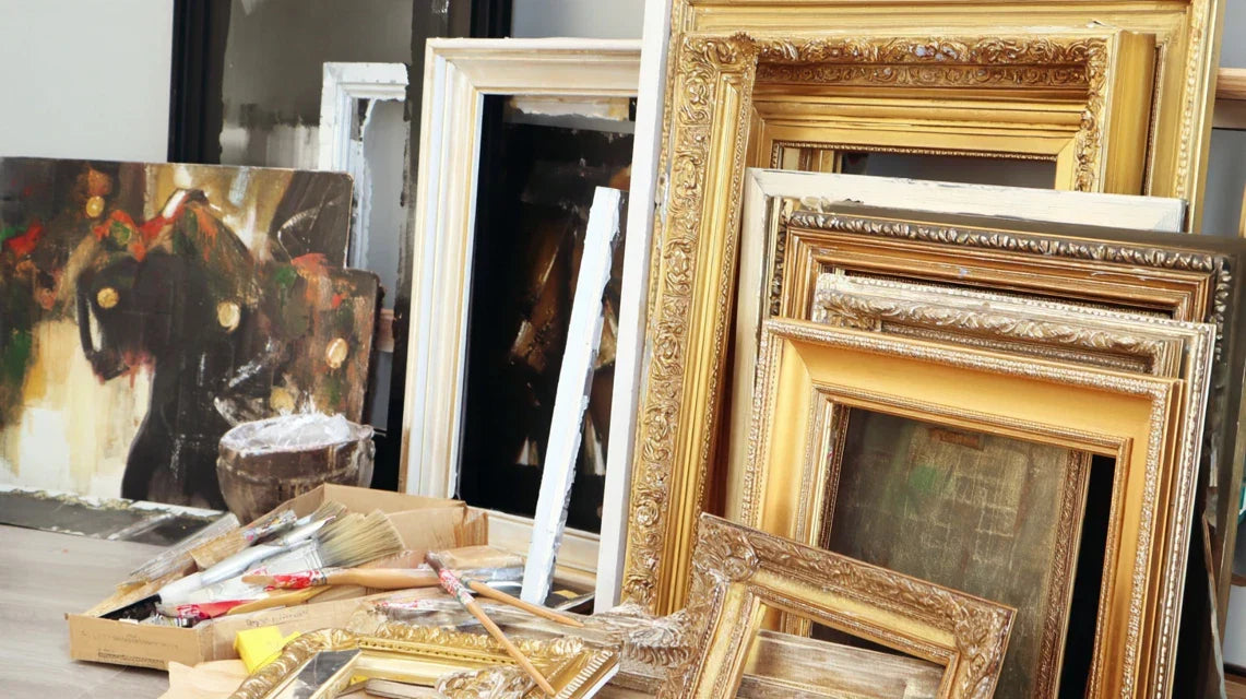
Step 1: Choose your artwork - the soul of the place
This first step is crucial as it determines the entire future atmosphere of your corner. It's like choosing the main melody of a musical composition: everything else will harmonize around it. Once your artwork is selected, you’ll already feel that little spark of excitement imagining your future sanctuary.
Essential selection criteria
- The format and dimensions: For a reading corner, prioritize a horizontal rectangular format (70x50cm or 100x70cm) that naturally accompanies the gaze without dominating it. This size creates a focal point without overwhelming the space. Avoid overly square formats which can appear static or too vertical ones which break the horizontal harmony of the armchair and table. The color palette: Opt for warm and soothing tones (ochres, beiges, soft browns, sage greens) that promote relaxation and contemplation. These colors act as a visual cocoon that envelops your reading moments. Too bright or contrasting colors risk creating excessive stimulation. The style and emotion: Choose a work that evokes serenity, escape or inspiration: soothing landscapes, soft abstractions, contemplative still lifes. The goal is to nourish your imagination without over-soliciting it during your reading breaks.
Let's move on to the concrete selection of your artwork now
How to identify THE perfect artwork for you
Define your intended atmosphere: Close your eyes and imagine yourself in your ideal reading corner. What emotion do you want to feel? Serenity, inspiration, escape, human warmth? This emotional intention will guide your artistic choice much better than current decor trends.
⏱️ Time : 5 minutes of reflection | ✅ Successful when: You can describe the desired atmosphere in 3 words | ⚠️ Warning: Don't be influenced by what "is done" - follow your personal feelings, it's your refuge!
Test the emotional connection: When faced with a painting that attracts you, look at it for 30 seconds in silence. Does your breathing calm down? Does your mind naturally wander? This is a sign of an authentic resonance between the work and your sensitivity.
⏱️ Time : 30 seconds per artwork | ✅ Successful when: You feel spontaneous calmness | ⚠️ Warning: First impressions count - if you have to convince yourself, it's not the right choice.
Check harmony with your furniture: Take a photo of your current corner and visualize the painting on the wall mentally. Do the colors complement each other naturally? Does the style blend in with the overall atmosphere? An intuitive harmony is better than a perfect but forced agreement.
⏱️ Time : 2 minutes of visualization | ✅ Successful when: The whole seems natural and balanced to you | ⚠️ Warning: A painting that is too matching can create a "magazine decor" effect without personality.
✨ Final validation: You've found THE painting when you surprise yourself smiling imagining it in your reading corner. Your enthusiasm is the best indicator of a successful choice. If you are still hesitating between several works, choose the one that most strongly evokes the emotion you seek during your reading moments.
OUR RECOMMENDED PRODUCTS
Step 2: Create the perfect setting around your artwork
Now that your painting is chosen, you will create the environment that highlights it while optimizing your reading comfort. This is when your corner goes from "functional" to "inspiring". The effect is felt immediately: the space gains coherence and personality.
Intelligent spatial arrangement
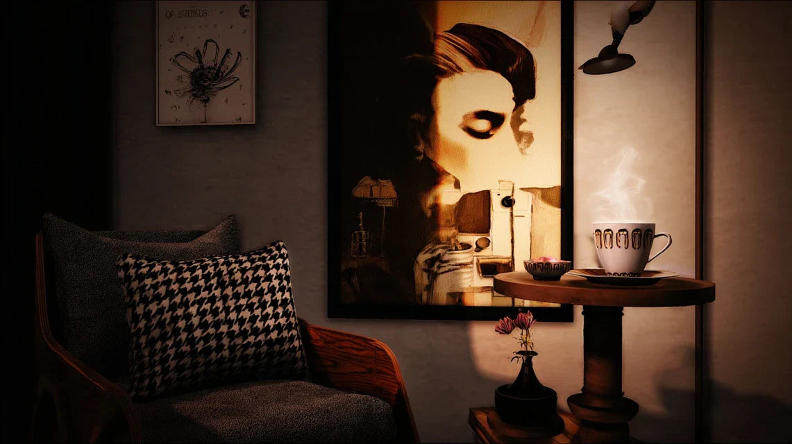
- The position of the armchair: Place your seat so that you have the painting in your peripheral vision when you read, but facing you when you look up. This position allows for natural contemplative pauses. Ideal distance: 1.5 to 2 meters from the wall for comfortable viewing.
- Optimal hanging height: The center of the painting should be at eye level when you are sitting (about 120-130cm from the floor). This height creates a harmonious visual connection and avoids neck strain during your moments of contemplation.
- Dedicated lighting for the artwork: Add soft lighting directed towards the painting (warm LED spotlight or adjustable wall lamp). This indirect light creates a cozy atmosphere while enhancing the colors of your artwork, even in the evening.
Arrange the space step by step
Define the perfect triangle: Create a harmonious triangle between your armchair, your side table and your painting. This natural geometry guides the eye and creates a visual cocoon that naturally defines your reading area from the rest of the room.
⏱️ Time: 15 minutes of adjustment | ✅ Success when: You can place your book, look up at the painting and resume reading effortlessly | ⚠️ Attention: Avoid placing the armchair against the wall - keep 20-30cm for air circulation and aesthetics.
Calibrate ambient lighting: Test different light intensities: enough to read comfortably, soft enough to contemplate the painting without glare. The ideal is to be able to adjust according to the moment (active reading vs contemplation).
⏱️ Time: 10 minutes of tests | ✅ Success when: You can read 2 pages without eye strain and look at the painting with pleasure | ⚠️ Attention: Lighting that is too direct on the painting creates annoying reflections.
Step 3: Perfecting the atmosphere with signature details
This final step transforms your arranged corner into a true personal sanctuary. This is where your artistic sensitivity expresses itself fully and the space becomes unique. The final result will surprise you: a place where you will naturally want to spend time, even without a book in hand.
Personalized touches
- Color harmony: Choose 2-3 accessories (cushion, plaid, flower pot) that subtly pick up a color from your painting. This color coherence unifies the whole without visually overloading it.
- Texture elements: Add materials that dialogue with the style of your artwork: raw wood for a natural painting, patinated metal for an industrial work, soft textile for a cocooning atmosphere. These material echoes enrich the sensory experience.
- Signature scent: A discreet diffuser with a delicate fragrance (lavender, sandalwood, tea) creates an olfactory memory associated with your reading moments. Your brain will associate this scent with relaxation and inspiration.
🎯 Final success test: Settle into your finished corner with a book. If you feel an immediate sense of well-being and the desire to take a photo to share it, you've won! Your reading corner has found its soul thanks to the painting which becomes its beating heart.
Natural progression rule: Each step should provide you with a visible satisfaction. After step 1, you should be excited about your artistic choice. After step 2, the space should feel coherent. After step 3, you should look forward to settling in. If a step doesn't generate this satisfaction, refine before moving on.
Now that your reading corner has taken shape, let's discover the expert subtleties that distinguish a successful arrangement from a truly exceptional space. These details make the difference between a pleasant corner and an irresistible refuge where your guests will want to settle.
🎨 Professional decorator’s secret: Create a "visual dialogue" between your artwork and an object placed on your side table (vase of the same color, book with a matching cover, miniature sculpture). This subtle correspondence unifies the space and reveals your refined aesthetic sense. The eye subconsciously perceives this harmony and feels a sensation of order and beauty.
💭 Frequent reader question
"I'm afraid my artwork won't match the rest of my decor..."
This concern is perfectly understandable and even healthy! It shows that you want to create a harmonious ensemble. The truth is that a artwork well chosen according to your tastes will naturally harmonize with your interior, as it will reflect your aesthetic sensitivity. Your eye has developed an unconscious consistency in your decorative choices. Moreover, a slightly "mismatched" artwork can become the character point that gives relief to a too uniform interior. Art has this magical power to transcend strict decoration rules.
🎯 Actionable tip: Order your artwork and live with it for a few days before permanently hanging it. Simply lean it against the wall and observe how it dialogues with your space. This familiarization period will allow you to adjust the arrangement if needed and reassure yourself about your choice.
The 5 mistakes that sabotage your reading corner
Beware, some common mistakes can turn your project into disappointment. Knowing these pitfalls will save you weeks of frustration and save you valuable time. The good news? These errors are easily avoidable when you know them.
- 🚫 Choosing a piece too large to impress: The desire to create a strong impact sometimes leads to oversizing the artwork. Result: it overwhelms the space and creates a feeling of suffocation rather than a cozy atmosphere. In a reading corner, the artwork should accompany, not dominate. Prefer a size that allows the space around to breathe.
- 🚫 Hanging too high out of habit: Many people reproduce the standard museum height (150-160cm) without adapting it to their usage. In your reading corner, you view the painting from a seated position, so lower. A work hung too high will force you to uncomfortably tilt your head.
- 🚫 Neglecting the lighting of the painting: An unlit painting becomes invisible as soon as natural light decreases. It then loses its role as a focal point and your corner returns to its disappointing neutrality. Lighting transforms your work into a living element that brings the space to life even in the evening.
- 🚫 Following trends rather than one's own tastes: Letting yourself be influenced by "fashionable" styles creates a disconnect with your personality. You will end up getting tired of a painting chosen rationally rather than emotionally. Your personal connection to the work is the guarantee of lasting satisfaction.
- 🚫 Installing the armchair facing away from the painting: This positioning error completely deprives your reading corner of its source of inspiration. The painting becomes decorative for others but does not enrich your personal experience of reading. The work should be within your field of vision to play its role as a contemplative accompaniment.
🔍 Checkpoints to validate your layout: Seated in your armchair, you should see the painting effortlessly, feel soothed by the overall visual, want to stay in this space, and feel that this corner resembles you. Warning signs: visual discomfort, impression of a cramped space, persistent neutrality, or feeling that "something is wrong" without knowing what.
🎁 Special readers offer
Because you took the time to inform yourself, enjoy 10% discount on your first order:
⏰ Valid for 72h after reading • Applicable to all our products
❓ Your questions about setting up a reading corner
Allow between 150€ and 400€ for a remarkable result: 80-200€ for a quality painting, 30-80€ for dedicated lighting, and 40-120€ for harmonization accessories (cushion, plaid, small decorative object). Budget tip: start with the painting that will immediately give character to your space, then add the other elements gradually. Even with a single painting, the transformation is striking.


