

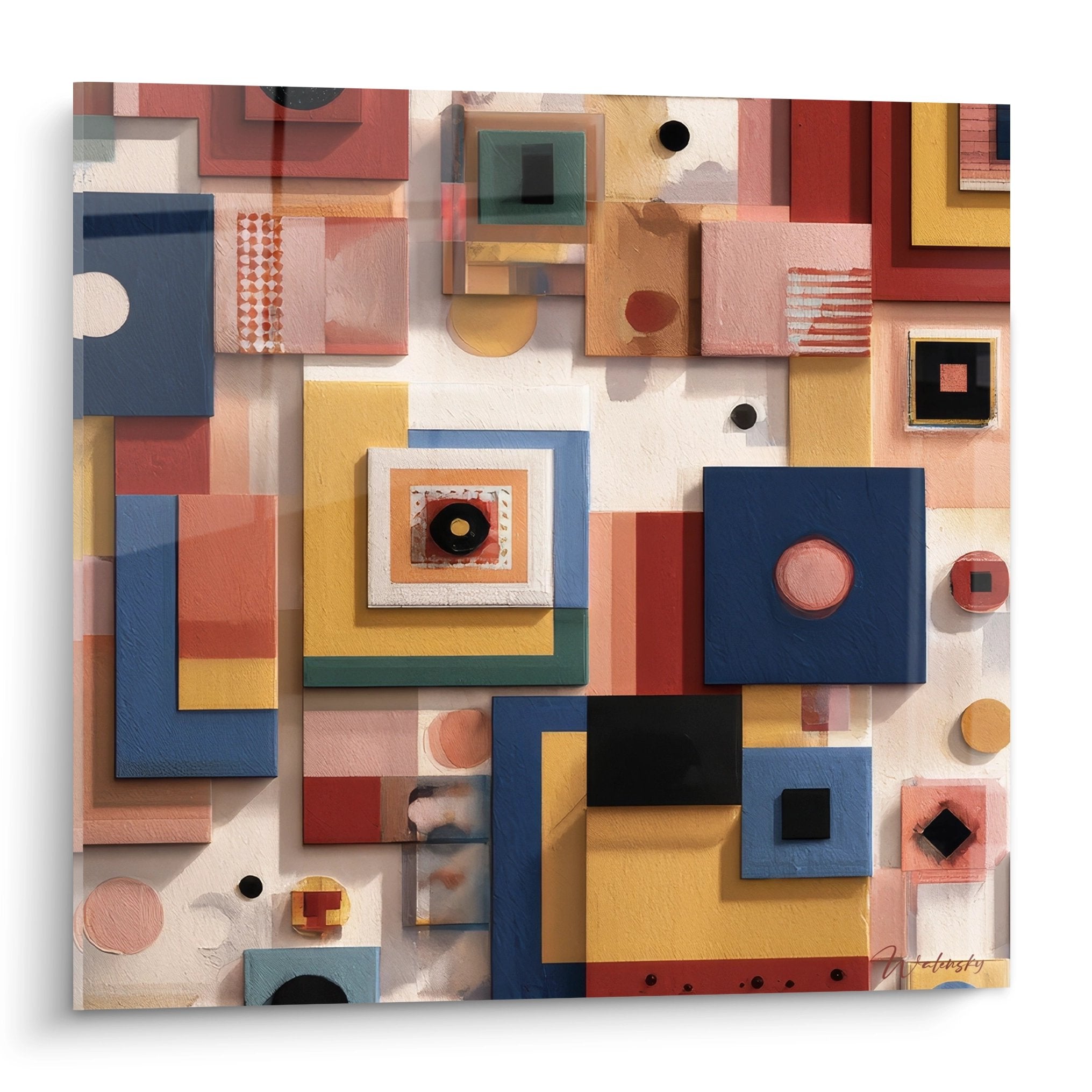






How to Style a Home Office Corner with an Inspirational Wall Composition?
October 11, 2025 · 18 min read · by Walensky
The golden rule of visual inspiration: A stimulating work environment increases creativity by an average of 25% according to behavioral studies. You should feel the first effects on your motivation within the first week of installation.
What's really blocking you in your office layout?
Do you recognize these situations? You go around and around in front of your wall wondering where to start. You hesitate between several artworks without knowing if they will look good together. You fear making holes in the wall "for nothing" if the result doesn't please you.
What is actually happening is that your brain is searching for consistent visual cues but can’t find them. Without a clear method, it is impossible to create the harmony that will make you feel comfortable. The problem isn't your lack of taste, but the absence of structure in your approach.
It's like trying to cook a gourmet dish without a recipe: even with excellent ingredients, the result is likely to be disappointing without logical progression.
First hidden cause: You start with objects instead of starting with the space
Most people begin by choosing artworks they like and then try to arrange them. Big mistake! Professional decorators do exactly the opposite: they first analyze the space, its constraints and its assets, then select the works accordingly.
It's like wanting to get dressed by first choosing your shoes, then hoping that the rest will harmonize. Your wall has a personality of its own: dimensions, lighting, color, fixed elements such as sockets or shelves.
This reversed approach explains why your previous attempts left you feeling unsatisfied. By starting with the space, you naturally create a visual coherence that gives the impression of a thoughtful and professional layout.
🔍 Quick test: Take a photo of your office wall with your phone, then mentally draw a rectangle where you imagine your composition. If this rectangle respects the rule of thirds (neither too centered nor stuck in a corner), you already have the right reflex!
Second cause: You underestimate the impact of hanging height
How many times have you seen artworks hung at random, too high like in a museum? This hanging mistake literally kills the decorative effect and creates a cold distance from the artwork.
Imagine that your paintings are windows onto other universes. If they are placed too high, it's as if you have to stand on tiptoe to look outside: uncomfortable and artificial.
Result: your composition floats in space instead of creating a visual cocoon around your workstation. You lose all the intimacy and emotional connection that beautiful wall art should bring.
Third cause: You neglect lighting in your choices
Here's the detail that 90% of people forget: the same artwork can appear dull or radiant depending on the lighting in your office. A painting with warm tones under cold light will lose all its magic.
Spot these clues in your space: if your colors look different in the morning and afternoon, if some areas always seem to be in shadow, if your screens create reflections on certain surfaces.
Ignoring these parameters risks investing in beautiful artworks that will never reveal their potential in your specific environment.
🔍 3 signals that your lighting influences your decor choices:
- The white test: If a sheet of paper looks yellowish or bluish near your desk, your lighting has a dominant hue that will alter the appearance of colors
- The mirror effect: If your computer screen reflects certain areas of the wall, these locations are not suitable for artworks under glass
- Shadow zones: If some corners remain dark even during the day, choose works with light or textured colors that capture light better
The trigger element: Creating a strong focal point
The secret of successful wall compositions? They always create a "visual anchor" that naturally attracts the eye and structures everything else. It's the positive domino effect: once this focal point is defined, all other elements naturally find their place around it. In your office, this focal point should be visible from your work position to regularly bring you a breath of inspiration. Look for the location that "calls" the eye when you look up from your screen.
The raised gaze rule: Your composition should be placed within your natural field of vision when looking above your screen. Simple test: sit at your desk and note where your eyes naturally settle when you are thinking.
| ❌ Instinctive approach | ✅ Professional method | 💡 Why it works | 🎯 Visible benefit |
|---|---|---|---|
| Choose paintings that you like and then place them | Analyze the space and then select suitable artworks | Harmony comes from consistency with the environment | Impression of a professional and thoughtful arrangement |
| Hang at eye level standing up | Adjust height to seated work position | The artwork accompanies your daily gaze | Stronger emotional connection with the decor |
| Rely only on store lighting | Test colors in your specific lighting | Each environment reveals nuances differently | Colors that remain beautiful from morning to evening |
| Space all elements evenly | Create a focal point and then balance around it | The brain needs a visual anchor point | Composition that attracts and holds the gaze |

The 3-step method to create your perfect wall composition
Rest assured: creating a harmonious wall composition is not complicated when you follow the right progression. We will proceed like an interior architect: first analysis and planning, then selection of elements, and finally optimized installation. It's like preparing a garden: we start by studying the terrain and exposure, then choose suitable plants, and arrange them to create a balanced ensemble that flourishes naturally.
🗺️ Overview of your project: Step 1 - Analyze and measure your space to define constraints and opportunities. Step 2 - Select artworks according to precise harmony criteria. Step 3 - Install your composition according to professional hanging rules. At each step, you will gain confidence and a clear vision of the final result.
Step 1: Analyze your space like a pro
This first step is crucial as it determines all subsequent decisions. This is where you lay the visual foundations of your future composition. Once this analysis is complete, you will have the satisfaction of knowing exactly where you are going, just like an architect who has finished their plans.
What you need for the analysis
- Strong>A measuring tape: Choose a model of at least 3 meters to comfortably measure heights and widths. Avoid overly flexible tapes that distort measurements. You will find it in any hardware store for less than €10. Accuracy to the nearest centimeter is important as it determines the final proportions. Strong>Your smartphone: The camera will be used to capture your wall at different times of the day and virtually test your ideas. Use grid mode to visualize the rule of thirds. The advantage over the naked eye: you can compare several options and see how the light evolves. Strong>Newspaper or kraft paper: To cut out templates the size of your future paintings and test them on the wall with repositionable tape. This avoids surprises and unnecessary holes. It's the technique used by professionals to validate their compositions before final installation.
Now, let’s move on to practice with your space
Concrete actions for analyzing your office
Measure and photograph your wall: Take the exact dimensions of the available area taking into account obstacles (sockets, shelves, angles). Then photograph your wall at 3 times: morning, midday, and artificial lighting in the evening. This step reveals how light changes the atmosphere and which areas are most flattering.
⏱️ Time: 15 minutes | ✅ Achieved when: You have 3 clear photos and measurements noted to the nearest centimeter | ⚠️ Attention: Don't forget to measure the height from the floor AND from your seated position, as this is what counts for hanging
Identify your natural focal point: Sit at your desk and instinctively spot where your gaze settles when you look up. Mark this spot with a post-it note. It's usually slightly off-center and at eye level while sitting, which is about 120-130 cm from the floor. This point will become the center of your composition.
⏱️ Time: 5 minutes | ✅ Successful when: You feel a sense of certainty, a "this is where it should go" feeling | ⚠️ Attention: Don't force yourself to perfectly center; slightly off-center compositions are often more dynamic
Test your dimensions with templates: Cut out rectangles from newspaper corresponding to the sizes of artworks you’re considering. Temporarily tape them onto the wall around your focal point. Step back and observe the visual balance. This step avoids 90% of proportion errors.
⏱️ Time: 20 minutes | ✅ Successful when: The paper composition makes you say "yes, that's it!" | ⚠️ Attention: If it looks too small, you often need to dare to go bigger - our eye underestimates dimensions on a wall
✓ Validation of step 1: You now have a clear "battle plan" with precise dimensions and a defined location. You can mentally visualize your future composition and feel that it will work. If you’re still hesitating, that's normal - take some time to live with your paper templates to validate your choices.

OUR RECOMMENDED PRODUCTS
Step 2: Select your artworks methodically
Now that your space is "mapped out", you’re going to choose your wall art based on specific criteria rather than gut feeling. This methodical approach guarantees a harmonious result and avoids impulsive purchases that you might regret. The snowball effect begins here: each choice guided by your analysis makes the next one easier.
Define your target style and ambiance
Choose your dominant color palette: Base yourself on the colors already present in your office (furniture, walls, accessories) and add 1-2 complementary colors to energize. Use the 60-30-10 rule: 60% neutral color (often your walls), 30% secondary color, 10% accent color. Test your colors with samples under your specific lighting.
⏱️ Time: 30 minutes | ✅ Successful when: You have 3-4 colors that harmonize naturally | ⚠️ Attention: Avoid more than 4 different colors, otherwise the overall look becomes confusing
Determine your artistic style: For an office, prioritize styles that promote concentration: geometric abstract, soothing landscapes, or architectural photography. Avoid overly figurative or emotionally charged subjects that could be distracting. The goal is to create a stimulating but not overwhelming environment.
⏱️ Time: 20 minutes | ✅ Successful when: You can define the desired style in 2-3 words | ⚠️ Attention: Stay consistent in your selection, mixing too many different styles disrupts harmony
Validate your choices with the rule of proportions: For a balanced composition, respect these ratios: one large artwork (40-50% of the total surface) as a centerpiece, 2-3 medium artworks (20-30% each) in accompaniment. If you opt for an identical series, choose an odd number (3 or 5) for a more natural effect.
⏱️ Time: 15 minutes | ✅ Successful when: Your dimensions respect these proportions | ⚠️ Attention: A set of artworks that are too similar in size creates a monotonous effect
🎯 Validation of step 2: You have a selection of works consistent in style and colors, with dimensions that respect the correct proportions. Your choices correspond to the atmosphere you want to create in your office. It's time to move on to installation!
This is where you bring your vision to life! This final step transforms your planning into reality. You will discover the immense satisfaction of seeing your wall composition come to life and instantly transform the atmosphere of your office. Professional installation makes all the difference between a "homemade" result and an arrangement worthy of a magazine.
Professional Installation Hardware
Prepare your fixing tools: Invest in anchors suitable for your wall type (drywall, concrete, brick) and quality screws. For artworks weighing less than 2kg, molly anchors are sufficient. Beyond that, use chemical or expansion anchors. Provide a spirit level, a pencil, and masking tape to mark your reference points.
⏱️ Time: 10 minutes of preparation | ✅ Successful when: All your tools are within reach | ⚠️ Attention: Check for electrical cables in the wall with a detector before drilling
Mark your attachment points: Replace your paper templates according to your validated plan. Mark the exact location of each fixing with a pencil, taking into account the hanging system of your artworks. For a perfectly straight line between multiple works, use a spirit level or draw a line with a pencil that you will erase later.
⏱️ Time: 15 minutes | ✅ Successful when: All your points are marked and verified at the level | ⚠️ Attention: Measure twice, drill once - a placement error is difficult to correct
Install and adjust the final composition: Drill your holes starting with the center piece, then the secondary elements. Install all fixing systems first, then hang your artworks, finely adjusting their horizontality. Step back regularly to check the overall balance and make any necessary micro-adjustments.
⏱️ Time: 45 minutes | ✅ Success when: Your composition is perfectly straight and balanced | ⚠️ Attention: Never force a picture that seems misaligned, it's better to take it down and readjust
🏆 Congratulations, step 3 completed: Your wall composition is installed and already transforming the atmosphere of your office! Take a photo of the final result to compare with the before. You should immediately feel a sense of pride and a renewed desire to spend time in this space.
The rule of continuous adaptation: Your composition can evolve over time. Wait at least one week before making any changes - you need that time for your eye to get used to it and objectively perceive the result. Minor adjustments are normal and part of the process.
Now that your wall composition is in place, here are the subtleties that separate amateurs from connoisseurs. These details will make the difference between a nice arrangement and a truly professional result that will impress your visitors.
💎 Professional decorator's tip: Add a small accent light directed at your composition (LED spotlight, adjustable wall lamp or even a well-positioned desk lamp). This dedicated lighting reveals the colors and textures of your artworks, especially in the evening, and creates a very professional atmosphere. The best architects' offices systematically use this technique.
Frequent question from our readers
"What if I get tired of my composition after a few months?"
This is a legitimate concern that many share! In reality, a well-designed composition evolves with you rather than tiring. You will discover new details depending on your mood, the season, or the lighting. And if the desire for change arises, you can easily evolve one or two elements without doing everything again - this is the advantage of a well-structured base. Many of our customers also tell us that they rediscover their office after several months!
💡 Evolutionary tip: From the start, plan for space for a small modular element (a small artwork, a plant, or a decorative object) that you can change according to your desires or the seasons. This renews the whole without questioning your basic composition.
— Our selection


Pitfalls to avoid at all costs (even beginner decorators fall into them)
After accompanying hundreds of home office projects, we have identified the recurring mistakes that compromise even the most beautiful intentions. These errors are so common that we see them regularly, even among very creative people.
- 🚫 Hanging too high out of habit "museum" : This is mistake #1! Our brain associates "painting" with "exhibition" and pushes us to hang it like in a gallery. The result: your composition floats above your workspace instead of accompanying it. The right height for an office: the center of your main painting should be at a maximum of 130-140 cm from the floor. Rest assured, we all made this mistake at first.
- 📏 Underestimating the necessary dimensions : "It looked bigger in the store..." We hear that phrase constantly! A bare wall visually “eats” 30% of the apparent size of a painting. What looks perfect in the store will seem small at home. Always dare to go one size above your first intuition, you won't regret it.
- 💡 Ignoring artificial lighting in the evening : You choose your colors in daylight, then discover in the evening that your beautiful composition becomes dull under your LED lighting. Each type of bulb changes the colors: cool LEDs blue, halogens yellow. Always test your works under your usual work lighting.
- ⚖️ Spacing uniformly out of symmetry : Mathematical spacing paradoxically creates a rigid and cold effect. The eye prefers slightly varying spacings that create a natural rhythm. Let your centerpiece breathe more and tighten the secondary elements.
- 🎨 Mixing too many styles "to personalize" : Wanting to express all facets at once creates a “catalog” effect where no element really stands out. It is better to fully embrace a style and add a subtle personal touch than to try to say everything at the same time.
🛡️ Quick verification system : Before definitively validating your installation, step back 3 meters and close your eyes for 5 seconds. When you open them, your first impression should be positive. If something bothers you immediately, it means that the adjustment is necessary. Other warning signs: you avoid looking at your composition, you feel a sense of imbalance, or you constantly explain your choices to visitors.
— You may also like


Your most frequent questions about arranging an office corner
For a standard office corner, expect to spend between €150 and €400 depending on your ambitions. A budget of €200-€250 already allows for a beautiful composition with 2-3 quality artworks. The trick to optimizing: start with a strong central piece (€100-€150) then gradually add the secondary elements. You will spread out the investment and can adjust according to the effect obtained.
The effect is generally immediate for the overall atmosphere, but the deep psychological impact develops over 1-2 weeks. Your brain needs this time to integrate the new environment and create positive associations. Most of our customers report a noticeable boost in motivation from the first week, with a peak of inspiration around day 10.
Absolutely! A small space even benefits more from a thoughtful wall composition because each element has more impact. The key: prioritize light tones and medium formats rather than mini ones. A large clear artwork visually expands the space more than several small ones that fragment it. Just avoid very dark colors which could visually shrink the room.
It's even recommended! An evolving composition remains more stimulating for longer. Plan from the start 1-2 "flexible" locations for artworks that you can change according to your desires or the seasons. The advantage of a well-structured base: you can modify 20-30% of the elements without questioning the overall harmony.
For a home office, framed artworks bring more structure and professionalism. Choose simple, harmonious frames (same color or same material). Unframed works are more suitable for very contemporary styles, but require more precise installation to avoid a "DIY" effect. If in doubt, the frame is safer to start with.
Your new office awaits you
In a few weeks, you will look at your office corner with immense pride. No more gloomy mornings facing a white wall! Your workspace will have become an inspiring cocoon that makes you want to settle in every day. Your video conferences will reveal a well-cared background that impresses your interlocutors and strengthens your professional image.
Beyond aesthetics, you will have developed a true decorative eye which will serve you in all your future decoration projects. This newly acquired confidence in your choices will impact other aspects of your life: you will dare more, you will affirm your personality better in your interior.
The hardest part was understanding the method - you now have it! All that's left to do is take the plunge and choose your first artworks. Start this week by analyzing your space, the rest will follow naturally. In a month, you won't recognize your office anymore!
🚀 Your transformation starts now:
Also read: 📖 Read more articles on wall art
</div— In the same vein


