Can I paint around my artwork to integrate it into the wall?
By Alexandre MARY
⏱️ Reading time: 8 minutes
You just hung your new artwork on the wall and then... disappointment. It seems to float in empty space, completely disconnected from your decor. Like a guest who arrives at a party and doesn't know anyone.
You step back a few feet, observe the whole thing, and that unpleasant feeling washes over you: something is wrong. The artwork is beautiful, the wall perfect, but there’s no harmony. It's as if two worlds coexist without ever meeting.
You may have already tried adding other frames around it, changing the lighting, or even moving your furniture. But nothing works: the artwork remains isolated, like locked in its own aesthetic bubble.
This is perfectly normal! The problem isn't your taste or your artwork. It simply comes from the fact that traditional wall art has never been designed to interact with the architecture of our modern interiors.
By the end of this article, you will master the art of making your artwork "breathe" beyond its limits, transforming a simple hanging into a true personalized wall installation that will impress your guests.
Why Your Artwork Deserves to Go Beyond Its Borders?
More than ever today, our walls have become true canvases for personal expression. Waiting for your decor to "come alive naturally" is like planting a seed and hoping it grows without water.
Opportunity? Create an immediate visual impact that transforms your room into a private art gallery.
🎨 Interior designer revelation: "Sarah, one of my clients, owned a superb blue abstract painting in her living room. Beautiful, but which seemed "lost" on her large white wall. With a few strategic brushstrokes around the frame, we created a subtle gradient that extends the artwork. Result: her living room went from "pretty" to "decor magazine" in one afternoon."
💬 Conversation with a decor expert
"But if I paint around, won't I damage the artwork? And besides, it doesn’t risk looking… amateurish?"
Imagine your artwork as an island: it can remain isolated or be connected to the continent by elegant bridges. Painting around never touches the artwork itself, but creates that missing visual connection. It’s exactly the opposite of amateurism: it's professional staging adapted to your interior.
"I was always told that you had to let works of art "breathe", that you shouldn't add anything around them..."
This rule dates back to the era when walls were adorned with moldings and ornaments. In our contemporary interiors with often bare walls, the opposite is true: your artwork needs a "visual setting" to reveal its full potential. The greatest modern museums have understood this for a long time.
The secret of professional decorators: they never just hang a piece, they create an environment that enhances it. Like a theater spotlight that doesn't just illuminate, but reveals the magic. Result visible from the first glance, definitive transformation in maximum 2-3 hours.
What really happens when your artwork seems "disconnected"
Do you recognize these situations? Your gaze passes over the artwork without truly stopping. Your guests admire politely but never ask questions about it.
Or, you feel that diffuse frustration upon entering the room, without being able to identify why.
What's happening is a very simple visual phenomenon: your brain doesn't find aesthetic continuity between the artwork and its environment.
Like two different languages in the same conversation. The problem isn't you, it’s the lack of "visual translation".
Imagine a great actor on a stage without scenery: his talent is there, but the context is missing to reveal all its power. That's exactly what happens to your artwork.
The real reason: your wall doesn't have a "soft transition"
Contrary to what many think, the problem isn't about the color or size of the artwork. It comes from the absence of a visual bridge between the artwork and the architecture.
It’s like trying to join two shores without a bridge: technically possible, but the effort is discouraging. Your eye needs this elegant gateway to naturally make the connection.
Result: instead of creating harmony that soothes you every day, your magnificent artwork creates an unconscious visual tension that fatigues your gaze and diminishes your pleasure in being at home.
🔍 Revealing test: Look at your artwork, then close your eyes for 3 seconds. Open them and observe where your gaze naturally settles: on the artwork or on the wall around it? If it goes directly to the white wall, that's because your brain instinctively seeks this missing transition.
The trap of "perfect neutrality"
Many think that a white wall is the ideal solution because "neutral". In reality, total neutrality creates a void that sucks the energy from your artwork instead of enhancing it.
It's like wearing a magnificent diamond on a plain white t-shirt: the contrast is too harsh. You need a subtle staging that reveals beauty without competing with it.
This forced neutrality explains why you sometimes feel that your interior lacks character, despite your beautiful artistic acquisitions. Your artworks are there, but they don't "speak" to the space.
The little-known psychological effect
What few people realize is that an artwork isolated on a wall creates a "storefront" effect: beautiful to look at, but which maintains an emotional distance.
Your brain needs progressive visual cues to truly appropriate a work of art. Without these cues, it remains "decorative" instead of becoming "lived-in".
Direct impact: you appreciate your purchase less, you talk about it less, and this artwork that was supposed to inspire you daily becomes invisible through habit.
3 signs that your painting needs integration:
Your gaze "bounces" off it: instead of lingering, your eye quickly passes over, as if searching for something else
Your guests never comment: they see the artwork but don't feel like talking about it, a sign of a lack of emotional impact
You think about "adding something" around it: this recurring desire reveals that your instinct senses the need for visual continuity
The trigger that changes everything
The real trigger is understanding that your wall is a theater stage, not just a support. Just as a lighting designer enhances an actor, your pictorial intervention will reveal the personality of your artwork.
Once you see your wall as a creative partner rather than a neutral background, anything is possible. The clue? That excitement that rises when you imagine the final result.
Golden rule of decorators: an artwork without visual context reveals only 30% of its aesthetic potential. Create this context and watch the magic happen. Immediate verification: take a before/after photo, the difference will be obvious.
❌ Painting isolated on wall
✅ Painting visually integrated
💡 Explanation
🎯 Benefit felt
Seems to float, disconnected
Dialogues with the architecture
Visual continuity created
Immediate harmony and tranquility
Goes unnoticed on a daily basis
Naturally attracts the eye
Visual anchor points added
Renewed pleasure every day
"Store window" effect
Becomes part of your world
Emotional appropriation
Pride and personalization
Limits decorative impact
Transforms the entire room
Visual radiance effect
"Magazine" interior feel
The gentle method to succeed with your wall integration
Rest assured: transforming your wall into a setting for your painting is more accessible than you imagine.
Like building a bridge, it just takes proceeding in logical steps. We will start from your current situation to arrive at a result that will delight you, without stress or risk of error.
The progression: observation → preparation → realization → finishing. At each step, you will notice a visible improvement that will motivate you for the next stage.
🏗️ Project Overview: we will first "listen" to what your painting wants to express, then prepare the ground with the right tools, and finally create that magical transition that unifies everything. Like a gardener who prepares the soil before planting: each step nourishes the next. Result at each phase: more harmony, more character, more pride.
Step 1: Understanding the Language of Your Artwork
Before touching a brush, you need to listen to what your painting has to say. Like a translator must first master both languages.
This step will give you confidence: you will discover aspects of your artwork that you have never noticed before. This satisfaction of "really understanding" your acquisition.
What You Need for This Analysis
Good natural or artificial lighting: ideally daylight or neutral white LED. Essential to perceive the subtle nuances that the eye captures poorly in yellow light. Avoid cold neon lights which distort colors. Criterion: you must be able to distinguish at least 3 shades in each colored area of your painting.
Your smartphone or camera: not for Instagram, but to capture the details that your conscious eye might miss. The lens often reveals hidden harmonies. Tip: macro mode for textures, normal mode with indirect flash for colors. Impact: discover the "color signature" of your artwork.
A notebook and a pencil: to note your observations so you don't forget them. Writing fixes fleeting impressions and helps you structure your thinking. More effective than memory alone because your brain will process a lot of visual information.Now, let's move on to the active observation of your artwork
How to "Interview" Your Painting Visually
Identify the dominant and secondary colors: step back 2 meters from your painting and squint slightly. The colors that "pop out" first are your dominants, those that appear next are your secondaries. Note them in order of importance. This blurry vision technique eliminates details to reveal the color architecture of the artwork.
⏱️ Time: 5 minutes | ✅ Successful when: you have listed 2-3 dominant colors and 2-4 secondary colors | ⚠️ Attention: don't rely on your first impression, the eye gets used to it. Look, look away, come back: the colors that persist are the real dominants.
Spot movements and rhythms: follow with your finger (without touching) the main lines of the artwork. In which direction does your painting "push"? Upwards, to the sides, in a spiral? These movements will guide your wall extension. It's like listening to the melody before composing the accompaniment.
⏱️ Time: 3 minutes | ✅ Successful when: you feel the main energy direction of the artwork | ⚠️ Attention: don't look for movement where there isn't any, some artworks are intentionally static, that’s valuable information too.
Evaluate overall energy: Does your painting exude serenity, dynamism, melancholy, joy? This emotional energy will determine the intensity of your wall intervention. A soothing work will call for a gentle extension, an explosive work can support more marked effects.
⏱️ Time: 2 minutes | ✅ Successful when: you can describe the atmosphere in 2-3 keywords | ⚠️ Attention: distinguish your personal emotion towards the artwork from the energy it objectively exudes. These are two complementary but different pieces of information.
✅ Validation of your analysis: You should now have a clear “identity card” of your painting: its basic colors, its dynamics, its character. If it's blurry, restart the observation by changing the lighting or distance. In case of difficulty, photograph the artwork and analyze the photo: sometimes the lens reveals what the familiar eye no longer sees. Bravo, you have just professionally met your artwork!
OUR RECOMMENDED PRODUCTS
Step 2: Prepare your creative intervention
Now that you "speak" the language of your painting, we are going to prepare your dialogue with the wall.
This step is more technical but very rewarding: you will feel that your project takes concrete shape. The multiplier effect begins here: each preparatory gesture increases your chances of final success.
Your palette of creative tools
Artist quality acrylic paints: prioritize Golden, Liquitex or Amsterdam for their pigment richness and durability. Avoid low-cost paints that yellow or dull. Quality criterion: the paint must remain shiny when drying. Simple test: a sample on cardboard must retain its saturation 24 hours after application.
Brushes suitable for wall effects: large flat brush (5-8cm) for backgrounds, medium round brush (n°12-16) for details, natural sponge for soft textures. The quality of the brushes determines the fineness of your rendering. Investment that changes everything: bristles that don't shed and retain their shape even after intensive use.
Smoothing and retarder mediums: to achieve these perfect gradients that make the difference between amateur and professional. The retard medium gives you time to work your transitions without stress. Visible benefit: smooth and natural color passages, without traces of corrections.
Technical preparation for an expert result
Protection and delimitation of the area: cover the floor with a plastic tarp extending 50cm around your work area. Precisely delimit the area you will paint with masking tape. This methodical preparation mentally frees you to focus on creation without fear of damage.
⏱️ Time: 15 minutes | ✅ Successful when: you can paint with your eyes closed without risking spilling | ⚠️ Attention: use quality masking tape (3M or Tesa) that removes without pulling off the existing paint. Test on a hidden area first.
Preparation of transition colors: First mix your dominant colors with white to create 3 to 4 different intensities of each shade. Prepare more than you need: nothing is more frustrating than running out of paint during work. This range of nuances will be your "dialogue" palette with the artwork.
⏱️ Time: 10 minutes | ✅ Successful when: you have a smooth progression between your pure color and the white of the wall | ⚠️ Attention: acrylic darkens slightly as it dries, prepare your mixes a little lighter than the desired effect.
Test on sample: Before attacking the final wall, test your effects on cardboard or in a less visible corner. Validate your technique and the harmony of colors. This step eliminates 90% of post-creation regrets because you visualize the result before committing.
⏱️ Time: 10 minutes | ✅ Successful when: your test makes you smile and gives you the desire to see the final result | ⚠️ Attention: look at your test under different lighting (day/evening/artificial) as the effect may vary depending on the light.
🎯 Checkpoint before action: Your space is protected, your colors prepared, your technique validated. You should feel that creative excitement mixed with a quiet confidence. If you have any doubts, this is the time to resolve them with an additional test. The next step will be pure creation!
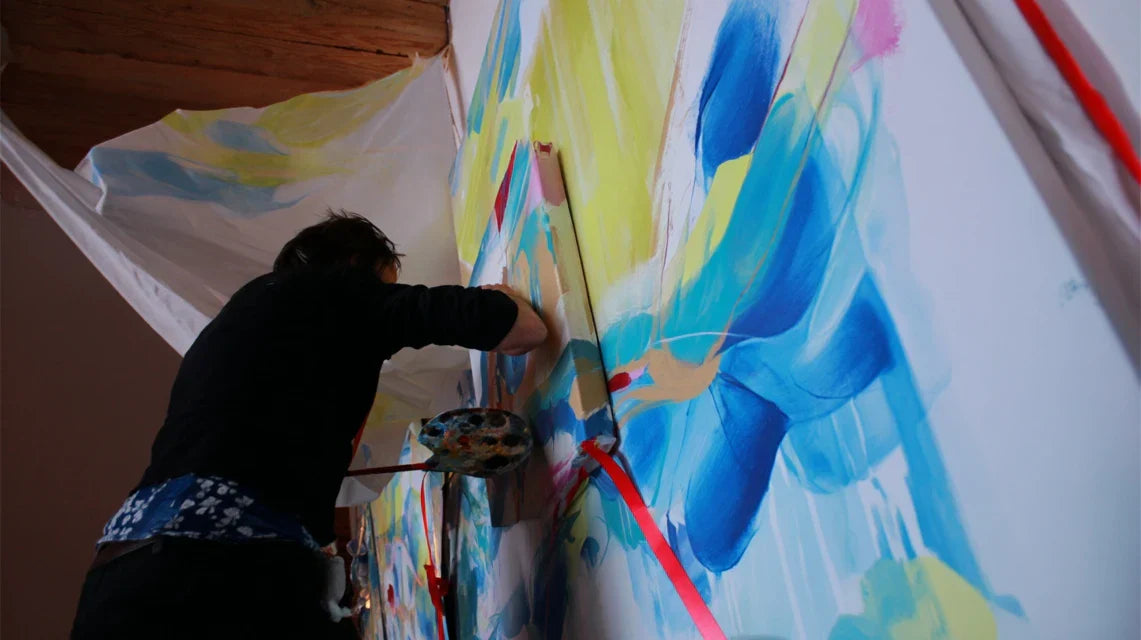
Step 3: Create your personalized wall extension
This is THE magical moment when your vision becomes reality. You will discover the unique pleasure of seeing your wall transform under your brushes.
This step often reveals hidden talents: many discover that they have a "hand" for decorative painting. The immediate feeling of satisfaction is powerful because each brushstroke visibly improves the whole.
Integration techniques according to the style of your artwork
Color gradient technique: start by applying your lightest color (close to the wall white) along the edge of your area. Gradually, intensify towards the deeper colors as you get closer to the artwork. Work on surfaces no larger than 30x30cm to keep the paint wet and blend the areas without demarcation.
⏱️ Time: 45 minutes per square meter | ✅ Success when: no visible demarcation between zones, smooth transition | ⚠️ Attention: never go over a drying area, you will create streaks. It is better to wait for complete drying and start again.
Complementary texture effects: depending on the energy of your artwork, add textured nuances with the natural sponge. Circular movements for soft atmospheres, irregular taps for more raw energies. These micro-variations in surface capture light differently and enrich the final effect.
⏱️ Time: 20 minutes | ✅ Success when: the texture adds depth without drawing attention to itself | ⚠️ Attention: less is often more. A subtle texture that reveals according to lighting is more elegant than a too much visible effect permanently.
Finishing and joints: carefully remove the masking tape before complete drying to avoid tearing the paint. Correct any edge imperfections with a fine brush. This finishing step makes the difference between "homemade" and "professional".
⏱️ Time: 15 minutes | ✅ Success when: contours are clean and the whole is perfectly integrated | ⚠️ Attention: to remove the tape, pull diagonally at a 45° angle in the direction of the fresh paint, never perpendicularly.
🎉 Reveal moment: step back 3 meters and observe your creation. You should feel that particular satisfaction of seeing your artwork finally "live" on your wall. If the effect pleases you at a distance, it's won! The details are refined, but the overall impact must convince you immediately. Congratulations, you have just created your first personalized wall installation!
Pro progression rule: a successful session makes you want to start again elsewhere in the house. If you feel this creative excitement, it means you have found the right technical balance. Be patient for complete drying (24h) before judging definitively, but the "wow" effect must be immediate.
Congratulations! You have just acquired a skill that few people master: transforming a simple wall hanging into a true staging. Now let's discover the expert secrets that will make you a true virtuoso of wall integration.
💎 Professional set designer's secret: vary the intensity of your extension depending on the time of day by playing with reflections and shadows. A slightly matte finish near the painting and a more satin finish towards the outside creates a sense of depth that evolves with natural light. Result: your wall "lives" and reveals itself differently in the morning and evening.
💭 Frequent question from our readers
"What if I choose the wrong color or the result doesn't please me? Am I going to have to repaint everything anyway?"
This concern is perfectly understandable, especially when you are tackling your wall for the first time! The beauty of this technique is that it is completely reversible. Acrylic comes off easily with a simple coat of white paint, and you start from scratch. But in 15 years of support, I can assure you that 95% of people are delighted with the result on the first attempt. The secret? Having taken the preparatory tests seriously.
🛡️ Safety tip: start with a 50x50cm area around a corner of the painting. If you like the effect, continue. Otherwise, you only have a small surface to redo. This progressive approach eliminates 99% of regrets!
Pitfalls to avoid for a perfect result
Even with the best preparation, some mistakes can spoil your creative pleasure. Knowing these pitfalls avoids frustration and loss of time. These errors are normal and are part of learning, but let's try to avoid them from the first attempt!
⚠️ Starting with dark colors: the desire to quickly see the final effect often leads to attacking directly with intense shades. Problem: impossible to correct if the effect is too strong. Consequence: glaring result that overwhelms the work instead of enhancing it. Solution: always start from the lightest to the darkest, you keep total control over the intensity. This is the most common mistake, even professionals have made it!
⚠️ Neglecting drying times: impatience to see the finished result encourages speeding up the steps. But wet and dry acrylic have very different behaviors. Problem: touch-ups on semi-dry paint create halos that are impossible to correct. Solution: respect the 2h drying time between coats, even if it's tempting to continue.
⚠️ Trying to cover the entire surface in one go: fearing a lack of homogeneity, some try to paint the whole wall in one session. Result: fatigue that lowers quality, and paint that dries too quickly for joints. It is better to work in areas of 60x60cm maximum, you keep precision and pleasure.
⚠️ Neglecting work lighting: painting in insufficient or overly yellow light completely distorts color perception. You only discover the true rendering the next day in natural light, sometimes with unpleasant surprises. Preventative solution: white neutral LED lighting of at least 1000 lumens throughout the work.
⚠️ Forgetting to photograph the before: this error seems harmless but deprives you of the satisfaction of measuring the progress made. And in case of doubt about the result, it's impossible to put things into perspective without a point of comparison. Always take a before/after photo, you will never regret it.
🔍 Anti-error verification system: Before each new color, step back 2 meters and observe the whole thing. Do you still like the overall effect? Take a picture to see with fresh eyes. Warning signs: feeling that "something is wrong" without being able to identify what, impression that the painting "disappears" instead of standing out, or visual fatigue when looking at the whole. In this case, STOP, let it dry and start again with a rested mind.
Because you took the time to inform yourself, enjoy 10% discount on your first order:
ART10
⏰ Valid 72h after reading • Applicable to all our products
🤔 Practical questions about wall integration
⏰ How much time should you allow for a successful wall integration, and what is the average budget?
For a standard size painting (60x80cm), allow 3 to 4 hours spread over 2 days (drying required), and a material cost of €25-€40 for quality paints and brushes. Optimization: start on a Saturday morning for preparation and the first coats, finish on Sunday. Concrete example: Marie transformed her living room for €32 worth of materials and lasting satisfaction for 2 years!
🎨 Do you need any particular artistic skills, or can you really start without risk?
No particular talent required! If you know how to hold a brush and follow a logical progression, you have all the cards in hand. The technique relies on patience and method, not on "artistic gift". Proof: 80% of our readers had never painted before and get results that impress their friends. The secret: accept that the first attempt is a learning experience, even if it often succeeds from the first try.
🏠 Does this technique work on all types of walls and with all styles of paintings?
Excellent adaptability! Smooth walls, fine plaster, even plain wallpaper: acrylic adheres everywhere. The only limit is heavily textured wallpapers that create irregularities. In terms of styles: abstract, figurative, photo, even framed posters... Each artwork has its "signature" which can be extended. Universal tip: the more colorful the work, the more creative possibilities you have.
🔄 If I want to change paintings later, can I easily modify the wall integration?
Absolutely! It's even one of the great advantages of this approach. A coat of white paint erases everything, and you start again with a neutral base for your new artwork. Many discover that they enjoy these seasonal transformations. Some of our readers change their staging every 6 months, creating a decoration that evolves with their desires and artistic acquisitions.
💡 Can this technique be applied to multiple paintings in the same room without creating visual confusion?
Excellent expert question! The golden rule: one "main" painting with strong integration, the others with more discreet extensions that "converse" with the first. Like in music: a soloist and accompaniment. Advanced technique: use the same base colors but with decreasing intensities according to the importance of each artwork. Result: overall harmony without visual cacophony.
🌟 Your new perspective on wall decoration
In a few weeks, when you enter your living room and your gaze naturally rests on your customized wall installation, you will feel that particular satisfaction of a creator. Your guests will no longer be able to pass by without commenting, and this artwork that you already loved will reveal a presence and elegance that you had only imagined.
But beyond aesthetics, you will have acquired much more: confidence in your creative ability, a new way of seeing space as an expressive terrain, and that particular pride of really living in your home rather than in an anonymous decor. Your friends will ask for your advice, and you will discover the pleasure of transmitting this transformative skill.
The best part? This understanding of the dialogue between art and architecture permanently changes your perspective. You will never see a wall again as just a support, but as a creative partner waiting to reveal its potential. The first step? Observe your painting with this new gaze, imagine the final effect, and let this creative excitement guide you towards your first realization.
🚀 Last inspiration before starting: every great decorator started by transforming their own space. Your painting has been waiting too long to reveal its full potential. All it takes is your creative intervention for this transformation to become a reality. And in a few hours, you will have that unique satisfaction of having created something beautiful and unique in your home.
📚 To further inspire your decor creativity
Now that you've mastered the art of wall integration, discover our other guides to transform every corner of your interior into a space for personal expression. Innovative hanging techniques, luminous atmospheres, harmonious color palettes... Your creative journey has only just begun!


