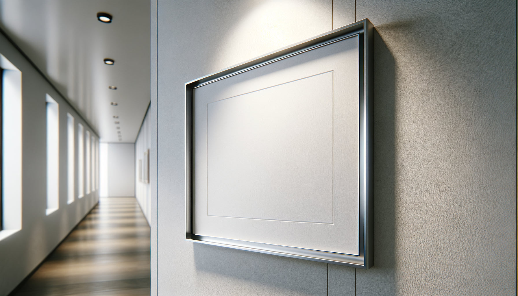
This hallway seemed endless to me. Barely three meters in plan, but visually, a real hall of mirrors without end. Then I hung an orange-toned painting near the entrance. The change was striking: the space instantly felt closer, became more intimate, almost warm. This experience marked the beginning of my fascination with the psychological impact of chromatic temperatures on our spatial perception.
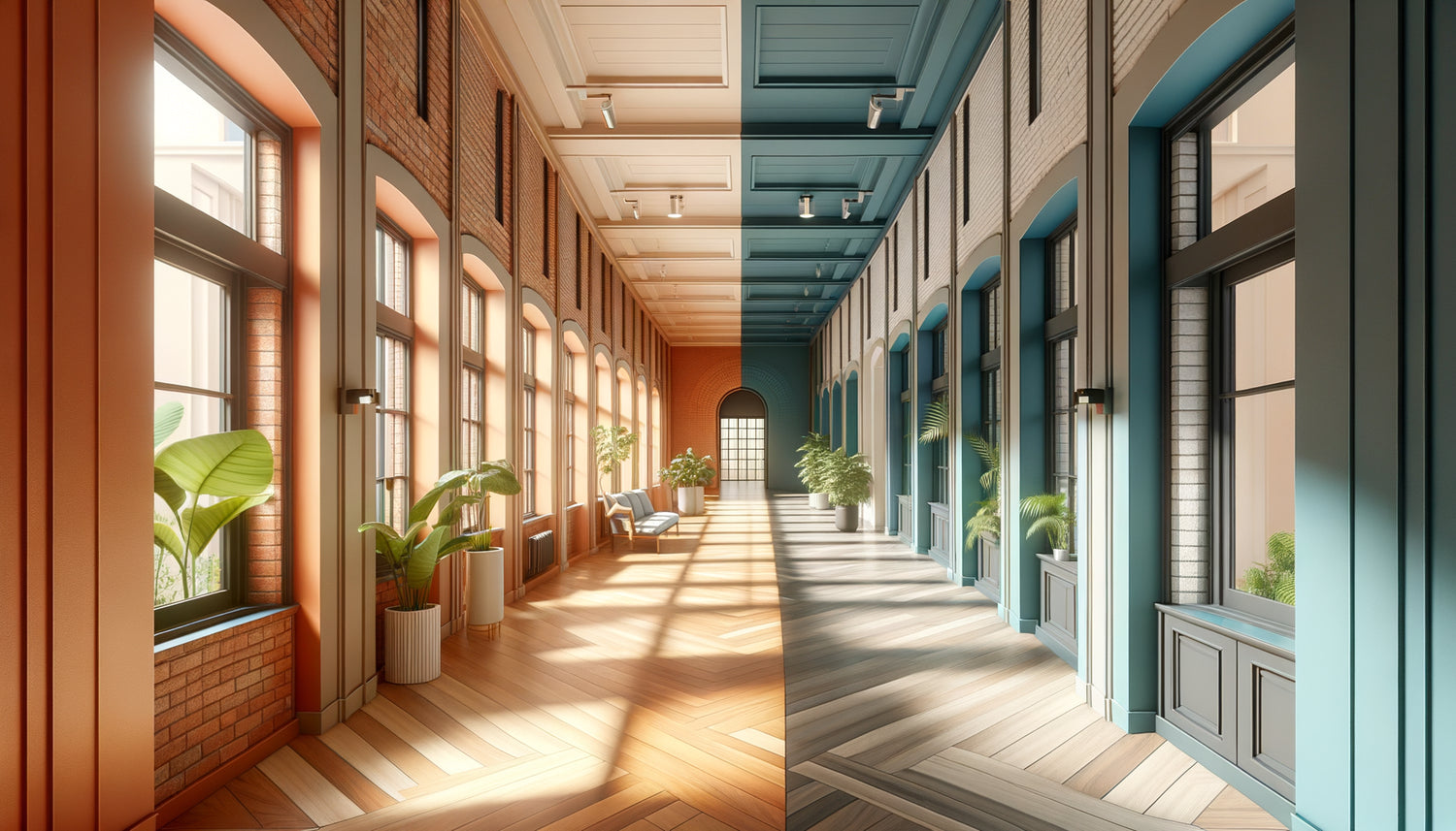
Warm tones (red, orange, yellow) create a sense of proximity and visually shorten a hallway, while cool tones (blue, green, violet) generate an impression of distance and can accentuate the perceived length. Here's what a well-chosen painting brings: an immediate modification of spatial perception, a direct influence on emotional atmosphere, and subtle control of visual circulation.
Do you know this frustration? This hallway that seems to extend indefinitely, creating an oppressive tunnel impression. Or conversely, this space so short it appears truncated, without depth or character. You've tried painting, changed the lighting, but the effect remains disappointing.
Rest assured: you don't need costly structural work. The solution lies in understanding a fundamental principle of visual psychology. Colors are not just decorative; they are architectural. A strategically placed painting with the right tones becomes a real tool for spatial modeling.
In this article, you will discover how chromatic temperatures radically change the perception of length of a hallway, which paintings to choose according to your spatial objective, and how to intelligently orchestrate warm and cool tones to transform your passage into a true visual experience.
The optics physics of chromatic temperatures
Our brain processes light wavelengths differently. This neurological peculiarity explains why an painting with warm tones seems literally to move towards us, while a painting with cool tones appears to recede into space.
Warm tones possess a longer wavelength that intensely stimulates our visual receptors. This stimulation creates an immediate sense of proximity. A vermilion red, a copper orange or a golden yellow on canvas seem to burst from the wall. In a hallway, this effect of visual rapprochement spectacularly shortens the perceived length.
Conversely, cool tones emit shorter wavelengths. Cobalt blue, emerald green or amethyst violet create an impression of distance. They soothe the gaze while generating a feeling of recession. Placed in a hallway, they can paradoxically accentuate the impression of expanse.
This physical reality explains why the placement of a painting becomes crucial. A maritime landscape with blue hues at the end of a long hallway will visually amplify this length. Placed in the same location, a painting with warm tones will psychologically bring the back wall closer.
Visually shorten an excessively long hallway
Endless corridors create an anxiety-inducing tunnel impression. To counter this effect, warm tones become your best allies. The goal: to create visual anchor points that fragment the perceived length.
Warm focal wall strategy
Hang a dominant artwork in warm tones on the back wall. A sunset, an orange abstraction, or a golden composition will immediately attract the eye and create a feeling of closeness. The wall appears to advance 20 to 30 centimeters visually, without any structural modification.
I tested this approach in an 8-meter corridor. A large format (120x80cm) depicting intense yellow sunflowers transformed the space. Visitors swore that the hallway had been shortened. Only the perception had changed.
Lateral warm sequencing
Arrange several artworks with progressively warmer tones along the side walls. This technique creates a visual rhythm that mentally fragments the length. The eye no longer travels a single distance but a succession of distinct visual steps.
Favor works in reds, oranges or pinks. Alternating between medium formats (60x40cm) generates dynamics that captivate the gaze and distract it from the actual length. Each artwork becomes a visual pause that breaks down the journey.

Creating depth in a short hallway
A hallway that is too short can feel truncated, sorely lacking character. Here, the strategy is reversed: cool tones visually open up the space and create a welcome sense of depth.
An artwork with blue or green hues placed in perspective generates a visual appeal that pushes the gaze further. The brain interprets this chromatic coolness as spatial distance. A snowy mountain landscape, a turquoise sea or a forest of fir trees amplifies this sensation.
In a hallway of only 2.5 meters, an artwork depicting a deep blue-gray thunderstorm created an amazing illusion. The proportions suddenly seemed more balanced, the space less cramped. The chromatic coolness had literally pushed back the visual limits.
Playing with atmospheric perspective
Classic painters knew this secret: the further an element is, the colder and more desaturated its tones become. Recreate this effect in your hallway. Choose a artwork with a marked atmospheric perspective, where the tones gradually cool towards the horizon.
This technique naturally reinforces the impression of depth. A forest path disappearing into bluish mists, a country road vanishing into purple hills: these compositions exploit our neurological wiring to suggest vastness.
Thermal balance: orchestrating warm and cool
The most sophisticated solution is to strategically combine warm and cool tones to create a custom spatial balance. This approach offers precise control over the perception of length while visually enriching the hallway.
Imagine a hallway of medium length with a slight tendency to appear stretched. Place a painting with warm tones at the entrance (red, sienna) and a painting with cool tones at the end (blue, turquoise). The entrance advances visually, the background recedes subtly. The result? A space that is perfectly proportioned visually.
The rule of thirds
For a harmonious effect, apply the rule of chromatic two-thirds. If your main goal is to shorten, use 60% warm tones and 40% cool tones. To visually lengthen, reverse the proportion. This balance avoids the monochrome effect while preserving the dominant spatial intention.
A hallway I decorated perfectly illustrates this approach. Four side paintings: three autumnal compositions in oranges and reds, a blue seascape. The warm dominance shortened the space visually, while the cool touch brought breathing room and complexity.

Format and intensity: amplify the chromatic effect
Color temperature doesn't work alone. The format of the artwork and the intensity of the shades significantly multiply or attenuate the effect on the perception of length.
A large format (minimum 120x90cm) amplifies the impact of warm tones. Its massive visual presence creates a psychological barrier that powerfully shortens perspective. Conversely, medium formats (60x40cm) in cool tones gently disperse the gaze without creating a marked visual barrier.
Chromatic intensity also plays a major role. A saturated, vibrant red literally stops the eye: maximum effect of bringing closer. A desaturated red, almost pink, softens this impact. For cool tones, a deep Klein blue dramatically recesses space, while a pastel blue subtly suggests distance.
Adaptation according to natural light
A dark hallway naturally amplifies the effect of bright warm tones. A golden yellow or a bright orange literally radiates in the dimness, creating a powerful focal point that visually brings closer. In a very brightly lit hallway, deep cool tones (midnight blue, forest green) offer a refreshing contrast that effectively recesses space.
Take this light variable into account. The same painting with warm tones will not have the same spatial impact whether it is bathed in natural light or illuminates a shaded area.
Ready to transform the perception of your hallway?
Discover our exclusive collection of hallway art that masterfully plays with color temperatures to shape your space according to your intentions.
Your hallway, reinvented by color
Each time you walk through your hallway now, you will no longer see just a passage. You will perceive a malleable space, shapable by the simple magic of color temperatures. This canvas with warm tones that visually shortens an endless hallway. This landscape in deep blues that miraculously opens up a cramped space.
The perception of length is never fixed. It modulates, adjusts, reinvents itself according to the shades you choose to hang. Start simply: identify your main spatial need. Does your hallway seem too long or too short? Then choose a first painting in the appropriate color temperature.
Observe the effect for a few days. You will be amazed at how quickly our brain reinterprets spatial proportions under the influence of colors. Then adjust, complete, orchestrate. Your hallway will become that fascinating laboratory where optical physics and aesthetic emotion meet to create space exactly as you desire.
Frequently Asked Questions
Can I mix warm and cool tones in the same painting?
Absolutely, and it's even a sophisticated strategy! The spatial effect will depend on the chromatic dominance of the artwork. If 60% of the composition presents warm tones, the overall effect will be one of closeness despite the presence of cool touches. Look for works with a clear dominant temperature for a controlled spatial impact. Balanced 50/50 artworks create an interesting neutral effect for hallways whose length already satisfies you. This approach adds visual richness without modifying the existing spatial perception. Observe your artwork from a distance: what general impression dominates? It is this first sensation that will guide the effect on the perceived length of your hallway.
Do neutral tones (gray, beige) have an effect on the perception of length?
Neutral tones act differently depending on their underlying temperature. A gray tending towards blue (cold gray) will create a slight receding effect, while a golden beige (warm neutral) will subtly bring closer. However, their impact remains noticeably less pronounced than saturated colors. Neutrals are excellent choices for visually stabilizing a hallway without radically changing its perceived proportions. They work particularly well in complement to a strong colored artwork: the neutral calms down without contradicting the spatial effect of the main artwork. If your hallway already has many colorful elements (doors, baseboards), a tempered neutral artwork can harmonize the whole without adding additional spatial tension.
At what height should you hang a painting to maximize the effect on length?
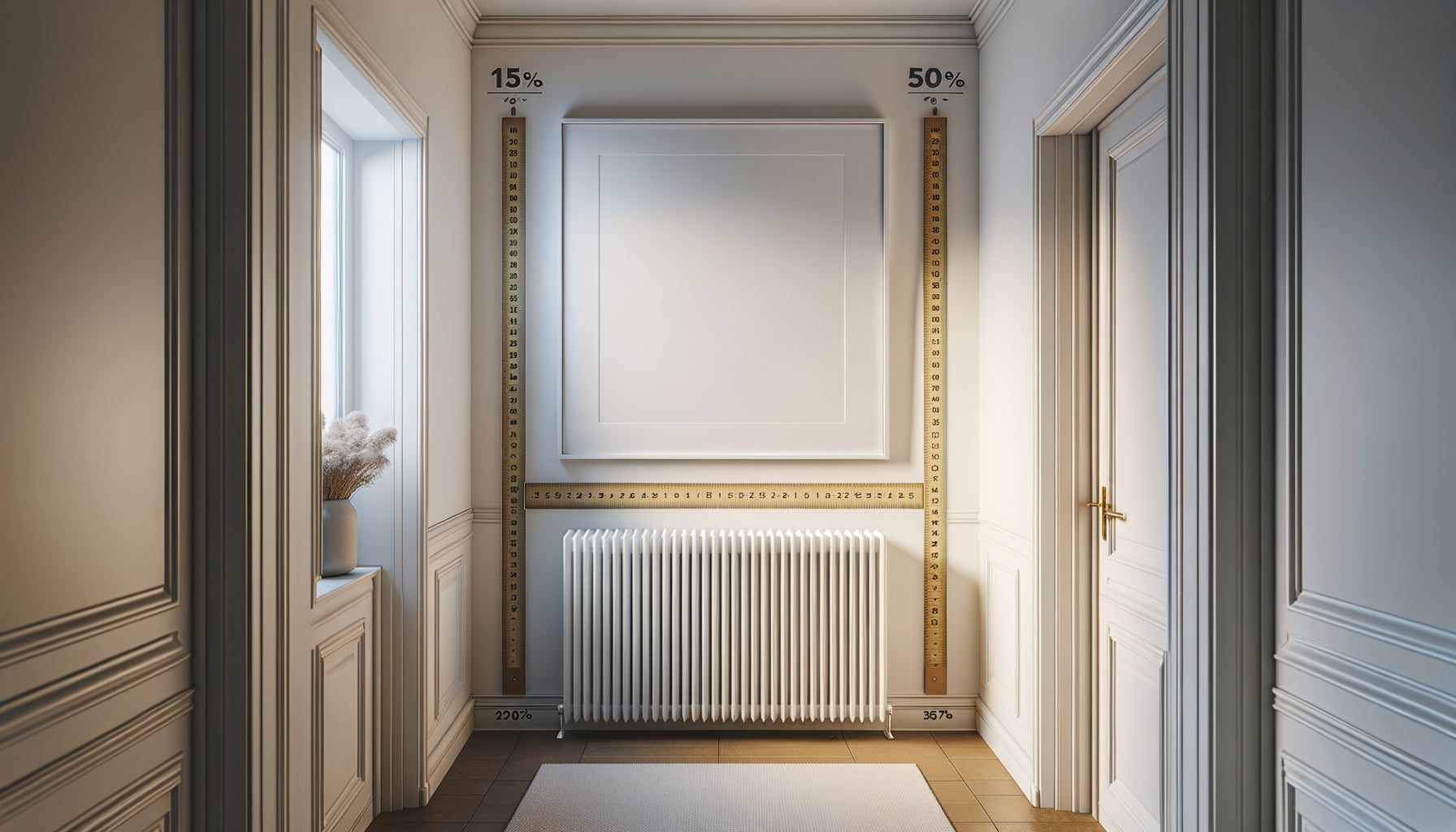
The standard height of the center of the artwork (between 1.50m and 1.60m from the floor) remains optimal for the chromatic effect on the perception of length. This position naturally corresponds to our main line of sight during circulation. An artwork hung too high (above 1.70m) loses spatial impact because our gaze captures it less instinctively. Too low (below 1.40m), it creates a visual break that can paradoxically segment the hallway. For a very long hallway that you want to shorten, consider hanging the artwork from the back slightly lower (1.45m): this reinforces the psychological feeling of proximity. The essential thing is that the artwork naturally fits into your field of vision when passing, without requiring a constraining upward or downward eye movement.