Three months ago, while visiting a new pediatric clinic in Brussels, I was struck by an unusual detail. As I accompanied my niece for a routine check-up, who usually clings to me as soon as she enters a medical office, she simply stopped in front of a painting. A large format depicting soap bubbles floating in a summer sky. "It's pretty," she said before calmly entering the examination room. That moment made me realize something fundamental: some artworks are not just hung in a medical environment, they are truly designed for it.
Here's what an artwork specifically designed for a medical environment brings: it reduces patient anxiety, it complies with strict hygiene standards, and it creates an atmosphere conducive to healing. Three characteristics that radically distinguish it from a classic decorative work of art.
The problem is that, faced with the multiplication of artistic proposals for medical offices, clinics and hospitals, it becomes difficult to distinguish a true creation thought for care from a simple aesthetic reproduction. How to recognize this crucial difference? What are the signs that do not deceive? I propose to discover together the criteria that transform an image into a therapeutic tool.
Soothing color palette: first indication of a medical design
During my consultations with healthcare facility directors, I always notice the same initial mistake: they choose artworks that they find "pretty" without considering the psychological impact of colors. An authentic artwork designed for a medical environment has a carefully elaborated color palette.
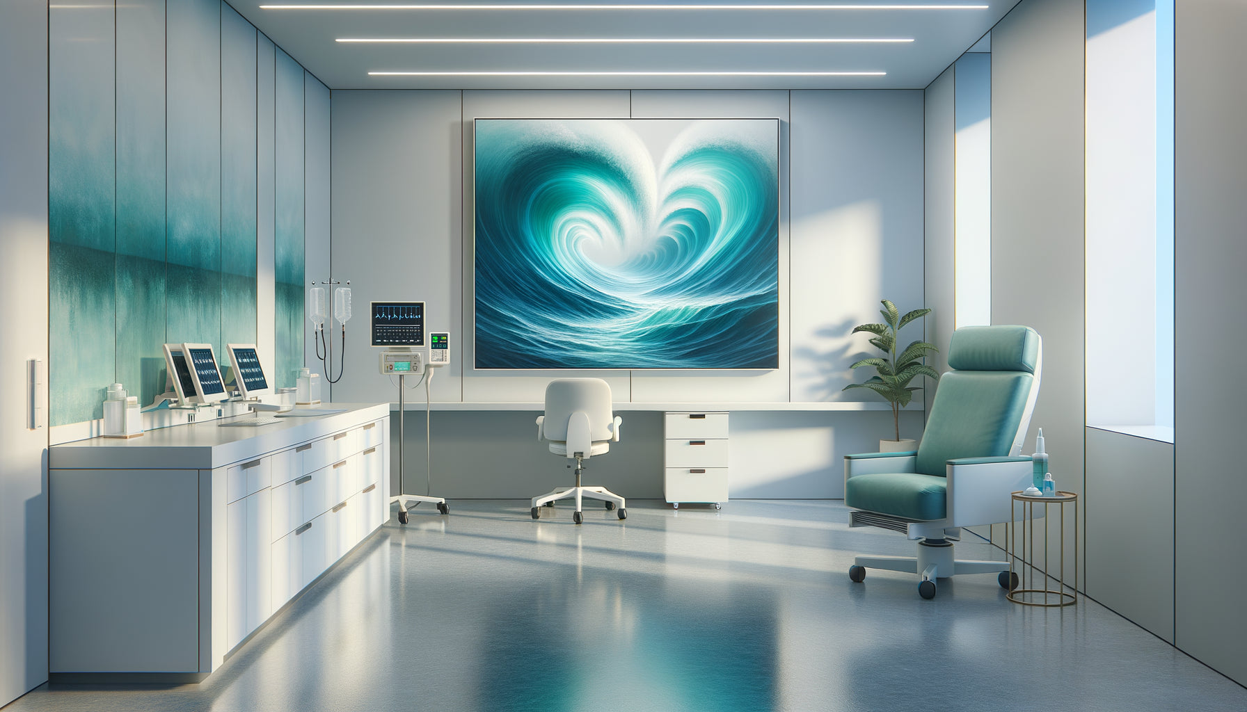
Dominant tones revolve around soothing blues, natural greens, neutral beiges and soft pastels. These shades are not an aesthetic coincidence: they correspond to the colors that, according to environmental psychology studies, reduce heart rate and blood pressure. Conversely, you will notice the almost systematic absence of bright red, aggressive orange or deep black – colors that activate stress responses.
In a cardiology clinic I recently accompanied, the doctor had initially chosen an abstract painting with red and orange tones, very dynamic. Beautiful in a living room, certainly, but totally counterproductive in a waiting room where patients already arrive in a state of cardiovascular anxiety. An artwork specifically designed for a medical environment would have favored cerulean blue gradients, evoking calm and serenity.
Total absence of anxiety-inducing elements: the golden rule of visual content
An absolute criterion for recognizing an artwork intended for the medical environment: its content contains no potentially stressful or ambiguous element. This seems obvious, but it is often overlooked.
Authentic creations for medical environments consistently avoid expressive faces (which can provoke anxious empathy), action scenes, dizzying perspectives, pointed or aggressive shapes, and of course any direct medical representation. Imagine a dental waiting room adorned with a still life depicting antique surgical instruments – as artistic as it may be, this work was not intended for its context.
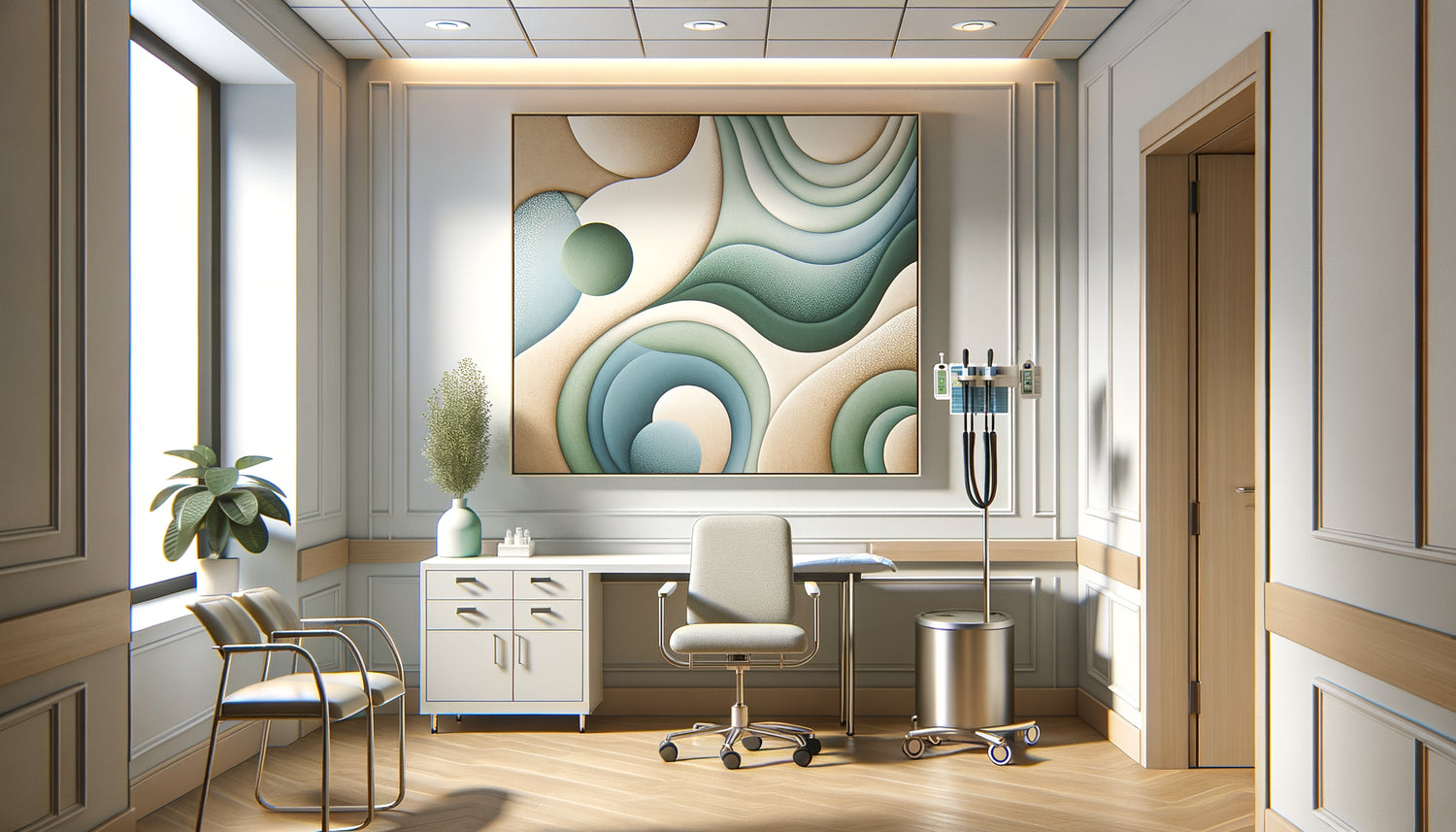
Preferred subjects in a true artwork for a medical environment include natural landscapes without human presence, gentle geometric compositions, stylized plant motifs, or flowing abstractions evoking water or sky. In a maternity ward where I regularly intervene, the works exclusively represent rounded organic shapes, enveloping curves – never sharp angles that could subconsciously evoke tension.
The prolonged contemplation test
Here is a simple criterion that I consistently use: a work designed for a medical environment should be able to be contemplated for 15 minutes without generating visual fatigue. No obsessive details that capture the gaze, no narrative complexity that requires mental resolution. Just a visual presence that accompanies without soliciting.

The technical specifications that betray medical use
Beyond aesthetics, a truly work designed for a medical environment is recognized by its specific technical characteristics. This is perhaps the most neglected aspect, but also the most revealing.
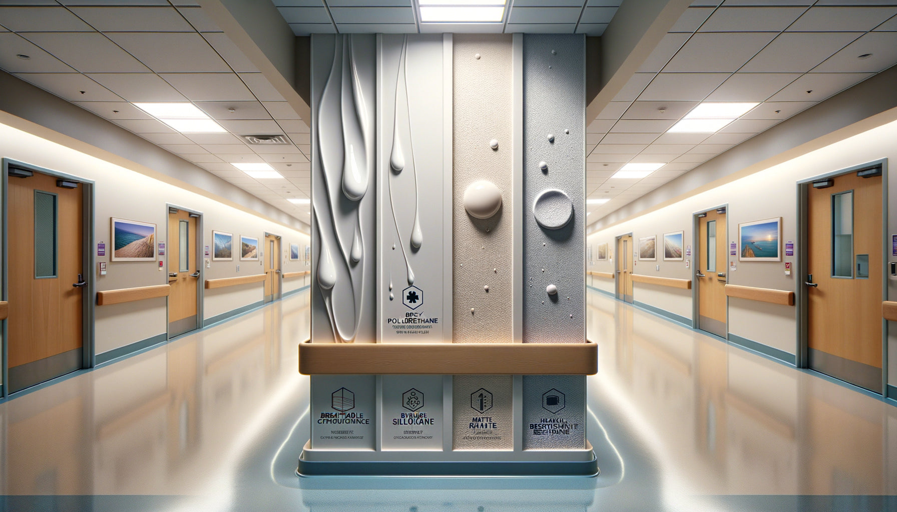
Firstly, the support. Tableaux for medical environments use washable and disinfectable materials. Forget traditional textile canvases that retain dust and bacteria. Authentic creations favor printing on aluminum dibond, medical plexiglass, or antimicrobial laminated supports. These materials allow regular cleaning with hospital disinfectants without alteration of the image.
Secondly, the framing. You will never find ornate frames with hard-to-reach recesses. Artwork for medical environments either has a complete absence of frame (mounted print), or smooth, ridgeless frames with rounded corners. I recently advised against a beautiful set of antique engravings framed under glass with complex gold moldings – impossible to clean properly, veritable breeding grounds for contamination.
Thirdly, the mounting. Hanging systems for medical environments are secure and fail-safe, often with reinforced wall fixings, particularly in pediatric or geriatric wards. A piece that simply has a hook on the back was not designed for the safety of a care setting.
The integrated therapeutic dimension from design
What fundamentally distinguishes an artwork designed for a medical environment is its initial therapeutic intention. It's not just decorative; it participates in the healing process.
In the most accomplished creations, you will discover visual elements that promote positive distraction: subtle details that emerge during prolonged contemplation, inviting the patient to a soothing visual exploration rather than anxious rumination. For example, in a piece I selected for an oncology department, the forest landscape progressively reveals variations in light, different vegetation textures, creating a meditative experience.
Some artwork for medical environments even integrates principles of chromotherapy or composition based on the golden ratio, aiming for visual harmony that resonates subconsciously with our natural perceptions of balance. This is not mysticism; it's the conscious application of research in neuroaesthetics.
Adaptation to the type of medical practice
A revealing characteristic: the artwork is adapted to the medical specialty. Creations for pediatric offices integrate a subtle playful dimension without infantilization. Those for geriatric services favor reassuring nostalgic scenes. Artwork for radiology centers opts for panoramic formats visible from a lying position.
I recently worked with an ophthalmology practice that had chosen artworks with too-low contrast – beautiful for a healthy eye, but frustrating for patients with visual impairments. An artwork truly designed for this medical environment would feature optimized contrasts and clearly defined shapes.

Certifications and quality processes: documented proof
An often unknown but decisive element: artworks authentically designed for medical environments come with precise technical documentation.
You should be able to obtain information on UV resistance (to prevent fading under intense medical lighting), material non-toxicity certifications (particularly crucial in pediatric or maternity wards), and recommended cleaning protocols. Some publishers even provide compatibility sheets with the main hospital disinfectants.
In the most demanding establishments, artworks for medical environments meet fire classification standards (M1 or equivalent), essential in public health facilities (Public Reception Establishments). A simple framed reproduction purchased from a decoration store will never offer these guarantees.
Transform your care space into a haven of serenity
Discover our exclusive collection of Wall art for medical offices that combines soothing aesthetics, strict hygiene standards and authentic therapeutic dimension.
Consistency with medical architecture and lighting
Last revealing criterion: a work specifically designed for a medical environment anticipates the particular exposure conditions of these spaces.
Medical clinics and hospitals often use cold spectrum lighting (high color temperature) for diagnostic accuracy reasons. An authentic artwork for this purpose is calibrated to reveal its nuances under this type of lighting, unlike classic works optimized for warm domestic light.
Similarly, these creations take into account the typical contemplation times: a few minutes in a waiting room, long minutes immobile in an examination or treatment room. Their visual composition adapts to these variable durations, offering a satisfying experience both during a quick glance and prolonged observation.
In a dialysis center where I work, patients spend several hours facing the same walls. The works we have selected offer a gradual visual richness: they do not reveal everything immediately, allowing for new discoveries with each session, thus avoiding fatigue.
Imagine your care space transformed
Recognizing a work truly designed for a medical environment means identifying a creation that reconciles aesthetics and therapeutic function. It is choosing a visual presence that quietly works to improve the well-being of your patients, day after day.
Imagine your patients who, instead of arriving tense and anxiously staring at their phone, look up at a soothing composition that slows their breathing. Visualize this child who, instead of crying at the thought of the consultation, is absorbed by the nuances of a dreamlike landscape. Think of this elderly person whose face relaxes imperceptibly in front of a familiar and reassuring scene.
The next time you consider dressing the walls of your clinic or healthcare facility, ask yourself these questions: does this work truly soothe? Can it be disinfected? Does it avoid any anxiety-provoking elements? Is it designed for my medical lighting? If you answer yes to these questions, you probably hold a true creation for a medical environment – not just decoration, but a therapeutic tool in its own right.
FAQ
Can I use any artwork in my medical office?
Technically yes, but that would be missing the main point. A work not specifically designed for a medical environment can certainly beautify your space, but it will not actively participate in the psychological comfort of your patients. Even more problematic, some works can unintentionally generate stress: aggressive colors, ambiguous subjects, unbalanced compositions. Not to mention practical hygiene issues – a classic textile canvas accumulates dust and allergens, and does not withstand medical cleaning protocols. If your priority is the well-being of your patients and compliance with health standards, prioritize creations authentically designed for care. They sometimes cost slightly more, but their impact on patient experience and durability over time largely justify this investment.
How to check that a work respects hygiene standards for a medical environment?
Excellent question that too few practitioners ask! Start by requesting a detailed technical sheet from the supplier listing the materials used. A work suitable for a medical environment must have a non-porous support (aluminum, plexiglass, rigid PVC) that can withstand common hospital disinfectants. Explicitly ask if the artwork can be cleaned with 70% alcohol, diluted bleach or disinfectant wipes – and demand this information in writing. Also check for the absence of complex frames with inaccessible corners. Ideally, the work should have a completely smooth surface and sealed edges. For establishments subject to strict regulations (clinics, hospitals), also check the fire rating and any antimicrobial certifications. A serious seller of creations for medical environments will spontaneously provide this information – if you have to pry it out of them, it's probably because the artwork was not designed for that specific use.
Are artworks for medical environments necessarily bland or impersonal?
This is a tenacious but totally unfounded prejudice! Confusing 'soothing' with 'boring' is a common mistake. The best creations for medical environments manage to be both serene and visually captivating. They use subtlety rather than aggression, contemplation rather than excessive stimulation – but this does not imply blandness. Personally, I have seen abstract compositions for waiting rooms that were true works of art, with sophisticated gradients, rich textures, fascinating depth. The constraint of soothing actually stimulates creativity: how to captivate without stressing? How to create visual interest without aggression? Artists and publishers specializing in medical environments meet this challenge brilliantly. Your practice can absolutely reflect your personality and visual identity while respecting the principles of a therapeutic work. It's even the ideal: a care space that is both professional, reassuring and bearing your unique aesthetic signature.