The office was perfect. Walnut desk, ergonomic armchairs, wall bookcase. Yet, my clients always seemed defensive during initial consultations. A friend who is an architect asked me a simple question: “What does your space communicate before you even speak?” I then realized that my white and empty walls created an invisible tension. It was by incorporating a painting with soothing hues that everything changed.
Here's what a painting with a blue or gray palette brings to your professional space: it reduces the perceptible tension during sensitive exchanges, it strengthens your credibility through thoughtful aesthetics, and it creates an atmosphere conducive to concentration and trust. Many professionals hesitate between these two colors, fearing creating a cold or impersonal environment. Yet, when used judiciously, these shades become your best allies. In the lines that follow, I reveal how to choose the perfect tone to transform your office into a place where serenity rhymes with professionalism.
Why blue and gray dominate demanding professional spaces
In environments where important decisions are made, color is never insignificant. Blue has a fascinating neurological peculiarity: it slightly slows heart rate and promotes serotonin production. This is why negotiation rooms and medical offices instinctively adopt it. A painting with a blue hue sends a subliminal message of stability and reliability.
Gray, for its part, embodies intellectual neutrality. Contrary to popular belief, it is not dull: there are dozens of shades, from light pearl gray to deep anthracite gray. In a professional space, a painting with gray tones creates an effect of mental pause. It allows the eye to rest without distraction, while bringing contemporary sophistication. I have noticed that clients facing a structured gray painting speak more freely, as if the chromatic neutrality allowed them to express their concerns without judgment.
The psychology of cool tones in a professional context
Behavioral design research reveals that cool tones reduce perceived aggression in exchanges. A painting with a blue hue placed within the field of vision of an anxious client acts as an emotional regulator. Gray, for its part, functions as an attention modulator: it does not capture the gaze intrusively, but offers a soothing visual anchor during moments of intense reflection.
Deep blue or light blue: decoding shades for your ambiance
Not all blues are created equal. A navy or midnight blue on a wall art piece brings a quiet authority, ideal for a law firm or boardroom. This tone evokes depth, strategic thinking, mastery. I've seen it radically transform the atmosphere of executive offices, replacing institutional coldness with reassuring elegance.
Conversely, a celadon or glacier blue infuses a welcome lightness into spaces where creativity must coexist with professionalism. These light shades work wonderfully in architecture firms, design studios, or therapy rooms. A piece with these nuances brings visual breathing room without compromising the seriousness of the environment. The trick is to observe your natural lighting: the brighter your room, the more you can afford a deep blue without darkening the space.
Blue-Gray: The Perfect Compromise
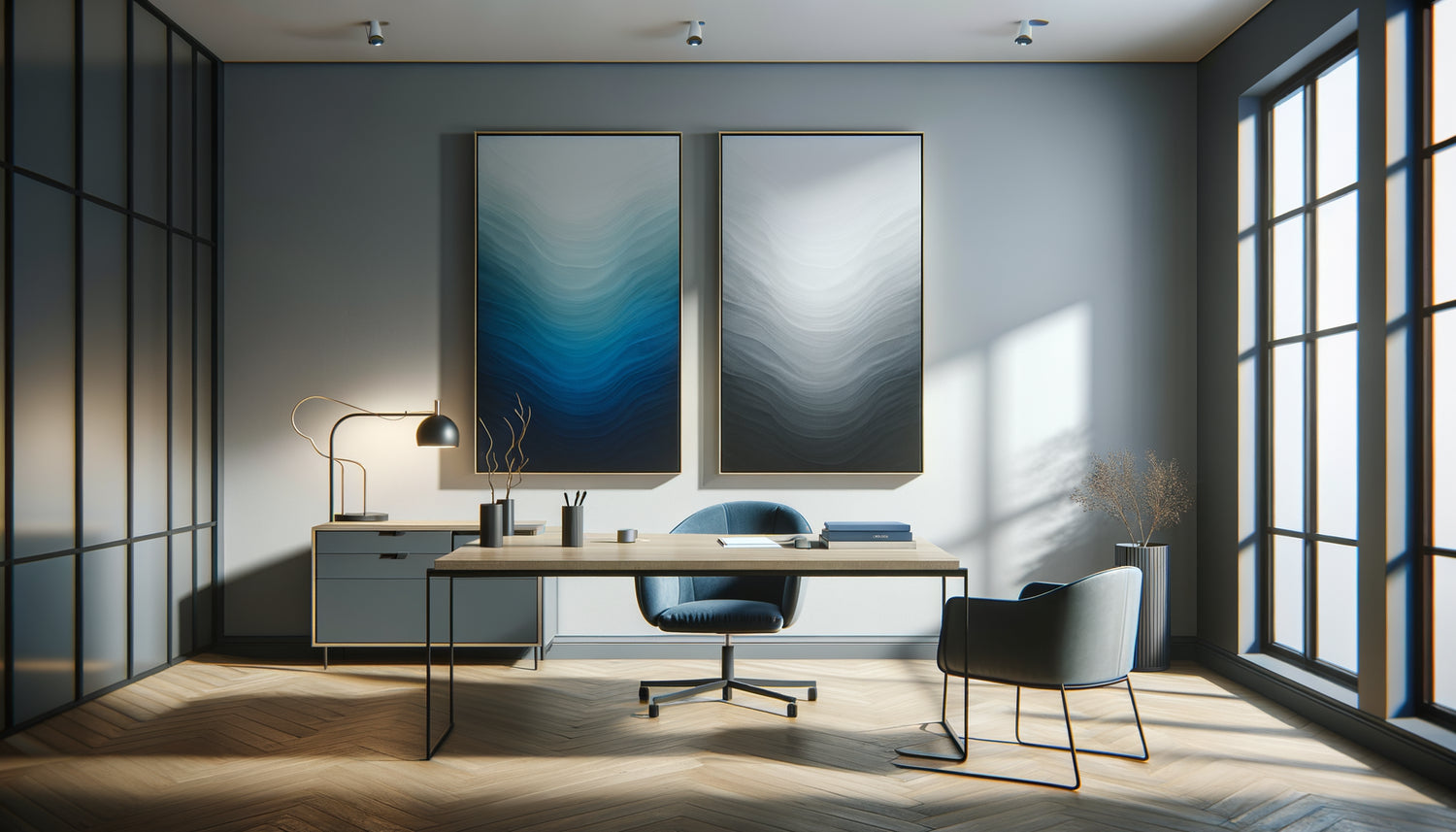
There's a fascinating family of hybrid shades: blue-grays. A piece playing on these tones combines the soothing virtues of blue and the neutrality of gray. This chromatic ambiguity creates subtle depth that avoids the pitfall of an overly cold space. I installed a large abstract blue-gray artwork in a medical waiting room: patients spontaneously reported feeling less anxious, without being able to pinpoint why.

The Different Personalities of Gray in Professional Art
Gray possesses a versatility that few colors can claim. A warm gray, slightly tinted with beige or taupe, instantly humanizes a modern office. A piece with these shades creates a professional cocoon where rigor does not sacrifice conviviality. These tones work particularly well in HR departments or consulting firms, where listening is paramount.
A cold gray, tending towards silver or graphite, asserts uncompromising modernity. A piece dominated by cool gray makes a statement in tech environments, startups, or communication agencies. This tone conveys innovation, precision, and efficiency. It creates a calming atmosphere not through softness, but through clarity: it eliminates visual clutter and aids concentration.
Anthracite Gray for Gentle Authority
A personal discovery: charcoal gray in a painting creates a powerful presence without aggression. Unlike black, which can seem intimidating, this deep shade offers reassuring gravity. In my own office, an abstract painting with charcoal gray and silver textures has become the focal point that structures the entire room. Visitors consistently notice it, and this initial attention defuses the usual tension of first exchanges.
How to choose between blue and gray according to your profession
Your profession partly dictates the ideal palette. Legal professions particularly benefit from deep blues and charcoal grays: these colors evoke rigor, confidentiality, protection. A painting with these dominant tones subconsciously reinforces the perception of competence and discretion.
For consulting and support businesses, prioritize mid-tone blues and warm grays. A painting with these shades creates an atmosphere of openness and listening. I have noticed that clients confide more easily in an environment where colors are neither too authoritarian nor too neutral.
Creative environments (agencies, studios) can dare to mix: a painting combining bright blue and pearl gray creates a visually stimulating dynamic while preserving a soothing base. This combination promotes innovation without veering into visual chaos.
The professional intention test
Ask yourself this question: what emotion do you want to evoke in the first seconds in your space? If it's trust, opt for a painting with blue dominance. If it’s serenity, gray prevails. If it’s a balance between professionalism and accessibility, blue-gray combinations are your ally.

The art of composing with your existing environment
A painting never lives alone. It dialogues with your furniture, your lighting, your materials. A dark wood office calls for a painting with warm grays to avoid a too massive effect. Contemporary metal and glass furniture harmonizes beautifully with cool blues and silver grays.
Lighting radically transforms the perception of colors. A painting with a blue hue under cold LED lighting can appear glacial, while the same painting under warm light reveals unsuspected depths. My advice: always test the tone of your painting at different times of the day. A pearly gray that is bright in the morning can become taupe gray in the late afternoon, subtly changing the ambiance of your space.
The rule of chromatic proportions
If your walls are already colored, a painting with a gray hue acts as a visual neutralizer that balances the whole. On white or beige walls, a blue painting instantly becomes the emotional anchor point of the room. The common mistake? Multiplying sources of strong color. A single well-chosen painting in blues or grays is enough to define the entire professional atmosphere.
Mistakes to avoid when selecting
The first mistake is to choose a painting solely for its size, neglecting its chromatic density. A large light gray painting can visually disappear on a white wall. Conversely, a small intense blue painting poorly positioned creates an imbalance. The right approach? Start by defining the desired emotional intensity, then adjust the dimension.
Second trap: confusing soothing and monotony. A completely uniform gray painting risks flattening the space. Look for works with tonal variations, textures, superimpositions. These subtleties create a depth that maintains visual interest without breaking the sought-after calm.
Third mistake: ignoring the frame. A soothing painting in a baroque gilded frame creates cognitive dissonance. For blue and gray hues, prioritize thin brushed metal frames, natural wood or even the absence of a frame for contemporary canvases. The simplicity of the container amplifies the power of the content.
Ready to transform your professional space into a place of serene authority?
Discover our exclusive collection of paintings for Law Firms that combine chromatic sophistication and measured psychological impact.
You are now facing an informed choice. Imagine your next client stepping into your office, their gaze caught for a few seconds by this painting with blue or gray hues. Before any words are exchanged, a silent communication takes place:
The gesture is simple: identify the strategic wall of your space, the one that your interlocutors see first or during exchanges. This is where your artwork will find its most powerful function. Don't wait for a complete renovation or move. A single well-chosen artwork is enough to recalibrate an entire atmosphere. Blue and gray colors are not just decorative options: they are professional tools in service of your relationship goals.
FAQ: Your questions about calming professional artworks
Will a blue or gray artwork make my office too cold?
This is the most common concern, and it's legitimate. The key lies in the choice of shade and balance with warm materials. A deep blue paired with a wooden desk, a textile rug, or plants creates a warm contrast. Taupe gray or warm gray naturally has a softness that avoids a clinical effect. The trick is also to choose an artwork with visible textures: exposed brushstrokes, layering of material, tonal variations. These details humanize the cool color. Finally, your lighting makes all the difference: prioritize warm light sources (2700-3000K) that reveal the warm undertones even in blues and grays. I've seen entirely gray spaces become welcoming simply by changing the temperature of the bulbs.
What size artwork should I choose for a small office?
The ideal size depends less on the surface area than on the viewing distance. In a small office, your visitors are often close to the wall: an artwork that is too large overwhelms them. The rule of thumb: your artwork should occupy about 60-75% of the width of the furniture it surmounts (desk, console, bookcase). For an empty wall, aim for a width representing one third to half of the wall's width. In small spaces, I often recommend a vertical format with blue or gray dominance: it creates an illusion of height that visually enlarges the room. An artwork measuring 60x80 cm works wonderfully in an office of 10-12 m². The common mistake? Multiplying small artworks, creating a visually exhausting fragmentation. A single structuring artwork calms better than three scattered ones.
Can I combine blue and gray in the same artwork?
Not only can you, but it's often the most sophisticated choice! Paintings combining blue and gray create a subtle chromatic richness that avoids monotony without creating distraction. This combination also offers great versatility: it harmonizes with almost all professional environments. Look for works where these colors blend gradually rather than brutal contrasts. An abstract painting with petrol blue gradients to anthracite gray creates a hypnotic depth particularly effective in reflective spaces. Contemporary artists excel at these blends: some even add discreet touches of white or beige that warm the whole without breaking the soothing harmony. If you are hesitating between blue and gray, choose this middle path: you will benefit from the psychological virtues of both shades.