You know, that moment when you stare at the ceiling, your mind agitated by a thousand thoughts that refuse to dissolve. The numbers on the alarm clock tick by relentlessly, and sleep seems to drift further away with each minute. We've all experienced those sleepless nights where our bedroom, meant to be a sanctuary of rest, seems to conspire against our vital need for sleep. What if the solution lay in what you look at before closing your eyes?
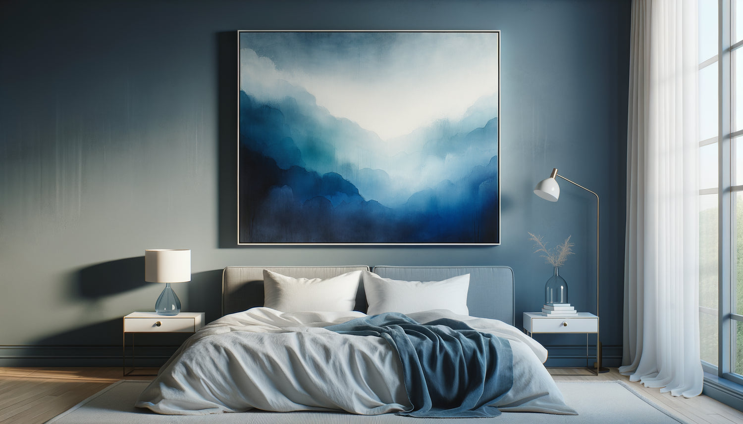
Here’s what a calming blue-dominant painting can transform in your bedroom: it naturally slows your heart rate, lowers your blood pressure by several points, and prepares your brain to produce melatonin, the hormone of sleep. No electronic gadget, no medication – just the ancestral science of colors at the service of your nights.
The frustration is real: you’ve tried essential oils, invested in an orthopedic mattress, banned screens an hour before bed. Yet, your bedroom itself might sabotage all those efforts if its visual elements don't speak the language of rest. White and bare walls create a coldness that keeps the mind alert. Warm and vibrant colors stimulate when you are seeking to soothe yourself.
Rest assured: transforming your bedroom into a cocoon conducive to falling asleep doesn’t require either pharaonic works or an excessive budget. A single strategically chosen element – a painting with a blue dominant – can reorient all the energy of your nocturnal space. I guide you towards the exact shades that dialogue with your nervous system to invite it to let go.
The symphony of blues: understanding their effect on your nighttime biology
Not all blues are equal when it comes to sleep. Some tones energize, others soothe, and a few possess this rare power to slow down time itself in your perception. When I compose with pigments, I distinguish three families of blues with radically different properties.
Cerulean blue, that luminous shade reminiscent of midday sky, contains too much energy for a bedroom. It stimulates creativity and concentration – perfect for an office, disastrous for falling asleep. Your brain subconsciously associates it with daytime activity, keeping your arousal circuits on alert.
Prussian blue, dark and deep, creates a meditative atmosphere but can tip into melancholy. Too saturated, it absorbs light to the point of creating atmospheric heaviness. A few touches work as accents, but a total dominant risks oppressing rather than soothing.
Between these two extremes lies the gold zone of calming blues: medium to low saturation shades, those that evoke twilight, morning mist on a lake, the sky just after sunset. These nuances contain enough gray to soften their intensity, enough blue to activate calm receptors in your visual system.
The science behind the calming power of blue
Studies conducted by chronobiologists have precisely measured the impact of different wavelengths on the production of cortisol and melatonin. Blues in the range of 470-490 nanometers – those we perceive as soft and slightly grayish – reduce cortisol (stress hormone) by an average of 11% after only 8 minutes of passive visual exposure.
Your artwork with a blue hue thus becomes a tool for biological regulation. When your gaze rests on these shades before sleep, your photoreceptors send specific signals to your hypothalamus, that region of the brain which orchestrates your circadian rhythms. The message is clear: day declines, body can slow down.
The five shades of blue that converse with your sleep
After years of observing how colors influence the atmosphere of a space, I have identified five blues particularly effective in promoting sleep. Each has its own personality and appeals to a different sensitivity.
Pearl gray blue comes out on top for its universality. Imagine that faded blue of denim shirts after one hundred washes, this textile softness that makes you want to snuggle up. On a painting, this shade creates a discreet but comforting presence. It adapts to all styles of decoration, from minimalist Scandinavian interiors to more eclectic bedrooms. Its low saturation makes it invisible to tired eyes – you no longer consciously notice it, but it continues its soothing work in the background.
Slate blue, more assertive, suits personalities who need structure even in rest. This shade evokes Parisian roofs under the rain, pebbles polished by the sea. A painting with this dominant blue visually anchors the space, creating a stable focal point that reassures anxious minds. However, be sure to balance it with light textiles to avoid an atmosphere that is too dense.
Glacier blue, this cool shade with almost white reflections, works wonderfully in south-facing bedrooms. Its visual coolness compensates for the natural warmth of the light, creating a balanced chromatic temperature. On canvas, subtle variations in this shade recall ice formations, Nordic winter skies – landscapes that naturally invite slowing down.
Celadon blue, with its green undertones, establishes a bridge between aquatic serenity and vegetal softness. This rare hue has an almost liquid quality that seems to absorb tension. A painting in these tones evokes antique porcelains, the shallow waters of lagoons – visual references universally associated with tranquility.
Finally, softened indigo blue – not the pure and vibrant pigment, but its desaturated, almost hazy version – creates a meditative depth. This shade works particularly well in large format, where its tonal variations can unfold like a night sky before total darkness. It contains just enough darkness to evoke the night without creating heaviness.

Beyond Color: Composition and Movement for Calm
The shade of blue is only the first half of the equation. The way this color is orchestrated on the canvas determines whether your favorite painting will promote sleep or maintain subtle visual stimulation.
Horizontal compositions consistently outperform vertical compositions in inducing calm. Our brains associate horizontal lines with rest (lying position, natural horizon), while verticals evoke activity and effort against gravity. A seascape with a blue hue, geological strata, stretched clouds – these horizontal motifs slow down the eye movement, inviting it to glide laterally rather than actively explore.
The degree of abstraction also plays a crucial role. Representations that are too figurative – a portrait, a complex narrative scene – activate the language and interpretation areas of the brain. Your mind goes into problem-solving mode: who is this person, what's happening, what's the story? Conversely, total abstraction can create slight anxiety in some people who desperately seek meaning, an anchor.
The ideal zone lies in suggestive abstraction: forms that evoke without describing, textures that recall water, sky, mist without representing them explicitly. Your blue-dominant painting then becomes a support for gentle projection, where your imagination wanders effortlessly and tensionlessly.
Texture as a Tactile Invitation to Rest
Even if you never touch your painting, its visual texture influences your physical state. Smooth and glossy surfaces create distance, a coolness that can maintain subtle alertness. Organic textures – visible brushstrokes, glazes layering, variations in material – invite sensory relaxation.
When I work on a piece intended for a bedroom, I incorporate almost imperceptible tonal variations, these modulations of blue that create a discreet life on the canvas. Under the changing lighting from morning to evening, the painting reveals different nuances, but always within this restricted and consistent palette that secures rather than surprises.
Strategic Placement: Where to Hang Your Blue Painting to Maximize Its Effect
The perfect hue loses its effectiveness if the artwork is positioned in the wrong place. Your bedroom has areas of high visual load and others more neutral – understanding this mapping makes all the difference.
Facing the bed, slightly above eye level when lying down: this is the premium location. When you settle down to sleep, your gaze naturally falls on this area before closing your eyes. The artwork with a blue dominant becomes the last conscious image your brain records – a visual imprint that infuses your transition into sleep.
Avoid the wall behind the headboard. Functional in design, this location is invisible from the bed and only serves when you are not in the room. Focus your visual investment where you will truly benefit from it.
If your bedroom has a reading or meditation corner, a second artwork in similar tones creates a chromatic consistency that unifies the space. This repetition of soothing blue reinforces the message: this entire room is dedicated to rest, not just the bed.
Be careful of direct sunlight which could create disturbing reflections or, worse, degrade the pigments over time. Blues are particularly photosensitive. A location benefiting from indirect natural light reveals subtle nuances without attacking them.

Harmonize your artwork with the chromatic ecosystem of the bedroom
Your artwork with a blue dominant does not float in a vacuum – it dialogues with your walls, your bedding, your curtains, your furniture. This chromatic conversation should also promote relaxation.
White or off-white walls create the perfect contrast, allowing the blue to deploy all its depth without competition. White reflects light, maintaining overall brightness even with medium to dark blue tones.
Pearl gray or greige walls (this subtle blend of gray and beige) envelops the blue in a soft, felt-like softness. This combination creates a particularly effective cocoon atmosphere for people sensitive to visual stimulation.
Absolutely avoid walls in pronounced warm tones – terracotta, yellow, orange. The thermal conflict between your blue artwork and a warm environment creates a visual tension that, even unconsciously, disrupts rest. If you like these colors, reserve them for daytime spaces.
For bedding, three strategies work: monochrome (variations of blue from light to medium), soft contrast (pure white or natural linen), or analogous harmony (blue-green, blue-gray). Test what resonates with your personal sensibility, but always maintain a restricted palette – no more than three colors in a bedroom.
Materials that amplify the soothing effect
The frame of your artwork deserves attention. Light woods (bleached oak, ash, maple) extend the visual softness of blue. Brushed metals in silver or champagne tones add a touch of refinement without creating harsh glare. Avoid yellows too golden or blacks too sharp that would break the soothing harmony.
The textiles in the bedroom – curtains, rugs, cushions – benefit from incorporating natural materials with soft textures: washed linen, organic cotton, merino wool. These materials subtly absorb light and sound, creating a sensory environment consistent with the visual message of your artwork.
Transform your children's nights into serene journeys
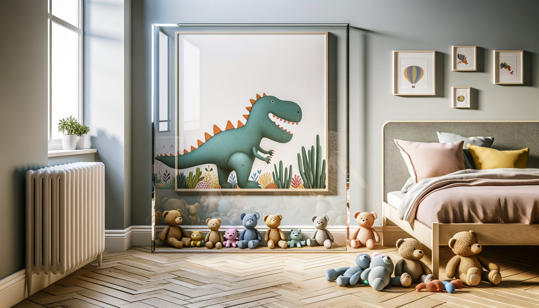
Discover our exclusive collection of wall art for kids' rooms that gently guide towards restful sleep thanks to their soothing palettes.
Ritualize the gaze: integrate your artwork into a sleep protocol
The most perfectly chosen object remains inert without intention. Your blue-dominant artwork gains power when it is integrated into a conscious ritual of preparation for sleep.
Ten minutes before turning off, settle comfortably in your bed, lights dimmed, and allow yourself a moment of silent contemplation. Let your gaze rest on the artwork without seeking to analyze, interpret or judge. Simply observe the variations of blue, tonal transitions, how light plays on the surface.
This practice, which therapists call visual anchoring, creates a powerful neurological association: this artwork = transition to sleep. After a few weeks of repetition, simply looking at this image will automatically trigger a cascade of relaxation responses in your body.
You can accompany this moment with conscious breathing: inhale on a count of four, hold for four counts, exhale on six counts, and hold lungs empty for two counts. Repeat while contemplating the blue nuances. This synchronization of visual and respiratory amplifies the soothing effect considerably.
For children, this ritual takes on a magical dimension. Invite them to tell you what they see in the abstract shapes of the artwork: clouds, waves, distant mountains. This narrative projection diverts them from anxious thoughts and guides them towards a state of reverie conducive to sleep.
When transformation occurs: signs that your artwork is working
The first changes are subtle, almost imperceptible. You probably won't fall asleep faster the first night. But after a few days, you may notice that your thoughts wander less during those crucial minutes between turning off the light and falling asleep.
Your breathing naturally becomes deeper, your jaw relaxes without you thinking about it, your shoulders drop on their own. These micro-physical adjustments signal that your nervous system is switching to parasympathetic mode – the rest and digestion state, opposite of the fight-or-flight mode.
After two to three weeks, the association becomes stronger. Simply entering your bedroom and seeing the blue-dominant artwork can trigger a conditioned relaxation response. Your brain recognizes the environment and prepares the physiological ground for sleep to come.
Some also note an improvement in sleep quality: fewer nighttime awakenings, more peaceful dreams, a feeling of deeper rest upon waking. These benefits testify to a sleep that regularly traverses deep cycles, thanks to an environment that does not disrupt these delicate phases.
Visualize this moment: you slip under your sheets, your body instantly finds its favorite position, your gaze naturally rests on the blue-toned artwork that has become like a benevolent presence. Your breathing slows down by itself, your eyelids become heavy, and this transition once laborious to sleep now happens with natural fluidity. Tomorrow morning, you will wake up rested, ready to greet the day, knowing that your nocturnal sanctuary awaits you for the next night. Choosing the right blue-dominant artwork is not a decorative detail – it's investing in the quality of nearly one third of your life.
Frequently Asked Questions
Can a blue artwork really improve my sleep or is it just psychological?
The distinction between physiological and psychological loses its relevance here, as the two systems are intimately linked. Yes, the effect begins in your perception – but this perception triggers measurable hormonal responses. Chronobiological studies show that exposure to certain blue wavelengths (mid-tones and desaturated hues, not the electric blues of screens) actually influences melatonin production and cortisol reduction. It's not a miracle cure that will instantly knock you out, but an element of a sleep-friendly ecosystem. Think of it like the temperature in your bedroom: no one claims that a room at 18°C will directly put you to sleep, but it creates optimal conditions for your body to lower its core temperature, a necessary signal for falling asleep. The blue artwork works on the same principle: it creates favorable visual and emotional conditions.
What size artwork should I choose for a 12m² bedroom?
The ideal size depends less on the floor area than on the viewing distance. From your bed, the artwork should occupy approximately 15 to 25 degrees of your field of vision – present enough to create a focal point, but not so imposing that it aggressively dominates the space. For a standard bedroom where you are 2.5-3 meters from the wall, this generally corresponds to a format between 60x80 cm and 80x100 cm. If your room is small and the bed is close to the wall, opt for the smaller size to avoid a feeling of being overwhelmed. A practical tip: cut out a rectangle of cardboard with the dimensions you are considering and temporarily attach it to the wall. Live with it for a few days, observe it from different positions in bed. This simulation will give you a much more reliable certainty than any theoretical rule. Remember that an artwork with calming blue tones can afford to be slightly larger than a work with bright colors, as its chromatic discretion makes it less visually intrusive.
I am a tenant and cannot repaint my walls orange, will blue work anyway?
Delicate situation, I won't lie to you: an orange wall creates a thermal conflict with a blue painting that diminishes the soothing effect of both. But solutions exist before giving up. First, check your lease – many contracts allow temporary paintwork on condition of restoring the original color when leaving. Repainting a single wall (the one facing the bed) white or very light gray could be your best health investment of the year, and costs less than €50 in materials. If that's really impossible, create a zone of chromatic neutrality: hang a large fabric (white linen, ecru cotton) on the orange wall, creating a neutral background for your blue painting. Yes, it’s less elegant, but infinitely more effective for sleep than a blue fighting an orange. Another option: focus on your bedding, curtains and textiles to create an immediate blue/neutral envelope around the bed, reducing the visual presence of the orange. The chromatic environment counts, but your immediate rest area counts even more.