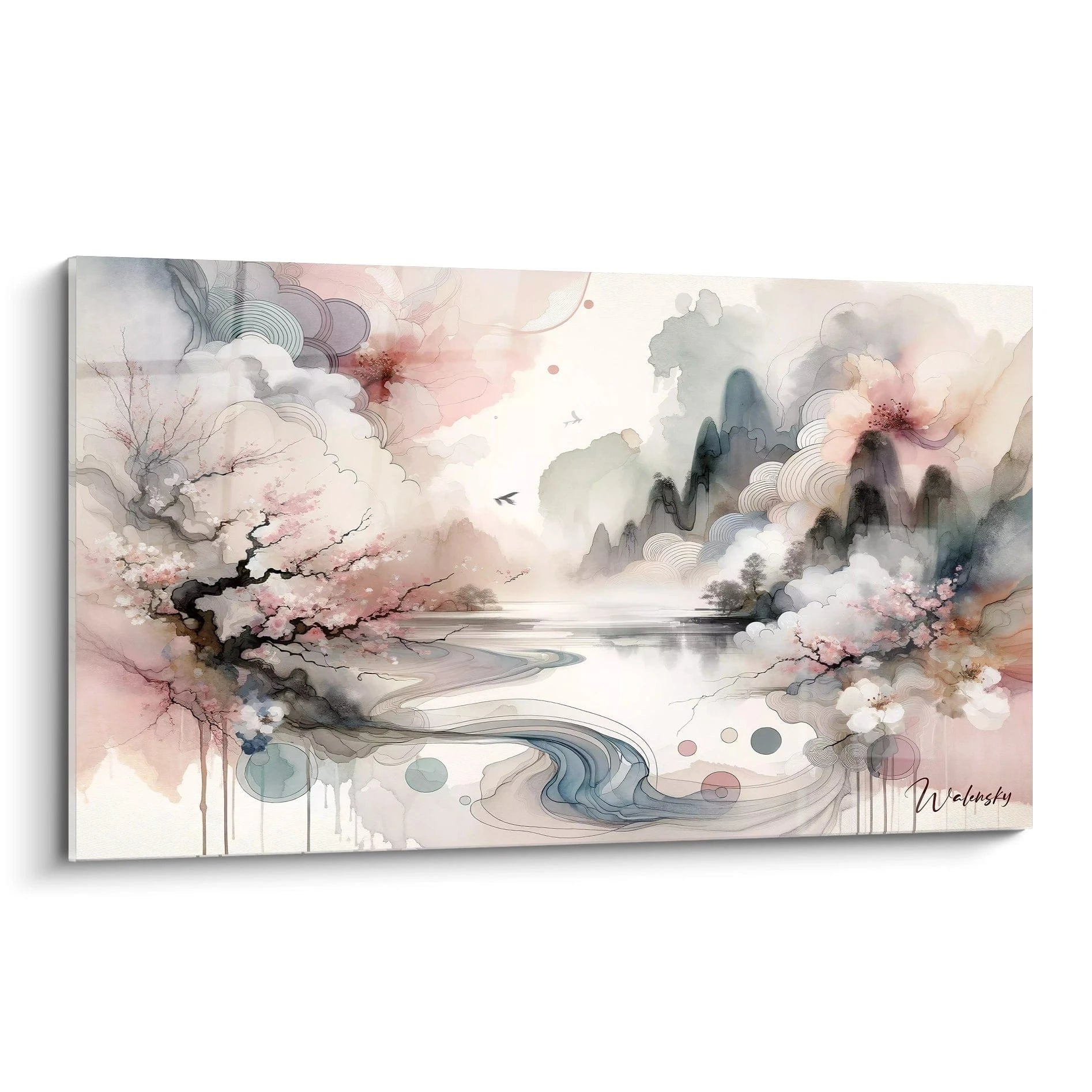
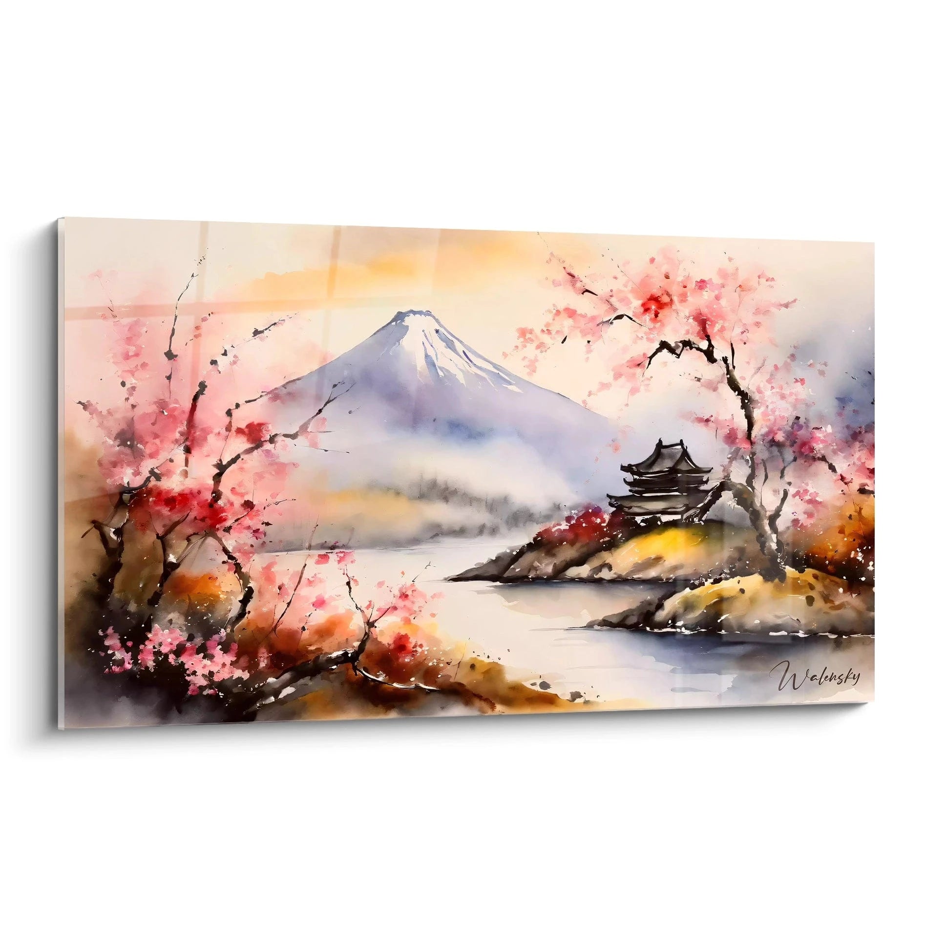
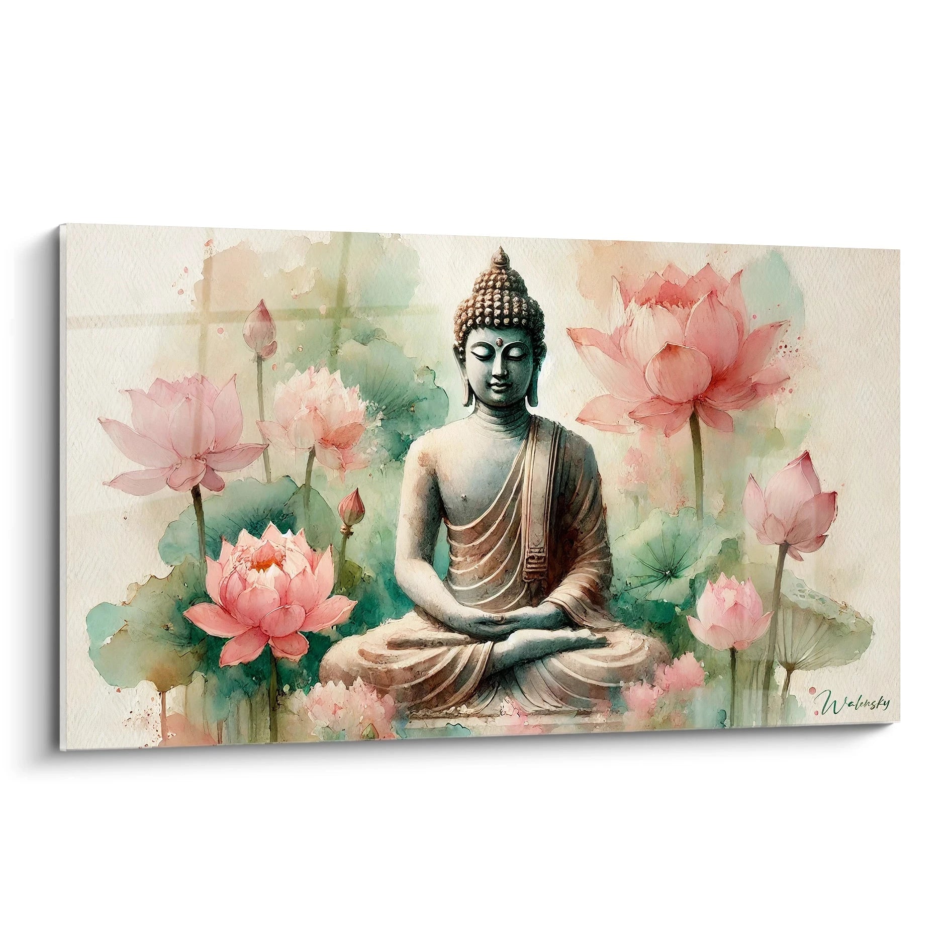
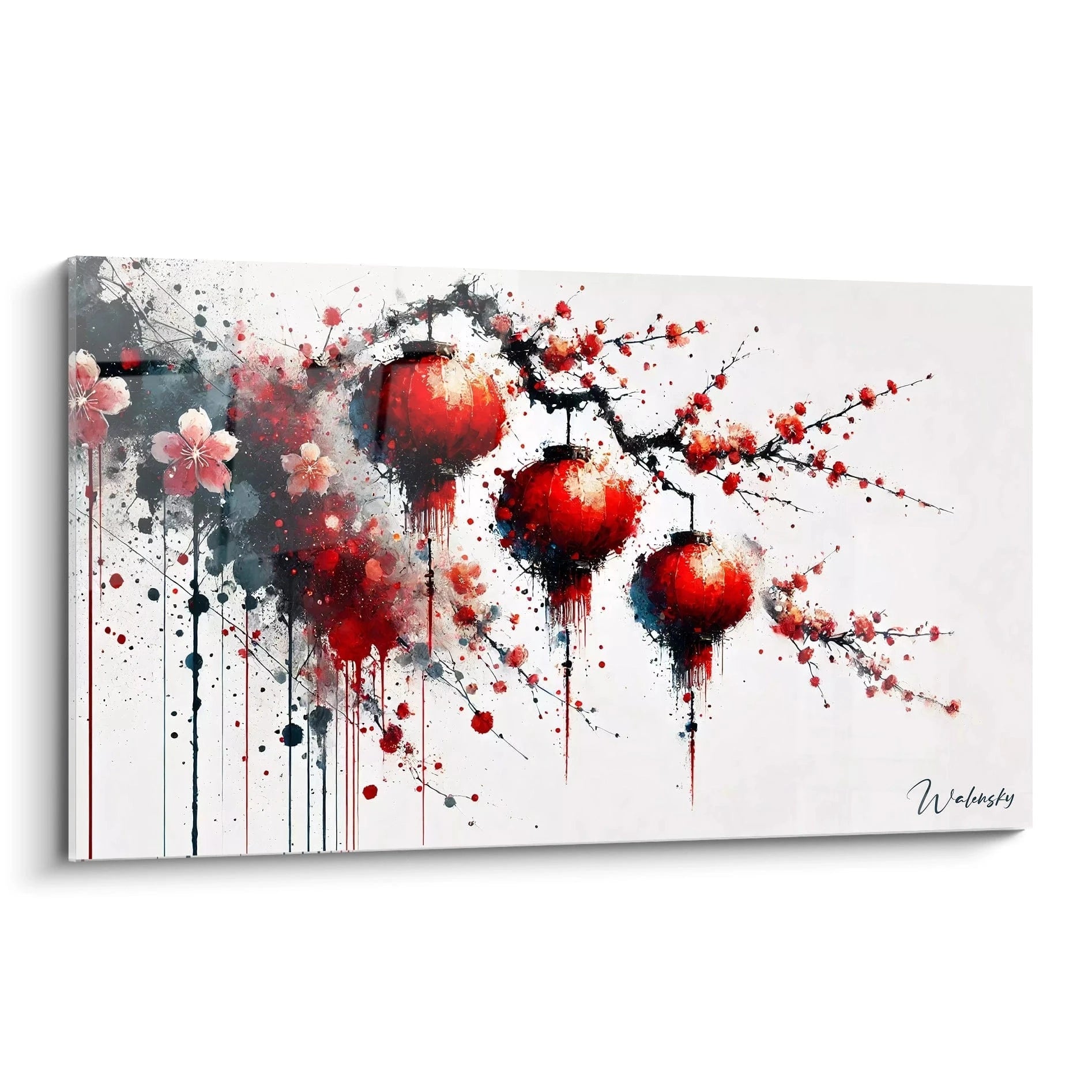
A watercolor painting for medical office radically transforms the clinical atmosphere by creating a soothing environment for anxious patients. Large panoramic formats allow you to occupy bare walls in waiting rooms and consultation offices, offering a natural focal point that diverts attention from medical equipment. The watercolor technique stands out for its soft transitions and delicate nuances, particularly suited to healthcare environments where serenity remains essential. These artistic creations meet the specific needs of practitioners wishing to humanize their professional space while maintaining a sober and professional aesthetic, thus facilitating the therapeutic relationship from the moment the patient arrives.
Watercolor as an anxiety-reducing tool in medical settings
The integration of a watercolor painting for medical office addresses a central concern of healthcare professionals: reducing preoperative anxiety and consultation apprehension. The subtle gradients inherent to this painting technique generate a measurable contemplative effect on patients' physiological parameters, particularly heart rate and blood pressure. Pediatric specialists favor watercolor compositions with fluid organic patterns, creating effective visual diversion during examinations.
Why does watercolor surpass other techniques in medical offices?
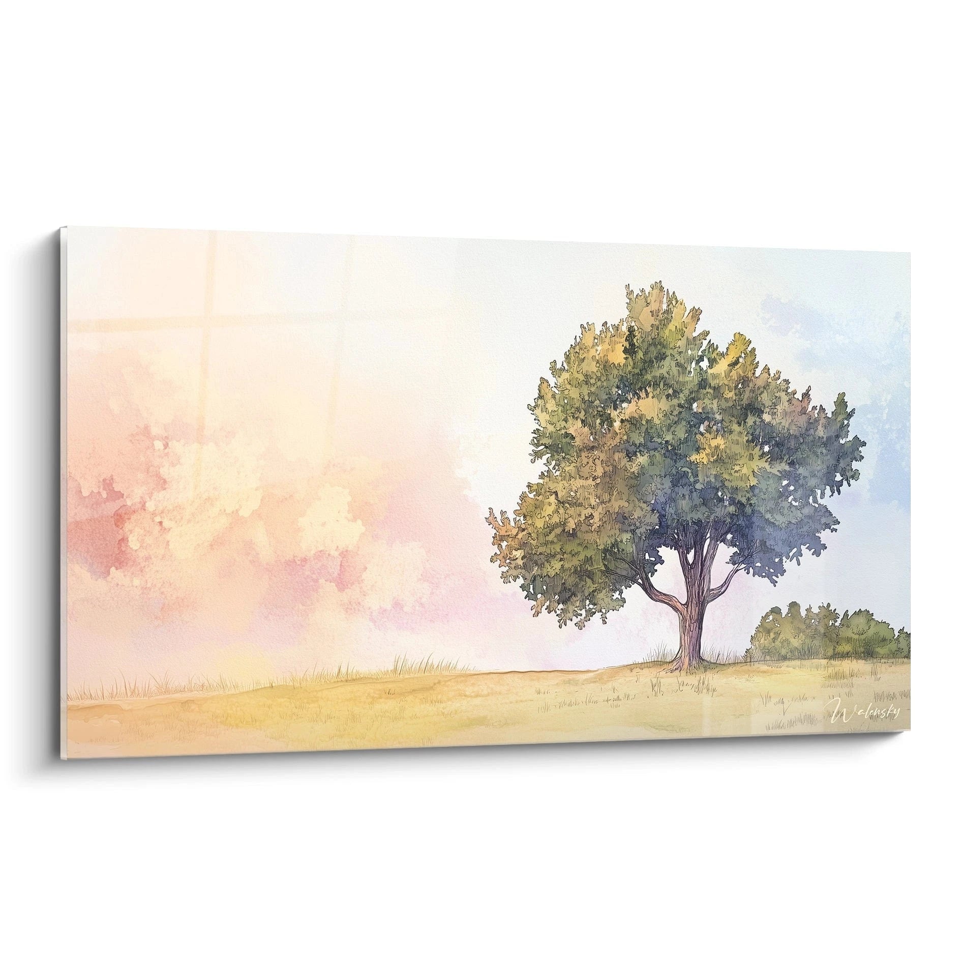
The characteristic transparency of watercolor naturally evokes lightness and fluidity, two psychological qualities sought in a medical context often associated with emotional heaviness. Unlike rigid graphic compositions or abstract paintings for medical offices with marked geometric forms, watercolor offers visual softness that does not assault the eyes of vulnerable patients. Monumental formats fully exploit this quality by creating virtual windows into soothing universes.
Watercolor compositions adapted to treated pathologies
Dermatologists frequently select watercolors with rosy and peach tones evoking skin health, while cardiologists favor fluid compositions suggesting harmonious circulation. Radiology offices opt for luminous watercolors compensating for the darkness necessary for imaging equipment. This semantic personalization reinforces coherence between the visual identity of the office and the medical specialty practiced, creating a consistent patient experience.
Effect on perceived waiting time
Environmental psychology studies demonstrate that patients exposed to large-scale watercolor works estimate their waiting time to be 23% less compared to rooms without artistic elements. Progressive chromatic nuances captivate attention without monopolizing concentration, allowing patients to relax while remaining receptive to staff calls. Horizontal panoramic formats amplify this effect by creating visual movement that naturally guides the gaze.
Optimizing patient reception through wall watercolor art
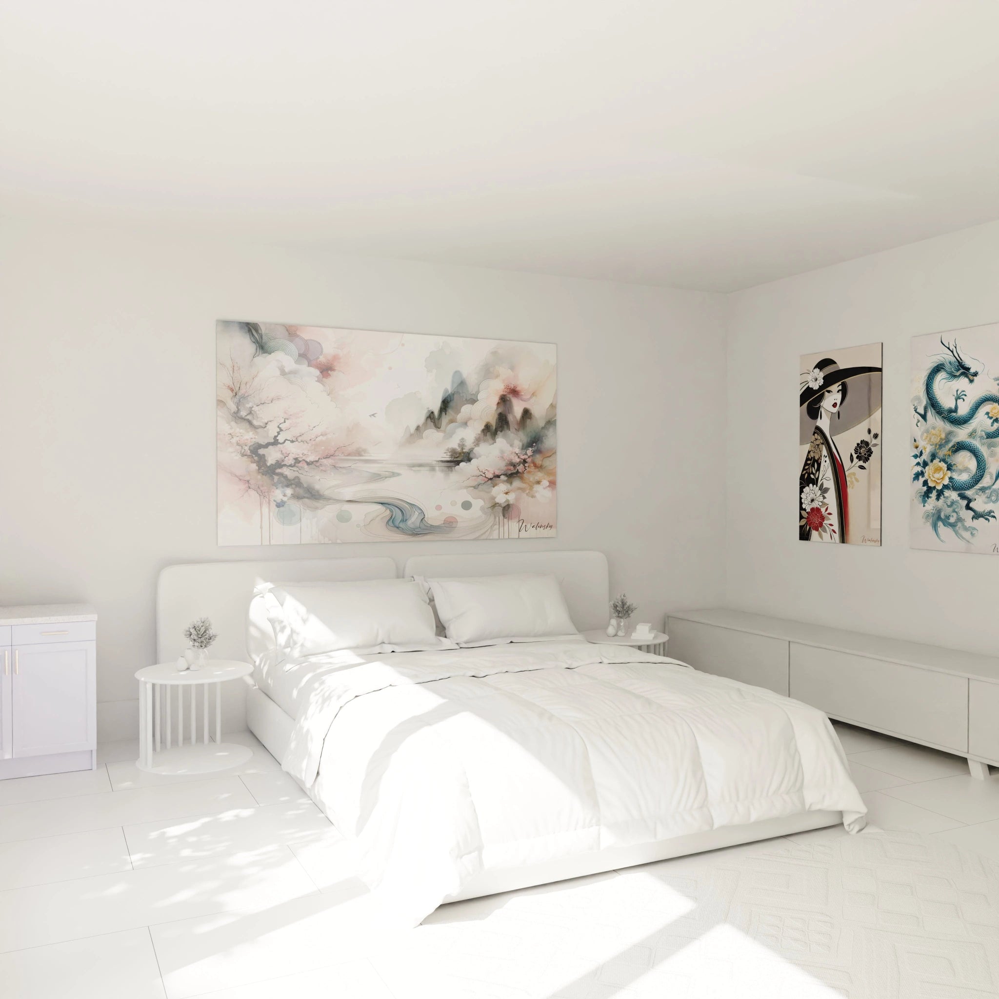
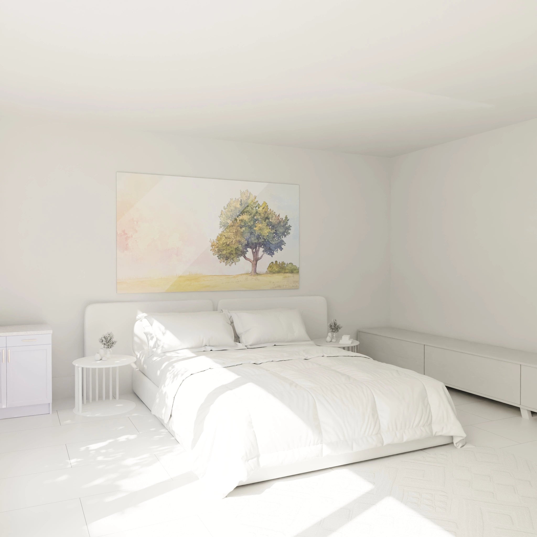
Installing a large-scale watercolor painting for medical office constitutes a strategic investment in overall patient experience. Imposing dimensions transform standardized waiting spaces into differentiated environments that enhance the professional image of the practitioner. Patients perceive this aesthetic attention as an indicator of quality care, establishing a psychological correlation between well-maintained environment and medical competence.
How does watercolor modify the first impression of the office?
A medical office reception determines in seven seconds the patient's overall impression of the practitioner's quality. A monumental watercolor composition immediately creates a memorable visual signature, differentiating the office from impersonal medical structures. The translucent tones typical of watercolor soften rigid clinical architecture, humanizing the space without compromising professional credibility. Patients report increased feelings of consideration in offices integrating quality artistic works.
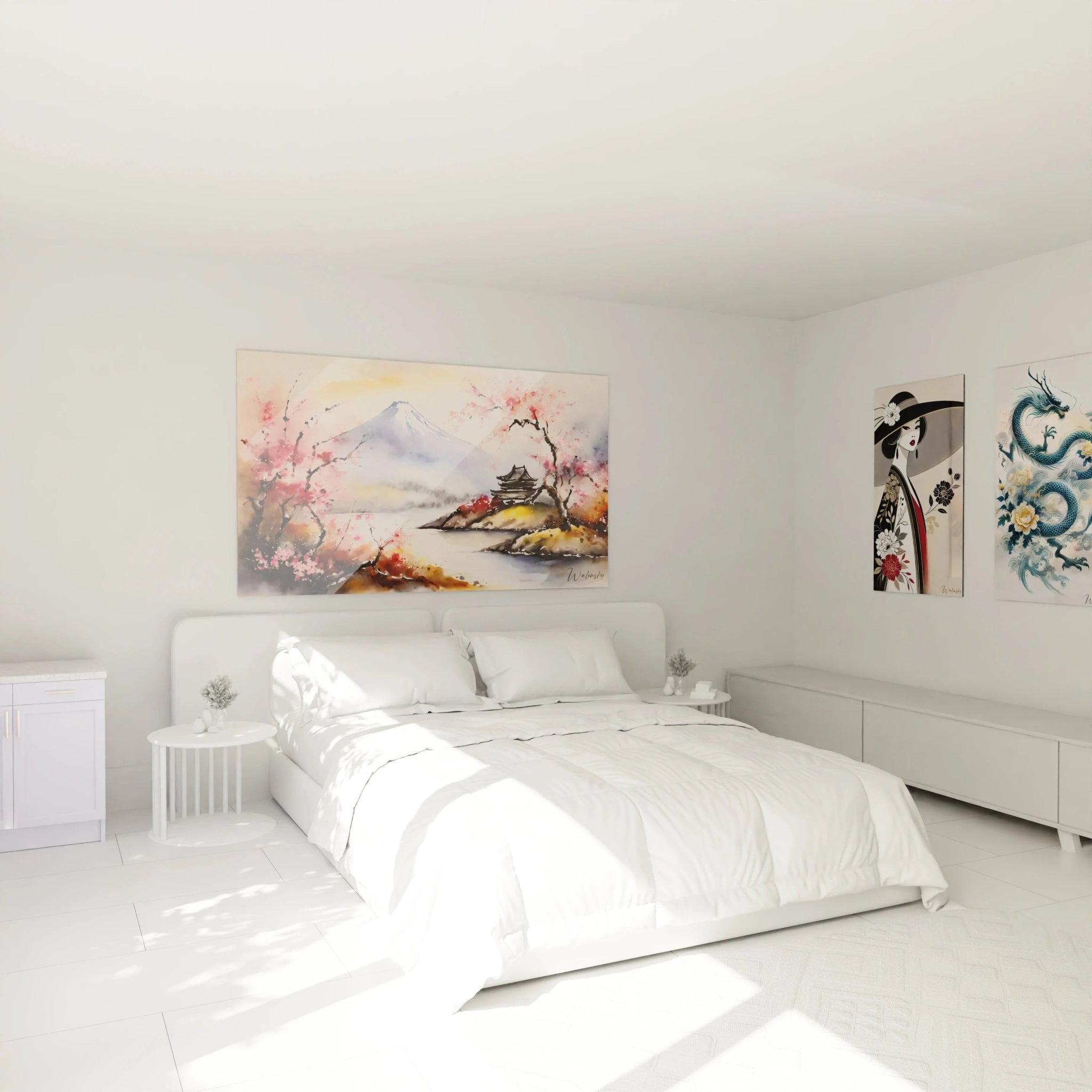
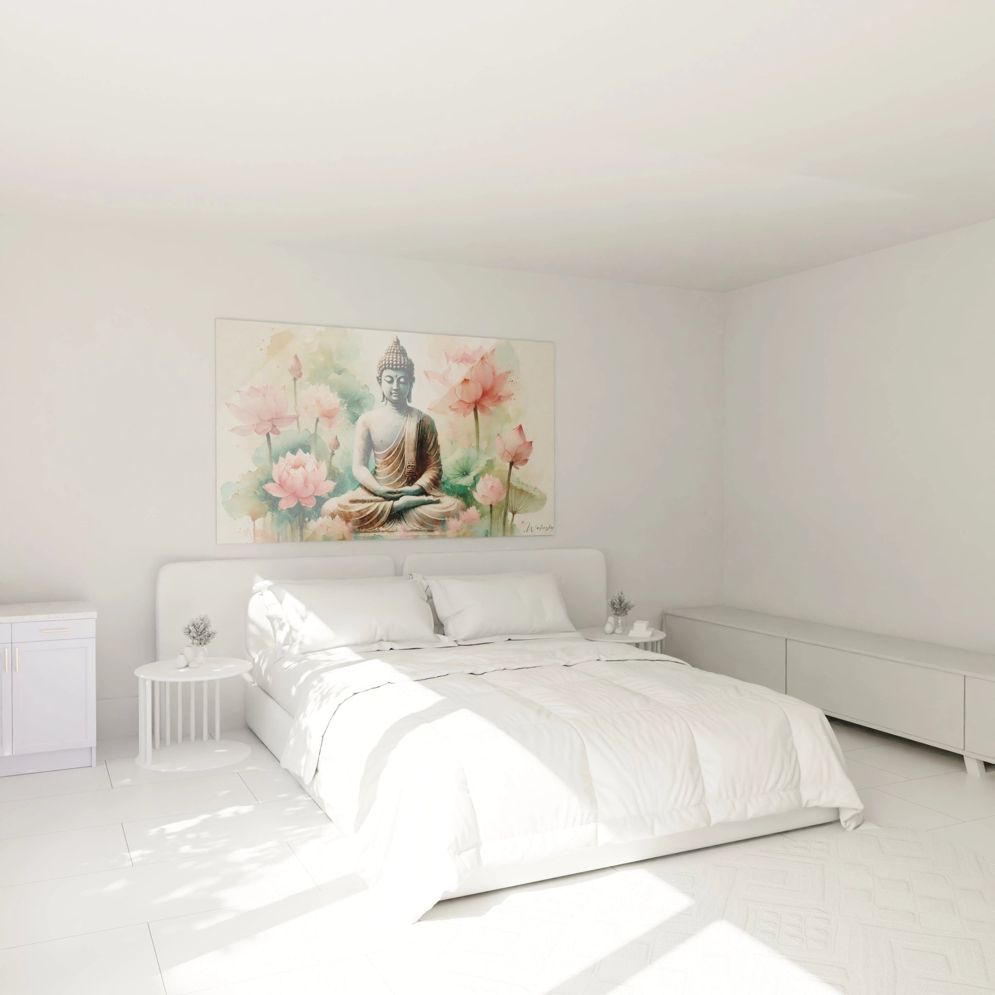
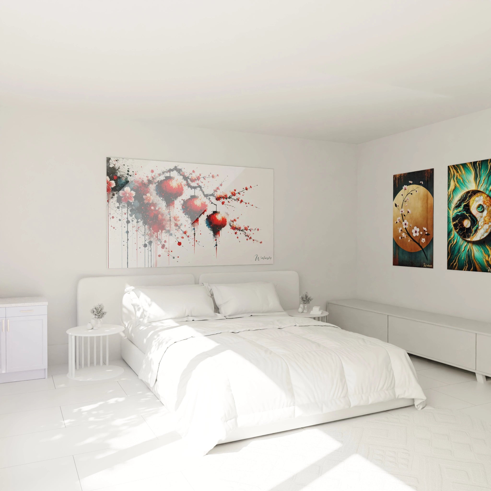
Strategic placement zones in waiting rooms
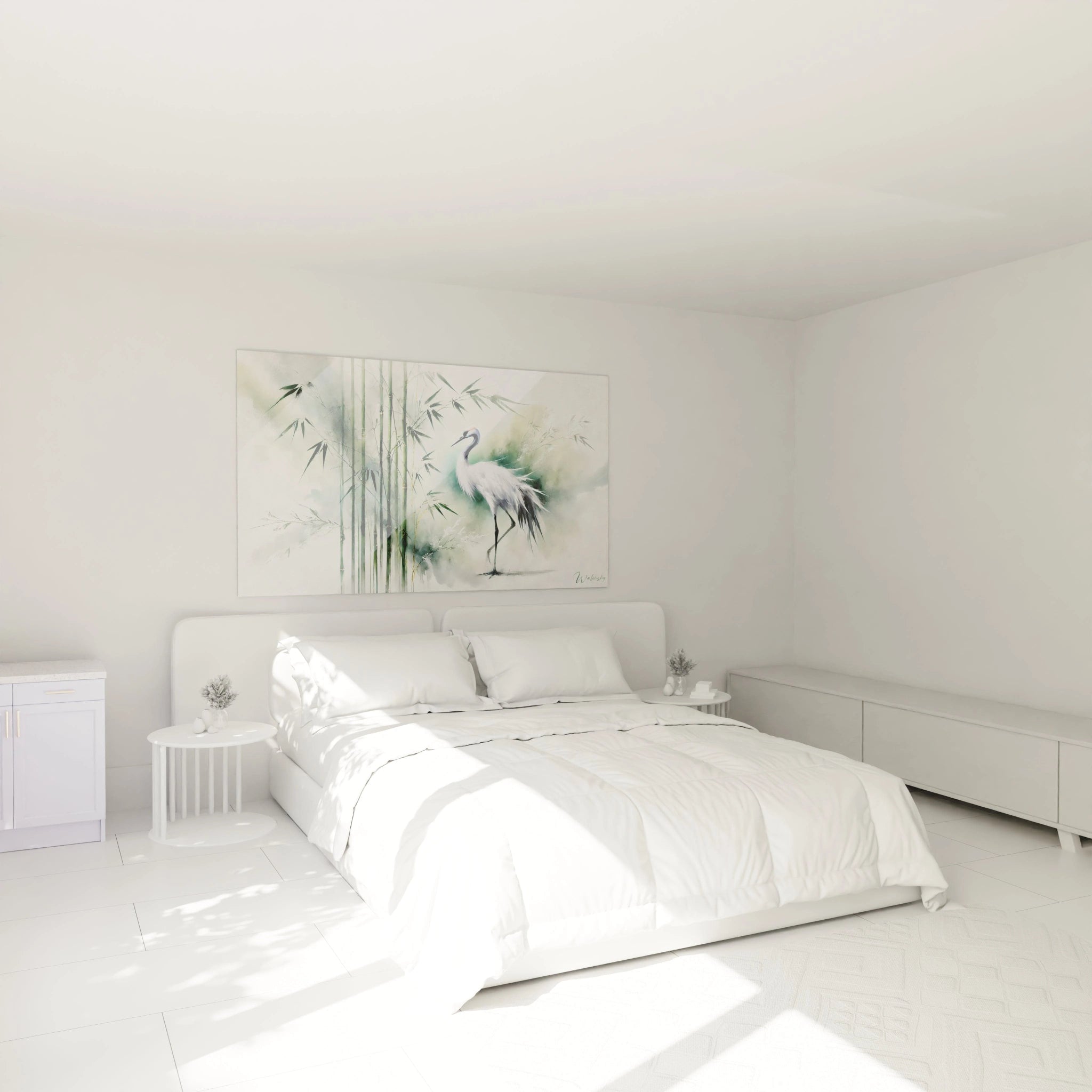
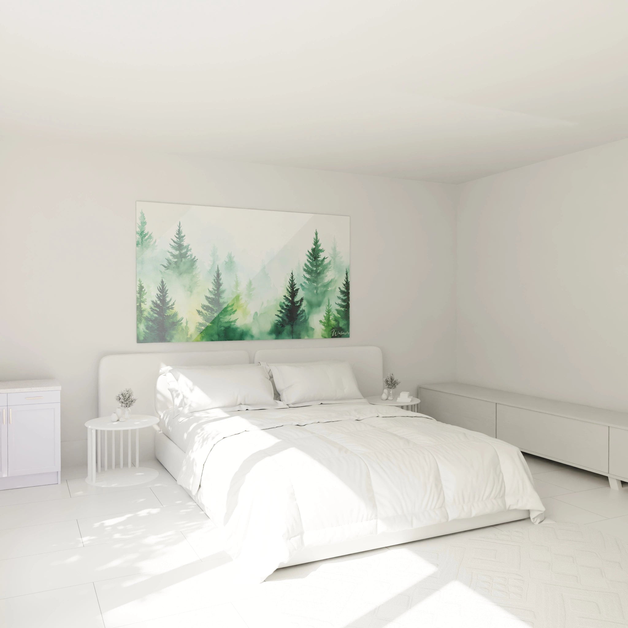
Positioning facing waiting seats maximizes the soothing impact of a watercolor painting, offering patients a natural focal point during their wait. Placements perpendicular to the reception desk create a visual sequence accompanying the patient's journey from entrance to consultation. Vertical formats adapt to restricted spaces between doors and windows, while horizontal compositions occupy the long blank walls characteristic of standardized waiting rooms.
Influence on measured patient satisfaction
Post-consultation satisfaction surveys reveal that physical environment represents 34% of overall medical experience evaluation. Integration of professional-quality watercolors correlates positively with recommendation and patient retention scores. Practitioners observe a decrease in complaints related to waiting time when spaces offer soothing visual stimulation. This qualitative improvement justifies investment in imposing formats that genuinely transform the atmosphere.
Group practices exploit coordinated watercolor series in different consultation rooms, creating visual identity coherence while varying ambiances according to specialties. This curatorial approach reinforces perception of a structured establishment attentive to detail, qualities unconsciously transferred to expected care quality.
Chromatic selection for watercolor therapeutic environments
The choice of tones for a watercolor painting for medical office responds to precise psychophysiological criteria, transcending simple aesthetic considerations. Chromatic palettes directly influence patients' vital signs and emotional state, requiring thoughtful selection according to medical practice type. Watercolors with cool dominant tones reduce pain perception by 18% according to medical neuroaesthetics research, while warm tones stimulate communication in psychotherapy offices.
Watercolor palettes by medical specialty
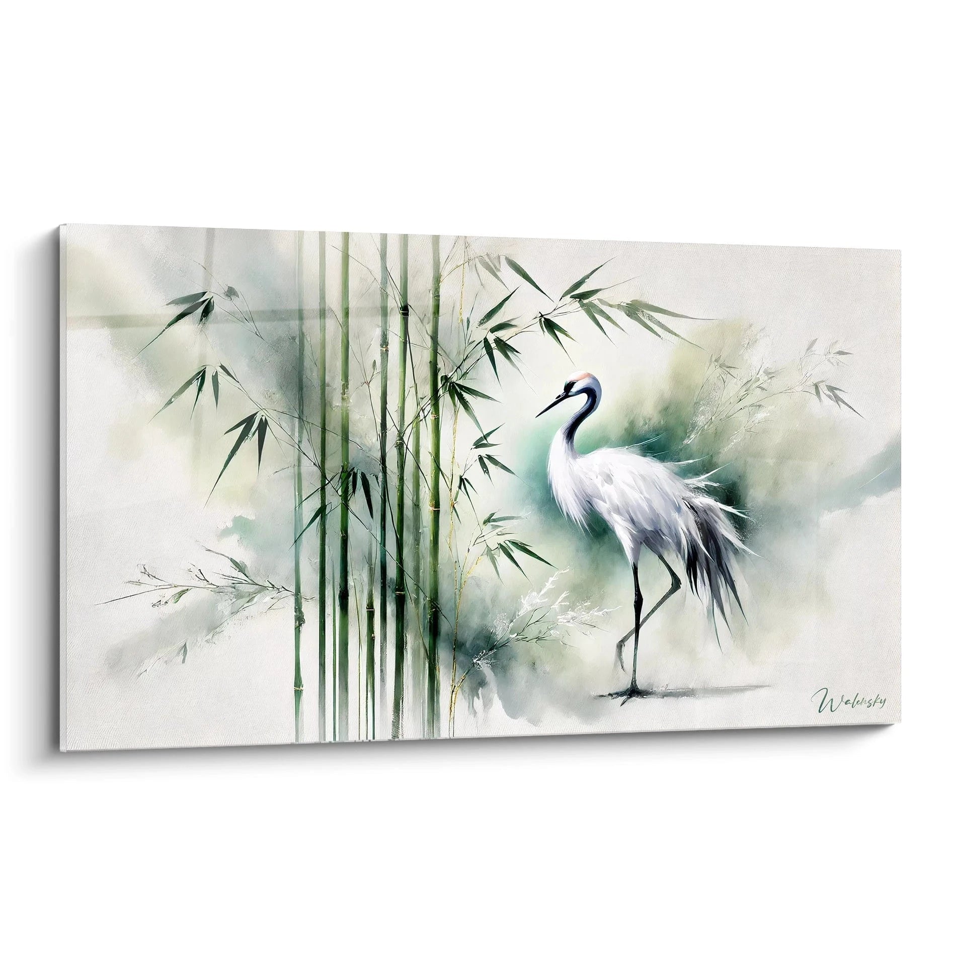
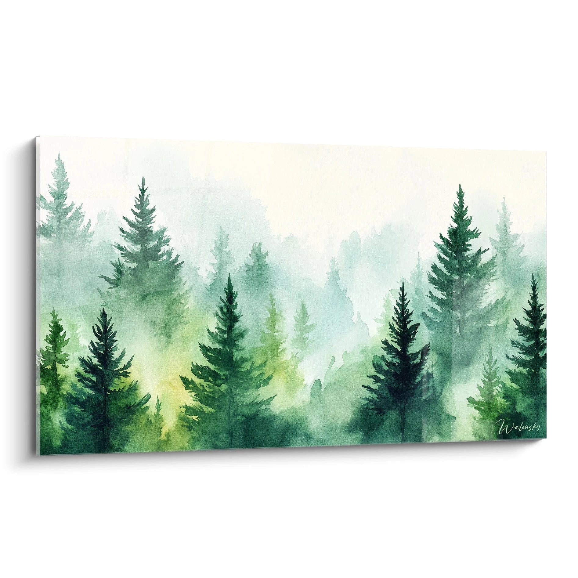
General practitioners favor watercolors with calming greens and sky blues evoking nature and overall health, creating reassuring neutrality for diverse pathologies treated. Gynecologists select powdered pinks and soft violets establishing respectful feminine ambiance. Psychiatrists opt for subtle monochrome compositions avoiding sensory overstimulation, while pediatricians integrate soft multicolor watercolors positively stimulating children's imagination without infantilization.
Which watercolor shades reduce procedural anxiety?
Oceanic and celestial tones in watercolors generate measurable cortisol reduction in patients before stressful interventions. Compositions incorporating horizontal gradients imitating maritime horizons create a sense of openness compensating for confinement in small examination rooms. Panoramic formats amplify this spatial extension effect, reducing claustrophobia frequent in offices with limited dimensions. The absence of harsh contrasts typical of watercolor avoids aggressive visual stimulation.
Coordination with regulatory medical lighting
Large-scale watercolors compensate for the coldness of normative LED lighting imposed in medical environments. The warm tones of compositions balance the elevated color temperature of technical luminaires, creating an overall more welcoming ambiance. Practitioners frequently install accent lighting highlighting the subtle nuances of watercolors, transforming a regulatory constraint into an aesthetic opportunity. This light-artwork synergy optimizes atmosphere without compromising visual hygiene standards.
FAQ - Watercolor painting for medical office
What dimension of watercolor painting for medical office suits a 20m² waiting room?
For a 20m² space, prioritize a horizontal format of 120 to 160 cm width that visually occupies the main wall without saturating the space. This proportion creates a dominant focal point while preserving architectural balance necessary for functional medical spaces.
Is a watercolor painting for medical office suitable for intensive disinfection areas?
Watercolors protected by professional varnish and waterproof framing resist standard medical cleaning protocols perfectly. However, avoid direct placement in disinfectant spray zones or in immediate proximity to surgical preparation sinks.
How to choose a watercolor painting for medical office suited to multicultural patient populations?
Opt for abstract watercolor compositions with universal natural motifs such as aquatic, floral, or celestial elements, avoiding figurative representations that may pose cultural interpretation issues. Neutral palettes with soothing tones transcend cultural differences while maintaining therapeutic effectiveness.