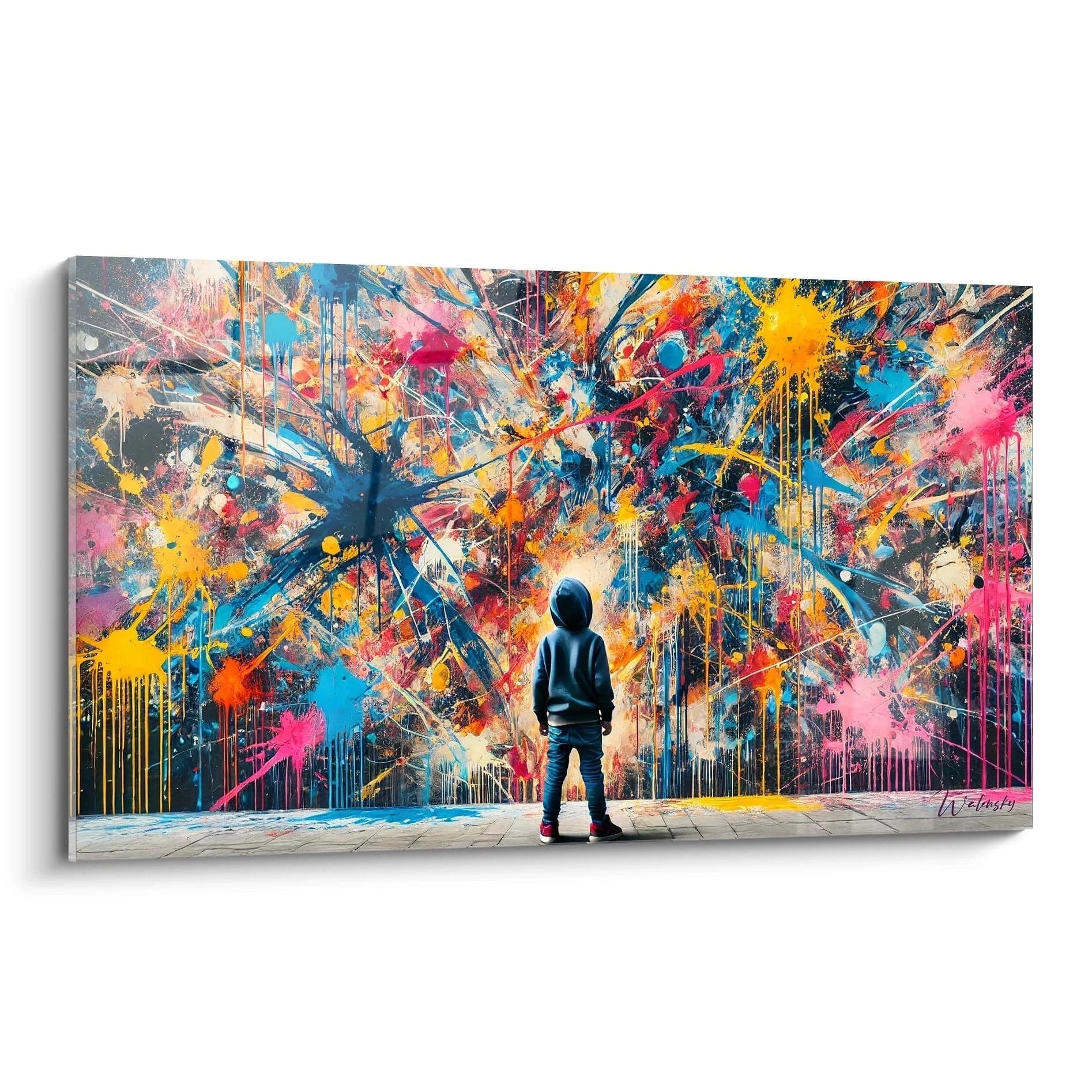
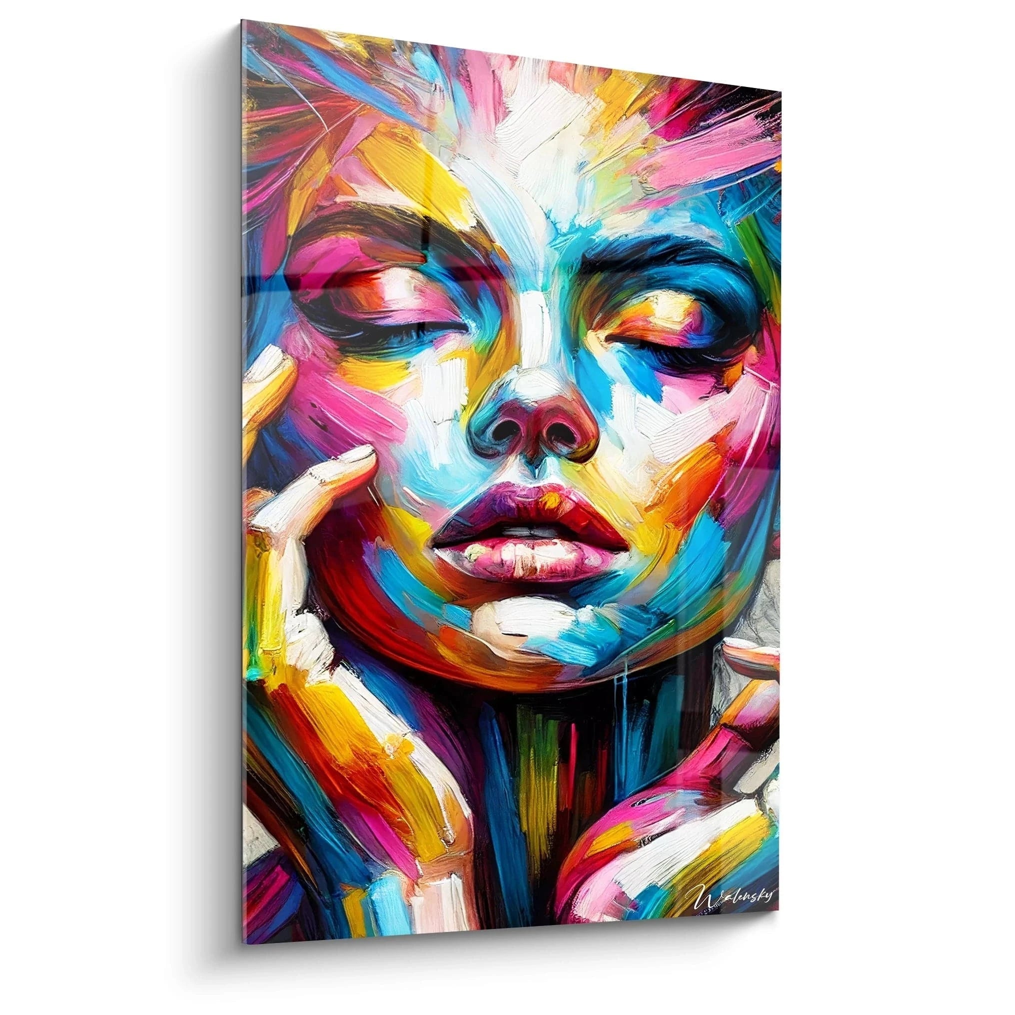
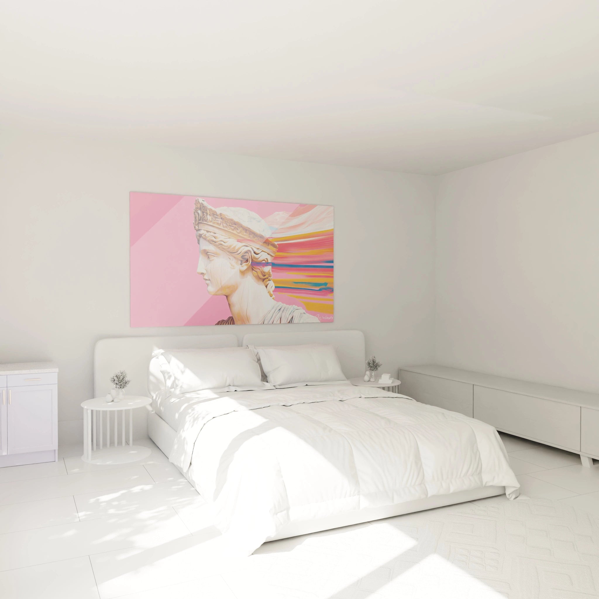
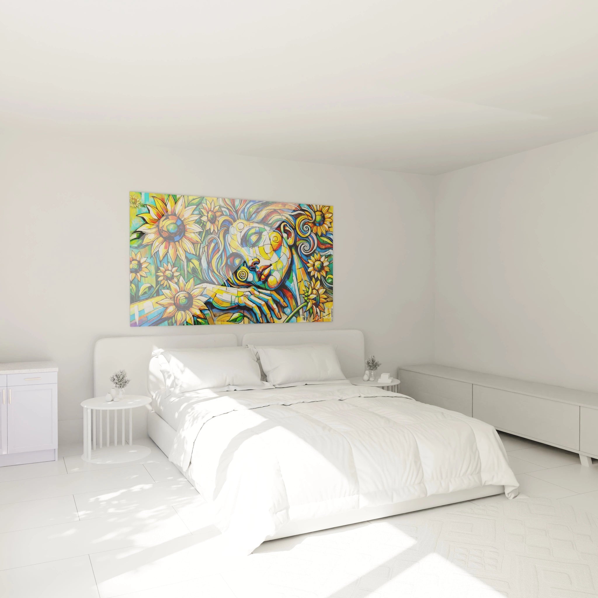
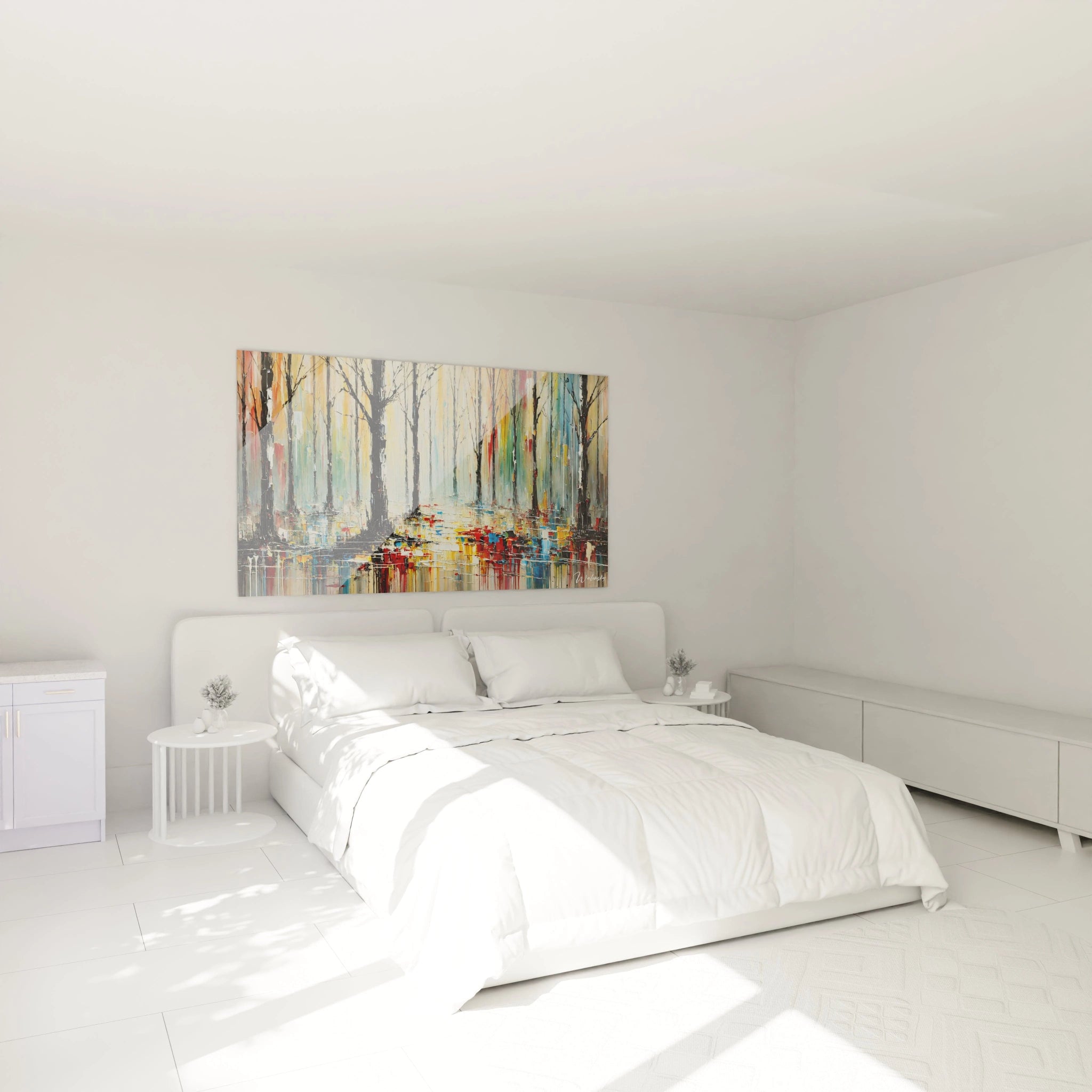
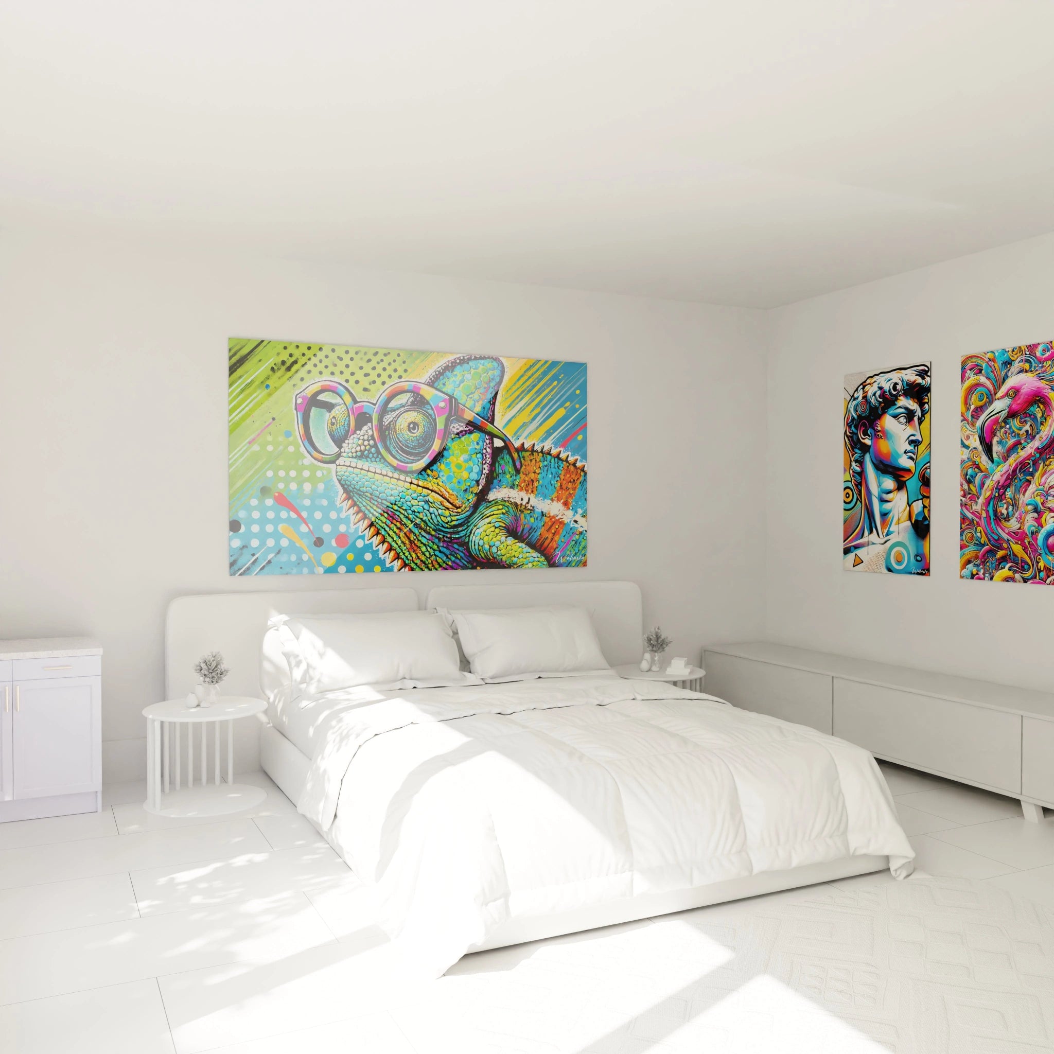
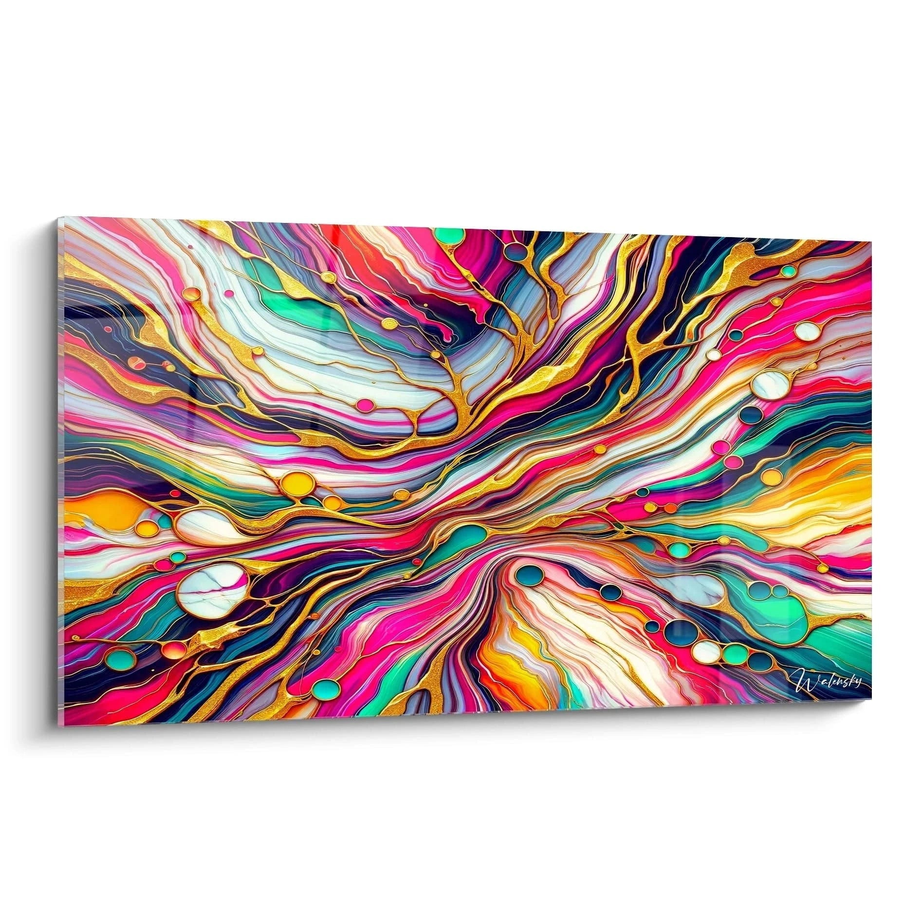
A vibrant multicolor living room wall art instantly transforms the atmosphere of your space by infusing it with incomparable chromatic energy. This category of wall decoration stands out through its visual intensity, capable of energizing contemporary interiors while creating spectacular focal points. Vibrant compositions combine multiple saturated hues that dialogue with each other, generating an affirmed wall presence particularly suited to the generous volumes of modern living rooms.
The Psychological Impact of Vibrant Multicolor Compositions in Living Room Spaces
A vibrant multicolor living room wall art acts as a natural visual stimulus that directly influences mood and spatial perception. Research in environmental psychology demonstrates that exposure to diverse and saturated color palettes increases perceived energy levels in a room, making reception spaces more dynamic and conducive to social exchange.
How do intense chromatic contrasts modify volume perception?
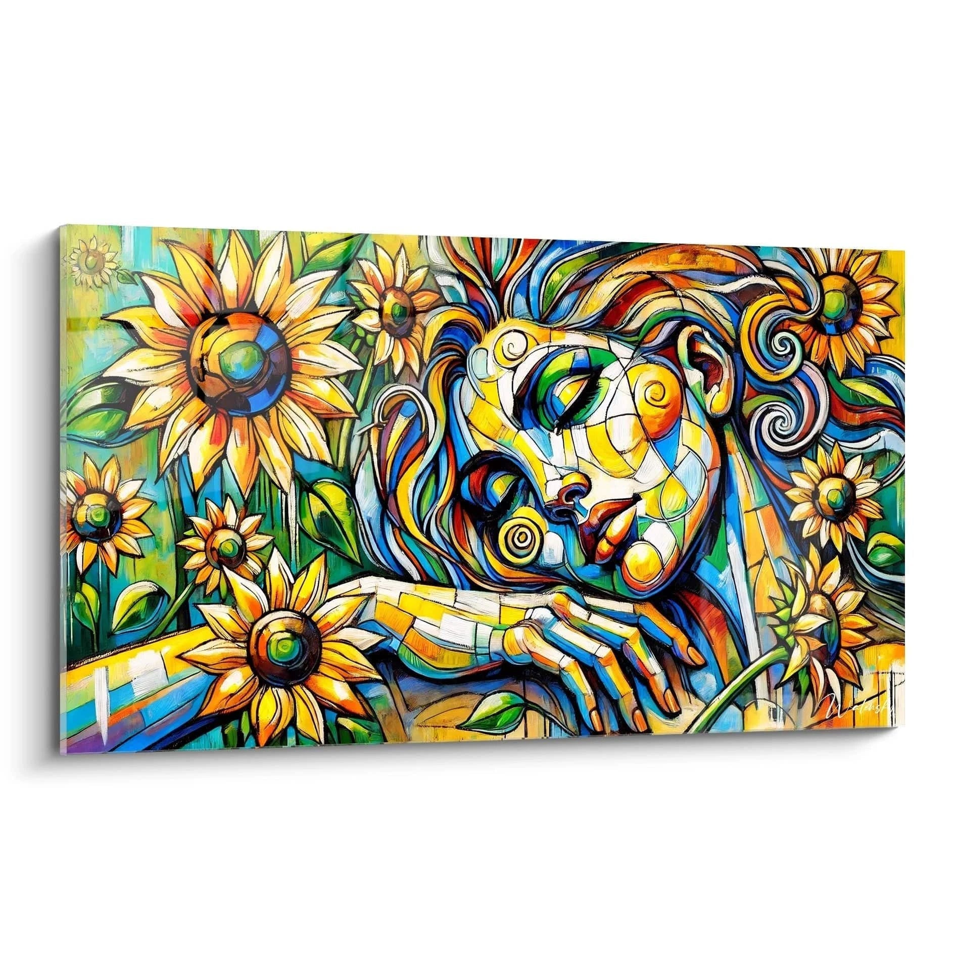
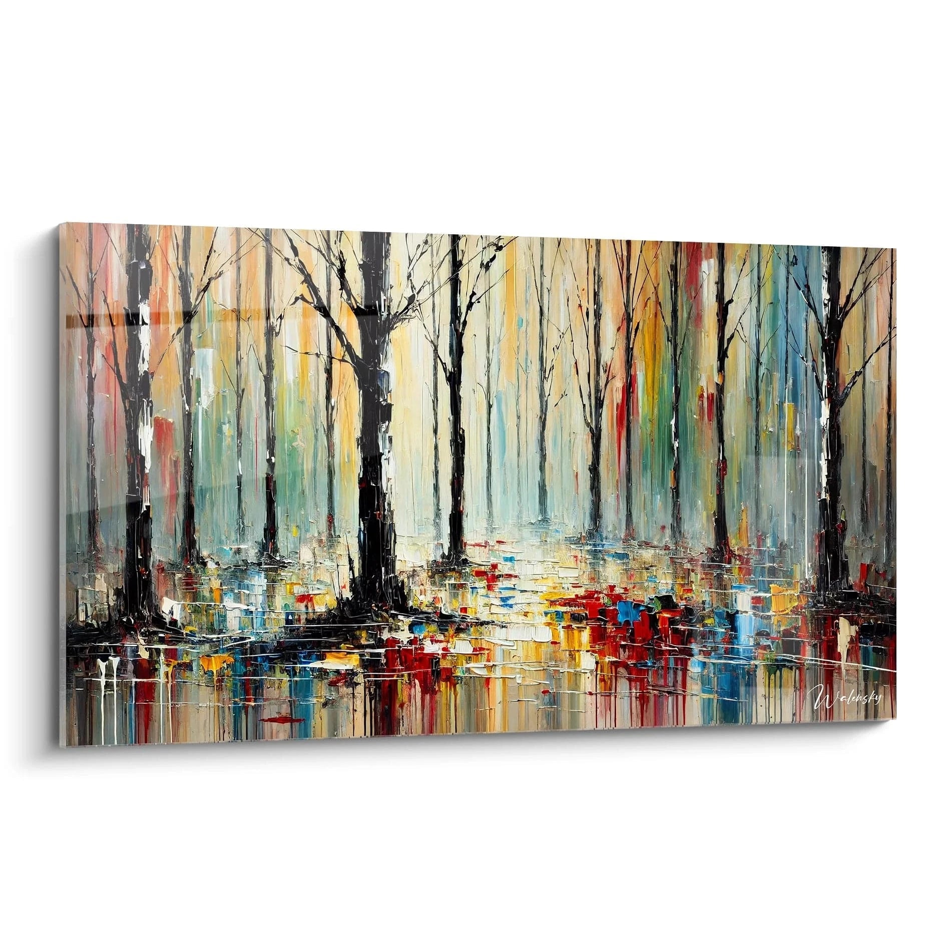
Large multicolor compositions exploit simultaneous contrasts to create illusory depth. A scarlet red juxtaposed with electric turquoise generates optical vibration that animates the wall surface, while the addition of lemon yellow and magenta amplifies this dynamic effect. This chromatic interaction works particularly well in spacious living rooms where viewing distance allows appreciation of the entire composition without visual saturation.
What energetic benefits do saturated hues bring to daily life?
Installing a vibrant multicolor living room wall art in your primary living space creates a stimulating daily visual ritual. Bright hues like mandarin orange, deep violet, and emerald green activate different perception zones, keeping the mind alert and fostering creativity. For those seeking more structured compositions while maintaining this vitality, exploring a modern abstract living room wall art allows you to discover how geometry and chromatic intensity combine.
The balance between visual stimulation and residential comfort
Contrary to common assumptions, an intense multicolor wall décor does not necessarily generate visual fatigue when properly dimensioned. Imposing formats allow different chromatic zones to breathe, creating micro-areas of visual rest between saturated zones. The eye can thus circulate freely between different intensities, naturally moving from a fuchsia explosion to a cobalt blue area before resting on softer transitions.
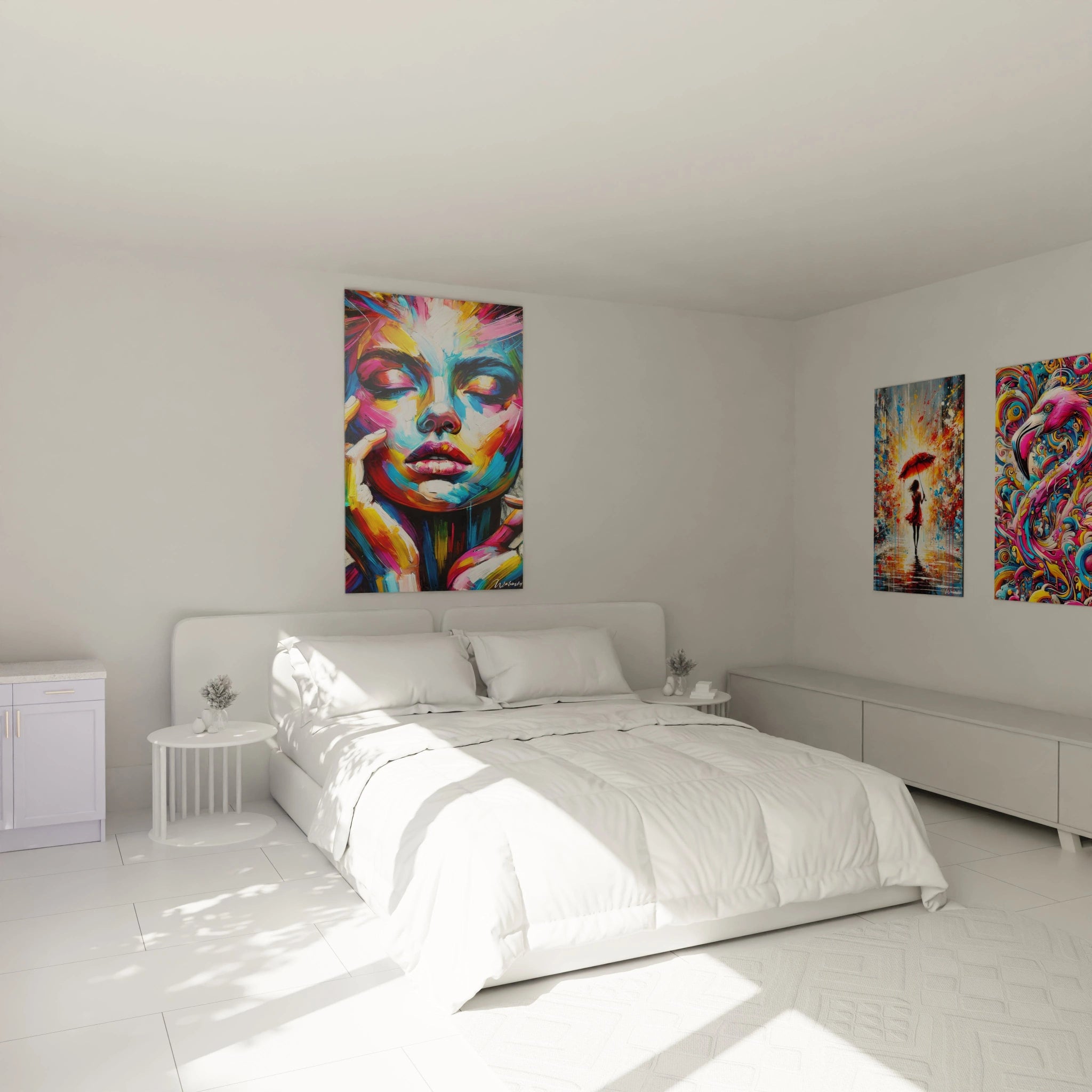
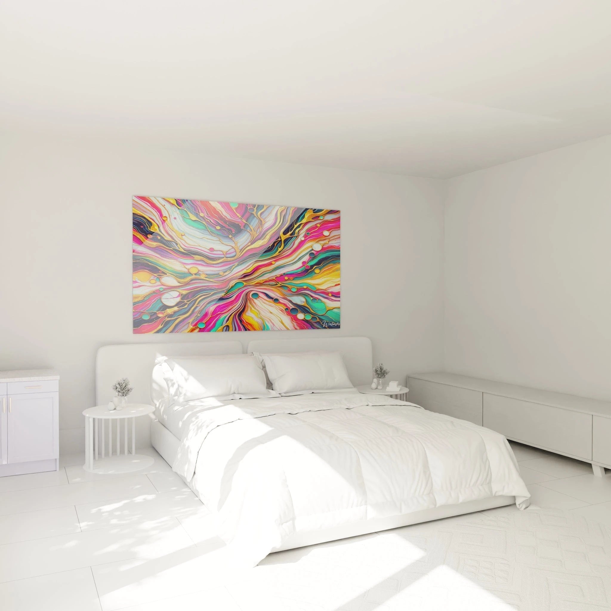
Owners of open-plan spaces particularly appreciate how these vibrant compositions define functional zones without physical partitioning. A large multicolor format positioned behind the sofa visually delimits the living room from the rest of the space while maintaining architectural fluidity.
Composition Strategies to Maximize Vibrant Impact
What chromatic density to prioritize based on living room architecture?
The success of a vibrant multicolor living room wall art largely depends on prior analysis of your architectural environment. In living rooms with standard ceilings, a composition concentrating saturated hues on the upper two-thirds creates visual elevation, while spaces with great ceiling height can accommodate chromatic explosions uniformly distributed across the entire surface.
Rooms bathed in natural light allow vibrant pigments to reveal their full intensity, particularly during golden hours when low-angle rays amplify perceived saturation. Conversely, north-facing living rooms benefit from compositions favoring warm hues – vermillion red, golden yellow, blood orange – that compensate for the coldness of indirect natural light.
Chromatic combinations with high impact for large formats
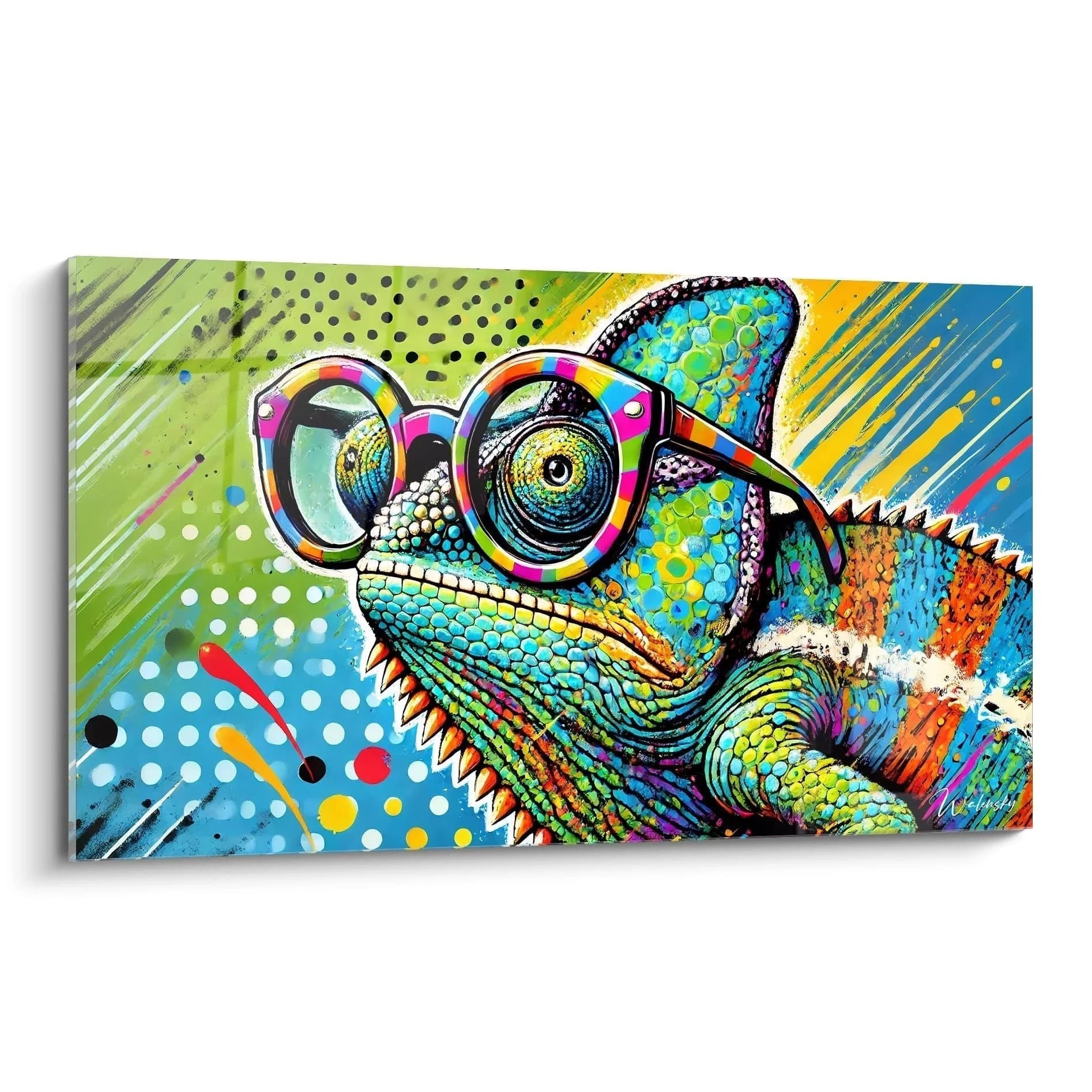
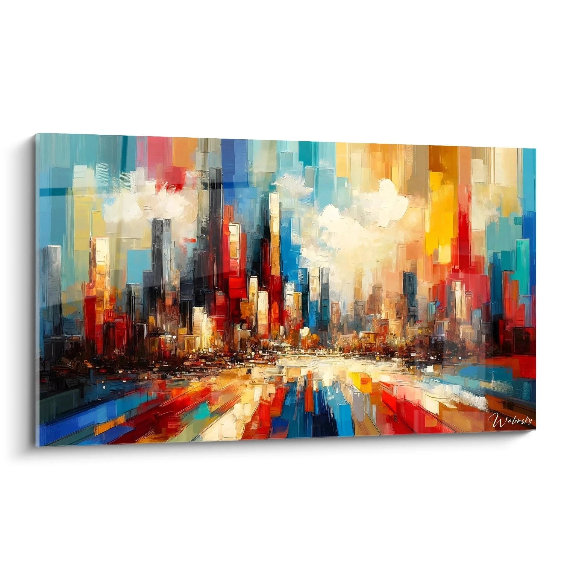
Explosive complementary triads form the foundation of successful multicolor compositions. The cyan-magenta-yellow association generates maximum vibration while maintaining theoretical balance, while tetradaic combinations – such as royal blue, vibrant orange, intense purple, and chartreuse – create sophisticated visual complexity. These chromatic orchestrations function optimally on formats exceeding 120 centimeters, allowing each hue to develop its individual presence before merging into overall harmony.
How to incorporate metallic elements into vibrant compositions?
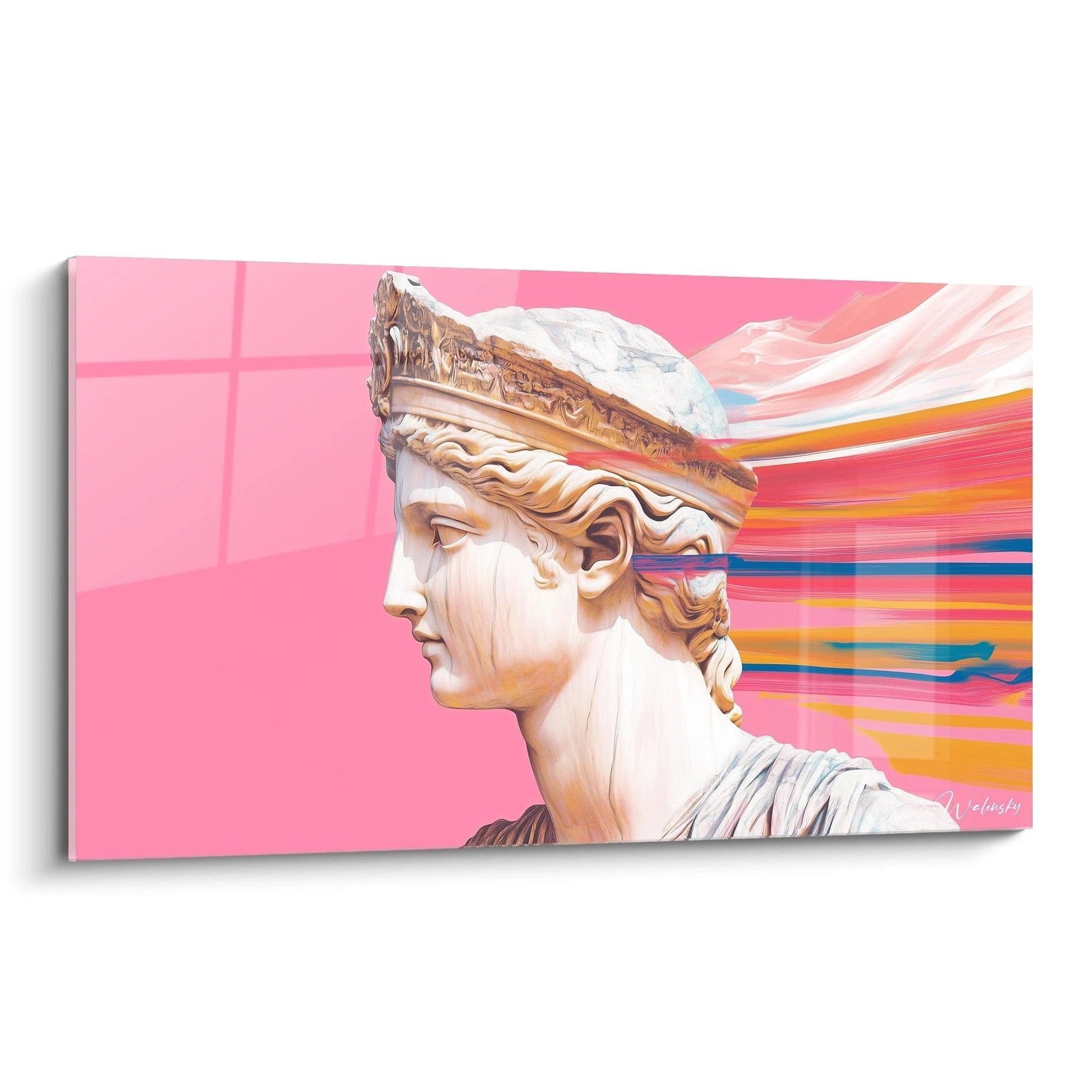
The subtle incorporation of golden, copper, or silver touches into a vibrant multicolor living room wall art creates reflection points that further energize the composition. These metallic accents capture ambient light and redistribute it through chromatic layers, generating subtle variations depending on the time of day and artificial lighting. This technique is particularly suited to contemporary interiors where metallic finishes on lighting fixtures and furniture find visual echo in the wall artwork.
Knowledgeable collectors seek pieces where chromatic transitions reveal affirmed technical mastery. Vibrant gradations – from carmine red to eggplant violet through saturated intermediate steps – demonstrate sophistication that transcends simple bright hue juxtaposition. These nuances add narrative depth to the composition, inviting extended contemplation beyond the initial impact.
Formal reception spaces benefit from structured multicolor compositions where chromatic energy is channeled through underlying geometric architectures. This approach maintains vitality while introducing order that dialogues with furniture and the living room's architectural lines.
Integration Scenarios and Decorative Associations for Vibrant Compositions
What textiles and materials accompany wall chromatic explosions?
Installing a vibrant multicolor living room wall art requires strategic consideration of the textile environment. Contrary to intuition, cushions and rugs in neutral hues – charcoal gray, sand beige, off-white – allow the wall composition to visually dominate without competition. However, a few textile accents picking up one or two specific hues from the artwork create harmonious recalls that unify the overall décor.
Natural fabrics like raw linen or solid velvet offer tactile texture that pleasantly contrasts with the visual intensity of the wall. This sensory duality – chromatic energy versus material softness – enriches the overall living room experience. Owners of contemporary furniture with clean lines find that these vibrant compositions bring emotional warmth sometimes absent from minimalist designs.
Specific lighting strategies for imposing multicolor formats
Illuminating a vibrant multicolor living room wall art requires a differentiated approach based on chromatic zones. Variable temperature LED lighting allows ambiance adjustment: cooler light (5000K) during the day amplifies cyan and violet hues, while warm tone (2700K) in the evening exalts reds and oranges. This flexibility transforms the artwork depending on time of day and activities.
Adjustable spotlights installed at 30 degrees prevent direct reflections while creating subtle modeling that reveals any surface texture. For particularly dynamic compositions, indirect ceiling lighting generates uniform luminosity that respects chromatic integrity without creating distracting hot spots.
Furniture associations that amplify vibrant impact
A sofa with marked architectural lines in black leather or charcoal fabric creates dramatic contrast that visually propels the multicolor artwork. This opposition between furniture sobriety and wall exuberance generates sophisticated aesthetic tension particularly prized in high-end contemporary interiors. Transparent glass coffee tables maintain the visual lightness essential to avoid weighing down a space already rich in chromatic stimulation.
Bookcases and wall shelving positioned on adjacent walls benefit from streamlined arrangement with a few decorative objects selected for their form rather than color. This restraint allows the gaze to circulate freely between the multicolor focal point and peripheral visual rest areas, creating balanced spatial rhythm.
What is the ideal viewing distance to appreciate a vibrant multicolor living room wall art of large dimension?
For formats exceeding 150 centimeters, a minimum distance of 3 to 4 meters allows different chromatic zones to visually merge while retaining their individuality. This distance generally corresponds to that separating the sofa from the opposite wall in standard configurations.
Does vibrant multicolor living room wall art suit spaces with colored walls?
The association works optimally when the display wall presents a neutral shade or subtly echoes one of the composition's secondary colors. A saturated competing wall risks creating visual cacophony, except in assumed maximalist approaches where overload becomes an aesthetic choice.
How to evolve décor around a vibrant multicolor living room wall art throughout the seasons?
The multicolor piece serving as permanent anchor, seasonal variations express themselves through subtle textile modifications: light linen cushions and transparent vases in summer, wool throws and scented candles in winter. These adjustments maintain decorative freshness without questioning the vibrant central composition that transcends ephemeral trends.