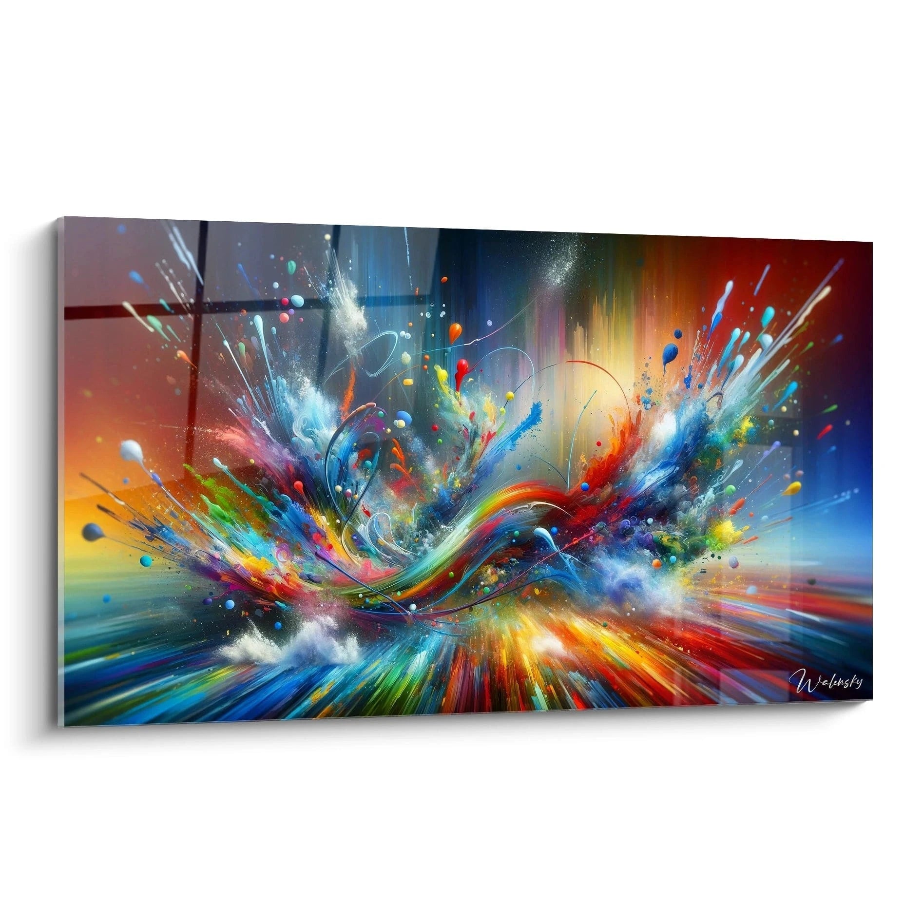
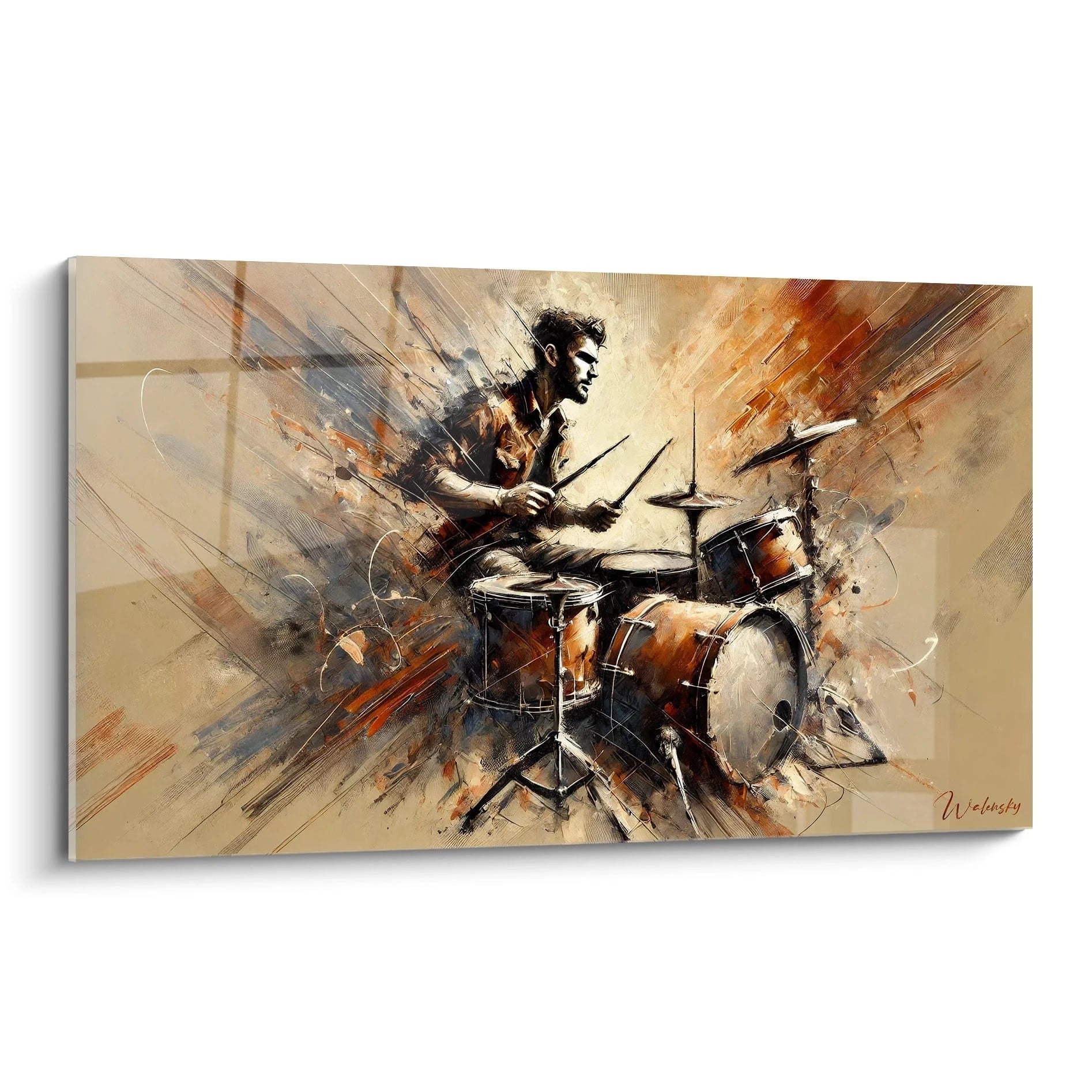
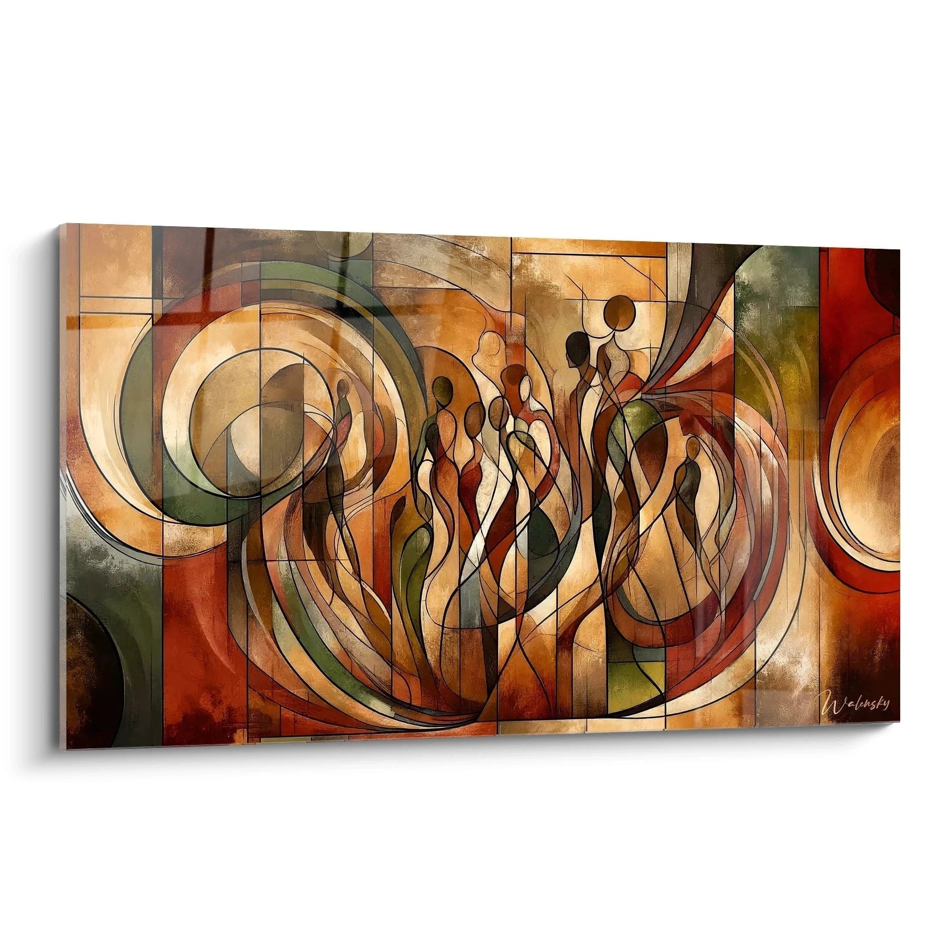
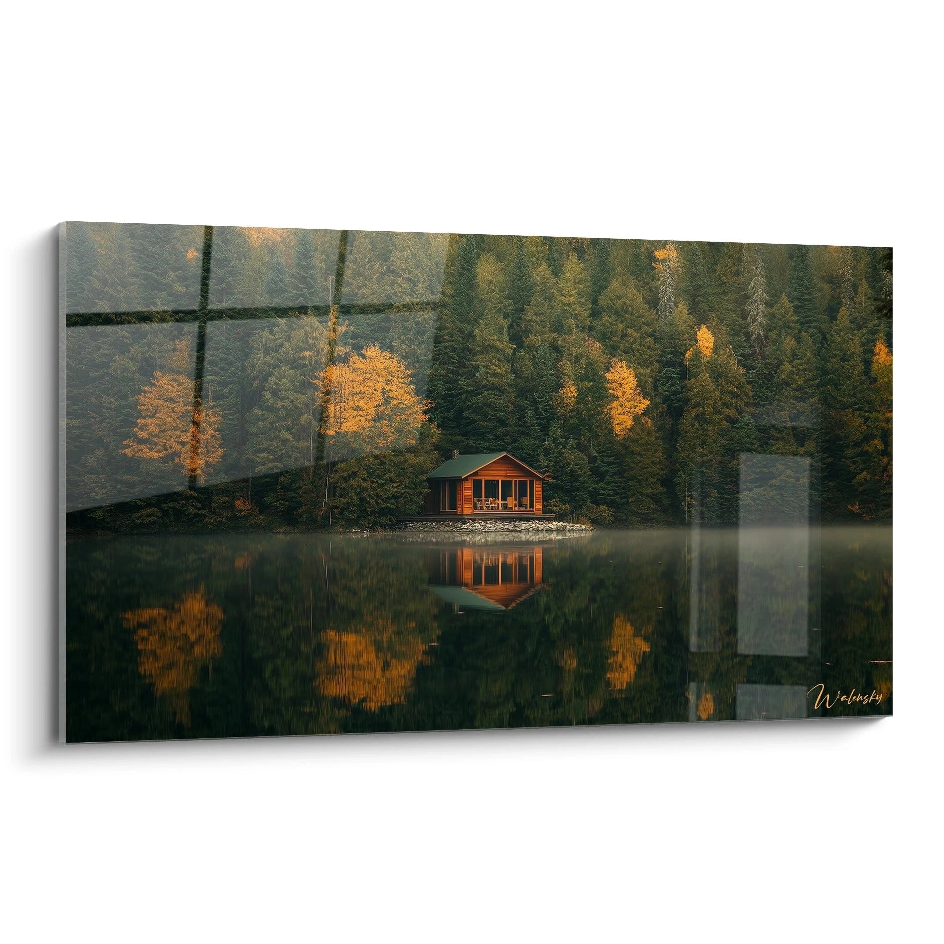
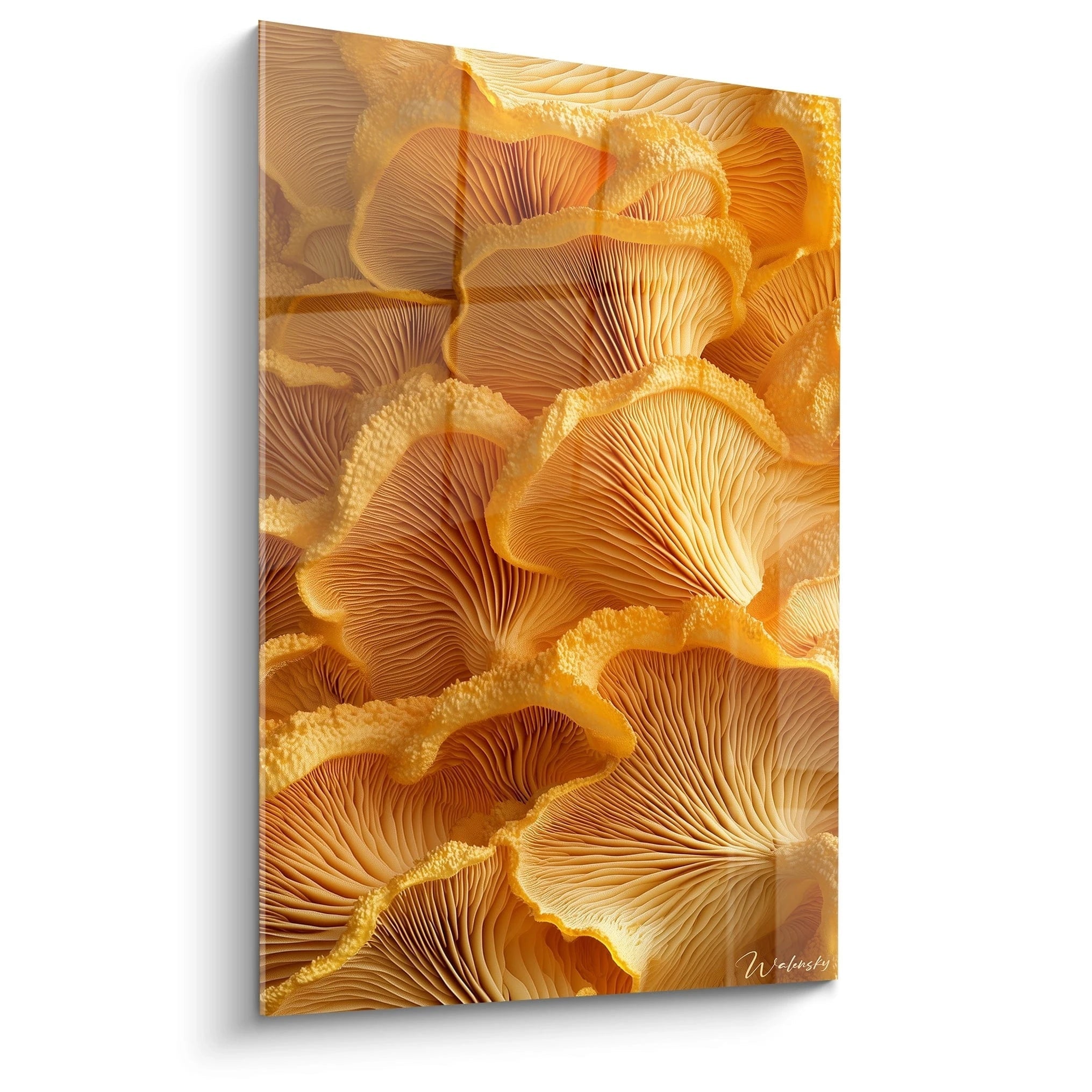
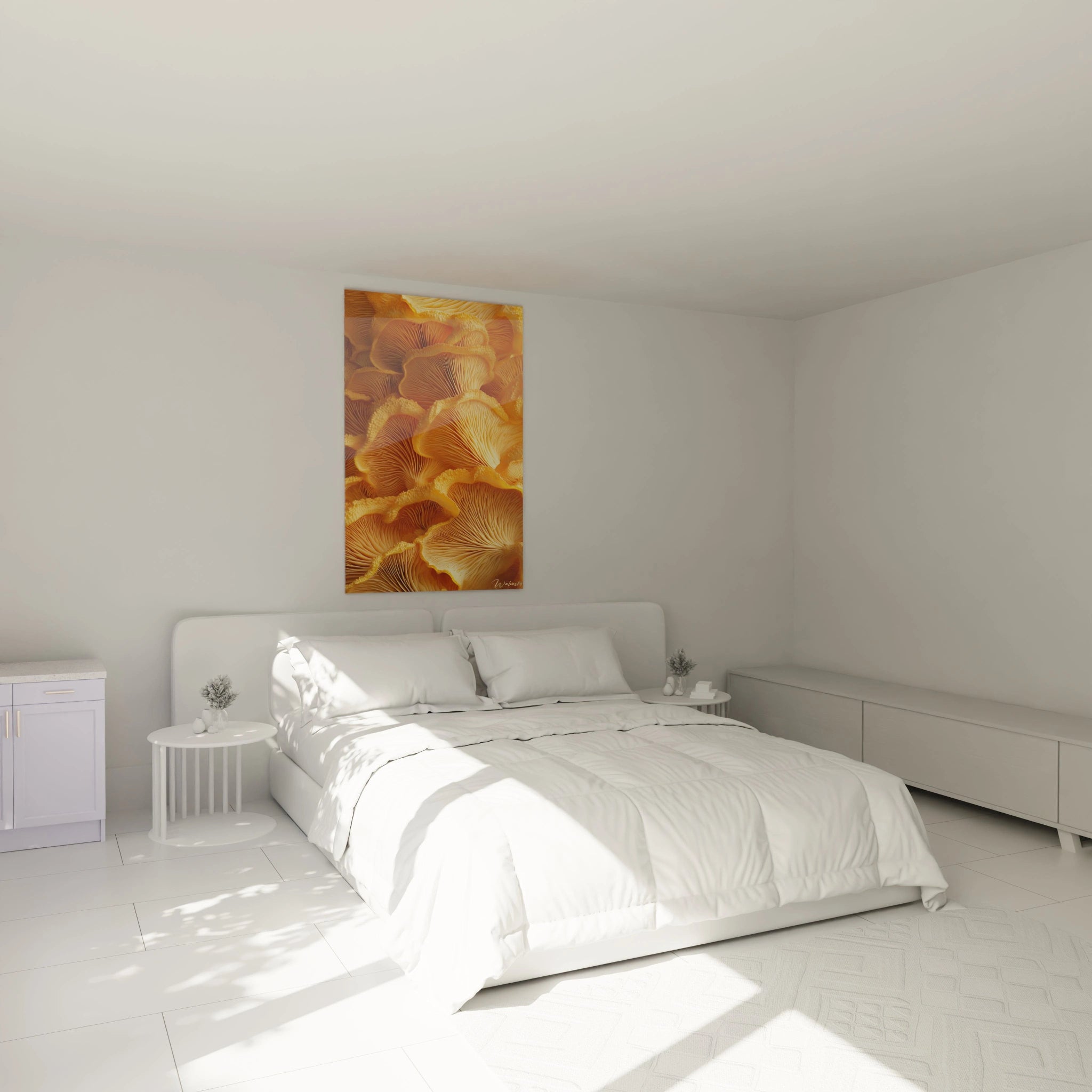
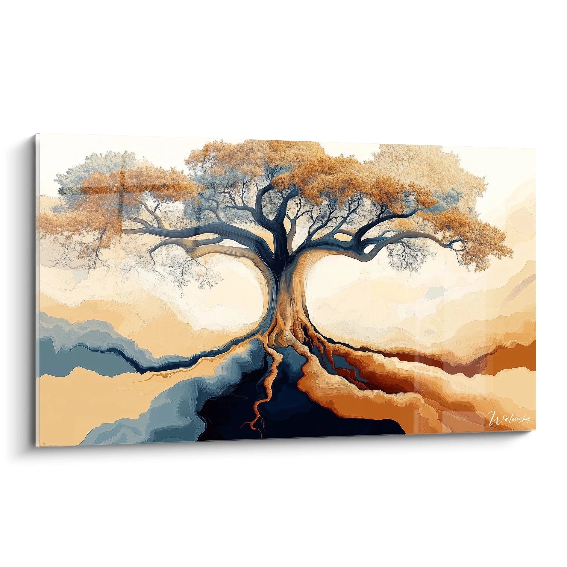
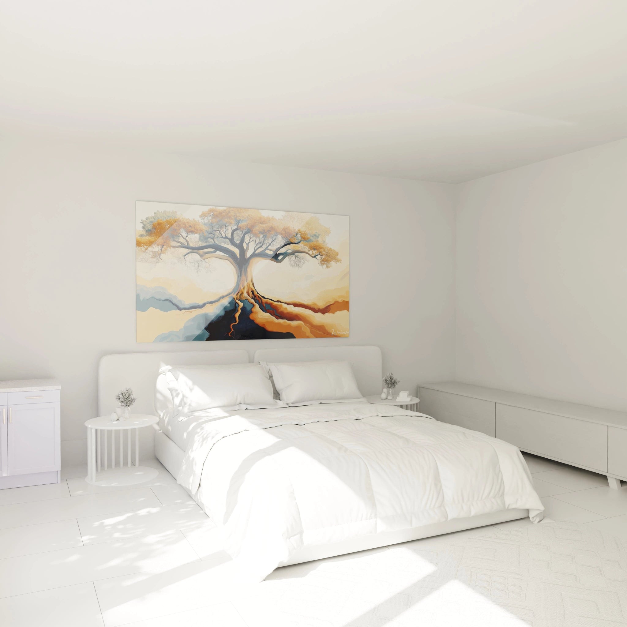
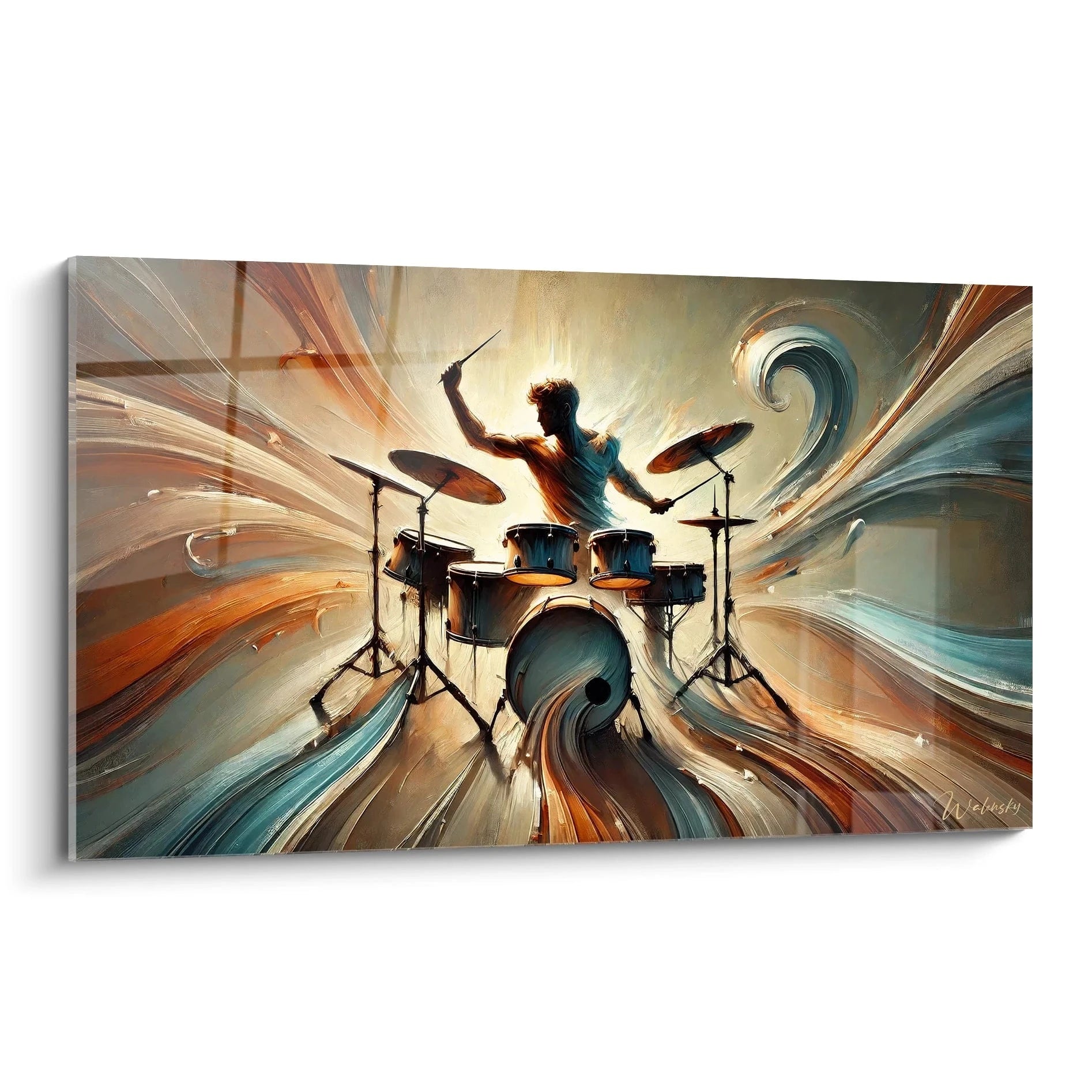
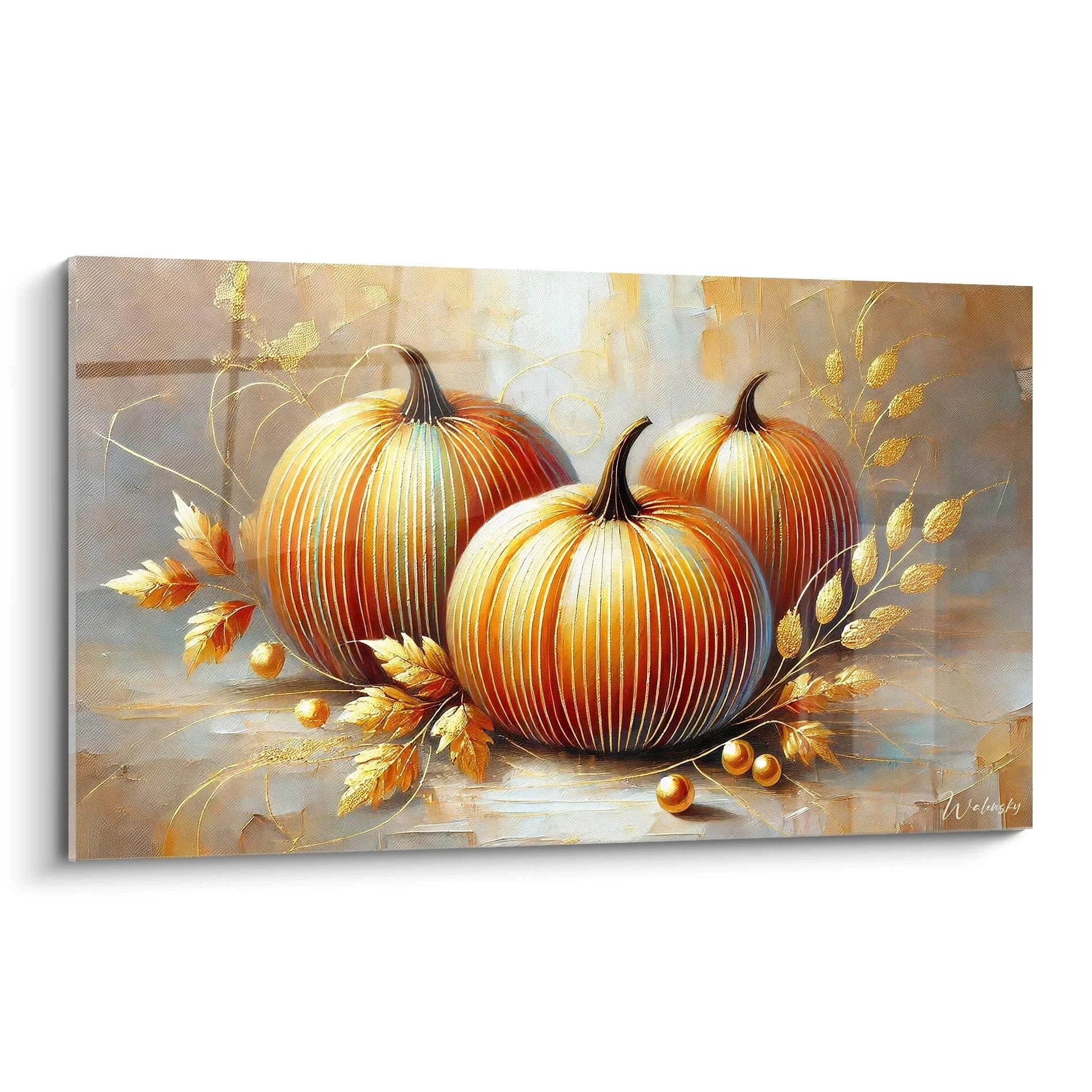
Transforming a conference room into a dynamic collaborative space requires careful consideration of the psychological impact of colors. The orange conference room wall art establishes itself as a strategic decorative element in modern professional environments. This energizing hue stimulates collective creativity and encourages participant engagement during collaborative work sessions. Innovative companies now integrate this chromatic dimension into their decision-making space design strategy. The use of warm-toned wall decoration addresses specific objectives for organizational performance and team dynamization. The large dimensions of these wall creations maximize their visual presence and amplify their psychological effect on all present collaborators.
Orange as a Catalyst for Productive Meetings
Why does orange stimulate professional exchanges?
The orange conference room wall art activates brain regions linked to enthusiasm and rapid decision-making. This warm color creates an atmosphere conducive to brainstorming and strategic sessions where innovation must emerge quickly. Neuroscience demonstrates that orange hues increase collective concentration while reducing interpersonal tensions during complex negotiations.
In boardrooms, this energizing tone combats the monotony of extended meetings. It maintains optimal attention levels even during budget presentations or quarterly reviews. Chief executives observe measurable improvement in active participation when their meeting space integrates this strategic chromatic dimension.
Visual intensity suited to large corporate spaces
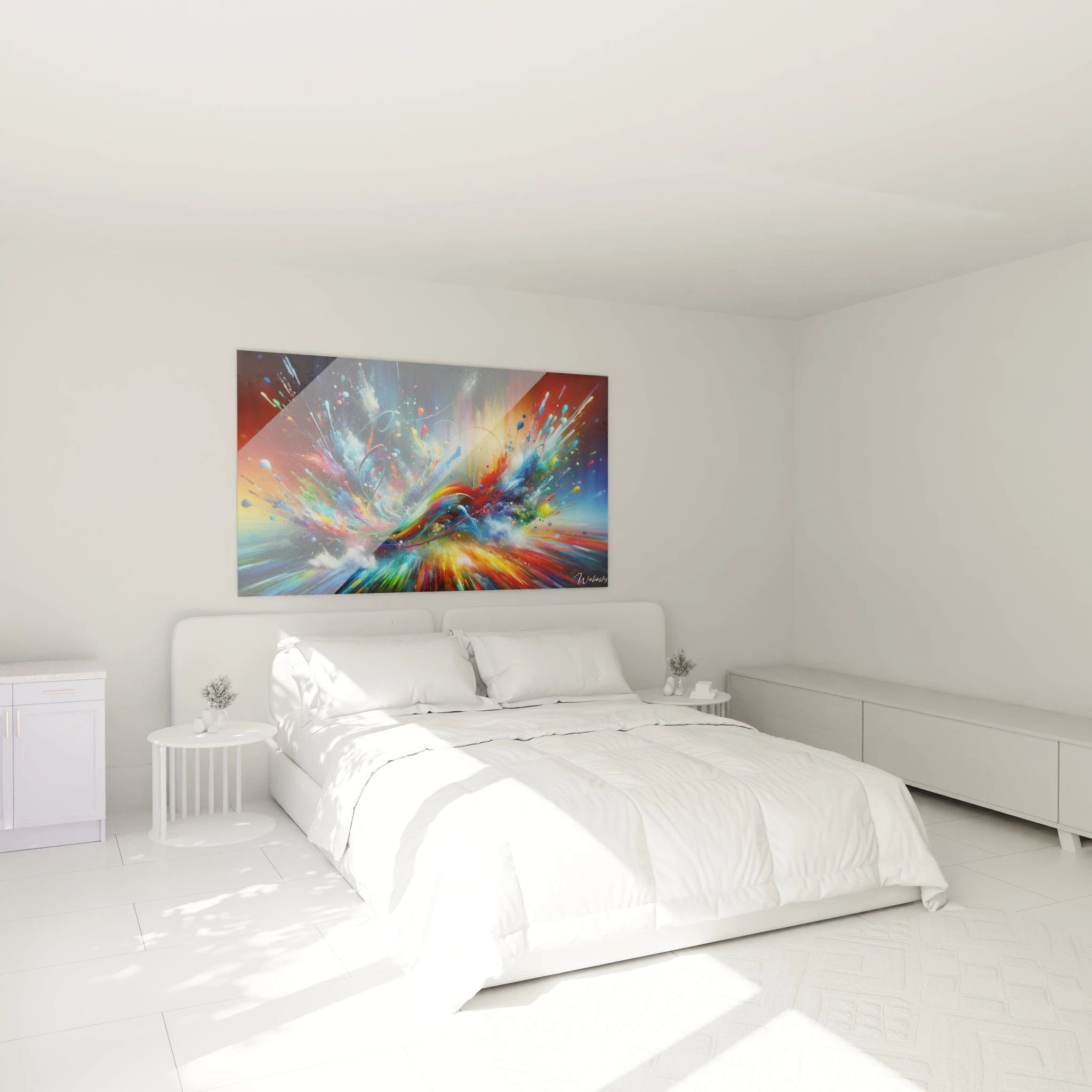
The monumental formats of orange wall creations naturally establish themselves in conference rooms of 40 to 80 square meters. Their architectural presence compensates for the substantial volumes and high ceilings characteristic of executive decision-making spaces. The chromatic saturation must be calibrated according to natural light exposure and room orientation.
Facilities management professionals favor works whose width exceeds 180 centimeters to create an effective focal point opposite conference tables. This generous scale visually balances imposing technological equipment such as videoconference screens and projection systems. For more varied ambiances, also consider an abstract conference room wall art that brings a complementary contemporary dimension.
Chromatic synergies with corporate identity
Integrating an orange wall artwork in a conference room often forms part of a broader spatial brand design approach. Technology companies and creative agencies use this hue to reinforce their innovative positioning. Terracotta or mandarin shades harmonize particularly well with graphic charters including neutral gray or beige tones.
Corporate interior architects recommend pairing this dominant color with furniture featuring clean lines in metallic or dark wood finishes. This combination avoids visual overload while maintaining a professional and stimulating atmosphere for board committees and client presentations.
Psychological Impact on Collective Performance
How does orange influence group dynamics?
The orange conference room wall art acts as an emotional regulator during idea confrontations and conflict resolution phases. This color facilitates the expression of divergent opinions without excessive aggression, creating a secure framework for disruptive innovation. Organizational psychologists observe a significant reduction in creative blockages in environments integrating this energizing chromatic quality.
Multicultural teams particularly benefit from this warm atmosphere that transcends cultural barriers. Orange possesses an almost universal symbolic value of openness and conviviality, facilitating international workshops and design thinking sessions. Human resources managers observe improved sense of belonging during strategic seminars organized in these optimized spaces.
Optimizing meeting cycles according to biological rhythms
The intrinsic luminosity of orange tones compensates for natural afternoon energy drops. A large-scale orange wall artwork maintains constant vigilance levels during weekly committees scheduled between 2 PM and 4 PM. This decorative solution avoids systematic recourse to coffee breaks to relaunch collective attention.
Neuroscience applied to workspaces demonstrates that this color activates dopamine production, the neurotransmitter essential to motivation and perseverance. Quarterly strategic planning sessions gain decision-making efficiency thanks to this stimulating yet non-aggressive chromatic environment.
Memorization of decisions and formalization of commitments
The visual association between a striking orange decorative element and decisions made facilitates the memory retention of collective commitments. Participants remember voting resolutions more precisely in a visually distinctive environment. This spatial anchoring reinforces individual accountability toward group-defined objectives.
Project directors strategically use this feature for critical program launch meetings. The chromatic environment thus becomes a cognitive landmark associated with important decision-making moments, creating memory continuity between different project advancement phases.
Integration into Contemporary Corporate Architectures
Compatibility with LEED and WELL environmental standards
Choosing an orange conference room wall art fits within tertiary building certification approaches focused on occupant well-being. The WELL Building Standard frameworks value chromatic interventions promoting vitality and emotional balance for users. This holistic space planning approach recognizes the direct impact of visual environment on organizational health.
Commercial real estate developers marketing premium office buildings now integrate these considerations from the design phase. Ready-to-use conference rooms frequently include wall decoration solutions with dynamizing hues calibrated by environmental psychology experts. This added value differentiates real estate offerings on saturated tertiary markets.
Adaptability to agile organizational changes
Companies adopting flexible work methodologies require versatile conference spaces. A large-scale orange decorative element retains its relevance whether for sprint planning, scrum retrospectives, or portfolio reviews. This functional neutrality justifies investment in a lasting decorative piece despite frequent reorganizations.
Digital transformation managers observe that these stable visual markers provide psychological reassurance during profound organizational change phases. As teams, processes, and tools evolve rapidly, the identifiable physical environment offers essential stabilizing reference points for change acceptance.
What technical criteria for lasting investment?
Selecting an orange wall artwork for a conference room requires evaluating its resistance to thermal variations generated by professional air conditioning systems. Formats exceeding 200 centimeters in width must present structural stability guaranteeing integrity against vibrations from technical equipment. Facilities managers favor solutions requiring minimal maintenance compatible with tertiary space cleaning protocols.
Evaluating color durability against exposure to high-intensity LED lighting constitutes a determining criterion. Executive conference rooms operate daily with sustained light levels, potentially accelerating pigment degradation. Specialized suppliers now guarantee color stability over 10 to 15 years for premium professional installations.
FAQ - Orange Conference Room Wall Art
Is orange conference room wall art suitable for traditional financial sectors?
Banks and audit firms are progressively adopting this chromatic quality for their innovation and digital transformation spaces, while maintaining neutral tones in classical board rooms. Orange visually signals zones dedicated to experimentation and rupture with conventional approaches.
How to size an orange conference room wall art for 12 people?
For a standard configuration accommodating twelve participants around a 4-meter table, prioritize a minimum width of 160 centimeters to create proportionate visual impact. The optimal height ranges between 100 and 130 centimeters to balance the main wall without overwhelming the space.
Do orange hues in conference room wall art influence differently according to cultures?
While orange retains universal energizing connotation, Asian teams associate it with prosperity notions particularly valued, whereas Northern European collaborators perceive greater innovation and non-conformist aspects. This cultural polysemy generally enriches interpretations without creating rejection.