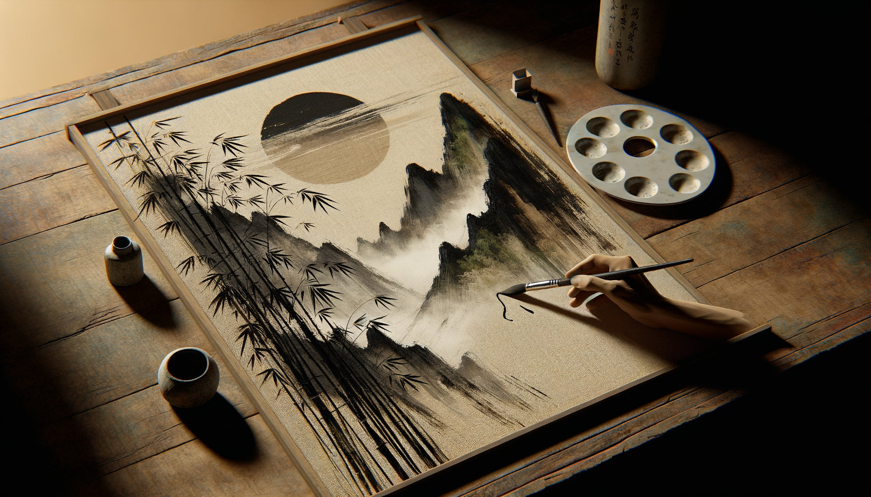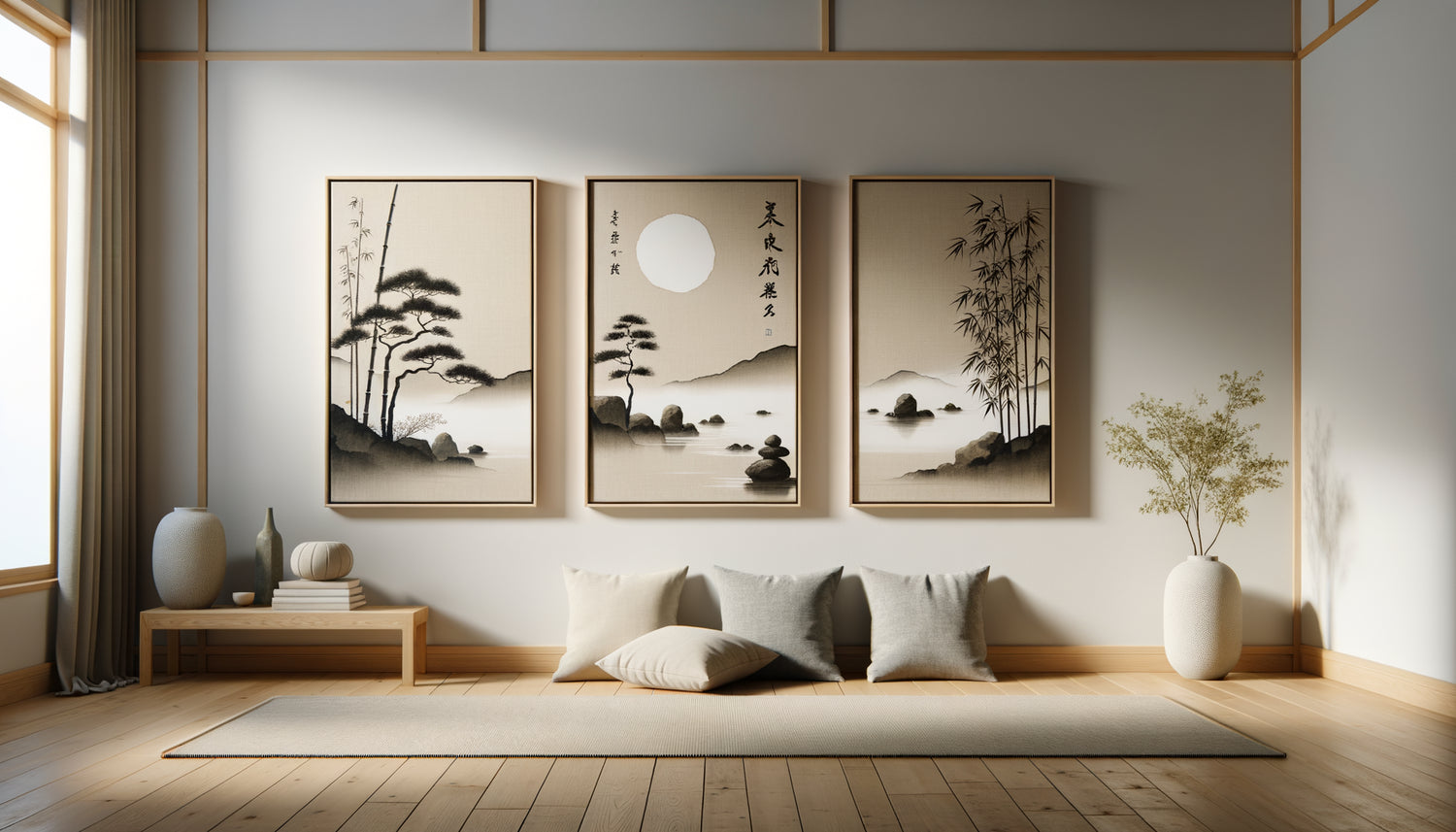
For a long time, I believed that hanging multiple zen artworks was simply a matter of symmetry. Then, during a trip to Kyoto, I observed how tea masters composed their tokonoma: each element engaged in a silent conversation. It wasn't the alignment that created harmony, but the intention. Upon returning to Europe, I completely rethought my approach to composing zen walls.
Harmonizing multiple artworks in the same room is creating a visual ecosystem that amplifies serenity rather than diluting it. This brings three major transformations: an aesthetic coherence that instantly soothes the eye, a spatial depth that visually expands the room, and a meditative atmosphere reinforced by harmonious repetition. Many fear overwhelming the space or creating an overly cluttered “gallery” effect. Yet, with a few principles from Japanese aesthetics and an intuitive understanding of visual balance, composing a zen wall becomes a deeply satisfying creative act. I guide you through the fundamentals that I have refined over dozens of compositions.
The rule of the guiding thread: when unity is born from variation
Harmonizing multiple zen artworks begins by identifying your guiding thread. It's not a constraint, but an invisible backbone that allows your works to engage. In my practice, I have identified four types of guiding threads particularly effective.
The chromatic thread remains the most intuitive: a palette of grays, beiges and off-whites creates a natural zen harmony. But you can also opt for variations around a signature color like sage green or navy blue. The important thing is to maintain a tonal coherence: if one artwork presents bright hues, the others must share that intensity.
The thematic thread works wonderfully for zen compositions. Imagine three artworks: an ensō circle, stylized bamboo, and a calligraphic quote. Three different subjects, but the same philosophy. This approach tells a visual story that reinforces the meditative atmosphere of the room.
The stylistic thread unifies through technique: Japanese watercolors, minimalist inks, or black and white photographs. Even with varied subjects, the consistency of the visual rendering creates an immediate harmony. I recently composed a triptych mixing zen pebbles, meditation and lotus, all treated in a purified monochrome. The result was strikingly coherent.
Finally, the geometric thread: all your zen artworks share the same format (square, panoramic) or the same style of framing. This structural approach reassures the eye and allows more freedom in the subjects chosen.
The error that breaks harmony
The trap I constantly see: trying to say too much. Seven zen paintings of radically different styles do not create richness, but visual cacophony. Zen philosophy itself teaches us that less reveals more. Limit yourself to a maximum of 2-4 works per wall, unless you are intentionally creating a structured gallery wall.
Compositions that breathe: geometry of serenity
The spatial arrangement of your zen paintings directly influences the energy of the room. I have experimented with dozens of configurations, and some geometries naturally amplify the feeling of tranquility.
The aligned horizontal composition remains a classic for zen spaces. Two or three paintings of the same height, spaced 10-15 cm apart, create a soothing visual rhythm. This configuration works wonderfully above a sofa or bed. The eye follows a fluid reading line, without jolts. To accentuate the zen effect, center the entire ensemble rather than each painting individually.
The staggered vertical arrangement is perfect for narrow spaces such as hallways or window sides. Three zen paintings of different sizes, arranged in a column with varying spacing, create an upward movement that evokes the growth of bamboo. This composition adds perceived height to the room.
The balanced triptych represents an ideal solution for harmonizing multiple zen paintings. A larger central painting flanked by two smaller works naturally creates a focal point. This gentle symmetry perfectly corresponds to the zen aesthetic. I recommend a 60x80 cm center painting with two 40x60 cm lateral ones, spaced 12 cm apart.
The controlled asymmetrical composition requires more sensitivity but offers striking results. A large zen painting on the left balanced by two stacked small paintings on the right creates a soothing visual tension. This approach is inspired by the Japanese principle of fukinsei (balanced asymmetry): harmony arises from controlled imbalance.
The golden rule of spacing
Between your zen paintings, respect a space of 10 to 20 cm depending on the formats. Too close together, they compete with each other; too far apart, they lose their dialogue. To test before drilling, use kraft paper cut to the dimensions of your paintings and attach it to the wall with masking tape. Live with this composition for a few days. Your intuition will tell you if harmony is present.

When empty space becomes the protagonist
Here's what few people understand when harmonizing multiple Zen artworks: the void around your works is part of the composition. In Japanese, this is called ma (間), the negative space that allows beauty to breathe.
I’ve seen too many Zen compositions drowned in cluttered walls. Shelves, mirrors, plants, clocks... each additional element dilutes the soothing effect of your artworks. To create a true Zen harmony, visually isolate your composition. Leave at least 40 cm of empty space around your artwork set. This void acts as an invisible frame that magnifies your works.
The color of the wall profoundly influences the harmony. A slightly warm off-white (like linen white or cream white) makes Zen artworks stand out while maintaining softness. Pearl grays work beautifully with black and white pieces. I avoid saturated colors that compete with the artworks rather than sublimate them.
Also consider the lighting environment. Zen artworks thrive in soft, natural light. Avoid aggressive directional spotlights that create reflections. Opt for soft ambient lighting or, even better, daylight filtered by linen curtains.
The art of mixing formats and proportions
Harmonizing multiple Zen artworks in different formats requires an intuitive understanding of proportions. My approach is based on the principle of balanced ratios.
If you combine two artworks, opt for a 1:2 ratio (for example 40x60 cm and 60x80 cm) or 2:3. These proportions create a natural visual hierarchy without excessive dominance. For three Zen artworks, I often recommend the 1:1:1 formula (three identical formats) for simplicity, or 1:2:1 (a large central piece framed by two smaller ones) for more dynamism.
Mixed panoramic + square compositions work particularly well in the Zen aesthetic. A long horizontal artwork (120x40 cm) depicting a bamboo scene, paired with a square (50x50 cm) showing a balanced pebble, creates a dialogue between horizontal contemplation and vertical focus.
Pay attention to the rule of visual fixation points: in a room, the eye naturally focuses on a maximum of 2 to 3 points. If you harmonize four or more Zen artworks, make sure they form an ensemble perceived as a single visual unit, not four competing fixation points.
The blurred gaze technique
Here's my foolproof test to verify harmony: step back 3 meters from your composition and squint slightly to blur the details. You should perceive a global tonal balance, without one artwork dominating the others. If one appears aggressively, readjust the proportions or spacing.
Ready to transform your space into a sanctuary of serenity?
Discover our exclusive collection of Zen artworks that naturally dialogue with each other to create harmonious compositions effortlessly.

Composing with the soul of the room
The final harmony also depends on the function and energy of your space. Each room calls for a different composition.
In a living room, where the energy is more social, I dare to create dynamic compositions: three Zen artworks in an off-center arrangement that invite conversation. The eye moves, explores, without ever tiring. Favor works with varied natural elements: water, stone, vegetation.
For a bedroom, harmony must promote total relaxation. I recommend a minimalist composition: one or two artworks maximum, in soft monochrome tones. A large Zen artwork representing an ensō circle above the bed is often enough to create the desired meditative atmosphere.
In a home office or workspace, harmonize your Zen artworks to stimulate calm concentration. A vertical composition that guides the eye upwards promotes mental clarity. I like to combine works depicting bamboo (flexibility) and stacked stones (balance).
Transition spaces such as hallways offer creative opportunities. A series of four identical small Zen artworks in the same format, spaced regularly, creates a soothing rhythm that accompanies movement. This harmonious repetition amplifies the meditative effect.
The finishes that seal the harmony
The frame is the detail that can sublimate or sabotage your composition. To harmonize several Zen artworks, frame consistency is non-negotiable.
My favorite choice: thin frames in light natural wood (oak, ash, bamboo) or minimalist matte black frames. The uniformity of the frames automatically creates a visual unity, even if the subjects of the paintings vary. Conversely, mixing baroque gold frames with minimalist black frames will instantly break the sought-after zen harmony.
Frameless paintings (on thick canvases) work wonderfully for a contemporary zen aesthetic. They create an impression of lightness and modernity. If you choose this option, make sure all your paintings share the same canvas thickness (usually 2 or 4 cm).
Regarding hanging height, respect the universal rule: the visual center of your composition should be at 145-155 cm from the floor, approximately eye level. For multiple paintings, calculate the center of the whole, not each painting individually.
Finally, a detail that is rarely mentioned: perfect alignment. Use a laser level or smartphone app to ensure your paintings are perfectly horizontal. A crooked picture, even slightly, unconsciously disturbs the eye and sabotages the zen serenity.
Conclusion: harmony as an evolving practice
Harmonizing multiple zen paintings in the same room is not an exact science, but a sensitive practice that evolves with you. What soothed you six months ago may require adjustment today. I encourage my clients to live with their compositions, to observe them at different times of the day, to feel their emotional impact.
True harmony manifests in this particular sensation: you enter the room, your gaze naturally embraces the entire set of zen paintings, and something within you instantly calms down. No discordant detail that catches the eye, just a serene visual flow that invites presence.
Start simply: choose two zen paintings that resonate with you, find their common thread, and let intuition guide their placement. Harmony will be born from this patient listening to space and your own feelings. Your zen wall then becomes much more than decoration: it becomes a daily tool for returning to yourself.
Frequently Asked Questions
How many zen paintings can you hang maximum in a room?
There’s no absolute limit, but Zen philosophy itself teaches restraint. For a standard room (20-30 m²), I recommend limiting to a maximum of 3-5 artworks to preserve the calming effect. Beyond that, you risk creating excessive visual stimulation which contradicts the goal of serenity. The exception: an intentionally structured gallery wall with 7-9 identical small Zen artworks in the same format, arranged in a perfect grid. In this case, repetition itself becomes meditative. Remember that each artwork must have space to breathe. If your gaze frantically jumps from one work to another without ever settling, then you have exceeded the threshold of harmony. The golden rule: always prioritize contemplative quality over quantity.
Can Zen artworks be mixed with other decoration styles?
Absolutely, but with discernment. Zen artworks particularly pair well with minimalist, Scandinavian and Japandi aesthetics. Their calming nature integrates harmoniously into clean interiors with natural materials. On the other hand, associating Zen artworks with a very busy decor (maximalist, baroque or raw industrial style) creates dissonance. The Zen works lose their soothing power drowned in visual chaos. My advice: if your interior mixes styles, create a dedicated zen zone – a reading corner, a meditation space, or the main wall of your bedroom – where your Zen artworks can fully deploy their energy without visual competition. Harmony comes from contextual consistency, not absolute uniformity.
What is the best arrangement for 3 Zen artworks of the same size?
Three identical Zen artworks offer wonderful flexibility. The horizontal aligned arrangement remains the most streamlined: the three works side by side at the same height, spaced 10-15 cm apart, create a harmonious triptych perfect above a sofa or console. For a more dynamic energy, try the stair-step arrangement: the first artwork at 140 cm from the floor, the second 20 cm higher, the third another 20 cm above. This ascending configuration evokes growth and is particularly suitable for artworks depicting natural elements such as bamboo. A third sophisticated option: the L arrangement, with two artworks horizontally aligned and the third perpendicularly below or next to them. This geometry breaks monotony while maintaining balance. Always test with kraft paper before drilling – your eye will tell you which arrangement resonates with the energy of your space.