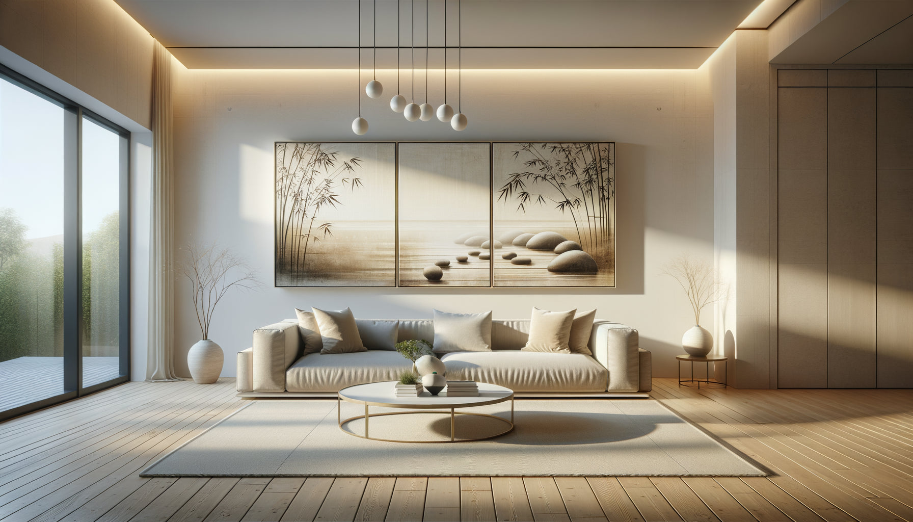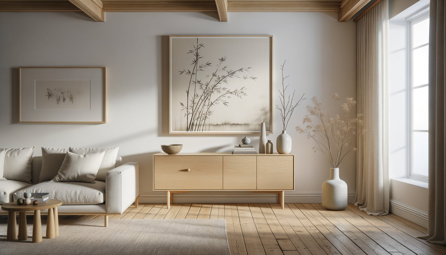
I spent eight years in Hong Kong before settling in Copenhagen to create my studio. This dual culture taught me one essential thing: Nordic minimalism and Zen philosophy are one. Yet, every week, I receive clients overwhelmed by what should be an obvious natural progression. Their Scandinavian interior breathes serenity with its clean lines and light wood, but the wall stubbornly remains empty. They seek the artwork that will complement this harmony without breaking it.
Here's what a Zen painting brings to a Scandinavian interior: a visual punctuation that amplifies silence, a meditative depth that dialogues with Nordic functionality, and a balance between emptiness and presence that transcends both aesthetics. The challenge isn’t finding wall decor, but discovering the missing breath of your space.
The real difficulty? Avoiding the cliché of bamboo postcard or gilded Buddha that clashes with your bleached oak furniture. I will show you how to choose a Zen artwork that respects the DNA of your Scandinavian decor, as if it had always been destined for that specific wall.
The common grammar of emptiness and silence
When my clients finally understand that Scandinavian design is already Zen by essence, everything becomes simpler. These two universes share an obsession: respecting the void as a compositional element. In a Nordic living room, the space between furniture isn't a gap to fill; it’s an intentional breath. Exactly like in a Japanese Zen garden where raked sand creates as much meaning as stones.
This kinship explains why some Zen paintings instantly integrate with Scandinavian furniture while others create immediate dissonance. Look for artworks that practice visual restraint: compositions where emptiness occupies at least 40% of the surface, brushstrokes that suggest rather than assert, monochromatic or bichromatic palettes that allow the eye to rest.
I recently hung a sumi-e Japanese calligraphy on ecru background in an apartment in Nørrebro. The client owned a pearl gray sofa and a solid birch bookcase. The black ink of the painting created the only deep color accent in the room – a visual anchor without pollution. The next day, he wrote to me: 'It's as if the painting had always been there, invisible until it appeared.'
The palettes that weave the dialogue
Color is your first ally or your worst enemy. Scandinavian furniture generally evolves within a reduced spectrum: off-whites, soft grays, natural beiges and light woods. A Zen painting must fit into this chromatic conversation without raising the volume.
Prioritize three families of palettes that work infallibly. First, monochrome inks: black on cream background, anthracite gray on pearl gray, sepia on ecru. These works bring depth without creating tonal disruption. Next, earth and minerals: soft ochres, warm beiges, stone grays that resonate with the natural textures of Nordic furniture. Finally, desaturated greens and grayish blues which evoke Scandinavian landscapes while respecting the zen plant palette.
Absolutely avoid bright reds, flashy gilding, and saturated colors. I've seen too many harmonious living rooms broken by a brightly colored zen painting bought on a whim in a souvenir shop. Chromatic sobriety is not a constraint but a liberating discipline.
Natural accents that unify
If your Scandinavian decor already incorporates touches of sage green or terracotta – cushions, throws, ceramics – your zen painting can pick up these nuances with delicacy. A watercolor wash depicting gingko leaves in gray-green tones will create a subtle visual continuity which reinforces the coherence of the whole.

Materials and textures: the touch of the eye
In a Nordic interior, natural materials reign supreme: raw linen, bouclé wool, raw wood, matte ceramics. Your zen painting should share this tactile sensitivity. Look for works on washi paper whose fibrous texture captures the light gently, unprimed ecru linen canvases that retain their visible grain, or raw wood supports where paint dialogues with the natural veins.
I have a particular fondness for rice paper artworks mounted on paulownia wood panel. This traditional Japanese presentation brings a subtle physical presence: the painting floats a few millimeters from the wall, creating shadow games that vary with daylight. In a Scandinavian living room where natural light is treated as a building material, this effect becomes magical.
Beware of prints on glossy canvas or plexiglass which bring an industrial coldness foreign to both aesthetics. Matteness is your compass: surfaces that absorb light rather than reflect it create the sought-after contemplative atmosphere.
Proportions and placement: the art of just measure
A zen artwork that's too large can overwhelm a Scandinavian space; if it's too small, it disappears into the void. The rule I consistently apply is: the artwork should occupy between 50% and 75% of the width of the main piece of furniture it sits above. Above a sofa measuring 220 cm, look for an artwork that’s 110 to 165 cm wide. This proportion creates a visual anchor without dominance.
Hanging height deserves particular attention. In Nordic aesthetics, low and horizontal lines are favored. Hang your zen artwork so that its center is between 145 and 155 cm from the floor – the natural eye level when standing. If you place it above a low Scandinavian sideboard, leave 15 to 25 cm of space between the furniture and the frame: not too close (a feeling of being crushed), nor too distant (loss of dialogue).
For multiple compositions, draw inspiration from the Japanese concept of ma (間), meaning interval. Three small square zen artworks measuring 30x30 cm aligned horizontally with 8 cm spacing create a rhythm that amplifies serenity rather than fragmenting it.

Zen themes compatible with the Nordic spirit
Not all zen subjects resonate equally well with Scandinavian furniture. Some themes create natural bridges between the two cultures. Minimalist landscapes – misty mountains in ink, pure maritime horizons – evoke both Norwegian fjords and Japanese prints. This double reference creates an immediate familiarity.
Subtle botanical compositions work beautifully: a cherry branch with minimal lines, stylized pampas grass, a solitary bamboo treated as a suggestion rather than a botanical illustration. These works establish a dialogue with Nordic indoor plants – monstera, ficus lyrata, dried eucalyptus bouquets.
Zen calligraphy requires more caution. A powerful Japanese character like 'mu' (void) or 'ma' (interval) can create a strong graphic presence that harmonizes with the clean typography of Scandinavian posters. But avoid overly ornamental calligraphies or long texts that create a visual density incompatible with Nordic breathing.
Symbols to be handled with caution
Buddhas, mandalas, yin-yang symbols: these explicit spiritual icons can create a stylistic break in a contemporary Scandinavian interior. If you want to incorporate these elements, choose abstract or minimalist interpretations: a large brushstroke enso circle rather than a colorful mandala, a shadow silhouette of Buddha rather than a reproduced golden statue.
The frame, that decisive detail
A beautiful zen painting can be ruined by an unsuitable frame. To dialogue with Scandinavian furniture, prioritize three proven options. The unfinished light wood frame – oak, ash, maple – creates an obvious material continuity with your furniture. The frame should remain thin (no more than 2 to 3 cm) so as not to weigh down the composition.
The ultra-thin matte black baguette (1 to 1.5 cm) offers a discreet elegance that works particularly well with ink artworks. It creates a clean framing without imposing itself visually. Finally, for some contemporary works, total absence of frame with a simple canvas on chassis with painted edges is the most minimalist option.
Forget golden frames, baroque-style worked baguettes, cream-colored mats that yellow the artwork. In the Nordic-zen universe, the frame must disappear behind the work while protecting and subtly structuring it.
Transform your space into a sanctuary of Nordic serenity
Discover our exclusive collection of Zen paintings that naturally dialogue with the Scandinavian aesthetic, to create that perfect balance between Nordic functionality and Eastern contemplation.
When the artwork finds its place
The right zen painting in a Scandinavian interior doesn't immediately stand out. It gradually infuses the space with a soothing presence. You will know you have made the right choice when, after a few days, you can no longer imagine that wall without this work – as if it had waited patiently to be revealed rather than having been added.
This harmony requires patience. Take the time to observe your space at different times of the day. Scandinavian light changes radically between the bluish morning and the golden evening. Your zen painting must live harmoniously in these variations of light. Bring photos of your interior when you go hunting for the ideal work, or request simulation visuals before buying.
Start with a main wall – the one that greets your gaze as you enter the room. Once this visual anchor is installed, the other decorative elements will find their place naturally by resonance. Zen art and Scandinavian design teach you the same lesson: fewer quality elements create more beauty than accumulation.
Your interior doesn't need to be filled, but completed. The zen artwork you are looking for already exists somewhere, waiting to create this silent conversation with your Nordic furniture. Trust that intuition that tells you 'this is it' rather than a rational checklist. Perfect harmony is felt before it is understood.
Frequently Asked Questions
Can I mix several styles of zen artworks in the same Scandinavian space?
Yes, but with method. Limit yourself to a maximum of two styles and create consistency through a common element: the color palette, the type of framing or the format. For example, three different works – calligraphy, minimalist landscape and plant composition – will work together if they share tones of gray and black on a light background, and if they are framed identically. The important thing is to maintain a visual global unity that respects Scandinavian discipline. Think of the space between the artworks as an element of composition: 8 to 15 cm spacing creates sufficient breathing room for each artwork to retain its integrity while participating in a harmonious ensemble.
What size of zen artwork to choose for a small room with Scandinavian furniture?
In a small space, resist the temptation of miniature format which would be visually lost. Paradoxically, a medium-sized artwork creates more amplitude than a multitude of small works. For example, in a 12 m² bedroom, an 80x60 cm zen artwork above the bed will structure the space without crushing it, provided that a clean composition with plenty of empty space in the work itself is respected. Favor horizontal formats which visually widen the space and minimalist subjects – a brushstroke, a solitary branch, a horizon – which amplify the feeling of breathing rather than constrain it. The scale must be thought in relation to the main piece of furniture: an artwork occupying 60% of the width of a low Scandinavian chest of drawers will create the ideal balance.
Do zen artwork prints work or should original artworks be preferred?
A professional-quality print is perfectly suitable if it meets certain essential criteria. Look for prints on matte art paper (minimum 300g) with pigment inks that guarantee durability and the absence of reflections. Giclée prints on cotton paper or non-glossy linen canvas remarkably reproduce ink and zen watercolor works. What matters more than originality is the quality of reproduction and the physical presence of the final object. A beautiful print, well framed, will create a more harmonious atmosphere than a mediocre original work. For a Scandinavian interior that values accessibility and functionality as much as aesthetics, an honest reproduction of a successful zen composition constitutes a choice consistent with the democratic values of Nordic design.