Composez votre galerie d'art

Des tableaux qui racontent votre histoire
Code d'initiation
ART10
10% offerts sur votre première acquisition
Découvrir la collection

Which artworks to choose for a Japandi or Wabi-Sabi decor?

Quels tableaux choisir pour une déco japandi ou wabi-sabi ?
⏱️ Reading time: 8 minutes

You’ve just finished decorating your living room in a clean style, inspired by Nordic and Japanese trends. Yet, something feels off. Your walls remain desperately bare, and every time you look at decor magazines, you feel that frustration: "How do they make it so harmonious?"

Your neutral furniture colors seem dull, the atmosphere lacks warmth, and most importantly, you can't visualize what type of wall art could complement this minimalist aesthetic without spoiling it.

You may have already tried a few canvases from big box stores, or followed the advice of a friend who recommended reproductions of classic art. The result? Either it's too busy and breaks the harmony, or it’s so bland that it reinforces the feeling of emptiness.

That's perfectly normal! The problem isn't your aesthetic sense, but the fact that Japanese Japandi and Wabi-Sabi art adheres to very specific codes that few people truly master.

By the end of this article, you will know exactly which paintings to choose to enhance your Japandi or Wabi-Sabi decor, and you’ll discover why some artworks instantly transform the atmosphere of a room.

Why is wall art the secret soul of Japandi style?

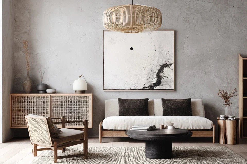
Imagine two identical living rooms: same light wood furniture, same beige sofa, same green plant in the corner. In the first, the walls remain bare. In the second, a single painting with earthy tones reigns above the sofa. The difference? The second breathes authenticity and serenity, while the first seems unfinished. That's exactly what happens when you neglect wall art in a Japandi decor: you miss the opportunity to create that zen soul that makes all the difference.

🏠 Testimonial from Sarah, interior architect: "I had a client who invested €15,000 in high-end Scandinavian furniture. Her house was beautiful but... cold. By adding three paintings with clean lines and natural tones, the atmosphere completely changed. Her guests now ask her for the name of her decorator!"

💬 Conversation with a decor expert

"I'm afraid my new painting won’t match if I change my wall color..."
Relax! It's exactly the opposite. A true artistic crush adapts and even reveals itself with new colors. It's like a diamond that shines differently depending on the lighting!
"But I was told you always had to match colors..."
Who told you that? Modern decor plays with subtle contrasts. A painting with warm tones on a cold wall is like a fireplace in a blue room: magical!

The golden rule of Japandi style: A successful artwork doesn't immediately catch the eye, but transforms the atmosphere subtly and durably. You should feel an immediate sense of calm when entering the room, from the very first hours of hanging it.

What’s really behind your hesitations

You hesitate between three different artworks on a decor site, you close the computer without ordering, you come back a week later... Does this situation speak to you? You are not indecisive, you simply feel that something doesn't fit, without knowing exactly what.

In reality, your instinct protects you from a bad choice. Your brain detects that these works do not correspond to the deep aesthetic codes of Japandi and Wabi-Sabi, even if you don’t know how to formulate them clearly yet.

It's like trying to recognize a foreign accent: you feel that "it sounds different" before you can explain why. Once you know the real criteria, your choices will become obvious and instinctive.

The first hidden cause: confusion between clean and empty

Many people think that Japandi style = white and empty walls. This is the most common mistake! True Japandi celebrates the beauty of natural materials and organic shapes. A bare wall isn't clean, it’s simply... bare.

Imagine a Japanese Zen garden: it's not empty, it's composed with intention. Each stone, each plant has its reason to be. Your wall art works the same way.

This confusion leads you to miss the very essence of the style: creating harmony between human and nature, between simplicity and emotional depth. As a result: your interior lacks character and doesn’t reflect who you are.

🔍 Quick test: Look at your living room and count the elements that evoke nature (wood, stone, plants, organic materials). If you have fewer than 3, it means your decor lacks this essential natural connection to Japandi.

The obsession with "perfectly matched" colors

You are looking for THE color that will perfectly match your beige cushions and gray throw? You’re on the wrong track! Japanese wabi-sabi celebrates natural imperfections and subtle nuances.

It's like wanting all the leaves of a tree to have exactly the same shade of green. In nature, it is the variations that create beauty and visual harmony.

This search for chromatic perfection locks you into bland and predictable choices, while you could dare soft contrasts that reveal the personality of your space.

The fear of making it "too Japanese" or "too Scandinavian"

You avoid traditional Japanese patterns for fear that your living room will look like a sushi restaurant, or you flee Nordic inspirations fearing the “IKEA catalog” effect. This fear prevents you from discovering the most beautiful pieces!

You can spot this hesitation when you tell yourself: "I quite like it, but my guests might find that strange..." or "It’s pretty, but doesn't it feel a bit… exotic?"

This self-censorship deprives you of the authenticity and unique character that you subconsciously seek. Your interior becomes generic when it could reflect your personal artistic sensibility.

3 signals that betray your true preferences:

  • You linger on a "different" work: Your eye naturally stops on it, even if your reason finds objections
  • You come back to see it several times: You reopen the tab, you show the image to someone nearby... This is a sign of a real crush You can imagine it in your home: You spontaneously visualize where to hang it and how it would transform the atmosphere

The magical trigger: emotion before logic

What really makes the difference is when you choose a work that personally moves you rather than one that "goes well with the decor". This authentic emotion shines through in the atmosphere of your home and naturally touches your guests. It's the butterfly effect of decoration: a personal and sincere choice positively influences the entire atmosphere of your house.

The rule of immediate feeling: If a work makes you smile or soothes you in the first 3 seconds, it's probably the right choice. You can check this by closing your eyes, opening them and observing your instinctive first reaction.

❌ What we believe ✅ The japandi/wabi-sabi reality 💡 Why it works 🎯 Benefit for you
Everything must be perfectly matched Nuances create harmony Nature varies subtly More lively and warm atmosphere
The simpler, the better Simple but with depth Avoids the blandness of cold minimalism Unique character without clutter
Avoid "ethnic" patterns Integrate inspiration subtly Authenticity touches more than uniformity Conversations and admiration from guests
Prioritize practicality Choose what moves us Emotion creates a unique atmosphere Daily well-being feeling

The 3-step method for choosing your perfect japandi artworks

Rassurez-vous, choisir le bon art mural n'est pas une science exacte ! C'est plutôt comme apprendre à reconnaître un bon vin : il faut connaître quelques bases, puis faire confiance à ses sens. Je vais vous guider étape par étape, de l'analyse de votre espace jusqu'au choix final, en passant par la compréhension de votre style personnel. À la fin, vous aurez cette confiance tranquille de savoir que votre choix est le bon.

🗺️ Your journey in 3 steps: First identify the soul of your space (the energies it emanates), then define your deep tastes (what truly touches you), and finally materialize with the right artworks. Each step brings you closer to that perfect harmony between your personality and your interior.

Step 1: Decipher Your Space's DNA

Before choosing anything, you need to understand what your space is already "telling" you. It’s like learning to listen before speaking. This step avoids costly mistakes and gives you the assurance that connoisseurs have: instantly knowing what will work or not.

What You Need for This Analysis

  • Your smartphone to photograph: Take 5-6 photos of your room from different angles and lighting conditions. The objective reveals details that your accustomed eye no longer notices. Avoid Instagram filters which distort colors, you need raw reality for an accurate analysis.
  • A moment of absolute calm: Choose a time when nobody will disturb you, ideally in the late afternoon when natural light is soft. This is the atmosphere where you spend most of your time at home, so it’s the one that really matters for your final choice.
  • A notebook or notes app: You're going to note down your spontaneous feelings, not a technical analysis. These first impressions are valuable because they reveal what your subconscious perceives about the current atmosphere.

Now, let’s move on to practical application with your personal diagnosis

Your Sensory Audit in 3 Steps

The exercise of the fresh eye: Enter your room as if it were the first time, stand for 30 seconds without doing anything other than observing. Note the first emotion that comes to you: peace, energy, coldness, warmth? This first impression reveals the dominant atmosphere that your future artwork should either reinforce or balance.

⏱️ Time: 2 minutes | ✅ Successful when: You can describe the atmosphere in 2-3 precise words | ⚠️ Attention: Don’t try to be objective, your personal feeling is what counts

The mapping of materials: Identify all visible materials: wood (light/dark), metal (gold/silver), textile (smooth/textured), stone, glass... Japandi/wabi-sabi favors natural materials with subtle imperfections. If you have too many perfectly smooth surfaces, your artwork should bring that missing organic texture.

⏱️ Time: 3 minutes | ✅ Successful when: You have a precise list of materials | ⚠️ Attention: Only count what is really visible, not what’s hidden in the closets

The test of magical light: Observe your room at three times: morning (cool light), afternoon (warm light), evening (artificial lighting). Note how the atmosphere changes. Your ideal artwork should be beautiful in these three contexts, because that’s what you will see on a daily basis.

⏱️ Time: 1 minute x 3 moments | ✅ Successful when: You identify the moment when you feel best in this room | ⚠️ Attention: Some lighting can completely transform colors

✨ Validation of your assessment: You should now be able to tell if your space needs more warmth, coolness, texture, or serenity. If you are still unsure, that's normal: repeat the fresh eye exercise in 2-3 days, your eye will have gotten used to it and will be more objective.

OUR RECOMMENDED PRODUCTS

Step 2: Revealing Your Authentic Tastes

Now that you know your space, you need to discover your personal aesthetic signature. This is the most rewarding part because you will finally understand why certain works mysteriously attract you. This clarity will save you a lot of time during your future purchases!

Your artistic exploration kit

  • Pinterest or Instagram to create a mood board: Create a secret "My japandi/wabi-sabi style" board and pin everything you like, even if it seems "off topic". Recurring patterns will reveal your true preferences. Don't censor yourself: your subconscious knows better than your reason what suits you.
  • Your 5 favorite photos from your phone: Analyze what led you to take them. Dominant colors? Soft or contrasting light? Geometric or organic motifs? These spontaneous choices reveal your natural artistic eye.
  • A moment in your favorite place: Cozy cafe, garden, library... What soothes you in this place? The bright atmosphere, the materials, the colors? This ideal atmosphere guides you towards the right type of wall art.

Your artistic profile in 3 revelations

The test of 20 spontaneous pins: Scroll through Pinterest for 10 minutes pinning everything that makes you "tilt" in the decor universe, even if it has nothing to do with japandi. Then look at your pins: what colors come back? What atmospheres? These unconscious patterns reveal your authentic decorative DNA.

⏱️ Time: 15 minutes | ✅ Successful when: You identify 2-3 recurring trends | ⚠️ Attention: Don't think, follow your instinct from the first second

Analysis of your past crushes: Think back to the last 3 objects/clothes/decorations you bought out of pure desire (not necessity). What do they have in common? Color, shape, style, emotion they evoke? These impulsive purchases reveal your deep tastes, beyond current trends.

⏱️ Time: 5 minutes | ✅ Successful when: You find the connecting thread between these purchases | ⚠️ Attention: Focus on the emotion felt at the time of purchase

The instinctive preferences questionnaire: Prefer a sunset or sunrise? A forest or an ocean? A bustling cafe or a quiet library? These spontaneous choices reveal whether you lean towards warm dynamism (copper tones, organic patterns) or contemplative serenity (blue-grey tones, clean lines).

⏱️ Time: 3 minutes | ✅ Success when: A clear trend emerges | ⚠️ Attention: Answer with your heart, not what you think is "right"

🎯 Your artistic profile revealed: You should now know whether you lean towards "contemplative japandi" (neutral tones, zen forms, soothing subjects) or "warm wabi-sabi" (textured materials, earthy colors, sublimated imperfections). If you're between the two, that’s perfect: you can mix influences!

Step 3: Making it concrete with the right artworks

It's time to take action! Armed with your space analysis and artistic profile, you will now choose with this quiet assurance of true connoisseurs. No more endless hesitations: every artwork that matches your criteria will automatically be a good choice.

Your final selection tools

  • Your list of personalized criteria: Derived from the previous steps, these 4-5 non-negotiable criteria (e.g., warm tones, visible texture, horizontal format...) automatically filter out 80% of artworks. No need to look at everything, you know what you're looking for!
  • The visualization technique: For each selected artwork, close your eyes and imagine it in your home. Which one makes you smile spontaneously? It’s a powerful indicator, more reliable than any rational analysis.
  • Your entourage's test opinion: Show your final selection (2-3 artworks max) to someone who knows your style well. Not for them to decide, but to see if they say "ah yes, that’s you!" It’s confirmation that you’ve found your signature.

Your selection in 3 effective filters

The dimensions and proportions filter: Measure your wall and apply the 2/3 rule: your artwork should be about 2/3 of the width of the furniture below it. For a sofa 180cm wide, aim for 120cm wide. This proportion creates a natural visual balance that harmoniously structures your space.

⏱️ Time: 5 minutes | ✅ Success when: You have a precise range of dimensions | ⚠️ Attention: Too small = lost on the wall, too large = overwhelming

The aesthetic consistency test: Compare each candidate artwork with your space analysis photos. Do the colors naturally dialogue? Does the style integrate without creating a break? A good japandi/wabi-sabi artwork should seem to have always been there, like a natural element of your decor.

⏱️ Time: 3 minutes per piece | ✅ Successful when: You perfectly visualize the integration | ⚠️ Attention: Beware of favorites that clash with your ambiance

The final emotional validation: For your top 2-3 finalists, imagine looking at them every morning at breakfast for the next 5 years. Which one will always give you that little discreet joy? That's it! The perfect wall art emotionally nourishes you daily, far beyond its decorative aspect.

⏱️ Time: 2 minutes of projection per piece | ✅ Successful when: A work makes you smile spontaneously | ⚠️ Attention: Avoid over-analyzing, trust your feelings

🏆 Your masterpiece found: You now have your ideal painting! It respects your technical constraints, harmonizes with your space, matches your personal style, and moves you. If you're still hesitating between two finalists, choose the one that inspires you most serenity: this is the very essence of Japandi/Wabi-Sabi.

The rule of natural progression: Start with a centerpiece in your living room, then gradually complete the other spaces. Each new painting should dialogue with the previous ones while having its own personality. Patience and consistency create those exceptional interiors that are never forgotten.

Congratulations, you now master the secrets of experts! There are a few advanced tips that even experienced interior designers only share among themselves. These details make the difference between "it's pretty" and "wow, how did they do it?"

🎨 Pro secret - The rule of the golden triangle: In a perfect Japandi room, your wall artworks form an invisible visual triangle with your decorative elements (plant, candle, cushion). This subconscious geometry creates a harmony that the eye perceives without understanding. Test by photographing your room: do the points of interest draw a balanced triangle?

🤔 Frequent reader question

"I love a piece but it costs more than expected. Should I crack or look for a cheaper alternative?"

I perfectly understand this hesitation! You've found THE piece that makes you vibrate, but your budget is screaming for help. Here's my expert recommendation: if this work represents less than 2 months of savings and it really transforms your daily life, it's an investment, not an expense. A work we love deeply brings us joy for years, or a few cents of happiness per day! On the other hand, a "not bad" alternative will end up frustrating you and costing more in the long run.

💡 My practical advice: Wait 48 hours keeping the work in your favorites. If you miss it during those two days, it's a sign of a true crush that deserves us to revise our budget. Otherwise, continue your research serenely.

The Pitfalls to Absolutely Avoid (Even Experts Fall For Them!)

Warning, these mistakes can ruin months of reflection and hundreds of euros! I'm going to reveal the most insidious traps so you can avoid them. Rest assured, these errors are so common that even beginner decorators make them.

  • 🚫 The "Matching" Group Purchase Trap: You come across a collection of 3 paintings "perfectly coordinated" and you take them all. Mistake! True japandi prefers works that complement each other without repeating. It's better to have one statement piece than three bland pieces. If you crack, space out purchases by a few months to test the effect of each.
  • 🚫 The Neglected Lighting Error: You choose your painting on screen, under the white LED lighting in your kitchen, then hang it in the living room lit with warm light. Surprise: the colors are no longer the same! Always check your selections under the lighting of the destination room.
  • 🚫 The Absolute Trend Syndrome: You see the same pampas or eucalyptus patterns everywhere and you follow the trend. In 2 years, these patterns will look "dated". Opt for timeless subjects: abstract shapes, clean landscapes, natural materials.
  • 🚫 The Main Wall Obsession: You focus all your efforts on the sofa wall, neglecting the others. Japandi harmony is felt throughout the room. A small painting in the entrance or near the window can transform the overall atmosphere.
  • 🚫 The "Default" Neutral Choice: You systematically opt for beige/white/grey thinking it's "safer". Wabi-sabi loves warm earthy tones: ochre, soft rust, sage green. These colors bring life without breaking the harmony.

🛡️ Your Anti-Error Checklist: Before any purchase, check that the work pleases you under 3 different lighting conditions, that it's not in all the trendy decor shops at the moment, that you can perfectly visualize it at home, and above all that it corresponds to your deep tastes and not the Instagram trends of the moment.

🎁 Special Readers Offer

Because you took the time to inform yourself, enjoy 10% discount on your first order:

ART10
⏰ Valid 72h after reading • Applicable to all our products

Your Most Frequent Questions About Japandi Wall Art

⏰ How long does it take for the decor effect to be visible after hanging?

The impact is immediate! As soon as you hang the right artwork, you feel the difference in the atmosphere. But allow yourself 2-3 weeks of adjustment for your eye to fully get used to it. This is the time needed for the work to "become part of the furniture" and for you to truly measure its effect on your daily well-being. If after this period you are still not convinced, then the choice was not right.

💰 What budget should be allocated for a Japanese wall art of quality?

Allow between €80 and €300 for a piece of medium size (60x80cm) that will really transform your space. Works costing less than €50 are often reproductions without character, while above €500, you sometimes pay more for the signature than for the quality. The sweet spot is around €150-€200: you have access to original creations, premium supports, and that satisfaction of owning something unique.

🔧 Is it complicated to hang a large artwork on the wall?

Not at all if you follow the method! For formats up to 80cm, simple special plate hooks are sufficient (available in hardware stores). Beyond that, invest in reinforced wall fixings. The golden rule: the ideal height places the center of the artwork at 1m60 from the floor (eye level). Trace lightly with pencil before drilling, and don't hesitate to ask for help with large pieces.

🌱 How to maintain a work of art so that it retains its colors?

Avoid direct exposure to sunlight (colors fade) and excessive humidity (deformations). A delicate dusting every 2-3 months with a microfiber cloth is sufficient. For textured canvases, use a large dry brush. Above all, do not use chemical products! A well-chosen work in a suitable environment retains its beauty for decades.

🎨 Can we mix Japanese style with other decorative influences?

Absolutely! Japandi blends perfectly with boho chic style (add golden touches), modern Scandinavian (reinforce white tones), or even soft industrial (integrate patinated metal elements). The important thing is to maintain this calming and natural base. Your artwork can also be the perfect bridge between two styles, creating a harmonious transition.

Your new expert perspective on Japanese wall art

In a few weeks, when your friends come to your home and stop dead saying "Wow, that's beautiful here!", you will know that you have succeeded. This transformation is not magical, it is the result of your new understanding of Japanese and Scandinavian aesthetic codes. You no longer choose by chance, you create with intention.

Beyond visual beauty, you have learned to create an environment that truly reflects you. This skill goes far beyond decoration: it develops your aesthetic confidence and your ability to make choices aligned with your deep tastes. Your future decor purchases will become instinctive and accurate.

The hardest part is behind you: understanding the mechanisms was the complex stage. Now, all that remains is to take action! Start by analyzing your main space using the method you have just learned. In one hour, you can already browse the collections with this expert eye that changes everything.

🌟 Your new decor superpower: You now know how to instantly recognize a work of art that will transform your space. This educated intuition saves you time and money, and above all guarantees you the daily pleasure of living in a place that truly inspires you.

Read more

L’art mural comme expression de son identité visuelle personnelle
Choisir un tableau mural quand on a un style de vie minimaliste