

No matter how you play with filters, search for the right angle, or adjust the lighting... nothing works. Your shots get lost in the crowd, invisible among the thousands of posts that scroll by each day. This bare wall taunts you, a silent witness to your lack of decorative inspiration.
You may have already tried some solutions: stickers that peel off, childish string lights, or plants that wither. Each attempt ends with the same disappointment: a bland result that doesn't reflect your unique personality.
Rest assured, it’s not a lack of taste on your part at all. The real reason for these failures? You are trying to decorate when you need to stage. Creating a successful Instagram spot requires a totally different approach than classic decoration.
By the end of this article, you will know exactly how to transform any wall into a real personal photo studio thanks to a strategically chosen and positioned painting. Your followers won't be able to scroll past your publications.
Why should your Instagram wall become your absolute top decor priority?
In our hyper-connected era, your interior becomes your digital calling card. Each photo published reveals your aesthetic universe to hundreds, even thousands of people. Waiting is missing the opportunity to build your personal visual identity while others take the lead.
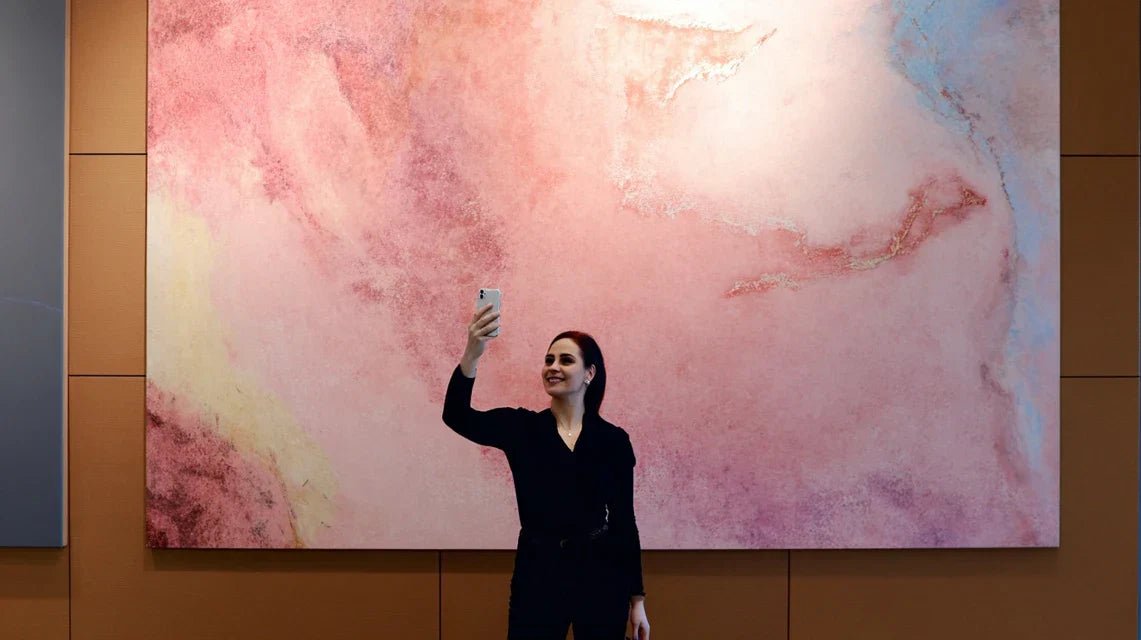
📸 Revealing testimonial: Sarah, a freelance graphic designer, saw her collaboration requests explode after creating her signature photo corner with an abstract painting in golden tones. Her Instagram feed became so recognizable that clients contact her directly mentioning "that famous wall that inspires."
💬 Conversation with a decor expert
Your Instagram wall must tell your story at a glance: like a book whose cover immediately captivates, your photo background should create instant recognition of your universe. Observable result in 2 weeks: your loved ones will start to identify your photos before even seeing your name.
Why have your previous attempts failed?
You probably recognize yourself in these situations: your photos always seem to lack depth, your wall appears flat and without relief, or worse, your visitors look everywhere but where you want to direct their attention.
What's really happening? You are applying the rules of classic decoration to a modern use that requires a completely different approach. Instagram is not your living room: it’s your stage, your personal theater where every element must have a precise role.
Imagine a professional photographer: he doesn't decorate his studio, he stages it. Every object, every color, every texture is designed to create the desired emotion. Your Instagram wall deserves the same strategic attention.
🎯 First hidden cause: You are trying to please everyone
Contrary to what many believe, a successful Instagram wall does not have to be "pretty for everyone". It must be magnetic for your tribe. This nuance changes absolutely everything in your artistic choices.
It's like choosing an outfit: wearing beige to offend no one makes you invisible, while daring a signature color makes you memorable. Your wall should have that same measured boldness.
This approach will radically transform your interactions: instead of polite "likes", you'll get passionate comments and real exchanges with people who share your aesthetic sensibility.
💡 Revealing test: Look at your 10 last Instagram photos. If a stranger could guess your personality just by seeing your backgrounds, you are on the right track. Otherwise, your wall lacks unique character.
🎨 Second cause: You underestimate the power of contrasts
The popular belief is that colors must be "harmonized" to create a beautiful ensemble. In reality, photos that mark people's minds play on subtle but impactful contrasts between the different planes.
Think of a luxury storefront: the jewel doesn’t shine because it blends in with the display case, but because it stands out enough to attract the eye while remaining elegant. Your wall art plays exactly this role of "architectural jewelry".
Result: your selfies and portraits instantly gain visual depth, and your followers finally notice that sophistication they couldn't identify before.
✨ Third cause: You neglect the effect of texture
Here's what almost no one notices: the most photographed Instagram walls always have a tactile richness that you can feel even through the screen. A perfectly smooth and uniform surface literally kills photographic magic.
Carefully observe your current photos: if they look "flat," it's probably because your background lacks that textural dimension that catches the light and creates relief.
This discovery will revolutionize your daily photo shoots: even with a basic smartphone, you'll get professional-looking effects thanks to these plays of shadows and reliefs.
🔍 The 3 signs of an Instagram wall fail:
- The "Ikea catalog" effect: Everything is coordinated but the whole thing lacks soul, like a impersonal hotel room
- The invisible syndrome: No one ever comments on your decor, a sign that your wall doesn't generate any particular emotion
- Visual fatigue: You quickly get tired of your own photos, revealing a lack of lasting aesthetic richness
🎭 The trigger element: The power of a magnetic focal point
What really makes the difference is your ability to create a "magnetic focal point" - that element which naturally attracts the eye and structures the entire composition. Like a visual magnet, it unconsciously organizes the perception of your entire space. You'll easily recognize it: it's the place where your guests naturally direct their gaze when they enter the room.
The golden rule of a successful Instagram wall: One strong element is better than ten cute details. Focus 80% of your visual impact on a perfectly chosen masterpiece, then subtly build around it.
| ❌ Classic decor approach | ✅ Instagram optimized approach | 💡 Why this changes everything | 🎯 Concrete benefit |
|---|---|---|---|
| Perfect harmony of all colors | A subtle but marked contrast | Creates photographic depth | Your portraits gain instant relief |
| Multiplying small decorative objects | One masterpiece + discreet elements | Avoids visual dispersion | Gaze captivated immediately |
| Smooth and clean surfaces | Play of textures and reliefs | Naturally catches the light | Professional effect even in natural light |
| Pleases most people | Assert your unique personality | Creates a recognizable visual identity | Engaged community that truly follows you |
The 3-step method to create your signature Instagram wall
Good news: transforming your wall into an irresistible photo spot is simpler than you imagine. Like building a house, it just takes respecting the right sequence: solid foundations, visible structure, personalized finishes. At each step, you'll see your space gain character and photogeny.
🏗️ Your transformation architecture: Step 1 = Choose your anchor artwork (your visual foundation), Step 2 = Optimize its positioning (your structure), Step 3 = Create the perfect ecosystem around it (your finishes). Logical progression that guarantees a harmonious and Instagram-ready result.
This first step determines 70% of the final success. Like choosing the location of a house before building it, the artwork you select now will influence all your future choices. Satisfaction is immediate: as soon as you hang it, you'll feel your room take on a new dimension.
🛒 What you need to get started
- A portrait or square format artwork: Prioritize at least 50x70cm (19.7x27.6in) to create sufficient visual presence. Avoid panoramic formats that disperse attention. Make sure the support is rigid (stretched canvas or wooden frame) for a professional finish. Paper prints look amateurish, even at a reduced price. A palette of 3 colors maximum: Your artwork should contain one dominant color, an accent color, plus white or black to structure it. This limitation creates natural sophistication that works on all social networks. More colors = patchwork effect that fatigues the eye. A style that truly reflects you: Test your choice with this question: "Would I wear this aesthetic as clothing?" If the answer is yes, you've found your signature style for Instagram.
🎯 Identify your personal Instagram style
Analyze your favorite photos: Browse your 20 latest Instagram likes and note the colors that reappear. You will naturally discover your instinctive palette, the one that attracts you without thinking. This method reveals your true aesthetic sensitivity, beyond temporary trends.
⏱️ Time: 15 minutes | ✅ Success when: You identify 2-3 colors that dominate your favorites | ⚠️ Attention: Do not confuse "colors I like" and "colors that suit me" - here we are looking for your natural attraction
Define your signature atmosphere: Choose between 3 universes: Cosy-warm (earth tones, soft textures), Modern-clean (sharp contrasts, geometric shapes), or Bohemian-creative (vibrant colors, organic patterns). This decision will guide all your future decor purchases for perfect Instagram consistency.
⏱️ Time: 10 minutes | ✅ Success when: You instinctively know how to say "this is me" in front of a style | ⚠️ Attention: Avoid mixing universes at the beginning - first master your guiding line
Test the "love at first sight" effect: Your perfect artwork should make you want to photograph it immediately, even leaning against a bare wall. If you feel this excitement, that's the one. This instant emotion guarantees that you won't tire of your choice, even after hundreds of photos.
⏱️ Time: Instantaneous | ✅ Success when: You already imagine your future photos in front of it | ⚠️ Attention: Beware of "reasonable" choices - Instagram rewards passion, not caution


