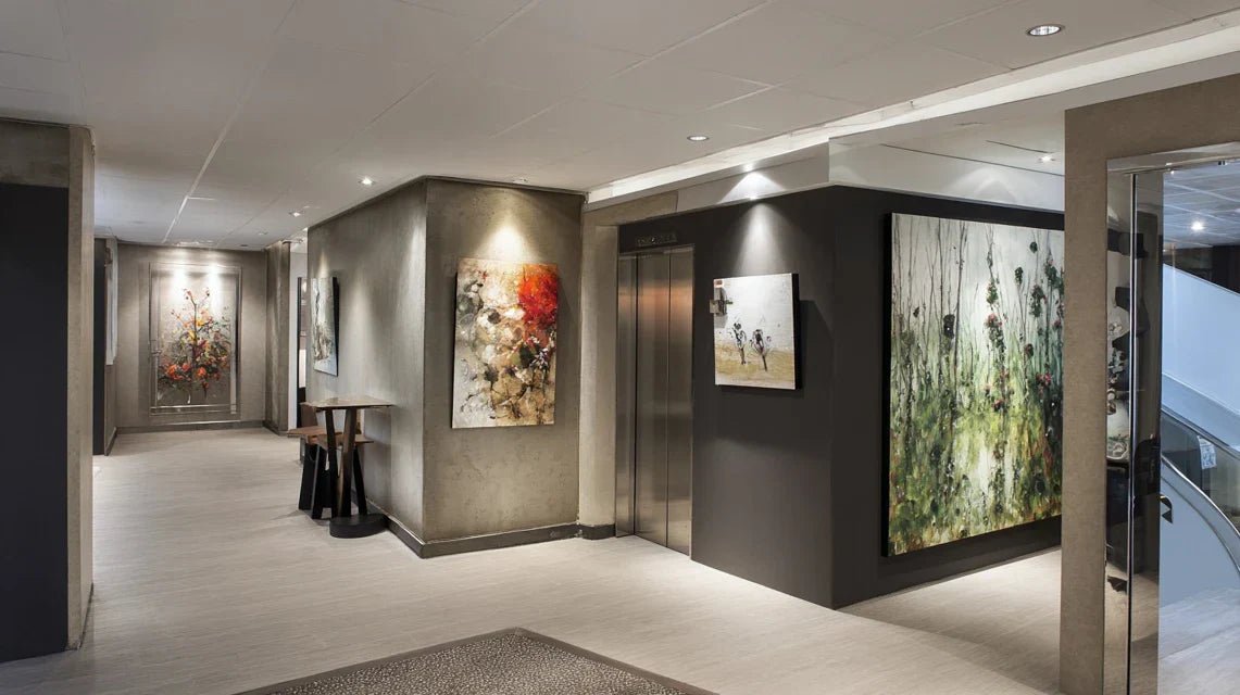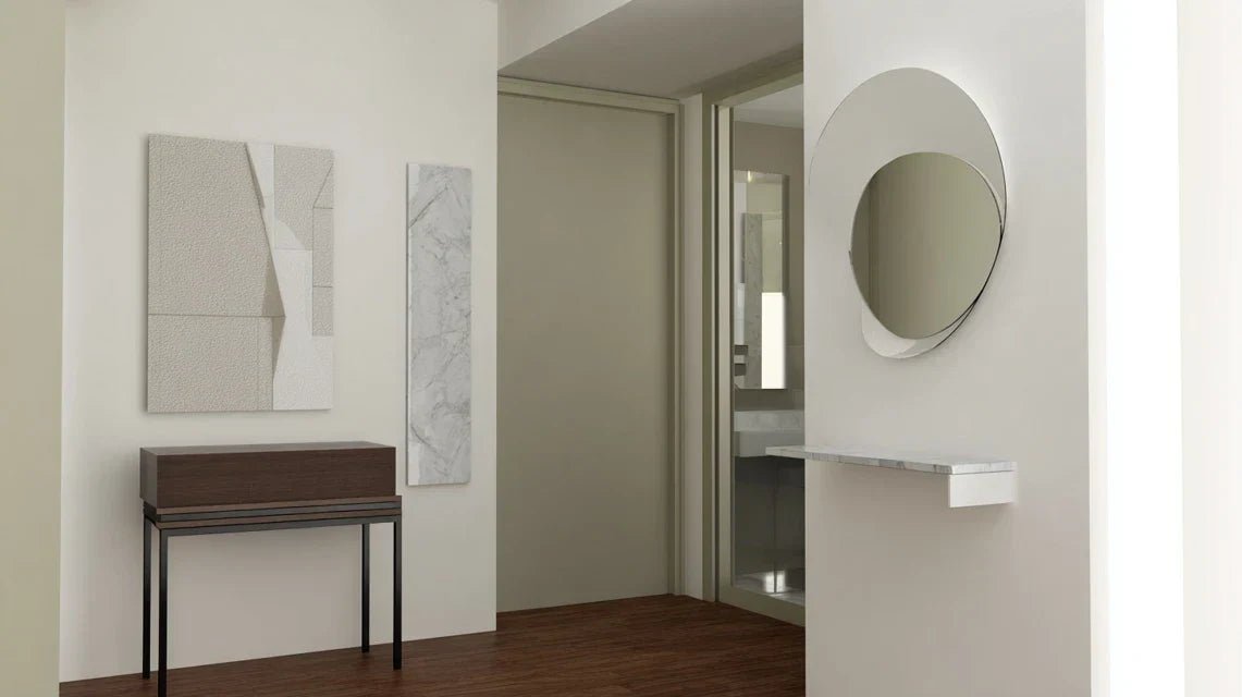
You're frozen in front of your small hall, a painting in hand, not knowing exactly where to hang it without it looking ridiculous or cluttered.
This bare wall has been taunting you for months, but as soon as you bring your artwork near, everything seems disproportionate, misplaced, or inappropriate for this particular transitional space.
You've already tried following classic decorating rules, tested different heights, consulted magazines… But nothing really works in this narrow entryway that is neither a hallway nor a real living room.
That’s perfectly normal! Transitional spaces like hallways and entryways follow specific rules that are rarely explained clearly. These areas have unique constraints regarding circulation, lighting, and proportions.
By the end of this article, you will know exactly how to choose, place, and highlight a painting in your entryway to create that striking first impression you dream of.
Why does your entryway deserve special attention now?
Your entryway is the first calling card of your interior. In 3 seconds, your guests form a definitive opinion about your style and attention to detail. It's like the welcome of a luxury hotel: if this first impression fails, everything else suffers.
🏠 Expert Testimony: Sarah, a decorator for 15 years, says: "I’ve seen beautiful apartments completely ruined by a neglected entryway. The owners had invested thousands of euros in their living room, but their guests remembered that bare and cold wall in the entrance."
💬 Conversation with a Decor Expert
The golden rule of entryways: Your painting should create a positive surprise effect that makes people want to discover the rest. Within 15 days maximum, you will see your guests spontaneously comment on your decorative choice.
What really happens when your hallway remains bare
You may feel that subtle discomfort each time you open your door, that impression something is off without being able to pinpoint it. Your guests glance quickly then avert their eyes to something else.
What's actually happening? Your brain and those of your visitors instinctively seek a visual anchor point in the space. Without this landmark, the entrance appears cold, transient, like a hospital corridor.
It’s exactly like trying to navigate a city without monuments: the eye wanders, finds nowhere to settle, and the overall impression becomes uncomfortable and impersonal.
The trap of "standard height" that never works
Contrary to popular belief, hanging your artwork at 1m65 (approximately 5’5”) from the floor in an entrance hall is often a major mistake. This rule was designed for living rooms, not for vertical circulation spaces.
Imagine yourself in an elevator: your gaze doesn't focus on the same spot as it does on your sofa! In a hall, people naturally look higher up because they are standing, in motion, often taking off their coats.
As a result, your artwork goes completely unnoticed, drowned in the visual dead zone of entrance halls, right at coat rack and shoe level.
🔍 Quick test: Stand in your hall as if you’ve just arrived from outside. Naturally look around for 10 seconds. Your eye spontaneously focuses between 1m80 (approximately 5’11”) and 2m10 (approximately 6’7”)
The illusion of a space "too small" that paralyzes you
Many think that a small hall cannot accommodate an artwork due to lack of distance to admire it. In reality, some artworks are specially designed to be appreciated up close, in the intimacy of a passage.
It’s like comparing an intimate conversation to a public speech: each format has its beauty and impact. A fascinating detail discovered up close often marks more than a large composition viewed from afar.
This belief prevents you from creating those spontaneous moments of contemplation that transform a simple passage into a daily aesthetic experience.
The "it won't go with anything" syndrome that discourages you
You’ve probably already thought: “My hall is neutral, I don’t know what style to choose”. This apparent neutrality is actually your greatest asset! It gives you total freedom impossible to achieve in other rooms.
Unlike the living room where everything must harmonize with the sofa, TV and curtains, your hall can accommodate a piece bold and independent that reveals your personality without compromise.
This area then becomes your decorative signature, the place where you dare to express your authentic taste without functional constraint.
🚨 3 signs that betray a poorly valued hall:
- Your guests immediately look at their phone: The absence of a focal point creates discomfort that the brain compensates for by seeking stimulation elsewhere
- You consistently turn on all the lights: A bare wall reflects light poorly and creates a sense of emptiness that leads to overcompensation
- You feel uncomfortable when you come home: Your subconscious detects the lack of identity in this space, which should be your "decompression chamber"
The trigger factor that changes everything: the concept of a "symbolic threshold"
What really makes the difference is understanding that your hallway isn't just a corridor but a symbolic threshold between the outside world and your privacy. It’s a psychological domino effect: when this space reflects you, your entire relationship with your interior transforms. You’ll recognize it by that feeling of spontaneous pride every time you turn the key.
Rule for a successful threshold: If your artwork makes you smile inwardly when you come home tired, then it's perfectly fulfilling its role as an emotional anchor. Test this sensation from the first day of hanging.
| ❌ Classic vision | ✅ Modern reality | 💡 Why it changes | 🎯 Immediate benefit |
|---|---|---|---|
| Hallway = neutral passageway | Hallway = personal calling card | First emotional contact with your universe | Memorable impression upon arrival |
| Discreet artwork to avoid disturbing | Strong artwork that reveals personality | Creation of a memorable focal point | Spontaneous conversations with guests |
| Standard height 1.65m everywhere | Height adapted to the standing gaze | Respect for actual visual ergonomics | Artwork naturally noticed |
| Small space = small artwork | Emotional impact takes precedence over size | Surprise effect in intimacy | Unique and memorable character |
The 3-zone method to transform your hallway
Rest assured, you don't need any particular artistic talent! This approach is like building a house: solid foundations, then structure, then finishing touches. Each step will bring you visible satisfaction and give you confidence for the next.
🎯 Overview: Impact zone (create the focal point), Circulation zone (respect the passage), Lighting zone (reveal the artwork). This logical progression leads you from diagnosis to perfect highlighting.
Step 1: Define your optimal impact zone
Starting by identifying your revelation wall avoids months of hesitation. It’s like planting a tree: the right location determines everything else. Once this base is laid, you'll immediately feel that satisfaction of seeing your space take shape.
🔧 What you need for this step
- Measuring tape: No approximate measurements! You need to know the ceiling height and wall width to the nearest centimeter. Avoid flexible measuring tapes that distort angles. A rigid meter ensures the necessary precision for calculating proportions. Newspaper or kraft paper: To simulate the size of your future artwork before purchase. The brain needs to visualize the scale concretely. A simple cut-out of paper glued to the wall instantly reveals whether the proportions work. Level: Even digital on your smartphone. A tilted picture immediately destroys the desired effect and betrays a lack of attention to detail. The accuracy of the horizontal line subconsciously reassures the eye.
Now, let's move on to concrete practice:
🎯 Actions to be taken
Identify the first impression wall: Stand exactly where your guests arrive and naturally look. The wall that spontaneously attracts your attention is your impact zone. If multiple walls are visible, choose the one perpendicular to the entrance rather than facing the door.
⏱️ Time: 5 minutes | ✅ Successful when: You can point to THE wall without hesitation | ⚠️ Attention: Don't automatically choose the wall facing the entrance - it is often in shadow
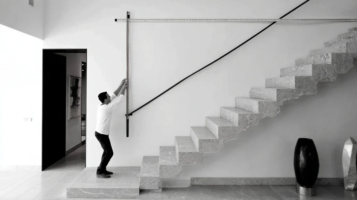
Measure your available area: Note the width between obstacles (radiator, switch, door...) and the height from floor to ceiling. Subtract 40cm at the top and 20cm at the bottom to obtain your actual "placement window". This zone defines your maximum format.
⏱️ Time: 10 minutes | ✅ Successful when: You have a precise rectangle in cm | ⚠️ Attention: Don't forget baseboards and moldings that reduce the usable space
Test the visual effect: Cut out a rectangle of paper with the estimated dimensions of your future artwork and fix it temporarily. Look at the effect from the entrance, then in motion. The impact should be immediate and pleasant, not aggressive.
⏱️ Time: 15 minutes | ✅ Successful when: You feel an obvious visual improvement | ⚠️ Attention: If it looks too small, increase by 20% - we always underestimate
✨ Validation of step 1: Your hallway now has a visible "decorative intention". Even with simple paper, the space appears less empty and more structured. If someone spontaneously makes a positive comment, you are on the right track!
OUR RECOMMENDED PRODUCTS
Step 2: Optimize circulation and proportions
Now that your impact zone is defined, you must ensure that your choice respects the flow of passage while creating the desired effect. This step gives you the satisfaction of seeing your space become both beautiful and functional. The effect multiplies as you create a perfect balance between aesthetics and practicality.
🎨 Elements to consider for this step
- Rule of visual thirds: Your artwork should occupy about 1/3 of the width of the wall to create a natural balance. Too small it disappears, too large it overwhelms. This proportion respects the harmony that the eye instinctively seeks. Standing eye-level height: Place the center of your work between 5ft 9in and 6ft 3in from the floor, depending on your height and that of your family. Entryways require this adaptation because no one sits there. This height creates a natural visual connection. Minimum viewing distance: You must be able to step back at least 5ft for an overall appreciation. If not possible, choose a work with fascinating details visible up close rather than a wide composition requiring distance.
📐 Precise calculations for perfect placement
Apply the rule of thirds: Measure the width of your wall and divide by 3. Your ideal artwork is this width, centered on the wall. If your zone is 47in wide, aim for a piece of art 15.7in wide. This proportion automatically creates the desired visual balance.
⏱️ Time: 5 minutes | ✅ Successful when: The calculation yields a standard available size | ⚠️ Attention: Always round up to the next available size
Adjust personalized height: Measure your own eye height (standing against a wall). Add 4-6in: this is the height of the center of your artwork. This personalization ensures that the work "speaks" to you naturally every day.
⏱️ Time: 3 minutes | ✅ Successful when: The height corresponds to your natural gaze | ⚠️ Attention: Prioritize the tallest family member if there is a significant difference
Verify traffic flow: Simulate your daily gestures: arriving with items, hanging coats, dropping keys... Your artwork should never hinder these natural movements. A good placement makes you spontaneously look up at the work during these actions.
⏱️ Time: 10 minutes | ✅ Successful when: All your gestures remain fluid | ⚠️ Attention: Also test with imaginary guests taking off their coats