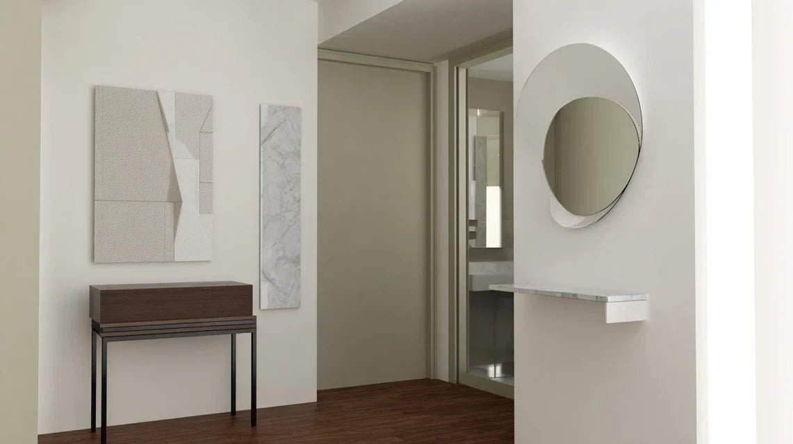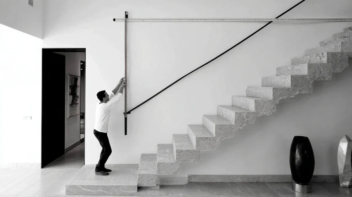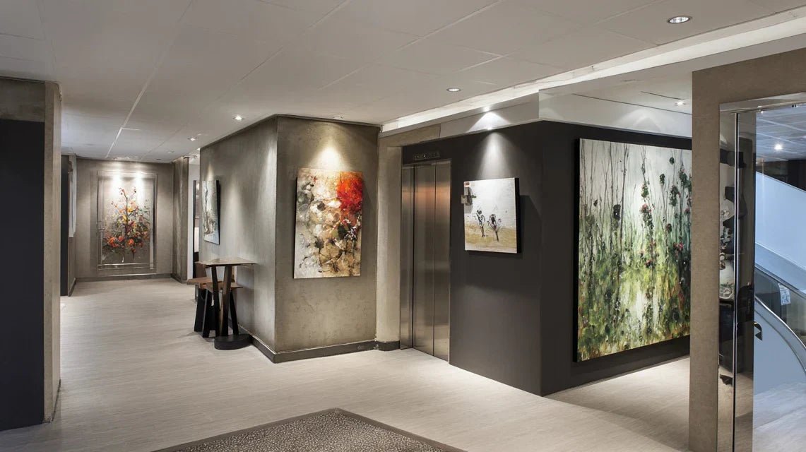
You are walking through your hallway several times a day, but something bothers you: these bare walls that give your otherwise well-kept interior an unfinished feel.
You feel the striking contrast between your cozy living room and these cold, impersonal transition spaces. Each passage reminds you that something is missing, but you don't know exactly what.
You may have already tried hanging tableaux too imposing that clutter the space, or chosen works that are too discreet and go completely unnoticed. Result: harmony is still not there.
This is perfectly normal! The difficulty doesn't come from your aesthetic sense, but from the fact that decorating passageways follows specific rules that few people master.
By the end of this article, you will know exactly how to choose and arrange discreet but impactful paintings that will transform your hallways into veritable personal galleries, creating a fluid and harmonious circulation throughout your interior.
🤔 Why do passageways deserve as much attention as your main rooms?
Neglecting the decoration of your hallways and transition areas today is missing a unique opportunity to create a visual coherence throughout your home. Imagine welcoming guests who discover an interior where every space tells the same decorative story, where elegance naturally extends from room to room.
🏠 Customer testimonial: "Marie-Claire thought her guests didn't notice her hallways. Until one day a friend told her: 'It’s a shame, your living room is beautiful but it feels like the magic stops at the door.' This comment motivated her to rethink entirely her transition areas with paintings specifically chosen for these spaces.”
💬 Conversation with a decor expert
The golden rule of hallway decor: A well-decorated transition space multiplies the aesthetic impact of your main rooms by creating a narrative continuity. You will feel this effect from the first days, when your gaze will no longer be hindered by these "decorative holes".
🔍 What really happens when your transitional areas remain bare?
You probably experience these three situations daily: a feeling of incompleteness when you move through your interior, a visual break between your rooms despite their harmony, and the impression that your decor lacks overall sophistication.
What's actually happening is that your brain registers these empty spaces as "dead zones" that disrupt the overall harmony. The problem isn’t your approach to decorating, but the lack of a specific strategy for these particular spaces.
It's like having a beautiful melody interrupted by silences: the emotional continuity is broken, even if each "note" (your rooms) is perfect individually.
🎯 The first hidden cause: the scale error
Contrary to what many think, the main problem isn’t the lack of space, but a misunderstanding of proportions adapted to transitional areas. The majority of people apply the same rules as for a living room, which never works.
Imagine trying to wear an XL suit when you're a medium: even the most beautiful fabric won’t flatter you if the proportions aren’t adapted to your build.
This scale error creates a visual imbalance that makes the space uncomfortable, even if you don’t know exactly why. Understanding this will revolutionize your wall decor approach in these spaces.
✨ Quick test: Place your hand flat against the wall of your hallway. If a painting is more than 3 times the width of your hand, it’s probably too large for this space. You should immediately feel if the proportions are harmonious.
🌊 The second hidden cause: the absence of visual rhythm
Many believe that simply hanging "something" on the wall is enough, but in reality, transitional areas need a specific rhythm that accompanies the natural movement of the body. This rhythm creates a pleasant circulation experience.
It's like the difference between walking on a well-marked path and wandering in an open field: your eye needs visual landmarks that naturally guide your movement.
Without this rhythm, you subconsciously feel a sense of imbalance each time you move through these spaces, which affects your overall well-being at home.
🎨 The third hidden cause: the "too discreet" trap
Fear of overwhelming, many choose artworks so understated that they become invisible. This is the story of Thomas who had hung three small engravings that were completely unnoticed in his long hallway.
You can easily spot this problem: if you have to stop and focus to see your wall art, it lacks presence for the space it occupies.
This decorative invisibility creates the same effect as a completely bare wall: your brain doesn't register any element of interest, and the space remains perceived as "dead".
🔍 The 3 telltale signs:
- The distracted gaze test: If you no longer notice your paintings when passing normally, they lack visual presence - like a whisper in a normal conversation
- The visual rebound effect: If your eye "rebounds" off the walls without stopping, it's because your artworks don't create anchor points strong enough
- The feeling of incoherence: If your guests compliment your main rooms but ignore your hallways, it's because these spaces do not participate in the overall harmony
⚡ The trigger element: the effect of narrative continuity
What really makes the difference is your pass-through paintings's ability to create a "decorative story" that naturally connects your spaces. It's like a musical thread that guides the emotion from one movement to another in a symphony. You will recognize this effect when your guests spontaneously comment on the coherence of your interior without being able to explain exactly why.
The rule of balanced presence: An effective painting for a passageway zone must be present enough to be noticed during natural passage, but discreet enough not to stop the movement. Test by walking normally: you should perceive it without stopping.
| ❌ Classic approach | ✅ Passageway zones approach | 💡 Why it works | 🎯 Perceived benefit |
|---|---|---|---|
| "You need very understated artworks" | "You need a measured presence" | The eye needs visual landmarks during movement | Feeling of fluidity and harmony |
| "One painting is enough" | "Create a visually adapted rhythm" | Linear spaces require progression | Pleasant circulation experience |
| "Choose according to your tastes" | "Choose according to the architecture" | The space dictates optimal proportions | Impression of evidence and elegance |
| "Decorate last" | "Integrate from the design stage" | Continuity is planned globally | Natural coherence of the whole |
🚀 The progressive method to succeed with your passageway paintings
Rassurez-vous : creating this perfect harmony in your transitional spaces is more accessible than you might think. We will proceed like an interior architect: first understand the space, then choose the right artworks, and finally arrange them according to professional rules. At each step, you'll see your hallway transform and gain natural sophistication.
🗺️ Your transformation plan in 3 steps: First we will analyze your space to determine the ideal proportions, then we will select the artworks that will create the right visual impact, and finally we will arrange them according to the technique of circulation rhythm for an immediate professional result.
📐 Step 1: Decipher your space for perfect proportions
Starting with this analysis is crucial because it determines all your subsequent decisions. It's like laying the foundations of a house: if this base is solid, everything else builds naturally. Once this step is complete, you will feel that satisfaction of finally understanding why some spaces seemed "difficult" to decorate.
🛠️ What you need for the analysis
- A measuring tape: Choose a model of at least 3 meters, rigid and easy to read. You can find it in any hardware store for less than €10. Accuracy to the nearest centimeter is essential because every proportion counts in small spaces. Avoid flexible tapes that distort measurements on vertical surfaces.
- A smartphone with a camera: It will be used to document your proportions and simulate different layouts. The advantage of digital is being able to instantly compare several options and keep track of your thoughts. You'll immediately see the visual impact of each choice.
- Newspaper or kraft paper: To create life-size templates of your future paintings. This inexpensive material allows you to concretely visualize the impact of different sizes before making any purchase. It's the technique used by all professional decorators.
Now, let's move on to concrete practice:
🎯 The decisive measurements to take
Measure the "visual influence zone": Measure the width of your hallway, then the ceiling height. Multiply the width by 0.6: this is the maximum recommended width for your paintings. This proportion ensures that the artwork remains in harmony with the space without overwhelming it. The more precise you are, the more elegant the result will be.
⏱️ Time: 5 minutes | ✅ Success when: You have the 3 measurements (width, height, maximum painting width) noted precisely | ⚠️ Attention: Many forget to subtract baseboards and cornices from the available height, which distorts all subsequent calculations
Identify "natural viewpoints": Walk normally through your hallway and note where your gaze naturally rests. These areas correspond to optimal locations for your future wall art. They respect the natural ergonomics of your movement and guarantee maximum visual comfort.
⏱️ Time: 3 minutes | ✅ Success when: You have identified 1 to 3 areas where your eye naturally stops | ⚠️ Attention: Do not confuse "logical" zones (center of the wall) with "natural" zones (where the eye goes spontaneously)
Test lighting at different times: Observe your walls in the morning, afternoon and evening. Lighting drastically influences perception of colors and contrasts. This step avoids unpleasant surprises and helps you choose works that remain beautiful in all circumstances.
⏱️ Time: 10 minutes spread over a day | ✅ Success when: You know the areas of shadow and light at each moment | ⚠️ Attention: Artificial evening lighting is often forgotten, yet it's when you enjoy your interior the most
✅ Validation of step 1: You must have a clear vision of your spatial constraints and opportunities. If you can explain in one sentence why one place is better than another, you've got it! In case of doubt, redo the natural walking test: your locations should seem "obvious".
OUR RECOMMENDED PRODUCTS
🎨 Step 2: Select your works with the "just impact" technique
Now that you master your space, we move to the next level: choosing paintings that will have exactly the right presence. This step is more rewarding because you will finally see your vision take shape. The snowball effect begins here: each good choice will facilitate the following ones.
🎯 Professional selection criteria
- Measured chromatic intensity: Look for works with a maximum of 2 to 3 dominant colors, one of which echoes your existing decor. Hallways do not tolerate chromatic explosions but love subtle harmonies. Check that at 2 meters away, you can still clearly distinguish the main elements of the work. Balanced composition strength: Favor compositions with a clear focal point but not aggressive. Imagine looking at the artwork while walking: it should attract the eye without "kidnapping" it. Soft geometric abstractions or clean landscapes work perfectly to create this measured presence. Support quality adapted: Choose materials that resist humidity and temperature variations in hallways. Canvas prints or high-quality rigid supports guarantee optimal durability. Avoid simple paper which quickly warps in these passageways.
🛍️ Practical selection
Apply the "3 second rule": Look at each potential artwork for exactly 3 seconds, then look away. If the image remains clearly present in your mind, it has the right impact strength for a passageway area. This technique accurately reproduces perception conditions in a hallway.
⏱️ Time: 2 minutes per artwork | ✅ Successful when: You easily retain the visual essence of the work after 3 seconds | ⚠️ Attention: Do not prolong the test, as you will distort the real conditions of perception in motion
Check harmony with adjacent rooms: Stand in your living room or bedroom and imagine seeing this artwork within your peripheral vision. It should complement without competing with your main decor. The goal is to create an elegant narrative continuity.
⏱️ Time: 5 minutes per artwork | ✅ Successful when: The work seems "naturally in its place" in your decor universe | ⚠️ Attention: Beware of the crush that does not match your overall style
📍 Step 3: Mastering hanging using the "lines of force" method
You are now reaching the level of mastery that makes the difference between an amateur and a connoisseur. This final step immediately reveals the quality of all your previous work. The final result you will be proud of: passageway areas that seem to have been decorated by a professional, with this visual evidence that characterizes beautiful interiors.
🎯 Professional hanging
Respect the "natural line of sight": Hang your paintings so that their center is between 1.45m and 1.55m from the floor. This height corresponds to the optimal level of perception for a person in motion, whether they are 1.60m or 1.80m tall. It's the technique used in all museums to maximize visual comfort.
⏱️ Time: 10 minutes per painting | ✅ Successful when: The center of your works forms a harmonious horizontal line | ⚠️ Attention: Many rely on their own height, while the universal standard guarantees comfort for everyone
Create the "circulation rhythm": If you are hanging multiple artworks, space them between 60 and 80cm apart. This distance creates a visual rhythm that naturally accompanies walking without creating a stroboscopic effect. Your eye should be able to "dance" smoothly from one work to another.
⏱️ Time: 15 minutes for the entire process | ✅ Success when: The visual flow seems smooth and natural | ⚠️ Attention: Too tight spacing creates confusion, too much space breaks the rhythm
Adjust according to final lighting: Turn on all your lights and check that no artwork creates a distracting reflection or disappears into shadow. Adjust the tilt slightly if necessary. This finishing touch makes the difference between an amateur and a professional hanging.
⏱️ Time: 5 minutes per verification | ✅ Success when: Your artworks remain perfectly visible in all lighting conditions | ⚠️ Attention: Daylight can mask problems that only appear in artificial light
The rule of mastered progression: You know you can move on to advanced optimization when your guests spontaneously notice the elegance of your hallways without being able to explain exactly why. Patience and ambition must be balanced: every detail counts, but the whole should remain natural.