What really happens when your artwork "disappears" in the light
You come home in the morning, glance at your living room, and your gaze glides over your painting without stopping. The same phenomenon in the evening: this work that you chose with so much care becomes a simple decorative element, without soul or presence. Or worse, it catches the eye for the wrong reasons, creating a visual dissonance that makes you uncomfortable.
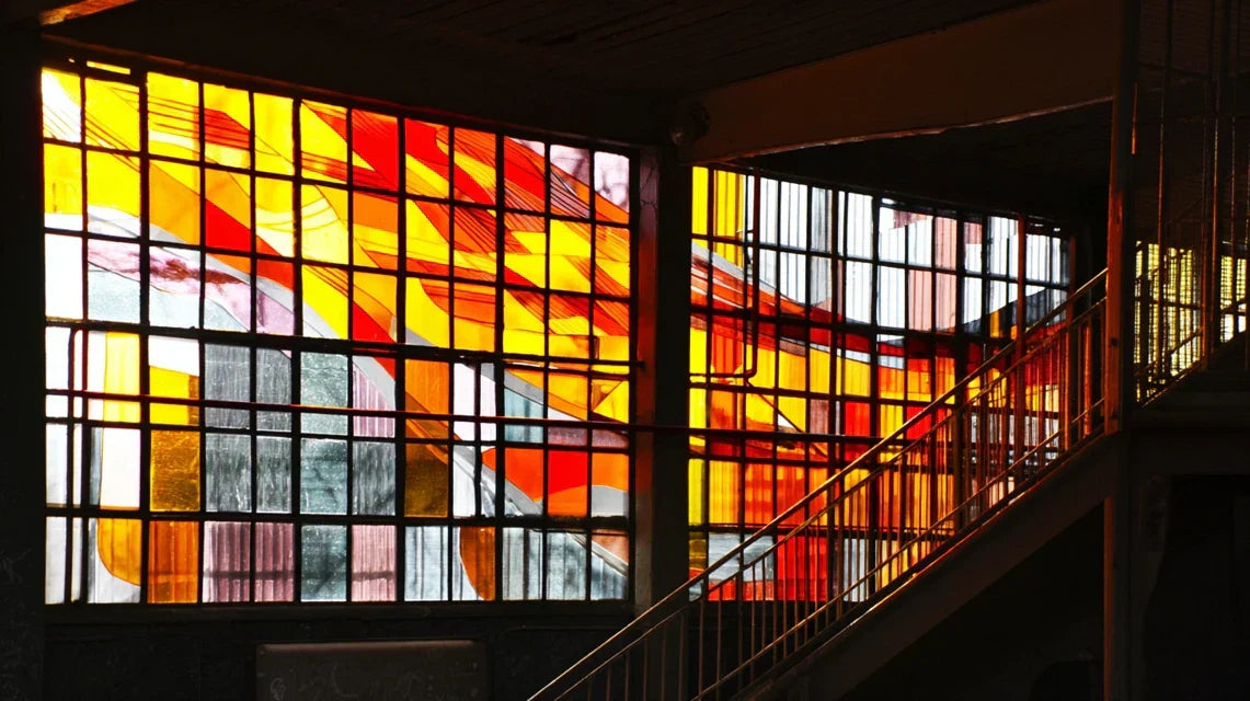
What's happening has nothing to do with the quality of your artwork or your artistic taste. It’s a perfectly logical optical phenomenon: your eye, dazzled by the intense light from the skylight, can no longer distinguish the subtle nuances of wall art. It’s like trying to appreciate a sunset while looking directly at a flashlight.
Imagine your eye as a camera that constantly has to adjust its exposure. Faced with a skylight, it adjusts to maximum brightness and loses its ability to perceive details in less lit areas.
The first hidden cause: the trap of "light competition"
Contrary to what one might think, the problem is not that your painting lacks light. It’s that it enters into direct competition with the main light source. Your skylight and your wall art are fighting for attention, and natural light always wins this battle... unless you know the right techniques.
It's like placing a street musician next to a symphony orchestra: even the most talented artist will be drowned in the noise. Your painting needs a different strategy to exist alongside this luminous power.
This understanding changes everything in your decorative approach. Instead of suffering from this "competition", you will learn to create a collaboration between your works and natural light.
🔍 Immediate test: Observe your painting at different times: 8am, 2pm, 6pm. Note how the colors and details transform. This simple observation will reveal the "light character" of your space and guide all your future artistic choices.
The second hidden cause: the illusion of "good lighting"
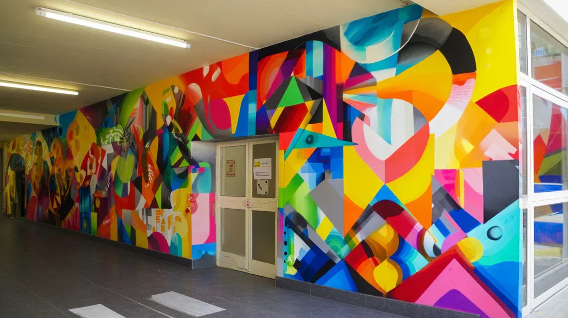
Many think that it is enough to have a lot of light to highlight a painting. That's wrong! Wall art needs directional and contrasting lighting, not a uniform bath of light that crushes reliefs and erases nuances.
Think of a face photographed in full midday: the features disappear, the person seems flat. This is exactly what happens to your painting in a too direct luminous flow coming from the skylight.
What’s the result? Your artwork loses its dimensionality, colors become dull, and you feel like it doesn't “live” anymore. You then look for complex solutions when the problem lies in the approach itself.
The third hidden cause: the "wrong moment" syndrome
Here’s what no one tells you: you probably chose your artwork under lighting conditions that have nothing to do with your conservatory. In a store, at the artist's studio, or even online, the artwork was in a completely different environment.
Recognize yourself in this situation: you fall in love with an artwork, install it at home with enthusiasm, and discover that it no longer has the same emotional impact. That's normal! Wall art is like a chameleon: it transforms according to its environment.
This revelation changes your buying and placement approach. Instead of choosing randomly, you will develop an expert eye that anticipates the effect of natural light on your future artistic favorites.
3 signs that your painting is suffering from "light fatigue":
-
The "morning wash" effect: Colors appear dull and lifeless during times of high brightness, as if the artwork has lost its natural luster
-
The "parasite reflection" phenomenon: You notice bright areas or reflections that disrupt the reading of the image, revealing a poor placement angle
-
The "gradual disappearance": As time passes and light decreases, your painting comes back to life, indicating it is overwhelmed by daytime intensity
The trigger element: the quality of transparency
The factor that really makes a difference is the transparency quality of your conservatory and how it diffuses light. A conservatory with textured, colored or partially opaque panes will create shadows and lights that enhance your paintings. An ultra-transparent conservatory will require different strategies to avoid the "light tsunami" effect that drowns everything in its path.
Rule of "light dialogue": The more transparent your conservatory is, the more texture and relief your paintings should have to create their own shadows. Check this immediately by observing how light catches on the details of your current artworks.
| ❌ Common belief |
✅ Reality |
💡 Explanation |
🎯 Practical benefit |
| The more light there is, the better it is for paintings |
Wall art needs contrasts and shadows |
Reliefs and textures need shadows to be perceived |
Your artworks gain depth and presence |
| Reflections must be avoided at all costs |
Some reflections create life and movement |
Controlled reflections add a temporal dimension |
Your decoration evolves naturally throughout the day |
| Bright colors are more resistant to light |
Mid-tones and textures make the difference |
The eye distinguishes nuances better in mid-tones |
Your artworks remain legible in all circumstances |
| You must match the artwork to the color of the wall |
Subtle contrast creates more impact |
The eye is attracted by gentle variations |
Your wall art becomes a true focal point |
The "3 Levels of Light" method to achieve perfect harmony
Don't worry, creating the perfect harmony between wall art and glass paneling isn't rocket science once you understand the logic. Imagine that you are going to build a bridge between two universes: that of raw natural light and that of man-made art. This bridge is built in three progressive steps, each contributing its stone to the edifice. At the end, you will obtain a space where artworks and transparency sublimate each other.
🎯 Overview of the method: Level 1 - Taming natural light (mastering the basics), Level 2 - Creating visual dialogue zones (orchestrating contrasts), Level 3 - Sublimating through expert details (fine-tuning excellence). Each level gives you more confidence and reveals new creative possibilities.
Level 1: Taming your natural light (Essential foundations)
Starting with this step is like learning the temperament of your space before inviting your artworks. This phase avoids costly mistakes and gives you a solid foundation. Once this step is mastered, you will feel that satisfaction of finally understanding what happens in your room at every moment of the day.
What you need for this first step
-
An observation notebook: A simple notebook to note your observations at different times. It will serve as a visual memory to identify light patterns. Avoid smartphone apps that would distract you from pure observation. Quality is measured by your diligence in noting, not the beauty of the notebook.
-
Color samples: 5-6 color charts or even pieces of fabric of different tones that you will place near the glass paneling. They reveal how natural light modifies the perception of colors according to the time of day. Choose a variety of tones: warm, cold, neutral, bright, dark. Their "behavior" will guide you for your future artworks.
-
An adjustable desk lamp: This tool allows you to simulate different lighting and understand how to create contrast zones. A basic lamp is sufficient, the important thing is that it can be adjusted. It becomes your "light brush" to create the perfect atmosphere.
Now, let's move on to concrete practice:
The specific actions to take
Map your light: For a week, observe and note the evolution of light in your room at 4 key times: 8am, 12pm, 4pm, 7pm. Note the intensity, direction, shadow areas. This mapping reveals the "golden hours" when your artworks will be best highlighted, and moments that are difficult to anticipate.
⏱️ Time: 5 minutes per observation | ✅ Success when: You can predict where shadows and lights are at each hour | ⚠️ Attention: Don't forget cloudy days which give different but equally important indications
Test the colors: Place your color samples in different locations near the skylight and observe their transformations. Some colors "vibrate" in natural light, while others fade. This experience reveals the tones that will flourish in your specific space.
⏱️ Time: 15 minutes per test | ✅ Success when: You identify 2-3 color families that remain beautiful all day long | ⚠️ Attention: A beautiful color in the morning can become dull in the afternoon
Create your first witness zone: Choose a small decorative object and test several locations near the skylight using your accent lamp to create contrasts. You discover the "magic points" where objects and light mutually sublimate each other.
⏱️ Time: 20 minutes | ✅ Success when: Your object remains attractive even in full daylight | ⚠️ Attention: Do not place the object too close to the skylight, as this may create annoying reflections


