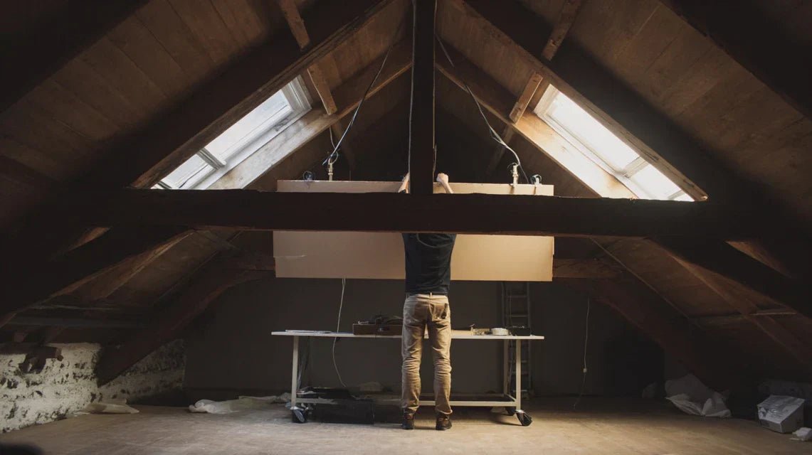
You’ve just finished furnishing your attic rooms into an office or bedroom, but something feels off. The space seems cold, impersonal, as if it's missing that decorative soul that transforms four walls into a true cozy haven.
You look at these unusual sloped walls, those particular angles, that variable ceiling height... and you feel overwhelmed. How do you adorn these special volumes without creating a “dusty attic” effect?
You may have tried some standard frames placed randomly, but the result disappoints you. The overall look lacks coherence, the proportions seem wrong, and ultimately, your converted attic doesn't reflect the warm atmosphere you imagined.
That’s normal! Attics present unique decorative challenges that classic advice never addresses. Traditional hanging rules simply don’t apply to these spaces with such particular volumes.
By the end of this article, you will master the art of enhancing your attics with perfectly adapted artworks, and you’ll transform this space into a true decorative showcase that you'll be proud of.
Why are attics the most underestimated home decor challenge?
Converted attics represent today’s most exciting decor opportunity in our interiors. Unlike standardized rooms, these spaces offer a unique architectural character that, when well exploited, becomes your decorative signature.
But be careful: each month of procrastination robs you of the daily pleasure of these precious square meters. It's like having a rough diamond and leaving it in a drawer instead of having it cut to reveal all its brilliance.
🏠 Customer testimonial: "Sophie had transformed her attic into an office, but avoided working there. The space, though functional, felt oppressive to her. Three strategically placed artworks were enough to create that inspiring atmosphere she was looking for. Today, it's her favorite creative refuge."
💬 Conversation with a decor expert
"I’m afraid the paintings will fall because of the slope of the walls... and besides, won't it make the space feel too cluttered in an already very particular setting?"
Don’t be fooled! Sloped walls actually offer more stability for hanging than a classic vertical wall. It's like hanging a painting against a rock: gravity works with you, not against you. And far from weighing down the space, well-chosen artworks visually expand your attics by creating vanishing points.
"I’ve always been told that in small spaces, you should avoid wall decorations so as not to visually clutter..."
This rule was a thing of the past when interiors were cluttered! Today, a well-sized artwork in an attic creates exactly the opposite effect: it structures the space and gives it depth that bare walls cannot offer. It's the difference between a hospital corridor and an art gallery.
The golden rule for decorating attics: An atypical space requires assertive decoration that embraces its volumes rather than fighting them. Visible result: your attic goes from a simple functional space to a true inspiring living space in less than 48 hours.
Understand why your previous attempts failed
Do you recognize yourself? You hung a small photo frame that seems lost on this large sloping wall. Or placed several paintings without logic, creating a disappointing "patchwork" effect. Maybe you even gave up, thinking that attics are not suitable for wall decoration.
What's really happening is that you apply the decorating codes of traditional rooms to a space that operates according to its own rules. It’s like trying to drive a car with bicycle techniques: the basics seem the same, but the approach must be completely rethought.
Imagine your attic is a miniature cathedral: every angle, every slope has been designed to create harmony. Your decoration should embrace this architecture, not contradict it.
🔍 First hidden cause: you underestimate the impact of proportions
Contrary to popular belief, attics require larger artworks, not smaller ones. The variable ceiling height and angles create an illusion of shrinking that makes small decorative elements insignificant.
It’s exactly like wearing delicate jewelry with a winter coat: they completely disappear. In your attic, a 40x60cm artwork will look like a postage stamp, while an 80x120cm one will create the perfect visual impact.
This proportion error makes you lose all the expected decorative effect and turns your decoration investment into a failure. But once you understand this logic, you can create spectacular compositions that truly enhance the space.
🧪 Quick test: Hold an A4 sheet against your attic wall, then an A3 sheet. You will immediately notice how the large size naturally asserts itself in these volumes.
🎯 Second hidden cause: you neglect the viewing angle
In attics, you don't look at paintings head-on as you would in a living room. You discover them as you climb the stairs, you contemplate them from your sloping desk, you catch sight of them from the mezzanine bed.
It’s like the difference between looking at a landscape from a window and observing it from a belvedere: the angle changes everything. Your artworks should be positioned for these multiple viewpoints, not for a single frontal angle.
Result: you live in a space where wall decor works with your daily life instead of remaining static, creating a renewed visual experience with each movement.
⚡ Third hidden cause: you ignore the specific natural light
Roof windows create a unique zenithal lighting that few people know how to exploit. This particular light can transform an ordinary painting into a living work of art that changes appearance according to the hours.
You can easily spot it: observe how the light travels across your sloping walls between 10 am and 4 pm. The areas that light up successively are your prime locations to create spectacular shadow and light games.
The impact? Your decoration becomes dynamic and alive instead of being static, creating an atmosphere that naturally evolves with your work or relaxation day.
🎨 The 3 signals that reveal untapped decor potential:
You avoid looking up in your attic: this means the ceiling and high walls lack visual anchor to create that cozy enveloping feeling
The space seems smaller than it actually is: this is a sign that the visual proportions are not optimized by wall decor
You prefer to work/relax elsewhere: your subconscious tells you that the atmosphere is not inspiring and personalized enough
🚀 The trigger element that changes everything
The key factor is to understand that your attic is not a room with an angled ceiling, but a unique sculptural volume. This revelation radically changes your decorative approach.
Instead of suffering from architectural constraints, you transform them into decorative assets. It's the domino effect: once you see your attic as a frame to be dressed, every decorative choice becomes obvious and harmonious.
The rule of embraced architecture: the more you respect and value the specificities of your attic, the more your wall decor gains impact. Immediate test: look at your attic and list 3 unique architectural elements (beam, skylight, angle...) - these are your decorative allies to exploit.
❌ Ineffective classic approach
✅ Specific attic method
💡 Why it works
🎯 Immediate benefit
Small frames scattered to "avoid overloading"
Large pieces strategically placed
Atypical volumes require assumed proportions
Strong and structuring visual impact
Standard eye-level hanging
Positioning according to actual viewing angles
Attics are discovered from multiple perspectives
Dynamic decorative experience
Avoiding "complicated" sloping walls
Exploiting slopes as assets
Unique architecture becomes the decor signature
Distinctive and personalized character
Ignore specific zenithal lighting
Play with the natural light from the roof
Top lighting enhances textures
A living atmosphere that evolves throughout the day
The 3-step method to transform your attic into a personal gallery
Rest assured: decorating an attic with wall art follows a clear and progressive logic. No need to be an interior designer!
It's like learning to cook a signature dish: you start by understanding the ingredients (your space), then you master the basic techniques (hanging), and finally you develop your personal style (composition). At each step, you will see your space transform and gain character.
🗺️ Your decorative roadmap: First, you will map out the strategic areas of your attic (15 min). Then, you will master secure hanging on sloping walls (30 min). Finally, you will compose arrangements that perfectly embrace your atypical volumes (45 min). Result: a complete transformation in less than 2 hours!
🎯 Step 1: Identify and prepare your impact zones
Starting with this space analysis is crucial because it will determine the success of your decorative project. It's exactly like an architect studying the land before building: this solid foundation guarantees a harmonious result.
Once this step is complete, you will feel that sense of clarity - finally, you know exactly where and how to act!
🛠️ What you need for this analysis phase
A measuring tape (minimum 3m): To measure the available heights and distances between architectural elements. Avoid folding rulers that do not provide the necessary precision for diagonal measurements on sloping walls. You can find it in any hardware store. Make sure it is well rigid and clearly graduated - this is the basis for calculating the correct proportions of your future wall art.
Colored masking tape: To visually delimit your potential zones without damaging the walls. The principle: you will "draw" rectangles with the dimensions of your future wall art to visualize the effect before purchasing. Choose a color that contrasts with your walls (blue on white, yellow on gray...). The impact: you avoid costly proportion errors and immediately see the decorative potential of each zone.
Your smartphone with a "level" function: To check the exact inclinations of your walls and identify perpendicular zones. Download a level app if your phone doesn't have one natively. This is crucial because the eye can deceive us about real angles. The benefit: your wall art will be perfectly aligned with the actual architecture of your attic.
Now, let's move on to concrete practice
🔍 How to proceed step by step
Map your "noble zones" : Walk through your attic in normal usage position (sitting at your desk, lying on the bed, standing near the staircase). At each position, note which walls naturally catch your eye. These areas of spontaneous gaze are your preferred locations - this is where your paintings will have maximum daily impact.
⏱️ Time : 10 minutes | ✅ Successful when : You have identified 3-4 zones that naturally "call" the eye | ⚠️ Attention : Don't rely on the first glance standing in the center - really test from your real living positions
Measure and outline with masking tape : For each identified zone, approximate size on the floor of a painting that would respect the proportions of the space. Rule of thumb: on an inclined wall, a painting represents 1/4 to 1/3 of the visible surface from your main viewing position. Then stick the masking tape directly onto the wall to materialize these dimensions.
⏱️ Time : 15 minutes | ✅ Successful when : Your masking tape rectangles create a visually pleasant visual balance from your usage positions | ⚠️ Attention : Many undersize for fear - dare generous sizes, you can always reduce
Test the lighting at different times : Observe your delimited zones at three key moments : morning (9am), noon, and late afternoon (5pm). Note how the zenithal light from your skylights evolves on each zone. Areas that benefit from optimal natural lighting without annoying reflections are your priority areas.
⏱️ Time : 5 minutes x 3 moments | ✅ Successful when : You know precisely which zones are enhanced by natural light | ⚠️ Attention : Reflections on glazing can create glare - position your future paintings to avoid it
🎯 Validation of your phase 1 : You should have 2-3 zones delimited with masking tape, including at least one benefiting from favorable natural lighting. If a zone visually bothers you, that's normal - move the masking tape until you find the perfect balance. Congratulations, you have just created the master plan for your future wall decoration!
OUR RECOMMENDED PRODUCTS
🔧 Step 2: Mastering secure hanging on inclined walls
You are now moving to the technical level - and this is where you will really feel the difference with an amateur approach. Hanging on sloping walls follows precise physical rules that, once mastered, give you complete confidence in the solidity and aesthetics of your installations.
The effect is immediate: your paintings will never move again and will seem to "part of the architecture".
🛠️ Professional hanging hardware
Special plasterboard Molly plugs (minimum 8mm) : These expanding plugs are specially designed for the partition walls of converted attics. Unlike standard plugs, they deploy behind the partition to distribute the weight. Require a minimum nominal load of 25kg - do not skimp on quality, your paintings are worth this investment. Absolutely avoid standard plastic plugs which will not hold in the plasterboard.
Stainless steel X hooks : These special hooks have an X shape that perfectly follows the slope of the attic walls. The principle: gravity works with the hook instead of pulling it down. Look for the "anti-slip" mention and a stainless steel finish to avoid oxidation marks on your white walls. The impact: your paintings remain perfectly pressed against the sloping wall without ever tipping over.
Galvanized steel wire (2mm) : More solid and more aesthetic than simple iron wire, this galvanized cable supports up to 50kg in tension. Its plastic sheath protects your paintings from scratches and gives a professional look. The benefit: even your heavy paintings are suspended with maximum security and impeccable finish.
🎯 Step-by-step installation
Locate the partition studs : Gently tap your wall with your knuckles - a full sound indicates a stud, a hollow sound indicates the void between studs. Studs are usually every 60cm. Mark them discreetly with pencil. Ideally, hang at the level of a stud for maximum solidity, but Molly plugs also work very well in the void.
⏱️ Time : 5 minutes per area | ✅ Success when : You clearly distinguish the full and hollow areas | ⚠️ Attention : Metal studs sound different from wood studs - adapt your drilling technique
Drill at the perfect angle : The secret: drill perpendicular to the sloping wall, not vertically relative to the floor. Use your smartphone level to check the angle. Start with a 6mm drill bit, then enlarge to 8mm for Molly plugs. Depth: minimum 5cm to allow full deployment of the plug.
⏱️ Time: 3 minutes per hole | ✅ Successful when: The wall plug inserts easily and expands with a firm resistance | ⚠️ Caution: If the drill bit "skips" on the angle, start with a small pilot hole using a center punch
Install X hooks with angled compensation: Screw your X hooks compensating for the wall's incline so that the horizontal part remains perfectly horizontal. Simple test: a small object placed on the hook should not slide off. This compensation ensures that your paintings never tilt to one side.
⏱️ Time: 2 minutes per hook | ✅ Successful when: The hook supports 10kg without flexing and remains perfectly horizontal | ⚠️ Caution: Do not overtighten - screw gradually to avoid cracking the drywall
🔒 Mandatory solidity test: Hang a heavy object (book, 1.5L bottle of water) on each hook for 30 minutes. No deformation or sagging should be visible. If so, congratulations! Your professional hanging system is operational. You can now hang your paintings with peace of mind.
🎨 Step 3: Compose harmonious arrangements
You have now reached the expert level - the one where your wall decoration is no longer just solid and well positioned, but becomes a true decorative signature.
This creative phase allows you to express your personality while respecting the architectural harmony of your attic space. The result: a space that resembles you and that you will love to show to your guests!
🎯 Advanced composition elements
Complementary format paintings: Favor panoramic rectangular formats (like 120x40cm) that naturally follow the horizontality of attics, and square formats (70x70cm) to create visual anchor points. Vertical narrow formats are perfect for spaces between beams. Avoid overly standardized formats (50x70cm) which lack character in these atypical volumes.
Thoughtful color consistency: Choose a palette of no more than 3 colors that dialogues with your existing materials (wood of the beams, white walls, gray skylights...). The principle: 60% dominant color, 30% secondary color, 10% accent color. This professional rule creates a natural visual harmony that unifies the entire space.
Consistent artistic styles: In attics, focus on stylistic consistency rather than eclecticism. Contemporary abstract art, black and white photographs, botanical illustrations... A strong guiding thread amplifies the decorative impact of each piece and creates that distinctive visual identity sought by art lovers.
🎼 Orchestrating your wall composition
Create a visual hierarchy: Identify your "masterpiece" - the most important piece that will set the tone. Place it in your main impact zone (identified in step 1). The other artworks gravitate around in harmonious dialogue: smaller, complementary in color, but never competing. This hierarchy naturally guides the eye and structures the space.
⏱️ Time: 20 minutes of testing | ✅ Success when: Your eye naturally goes to the masterpiece then harmoniously explores the others | ⚠️ Attention: If two artworks "compete" for attention, it means the hierarchy is not clear - reposition or resize
Exploit architectural lines: Use the beams, edges and contours of your attic as composition guides. An artwork can "continue" a beam, follow the slope of a wall, or create an interesting geometric counterpoint. This technique makes your decoration seem "born with the architecture" rather than added later.
⏱️ Time: 15 minutes of adjustments | ✅ Success when: Each artwork seems logically placed in relation to an architectural element | ⚠️ Attention: Don't force impossible alignments - sometimes, a slight voluntary offset creates more dynamism
Optimize contemplation distances: In attics, you often contemplate artworks from varying distances (close when passing by, far from the staircase...). Test the readability and impact of each artwork from these different positions. Adjust the size or position if necessary so that the effect is optimal at all usage distances.
⏱️ Time: 10 minutes of validation | ✅ Success when: Each artwork remains impactful and readable from all your daily positions | ⚠️ Attention: Fine details are only visible in close vision - prioritize strong graphic compositions for distant viewing
✨ Final validation of your personal gallery: Spend 24 hours in your attic with your new wall decoration. Your feeling should be immediately positive: sense of expanded space, warmer atmosphere, desire to spend time in this space. If so, congratulations! You have succeeded in the decorative transformation of your attic. Your space now has its own personality and you are proud of it!
The rule of natural progression: Start by installing your masterpiece, live with it for a week, then gradually add the other pieces. Your eye gets used to it and guides you towards the most harmonious choices. Patience and ambition complement each other to create truly personalized decoration.
You now master the technical and aesthetic fundamentals of wall decor in attics. But a few expert subtleties can transform your beautiful creation into a true decorative masterpiece. These details make the difference between "it's pretty" and "it's exceptional" - exactly what distinguishes an amateur decoration from a professional arrangement.
🎯 Pro tip - Accent lighting: Install a small adjustable LED spotlight (track or wall sconce) that enhances your masterpiece painting in the evening. This gallery art technique completely transforms the ambiance of your attic as dusk falls. The effect is striking: your artwork becomes the luminous focal point of the space, creating an intimate and sophisticated atmosphere that your guests will immediately notice.
💭 Frequent question from our readers
"I often work late in my attic office... won't the paintings distract me from my work?"
This is a very legitimate concern! In reality, it’s exactly the opposite that happens. Neuroscience studies show that our brain needs "visual rest points" to maintain concentration over time.
Your well-chosen paintings become these visual oases that allow your eyes to relax for a few seconds before returning to your screen. A 2-3 second glance at a soothing artwork will refresh your concentration rather than break it. It's the same principle as coffee breaks, but for your eyes!
🧘 Practical advice: Choose paintings with calming colors (blues, greens, natural tones) for your workspace and avoid overly dynamic compositions or bright reds. Test for a week: you will notice that your concentration endurance improves significantly.
⚠️ The 5 mistakes that sabotage your decor project (and how to avoid them)
After supporting hundreds of decoration projects in attics, I want to save you from the common pitfalls that turn a beautiful project into disappointment. These errors are so common that they seem "logical" when you commit them - but once you know them, you will never make them.
🚫 Buying paintings before testing locations: This is the temptation of all beginners! You see a beautiful artwork, you buy it, and then try to find a place for it. Result: unsuitable proportions or style that clashes with the architecture. The correct method: first delineate your zones with masking tape, measure, and then only look for artworks with the right dimensions. This mistake costs an average of €200-300 in ill-suited paintings - a mistake made by 70% of people on their first project.
🚫 Neglecting hanging safety to save money: "Basic screws and wall plugs will be fine..." Big mistake! Attics vibrate more than other rooms (passage, wind on the roof...) and partition walls are often more fragile. A falling painting damages both the artwork AND the wall. Invest in quality hardware: an extra 20€ for peace of mind is the best home decor investment of your life.
🚫 Wanting to "fill" all available walls: The maximizer's mistake! Attics have architectural charm that must be allowed to breathe. Too many paintings kill the decorative effect and create a feeling of oppression in already sloped spaces. Golden rule: it’s better to have 2-3 perfectly chosen and positioned paintings than 6-7 disparate items. Elegant sobriety always impresses more than accumulation.
🚫 Ignoring the evolution of natural light: Many people position their paintings on a sunny Sunday morning... and discover annoying reflections or dark areas during the week. Be sure to test the lighting at different times and seasons! A poorly lit painting loses 80% of its visual impact. Walk around your attic at 9am, 2pm and 6pm before permanently fixing your locations.
🚫 Copying Pinterest inspirations without adaptation: These perfect photos rarely show real residential attics! Actual constraints (radiators, sockets, switches, skylights...) are never visible in these stylized images. Get inspired, but always adapt to YOUR specific constraints. Your decoration should be beautiful AND functional in your daily life, not just photogenic.
🛡️ Your safety checklist before finalization: Your paintings don't move when you go up the stairs (vibration test) ✓ No annoying reflections at any time of day ✓ You can circulate normally without risking bumping into them ✓ The whole remains harmonious even with artificial lighting in the evening ✓ Warning signs: feeling of clutter, difficulties moving around, visual fatigue, or desire to "change something".
Because you took the time to inform yourself, enjoy 10% discount on your first order:
ART10
⏰ Valid for 72h after reading • Applicable to all our products
❓ Your most frequent questions about paintings in attics
🏠 How long should you plan to decorate the wall of a 25m² attic?
Allow a full day for optimal results: 2 hours for analysis and planning, 3 hours for hanging (including drying time if retouching paint), 2 hours for adjustments and finalization. To optimize: prepare all your materials the day before and start with the measurement phase in the morning when you are fresh. With a budget of €300-€600 for 3-4 quality artworks, you completely transform the atmosphere of your attic.
🔧 Is it more complicated to hang on drywall than on concrete?
It's different, not more complicated! Drywall requires specific anchors (Molly expansion) but offers more freedom of positioning than concrete (no drilling constraints). Advantage of drywall: you can easily reposition if you change your mind. The secret: use appropriate hardware and don’t skimp on the quality of the fixings. Result: a perfect hold even superior to concrete for normal loads (up to 15kg per hanging point).
💡 How to avoid reflections from your artworks with skylights?
The pro technique: position your artworks in "oblique shadow zones" relative to the skylights. Specifically, if your skylight is south-facing, place your artworks on east or west walls, never directly opposite. Simple test: hold a mirror in place of the future artwork at different times - if it reflects direct light from the skylight, change location. Alternative: choose artworks with anti-reflective varnish or canvas without glass for the most exposed areas.
🎯 What size artwork should I choose for an attic with a maximum height of 1m80?
Contrary to popular belief, height constraints require generous horizontal formats rather than small ones! Optimize with panoramic 120x40cm or square formats up to 80x80cm maximum. The rule: your artwork should never exceed 2/3 of the visible wall height. Within your dimensions, prioritize formats such as 100x30cm, 90x60cm, or 70x70cm which create impact without "touching the ceiling". Avoid vertical formats that accentuate the height constraint.
🎨 Should I favor a particular artistic style for attics?
Attics particularly enhance three styles: geometric abstract art (which dialogues with the architecture), soothing landscapes (which "open" the space visually), and black and white photography (which harmonizes with all materials). Avoid overly elaborate styles or very bright colors that can create a feeling of oppression. The secret: choose a stylistically coherent thread rather than eclecticism - your attic will gain sophistication and distinctive personality.
🚀 Your attic transformed: from functional space to inspiring refuge
In a few weeks, when you go up to your attic, you will feel that deep sense of "home" achieved. This space that seemed cold and impersonal will have become your favorite decorative refuge - the one where you like to work, relax, and welcome your loved ones in a unique atmosphere.
Beyond visual beauty, you will have acquired a transferable decorative skill to all your future design projects. This mastery of hanging, this understanding of proportions, this ability to compose harmoniously... all of this will serve you in every room of your house. Your friends will ask for advice and look at you with the admiration reserved for those who "have an eye".
The best part is that you now know that understanding atypical volumes was the only real difficulty. Now that you master these principles, you can start this weekend with your masking tape analysis phase. In 48 hours, you will already see the transformation taking shape before your eyes!
🎯 Your first step towards transformation: Your attic just needs to reveal its exceptional decorative potential. You now have all the keys to achieve this - all that remains is to take action and create the space you've dreamed of since the layout!
📚 Continue your decor expertise
Now that you master the art of paintings in attics, discover our other guides to create a harmonious wall decoration in all rooms of your house and develop your personal decorative signature.