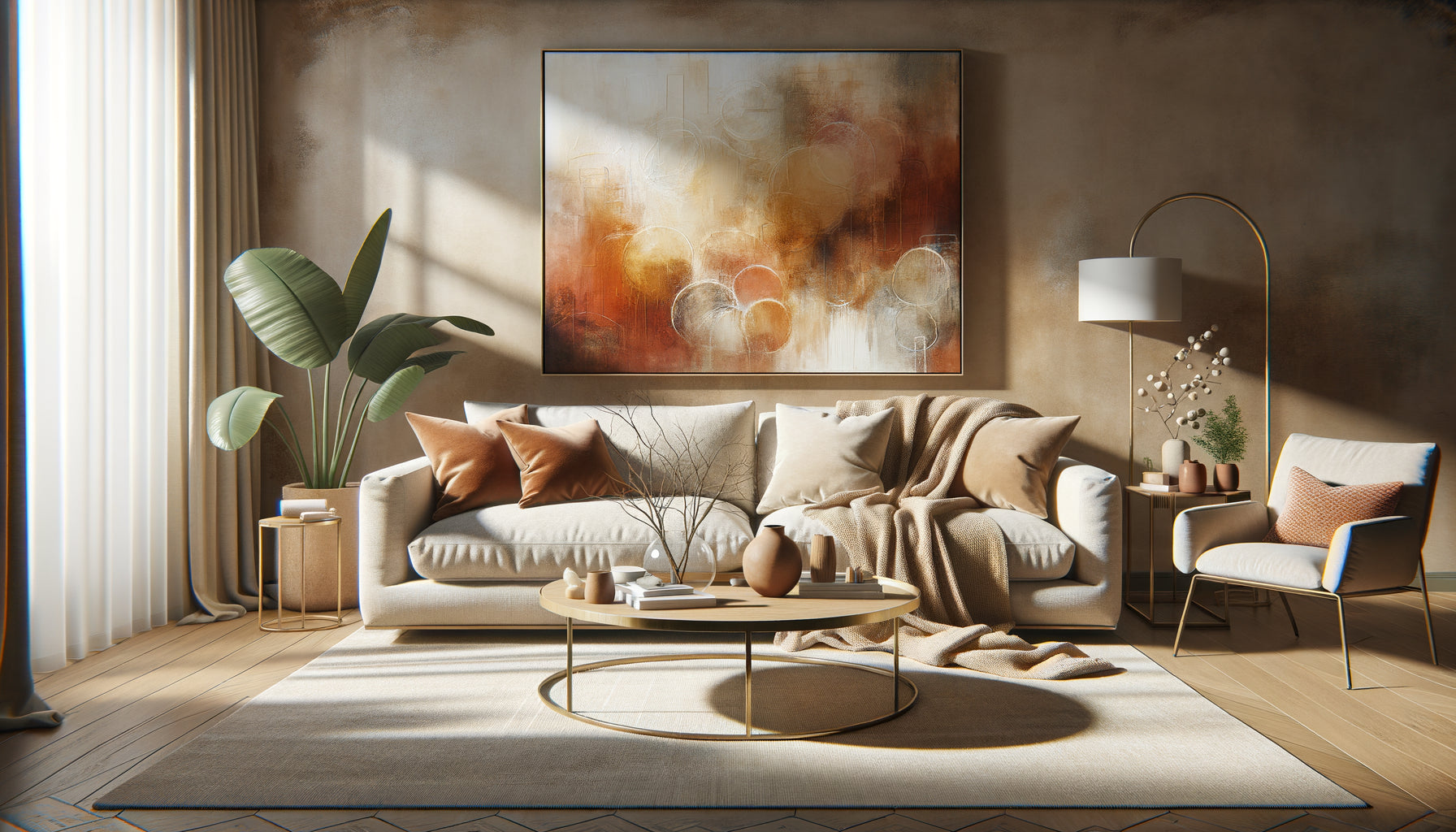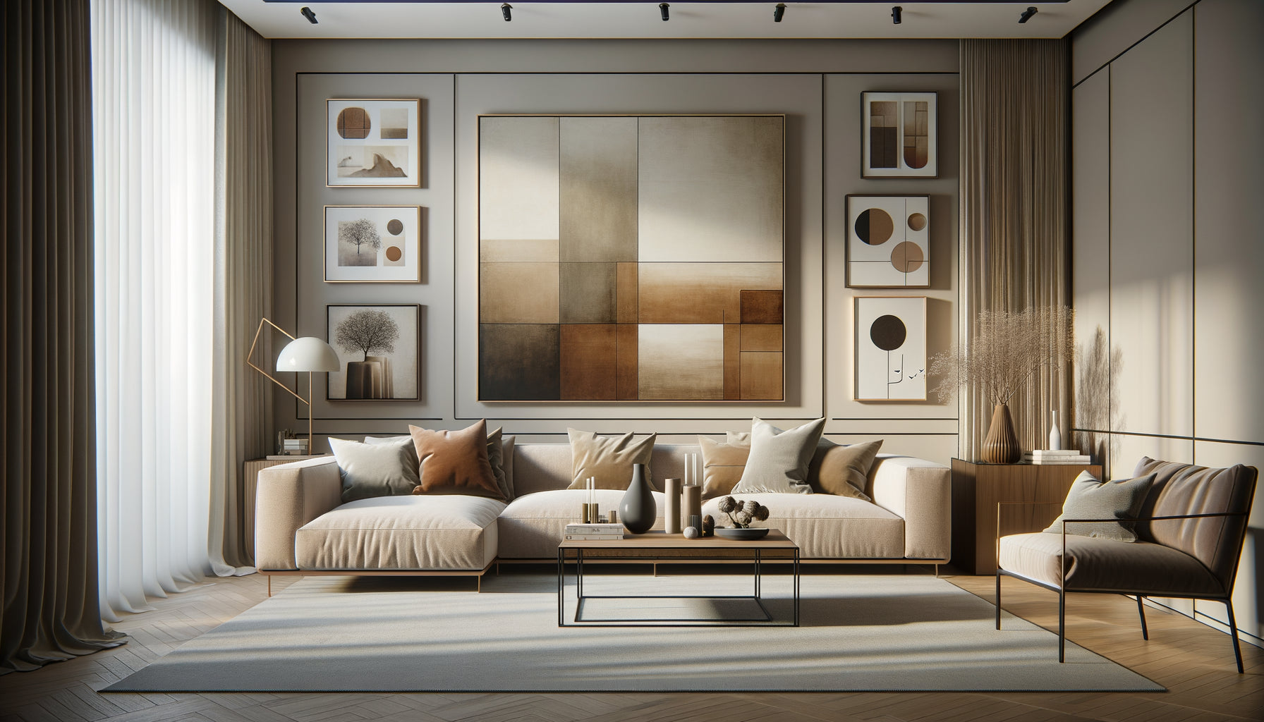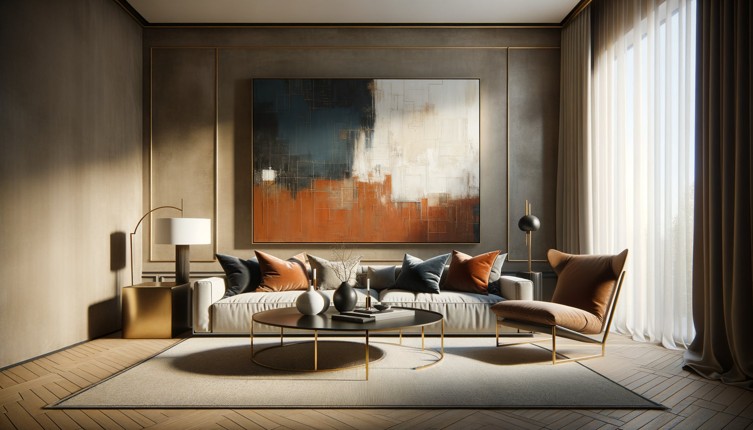
I've seen impeccable living rooms transform into lifeless, soulless spaces. Designer sofas costing several thousand euros, architect-designed lighting fixtures, Persian rugs... and yet, something was missing. That presence, that focal point that captures the eye and defines the atmosphere. Then, a painting – the right painting – arrived. The balance was instantly created.
Here's what a perfectly selected artwork brings to your living room: it visually anchors the space by creating a natural convergence point, it reveals your personality without needing words, and it transforms functional decor into an emotional universe. These three dimensions make all the difference between a well-arranged interior and a truly inhabited place.
The frustration is universal: you're looking for that painting that will awaken your living room, but faced with the infinity of styles, formats and prices, doubt creeps in. Abstract or figurative? Bold large format or more discreet composition? And above all, how to avoid the mistake that will cost money and clutter your walls for years?
Rest assured, selecting the centerpiece of your living room doesn't require artistic training. It requires a clear methodology, a few sensory guidelines, and above all listening to your space. I am going to share with you the exact process that I use to identify that unique painting which will transform your living room into a magnetic place.
The alchemy between artwork and space: understanding your living room first
Even before thinking about colors or styles, observe your living room as a living territory. What is its natural luminosity at different hours? Spaces bathed in light can tolerate dark and dramatic works, while more subdued living rooms call for paintings that capture and diffuse light.
Then analyze your recipient wall. A large empty wall above the sofa naturally calls for a painting of generous format – generally between 120 and 180 cm wide. An artwork too small on a large wall creates an uncomfortable visual imbalance, like a postage stamp lost in immensity.
The positioning height is crucial: the center of the painting should be at eye level, or about 145-150 cm from the floor. This museum rule also works in living rooms because it creates a natural dialogue between the artwork and the viewer.
Architecture dictates format
In contemporary living rooms with high ceilings, prioritize vertical formats or triptychs that exploit the verticality. More traditional spaces with classic proportions wonderfully welcome horizontal panoramas that visually widen the room.
Measure your available space precisely and visualize the scale mentally. A practical tip: cut a template from kraft paper to the dimensions you are considering and temporarily attach it to the wall. Live with it for a few days. This simulation immediately reveals whether the format breathes or suffocates.
The chromatic dialogue: when colors tell your story
The colors of a wall art for living room should never be chosen in isolation. They converse with your existing palette – textiles, walls, woodwork. But beware: harmonizing does not mean duplicating.
Three chromatic approaches work beautifully. Tonal harmony involves choosing a piece within the same color family as your decor, but with variations in saturation and brightness that create depth. Calculated contrast introduces a complementary color that energizes the space – deep blue in a living room with warm tones, or vibrant coral in a gray universe.
The third path, bolder, makes the painting the sole source of bright color in a deliberately neutral living room. This gallery approach transforms the wall art into a true star of the living room, all attention naturally converges on it.
The balance between presence and discretion
A maximalist living room, rich in patterns and textures, benefits from a more refined work that offers visual breathing space. Conversely, a minimalist interior with clean lines can accommodate an explosive, gestural painting that becomes the exclamation point of your decor.
I have observed that a painting becomes a centerpiece not by its complexity, but by its ability to create a harmonious tension with its environment. Neither total fusion nor aggressive rupture – but this perfect balance that intrigues and soothes simultaneously.

Style and subject: reveal the soul of your home
The style of your painting instantly communicates an atmosphere. Abstract art, with its free forms and play of materials, is particularly suitable for contemporary interiors and offers a narrative neutrality – each person projects their own interpretation onto it.
Landscapes bring an emotional window: a misty forest instills contemplation, a dynamic marine scene infuses energy, a mineral desert creates serenity. Figurative or portrait works add a human presence that warms impersonal large spaces.
For a lively family living room, avoid overly precious or psychologically fragile works. Favor generous paintings with texture and movement that absorb the surrounding dynamism. For an intimate library-living room, more introspective works, with details that are gradually revealed, enrich the contemplative experience.
Authenticity over trend
Beware of fleeting trends. A living room painting will accompany you for years, sometimes decades. Choose a work that resonates with your core values rather than the latest Instagram trends. Emotional authenticity transcends decorative cycles.
Ask yourself this essential question: in ten years, when everything else may have changed, will you still be moved by this artwork? If the answer hesitates, continue your search.
Texture and relief: the often-forgotten tactile dimension
A little-considered element radically transforms the presence of a painting: its physical materiality. Works with relief, impasto or mixed techniques create their own life depending on the angle of light.
A palette knife painting with generous materials captures and reflects morning natural light differently from evening light, offering two works in one. Textured canvases add a sensory dimension that enriches the experience, even at a distance – our brain perceives this depth and responds to it.
In modern living rooms with often smooth surfaces – glass, polished metal, waxed concrete – a richly textured painting introduces a tactile contrast that humanizes the space. It becomes a sensory anchor in a potentially cold environment.

The frame and presentation: these details that change everything
The frame of a living room painting is never insignificant. It can strengthen or weaken the impact of the artwork considerably. Thick, ornate frames suit classic works and add prestige, but can overwhelm contemporary creations.
Thin, discreet frames, in matte black, white or natural wood tones, highlight the work without competing with it. For modern canvases, presentation without a frame, with painted edges, creates a fluid continuity between the artwork and the wall, particularly suitable for minimalist interiors.
An important technical detail: make sure your hanging system is up to par. A heavy painting poorly secured is a hazard and generates subconscious anxiety. Invest in professional fixings – X hooks, fasteners adapted to the type of wall – so that your masterpiece rests safely.
Lighting sculpts emotion
A perfectly selected artwork can be ruined by unsuitable lighting. Ideally, install dedicated lighting – a track with adjustable spotlights or special picture lights – that highlights the colors and texture without creating reflections.
Color temperature matters: warm light (2700-3000K) enhances artworks with warm tones and creates a cozy atmosphere, while neutral light (4000K) faithfully reveals colors, particularly crucial for contemporary works with subtle nuances.
Acquisition: investing wisely
The budget for a living room artwork varies considerably, but some principles guide judicious investment. For an authentic masterpiece, always prioritize an original work or high-quality art reproduction rather than generic prints.
Works by emerging artists offer exceptional value – authenticity, uniqueness and potential appreciation. Online galleries specializing in art democratize access to art while guaranteeing the quality and authenticity of the pieces.
Never buy impulsively. Take the time to live with the image – display it virtually on your wall using visualization tools, revisit it several times if possible. An immediate crush can turn into rapid fatigue, while a work that gradually grows in your mind promises a lasting relationship.
Your living room deserves this presence that magnifies it
Discover our exclusive collection of wall art for Living Room that transforms ordinary spaces into extraordinary ones.
Transformation awaits you
Tonight, when you return home, observe your living room with a fresh eye. Identify the wall that is waiting for its revelation, visualize the artwork that will converse with the light, imagine the emotion that will seize you each time your gaze rests upon it.
Selecting the artwork that will become the centerpiece of your living room is not simply a decorative acquisition. It's an act of personal affirmation, a decision that anchors your identity in your living space and creates an emotional convergence point for all those who cross your threshold.
Start by measuring your space, define your emotional palette, then let yourself be guided by the work that chooses you as much as you choose it. The perfect piece exists, and it is simply waiting for you to recognize it.
Frequently Asked Questions
What size artwork should I choose for a medium-sized living room?
For a standard living room of 20-30 m², aim for a main artwork between 100 and 150 cm wide. The rule of thumb: your piece should occupy about two thirds of the width of your sofa to create a harmonious visual balance. Above an 180 cm piece of furniture, a 120-140 cm artwork works perfectly. Don't be afraid of large formats – artworks that are too small are the most common mistake. They create an insignificant decorative effect rather than the desired magnetic presence. If you hesitate between two sizes, always choose the larger one. A generous artwork structures the space and naturally becomes the focal point, while a timid piece gets lost in the decor. Also consider ceiling height: vertical spaces call for tall formats or stacked compositions.
Is it essential to match the colors of the artwork with the existing decor?
No, and it's often counterproductive. Perfect matching creates monotony and makes the artwork disappear rather than enhancing it. Instead, look for a chromatic resonance: pick up one or two colors from your existing palette, but in different intensities, and let the artwork introduce new nuances. For example, in a beige and gray living room, an artwork with touches of petrol blue, gold and umber enriches the atmosphere without a brutal break. The most sophisticated approach is to create a chromatic bridge: your artwork contains a dominant color that dialogues with your decor, and accents that open up new possibilities you can explore via cushions, a throw or a vase. Your piece then becomes the chromatic conductor of the entire space, not just one element among others.
How do I know if I will still like a painting in several years?
Excellent question that distinguishes an impulsive purchase from a lasting emotional investment. Apply the test of deep resonance: in front of the artwork, ask yourself if it evokes a memory, a place, a sensation that is fundamentally personal to you. Artworks that stand the test of time are those that connect with your intimate story, not fleeting trends. Beware of purely visual crushes – they quickly burn out. Favor works that gradually reveal their subtleties, with details that are discovered over repeated glances. A practical technique: display the image of the artwork as your phone wallpaper for a week. If you still feel interested and discover new aspects after this overexposure, it's an excellent sign. Finally, ask yourself about the emotion generated: superficial excitement or deep satisfaction? The latter guarantees longevity.