

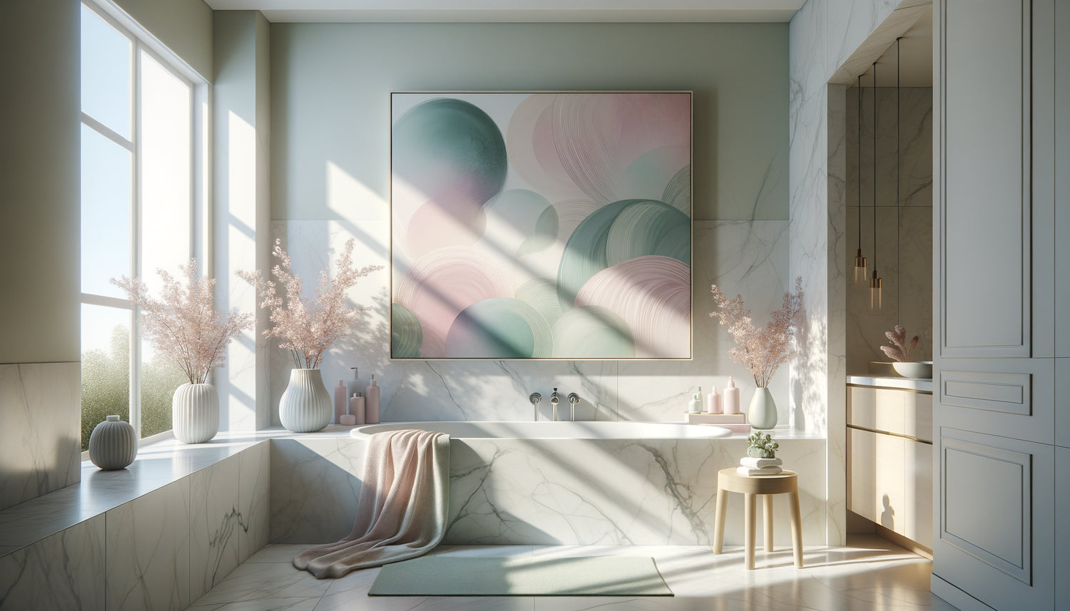
Imagine: the end of a never-ending day, the bathroom door closing softly behind you, water flowing into the bathtub. That sacred moment when the outside world no longer exists. And there, on the wall facing you, a watercolor with shades of dusty rose and celadon blue welcomes you like a visual caress. Pastel-toned paintings transform the bathroom into a sensory sanctuary, creating that absolute atmosphere of softness that our hyperactive era sorely lacks.
Here's what pastel-colored artworks bring to your bathroom space: an immediate reduction in nervous tension thanks to their soothing palette, amplification of natural light which enhances even the smallest spaces, and timeless elegance that transcends fleeting trends. These three pillars transform a simple hygiene ritual into a true ceremony of well-being.
How many times have you entered your bathroom feeling that emptiness, that clinical coldness of white tiles and chrome surfaces? That impression that even your haven of cleanliness asks you to be performant, efficient, fast. The modern bathroom often suffers from a lack of soul, reduced to its sole functionality, forgetting that it should be the first refuge for body and mind.
But rest assured: transforming your bathroom into a cocoon of serenity does not require major renovations or a significant budget. A single pastel-toned painting, carefully chosen and placed, is enough to operate this metamorphosis. I promise you that at the end of this article, you will know exactly how to create that enveloping atmosphere of softness that is missing from your daily life.
The science of soothing: why pastels speak to our brain
Neuroscience reveals to us what our grandmothers intuitively knew: pastel colors activate the areas of the brain associated with rest and safety. Unlike saturated hues that stimulate attention and alertness, softened shades of pink, blue, mint green or lavender naturally slow down our heart rate. It is a physiological response, not simply an aesthetic one.
In the intimacy of the bath, where we literally find ourselves naked, vulnerable, this psychological dimension makes all the sense. A painting in pastel tones acts as a silent emotional regulator. The dusty mauve recalls the first rays of dawn, a universal moment of calm. Glacier blue evokes the refreshing coolness of water itself. Old rose awakens that sensory memory of tenderness.
I have observed in countless projects that people instinctively place these works facing the bathtub or above the sink – where their gaze rests during those suspended moments. It's not by chance. The eye naturally seeks soft visual anchors when the body relaxes. Pastel tones offer this comforting presence without ever overwhelming.
The art of creating a dialogue between water and pigments
Water possesses the unique quality of reflecting and diffusing light. When you introduce a tableaux aux tons pastel into your bathroom, you create a fascinating play of correspondences. The steam from the bath further softens the contours of the work, creating a kind of natural sfumato worthy of the Renaissance.
Choose compositions that evoke fluidity: abstractions aquatiques where pigments seem to have been diluted on canvas, seascapes with infinite horizons tinted with peach and pearl gray, evanescent florals where petals dissolve into ivory backgrounds. This thematic resonance between the subject of the work and the function of the place greatly amplifies the effect of harmony.
Color palettes that work wonderfully
After years of experimentation, some combinations prove infallible. The trio of rose powder, dove gray and broken white creates a soft sophistication particularly suited to classic bathrooms. For contemporary spaces, opt for a gradient of pastel blues – from celadon to glacier blue – which dialogues beautifully with modern materials.
Apricot and peach hues, often overlooked, possess the rare ability to warm the atmosphere without weighing it down. When paired with touches of sage green, they evoke a garden at dawn, bringing an almost olfactory dimension to your wall decor. Don't be afraid of color, as long as it is softened, desaturated, as if veiled in light.

Where and how to hang to maximize serenity
The placement of a tableaux aux tons pastel in the bathroom obeys different rules than in other rooms. Here, the eye level when sitting or lying down becomes the main criterion. Facing the bathtub, place the work slightly lower than in a living room – about 140 cm from the floor to the center of the painting.
Avoid direct splash zones, but don't shy away from excessive humidity. A properly framed painting (with UV protection and waterproof backing) will perfectly withstand a well-ventilated bathroom. The trick of the initiated : always leave at least 15 cm between the work and any direct water source.
For small bathrooms, prioritize a vertical format that visually elongates the space. Pastel tones have this remarkable property of pushing walls away, creating an illusion of spaciousness. In large bathrooms, dare to create a composition of several paintings with complementary shades – a diptych or triptych creates a true contemplative landscape.
When light reveals the magic of nuances
A painting in pastel tones lives differently depending on the hours. Perhaps it is its most subtle charm. At dawn, when natural grazing light enters through the window, roses become almost golden, blues are tinged with mauve. In the evening, under warm artificial lighting, these same shades reveal their hidden depth.
To enhance these variations, install indirect lighting – adjustable spotlights or wall lights with dimmer. Direct light kills the delicate nuances of pastels. Prefer a lateral light source that grazes the surface of the work, revealing texture and relief without creating aggressive reflections on the protective glass.
The fatal error to absolutely avoid
Never choose a painting in pastel tones in a store or online under lighting different from that of your bathroom. Commercial neon lights completely distort these subtle shades. If possible, request a preview in your real environment, or at least photograph the work under different lights before purchasing. This precaution will avoid many disappointments.

Beyond decoration: creating a visual ritual
The true power of a painting in pastel tones in the bathroom goes far beyond aesthetics. It becomes the visual anchor of your disconnection ritual. Every evening, when your gaze rests on these soothing shades, your nervous system receives the signal: it is time to slow down, to return to yourself.
Some of my clients have confided in me that they use their artwork as a focal point for conscious breathing exercises. Three minutes facing a gradient of pastel blue, synchronizing inhalation on the light areas and exhalation on the darker areas. This simple practice transforms the bathroom into a true meditative space.
The intimacy of the bathroom demands this particular softness that only desaturated tones can offer without overwhelming. Unlike a living room where the artwork engages with guests, here it addresses you alone, in your most private moments. This silent conversation with soothing shapes and colors rebuilds, day after day, your relationship with calm.
Harmonizing materials: wood, stone and light pigments
Pastel tones possess this rare ability to harmonize with all natural materials. On a gray concrete-effect wall, a painting in shades of old rose creates a sophisticated contrast that softens the minerality. Against white subway tile, touches of sage green and powder blue bring that personality which is so often lacking.
For bathrooms with woodwork – teak furniture, light oak shelves – prioritize artworks with warm tones: peach, apricot, blush beige. These nuances resonate with the grain of the wood, creating an organic continuity. Conversely, in a very mineral space (marble, stone, ceramic), cool pastels – lavender, glacier blue, mint – bring that essential touch of softness.
Transform your bathroom into a sanctuary of serenity
Discover our exclusive collection of wall art for Bathroom that brings this pastel softness suited to the intimacy of your daily rituals.
The silent transformation of your everyday life
Visualize this moment, in a few days: you enter your reinvented bathroom. Your gaze immediately rests on this new visual companion, this painting with pastel tones that seems to have always been there. Your shoulders instantly relax. Breathing deepens. The space is no longer just functional – it becomes refuge.
It's not magic, it's the simple alchemy of soft color, thoughtful placement and intention. Your bathroom deserves this attention, as it’s often the first and last room you visit each day. Starting and ending your day in a visually soothing environment profoundly changes the quality of our daily experience.
So choose the artwork that makes you breathe slower. Hang it carefully. And observe how, gradually, your relationship with these moments of intimacy transforms. The softness of pastels is a gift you give yourself, an investment in your well-being that costs only a moment of decision.
Frequently asked questions about pastel paintings in the bathroom
Do pastel artworks really resist the humidity of the bathroom?
Absolutely, provided you follow a few simple precautions. Opt for canvas prints on treated canvas or artworks protected by glass with sealed edges. The key is to ensure good ventilation in your bathroom – open the window after showering or use an extractor fan. Pastel tones, whether applied in acrylic, fixed watercolor, or giclée print, resist normal ambient humidity perfectly well. Simply avoid direct splashes and maintain a minimum distance of 50 cm from the shower. Thousands of bathrooms have housed these delicate artworks for years without any degradation. The key: choose a painting designed for humid spaces, with a protected back and suitable frame.
What pastel shades work best for a small, dark bathroom?
For restricted and dimly lit spaces, prioritize light pastels with warm undertones: peach, blush pink, very pale yellow or rose beige. These nuances have the remarkable ability to capture even the faintest light source and diffuse it throughout the room. Avoid gray or too cool pastels (icy blue, deep lavender) which risk darkening the atmosphere further. A painting dominated by off-whites with touches of apricot will create an illusion of space and brightness. The extra tip: choose a work with very clear areas, almost white, that will reflect light like discreet mirrors. Add warm white LED lighting above the artwork to maximize this visual opening effect, even in the smallest 3m².
How to choose between an abstract or figurative painting in pastel tones?
This decision depends entirely on your personal relationship with the image during your intimate moments. Abstract artworks in pastel tones – gradients, flowing shapes, minimalist compositions – favor free contemplation and reverie. Your mind projects its own interpretations, which can be deeply soothing after a day of constant visual stimulation. Conversely, figurative pastel paintings – evanescent seascapes, soft florals, desaturated natural scenes – offer a reassuring narrative anchor. They evoke places of tranquility (sunrise beach, misty garden) that facilitate mental disconnection. My advice: if your bathroom is already visually cluttered (patterned tile, numerous objects), opt for abstract art which simplifies. If it's minimalist, a delicate figurative piece will bring the necessary touch of life without overloading.


