During my last intervention in an orthopedics clinic, I observed a patient convulsively gripping the armrest of her chair. Her gaze was fixed on an abstract painting with aggressive colors, sharp angles, and violent contrasts. The practitioner, an excellent surgeon, had never realized that his decorative choice amplified pre-operative anxiety. This scene repeats itself in countless medical offices: mismatched wall art transforms a care space into an additional source of stress.
Here's what a thoughtful selection of paintings by medical specialty brings : a measurable reduction in patient anxiety (up to 30% according to some hospital studies), improved perception of the practitioner’s professionalism, and visual consistency that subconsciously reinforces therapeutic trust. Yet, most healthcare professionals select their artworks randomly, guided by personal tastes that completely ignore the psychology of their patients and the particularities of their practice.
You have probably invested in state-of-the-art medical equipment, optimized your patient journey, but your walls may be telling a contradictory story. Rest assured: adapting paintings to different medical specialties requires neither artistic training nor a colossal budget. It simply takes understanding the visual codes that speak to your patients and translating them into relevant aesthetic choices. I will show you how each specialty has its own visual language, and how to master it to transform your office into a sanctuary of healing.
Pediatrics: when colors become therapeutic
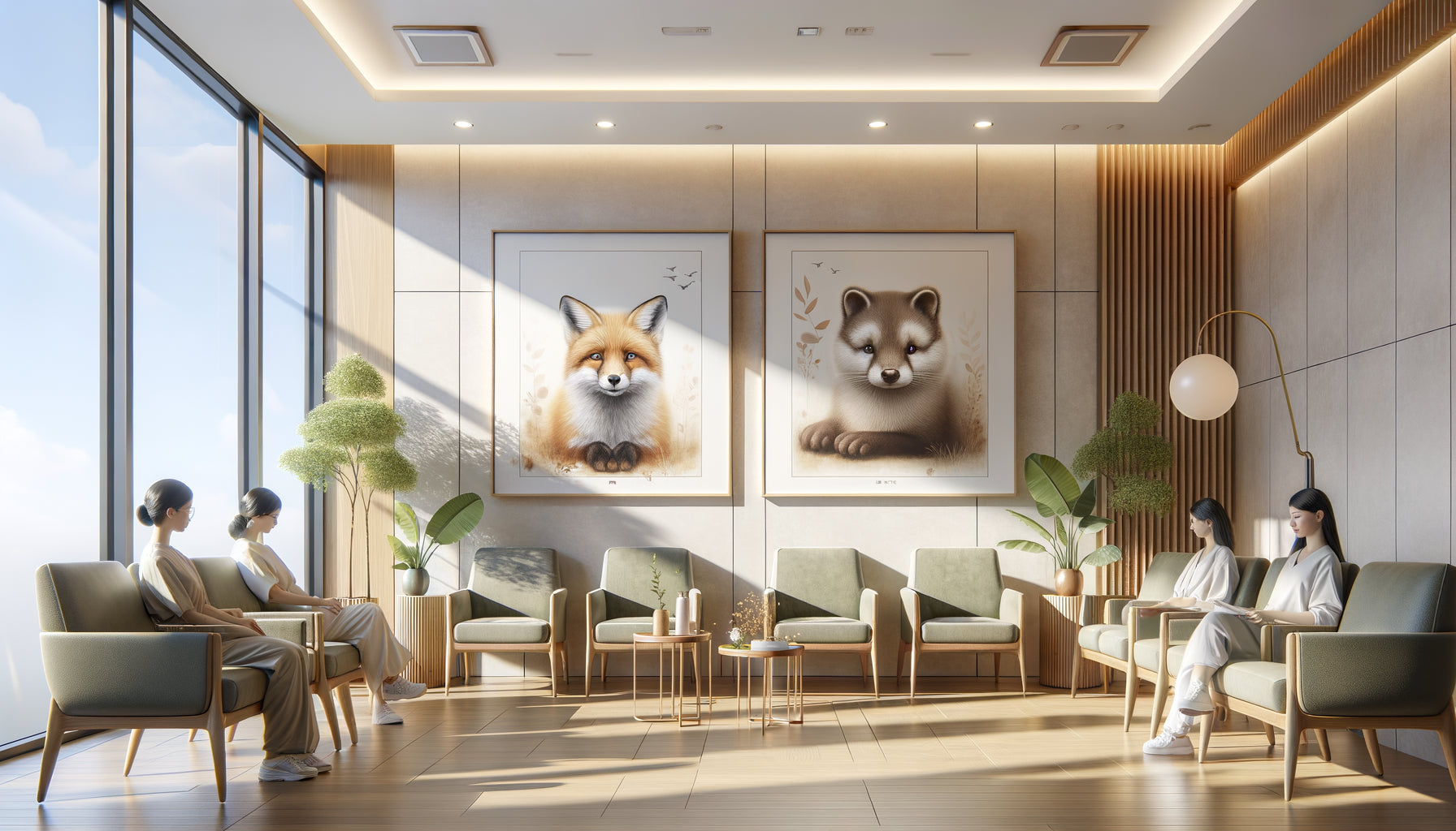
In a pediatric practice, paintings are not just decorations but therapeutic distraction tools. I accompanied a pediatrician who received terrified children daily. After replacing her neutral landscapes with a collection of playful animal illustrations and colorful geometric compositions, she noticed a spectacular decrease in crying during consultations.
For pediatrics, prioritize paintings with endearing characters without being infantilizing: stylized animals, gentle imaginary worlds, accessible nature scenes. Primary and secondary colors positively stimulate without overloading. A trick I developed: create visual sequences between the waiting room and the office. A little fox in the waiting room that subtly reappears in the office creates a reassuring continuity for the child.
Mistakes to absolutely avoid
Ban direct medical representations (stylized syringes, stethoscopes) that recall dreaded procedures. Also avoid abstractions that are too complex and generate confusion in young patients. A child should be able to tell a story from your painting, not feel lost in front of it.
Psychiatry and psychology: the art of contemplative appeasement
In these specialties where speech is central, artwork should create a mental breathing space without imposing an interpretation. A psychiatrist I advised had instinctively chosen narrative figurative works. His patients spent sessions analyzing the paintings rather than exploring their own emotions.
To adapt artwork to psychiatry and psychology, opt for minimalist compositions, clean landscapes, soft abstractions with fluid transitions. Earthy tones, pale blue, sage green work remarkably well. The key is non-intrusion: the patient should be able to look at the painting without it monopolizing their attention or imposing an emotional narrative.
Photographic black and white works of natural landscapes produce excellent results: interesting enough to offer a visual resting point during therapeutic silences, yet neutral enough not to interfere with psychological work. I have also observed the effectiveness of organic abstract compositions that evoke fluidity without definite form.

Cardiology and internal medicine: reassurance through visual stability
Patients consulting these specialties often carry deep existential anxieties. Artwork should embody solidity, continuity, life that persists. A cardiologist shared with me how his patients spontaneously commented on his calm seascapes, projecting their hopes for serene tomorrows onto them.
For these medical specialties, prioritize wide horizons, open landscapes without visual obstacles, natural scenes evoking regular cycles (seasons, tides, sunrise). Balanced compositions with a stable focal point subconsciously convey a message of physiological stability. Absolutely avoid intense reds which, in this context, can trigger associations with blood or emergency.
The power of blues and greens
These tones have a demonstrated effect on heart rate and blood pressure regulation. A painting dominated by these colors in a cardiology waiting room is not just aesthetic: it's a therapeutic choice consistent with your specialty.
Dermatology and cosmetic medicine: celebrating natural beauty
These specialties require a particular approach because your patients are hyper-aware of aesthetics and scrutinize your decorative choices as indicators of your sensitivity. A dermatologist I accompanied had unconsciously chosen close-up photographic portraits. Her patients, already anxious about their appearance, felt scrutinized even by the walls.
To adapt the paintings to dermatology and cosmetic medicine, select works celebrating beauty without personalizing it: elegant florals, enlarged natural textures (wood, stone, water), impeccable finish abstractions. The excellence of execution is extremely important here. Your patients evaluate your attention to detail through every visual element in your practice.
Botanical macro photographs, minimalist compositions with pure lines, sophisticated monochromes convey refinement and meticulous attention. These paintings reflect the values of your practice: sublimating what already exists, revealing intrinsic beauty, perfecting delicately.

Oncology: hope without naivety
Adapting paintings to oncology requires a particular sensitivity between acknowledging the severity and maintaining hope. An oncologist confided in me his difficulty: how to decorate without falling into toxic optimism or sinking into darkness?
The solution lies in works evoking natural resilience: centuries-old trees, mountain landscapes testifying to permanence, autumn seasons rich in warm colors. These paintings implicitly recognize life cycles while celebrating continuity. Patients find a mirror of their own struggle: nature that persists, regenerates, and weathers storms.
Avoid sunsets (too associated with endings) and favor sunrises, springs, images of regeneration. Abstract works with subtle gradations from dark to light work remarkably well, offering a visual metaphor for the therapeutic journey without imposing it heavily.
Orthopedics and sports medicine: dynamism and reconstruction
These specialties call for paintings evoking movement, structure, regained strength. My orthopedic clients get excellent feedback with dynamic geometric compositions, stylized sports photography (without aggressive competition), abstract representations of momentum and balance.
To adapt artworks to orthopedics, consider natural architecture: bamboo evoking flexibility and strength, mineral structures testifying to solidity. Patients undergoing rehabilitation subconsciously project themselves into these images of material resilience. A composition showing a visual progression (sequence of shapes rising, ascending lines) subtly reinforces the message of progressive recovery.
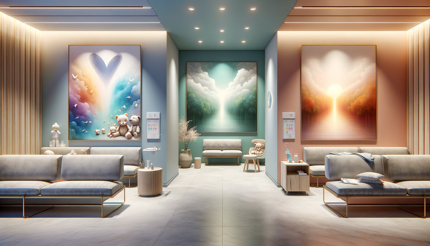
Transform your medical space into a coherent therapeutic environment
Discover our exclusive collection of wall art for Waiting Room that perfectly harmonize with your medical specialty and naturally reassure your patients.
How to choose your artworks according to your specialty
Start by observing your patients for a week: what are their gazes, postures, recurring anxieties? This quick ethnography will reveal the specific emotional needs of your patient population. A gastroenterologist will not decorate like a pulmonologist, because their patients do not arrive with the same emotional baggage.
Next, identify three adjectives defining what you want to convey. For a neurologist: precision, tamed complexity, continuity. For a general practitioner: accessibility, universality, human warmth. Your artworks should visually embody these values. Mentally test each artwork considered: does it tell the therapeutic story of my specialty?
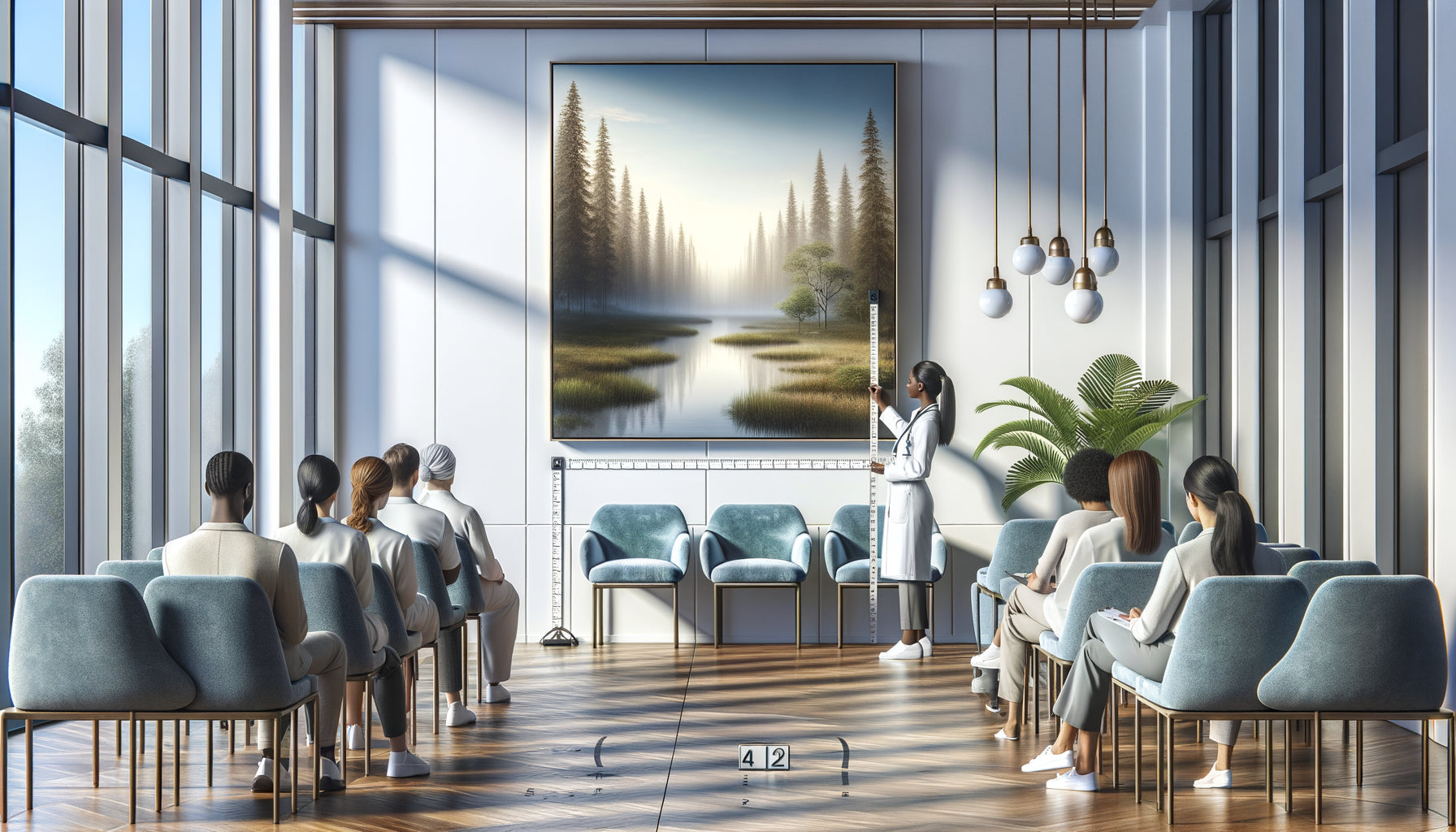
Also consider the duration of exposure. In waiting rooms, patients scrutinize for a long time: prioritize works with a richness of detail discoverable progressively. In the consultation room, where the gaze is brief, opt for compositions with an immediate message. This distinction between contemplative artworks and artworks with an instant impact is crucial to effectively adapt your decoration to your medical specialty.
Imagine a patient entering your office tomorrow, anxious, vulnerable, subconsciously looking for signs of your competence and empathy. Your artworks speak to them before you even open your mouth. They tell him: here, someone has thought about your well-being in every detail. This consistency between your medical specialty and your visual environment is not a decorative luxury, it is an extension of your therapeutic gesture. Start with a single artwork, the most visible in your waiting room, and observe the difference in your patients' gazes. You will never decorate randomly again.
Frequently Asked Questions
Do I need to change all my artworks at once to adapt my office to my medical specialty?
Absolutely not, and I would even advise against it. Proceed gradually, starting with the waiting room, the space where your patients spend the most time and develop their first impressions. Replace the most visible artwork first, observe reactions for a few weeks, then continue. This approach allows you to adjust your selection based on real feedback from your patients. Some of my clients even keep a few personal artworks in private areas (administrative office) while strictly adapting patient zones. The important thing is consistency in therapeutic spaces, not total decorative revolution.
How to know if my current artworks are really unsuitable for my specialty?
Do this simple test that I propose to all my clients: photograph your current walls, show the images to three colleagues of your specialty without context, and ask them what medical practice these spaces evoke. If their answers are vague or contradictory, your paintings lack consistency with your professional identity. Another indicator: listen to spontaneous comments from your patients about your decoration for a month. If they never mention your paintings positively, or worse, if they criticize them, it is a clear signal. Finally, honestly ask yourself: do these works reinforce the therapeutic message of my specialty or are they simply decorative fillers? The answer will guide you.
Can I adapt artworks to my specialty with a limited budget?
Excellent news: adaptation does not depend on price but on relevance. I have seen cabinets transformed with accessible reproductions perfectly chosen surpass spaces decorated with expensive original works but unsuitable. Focus your budget on high-impact emotional areas: the painting facing the entrance door of the waiting room, and the one visible from the examination chair. Two strategically selected artworks are better than five random ones. Always prioritize print and framing quality over artwork rarity. A soothing landscape perfectly reproduced and carefully framed will have more therapeutic impact than a mediocre original. Your investment should reflect your intention of consistency with your medical specialty, not your artistic purchasing power.