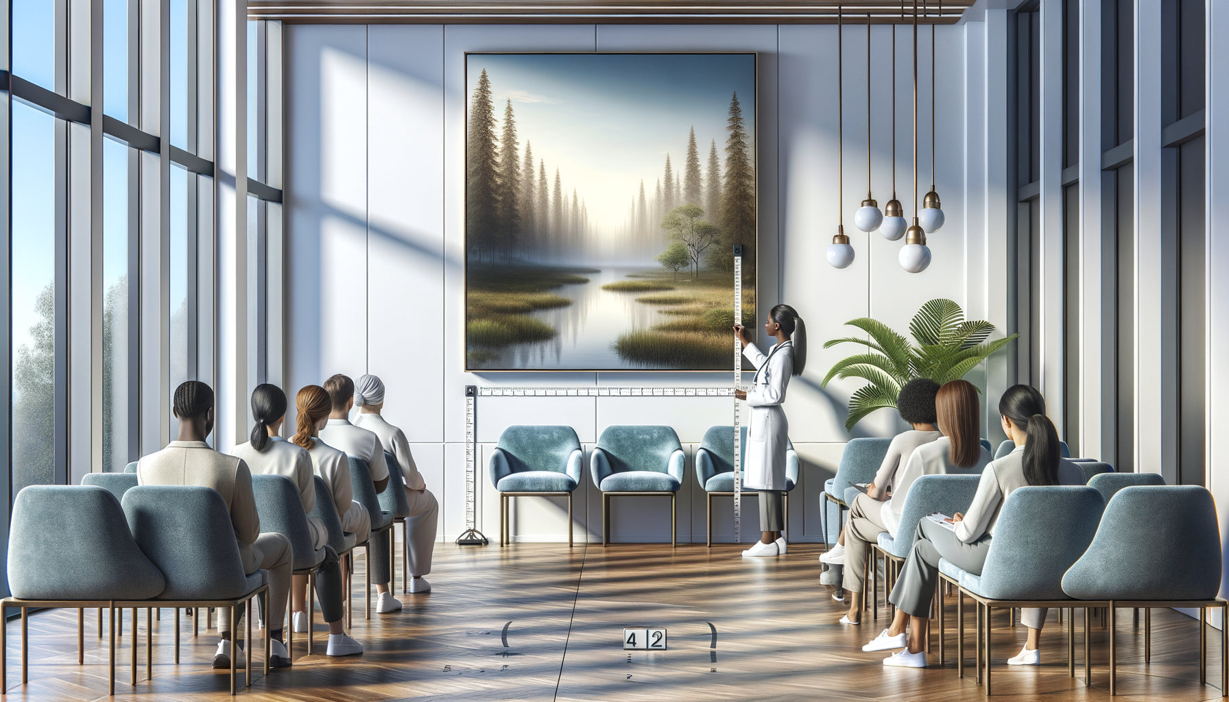
That morning, in a crowded waiting room, I observed something fascinating. While a vibrant red abstract work captured everyone's attention, it was towards the blue painting hanging at the back that stressed people instinctively turned. Their shoulders relaxed. Their breathing slowed down. The blue worked its silent magic.
Here’s what blue-toned abstract paintings bring to your interior: a measurable reduction in stress through their psychophysiological effect, spatial depth that visually enlarges your rooms, and decorative versatility that transcends trends without ever becoming dated. Neuroscience confirms what architects have known since antiquity: blue possesses a unique calming power within the color spectrum.
You may have tried countless tricks to create a serene atmosphere at home. Scented candles, green plants, soft textiles. But your space remains nervous, agitated, unable to offer you the haven of peace you dream of after a grueling day. You are looking for that invisible key that would transform your interior into a sanctuary.
Rest assured: this transformation requires neither pharaonic work nor an excessive budget. A single well-chosen element can metamorphose the energy of an entire room. Blue abstract paintings embody this elegant solution, both scientifically grounded and aesthetically timeless.
I will reveal to you why these works generate such a deep sense of calm, how to choose the shades that will correspond to your sensitivity, and in which spaces they deploy their full potential. Prepare to rediscover the transformative power of a millennia-old color.
The science behind the calming effect of blue
When your gaze rests on a blue abstract painting, your body reacts before your consciousness even analyzes the work. The receptors in your retina transmit information to the parasympathetic nervous system, that very one which slows your heart rate and decreases your blood pressure. This is not mysticism: it is pure biology.
Studies in chromotherapy reveal that exposure to blue reduces cortisol production, the stress hormone, by 15 to 20% on average. Unlike reds and oranges which stimulate alertness and action, blue tones activate our natural relaxation mechanisms. In an abstract painting, this reaction is amplified because the absence of figurative form avoids your brain the work of identification and narrative interpretation.
Blue abstraction creates a kind of visual meditation. Your eyes wander between the nuances – from deep cobalt to pale celadon – without ever seeking to « understand » a scene. This perceptual freedom generates a state of contemplation close to mindfulness. I have observed this phenomenon in hospital rooms where blue abstract paintings significantly reduced the demand for anxiolytics.
Why abstraction amplifies the power of blue
A blue seascape can be beautiful, but it tells a story. Your mind evokes vacations, memories, perhaps also regrets or nostalgia. Abstraction, on the other hand, imposes no narrative. It offers you a blank space where to project your own quest for appeasement.
In an abstract composition, blue becomes emotional architecture. Glazes create infinite depth where your gaze plunges without ever touching bottom. Variations in saturation – from bright turquoise to mysterious midnight blue – orchestrate a visual symphony that captures attention without monopolizing it. It is this subtlety that differentiates a soothing painting from a simple blue decoration.
The organic or geometric shapes of a blue abstract work dialogue with your unconscious. A fluid curve will evoke the movement of water or breathing, while superimposed blue rectangles will recall the horizon and stability. This non-verbal communication penetrates directly into your limbic system, the emotional center of your brain, without passing through the analytical filter of the cortex.
The psychology of shades: not all blues are equal
Yves Klein blue, this saturated and vibrant ultramarine blue, provokes intense, almost spiritual contemplation. It is suitable for personalities seeking intellectual depth. Pastel blue, on the other hand, envelops spaces dedicated to rest with a maternal softness. Between these extremes, an infinity of nuances responds to specific emotional needs.
Petrol blue mixed with touches of gray brings a soothing sophistication to offices and libraries. Turquoise blue, with its green notes, infuses regenerating energy into care or meditation spaces. Midnight blue tinted with purple creates an intimate cocoon ideal for bedrooms. Each shade has its own emotional frequency.

The spatial effect of blue abstract paintings
Beyond their emotional impact, these works physically transform your perception of space. Blue is a cool color that optically recedes. Hung on a wall, a large blue abstract painting visually hollows out the surface, creating an illusion of depth that expands the room by several virtual square meters.
This property is valuable in compact urban spaces where every centimeter counts. I have seen 25m² studios gain unexpected spaciousness thanks to a blue abstract canvas of 120x80cm cleverly positioned. Blue opens up walls like windows onto infinity, a trick that decorators have been exploiting for decades.
In attic rooms or narrow hallways, an abstract painting with sky blue hues visually lightens the structure. Ceilings appear higher, passages wider. This optical magic occurs without work or actual enlargement, simply through expert manipulation of color and abstract composition.
Where to place your blue abstract paintings for maximum effect
The bedroom remains the privileged sanctuary for these soothing works. Position your blue abstract painting facing the bed, as the first vision upon waking and the last contemplation before sleep. This daily presence gradually regulates your circadian rhythm and improves the quality of your rest. Favor lavender blues or grey-blue to avoid excessive stimulation.
Bathrooms, often neglected in terms of art, are wonderfully suited to blue abstract compositions. The natural association with water reinforces the soothing effect. Choose works on moisture-resistant supports and let the blue dialogue with the tiles and fittings. This morning ritual facing a marine abstraction transforms a mundane routine into a contemplative moment.
In professional spaces – medical offices, waiting rooms, offices – blue abstract paintings reduce ambient anxiety. Several studies show that a waiting room adorned with blue works reduces the perception of waiting time by 30%. Patients are less impatient, employees work better. Artistic investment becomes an investment in collective well-being.
The living room: balancing stimulation and serenity
The living room presents a particular challenge as it hosts various activities – conviviality, rest, reading, entertainment. A large format blue abstract painting becomes the visual anchor that unifies these contradictory functions. Place it above the sofa or on the main wall, as a natural focal point for the eye.
To avoid a too cold atmosphere, combine your blue artwork with warm textiles – terracotta cushions, caramel throws, natural rugs. This tension between the coolness of blue and the warmth of materials creates a sophisticated balance. Blue soothes without putting to sleep, it calms without extinguishing the social energy of the room.

Compose with blues: associations and harmonies
A blue abstract painting never floats in a vacuum. It dialogues with your furniture, your walls, your natural light. On an immaculate white wall, the blue bursts forth in all its purity, creating a Mediterranean contrast. On a pearl gray wall, it gains depth and sophistication, evoking Scandinavian or Japanese interiors.
Light woods – bleached oak, natural ash, bamboo – enhance blue abstract paintings by creating a Nordic harmony. Dark woods – walnut, wenge – amplify the contrast and confer an elegant theatricality. Avoid associations with orange woods that create an unpleasant chromatic dissonance.
Light radically transforms the perception of blues. A warm light at the end of the afternoon softens cool blues by adding purplish nuances. A northern light, colder, reveals all the clarity of pale blues. Consider the orientation of your room before choosing the color temperature of your blue abstract artwork.
Beyond decoration: investing in your mental health
Hanging a blue abstract painting is not just an aesthetic decision. It's an investment in your interior ecology, a strategy for preventing daily stress. In our society overstimulated by screens, notifications and constant noise, creating islands of visual calm becomes a salutary act of resistance.
Forward-thinking companies have understood this by integrating soothing works into their workspaces. Productivity paradoxically increases when the brain is offered contemplative visual breaks. A thirty-second glance at a blue abstraction resets the nervous system like an unconscious micro-meditation.
For people suffering from chronic anxiety or sleep disorders, the visual environment constitutes an underestimated therapeutic lever. Of course, a painting does not replace medical follow-up, but it participates in a sensory ecology that is favorable. Several psychotherapists now recommend optimizing the domestic visual environment as a complement to cognitive approaches.
Transform your space into a haven of serenity
Discover our exclusive collection of wall art for Waiting rooms that bring calm and depth to your interiors, whether they are professional or personal.
Your new relationship with blue
You will never look at a blue abstract painting the same way again. You now understand that behind these seemingly simple shades lies a complex psychophysiological mechanism. This knowledge transforms your act of buying into a conscious gesture, your decoration into emotional architecture.
Start modestly if you are hesitant. A small blue abstract artwork in your most stressful space – office, entrance, kitchen. Observe the subtle changes: your breathing deepening as you pass by, that second of involuntary contemplation that suspends time. These micro-moments accumulate their benefits day after day.
Blue awaits you, patient and infinite like the ocean or the sky. It only asks to deploy its soothing magic in your daily life. A single painting can initiate this silent revolution. Your next deep inspiration may begin with the choice of a blue abstract artwork.
FAQ : Your questions about blue abstract paintings
Are blue abstract paintings suitable for children?
Absolutely, and it is even recommended for hyperactive or anxious children's rooms. Blue naturally regulates excitement without creating excessive drowsiness. Favor playful compositions with multiple shades of blue – turquoise, azure, celadon – rather than uniform blues that may seem sad. Abstract shapes stimulate the imagination without imposing a scenario, allowing the child to project their own daydreams. Several Montessori schools integrate blue abstract artworks into their rest areas precisely for this ability to calm without infantilizing. Simply avoid too dark blues before 8-10 years old, which can generate an atmosphere that is too serious for toddlers.
Can multiple blue abstract paintings be mixed in the same room?
Yes, provided that a consistency is maintained in the shades or textures. Two approaches work particularly well: either create a monochrome gallery with different works exploring the blue palette (from lightest to darkest), or install a diptych or triptych composition that fragments the same abstract vision. The mistake to avoid would be to juxtapose styles that are too different – a saturated Klein blue next to a pale blue watercolor would create a visual dissonance. If you want to diversify, play instead with formats (a large central painting surrounded by smaller works) while maintaining a similar chromatic temperature. The eye should circulate harmoniously between the artworks without experiencing visual shocks that would cancel out the soothing effect sought.
Do blue abstract paintings work in small spaces?
Not only do they work, but they are particularly recommended to visually enlarge compact spaces. Blue has this optical property of receding, creating an illusion of depth where the wall seems to open up. In a studio or small apartment, choose a proportionate format (not too small, otherwise the effect is lost): approximately 80x60cm minimum for a main wall. Compositions with gradients from light to dark further amplify this perspective effect. A sky blue or glacier blue abstract painting proves particularly effective in dark rooms or windowless spaces, as it brings that airy luminosity that is lacking. Avoid too dark blues (navy, night) in very small spaces, which would risk creating a feeling of oppression rather than openness.