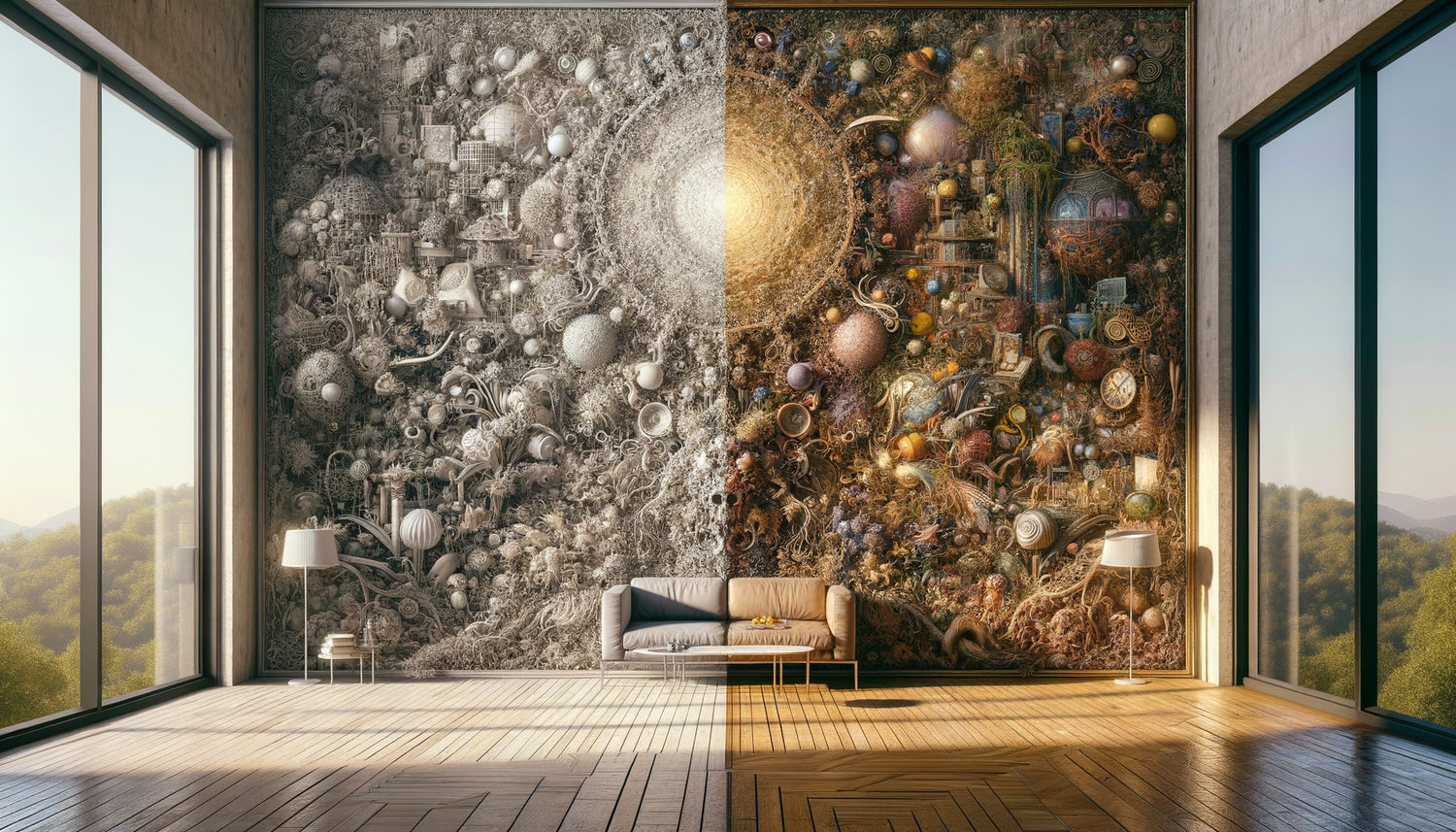
I still remember visiting Marguerite, 78 years old, in her care facility near Toulouse. Her son had just hung a large painting depicting a medieval market scene in her room: dozens of characters, overflowing stalls, complex architectures, animals, banners... An explosion of details intended to stimulate her memory. The result? Marguerite consistently averted her gaze, complained of headaches at the end of the day, and showed signs of unusual agitation.
Here's what cognitive science teaches us: a painting overloaded with visual details excessively stimulates our attentional system, generates measurable mental fatigue, and can trigger stress and confusion, particularly in elderly or cognitively fragile people. What we consider cultural richness sometimes becomes a source of silent exhaustion.
You might think that the more things there are to look at, the more interesting the work is. That these infinite details offer material for contemplation. Yet, in care environments or the living spaces of seniors, I regularly observe this same confusion: well-intentioned paintings that generate the opposite effect of what is sought.
Rest assured: understanding the mechanisms of visual cognitive load allows us to choose works that truly soothe, without giving up beauty or intellectual stimulation. There is a subtle balance between visual richness and mental comfort.
I invite you to discover why our brain saturates when faced with certain images, and how to create visual environments that nourish without exhausting.
When the brain cries 'too much' : cognitive load explained
During my cognitive ergonomics interventions, I often use this metaphor: imagine your attention as a theater spotlight. In a dark room, it can illuminate a main scene and a few secondary elements. But if you multiply the light sources in every corner, the viewer doesn't know where to look. Their brain flits around, desperately seeking an anchor point, and ends up... exhausted.
This is exactly what happens with paintings overloaded with details. Our visual system works by scanning: the eyes make micro-movements called saccades, capturing information that the brain must then process, prioritize, interpret. Faced with a flourishing work, this process accelerates.
Neuroscience has demonstrated that our working memory – this ability to temporarily maintain information in consciousness – has a physiological limit. It can handle approximately 4 to 7 distinct elements simultaneously. Beyond that, the system saturates. Moreover, a painting rich in details can present dozens, or even hundreds of distinct elements.
For elderly people or those with cognitive impairments, this capacity is already reduced. The addition of a complex visual environment then becomes a significant source of cognitive confusion. The brain, unable to create a clear visual hierarchy, remains in a constant state of alert – a mentally costly situation.
Three warning signs of visual overload
In my practice, I have identified three reliable indicators of a visually overloaded environment: avoidance of eye contact (the person systematically looks away from the artwork), unexplained fatigue after periods in the area concerned, and behavioral restlessness without apparent medical cause. These signs indicate an overwhelmed brain.
The paradox of Brueghel: when complexity becomes oppressive
I must admit: I love Pieter Brueghel the Elder and his village scenes teeming with life. In a museum, I can spend twenty minutes in front of 'Children Playing' discovering each activity, each character. But this same work, reproduced in the bedroom of someone with cognitive fragility? A disaster waiting to happen.
Brueghel’s paintings, those of Jérôme Bosch, or certain contemporary hyperrealistic works share one characteristic: a lack of clear visual hierarchy. Every square centimeter claims attention. There are no 'visual rests', these empty spaces that allow the gaze to settle, the brain to breathe.
In a museum context, with limited visiting time and optimal concentration, we manage this complexity. But in a daily living space, where this painting will be seen dozens of times a day, in different states of fatigue or stress, the equation changes radically.
I accompanied a residence that had decorated its common room with reproductions of very detailed market scenes. The intention was laudable: to create visual richness, to spark conversations. Observed result? Residents preferred the more neutral corridors. Their attentional system, already sollicited by social interactions, could not support this additional visual load.

Why soothing paintings work: the magic of structured simplicity
Let's replace this market painting with a Rothko artwork now: two or three large bands of vibrant colors, blurred outlines, a clean composition. No anecdotal details. Just color, light, pure emotion.
The transformation I then observe is spectacular. Gazes naturally settle on the work. People report a sensation of visual soothing. Why? Because the brain can immediately understand the overall structure without having to analyze hundreds of details.
This principle is called optimal perceptual load. A cognitively effective work presents enough interest to captivate (thus avoiding boredom), but not enough complexity to exhaust (avoiding confusion). It's a delicate balance.
Clean landscapes, minimalist compositions, simple geometric abstractions, certain monochromes or scenes with a single clear focal point work remarkably well. They offer the aging brain exactly what it needs: beauty without attentional struggle.
The three-second rule
I consistently apply this test: if, in three seconds, you cannot clearly identify the main subject of a painting intended for someone with cognitive fragility, it is probably too complex. The brain needs this immediate understanding to feel safe and comfortable.
Colors also carry their load: beyond composition
The complexity of a painting does not only lie in the number of elements represented. The color palette plays a major role in visual cognitive load.
A painting may present a simple scene – say, a bouquet of flowers – but use forty different shades with violent contrasts between each petal. The result? A cognitive stimulation as significant as a complex narrative scene.
Our visual system must constantly adjust its perception to process these chromatic variations. Each color change, each strong contrast, requires a micro-effort of adaptation. Multiply these efforts across an entire composition, and you get eye and mental fatigue.
Works using restricted palettes – three to five harmonious colors – allow the brain to relax. Smooth transitions, progressive gradients, tonal harmonies create a perceptual fluidity. The gaze naturally glides without snagging, without effort.
I have found that people with cognitive disorders react particularly well to monochromes or camaïeux. A seascape in variations of blues, a forest in shades of greens, a sunset in harmonious warm tones: these are compositions that nourish the soul without exhausting the mind.

The magnifying glass effect: when size amplifies confusion
Here's a common pitfall: taking a detailed painting and displaying it in a large format. The intention is generous – to make the artwork more visible for people with visual difficulties. But the cognitive impact can be devastating.
A 40x50 cm painting depicting a complex scene remains manageable: the eye can grasp the whole at a glance. The same painting reproduced in 120x150 cm becomes overwhelming. The visual field is saturated, it's impossible to perceive the totality without moving your head, the details take excessive proportions.
In senior residences, where wall space is often limited and visible from the bed or armchair, this question of proportion becomes crucial. A large, cluttered painting can literally dominate a person's mental space.
My advice: for large walls, prioritize clean compositions, blocks of color, simple horizons. Reserve more detailed works (if necessary) for small formats, placed at viewing distance, not in the permanent visual field.
The specific case of triptychs and polyptychs
Multiplying panels does not solve the complexity problem – on the contrary. Three moderately detailed paintings often create more cognitive confusion than a single simple painting. The brain must manage each composition, as well as their spatial relationships. Unless there is very controlled artistic intention, it's better to have a unique and clear work.
Creating visual sanctuaries: towards spaces that breathe
After fifteen years working on the ergonomics of care environments, one conviction has emerged: wall art should not be systematic. Sometimes, a white wall is the best therapeutic choice.
We live in a culture of fear of emptiness. Every surface must be decorated, dressed, occupied. But for a fragile brain, this void represents a precious gift: a space of cognitive rest.
When you choose a painting for a care environment or the bedroom of a senior, ask yourself this fundamental question: does this work bring more serenity than a bare wall? If the answer hesitates, it's probably because the painting is too complex.
Visually soothing environments share common characteristics: large neutral spaces punctuated by a few carefully chosen works. These paintings act as visual anchor points – invitations to contemplation, not obligations to analysis.
I also encourage the rotation of artworks. Even a simple painting becomes invisible after several months of daily exposure. Changing the artwork every quarter maintains interest without creating saturation. This dynamic approach respects our need for novelty while avoiding perceptual saturation.
Transform your spaces into true havens of visual peace
Discover our exclusive collection of wall art for senior residences that combines artistic beauty and cognitive comfort, specially designed to soothe without boring.
The therapeutic power of a calmed gaze
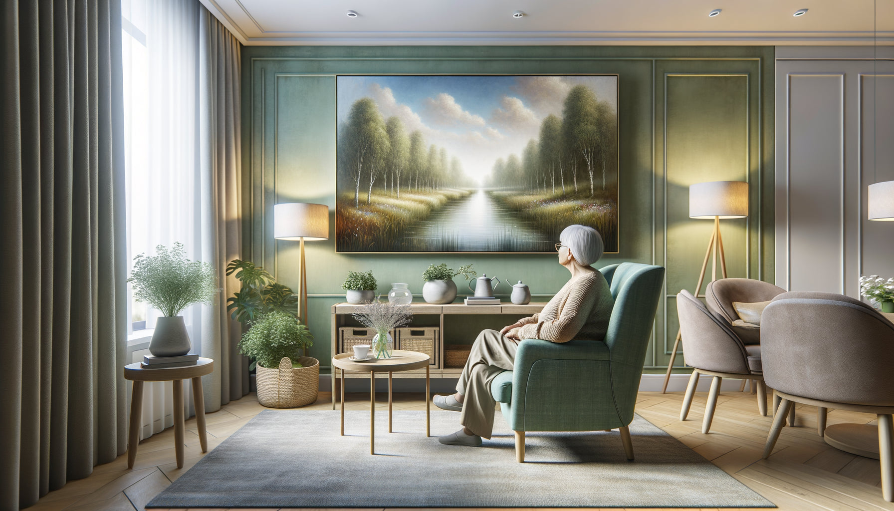
Let me tell you the rest of Marguerite's story. After identifying the source of her discomfort, we replaced the medieval market painting with a large-format photograph of a forest path, bordered by slender-trunked trees, with soft light filtering through the foliage. A single vanishing line, harmonious colors, no distracting details.
Changes appeared in just a few days. Marguerite began to look at her wall with pleasure again. Her end-of-day migraines disappeared. She even started sharing memories of walks in the forest, stimulated by this soothing image – exactly the cognitive stimulation initially sought, but achieved through simplicity rather than complexity.
This experience illustrates a principle I defend: less can be infinitely more when it comes to therapeutic art. A simple painting is not a simplistic work. It's an artwork that has understood the essence of its mission: to touch emotion without tiring cognition.
Today, when you choose a piece for yourself or a loved one, I invite you to this practice: stand in front of the painting for thirty seconds. If your gaze continues to search for where to settle, if you feel slight tension, it is probably too complex. On the contrary, if you feel your breathing slow down, your shoulders relax, and your mind calm, you have found the right piece.
The ideal painting for a care environment is not one that impresses visitors with its richness of detail. It's the one in front of which you can close your eyes after looking at it, and feel better. It’s the one that transforms a wall into a window to serenity.
Frequently Asked Questions
Isn't an abstract painting too difficult for a senior citizen to understand?
It’s a misconception I constantly encounter, and it rests on a confusion between narrative complexity and perceptual complexity. An abstract painting – let's say simple geometric shapes or blocks of color – certainly doesn't tell a literal story, but it is immediately understandable visually. Your brain doesn't need to decode symbols, identify characters, or interpret a scene. It directly perceives colors, shapes, and emotions. For someone with cognitive fragility, this immediacy represents an immense advantage. Clean abstraction avoids cognitive confusion by eliminating all narrative ambiguity. Many art therapy studies also show that people with dementia often react better to simple abstract works than to complex figurative scenes. The essential thing is that the work evokes a positive emotion – serenity, joy, gentleness – without requiring interpretative effort.
How to tell if a painting is too detailed before hanging it?
I personally apply the three-look test : observe the painting three times quickly, as if you were entering the room. Each time, does your eye naturally settle on the same focal point, or does it flutter around desperately searching for where to look? If it's the latter case, it’s probably too complex. Another reliable indicator: mentally count the distinct elements that attract attention (characters, objects, areas of strong contrast). Beyond five to seven elements, you enter a zone of high cognitive load. Finally, photograph the painting with your phone and look at the miniature photo: clear compositions remain readable even when reduced, while overloaded works become confusing. This readability test is excellent for predicting cognitive impact. Also remember to consider the context: a painting may be appropriate in a spacious living room where it is viewed from afar, but oppressive in a small bedroom where it occupies the entire visual field from the bed.
Can we still stimulate cognitively with simple paintings?
Absolutely, and that's even the most effective approach! Cognitive stimulation doesn’t require visual complexity – it requires emotional and memorial resonance. A simple mountain landscape can trigger an hour of vacation memories. A clean still life with three apples can evoke childhood on the farm. A minimalist portrait can recall a loved one. The cognitive richness comes from personal connection, not the number of details. I’ve seen wonderful conversations born around a simple lavender field painting – each sharing sensory experiences, trips to Provence, the scent evoked by these purple hues. Moreover, visual simplicity frees up cognitive resources for socialization, conversation, and daydreaming – all mentally stimulating activities. An overloaded painting monopolizes attention on visual decoding and exhausts available capacities for those valuable interactions. True lasting cognitive stimulation comes from works that invite serene contemplation, not exhaustive analysis.