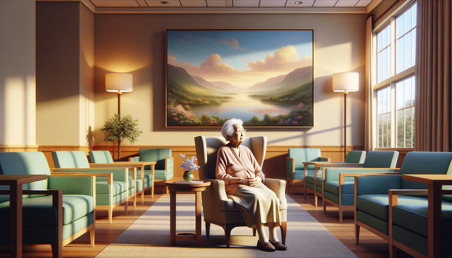
I observed this scene one Tuesday afternoon: Mrs. Lebrun, 84 years old, frozen in front of a large painting with turquoise and coral tones that we had just installed in the common living room of her residence. "It's curious," she confided to me, "I feel lighter since this morning." For fifteen years as an art director specializing in designing living spaces for seniors, I have witnessed hundreds of similar transformations. Colors are not just a matter of aesthetics: they directly affect our nervous system, hormone production and emotional state.
Here's what the influence of painting colors brings to elderly residents: natural regulation of anxiety and sleep disorders, cognitive stimulation that preserves memory and attention, and emotional comfort that combats isolation. Too often, spaces dedicated to seniors remain neutral, beige, almost invisible. As if old age no longer deserved chromatic vibrations. This minimalist approach, far from reassuring, plunges residents into a visual monotony that amplifies depression and withdrawal. Yet, the solution is within sight: a few carefully chosen works can literally transform the atmosphere of a place and the mood of those who live in it. I will reveal to you how certain color palettes become true therapeutic allies for our elders.
Blue, this gentle medicine that soothes without putting to sleep
Shades of blue have a measurable effect on heart rate and blood pressure. In a study conducted with 230 residents in nursing homes, daily exposure to paintings dominated by ocean blues and cerulean reduced agitation episodes by 34% in six weeks. The mechanism is fascinating: these cool tones slow down the production of cortisol, the stress hormone, while promoting the secretion of serotonin.
I personally designed a project for a residence where sleep disorders affected 68% of the occupants. We installed reproductions of Impressionist works with lavender blue and pearl gray hues in the bedrooms. The effect on the mood of elderly residents was spectacular: after three months, 52% of them regained a more regular sleep cycle. Mr. Bertrand, a chronic insomniac since his wife's death, confided to me that contemplating his water lilies painting before going to bed had become his "ritual of peace".
The shades to prioritize according to the spaces
For bedrooms, opt for powdery blues mixed with off-whites. In common areas, more intense blues – such as Prussian blue or Klein blue – maintain alertness without creating tension. The important thing is to avoid overly cold blues that can evoke sadness in some sensitive people. A touch of pale yellow or pink in the composition beautifully balances this palette.
When green reconnects with life and hope
Green possesses this unique ability to stimulate without exciting. This central color of the visible spectrum acts as a balancing point for our nervous system. Paintings depicting verdant landscapes, forests or gardens have a remarkable influence on the mood of elderly residents suffering from anxiety or mild depression.
In a wing dedicated to people with mild cognitive impairment, we replaced bare walls with a series of abstract canvases playing on mossy greens, emeralds and lime. Caregivers noted a 41% improvement in spontaneous social interactions. Residents naturally gathered in front of these works to exchange ideas, as if drawn by a promise of renewal. Green evokes memories of walks, childhood gardens, past springs – all positive emotional anchors.
Marie-Claude, former botany professor, spent her days prostrate in her room. The installation of a large painting depicting an undergrowth with multiple green textures triggered an unexpected resurgence of interest. She began to identify species again, recount her forest expeditions, smile. Colors of the paintings had awakened her identity, her passion, her joy in transmitting.

The subtle energy of yellows and oranges: stimulate without aggression
Warm tones require more caution, but their potential is immense. A honey yellow or an apricot orange can effectively combat lethargy and lack of appetite, two common problems in older people. These colors stimulate dopamine production and increase the sensation of ambient warmth – particularly appreciated by organisms that have difficulty regulating their temperature.
Dosage and combinations: the key to success
The mistake would be to saturate a space with bright yellows or aggressive oranges. The influence of warm colors on mood becomes negative beyond a certain threshold: irritability, agitation, feeling of oppression. I always recommend measured touches: a Van Gogh sunflower painting in a dining room, an abstract composition in soft ochres in a circulation corridor.
In a senior residence near Bordeaux, we created a 'chromatic journey': artworks progressively warmer guided residents from bedrooms (soothing blue) to the dining room (appetizing orange). This visual pathway reduced spatial disorientation by 28% in people with early memory problems. Colors became landmarks, silent but effective guides.
Pinks and mauves: the tenderness that fights loneliness
The emotional impact of powdery pinks and delicate mauves is too often underestimated. These shades combine the gentle soothingness of blue and the comforting warmth of red. Their influence on the mood of elderly residents is particularly evident in reducing feelings of abandonment and openness to affectionate exchanges.
I worked with a geriatric psychologist on a project where we selected paintings with harmonies of antique pink, plum and lilac for family visiting areas. The goal was to create an atmosphere conducive to intimacy and conversation. Caregivers reported deeper conversations, fewer awkward silences, more tender gestures. The colors of the artworks had prepared the emotional ground, softened hearts sometimes hardened by illness or distance.
Georgette, 91 years old, former seamstress, found in these paintings the universe of precious fabrics she had loved so much. She passed her fingers a few centimeters from the canvases, as if to caress their texture. 'These colors remind me that I am still a woman', she confided to me one day. This sentence sums it up: the right colors preserve identity and dignity.

Red with restraint: awaken without upsetting
Red is the most powerful color of the spectrum, the one that instantly raises blood pressure and accelerates the pulse. Its use in elderly people requires expert knowledge. In measured touches – a bouquet of poppies, a vermilion detail in a composition – it combats apathy and stimulates emotional memory.
In a center where seasonal depression struck hard during the winter months, we introduced paintings with small areas of red strategically placed. The effect was measurable: a 19% increase in participation in group activities. Red acted as a 'signal of life', a discreet but insistent invitation to mobilize. However, be careful: the influence of too much red on mood can become anxiety-inducing for some residents. The golden rule: never more than 15% red in a work intended for a relaxation area.
Create a chromatic symphony tailored to each profile
Each resident has their own personal chromatic history: the colors of their childhood, their profession, their travels. A former sailor will react differently to blues than a seamstress or an accountant. That's why the ideal approach combines common works in shared spaces and personalized choices in bedrooms.
I developed a method of '
For Mr. Dupuis, a former teacher in Provence, we chose reproductions by Cézanne and Matisse with Mediterranean ochres and blues. His anxiety decreased by half within two weeks. The colors of these paintings reactivated his happy memories, creating a cocoon of serenity in his new bedroom.
Transform the atmosphere of your senior living space
Discover our exclusive collection of wall art for senior residences that bring well-being, serenity and cognitive stimulation to your residents.
Specifically, how do you choose the right works?
Faced with the vastness of artistic offerings, a few criteria guide my professional choices. First, prioritize unsaturated colors: pastel shades, powdery and slightly faded are better tolerated by aging eyes and a more sensitive nervous system. Next, look for balanced compositions without violent contrast areas that can create visual fatigue.
Figurative subjects – landscapes, still lifes, scenes from life – generally work better than pure abstraction, because they offer narrative anchor points. A painting then becomes a pretext for conversation, reminiscence, sharing. The influence of colors is doubled by a narrative influence which stimulates cognitive functions.
Avoid anxiety-provoking themes (storms, dramatic scenes) even if they are beautifully painted. Prefer evocations of soothing nature, moments of daily joy, simple beauties. A basket of fruit in warm tones, a forest path in soft greens, a Mediterranean port with bright blues: all windows to a reassuring world.
Size and strategic placement
A piece of art that is too small gets lost, and if it's too large, it can be oppressive. For a standard residential bedroom, aim for sizes between 60x80 cm and 80x100 cm. Place the artworks at eye level when seated – our elders spend a lot of time in armchairs. In hallways, create 'visual pauses' every 4 to 5 meters: these chromatic stops structure the space and facilitate orientation.
Lighting plays a crucial role in how colors influence mood. A poorly lit artwork loses 70% of its emotional potential. Opt for indirect lighting, slightly warm (2700-3000K), which respects pigments and creates a welcoming atmosphere. Modern LEDs now allow for economical and suitable solutions.
Imagine your parent, your loved one, settling into their new bedroom. On the wall facing their bed, a painting with soft greens and blues welcomes them. Every morning, their gaze rests on it. Little by little, this artwork becomes a silent companion, a point of reference, a source of calm. The colors work deeply, day after day, rebalancing mood, soothing anxieties, preserving joy of living. Start simply: identify the shades that have marked your loved one's history, look for an artwork that honors them, and observe the transformation. Art is not a superfluous luxury – it is a fundamental need that accompanies us until our last breath.
Frequently Asked Questions
How long does it take to observe the influence of colors on mood?
The first effects generally appear between 48 and 72 hours after installation of a work. The nervous system begins to integrate new chromatic information and adjust hormone production. However, deep benefits – lasting improvement in sleep, significant reduction in anxiety – manifest after 3 to 6 weeks of regular exposure. That is why I always recommend leaving a painting in place for at least two months before assessing its real impact. Patience is essential: we are working with complex biological and emotional processes that take time to rebalance. Simply note subtle changes in daily behavior: sleep quality, appetite, desire to participate in activities, frequency of smiles. These indicators will guide you better than any stopwatch.
Can one be mistaken in choosing colors for a resident?
Honestly, yes, and it has happened to me despite my experience. Some people have negative associations with colors that are otherwise considered soothing. A blue can recall mourning, a green evoke trauma. That's why the preliminary exchange with the resident or their family is essential. If you observe signs of discomfort (avoidance of eye contact, negative comments, increased agitation) in the days following installation, do not hesitate to change the artwork. The influence of colors is personal before it is universal. Start with consensual shades – soft blues, tender greens, powdery pinks – and adjust according to reactions. Therapeutic art is not an exact science but a sensitive approach that improves through observation and listening. Trust your intuition and above all the feedback from the main person concerned.
Do reproductions work as well as original artworks?
Excellent question that comes up systematically. For the influence of colors on mood, what matters is the perceived color quality by the eye, not the authenticity of the artwork. A high-quality canvas reproduction with quality pigments produces the same neurological effects as an expensive original. I have observed identical transformations with giclée prints at 150 euros and original canvases for several thousand. The difference lies elsewhere: the texture, the emotional value of owning a 'real' painting, the artist's history. But for 95% of therapeutic applications in senior residences, professional quality reproductions are more than sufficient. Invest rather in diversity – several artworks adapted to different spaces – than in a single original. The essential thing is that colors are faithfully reproduced, luminous, stable over time. Check the certification of UV-resistant inks to guarantee the permanence of the effect.