When Marguerite, 82 years old, left her family home to join a senior residence, she confided in me something astonishing: 'What I miss most isn't my furniture, it’s the light of my yellow living room.' This remark still resonates deeply within my practice. The colors that inhabit our walls are not mere decorations; they sculpt our emotions, influence our vitality and dialogue with our memory.
Here's what a thoughtful chromatic choice brings to senior residences: cognitive stimulation without aggression, a soothing effect that promotes rest, and an atmosphere that honors the dignity of residents. Because contrary to popular belief, this debate is not a binary opposition. It’s about understanding how each palette interacts with the physiological and emotional needs of our elders.
Too often, I observe two extremes in these living spaces: either aseptic environments with faded tones that evoke more of a hospital than a home, or clumsy attempts to 'energize' with garish colors that generate more anxiety than joy. Between these pitfalls lies a subtle territory where nuances become accomplices of well-being.
I invite you to discover how to orchestrate this chromatic palette with precision, taking into account the physiological realities of aging, while creating spaces that celebrate life. Because living in a senior residence doesn't mean giving up the vibrant beauty of the world.
The soft palette: more than just a reassuring aesthetic
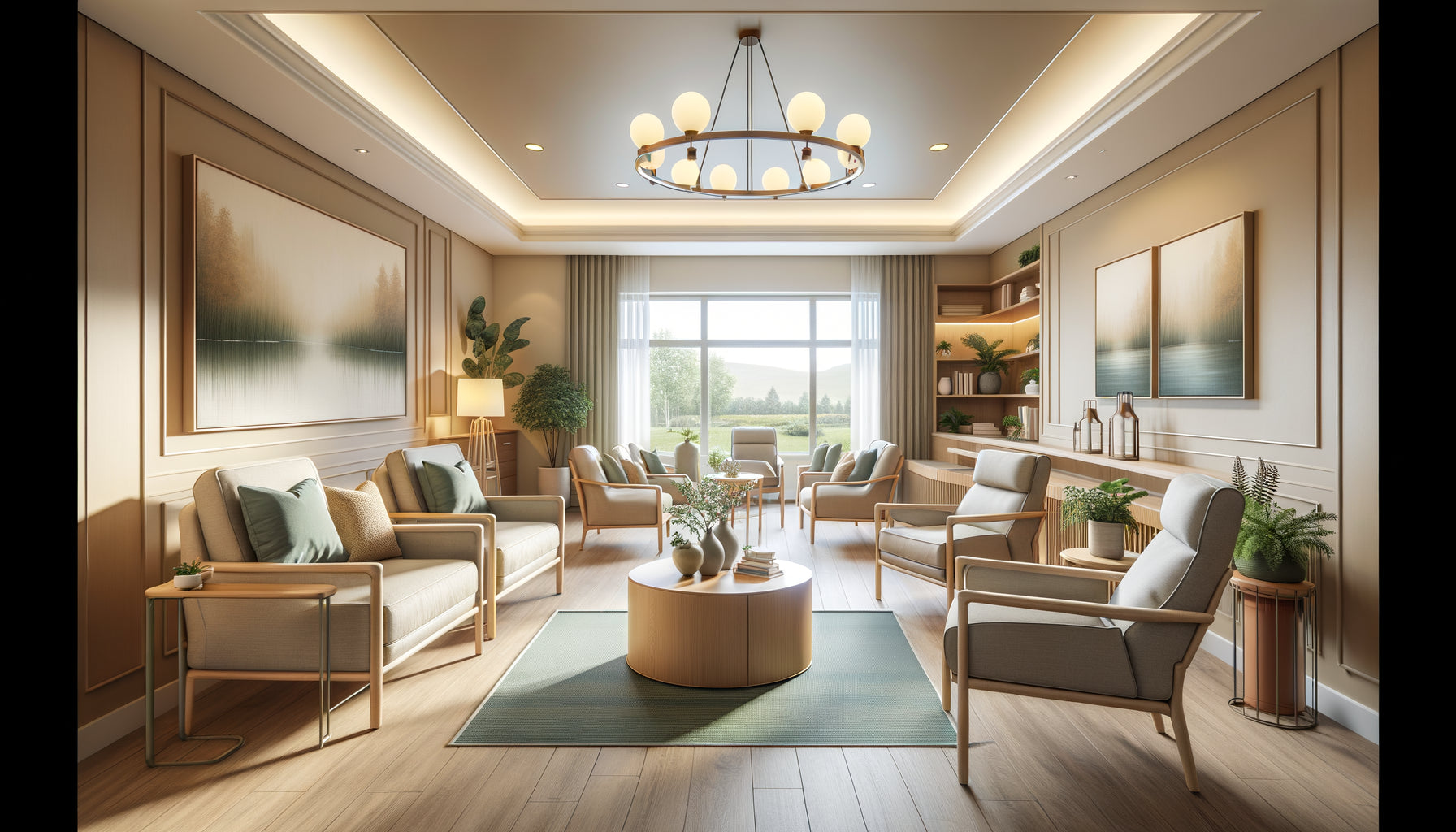
Soft colors are not synonymous with dullness. Think of the dusty blues of a summer sky fading, the sage greens that recall a garden after the rain, the pale pinks of a peony in spring. These shades possess a particular emotional intelligence: they envelop without stifling, they soothe without lulling.
Physiologically, this chromatic softness responds to an undeniable medical reality. With age, perception of contrasts evolves, the crystalline lens yellows slightly, and sensitivity to glare increases. Tableaux aux couleurs douces naturally harmonize with these transformations. They offer immediate visual comfort, reducing eye fatigue and glare phenomena that can destabilize.
In rest areas – individual bedrooms, reading rooms, meditation corners – these tones create a cocoon conducive to relaxation. I have observed in several establishments that residents spontaneously choose to settle near works with soothing colors for their moments of reading or intimate conversation. A tableau aux nuances pastel then becomes an emotional anchor, a familiar landmark that structures the space.
The impact on sleep and serenity
Chromotherapy research confirms it: soft blues, pale lavenders, and pearl grays promote melatonin production and facilitate sleep. In senior residences' bedrooms, favoring artworks with soft colors is not a superficial aesthetic choice – it’s a decision that honors fundamental physiological needs.
However, monotony looms. An environment exclusively composed of pastel shades risks sinking into a depressing uniformity. This is where the art of composition comes in: playing with textures, varying nuances within the same color family, creating subtle dialogues between artworks.
Vibrant colors: celebrating the vitality of the present
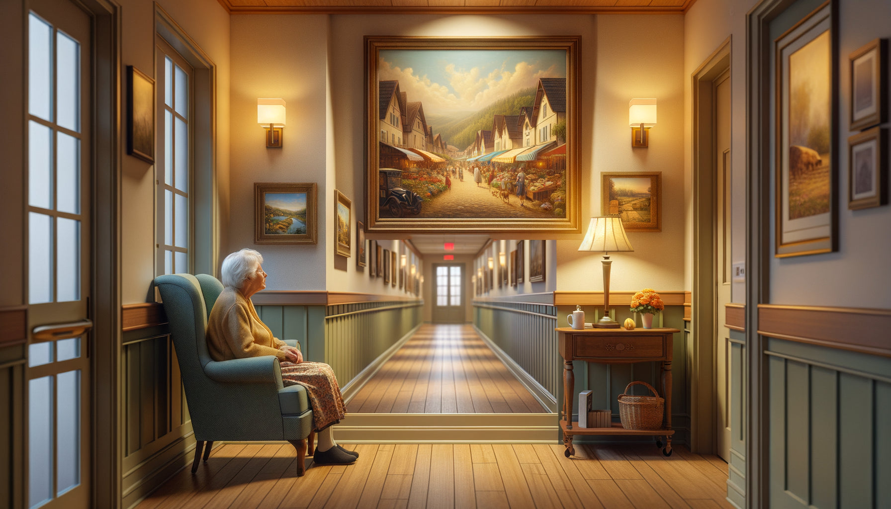
Recently, during a visit to a Bordeaux residence, I witnessed a revealing scene. In the entrance hall stood a large painting with vibrant colors – bright oranges, vermilion reds, and dazzling yellows evoking a Provençal market. Around this artwork, conversations buzzed, smiles widened, and eyes sparkled. This canvas had become the heart of the establishment.
Vibrant colors possess a remarkable power: they stimulate attention, revive emotional memory, and combat apathy that sometimes threatens older people. A sun yellow recalls childhood summers, a cobalt blue evokes the Mediterranean, an emerald green brings back memories of forest walks. These saturated tones act as memory triggers, opening spaces for conversation and sharing.
Cognitively, the visual stimulation offered by these energetic colors contributes to maintaining mental alertness. In common areas – dining rooms, creative workshops, activity zones – dynamic-colored paintings encourage social interaction and combat isolation. They create a festive atmosphere without being artificial, lively without being exhausting.
Beware of excess and visual fatigue
However, caution is advised. Saturated colors can generate overstimulation, particularly in people with cognitive disorders. A red that is too aggressive can increase agitation, a flamboyant orange can disrupt rest. Location then becomes crucial: reserve vibrant colors for passageways and activity areas, never bedrooms or resting zones.
I have also observed that certain pathologies – notably dementias – alter color perception. Colors that are too contrasting can create destabilizing visual illusions, threatening shadows where there is only a transition of tones. Balance becomes a delicate exercise.

The winning strategy: a zoned and personalized approach
After fifteen years of support, I have developed a conviction: the debate 'bright colors versus soft colors' in senior residences is poorly posed. The real question is: what color, in what space, for which resident?
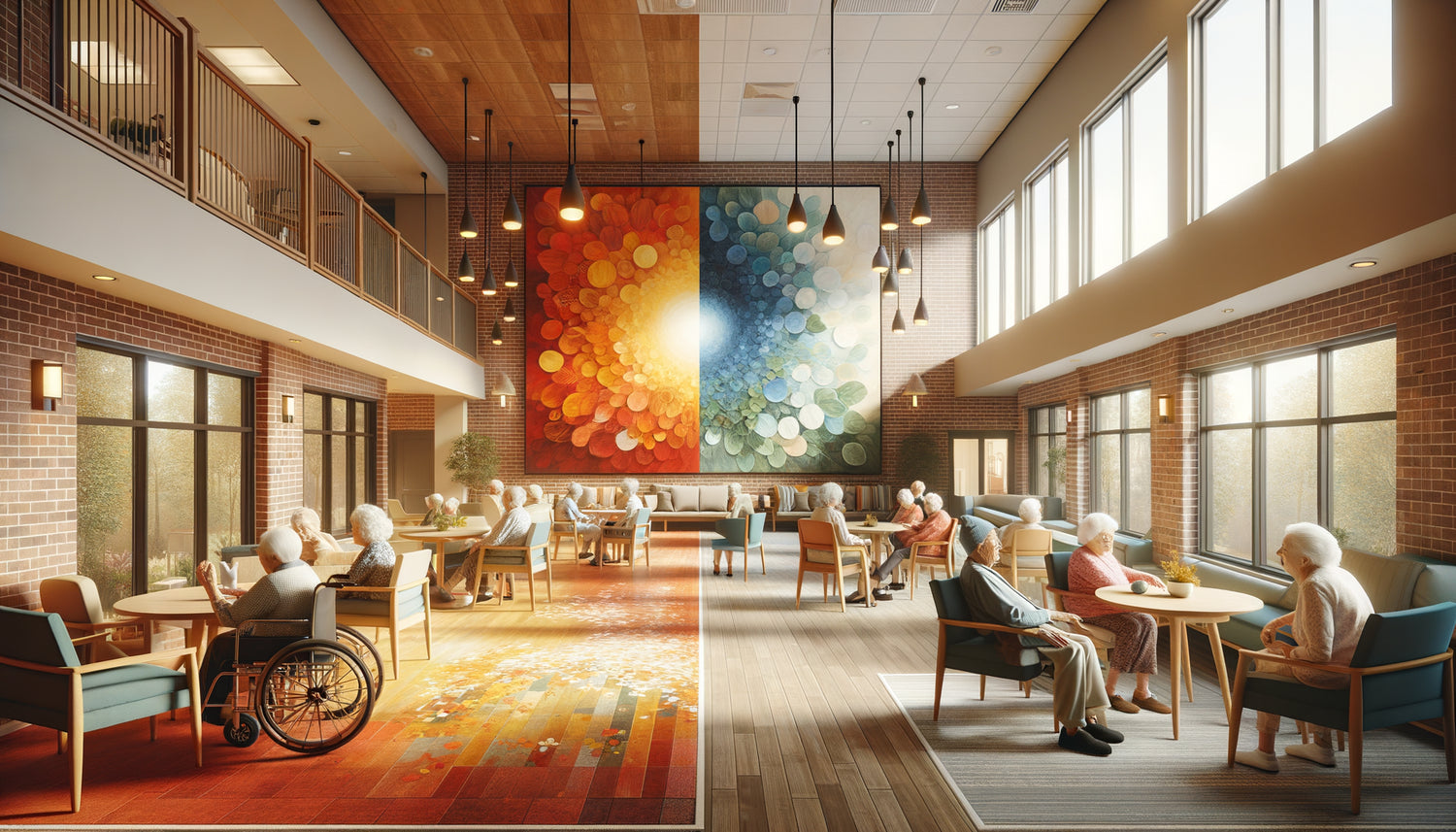
The zoned approach involves adapting the color palette to the function of each location. In dynamic common areas – reception halls, activity rooms, cafeterias – dare to use paintings with energizing tones. Favor balanced compositions where bright colors dialogue with soothing neutrals: a beige background that makes a bouquet of sunflowers sing yellow bright, a pearl gray sky that magnifies red poppies.
In transition zones – corridors, landings – create visual rhythms alternating soft works and more assertive touches. This variation maintains interest without fatigue, guides movement while offering visual pauses.
For private spaces – bedrooms, reading rooms, winter gardens – chromatic softness naturally prevails. This does not mean uniformity: a glacier blue can coexist with an almond green, a delicate mauve dialogue with an old rose.
Personalize according to individual preferences
In individual bedrooms, personalization becomes essential. Some residents will need the vitality of a colorful painting to combat melancholy. Others will find their balance in contemplating a watercolor with vaporous tones. Involving residents – and their families – in choosing the works that will inhabit their personal space transforms decoration into a therapeutic act.
I systematically encourage facility directors to create a 'mobile artotheque': a collection of varied artworks that residents can borrow, exchange, and evolve according to their moods and needs. This flexibility honors their autonomy and recognizes that their tastes are not fixed.
Beyond color: composition, subject and emotion
Color temperature is only one parameter among others. A painting with bright colors will only be stimulating if its composition remains readable and harmonious. Conversely, a work in soft tones can prove to be anxiety-inducing if its subject is melancholic or its forms confusing.
For senior residences, I recommend recognizable figurative subjects: familiar landscapes, scenes of daily life, appetizing still lifes, benevolent portraits. These motifs facilitate immediate emotional connection and foster conversation. A painting depicting a Provencal market with warm colors will trigger memories, anecdotes, and create connections between residents.
The clarity of the composition is also important. Avoid overly conceptual abstractions or dark and tormented works that may generate discomfort. Favor fluid lines, reassuring perspectives, generous lights – whether carried by bright or soft colors.
The importance of quality and authenticity
In this universe, artistic quality makes the difference. A cheap reproduction with garish colors will create an artificial environment and devalue residents. Conversely, an authentic work – even modest – testifies to a respect and attention that elevates the atmosphere of the establishment.
Paintings specifically designed for senior residences integrate these multiple dimensions: thoughtful color balance, uplifting subjects, soothing compositions, durable print quality.

Create a global color harmony
The frequent mistake is to reason piece by piece, without an overall vision. A painting with soft colors magnificent in a gallery can get lost on a wall already loaded with patterns. Conversely, a vibrant canvas can become aggressive if it conflicts with furniture that is already colored.
Overall color harmony requires an orchestral approach. Consider the existing environment: color of the walls, tone of the furniture, natural light, flooring. A space with white walls and neutral furniture can accommodate works with more pronounced colors. A room that is already warm with wood and colorful textiles will call for paintings in soothing tones that balance the whole.
The natural light also plays a decisive role. A room bathed in southern sun will support fresh blues and tender greens that will refresh the atmosphere. A north-facing space, naturally colder, will benefit from warm touches – soft ochres, powdered pinks, pale yellows – which will compensate for the coolness of the light.
Transform your residence into a place where every color celebrates life
Discover our exclusive collection of wall art for senior residences that combines color expertise and respect for the specific needs of your residents.
Towards an emotional approach to color
Ultimately, the question of colors in senior residences transcends a simple aesthetic decision. It touches on profound dimensions: dignity, memory, identity, joy of living. Choosing between bright and soft colors means asking ourselves what emotion we want to cultivate in these living spaces.
Imagine Mrs. Henriette who, every morning, opens her eyes to a painting with lavender hues depicting a field of Provence. This chromatic softness accompanies her awakening, prolongs the serenity of the night, prepares her day gently. Now visualize Mr. André who joins the dining room brightened by a still life in generous colors – fruits bursting with sunshine, vibrant flowers. This chromatic vitality stimulates his appetite, nourishes his sociability, combats gloom.
These two scenarios do not exclude each other: they complement each other. The ideal residence orchestrates this chromatic diversity intelligently and sensitively, creating a visual symphony where each color finds its rightful place.
The choice between bright and soft colors in senior residences is therefore not a matter of principle, but of intention and adaptation. Soft colors protect, soothe, envelop – essential in rest and privacy areas. Bright colors stimulate, celebrate, energize – indispensable in collective living and activity areas. Between these two poles lies an infinity of nuances, combinations, possible dialogues.
Your role, as a facility manager, decorator or involved family member, is to become the conductor of this chromatic harmony. Listen to physiological needs, respect individual preferences, observe reactions, continuously adjust. The wall art you choose are not just wall decorations – they are silent companions who, day after day, weave the emotional atmosphere of these living spaces.
Because living in a senior residence never means giving up beauty, emotion, the colorful vibration of the world. It simply means reinventing this palette with wisdom and kindness.
Frequently Asked Questions
Do seniors really prefer soft colors?
This belief is partially incorrect. While some older people do appreciate the softness of pastel shades for their soothing effect, many retain an attraction to bright colors that remind them of happy moments in their lives. Studies show that color preferences are primarily individual and linked to personal history, memories, and cultural background. The important thing is to avoid two pitfalls: the depressing uniformity of a solely pale environment, and the visual aggression of an overly saturated space. In senior residences, personalization becomes essential. Offer a varied choice, observe reactions, adjust according to feedback. Some residents will wake up with joy facing a sunrise with flaming oranges, while others will find their serenity in contemplating a marine landscape with delicate blues. The real question is not ‘what color for everyone’ but ‘what color for each person’.
How to avoid overstimulation with bright colors?
Visual overstimulation occurs when bright colors are poorly dosed, misplaced or poorly associated. To avoid this in senior residences, several principles apply. First, respect a rule of proportion: in a given space, limit saturated colors to 20-30% of the visual environment, making them interact with soothing neutrals. Then, prioritize strategic locations: colorful artworks work wonderfully in passageways and activity areas, but become problematic in bedrooms or resting areas. Also consider the lighting: a bright color under intense lighting can become aggressive, while the same shade in soft light remains stimulating without being exhausting. Finally, observe individual reactions: some people with cognitive disorders may be destabilized by contrasts that are too marked. In these specific situations, prefer soft colors with a few subtle accents of color rather than a chromatic explosion.
Can bright and soft colors be mixed in the same space?
Not only is it possible, but it’s often the most harmonious solution for a senior residence. The secret lies in the art of composition and the balance of proportions. Imagine a common room with walls in a soft pearl gray, neutral-toned furniture, and several paintings creating a chromatic progression: a work in pastel shades near the reading area, a composition in moderately saturated colors in the conversation zone, and a canvas with more assertive colors near the entrance or activity space. This orchestration creates visual rhythm without abrupt disruption, naturally guides movement, and allows each resident to find the atmosphere that suits them according to their mood. The key is to ensure harmonious transitions: use bridge colors that belong to both universes, play on nuances rather than stark contrasts, and make sure a soothing chromatic dominant serves as a backdrop for a few more dynamic accents. This nuanced approach also reflects the complexity of life itself, alternating between moments of calm and intensity.