Dawn isn't just for photographers. Imagine yourself facing your easel, brushes in hand, as the sky barely begins to blush. Painting those first rays of dawn represents one of the most intoxicating challenges for any artist. Every morning, nature offers you this ephemeral spectacle where the sky gently ignites, transforming darkness into a festival of colors.
Painting the first light of dawn: understanding the luminous phenomenon
Observe carefully the moment when day is born. This morning light possesses an incomparable softness, slightly bluish, totally different from midday sun. Renaissance artists already knew this: this moment symbolizes much more than a time of day. It embodies the victory of clarity over darkness, a symbol of purification.
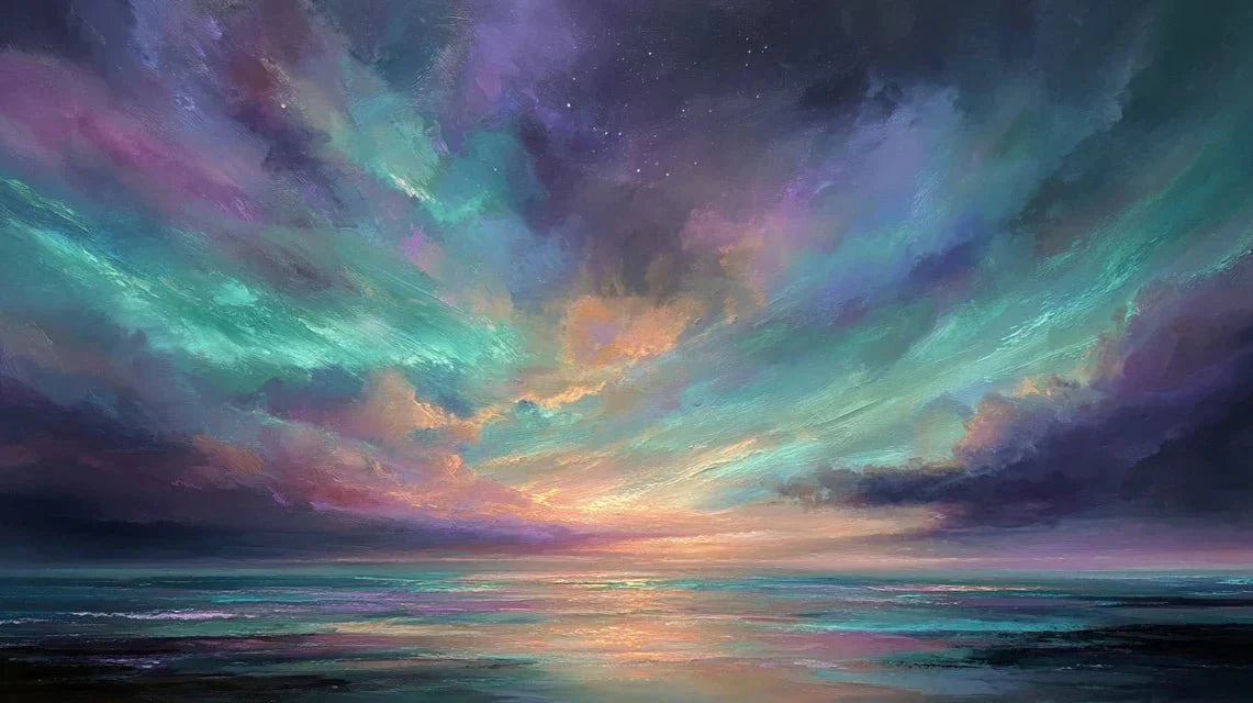
Scientifically, rays pass through the atmosphere at a particular angle which filters wavelengths. This magic creates those auroral pink, violet and orange hues that captivate the eye before the sun even appears. To represent dawns accurately, remember this: dawn is never brutal. It stretches minute after minute, color after color.
Techniques for painting dawns and capturing daily rebirth
The key? Transparency and layering. Unlike a portrait where opacity dominates, dawn requires successive delicate layers. Watercolor and diluted gouache become your best allies thanks to their ability to create luminous effects translucent.
Some artists love the wet-on-wet blending method. First, wet your entire canvas. Then apply colors mixing them directly on the still-wet support. This technique produces those fluid transitions that characterize sunrise. Work quickly to avoid the shades mixing poorly and losing their intensity.
Do you prefer acrylic? The trick is to work with highly diluted pigments for your first layers. Create a translucent base. Then only add progressively more opaque touches where the luminosity explodes. This layering of colors faithfully reproduces the daily rebirth of day.
Palette and colors for painting the first light
Your color selection will make all the difference. Prepare these essential shades:
- Primary yellow and lemon yellow : for those first rays announcing the solar star
- Magenta pink and violet : present in the very first moments
- Turquoise blue and emerald green : for the intermediate shades of auroras
- Titanium white : essential to create areas of pure light
Beware of the classic mistake: using colors too saturated from the start. Dawn is built with slightly tinted pastel tones. A white barely colored with yellow or pink creates those nascent effects of light much better than a bright pure yellow.
Warm colors generally dominate sunrises in the east. Other horizons may show cooler variations. Understanding this color temperature allows you to adapt your palette according to the daily rebirth you want to represent. Mastering these chromatic harmonies paves the way for application technique, particularly stretching.
Stretching paint: a key technique for painting auroras
Here's the secret to successful auroras: stretching the material. Forget the idea of painting each luminous streak one by one with a fine brush. Guaranteed result: artificial and failed. Instead, apply a line of variable width with a sufficiently diluted color. Then stretch it immediately in the desired direction.
The magic brushes for this technique:
- The mop brush: the optimal tool for stretching material smoothly
- The fan brush: excellent for atmospheric diffusion effects
- The beveled or flat brush: offers precise control over direction
Your gesture must be confident and quick. Apply the color, then without waiting, stretch upwards or according to the observed angle. This action naturally reproduces the appearance of light streaks at dawn. To accentuate certain areas, pass over with a slightly tinted white. But sparingly: too many retouches kill spontaneity. Combining landscape paintings painted with this stretching technique creates a consistent series that testifies to the diversity of aurora moments.
Optimizing contrasts in aurora painting
The contrast between light and darkness amplifies the dramatic impact of your aurora. The first rays exist only in opposition to the night that precedes them. Work on a dark background: black, deep navy blue or dark purple. Your bright colors will then truly radiate.
The technique of chiaroscuro, inherited from classical masters, applies perfectly. Intentionally create areas of intense shadow that make the nascent luminosity stand out. Color temperature contrasts also work: combine cool colors in dark areas with warm colors in lighted areas. This opposition reinforces the feeling of daily rebirth.
Final touch on smooth paper: project white droplets to simulate stars still visible. Don't paint them with a brush, project them. This natural and spontaneous effect completes the atmosphere of wonder characteristic of the early hours of the day.
FAQ: Painting auroras
Q1: What type of paint is best for painting auroras?
Watecolor and diluted gouache are ideal for capturing the transparency and luminous effects of auroras. Acrylic also works very well if you dilute it sufficiently during the first layers. The key lies in the ability to create translucent superimpositions rather than opaque layers.
Q2: Why do my light trails look artificial?
The most common mistake is to paint each trail individually with a fine brush. Instead, use the stretching technique: apply a diluted color and immediately stretch it with a mop or fan brush. This gesture naturally reproduces the fluid and organic appearance of auroras.
Q3: Should I paint on a white background or a dark background for an aurora?
A dark background (black, navy blue, or deep purple) is highly recommended. It allows light colors to truly radiate and creates the necessary contrast between night and the first rays of day. A dark background amplifies the dramatic impact of your composition.