

You just fell in love with a beautiful bohemian style painting seen in a store, but once hung at your home, it completely clashes with your Scandinavian decor. The result? A living room that looks like a messy patchwork rather than the harmonious space you dreamed of.
You may have experienced this disappointment several times. An industrial wall art that feels cold in your Nordic cocoon, or a painting with bright colors that completely overwhelms the zen atmosphere you carefully created. Each purchase becomes a risky bet.
You've probably tried to follow advice found on Pinterest: "match the colors", "respect the style", "don't mix genres". But despite your efforts, your wall paintings always seem out of place, like guests who don't know the house rules.
Rest assured, this is not a lack of taste on your part. The problem comes from a fundamental misunderstanding: each decorative style has its own visual codes and specific expectations regarding wall art. Once these rules are understood, choosing becomes child's play.
By the end of this article, you will know exactly what type of painting to choose to enhance your decorative style, and above all how to create that perfect harmony which transforms a simple room into a true personalized haven of peace.
Why do your paintings never really blend in with your decor?
Wall art is not just a decorative element, it's the soul of your interior. Yet, 80% of homeowners admit to having at least one painting that "doesn't fit" in their living room. If you don't act now, you risk continuing to accumulate mismatched works, gradually transforming your home into an incoherent gallery where each wall tells a different story.
🏠 Revealing testimony: Sarah, interior architect, says: "I recently visited a sublime Parisian apartment, decorated in pure Scandinavian style. Light wood furniture, natural textiles, perfect lighting. But on the wall of the living room was a huge street art painting with fluorescent colors. The owner confided to me: 'I love this painting, but I feel it's not in its place.' He was right: this magnificent work completely killed the Nordic serenity he had created."
💬 Conversation with a decor expert
The golden rule of decorative harmony: A successful artwork should dialogue with your style without dominating it, like a good wine that reveals a dish without crushing it. You should notice this harmony from the moment you hang it, and this feeling will only amplify over time.
The 3 mistakes that sabotage your decor (and that 90% of people make)
Do you recognize yourself in these situations? You love a painting but hesitate for weeks before buying it. You constantly change the placement of your wall art. You systematically ask ten different people for their opinion before each purchase.
These behaviors reveal a deep confusion between "personal style" and "decorative coherence". The problem is not your artistic taste, but the lack of method to adapt wall art to your existing decorative universe.
It's like trying to cook a gourmet dish without knowing flavor pairings: you have all the right ingredients, but the final result lacks harmony.
Mistake #1: Confusing "I love it" and "it goes with my home"
Contrary to what one might think, falling in love with a painting is not enough for it to integrate perfectly. Emotion takes precedence over decorative logic, and that's normal. But a spectacular bohemian style painting can totally destabilize a streamlined Scandinavian decor.
Imagine wearing a tuxedo to the beach: a beautiful garment, wrong context. Your favorite painting can become a disruptive element if it doesn't respect the "dress code" of your interior.
This emotional confusion leads you to buy impulsively and then regret once you get home. The result: your walls become a museum of your incompatible crushes, instead of being a coherent personal gallery.
🔍 Instant test: Look at your living room and count how many different decorative styles coexist on your walls. More than two styles = guaranteed visual dispersion. Your guests don't know where to look.
Mistake #2: Ignoring the "personality" of each decorative style
Many people think that a beautiful painting goes everywhere. False! Each decorative style has its own visual codes, like a language with its specific grammar. Scandinavian wall art favors simplicity and natural tones, while industrial style embraces strength and contrast.
It's like trying to do yoga with techno music: technically possible, but the atmosphere doesn't fit. Your bohemian decor requires works that breathe creativity and freedom, not geometric rigor.
This lack of knowledge leads you to create visually exhausting blends. Your eye never finds rest, constantly solicited by contradictory messages.
Mistake #3: Underestimating the impact of proportions and placement
Even the perfect painting can miss its mark if it is poorly sized or placed. A small format gets lost on a large wall, while an imposing work overwhelms a restricted space. It's a detail that few people notice consciously, but which enormously influences the atmosphere.
You can easily spot it: if your guests notice your artwork for the wrong reasons ("It's a bit small, isn’t it?" or "Wow, it takes up space!"), then the proportions are unsuitable.
This oversight turns your artistic investment into a source of daily frustration. You look at your wall thinking “something is off” without pinpointing exactly what.
🎯 3 warning signs to watch out for:
- Your gaze consistently avoids the artwork: This means an unconscious disharmony, like a false note in music
- Your guests never comment on your wall art: The work is either invisible (too small) or uncomfortable to look at
- You constantly hesitate to move your artworks: Your brain instinctively seeks the visual balance that’s missing
The trigger factor: The "decorative anchor" effect
Here's what changes everything: your first wall art unconsciously becomes the visual reference point for the entire room. It creates a "domino effect" that influences all your subsequent choices. If this first piece perfectly respects your decorative style, it facilitates all later choices. Otherwise, it sabotages the coherence of the entire space. Check immediately: does your main artwork (the most visible one) really match the atmosphere you want to create?
The 3-second rule: If someone can identify your decorative style in less than 3 seconds when entering your home, your artworks are perfectly chosen. Otherwise, they create visual confusion.
| ❌ Common mistake | ✅ Successful approach | 💡 Why it works | 🎯 Immediate benefit |
|---|---|---|---|
| "This artwork pleases me, it will go everywhere" | "This work corresponds to my Scandinavian style" | Respect for visual coherence | Immediate harmony without questioning |
| "The bigger it is, the more impressive it is" | "The size must serve the desired atmosphere" | Proportions adapted to the space | Visual comfort and natural balance |
| "I absolutely have to match the colors" | "The tones must dialogue without imitating each other" | Creation of subtle nuances | Rich visual experience without cacophony |
| "One style = one type of artwork only" | "Variations within the same aesthetic universe" | Avoids monotony while maintaining unity | Affirmed personality without confusion |
The method of 3 universes: choosing the perfect artwork for your style
Forget the stress of making bad choices! This proven method will transform your approach to wall art. Like an architect who respects foundations before building, we'll first identify your style and then select artworks that enhance it. In 30 minutes, you’ll know exactly what type of artwork to look for, and above all why it will work perfectly in your home.
🎨 Your transformation overview: Step 1 = identify your decorative DNA, Step 2 = master the visual codes of your style, Step 3 = choose your artworks with the confidence of an expert. Each step brings you closer to an interior where every artwork tells your personal story.
Step 1: Decoding Your Decorative Style's DNA
Let’s start with the foundations, because 90% of choice errors come from a poor identification of one’s own style. It’s like building on sand: even the most beautiful artwork won’t compensate for this unstable base. Once you master this step, you will immediately feel more confident in your artistic choices.
🔍 Clues Revealing Your Style
- Your dominant colors: Look at your walls, textiles and main furniture. The Scandinavian style favors whites, soft grays and natural wood. These shades create that feeling of serenity which characterizes the North. Avoid confusing it with cold minimalism: Scandinavian remains warm. Your preferred materials: Furs, velvet and rich textiles signal a bohemian decoration. These materials tell stories of travel and creativity. The principle is to layer textures to create an artistic cocoon. Plastic or too smooth materials kill this atmosphere. Your signature furniture: Raw metal, patinated leather and recycled wood betray the industrial wall art. These elements evoke the authenticity of old New York lofts. The desired impact: an assumed aesthetic that mixes industrial past and modern comfort.
Let's move on to the practical analysis of your space now
🏠 Analysis of Your Existing Environment
Photograph your main walls: Take 3 photos of your living spaces from the entrance of each room. This guest perspective reveals the first impression created by your decoration. Photos allow you to step back and identify inconsistencies invisible on a daily basis.
⏱️ Time: 5 minutes | ✅ Successful when: You can name the dominant style of each photo | ⚠️ Attention: If you hesitate for more than 10 seconds, it means that several styles are mixed up confusingly
List your 5 favorite decorative objects: Note the 5 elements that you would not change for anything in the world. Analyze their common points: colors, shapes, materials. These constants reveal your true decorative personality, beyond fleeting trends.
⏱️ Time: 3 minutes | ✅ Successful when: You identify 2-3 common characteristics | ⚠️ Attention: Do not confuse "useful object" and "object that looks like you"
Test the 70% rule: In each room, a decorative style should represent at least 70% of the elements to create a clear identity. Count your furniture, textiles and accessories according to their style. This proportion guarantees visual consistency while allowing for a few personal touches.
⏱️ Time: 8 minutes | ✅ Success when: A style clearly dominates in each room | ⚠️ Attention: Many confuse "eclecticism" and "disordered accumulation".
✅ Validation of your diagnosis: You should now be able to describe your style in a simple sentence ("My living room exudes Scandinavian coziness with natural touches."). If it's blurry, repeat the photo analysis photo by photo. This clarity is the key to all your future successful artistic choices.
OUR RECOMMENDED PRODUCTS
Step 2: Mastering the secret codes of your style
Now that your style is identified, let's get to the heart of the matter: understanding its specific artistic rules. This is where the magic happens: you will discover why certain wall art instinctively attract you and others leave you indifferent. This knowledge of codes gives you a huge advantage over 95% of buyers who navigate blindly.
🎨 Decoding codes by style
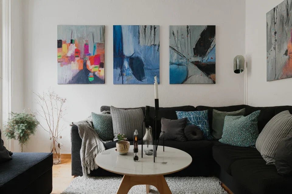
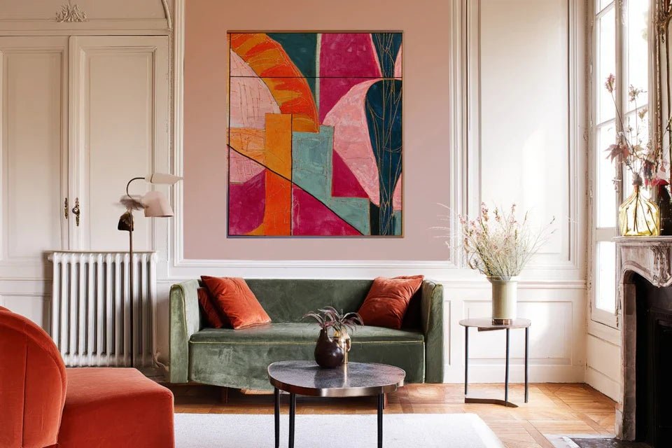
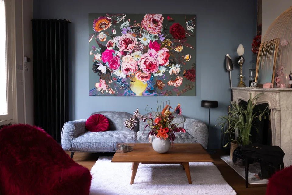
- Scandinavian style - The power of simplicity: Favor works with clean lines, soft colors (white, pearl gray, warm beige, sage green). Natural subjects work perfectly: minimalist landscapes, black and white photographs, stylized botanical illustrations. The desired effect: extend this feeling of Nordic serenity where every element breathes. Bohemian style - The art of creative freedom: Dare to use warm colors (terracotta, ochre, deep burgundy), ethnic patterns, visible artistic textures. Macrame, expressive watercolors, travel photography, revisited tribal art. The fundamental principle: each work must tell a story and invite inner travel. Industrial style - The aesthetics of authenticity: Focus on strong contrasts (black and white, intense sepia), apparent raw materials, urban or mechanical subjects. Photographs of industrial architecture, antique engravings, works on metal or raw wood. The desired impact: embrace a strong aesthetic that dialogues with the raw materials of your furniture.
🎯 Practical application of these codes
Create your reference color palette: Select 5 colors that already dominate your interior. Your future bohemian style painting or Scandinavian wall art should contain at least 2 of these shades to create a natural harmony. This method avoids the most frequent chromatic errors.
⏱️ Time: 6 minutes | ✅ Success when: Your palette reflects the ambiance of your room | ⚠️ Attention: Do not choose the colors you would like to have, but those that already exist
Define your level of visual intensity: Does your style support statement works (that attract attention) or does it prefer harmonious pieces (that blend discreetly)? Industrial style generally assumes more visual strength than Scandinavian, which favors softness.
⏱️ Time: 4 minutes | ✅ Success when: You know whether you want to "impress" or "soothe" | ⚠️ Attention: A work that is too intense can destroy a zen atmosphere
Identify your strategic hanging zones: Each style has its preferred locations. Scandinavian often favors a clean main wall, bohemian embraces artistic accumulations, industrial plays with heights and atypical formats. Mark these areas on your mental plan.
⏱️ Time: 7 minutes | ✅ Success when: You can visualize where each future painting will find its place | ⚠️ Attention: Avoid overloading the walls: even bohemian style needs breathing room
🎨 Validation of your stylistic mastery: Test yourself by visiting an art gallery or browsing online sales sites. You should now be able to immediately identify which works correspond to your style and which would create a dissonance. This educated intuition is your new decorative superpower!
Step 3: Select and buy like an expert
You now master the fundamentals. Time for expertise! This final step transforms your theoretical understanding into concrete and successful choices. No more endless hesitations in stores or impulsive purchases you regret. You will develop this quiet confidence of true connoisseurs who know exactly what they are looking for.
🛒 Optimized purchasing strategy
Apply the "harmonious triangle" rule: Your ideal wall painting should create a perfect triangle between your decorative style (base), your dominant colors (left side) and the emotion you are seeking (right side). This visual geometry guarantees harmony for sure.
⏱️ Time: 3 minutes per evaluated work | ✅ Success when: The 3 criteria align naturally | ⚠️ Attention: If you force one of the 3 aspects, the harmony will be fragile
Test emotional compatibility: Look at the artwork for 30 seconds. Does the emotion it conveys correspond to the ambiance you want to create in this room? A industrial wall art that energizes can be perfect for an office but unsuitable for a calming bedroom.
⏱️ Time: 1 minute | ✅ Success when: The artwork's emotion extends the feeling of your space | ⚠️ Attention: Don’t confuse "I like this emotion" and "this emotion suits me here"
Check lasting quality: A painting of good quality ages well and retains its beauty over time. Check the color stability, support quality, and overall finish. Your artistic investment should accompany you for years without losing its decorative impact.
⏱️ Time: 2 minutes | ✅ Success when: All technical details convince you | ⚠️ Attention: A cheap painting that degrades quickly costs more than a quality artwork
🏆 Certification of your expertise: You are now able to choose a bohemian style painting, Scandinavian wall art or industrial with the confidence of a professional. This method saves you time, money, and guarantees years of visual satisfaction. Your next guests will immediately notice this perfect harmony!
The connoisseur's progression rule: Start by mastering one main artwork perfectly (the one that sets the tone), then gradually add complementary pieces. This approach avoids visual overload and allows you to refine your eye over time.
You now have the keys to transform your interior into a coherent personal gallery. Here are the subtleties of an expert that make the difference between an enlightened amateur and a true connoisseur of wall art. These tips give you an advantage over 99% of buyers who ignore these crucial details.
💎 Pro secret - Revealing lighting: The same artwork can look totally different depending on the lighting in your room. Always test your favorites under different lights (natural, warm artificial, cold artificial). A bohemian style painting with warm colors may appear dull under cool LED lighting, while a Scandinavian wall art is enhanced by Nordic natural light.
🤔 "But what if I get tired of my decor style in 2 years?"
"I'm afraid of investing in paintings specific to my current style and having to change everything if my tastes evolve..."
This concern is perfectly legitimate and reveals a true maturity in your approach! In reality, a well-chosen decorative style (one that truly reflects your personality) evolves more than it radically changes. Your Scandinavian decor can be enriched with more colorful touches without losing its Nordic essence. Quality art transcends trends and adapts to the subtle evolutions of your tastes. Prioritize timeless works in your style rather than pieces too marked by current trends.
🎯 Anti-regret tip : First choose 1-2 "foundation" artworks that will remain relevant even if your style evolves, then add more specific pieces. You create a durable base that you can enrich according to your future desires.
The 5 deadly traps that ruin your artistic investments
Warning! Even with the best method, some mistakes can negate all your efforts. I'm going to reveal the most costly pitfalls to avoid lasting regrets and unnecessary expenses. These errors are so common that even novice decorators commit them regularly.
- 🚨 Buying a "love at first sight" painting on vacation : The emotion of the moment makes you crack for a wall art piece that seemed perfect under the Mediterranean sun, but which clashes completely in your Parisian living room. The atmosphere of the place of purchase greatly influences your perception. Wait 48 hours and visualize the artwork in your interior before finalizing. It's not indecision, it's wisdom!
- 📏 Neglecting proportions in relation to furniture : A painting that is too small above a large sofa creates a "stamp" effect, while an oversized work crushes the space. The 2/3 rule: your painting should be about 2/3 of the width of the furniture it surmounts. This proportion automatically creates the desired visual balance.
- 💡 Ignoring the existing lighting in the room : Some works require a lot of light to reveal their nuances, others are content with subdued lighting. A bohemian style painting with fine details becomes invisible in a dark hallway. Always test the visibility of your choice at different times of the day.
- 🎨 Mixing too many different artistic techniques : Watercolor, oil, photography, digital printing... each technique has its visual personality. Too much diversity creates a confusing gallery rather than a coherent collection. Limit yourself to 2-3 techniques maximum per room to maintain harmony.
- 💰 Choosing only according to the available budget : It's better to have a beautiful work that truly transforms your space than three average paintings that go unnoticed. Quality wall art is a long-term investment that enhances your daily life for years to come. Save if necessary, but don't compromise on emotional impact.
✅ Safety checklist before purchase: Does the artwork match your dominant style? Does it integrate into your color palette? Is the size proportional to the intended space? Does the lighting in the room enhance it? Warning signs: if you have to "convince" someone else that it's the right choice, it probably means you subconsciously doubt it yourself.
🎁 Special offer for readers
Because you took the time to inform yourself, enjoy 10% discount on your first order:
⏰ Valid 72h after reading • Applicable to all our products
❓ Your most frequently asked questions about wall art and decoration
Allow between €150 and €400 for a quality work that will truly transform your 20-30m² space. An accent wall art impactful generally costs the equivalent of 3-4 high-end sofa cushions, but its decorative effect is incomparably superior. To optimize your budget, prioritize a remarkable main piece rather than several small anonymous pieces. The artistic investment pays off in daily pleasure and enhancing your interior.
If the choice is consistent with your style, the harmony is immediate: you should feel satisfaction from hanging. The "as if it has always been there" effect develops in a maximum of 2-3 weeks. If after a month you still have doubts, it's usually because the work does not perfectly match your decorative universe. Trust your feelings: your eye quickly gets used to beauty, never to discord.
Excellent concern! For a bohemian style painting or Scandinavian wall art standard (up to 3kg), high-strength adhesive fixings avoid drilling. Beyond that, prioritize the fasteners suitable for your type of wall (drywall, concrete, brick). The golden rule: always test the solidity with an object of equivalent weight before hanging your artwork. Quality mounting protects your artistic investment.
🌟 Your artistic transformation begins now
In a few weeks, when your guests cross your threshold, they will immediately feel that perfect harmony that only truly successful interiors emanate. Your Scandinavian wall art, bohemian style painting or industrial decoration will tell your story with a consistency that commands respect and admiration. Never again that feeling of "something is wrong" when you look at your walls.
This mastery of wall art goes far beyond simple decoration: you develop an artistic eye that will enrich all your future aesthetic choices. This newly acquired confidence is felt in the way you inhabit your space, more serene and assumed. Your loved ones will notice this subtle but tangible change in your daily well-being.
You now have all the tools to create the personal gallery you dreamed of. Understanding was indeed the most complex part. Now, all that remains is for you to make that first informed choice that sets the tone for your new aesthetic. Your future self will thank you for this decision that transforms a simple home into a true personalized artistic haven.
✨ Your first step towards decorative excellence: Choosing art that truly resembles us is not a luxury, it's an act of love for ourselves and our daily lives. You deserve to live surrounded by beauty that inspires you every day. Your artistic journey begins with just one click!


