

You’re looking at your impeccable living room, with perfectly coordinated neutral tones, and yet... it lacks that spark that makes the heart beat. This feeling of entering a showroom rather than your personal haven frustrates you daily.
In the morning, while drinking your coffee, you observe these immaculate walls that seem to be waiting for something. A soul, a personality, a story that would transform this wise space into a true inspiring refuge.
You’ve already tried some colorful cushions, changed the curtains, added plants... But nothing works. The effect remains timid, almost invisible, and you begin to believe that your neutral decor condemns you to eternal blandness.
Rest assured, it's not your fault! The problem is that small accessories get lost in a neutral universe, like whispers in a cathedral. You need an element powerful enough to create the visual dialogue you’ve been searching for.
In this article, you will discover how a single colorful artwork can transform your subdued decor and create that warm atmosphere you've been visualizing for so long.
Why does your neutral decor now crave a colored soul?
Your instinct isn’t wrong: a neutral decor without a focal point quickly becomes anonymous. It's like a melody played only on the white keys of the piano - technically perfect but emotionally bland. Without that strategically placed color note, you are missing out on the extraordinary potential of your space.
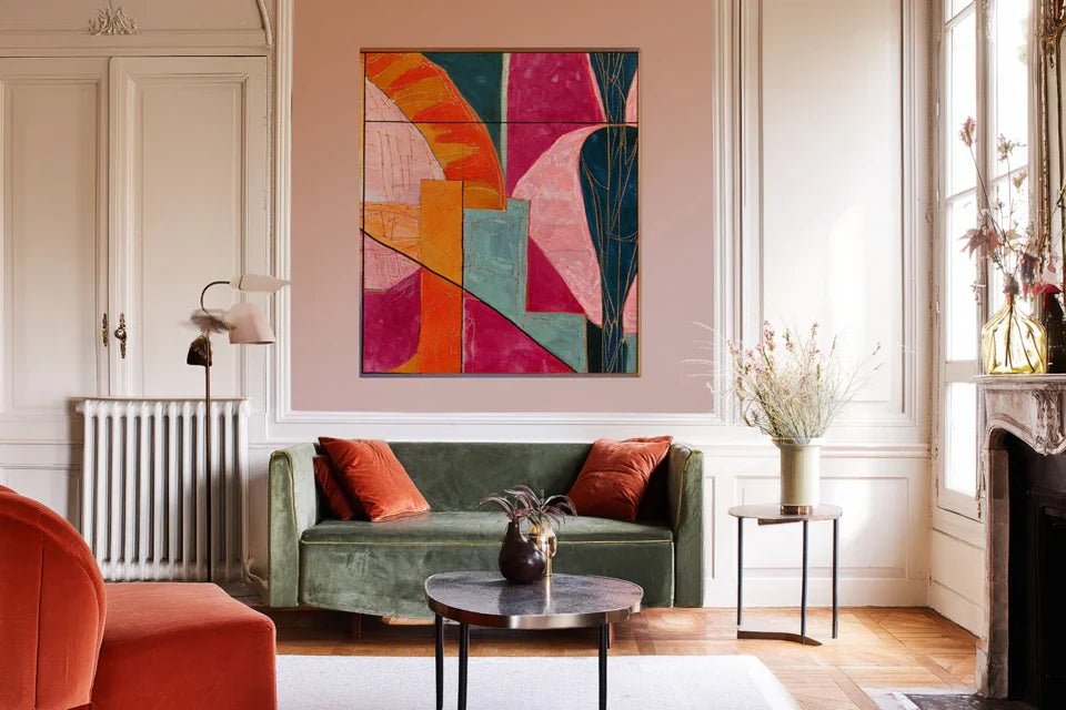
🏠 Customer testimonial: "I lived in a completely white apartment for 3 years. Beautiful but... cold. The day I hung my first canvas with ochre and terracotta tones, my guests immediately noticed the difference. 'It changes everything!', they said. And they were right."
💬 Conversation with a decor expert
The secret of the transformative artwork: It acts as a visual magnet that instantly restructures the entire perception of your room, creating a harmonious hierarchy in 24 hours flat.
What’s really happening in your neutral decor
Do you recognize these situations? Your guests compliment the "cleanliness" rather than the style of your interior. You hesitate to take photos of your living room for social media. Your space soothes you but no longer inspires you.
The situation you are experiencing is called the "blank canvas syndrome" in decor. Your neutral base is perfect, but it awaits its defining element. This isn't a lack of taste, it’s simply an unfinished step in your décor project.
Imagine a Michelin-starred chef preparing a perfect sauce but forgetting the final pinch of fleur de sel. Everything is there, but that note that elevates the whole thing is missing.
First hidden cause: The illusion of neutral safety
Contrary to popular belief, neutral colors are not "safer" than colors. They actually create an emotional void that your brain subconsciously seeks to fill.
It's exactly like those restaurants with immaculate white walls: technically flawless but don’t make you want to linger to savor the moment.
This constant search for something missing generates a subtle visual fatigue that explains why you never feel completely "at home" in your own living room.
🔍 Revealing test: Close your eyes for 30 seconds in your main room, then open them. If your gaze wanders without finding an anchor point, you have your diagnosis!
Second cause: The myth of perfect harmony
Many think that adding color will "break" their existing harmony. In reality, true harmony is born from controlled contrast, not uniformity.
It's like an orchestra: beauty comes from the conversation between instruments, not from them all playing the same note.
Without this creative tension, your decor remains in a faded comfort that lulls emotion to sleep rather than awakening it. Hence the persistent impression that "something is missing".
Third cause: The fear of color commitment
You constantly postpone adding color for fear of being wrong. This hesitation turns your decor into an eternal draft that never reveals your true personality.
Observe around you: the spaces that mark you all have a strong element that affirms a vision, an assumed boldness.
This excessive caution deprives you of the authentic emotion that comes from an interior that truly resembles you.
🎯 The 3 signals of a decor waiting:
- The fleeting gaze: Your eyes never find where to settle comfortably - like in a waiting room
- Showroom effect: Everything is perfect but nothing tells your story - the space lacks personal soul
- Silent fatigue: You feel an unexplained tiredness in this space - your brain subconsciously seeks a stimulus
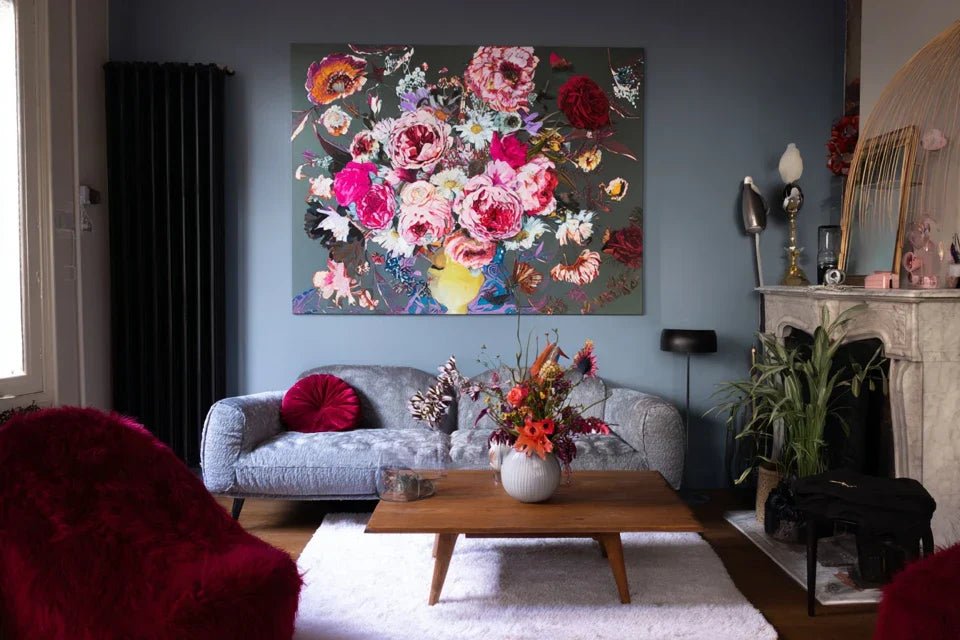
The Trigger Element: The Power of Attraction Through Contrast
A colorful artwork on a neutral wall acts as a visual magnet that instantly restructures your space's entire perception. It’s the positive domino effect: this focal point creates a natural hierarchy that gives meaning to every element of your decor. You’ll recognize it by that immediate feeling of “rightness” when you enter the transformed room.
The golden rule of mastered contrast: A single strong color element transforms your space more effectively than ten scattered small details. Test it by temporarily hiding all your colorful accessories - if nothing changes, they aren’t working enough!
| ❌ Stagnant neutral decor | ✅ Dynamized neutral decor | 💡 Why it works | 🎯 Immediate benefit |
|---|---|---|---|
| All walls look the same | One wall becomes the hero of the room | The brain loves visual hierarchy | Intuitive navigation within the space |
| The eye wanders aimlessly | The gaze immediately finds its anchor | Contrast creates a visual resting point | Immediate feeling of well-being |
| Waiting room atmosphere | Warm and personal atmosphere | Color stimulates endorphin production | Natural desire to stay and enjoy |
| Decor that seems unfinished | Space that tells your story | Art reveals the owner’s personality | Pride in hosting and sharing |
The 3-Step Method to Revive Your Understated Decor
Take a deep breath: transforming your neutral space into an inspiring cocoon is simpler than you imagine. We’ll proceed like a chef building their recipe: first the perfect base (you already have it!), then the signature ingredient (your artwork), finally the finishing seasoning. At each step, you'll see your room come back to life before your eyes.
🎨 Your transformation roadmap: Step 1 - Identify your hero wall (5 minutes). Step 2 - Choose your signature palette (one day of reflection). Step 3 - Hang and harmonize (1 hour of creative happiness). Result: a transformed space that finally looks like you!
🎯 Step 1: Identify Your Hero Wall (the most rewarding!)
Starting with this step is crucial because your hero wall will become the soul of your room. It’s like choosing the location of a fireplace in a house: once found, everything else naturally organizes around it. This discovery will give you that immediate satisfaction of finally seeing clearly in your decor project.
🔍 What You Need for This Step
- Your eyes and your intuition: No complex tool, just your natural feeling. Your instinct already knows which wall attracts your gaze first. Trust this first impression - it reveals the emotional architecture of your space. A moment of calm: 10 minutes without distraction to really feel the energy of each wall. Like a photographer looking for the right angle, take the time to position yourself in different places in the room. Natural lighting: Ideally observe midday when natural light reveals the true character of your walls. Avoid artificial lighting which can distort your perception of volumes.Now, let's move on to practice with a foolproof method
- Your favorite wardrobe: Observe the colors you naturally wear - they reveal your deep affinities. If you like blues in your clothes, they will also soothe you in your decor. Your dress instinct is a valuable guide!
- Your favorite travel photos: These images that you look back on with nostalgia often contain your ideal emotional palette. A sunset in Tuscany, a Caribbean beach... These happy memories hold your colors of happiness.
- Your existing lighting: Note whether your room is bathed in warm light (bulbs) or cool light (fluorescent lights), as this will influence the final effect of your colors. Warm tones thrive under warm lighting, cool tones under white lighting.
- 🎭 The "false friend color" mistake: Choosing a painting with seemingly vibrant colors but in reality faded or pastel. On a neutral wall, these dull shades disappear completely. Opt for frank and saturated colors - they will be softened naturally by your neutral base. It's counterintuitive but essential!
- 🔧 The trap of approximate hanging: Hanging "by eye" without measuring. 3cm difference is enough to create an imbalance that ruins everything. Take 5 minutes to mark with a pencil and measure - your painting will thank you! Use a level, even for small formats.
- 💡 Forgetting lighting: Neglecting the impact of lighting on colors. A magnificent orange can become dull under white neon. Test your painting under your usual evening lighting before definitively validating its location.
- 📏 The proportion error: Choosing a format that is too small for fear of doing "too much". On a large neutral wall, a small painting gets lost like a stamp on an envelope. Dare to use generous formats - they structure the space better and have more visual impact.
- 🏃 Decorative haste: Immediately adding other colorful elements everywhere. Let your main painting settle first and reveal its full potential. Like a perfume that needs a few minutes to unfold on the skin!
🎬 Your wall casting session
The natural gaze technique: Enter your room as if it were the first time. Note which wall your eye instinctively lands on - it's often the one with the best natural lighting or that offers the largest continuous surface. This wall already has the potential to be your star!
⏱️ Time: 2 minutes | ✅ Successful when: A wall naturally imposes itself on you | ⚠️ Attention: Don't choose the largest wall automatically - prioritize the one that "calls" to your gaze
The life triangle test: Identify your sofa-TV-window triangle (or equivalent depending on your use). The hero wall must be visible from your favorite relaxation position to maximize your daily enjoyment. It's the one you will contemplate most often!
⏱️ Time: 3 minutes | ✅ Successful when: Your future artwork will be in your natural field of vision | ⚠️ Attention: Avoid walls that you never look at - even beautiful ones, they won't transform your daily life
✨ Validation of your choice: Your hero wall should give you that little excitement when you imagine your future artwork on it. If you are still hesitating between two walls, choose the one that benefits from the best natural light. In case of doubt, you can always test with a temporary poster before making a final decision!
OUR RECOMMENDED PRODUCTS
🎨 Step 2: Choosing your signature palette (the revealing step!)
You are now entering the most exciting creative part! This is where your personality will finally express itself. Contrary to what one might think, choosing colors on a neutral base is more liberating than restrictive - like an artist drawing on white paper rather than on scrap. The snowball effect begins: each color you consider reveals an aspect of your taste that you may not have suspected.
🎯 Your tools for colorful reflection
🌈 Your personalized color exploration
The instant crush rule: Browse images of paintings online and spontaneously note those that make you smile. Don't think, follow your first emotion. These crushes reveal your natural palette - the one that will resonate with your deep self.
⏱️ Time: 30 minutes | ✅ Success when: 3-4 colorful styles naturally attract you | ⚠️ Attention: Don't censor yourself for fear that "it won't match" - we'll see that later!
The projection test: For each color that attracts you, imagine yourself contemplating it every morning during your coffee. Does this color make you want to start the day or does it soothe you in the evening? Choose according to the desired effect in your living space.
⏱️ Time: 15 minutes | ✅ Success when: A color/ambiance really makes you want it | ⚠️ Attention: Distinguish between colors that you admire and those with which you want to live daily
You are now at the most rewarding moment: the visible transformation of your space! It's like lighting the first candle in a dark room - the effect is immediate and magical. You will finally see your vision take shape and understand why this transformation was exactly what your decor needed.
🔧 The hanging that changes everything
The perfect height (museum rule): Place the center of your artwork at 5.25 feet from the floor - this is the natural eye level. This universal rule guarantees optimal visual comfort from any position in the room. Not too high (neck strain), not too low (feeling crushed).
⏱️ Time: 10 minutes | ✅ Success when: Your artwork integrates naturally with the furniture | ⚠️ Attention: On a sofa, leave 5.9 - 7.8 inches between the back and the bottom of the frame to avoid a "placed" effect
Adjusting the lighting: Test your artwork under different lights - day, evening, accent lighting. If some colors become dull in the evening, add accent lighting (spot or wall lamp) that will reveal its beauty permanently.
⏱️ Time: 24 hours of observation | ✅ Success when: Your artwork remains beautiful at all times | ⚠️ Attention: Avoid direct reflections that create blind spots on the canvas
The rule of harmonious progression: Let your artwork "breathe" for 48 hours before adding anything else. Your eye needs time to get used to this new focal point to objectively assess whether further adjustments are necessary.
Congratulations! You now master the subtle art of controlled contrast. Here are the expert tips that will make the difference between a nice hanging and a real decor transformation that will impress your guests.
🎨 Expert secret - The color echo technique: Take one single color from your artwork and repeat it in a small detail elsewhere in the room (cushion, vase, book...). This subtle echo creates a professional consistency without overloading. The effect is striking: your space suddenly seems designed by a decorator!
💭 Frequent question from our readers
"What if my colorful artwork ends up boring me after a few months?"
This concern is perfectly understandable when you invest in an important piece. But here's the secret: a true artistic crush evolves with you rather than tiring you out. Like a book you enjoy rereading, you will discover new details and nuances according to your mood and the seasons. Always choose authentic emotion over fleeting trends.
🔄 Anti-boredom test: Before buying, look at your favorite artwork several days in a row online. If it still attracts you after 3-4 viewings, it's the right one! Your initial enthusiasm will withstand time.
The 5 mistakes that ruin the transformative effect
Beware, some common mistakes can negate all your work! I want to avoid you these frustrating disappointments that I have seen too often. These mistakes are natural when you start out, but now that you know them, you will easily avoid them.
🛡️ Your anti-error checklist: Step back and observe your painting from 3 different positions in the room - standing near the entrance, sitting in your armchair, from the kitchen if it is open. Warning signs: painting invisible from afar, colors that seem "dirty", feeling that something is wrong without knowing what.
🎁 Special readers offer
Because you took the time to inform yourself, enjoy 10% discount on your first order:
⏰ Valid for 72h after reading • Applicable to all our products
🤔 Your questions, our experts' answers
Expert secret: neutral colors harmonize with 90% of existing colors! Your beige/grey/white base is like a blank canvas that enhances everything. Simple test: if you like a color on your clothes or in a photo, it will work on your neutral wall. Trust your instinct!
Rest assured! With the right anchors (designed for the weight of your artwork), the risk is almost zero. Foolproof technique: trace with a pencil, drill gently, use an appropriate anchor. Worst case scenario: a small hole can be patched in 2 minutes with filler. The beauty stakes are worth this minimal risk!


