

You’ve just installed your new sofa in the living room, and now you're looking at that bare wall above... You have this beautiful artwork waiting in a corner, but a little voice whispers to you: "What if I get the proportions wrong? What if it looks weird?"
You can already imagine the looks of your guests, that unpleasant feeling that something is off with your living room wall decor. You measure, you step back, you re-measure... but it’s impossible to visualize the final result.
You may have even tried the “feeling” approach or followed generic advice found online. Result? A painting above-sofa that seems to float in space or completely overwhelms your furniture.
Rest assured, it’s not a lack of taste on your part. The problem is that most decor advice ignores a fundamental reality: each sofa has its own proportions, and universal rules simply don't work.
By the end of this article, you will master the true rules of proportion to create a perfectly balanced ensemble that will transform your living room into a space where you’ll be proud to entertain.
Why the visual harmony of your living room depends on this decision?
Your living room is the first impression guests get, and the balance between your sofa and your artwork instantly determines whether the space breathes elegance or imbalance. It’s like a perfect chord in music: when it's right, you feel it immediately. A bad proportion can ruin thousands of euros invested in furniture and decoration.
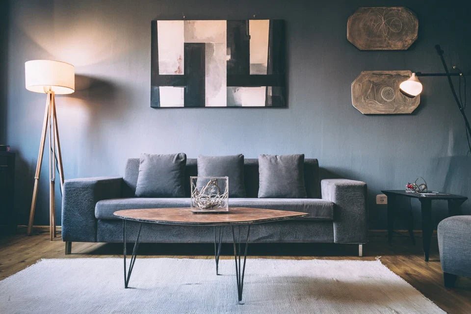
🎨 Interior designer testimonial: “Last week, a client called me in a panic. She had just hung a 40 cm painting above her three-seater sofa. The result? Her beautiful living room suddenly seemed unbalanced, as if something invisible was pulling the eye downwards.”
💬 Conversation with a decor expert
The golden rule of harmonious proportions: Your artwork should create a visual dialogue with your sofa, not a competition. By respecting the right proportions, you will achieve a "magazine decor" effect in less than 30 minutes of installation.
The 3 invisible mistakes that sabotage your wall decoration
You may feel this frustration: your living room never looks like those in magazines, even with beautiful furniture. You change the cushions, the color of the walls, but the perfect harmony always eludes you.
This is not your fault. The problem comes from three proportion errors so common that they have become "standards" in the minds of many. These errors create an unconscious visual tension that prevents your living room from reaching its full potential.
Imagine your living room as a symphony: each element must harmonize perfectly. A single false note, and the whole melody sounds wrong, even if you don't know exactly why.
The illusion of the "rule of thirds"
You were probably told that your artwork should be "two-thirds the width of the sofa". This rule, repeated everywhere, completely ignores the height of your backrest, the thickness of the armrests, and the personality of your room.
It's like using the same shoe size for everyone: technically possible, but rarely comfortable. Each sofa has its own "visual footprint", and applying a universal rule often creates more problems than it solves.
Result? Your magnificent work of art seems either lost on your wall or too imposing. This "one-size-fits-all" approach deprives you of personalized harmony that deserves your interior.
🔍 Quick test: Place your hand flat in front of your current artwork and step back 3 meters. If your eye is first drawn to your hand rather than the sofa-artwork ensemble, then the proportions are not working.
The myth of universal height
The famous "150 cm from the floor" rule that we read everywhere ignores a fundamental reality: the height of vision changes depending on the position of your guests and the layout of your living room.
It's like adjusting all car rearview mirrors to the same height, regardless of the driver's size. In your living room, the "right" height depends on your sofa, the distance from which you look back, and even the ambient lighting.
This rigid approach often creates a visual disconnection between your sofa and your artwork. Your work literally floats in space, without creating that decorative unity that characterizes successful interiors.
Ignoring the light environment
Almost no one talks about the crucial impact of lighting on the perception of proportions. An artwork perfectly proportioned in full daylight can seem completely unbalanced in the evening.
You can see this in your own living room: some elements "disappear" when natural light decreases, completely changing the visual balance of your room.
This neglect of the luminous aspect explains why your decoration may satisfy you at times and disappoint you at others, creating this frustration of never achieving a constant result.
🎯 The 3 warning signs of a failed proportion:
- The gaze wanders to the sides: When your guests subconsciously avoid looking at the whole, it's because the visual balance is broken A persistent feeling of emptiness: Even with a beautiful painting, you feel that something "is missing" - this is a sign of poor proportion The desire to fill the space: This urge to constantly add decorative elements reveals a fundamental imbalance in the main proportions
What really makes the difference is the balance between the visual volumes of your sofa and your painting. Like a lever, the right ratio of force creates a visual stability that instantly transforms the atmosphere of your living room. You can identify it by observing how your eye naturally moves in space: in a well-proportioned living room, the gaze circulates smoothly without snag or tension zone.
The rule of harmonious triangle: Your painting should form a balanced visual triangle with the ends of your sofa. Check by mentally tracing these lines - if the triangle seems stable, you have found your proportions.
| ❌ Standard approach | ✅ Personalized method | 💡 Why it works | 🎯 Visible result |
|---|---|---|---|
| Measure 2/3 of the width | Analyze the overall visual footprintEach sofa creates its own volumeNatural and personalized harmony|||
| Hang at 150cm from the floor | Adjust according to the seated point of viewRespects the real perspective of useOptimal visual comfort|||
| Ignore lighting | Test under different lightsPerception changes with atmosphereConstant balance day and night|||
| Follow a single rule | Create a dialogue between volumesHarmony is born from visual conversationProfessional "decor magazine" effect
Step 2: Calculate your ideal proportions
With the visual footprint of your sofa in hand, you now move to the next level: transforming this data into perfect proportions for your artwork. This step is more rewarding as you begin to visualize the final result concretely. The snowball effect begins here: each good decision facilitates the next.
📏 Personalized calculation tools
- Golden ratio ruler: Use the 1.618 ratio (golden number) to define perfect balance. Divide the visual width of your sofa by 1.618 to obtain the ideal maximum width of your artwork. This mathematical formula reproduces the naturally harmonious proportions that our eye appreciates instinctively. Smartphone calculator: To avoid rounding errors that create subtle but annoying imbalances. Proportions are sometimes off by a few centimeters - an approximation can turn a perfect balance into "almost successful". Newspaper or kraft paper: Create a template with the calculated dimensions to visualize the actual footprint on your wall. This crucial step avoids unpleasant surprises and allows you to adjust before purchase if necessary.
🧮 Personalized calculations for your living room
Apply the balance formula: Take your measured visual width from step 1 and multiply it by 0.618 (the inverse of the golden number). This result gives the optimal width of your artwork to create a harmonious dialogue without competition.
⏱️ Time: 5 minutes | ✅ Successful when: You have a precise width down to the centimeter | ⚠️ Attention: Do not confuse frame width and artwork width - count the total footprint
Determine proportional height: If your sofa leans towards the horizontal, choose a landscape format whose height represents 60% of the calculated width. If it elevates the space, dare to use a more square (80%) or even portrait format to create a dynamic contrast that enriches the composition.
⏱️ Time: 8 minutes | ✅ Successful when: You can mentally visualize the impact of the chosen format | ⚠️ Attention: A low ceiling prohibits formats that are too vertical - they visually overwhelm the space
Create the validation template: Cut your paper to the exact calculated dimensions and temporarily attach it to the wall with masking tape. Step back and observe from all tested angles in step 1. This simulation immediately reveals whether your calculations translate your vision.
⏱️ Time: 15 minutes | ✅ Successful when: The template "disappears" naturally into the ensemble without creating tension | ⚠️ Attention: A template that attracts too much attention signals excessive proportions
🎨 Quality control: Your template should create an immediate visual calming effect. If you still feel tension or hesitation, refine your dimensions by 5-10 cm. This additional precision makes the difference between "not bad" and "perfect". Keep your calculations noted - they will serve you for the final step.
Step 3: Optimize installation for all lighting conditionsYou are now reaching the level of mastery that separates amateurs from connoisseurs: creating a balance that works perfectly under all lighting conditions. This final step transforms your technical installation into a true decorative work of art that you will be proud of in all circumstances. The result? A living room that impresses as much during the day as it does in the evening intimate setting.
💡 Optimized installation material
- Laser level or bubble level of at least 60 cm: Perfect horizontality is essential because even 1° of inclination creates an unconscious visual tension. Invest in a good level - it's the tool that guarantees the professionalism of your installation. A quality level remains perfectly reliable over the years. 2H pencil for marking: Harder than a classic pencil, it leaves fine and precise lines that erase easily. Avoid greasy pencils that permanently mark your walls and complicate adjustments - precision is in the details. Mobile additional lighting: A desk lamp or your smartphone flashlight to test the effect under different lighting angles. This check reveals how your artwork interacts with shadows and reflections depending on the time of day.
🔧 Professional level installation
Define optimal eye-level height: Sit on your sofa and note the height of your eyes from the floor (usually 110-120 cm). The center of your artwork should be 10 cm above this line to create a comfortable viewing angle without visual fatigue. This personalization transforms your living room into a perfectly adapted cocoon.
⏱️ Time: 8 minutes | ✅ Successful when: You can admire your artwork naturally without tilting your head up or down | ⚠️ Attention: If multiple people use the sofa, take the average of their eye heights
Test the light impact: Temporarily hang your artwork and observe it at different times: morning, afternoon, evening with artificial lighting. Note if any shadows or reflections disrupt the visual balance. A good positioning remains harmonious under all lights.
⏱️ Time: 24 hours of observation | ✅ Successful when: The artwork retains its presence regardless of the lighting | ⚠️ Attention: An artwork that "disappears" in the evening reveals a contrast problem with the wall
Adjust wall spacing: The distance between the top of your sofa back and the bottom of your artwork should be approximately 15-25 cm to create visual breathing space without disconnection. Too close, the whole seems crushed; too far away, the elements float without apparent relationship.
⏱️ Time: 10 minutes of adjustment | ✅ Successful when: The intermediate space feels natural and balanced | ⚠️ Attention: A very high sofa (backrest + cushions) reduces this optimal spacing
🏆 Final validation: Invite a trusted person to discover your living room. If their gaze naturally settles on the sofa-artwork ensemble without any hiccups, you have succeeded. Perfect harmony is recognized by this quiet evidence that never forces attention but retains it naturally.
The rule of mastered progression: Each step validates the previous one - if the final installation does not satisfy, go back to the calculations of step 2. Patience in adjustments distinguishes the amateur installation from the professional result that will last for years.
Congratulations! You now master the subtleties that even some decorators ignore. These advanced techniques give you the advantage of professionals to create compositions that permanently mark your guests.
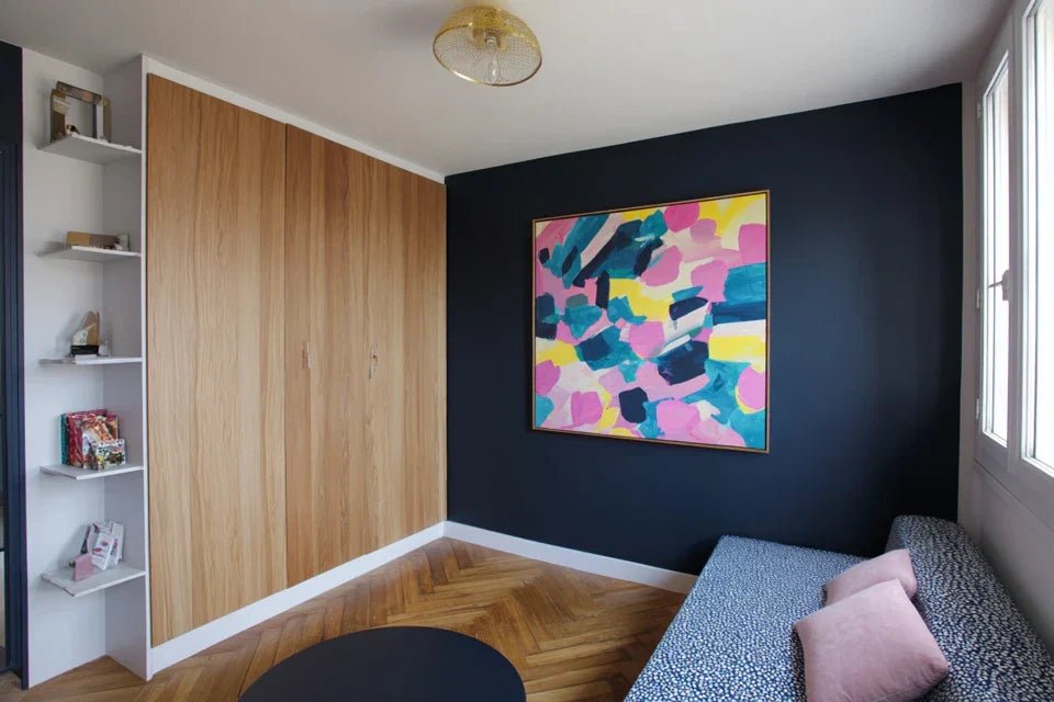
🎯 Professional decorator tip: For corner sofas, apply the method to the main section (the longest) and add a complementary decorative element to the other panel - mirror, shelf or smaller artwork. This technique creates a dynamic composition that avoids monotony while maintaining harmony.
🤔 "What if I'm still wrong?"
"I'm afraid of making a hole in the wall for nothing, what if the result doesn't please me?"
This concern is perfectly normal - we're talking about your living room, your daily living space. The good news? This method eliminates 95% of the risk of error thanks to the template and light tests. Furthermore, modern mounting systems allow for adjustments of several centimeters without new drillings. Start by testing with the template for a full week - if you don't feel any visual discomfort during this period, you can install with confidence.
🛡️ Installation safety: Use adjustable hooks for initial trials. They allow fine adjustments without damaging your walls and give you time to perfectly validate your choice before final installation.
The 5 mistakes to absolutely avoid
Now that you know the right method, let's protect your success by identifying the errors that can ruin everything even with good intentions. These traps are so common that they seem normal, but they silently sabotage the harmony of your living room.
- 🚫 Neglecting ambient lighting: Many people install their artwork in full daylight and discover in the evening that it "disappears" completely. This classic mistake turns your decor investment into a ghostly element as soon as night falls. Always test under your usual evening lighting - this is often when you enjoy your living room the most. 🚫 Copying proportions from a magazine: Decor photos are often retouched and taken with wide-angle lenses that distort real proportions. Directly applying these "examples" to your living room creates frustrating imbalances. Rely on your personalized calculations rather than external inspirations. 🚫 Ignoring ceiling height: A 2m40 ceiling doesn't allow the same boldness as a 3m20 ceiling. Forcing a vertical format into a low space visually crushes the room and creates an uncomfortable feeling of oppression. Always respect the proportions of your overall volume. 🚫 Choosing the artwork after installation: This reverse approach sabotages the entire process. Your ideal dimensions are calculated for your specific space - then looking for a painting that "fits" within these constraints drastically limits your artistic choices and compromises the final harmony. 🚫 Neglecting adjacent elements: A television, console or plants completely change the visual balance of your composition. Analyzing the artwork and sofa in isolation without considering the overall environment creates unpredictable imbalances that ruin the desired effect.
🔍 Anti-error verification system: Before final installation, check that your ensemble works from the entrance of the room, that evening lighting does not create annoying shadows, that proportions remain balanced even with cushions out of place, and that harmony persists when you turn on the television. These four checkpoints guarantee a lasting result.
🎁 Special offer for readers
Because you took the time to learn more, enjoy 10% discount on your first order :
⏰ Valid 72h after reading • Applicable to all our products
❓ Frequently asked questions about hanging above the sofa
Allow approximately 3 hours for the entire process: 1 hour for analysis and calculations, 1 hour of testing with the template, and 1 hour for final installation with adjustments. This time investment saves you months of frustration and readjustments. A customer recently told us: "I spent more time choosing my sneakers than installing my artwork, and that's what transforms my living room the most!"
Absolutely not. Perfect proportions enhance an accessible work as much as a collector's piece. We have seen €50 paintings perfectly integrated creating more impact than poorly proportioned expensive works. Focus your budget on correct dimensions and careful hanging rather than the prestige of the artwork.
The material of the wall only influences the hanging technique, never the proportions. For plasterboard, use Molly plugs or specialized hooks. For concrete, prefer expanding anchors or expansion systems. The important thing remains to respect your proportion calculations - the technical support always adapts.
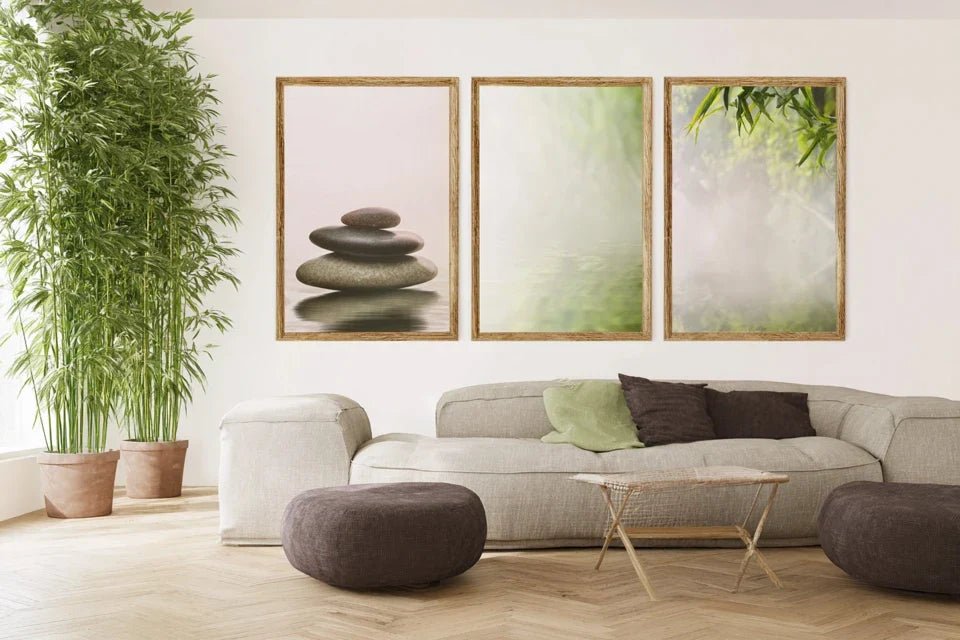
Yes, but consider all the paintings as a single work. Calculate the total width of your composition (works + spaces) using the same method, then distribute harmoniously. Keep regular spacing between the pieces - generally 5 to 10 cm depending on the size of the works. This approach creates a professional wall gallery.
First, identify the main section (usually the longest or the one facing the entrance) and apply the classic method. For the other section, add a smaller complementary element - mirror, decorative shelf or portrait format painting. This controlled asymmetry creates dynamism while maintaining overall balance.
🏡 Your living room transformed into a prestigious space
In a few weeks, when your guests step through the doorway of your living room, their gaze will naturally fall on this perfectly harmonious set that you have created. They will immediately feel this impression of elegance and refinement, without being able to explain exactly why your decor seems so right. You will have this discreet pride in seeing looks linger, compliments flow, and your loved ones ask for advice for their own interiors.
More than a simple decorative technique, you have acquired a true skill in interior design that will apply to all your future projects. This intuitive understanding of proportions transforms the way you see and organize space, whether it's for a kitchen, bedroom or office.
The hardest part was understanding why classic methods failed. Now that you master the real rules, all you have to do is take your measurements and start. Your dream living room is waiting for this first concrete action that launches the transformation.
✨ Your moment of excellence : Every great living room starts with the decision not to accept mediocrity. You now have all the tools to create this harmony that will accompany you for years. Your vision becomes a reality today.


