

You’ve just hung your new favorite artwork on the living room wall, and yet... something feels off. The overall look seems unbalanced, too empty on one side, too cluttered on the other. Your beautiful acquisition seems lost, drowned in a visual chaos that frustrates you with every glance.
This feeling of incompleteness follows you around the room. Your guests compliment politely, but you can tell that the harmony is missing. The wall looks more like a haphazard patchwork than the sophisticated gallery you dreamed of.
You may have tried adding more frames, changing the heights, spacing them differently... But each attempt seems to worsen the problem. The more elements you add, the more the overloaded effect takes over the elegance you’re seeking.
Rest assured, it's not a lack of taste on your part. It’s simply that no one has ever explained to you the golden rules of wall composition that professional decorators instinctively master.
By the end of this article, you will know how to create a perfectly balanced gallery wall that will impress your guests and give you the deep satisfaction of having created something truly beautiful in your interior.
Why Your Gallery Wall Can Transform Your Interior Today?
A harmonious gallery wall is not just a decoration. It's the focal point that instantly gives character to your room. Imagine the impact: your guests spontaneously stopping in front of your composition, the impression of refinement that emanates... If you wait for the “right moment”, you’re missing out on months of daily pleasure in your own interior.
🎨 True story: Sarah, a Parisian interior architect, recently told me how a client had transformed her dull living room into a true art gallery in a weekend. “On Monday, her colleagues only talked about it during telecommuting. Her Zoom background had become the star of the meetings!”
💬 Conversation with a Décor Expert
The golden rule of wall harmony: A successful gallery wall tells a coherent story without shouting louder than the room itself. Like a melody that supports a song, your composition should sublimate the space in 2-3 weeks maximum.
What’s Really Behind Your Wall Composition Failures
You look at your wall and something bothers you, but you can't quite put your finger on it. Your artworks seem to "float" in space, or conversely crash into each other. The final result lacks visual coherence despite all your efforts.
What you’re experiencing isn't a lack of taste. It's simply that wall harmony obeys specific principles that our eye perceives subconsciously. When these rules are not respected, our brain sends an alert signal: "something is wrong".
It's like looking at a face with unbalanced proportions. Technically, all the elements are there, but the whole doesn’t work. Your wall has exactly the same problem.
The Real Reason for the “Patchwork” Effect That Ruins Everything
Contrary to what one might think, the problem isn't about the number of artworks or their style. It comes from the absence of visual dialogue between the works. Each frame lives its life without considering its neighbors.
Imagine an orchestra where each musician played his part without listening to the others. Even with excellent soloists, the result would be cacophonous. Your wall functions exactly the same way.
This understanding changes everything in your approach. Instead of trying to "fill the space", you will learn to create connections between your works. The effect is immediate and striking.
🔍 Quick test: Place your hands in front of your eyes to see only one artwork at a time. Please isolate them but if the whole bothers you, it's indeed a problem of visual dialogue, not taste.
Why Your Obsession with Symmetry Lets You Down
Many think that a harmonious wall must be perfectly symmetrical. This popular belief is actually a trap that leads to stiff and lifeless compositions. Harmony doesn't come from perfect symmetry, but from the balance of visual masses.
It’s like a tightrope walker on his wire: he doesn’t stay straight and still, he constantly balances to maintain equilibrium. Your wall must breathe in the same way.
This revelation completely frees your creativity. You are no longer imprisoned by rigid rules; you compose with fluidity and naturalness. Your guests will feel this ease without being able to explain it.
The Fatal Mistake of Hanging Art Too High
Almost everyone hangs their artworks too high, thinking they are doing well by "highlighting" them. In reality, an artwork poorly positioned at height immediately breaks the harmony, even in a perfect composition.
Your eye needs to be able to naturally embrace the whole without looking up. When you force your gaze upwards, you create an uncomfortable tension that disrupts the entire perception of space.
The right height instantly transforms your living room into an art gallery. Your artworks become integral parts of your daily life instead of being "high-hanging decorations" that are quickly forgotten.
The 3 warning signs that betray a failed hanging:
You instinctively tilt your head to look at your artworks: The space seems "cut in two" between the top and bottom:Your guests quickly glance then look away: The visual discomfort prevents them from truly appreciating your artworks
The decisive factor that no one tells you: natural lighting
The light bathing your wall completely changes the perception of colors and contrasts depending on the hours. A perfect wall in the morning can seem dull in the evening. Professionals observe their wall at different times before definitively validating the hanging.
Rule of 3 moments: Check your composition in the morning, mid-afternoon and in the evening with artificial lighting. If it satisfies you in these 3 configurations, it is successful.
| ❌ Amateur approach | ✅ Expert approach | 💡 Why it works | 🎯 Visible result |
|---|---|---|---|
| Hanging by feeling without measuring | Respecting the guideline at 145-155cm | Natural height of human gaze | Immediate visual comfort |
| Seeking perfect symmetry | Balancing visual masses | Natural dynamism like in nature | Living and modern composition |
| Filling all empty spaces | Leaving breathing spaces | The eye needs resting areas | Elegance and refinement |
| Choosing only by personal taste | Thinking about dialogue between artworks | Stronger overall coherence | Professional gallery effect |
The 3-step method for a wall gallery that impresses
Don't worry about past mistakes anymore. Creating an harmonious wall follows a logical progression, like building a house. You will first lay the foundations (overall structure), then raise the walls (precise placement), and finally add the finishing touches (aesthetic adjustments). In 3 weekends, your living room will have the look of a private gallery you dream of.
🗺️ Your artistic battle plan: Step 1 → Define your guideline (the "red thread" invisible that guides the eye). Step 2 → Place your main artworks (the "visual anchors"). Step 3 → Harmonize the whole (the subtleties that make the difference). Result at each step: clear structure, then visual impact, finally sophistication.
This first step is crucial because it determines all the success of your composition. Like an architect first traces the foundations, you will establish the "backbone" of your wall. This invisible line will naturally guide the gaze and give that impression of spontaneous order which distinguishes amateurs from professionals.
🛠️ What you need to get started
- A quality measuring tape: Choose a model with automatic locking and clear graduation. It will serve you for all crucial measurements. Avoid cheap measuring tapes that warp: accuracy to the nearest centimeter makes the difference between an amateur and a professional. A spirit level (minimum 60cm): Essential for the perfect guideline. A level that is too short will give you frustrating approximations. Invest in a model with well-visible vials: your guests will subconsciously notice the accuracy of your hanging. Grey HB pencil and eraser: To discreetly mark your guidelines on the wall. The HB erases easily without leaving traces, unlike fat pencils that can stain permanently.
Now, let's move on to practice with confidence
🎯 How to trace your guideline like a pro
Measure the reference height: Stand facing your wall and measure 150cm from the floor. This height corresponds to the optimal visual center for most works. Discreetly mark a point with pencil: this is your "zero" reference point.
⏱️ Time: 5 minutes | ✅ Successful when: You can look at this point without tilting your head up or down | ⚠️ Attention: Never measure from the ceiling as ceiling height often varies by a few centimeters
Trace the invisible guideline: From your reference point, draw a discreet horizontal line across the entire width of your future gallery wall. Use a spirit level for perfect accuracy. This line will be the "guiding thread" on which your works will visually align.
⏱️ Time: 10 minutes | ✅ Successful when: The line is perfectly horizontal along its entire length | ⚠️ Attention: Draw lightly: this line should be erasable once the hanging is complete
Define placement zones: Mentally divide your line into 3 or 5 sections (always odd for more dynamism). Discreetly mark these sections: they will become your "anchor zones" where you place your main works. This distribution avoids accumulation on one side and emptiness on the other.
⏱️ Time: 5 minutes | ✅ Successful when: You clearly visualize 3 or 5 balanced locations | ⚠️ Attention: Resist the temptation to do "even" (2, 4, 6 zones) which gives a too rigid effect
✨ Check before proceeding: Step back 2-3 meters and observe your line. It should seem natural to you, neither too high nor too low. If you feel discomfort, adjust by 5-10cm. Your feeling is the best guide: this line will soon be invisible but its effect will be permanent.
OUR RECOMMENDED PRODUCTS
Step 2: Confidently Arrange Your Main Pieces
You are now at the heart of the transformation. This step will bring your guiding line to life by hanging your most striking artworks. This is where your wall really takes shape and you begin to feel that satisfaction of a job well done. The effect will already be stunning.
🖼️ Artwork Selection and Preparation
- Your main "favorite" artwork: Choose the piece that has the most emotional impact on you. This will be your "central anchor", setting the tone for the entire composition. Its ideal size: between 16x24in and 32x40in for optimal impact without being overwhelming.
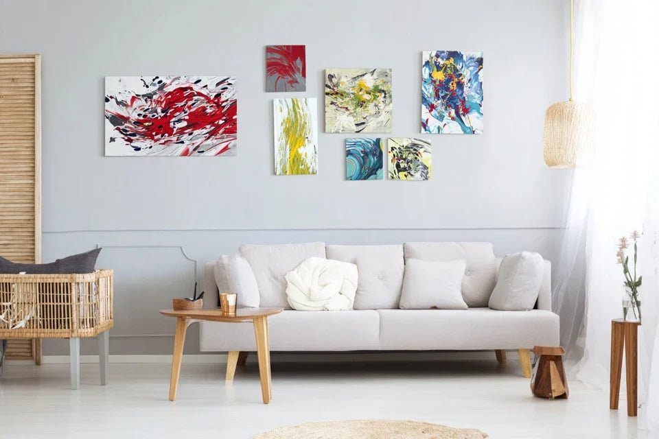
- 2-4 complementary artworks: Select pieces that "converse" with your main artwork through color, style or emotion. Vary the sizes: one large, two medium, one small, for example. This diversity creates visual rhythm.
- Professional hanging system: Invest in fixings suitable for the weight and wall (drywall, concrete, brick). Screws with anchors for heavy pieces, discreet hooks for lighter ones. A solid mounting provides reassurance and lasts over time.
🎨 Strategic Placement of Your Artworks
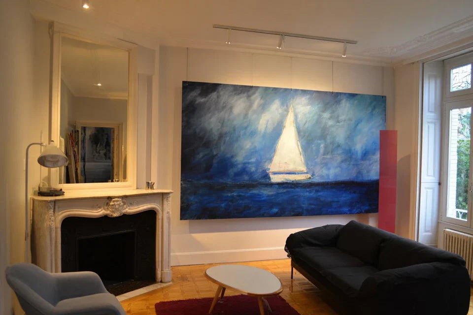
Position the central anchor: Place your main artwork in the central zone of your guiding line. Its center should align exactly with your 60in line. This piece will "hold" visually the rest of the composition and naturally attract the eye first.
⏱️ Time: 15 minutes | ✅ Success when: The artwork "speaks" to you as soon as you enter the room | ⚠️ Attention: Never place it exactly in the geometric center of the wall, but in the visual center of your composition
Create visual dialogues: Arrange your other artworks following a principle of "conversation". Imagine that your paintings are talking to each other: place them at distances that allow the eye to naturally pass from one to the other. Respect 6-10in spacing between frames for a sophisticated gallery effect.
⏱️ Time: 25 minutes | ✅ Success when: Your gaze flows smoothly from one artwork to another | ⚠️ Attention: Avoid spaces that are too large (dispersed effect) or too tight (cluttered effect)
Step 3: Harmonize for an Exceptional Gallery Effect
You are now reaching the level of expertise that truly distinguishes connoisseurs. This final step will sublimate your composition with the subtleties that make all the difference. This is where your gallery wall takes on a professional dimension that will impress even your most demanding guests.
🔧 Finishing Tools for Perfection
- Accent lighting: Directional spotlights or wall sconces to reveal your artwork in the evening. Warm light (2700K) enhances warm tones, neutral light (4000K) reveals details better. Good lighting doubles the visual impact of your composition.
- Highlighting accessories: A few decorative objects (vase, sculpture, art book) can dialogue with your paintings without competing with them. They anchor the composition in space and make it more lively.
✨ The finishes that make a difference
Fine-tune the final adjustments: Step back and observe your composition from different angles. Adjust by a few centimeters if necessary. Sometimes, a simple 5cm shift transforms a "almost perfect" composition into a masterpiece of harmony.
⏱️ Time: 20 minutes | ✅ Successful when: You feel a "click" of visual satisfaction | ⚠️ Attention: Don't over-adjust: harmony is felt more than it is calculated
Expert progression rule: Move on to the next step when the current step gives you a stable visual satisfaction. Respect your pace: it’s better to master one step perfectly than three rushed steps.
You now master the fundamentals, let's explore the expert subtleties that transform a good gallery wall into a true decorative work of art. These details make the difference between a composition that pleases and a composition that permanently marks people’s minds.
🎯 Pro secret - The rule of the golden triangle: Arrange your three main works according to an invisible triangle whose sides are never equal. This natural asymmetry creates dynamism that the eye perceives as particularly harmonious. Observe art galleries: they systematically use this technique.
🤔 Frequent question from our readers
"I'm afraid of making holes in the wall for nothing if the result doesn’t please me..."
This hesitation is perfectly understandable! That's exactly why professionals first use kraft paper or cardboard templates with the exact dimensions of their paintings. Stick these templates to the wall and live with them for 2-3 days. You will immediately see if the harmony works before making any holes. This simple technique avoids 90% of regrets.
💡 Immediate action: Cut out rectangles of paper in the sizes of your paintings and test different compositions with repositionable tape. In 30 minutes, you will know which arrangement gives you the most satisfaction.
The pitfalls to absolutely avoid to protect your investment
After helping hundreds of people with their gallery wall projects, I've identified the mistakes that consistently come up. These pitfalls are tempting because they seem logical, but they inevitably sabotage the final harmony. Knowing these traps will save you weeks of frustration.
- ⚠️ The trap of progressive accumulation: Starting with one painting and then adding another, and then another... This "feeling out" approach almost always leads to visual clutter. Plan the whole thing first, even if you acquire it gradually. It's normal to want to fill quickly, but patience pays off. ⚠️ The mistake of “all the same size” : Buying several identical frames for consistency kills visual interest. Your eye gets bored quickly with repetition. Vary the formats: it is controlled diversity that creates harmony, not uniformity. ⚠️ The myth of the "perfect straight line": Rigorously aligning all paintings on the same horizontal line gives a very cold “barracks” effect. Instead, create a subtle undulation around your guideline, like a melody that breathes. ⚠️ Overloading “small spaces”: Wanting to optimize every square centimeter of wall with mini-frames creates a tiring “patchwork” effect. Allow for breathing room: your eye needs areas of rest between points of interest. ⚠️ Forgetting natural light : Positioning a painting facing a window without considering reflections or overexposure. Observe your wall at different times of the day before definitively validating the location. Light changes everything.
🛡️ Your safety checklist before hanging: 1) Do you like your composition as much in the evening as in the morning? 2) Can you move naturally around the room without the wall “aggressing” your peripheral vision? 3) Would a visitor spontaneously look at your works or would they look away? 4) Does the whole thing give you a feeling of calm and satisfaction?
🎁 Special readers offer
Because you took the time to inform yourself, enjoy 10% discount on your first order:
❓ Your most frequently asked questions about wall art
Allow a full weekend for planning and installation (6-8 hours total), plus the time to acquire the artworks. Budget: €300-€800 for a gallery wall of 3-5 quality artworks, including frames. Optimization tip: start with 2-3 main rooms and gradually complete them. Concrete example: Marine created her living room gallery wall in 3 months with a budget of €450, buying one artwork per month.
Your transformation from expert in wall decoration starts now
In a few weeks, you will look at your living room with that quiet pride of someone who has created something truly beautiful. Your guests will spontaneously stop in front of your gallery wall, ask for advice for their own interior. This natural recognition of your taste and expertise will give you that particular confidence that true art lovers have.
Beyond simple decoration, you will have developed an expert eye that will transform your relationship with art and space. This newly acquired sensitivity will influence all your future decorative choices, making you instinctively capable of creating harmony in any environment. Your surroundings will notice this subtle but real evolution of your aesthetic sophistication.
The most difficult part was understanding the invisible mechanisms of visual harmony. Now that you have mastered them, all you need to do is trace your first guiding line and feel the excitement of seeing your vision take shape. Your future gallery wall awaits you, and it will be exactly in your image: unique and unforgettable.
🚀 Your first mission, should you choose to accept it : Within the next 48 hours, trace your guiding line and test your first composition with paper templates. You'll immediately feel that creator satisfaction of giving birth to something beautiful.


