

Looking at your living room, a feeling hits you: the walls seem to be closing in more and more each day, the space feels cramped despite your efforts to declutter.
No matter how much you push furniture against the walls or obsessively tidy up every object, it doesn't help. This feeling of confinement persists and transforms your cozy nest into a shoebox.
You’ve probably tried mirrors (too clinical), light colors (faded and impersonal), or even removed furniture (leaving you in an empty space that still feels oppressive). These classic solutions don't create the illusion of space you hoped for.
Don’t blame yourself! These traditional methods ignore a fundamental principle: the human eye evaluates space based on precise visual cues that have nothing to do with actual surface area.
By the end of this article, you’ll know exactly what types of artwork transform a cramped room into a visually generous space, and you'll feel that immediate liberation upon hanging the first frame.
Why does your room seem smaller than it really is?
The illusion of space doesn’t depend on actual square footage, but on visual signals that your brain interprets in a fraction of a second. It's like looking at the horizon at sea: even on a small boat, the feeling of infinity comes from lines that direct your gaze towards a distant perspective. Ignoring this neurological mechanism is wasting the spatial potential of your interior.
🏠 Revealing testimonial: Sarah, an interior architect, recounts: "I visited two identical 45m² apartments. In the first, furnished with neutral colors and mirrors, I felt cramped. In the second, three paintings with deep perspectives created an extraordinary sense of amplitude. Same surface area, totally different perception."
💬 Conversation with a decor expert
The secret of professional decorators: They don’t try to make it look bigger, but to create the illusion of depth. Observable result in less than 24 hours: your gaze rests differently and spatial oppression transforms into a feeling of openness.
Understanding what really creates the illusion of space< h2 > < p > Do you recognize these situations? You enter someone's home and the space seems immense while you know it’s the same size as yours. Or, some rooms make you want to linger in them while others instantly feel oppressive. You sense this < strong >unexplained difference in scale. < p > What's really happening is that your brain < strong >evaluates the space according to guidelines and vanishing points, just like in classical perspective. The problem isn’t your room, but the lack of these < strong >visual cues for distance. < p > Imagine looking at a road disappearing on the horizon versus a uniform brick wall. The same physical length, but your perception of distance changes dramatically depending on the < strong >depth cues present. < h3 >Perspective: Your Little-Known Ally to Enlarge Space < p > Contrary to popular belief, it’s not light colors that enlarge, but < strong >lines of perspective that direct the gaze towards a distant point. The difference? A light canvas remains a surface, while an artwork with perspective becomes a < strong >virtual window. < p > It’s like the difference between looking at a landscape photo on your phone versus contemplating the same landscape from a window. In both cases, the same image, but one creates a feeling of escape, the other remains a decorative object. < p > This understanding will revolutionize your decorating approach: < strong >no more suffering with your space, you’ll sculpt it visually. Forget compromising with a sense of narrowness; you now create your own < strong >inner geography. < div class="aha-moment"> < p> < strong >🔍 Quick test: Look at the main wall of your living room for 30 seconds. Does your eye find a point to direct itself, or does it remain blocked on the surface? If it’s the latter, you’ve just identified why the space feels closed. < h3 >The Mistake of Neutral Tones: Why Beige Shrinks Your Space < p > You've been told that light colors enlarge, but this < strong >popular belief ignores the psychology of perception. A uniform beige wall creates the opposite effect: it visually brings the surface closer and < strong >eliminates any sense of recession. < p > It’s like comparing dense fog to a starry sky: the fog (uniform neutral tones) limits vision, while the stars (contrasts and depths) suggest infinity. Your eye needs < strong >variations to estimate distances. < p > Result in your daily life: you subconsciously feel < strong >limited by these uniform walls that act as visual barriers. Understanding this will transform your relationship with color and the < strong >creation of airy spaces. < h3 >The Trap of Decorative Overload
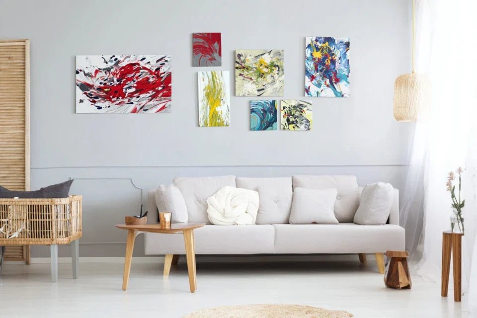
Many people accumulate small decorative items thinking to create visual richness, but get the opposite effect. Marine, an interior designer, testifies: "My client had 15 small frames on a wall. The feeling was cluttered and shrinking. A single large artwork with perspective: immediate transformation."
Here's how to spot this clutter in your home: count the number of elements your eye has to process on a wall. More than 3-4 different objects? Your brain goes into "analysis" mode instead of "contemplation" mode, and the space appears cramped even if it's not physically crowded.
This affects your daily well-being because it creates an unconscious visual fatigue that accumulates and turns your home into a source of stress rather than a soothing refuge.
🎯 The 4 signs of a visually cramped space:
- Your gaze "bounces" off the walls: No line guides the eye towards depth, like a ball bouncing in a closed box
- You subconsciously avoid certain angles: Your body feels oppression and pushes you towards the "open" areas, revealing a visually unstructured space
- Guests stay near the entrance: Sign that the space does not invite them to venture further, lacking engaging perspectives
- You dream of enlarging when you have enough space: Proof that the problem is perceptual, not spatial
The trigger factor: the rule of thirds in depth
The real secret lies in visual layering: your eye must perceive a foreground, a middle ground, and a background. It's the domino effect of space: as soon as a perspective opens up, the entire environment appears more vast. Identify this principle in your home by observing where your gaze naturally rests and whether it finds this progression towards infinity.
The golden rule of visually generous spaces: An artwork should offer at least three distinct planes of depth to create the illusion of space. Check immediately by looking at your walls: is there this visual progression that leads the eye towards the horizon?
| ❌ Limiting belief | ✅ Liberating reality | 💡 Why it works | 🎯 Immediate benefit |
|---|---|---|---|
| Light tones always enlarge | Depth enlarges, not color | The eye measures space according to perspectives | Freedom to choose rich colors |
| Several small paintings create dynamism | A large painting structures the space | The brain prioritizes visual coherence | Immediate feeling of order and amplitude |
| Mirrors are a miracle solution | Painted perspectives are more effective | They create depth without parasitic reflections | Enlarged space without a "bathroom" effect |
| Dark colors should be avoided | A dark foreground recesses the background | Contrast = feeling of distance | Sophistication and enlargement combined |
The 3-step method for choosing the perfect artwork
Now that you understand the mechanics, let's move on to practice with a progressive method that will transform your perception of space. Like building a house, we will lay solid foundations, raise the structure, then add the finishing touches. At each step, you will feel a noticeable improvement in visual amplitude until you achieve that liberating feeling of regained space.
🗺️ Overview of your transformation: Step 1 = Choose the strategic location (feeling of openness), Step 2 = Select the type of perspective (controlled depth), Step 3 = Adjust the proportions (perfect harmony). Each phase brings its own satisfaction and prepares for the next.
Step 1: Identify the focal wall of your transformation
Let's start with the foundations because location determines 70% of success. Just as planting a tree in the right place so it grows ideally, the chosen wall will either amplify the feeling of space or limit it. This first achievement will give you confidence for the next steps and this immediate satisfaction of seeing your space transform.
🔍 What to observe before choosing
- The natural line of sight: Observe where your eyes naturally settle when entering the room. This is the wall that your brain considers "main" and has the most psychological impact. Avoid the wall facing a window (light competition) and prefer the one perpendicular to the source of natural light.
- The optimal viewing angle: Stand where you spend the most time and identify the wall visible in your direct field of vision. An artwork on this wall will constantly work on your spatial perception, unlike a location that you only see occasionally.
- Circulation in space: Identify the wall that does not obstruct passage but remains visible from several points in the room. This strategic position maximizes the enlargement effect because it influences your perception from different angles.
Let's move on to practical observation of your space now
🎯 "Visitor's gaze" technique
The 3-second analysis: Enter your room as if you were discovering it and note where your eye settles in the first 3 seconds. This "magnetic" wall is your priority candidate because it naturally captures attention and will multiply the effect of the chosen artwork.
⏱️ Time: 5 minutes | ✅ Successful when: You identify the same wall three times in a row | ⚠️ Attention: Do not choose the largest wall automatically, but the one that "attracts" naturally
The distancing test: Step back as far as possible in the room and observe which wall seems to "close" the space. It is paradoxically on this wall that the artwork will have the most impact, as it will transform this feeling of closure into an opening towards infinity.
⏱️ Time: 3 minutes | ✅ Successful when: You physically feel which wall "blocks" the view | ⚠️ Attention: Perform this test at different times of the day (variable lighting)
The elimination check: Imagine mentally a large artwork on each wall and visualize which would create the strongest feeling of escape. Your instinct guides you towards the optimal choice because your brain subconsciously calculates angles and perspectives.
⏱️ Time: 2 minutes per wall | ✅ Successful when: One wall clearly stands out from the others | ⚠️ Attention: Don't rationalize too much, rely on your first spatial impression
✨ Validation of step 1: Your chosen wall should be visible from the entrance, perpendicular to the main light, and create a feeling of openness when you imagine it with a large artwork. If hesitation persists, test by temporarily hanging a large sheet of white paper and observe your feelings. Congratulations, you have laid the first stone of your spatial transformation!
OUR RECOMMENDED PRODUCTS
Step 2: Selecting the perspective type that expands
Now that your focal wall is identified, we are moving to the next level: choosing the perspective type that will create this magical illusion of space. This step is more rewarding because you will finally see concretely how to transform your wall into a "virtual window". The snowball effect begins here: a good perspective automatically leads to a feeling of amplitude in the entire room.
🎨 The 4 types of perspectives that expand
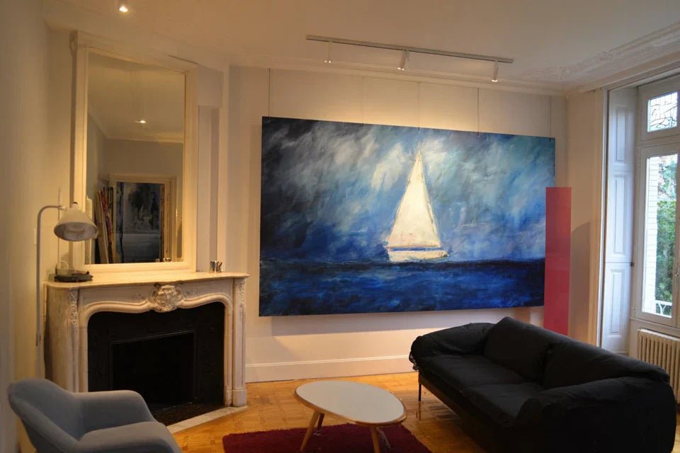
- Linear perspective: Roads, paths, corridors converging towards the horizon. Recognizable by lines that meet in the distance, it creates the strongest illusion of distance. Look for works where these lines start from the edges of the artwork towards the center-back. Guaranteed impact because your eye naturally follows these "visual rails" to infinity. Atmospheric perspective: Landscapes with multiple planes that fade into the background. The principle is: close elements are sharp and contrasting, those in the background become blurred and bluish. This technique mimics natural vision and perfectly fools the brain about the actual distance represented. Architectural perspective: Interiors with arcades, columns, or successive openings that create a tunnel depth. Particularly effective because it reproduces the familiar experience of traversing spaces and activates our unconscious spatial references.
- Marine perspective: Oceans, lakes, or expanses of water that blend into the horizon. Water naturally creates a sense of horizontal infinity which visually widens the space, particularly recommended for narrow rooms that need to "breathe" laterally.
The art of choosing according to your spatial configuration
🏠 Adapt the type to your specific needs
For long rooms: Choose a marine or atmospheric perspective that widens horizontally. Avoid overly marked linear perspectives which would accentuate the "corridor" effect by directing the gaze towards the end of the room.
⏱️ Time: Research 15 minutes | ✅ Successful when: The horizon of the painting seems to "break" the length of the room | ⚠️ Attention: Test the effect by holding the painting against the wall before purchase
For square and small rooms: Opt for a strong linear perspective that creates a "visual escape" to the background. The goal is to give the impression that you can "enter" the painting and traverse the distance represented.
⏱️ Time: Comparison 20 minutes | ✅ Successful when: You feel like "walking" into the painting | ⚠️ Attention: Check that the vanishing lines start from the corners of the frame
For low ceilings: Prioritize architectural perspectives with marked verticals (columns, trees) that give an impression of height. These vertical elements "pull" visually the ceiling upwards and compensate for the feeling of being crushed.
⏱️ Time: Analysis 10 minutes | ✅ Successful when: The painting seems to "draw" your gaze upwards | ⚠️ Attention: Avoid perspectives that are only horizontal which would reinforce the low ceiling effect
🎯 Step 2 Validation: Your chosen perspective type should visually compensate for the defects of your room (widen if narrow, deepen if square, raise if low). Test by closing your eyes and visualizing the effect: do you feel an "opening" in the desired direction? If so, you have found your magic perspective!
Step 3: Adjust proportions for perfect harmony
Here is the mastery step that transforms a good choice into a spectacular success. You will refine the dimensions and precise location to create this perfect harmony which makes the difference between "pretty" and "stunning". The final result you will be proud of: a transformed space that impresses and recharges you every day.
📏 The proportion rules that change everything
- The 2/3 wall rule: Your artwork should cover approximately 60-75% of the width of the chosen wall. Smaller, it appears "lost" and emphasizes the size of the wall. This proportion creates the illusion that the wall "disappears" behind the work, visually enlarging the space.
- Strategic height: Place the center of the artwork 1.60m (5ft 3in) from the floor (standard eye-level height). This position optimizes perspective as it aligns the horizon line of the artwork with your natural gaze, reinforcing the illusion of spatial continuity.
- The framing effect: Leave an equivalent space on each side of the artwork (if the artwork is 120cm/47in wide on an 180cm/71in wall, you have 30cm/12in on each side). This symmetry rests the eye and avoids the "stuck in a corner" effect that reduces visual impact.
🎨 Precise placement for maximum effect
The "false frame" technique: Cut out a piece of cardboard to the exact dimensions of your future artwork and temporarily attach it to the wall with masking tape. This simulation allows you to validate the effect before purchase and adjust the position for optimal impact.
⏱️ Time: 30 minutes | ✅ Success when: You feel the enlargement even with the cardboard | ⚠️ Attention: Test at different times of the day to validate with all lighting
Adjustment by elimination: Move your simulation 10cm (4in) in each direction and observe which placement creates the strongest sense of space. Sometimes, being 5cm (2in) higher or more to the right completely transforms the perspective effect.
⏱️ Time: 15 minutes | ✅ Success when: One position stands out noticeably from the others | ⚠️ Attention: Mark the winning position with pencil before removing the cardboard
Validation by the "recoil test": Step back to the entrance of the room and observe whether the placement creates that feeling of openness from the main viewpoint. This is the position your guests will see, and it should create an immediate "wow" impact.
⏱️ Time: 5 minutes | ✅ Success when: The enlargement effect is perceptible from the entrance | ⚠️ Attention: If the effect doesn't work from the entrance, go back to step 1
🏆 Final validation of the method: Your simulation should create an immediate feeling of openness, be visible and harmonious from the entrance, and make you want to contemplate this "enlarged" space. If these three criteria are met, you are ready for purchase. Your spatial transformation is now mastered!
The expert's progression rule: You can move on to purchasing when your cardboard simulation already creates 70% of the hoped-for enlargement effect. The real artwork, with its colors and perspective, will amplify this effect. Patience in choosing, speed in action once the decision is made!
You now master the basics, let's move on to expert subtleties that transform a nice effect into a true decorative masterpiece. These details make the difference between those who "decorate" and those who sculpt space with recognized expertise.
Professional decorator’s secret: Choose a painting whose painted light comes from the same direction as your natural lighting. This luminous coherence completely fools the brain and reinforces the illusion that the painting is a real opening to the outside. An infallible technique tested in the most beautiful Parisian interiors!
But what if I change my decor later?
I'm afraid that a large perspective painting will limit my options for evolving my decor...
Your concern is legitimate, but rest assured: a quality perspective painting adapts to all styles like an architectural element. Imagine a beautiful window with a view of a landscape: it enhances both a modern and classic interior, contemporary and bohemian. The secret? Perspective transcends trends because it responds to a fundamental human need: visual escape. You will even discover that your future decor changes will naturally organize around this "window" which has become the focal point of your space.
Reassuring tip: Before purchasing, photograph your room with the cardboard simulation from several angles. These photos will confirm that the enlarging effect works independently of the surrounding decor style.
The 5 mistakes that ruin the enlarging effect
Now that you know the right method, let's protect your investment by avoiding common pitfalls that cancel out all your efforts. These mistakes are tempting because they seem logical, but they sabotage the sense of space you are trying to create.
- Choosing several small paintings "to avoid overloading": This excessive caution fragments the gaze and prevents the creation of a unified perspective. Your eye flits without ever "entering" a depth. The real solution? A single large painting that imposes its perspective. Very common mistake because it seems safer financially.
- Placing the painting too high "so that it is well visible": Above 1.70m, you break the visual continuity between your gaze and the painted horizon. The illusion of spatial extension no longer works. Consequence: the painting becomes decorative but loses its enlarging power. Always hang at eye level.
- Choosing a perspective that goes in the same direction as the room: In a hallway, a linear perspective in the direction of the length accentuates the tunnel effect instead of correcting it. For a narrow room, prioritize horizontal perspectives that break this feeling of narrowness. Think compensation, not amplification.
- 🚫 Avoid frames that are too thick or gold: The frame then becomes more visible than the perspective itself, cutting off the illusion of spatial continuity. Your eye focuses on the border instead of "diving" into the depth. Opt for discreet frames that "disappear" visually.
- 🚫 Illuminating the painting with a direct spotlight: Frontal artificial lighting creates reflections that recall that it is a flat surface, destroying the illusion of depth. Prefer ambient lighting that respects the natural light of the painted perspective.
🔍 Quick verification system: Before making the final purchase, check these 4 points: Does the painting cover at least 60% of the wall? Does its perspective compensate for imperfections in your room? Is the center at eye level? Does natural light come from the same direction as in the work? Warning signs: if you are still hesitating after simulation, if your loved ones think it's "too big", or if you are already thinking about the "other little things" to add around.
🎁 Special offer for readers
Because you took the time to inform yourself, enjoy 10% discount on your first order:
⏰ Valid 72h after reading • Applicable to all our products
Frequently asked questions about enlargement paintings
For a 120x80cm painting that truly transforms the space, count between €150 and €400 depending on the quality of printing and support. The optimization? Prioritize size over technique: a large well-chosen painting at €200 will have more impact than a small luxury painting at €500. Concrete example: Sarah transformed her 25m² living room with a 140x90cm painting for €280, immediate and lasting result.
Not at all! For paintings up to 5kg (most canvas prints), two suitable wall plugs are sufficient. Simple technique: first trace with a pencil, drill with a bit adapted to your wall (concrete/plasterboard), insert the plugs, screw. Actual time: maximum 20 minutes. Rassuring tip: start by testing with your cardboard simulation to validate the location before drilling.
Choose a perspective neutral in terms of style but strong in depth: natural landscapes, timeless architectures, or classic seascapes. These subjects transcend trends because they respond to universal emotions. Avoid works that are too characteristic of a particular era (pop art, very marked street art) and favor the timeless. Golden rule: if the perspective transports you elsewhere, it will work whatever your future decorative style.
Use the digital simulation technique: download the painting image, print it in A4 format, and stick it to your simulation board. This method reveals whether the perspective works in your specific space. Complement: take a photo of your wall with the simulation and send it to the seller for validation. The specialists can confirm that your choice will create the desired enlargement effect.
Your new relationship with space in 30 days
In a month, you'll look at your room transformed with this deep satisfaction of rediscovered space. No more oppression, no more feeling of confinement: your gaze now finds that escape to infinity which frees your breath and your daily well-being. Your guests will immediately notice this new amplitude without exactly understanding where it comes from, and you will discreetly savor your mastery of spatial illusion.
This transformation goes beyond simple decoration: you have developed a fine understanding of spatial perception that will serve you for all your future layout projects. No more suffering your space, you now know how to sculpt it according to your needs and desires. This new confidence will radiate on your general well-being and creativity in all areas.
The hardest part was understanding the mechanisms, now you have the method. Your first step? Identify that focal wall waiting for its transformation. Then let yourself be guided by this new way of seeing space: your home has never been so close to your dreams of amplitude.
🌟 Your moment has arrived: You now have all the keys to transform spatial oppression into a feeling of freedom. This knowledge belongs to you, all that remains is to take action to see your space finally reveal itself as you have always dreamed it: generous, breathable, and perfectly yours.


