

You've just acquired this stunning piece of modern art that excites you, but here's the thing: facing your wall, you hesitate for hours. Visible classic frame or a modern invisible invisible frame? This question obsesses you and prevents you from fully enjoying your purchase.
You already imagine the looks of your guests scrutinizing your choice. Will that gold frame look too busy? Does that invisible frame risk looking cheap? Will the artwork be sufficiently protected? Each option seems to have a trap.
You've probably already consulted dozens of decor sites, asked for advice from those around you, and compared prices. But opinions diverge, styles clash, and here you are more lost than before. It’s impossible to decide serenely.
Rest assured: this hesitation is not a lack of taste on your part. It simply reveals that no one has yet explained the real criteria for choosing. Because yes, there are specific rules for choosing between visible frame and invisible framing depending on the desired effect.
By the end of this article, you will know exactly what type of framing will enhance your modern artwork, based on your interior, your personality and the atmosphere you want. Never again paralyzing hesitation!
Why does this choice determine the entire ambiance of your room?
The framing of a modern artwork is like the framing of a photo: it completely directs the gaze and emotion. Choosing now avoids regretting in 6 months when you realize that your living room lacks character or, conversely, that it's
The frame doesn't decorate the artwork, it reveals its potential: Like lighting that transforms a rough diamond into a sparkling jewel, the right choice of frame can take your interior from "pretty" to "extraordinary" in less than a week.
Finally understand why you hesitate so much
You surely recognize yourself in these situations: you change your mind every week between the two options, you fear the judgment of others on your choice, or you constantly postpone hanging it for fear of making a mistake.
This paralysis doesn't come from a lack of taste, but from confusion between personal style and imposed trends. You have been conditioned to believe that there were absolute rules, when everything depends on the emotional effect sought.
It’s like trying to choose between a sports car and an SUV without knowing if you're going to the city or the mountains. Impossible to choose well without knowing the context!
🔍 First hidden cause: confusion between "modern" and "minimalist"
Contrary to popular belief, modern art doesn't necessarily mean invisible framing. This confusion comes from decor magazines that always show the same aseptic interiors.
Imagine a chef who only serves white dishes on white plates: technically perfect, but where is the personality? Your interior deserves more character.
This belief deprives you of creative solutions and locks you into choices that don't reflect you. The result: you end up with an "Instagram-friendly" but cold living room, where you don’t feel at home.
🧪 2-minute express test: Look at your artwork while alternately hiding its edges with your hands, then framing them with your fingers. Observe how your perception changes instantly. This is proof that the frame influences your emotion more than the artwork itself!
Many think that an apparent frame makes something “traditional” and that an invisible framing automatically makes it “trendy”. In reality, it's the harmony with your space and your personality that creates elegance.
It’s like wearing a custom-made suit versus a branded suit: it's not the price or the trend that counts, but the perfect fit to your morphology and style.
This fear prevents you from missing bold but successful combinations, such as an elegant modern frame that can sublimate a contemporary artwork better than a standard invisible framing.
💡 Third hidden cause: forgetting the emotional impact
No one has ever told you that the frame should first make you feel something. We focus on aesthetics while forgetting emotion, when it is what transforms a decoration into a personal universe.
You can easily verify this: observe your reaction to the same artwork in different types of framing. Does your pulse quicken? Do you feel pride? Serenity? These signals never lie.
Ignoring this emotional dimension explains why some interiors, though technically successful, lack soul and tell no personal story.
🎪 The 3 signals that don't lie:
- You avoid looking at the artwork as you walk past: The frame creates a visual dissonance that disrupts your subconscious well-being
- Your guests never positively comment: The overall effect lacks emotional impact, a sign of a poor framing choice
- You regularly consider moving the artwork: The problem isn't the location but the mismatch between the frame and the desired atmosphere
⚡ The trigger element: the sought-after sense of presence
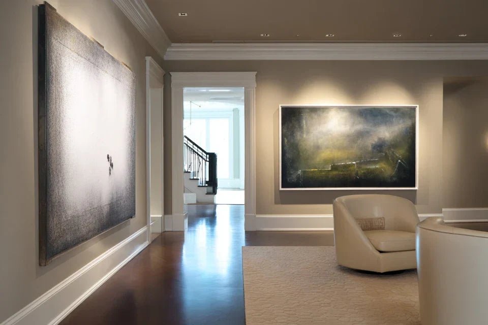
The real criterion for choice is the intensity of presence you want to give to the artwork. Like a spotlight that can illuminate gently or create a dramatic focus, the frame modulates the impact force of your art. An invisible frame integrates the artwork into the space, while an apparent frame detaches it to highlight it.
The golden rule of modern framing: Choose according to the emotion you want, not according to fashion. Test your visceral feeling by visualizing each option in your space. Your first intuition is often the right one.
| ❌ Persistent misconception | ✅ Reality of professionals | 💡 Why this difference | 🎯 Benefit for you |
|---|---|---|---|
| Modern = necessarily without a visible frame | Modern = harmony with the space and the artwork | Magazines show only one standardized aesthetic | Creative freedom and real personalization |
| Frames always cost a lot of money | The impact depends on the choice, not the price | Confusion between luxury brand and visual effect | Controlled budget and professional result |
| A committed choice for years | It is easy to evolve the frame | Lack of knowledge of modern modular solutions | Freedom to experiment without risk |
| You have to match everything in the room | Controlled contrasts create character | Fear of risk and lack of confidence | Unique interior and affirmed personality |
The foolproof method for choosing your frame
No more endless hesitations! This 3-step approach guides you to the perfect choice by analyzing your space, your artwork and your personality. It's like following a recipe: each ingredient has its place, and the final result will look just like you. You will feel a new clarity about your preferences from the first step.
🗺️ Your personalized roadmap: Analysis of the space (understanding your context), evaluation of the artwork (determining its needs), then emotional test (validating your choice). Each step reveals a key aspect, and in the end you will have absolute certainty.
🏠 Step 1: Decipher your space (the foundation)
Start by analyzing your environment to avoid choosing a frame that is not suitable for your reality. It's like building a house: you first study the land. This step will immediately give you a feeling of control and understanding of your actual constraints.
🔧 What you need for this analysis
- A measuring tape: To measure distances between furniture and ceiling height. Choose a metal model of at least 5m (16ft). Avoid fabric tapes that deform and distort proportions important for visual balance.
- Your phone's camera app: It allows you to objectively frame your space without distortion related to your usual perception. Use the "grid" mode to analyze guidelines. It’s more reliable than your eye, accustomed to your interior.
- A notebook and a pencil: To note your observations so you don't forget them. Digital tools lose important nuances. Choose a notebook with blank pages so you can draw a schematic diagram. The impact on memorizing your criteria is decisive.
Now, let’s move to concrete action
🎯 How to proceed step by step
Photograph your wall from 3 different angles: Front, slightly to the right, slightly to the left. This technique reveals the play of light and shadow that your eye no longer notices. Also vary the shooting heights because this is how your guests will discover the space.
⏱️ Time: 5 minutes | ✅ Successful when: You see your space "with new eyes" in the photos | ⚠️ Attention: Don't take the photos at your usual height, as this reproduces your biased vision
Measure the “breathing room” around the location: Distance to the nearest furniture, available height, free width. An invisible frame requires more empty space to create its floating effect, while an exposed frame can structure a more cluttered space.
⏱️ Time: 3 minutes | ✅ Successful when: You have noted 3 precise measurements in centimeters | ⚠️ Attention: Consider seasonal variations (Christmas decorations, plants that grow)
Identify light sources and their impact: Note the hours when natural light hits the wall, the location of artificial lighting. The frame interacts with light: a shiny frame can create annoying reflections, an invisible frame may lack definition in low light.
⏱️ Time: 10 minutes (observation over half a day) | ✅ Successful when: You know when your wall is best lit | ⚠️ Attention: Cool white LED lighting can dull certain types of frames
✅ Validation of this first step: You must be able to describe your space in 3 words (e.g., "bright, clean, spacious" or "cozy, loaded, subdued"). If it's blurry, review the observation. In case of doubt, ask someone close to you to describe your room; it reveals objective perception.
OUR RECOMMENDED PRODUCTS
🎨 Step 2: Analyze your artwork's needs (the adapter)
Now that you know your environment, you need to understand what your artwork requires to fully express itself. Some creations need to be "contained" by a frame, while others need to "escape" with an invisible frame. This step creates the trigger: you will intuitively feel what suits your room.
🔍 Artwork analysis tools
- Mobile lighting (flashlight or spotlight): To test different light intensities on the artwork. Reveals details that require a frame to be highlighted, or conversely the overall strength that can accommodate an invisible frame. Avoid fixed lighting which does not allow you to experiment.
- White A4 sheets: To temporarily create different types of framing and visualize the effect. More accessible and flexible than rigid frames. The neutral white does not bias your perception of the artwork's colors.
- Physical distance: Allow yourself to be at least 3 meters away from the artwork. This distance reveals the overall impact that the frame will have on the balance of your room, beyond the close aesthetic detail.
🎭 Reveal your artwork's personality
"Paper framing" test: Position 4 white sheets around your artwork to simulate a wide frame, then bring them closer for a thin frame. Observe how the emotional impact changes. A strong work can support a marked frame, a subtle work risks being stifled.
⏱️ Time: 8 minutes | ✅ Successful when: You feel a clear preference for a width | ⚠️ Attention: Don't judge only from close up, step back to see the overall effect
Analysis of "critical edges": Examine whether the artwork has important elements that reach the edges (text, face, crucial detail). These elements often require the visual protection of an apparent frame. An invisible frame can "psychologically cut" these details.
⏱️ Time: 5 minutes | ✅ Successful when: You have identified the edges sensitive areas | ⚠️ Attention: Eyes on a portrait are particularly sensitive to "framing"
"Self-sufficiency" test: Temporarily place the artwork against the wall without any framing. If it "holds" the space visually and naturally attracts attention, it may accept an invisible frame. If it seems to get lost or lacks definition, it needs a structuring frame.
⏱️ Time: 3 minutes of observation | ✅ Successful when: Your first impression is clear and instinctive | ⚠️ Attention: Do not rationalize this step, rely on your immediate feeling
🎯 Step 2 checkpoint: You must be able to qualify your artwork as "self-sufficient" (capable of asserting itself = invisible frame possible) or "accompanied" (requiring visual support = frame recommended). If you are hesitant, it means that the work is on the limit: choose the solution that reassures you most.
This final step transforms your technical analysis into personal certainty. This is where you go from "correct" to "perfect for me". You will test your emotional reaction to the two options and discover which one gives you that little spark of pride and pleasure. The final result will provide you with lasting satisfaction each time you look at your artwork.
🌟 The "confirmed crush" method
Real-world simulation: Test each option for a minimum of 24 hours using simulation material (paper, repositionable adhesive). Live with each choice: eat meals in front of it, watch TV, receive friends. The perfect frame becomes invisible in use but continues to please you.
⏱️ Time: 2 days of observation | ✅ Successful when: One of the two tests is missed when you remove it | ⚠️ Attention: Resist the temptation to judge too quickly, let habit form
"Other people's gaze" test: Show each option discreetly to 2-3 trusted people without influencing their opinion. Note their spontaneous reactions. If they match your sensations, that’s a good sign. If they diverge completely, investigate why.
⏱️ Time: 15 minutes per person | ✅ Successful when: You get consistent feedback | ⚠️ Attention: Avoid people who tend to impose their tastes rather than analyze objectively
The rule of enlightened choice progression: Move on to the next step only when you have a clear preference at the previous step. If you are still hesitating after step 3, it means that the two options are equal for you: choose the one that costs you the least or the one that offers the most future flexibility.


