

You look at your new painting hanging on the wall and something feels off. Despite its beauty, it seems stifled, trapped in its frame like a bird in a cage. The artwork you chose for its strength and emotion suddenly appears banal, almost outdated.
The light no longer plays with the colors as it did in the gallery. Fine details disappear behind the glass which reflects your lighting fixtures. Your artistic investment is lost within an ensemble that resembles a dusty museum more than a modern and vibrant interior.
You followed all the "rules" though: matching frame, protective glass, perfect hanging. But these traditional solutions that everyone recommends create an invisible barrier between you and the art you love.
It's perfectly normal to feel this frustration! The problem doesn’t come from your taste or your painting, but from a decorative approach that dates back to an era where protecting was prioritized over revealing. Codes have changed, contemporary art has too.
By the end of this article, you will know exactly why frameless paintings radically transform the visual impact of your artworks and how this modern approach turns your interior into a true artistic showcase.
Why does your painting deserve more than just a frame?
Contemporary art demands a new approach as interiors evolve towards greater simplicity and authenticity. Imagine the effect of a sunset seen through a window versus the same landscape framed in a photo: the emotional experience is completely different. Every day of delay in this transition means missing the opportunity to create an interior that truly reflects you.
📸 Revelation in a Parisian gallery: Sarah, an interior designer, noticed that the most striking works in the Beaubourg exhibition were presented without frames. "It was as if the colors were finally breathing," she recounts. The red vibrated directly on the white wall, without the visual break created by a golden frame."
💬 Conversation with a decor expert
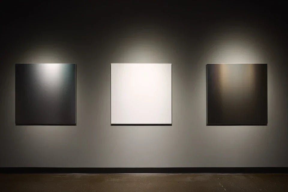
Borderless art creates direct emotion: Without the visual interruption of a frame, your gaze immediately plunges into the artwork as if into a parallel world. You will feel this difference from the first glance, in less than 30 seconds of observation.
Finally understand what's really happening in your decor
You enter your living room and your gaze catches on the frames before the art. You constantly adjust the lighting to avoid reflections on the glass. You hesitate to change anything in the room for fear that "it won't match". These signals reveal that your paintings have become decorative objects rather than sources of inspiration.
What is actually happening is an unconscious visual conflict between the emotion that art should convey and the physical barriers surrounding it. Your brain first processes the information "frame = finished object, delimited" before being able to access the artistic message.
It's like trying to appreciate a sunset while looking through bars: the beauty is there, but the experience is filtered.
The invisible tyranny of "that's how it's done"
Everyone tells you that a painting "should" have a frame, but this belief comes from an era when art was rare and fragile. Today, modern supports like dibond, acrylic or canvas prints are designed to be self-supporting and durable.
It's exactly as if you were still wearing a hat out of social obligation while no one goes around with their head bare out of necessity. Codes evolve, so does art.
This liberation from the frame transforms your relationship with art: no more impression of "applied decoration", place for the natural integration that makes your interior a true personalized showcase.
🔍 Immediate test: Take a photo of your current painting, then mask the frame with your fingers on the screen. Observe how the artwork suddenly seems to grow and breathe – that's exactly what your guests feel with a frameless painting.
The "dusty museum" effect that kills emotion
Gold frames and glass create an unconscious reverential distance that turns your living room into a mini-museum. Your art becomes something you "look at politely" rather than something that touches us daily.
Imagine the difference between admiring flowers in a vase on your table versus observing them behind the glass of a florist: emotional proximity changes everything.
This psychological barrier prevents you from creating this intimate connection with your artworks that makes us never tire of looking at them and that inspires us every day.
The "protection at all costs" trap
You protect your paintings like relics when art is meant to be lived, not venerated. This over-protection creates a decorative rigidity that prevents you from naturally evolving your interior.
It’s like keeping your finest dress in the wardrobe "for special occasions": the more you try to preserve it, the more you deprive yourself of what's essential .
As a result: you hesitate to move things around, change them, experiment. Your decor freezes while your personality continues to evolve .
🎯 3 signs that your frames are taking over:
- You clean the frame more often than you admire the artwork: The container has taken precedence over the content – like polishing the shop window instead of looking at the merchandise
- You calculate the placement based on the frame, not on the art: The accessory dictates the decor – the tail wags the dog
- Your guests first comment on "the beautiful frame": Attention is diverted – like noticing the packaging before the gift
The turning point: when art comes alive again
The realization happens when you understand that contemporary art doesn't need decorative crutches to exist. It’s like taking off your sunglasses indoors: suddenly the colors regain their true intensity. This awareness gives you the keys to create an interior where each artwork dialogues directly with your living space.
Golden rule of modern art: If you have to justify the presence of a decorative element, it's detracting from the whole. Test by mentally hiding the frame – if the artwork gains impact, you have your answer.
| ❌ Traditional vision | ✅ Modern approach | 💡 Why it changes everything | 🎯 Immediate benefit |
|---|---|---|---|
| "A painting must be protected by a frame” | Art on modern supports is self-sufficient | Materials evolve, codes too | Total freedom of placement and lighting |
| “The frame is part of the artwork” | Only the image should captivate the gaze | Emotion arises from direct contact, not mediated | Immediate and lasting visual impact |
| “You must match the frame to the style” | Art transcends decorative styles | A strong artwork adapts, doesn't suffer | Decor evolution without constraint |
| "The glass protects from UV rays and dust" | Modern prints are naturally resistant | Technology makes overprotection obsolete | Minimal maintenance, maximum pleasure |
The 3-step method to reveal the potential of your artworks
Rest assured, this transformation requires neither specific technical skills nor a large budget. It’s like learning to cook without a recipe: once the principles are understood, everything becomes fluid and natural. We will proceed step by step, each revealing a new facet of your artworks until you create that artistic interior you dreamed of without knowing it.
🗺️ Overview of your artistic transformation: First choose the right support that reveals your image (like selecting the right canvas for a painter), then master the hanging which makes the artwork dialogue with the space (like a lighting designer reveals a monument), finally create an overall harmony which unifies your interior (like a conductor balances the instruments).
Step 1: Select the support that releases your image
Starting with the choice of support is crucial because it determines the final impact of your frameless artwork. Like solid foundations for a house, this technical base conditions everything else. Once this step is mastered, you will immediately feel that sensation of "now that's it, that's what I wanted!"
🎨 Modern supports that change the game
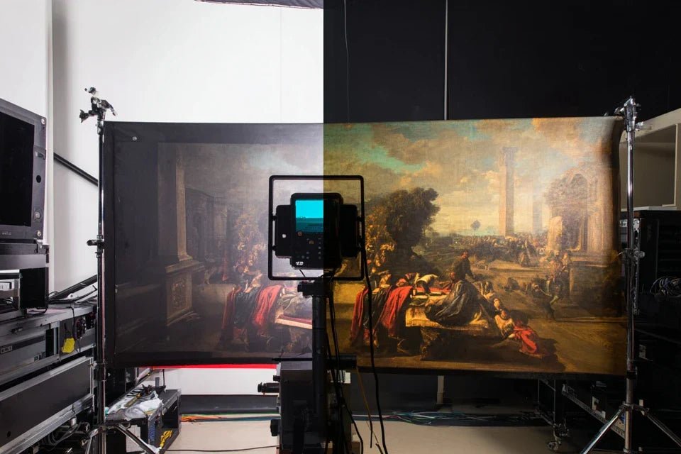
- Dibond (aluminum composite): Smooth and matte surface that absorbs light without reflection, just like a cinema screen. Available in specialty stores or online, check the thickness (minimum 3mm for rigidity). Avoid cheap PVC which yellows and deforms – investing in dibond is like choosing a good mattress: it lasts decades. Direct print on acrylic: Crystalline transparency that makes the colors of the interior vibrate, like a modern stained glass window. Recognizable by its uniform brilliance and perfect sharpness. This optical depth creates a striking relief effect that transforms your wall into an artistic window. Canvas mounted on thick frame: Authentic texture and warm physical presence, like having a real masterpiece at home. A minimum 4cm frame guarantees stability and avoids the "poster stuck to the wall" effect of formats that are too thin.
Now, let's get practical:
🔧 How to make the right choice with confidence
Analyze your source image: Carefully examine the fine details and contrasts of your visual. A very sharp photo with fine details will thrive on acrylic, while a work with pictorial textures will prefer canvas. It's like choosing the right instrument for a melody – each support reveals art differently.
⏱️ Time: 10 minutes | ✅ Success when: You can describe the dominant emotion in one word (dynamic = acrylic, intimate = canvas, contemporary = dibond) | ⚠️ Attention: Don't just rely on colors – it's the overall atmosphere that guides
Test the effect on your wall: Hold your printed image on paper against the intended wall, step back 3 meters and observe the interaction with ambient light. A very bright wall requires a matte support (dibond), a darker corner benefits from the brilliance of acrylic.
⏱️ Time: 5 minutes at different times of the day | ✅ Successful when: The "image" disappears into the wall rather than sticking out like a brought-in element | ⚠️ Attention: Evening lighting reveals better the final effect than harsh daylight
Validate optimal dimension: The rule of thirds: your unframed painting should cover about 2/3 of the width of the furniture it overlooks, or extend over 60-80cm for a bare wall. Larger unframed is always better than too small with frame.
⏱️ Time: 15 minutes with a meter | ✅ Successful when: The artwork "naturally occupies" the space without dominating or disappearing | ⚠️ Attention: We always underestimate the necessary size – dare 20% larger than your first idea
✨ Validation of step 1: Your chosen support must "become one" with your artistic intention – acrylic for brilliance, dibond for sobriety, canvas for authenticity. If you are still hesitating between two options, trust your first intuition and visualize which one you will enjoy seeing every morning. The next step will reveal all its magic!
OUR RECOMMENDED PRODUCTS
Step 2: Mastering the Hanging That Makes a Difference
You are now moving to the next level of artistic integration. Forget "makeshift" hanging with a nail hammered at random! This step reveals how your artwork dialogues with the architecture of your room. The effect is striking: your guests will no longer see "a painting on a wall" but "a coherent artistic interior".
🔨 Professional Hanging Hardware
- Discreet rail system: Invisible fixing that allows adjustments without drilling, like an art gallery system. Available from framing suppliers, prioritize anodized aluminum. Forget visible hooks that break the magic of floating art.
- Laser level or smartphone app: Millimeter precision for perfect alignment which makes all the credibility of a professional hanging. The eye unconsciously detects 2mm of misalignment – this rigor transforms the amateur into a connoisseur.
- Dowels adapted to the type of wall: Absolute stability that avoids the drama of the falling painting. Plasterboard = Molly dowel, concrete = struck dowel, brick = anchor screw. A secure support frees the mind to appreciate art serenely.
📐 The Millimeter-Perfect Hanging That Changes Everything
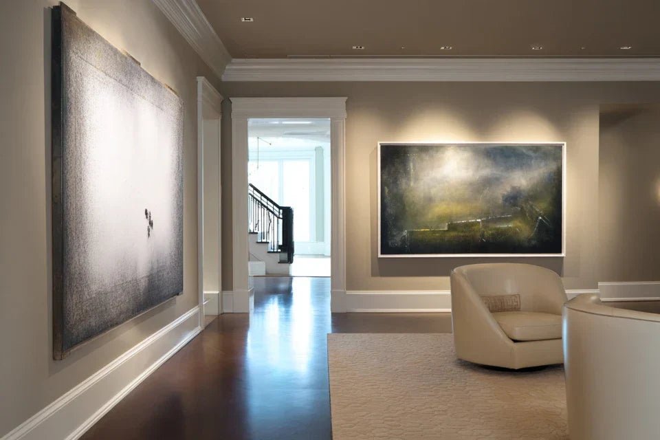
Calculate the ideal height: Center of the artwork at 1m50 from the floor (standard eye level height), adjusted to your height and room usage. In a dining room, lower it by 10cm as you view it while seated. This museum rule guarantees optimal visual comfort.
⏱️ Time: 20 minutes with precise measurements | ✅ Success when: Eye is naturally drawn without neck strain | ⚠️ Attention: Too high causes fatigue, too low diminishes – the first impression is always the right one
Create balance with volumes: Respect the "breathing space" of 15-20cm between the artwork and furniture. Your unframed painting should "float" in the space, not seem placed on a piece of furniture. This visual suspension creates modern lightness.
⏱️ Time: 15 minutes of adjustments | ✅ Success when: The whole appears naturally balanced | ⚠️ Attention: The eye unconsciously compensates – trust your first glance
Optimize revealing lighting: Avoid direct frontal lighting that creates reflections, favor ambient lighting that reveals without being harsh. An adjustable spotlight at 30° from the side enhances the reliefs of a Dibond, soft light facing acrylic makes colors vibrate.
⏱️ Time: 30 minutes of evening trials | ✅ Success when: The artwork "illuminates" naturally in its environment | ⚠️ Attention: Daylight masks imperfections – test absolutely under artificial light
🎯 Validation of step 2: Your painting should seem "born there", as if it had always been part of the architecture. Ultimate test: take a photo of the whole – if the artwork naturally attracts the eye without anything else disturbing, you've got it! Move to the final harmony.
Step 3: Create an overall harmony that defines your style
You are now reaching the level of decorative mastery that distinguishes a "decorated" interior from a "lived-in" interior. This final step reveals how your unframed artworks become the guiding thread of your decorative personality. The result? An interior where every element seems chosen by an interior architect, this unique signature that makes people feel instantly at home.
🎭 Elements of artistic coherence
- Dominant color palette: Visual red thread that connects your artworks without making them uniform, like a musical theme declined in variations. Identify 2-3 recurring tones in your artistic choices. This color signature subconsciously creates unity.
- Rhythm of formats and orientations: Visual breathing that avoids the monotony of a gallery wall. Alternate large vertical, medium horizontal, small square to create a decorative melody. Your eye naturally follows this artistic path.
- Decorative "silence" spaces: Voluntarily neutral zones that allow the art to breathe and the gaze to rest. A wall completely bare between two strong works, is like a musical pause that enhances the melody.
🎨 The final orchestration of your artistic interior
Establish the visual journey: Create an "artistic path" that naturally guides the eye from one work to another without forcing attention. The eye should be able to "wander" through your interior as in a well-designed garden, gradually discovering your tastes and your universe.
⏱️ Time: 45 minutes of stepping back and adjustments | ✅ Successful when: The gaze flows smoothly without "catching" on breaks | ⚠️ Attention: Too many works kill the effect – it's better to have 3 favorites than 10 average choices
Balance visual "weights": Distribute the impact of your works to avoid one side of the room "collapsing" visually. A large, strong work balances with two softer mediums, like balancing a mobile by Alexander Calder.
⏱️ Time: 30 minutes of moving around | ✅ Successful when: No area seems "empty" or "overloaded" | ⚠️ Attention: Balance is felt more than it is calculated – trust your instinct
Finalize architectural integration: Your framed artworks should "converse" with the lines of your interior – straight angles of furniture, curves of a staircase, verticality of windows. This architectural harmony is a sign of the mature decorative design of a thought-out interior.
⏱️ Time: 1 hour of contemplation and fine adjustments | ✅ Successful when: The whole seems "obvious", as if it could not be otherwise | ⚠️ Attention: Perfection comes in successive touches – don't force it, let it mature
🏆 Final validation of your transformation: Invite a friend and observe their spontaneous reaction. If the first words are "Wow, your place is beautiful!" rather than "I like your painting", you have succeeded. Your frameless art has created an artistic interior, not applied decoration!
Rule of decorative evolution: An artistic interior grows with you – you will know that it is time to add a work when a "creative void" naturally calls you. Patience and instinct are better than haste and over-decoration.
You now master the three pillars of frameless art that transform an ordinary interior into a personal artistic showcase. But a few expert subtleties can still amplify the impact of your choices and give you that decorative confidence that subtly impresses your guests.
💎 Gallery secret: The "collection" effect is born when your works share a common intention (emotion, era, technique) rather than identical style. Three black and white still life photographs create more impact than a heterogeneous assortment of colors. Unity in diversity is the signature of true collectors that makes people say "this person has taste".
🤔 "But my spouse prefers traditional frames..."
"How to convince someone who finds that without a frame, it looks unfinished?"
I perfectly understand this resistance – it's exactly what Marie-Claire felt when her husband found their living room "too modern" without frames. The trick? Start with a single work in a neutral space (hallway, office) where the impact is obvious without disrupting habits. When he saw how their Venice photograph finally "breathed" on dibond in the entrance, he asked to remove the gilded frame from the living room! Visual evidence convinces better than all arguments.
🎯 Diplomatic test: Suggest a 15-day trial period for a secondary work – visual habit does the rest. Guaranteed result: after a week, the old frame will seem "heavy" by contrast.
The 5 mistakes that ruin everything (and how to avoid them easily)
Attention, these traps are tempting and can nullify all your artistic modernization efforts. I share these errors not to worry you, but to save you the frustrations I have seen in so many well-intentioned clients.
- 🚫 Choosing a support that is too thin for economy: A 2mm dibond or canvas on a 2cm stretcher bar immediately gives a "cheap" appearance that discredits your artistic approach. It's like wearing a well-cut suit with worn shoes – the detail ruins the whole thing. Invest in thickness (3mm minimum for dibond, 4cm for stretcher bars) or temporarily forgo it – better to wait than regret.
- 🚫 Hanging too high "to protect": Placing the work at 1m80 from the floor under the pretext that it will be less touched transforms your art into ceiling decoration! Your guests will strain their necks looking up. Art should be at human height, not veneration – stay at a maximum of 1m50 in the center of the work.
- 🚫 Multiplying formats without logic: Mixing 15 different sizes thinking it will create dynamism has the opposite effect: visual chaos that fatigues the eye. It's like listening to 10 songs at once – your brain shuts down instead of appreciating. Limit yourself to a maximum of 3 formats per room, that is the golden rule of professional gallery owners.
- 🚫 Neglecting ambient lighting: Installing a spotlight that turns the artwork into an advertising panel breaks all the magic of natural integration. Art without a frame should seem to light up from within, not be "projected" onto the wall. Always prefer indirect lighting which reveals without assaulting – your work will gain mystery and elegance.
- 🚫 Copying a layout seen elsewhere: Reproducing exactly the hanging of a magazine or a friend totally ignores the specificity of your space and your personality. It's like wearing the exact same outfit as a model – it can’t work. Get inspired, yes, but always adapt to your context, your volumes, your lifestyle.
🛡️ Anti-disaster system in 4 checks: Before permanently fixing, take a photo from 3 meters away – it reveals the invisible imbalances seen up close. Test evening lighting – 80% of appreciation is done under artificial light. Ask for spontaneous external feedback – forced compliments are easily distinguished from sincere "wow". Allow yourself 48 hours to step back before validating – the enthusiasm of the moment can mask obvious flaws the next day.
🎁 Special reader offer
Because you took the time to inform yourself, enjoy 10% discount on your first order:
⏰ Valid for 72h after reading • Applicable to all our products
🔧 Your practical questions about frameless art
Realistic budget: €150-400 for a quality artwork in 60x40cm, depending on the support chosen (economical canvas vs premium acrylic). The visual impact is immediate upon hanging – your guests will notice it before you even say anything. To optimize: start with a strong piece that already transforms the atmosphere, then gradually add more. Better one perfect artwork than three average ones.
Absolutely, and it’s even lighter than with a frame! A Dibond print 60x40cm weighs 800g compared to 2-3kg for the frame+glass+system. Use appropriate Molly anchors (load capacity 20kg), distribute over 2 attachment points. Pro tip: attach an invisible horizontal batten behind the artwork which distributes the weight over 40cm of wall – perfect stability guaranteed.
Modern supports are more resistant than you might think! Dibond resists alteration for 50 years, acrylic doesn't yellow and can be cleaned with clear water. For dust: a quick wipe with a microfiber cloth every 3 months is enough, just like for a TV screen. Simply avoid direct sunlight (which faded even with frames) and excessive humidity (bathroom with shower). Your art will last longer without the constraints of a frame that deforms!
Excellent optimization question! If your current artwork has sentimental value, a professional photographer can reproduce it in high definition for €80-120, then print it on the support of your choice. For standard posters or prints: try delicate disassembly from the frame – 50% are recoverable if the fixing hasn't damaged the image. Otherwise, keep your favorites framed in private spaces (office, bedroom) and invest in new pieces for reception areas.
That’s exactly where the magic happens! Frameless art creates a bridge between tradition and modernity that avoids the “frozen museum” effect. A reproduction of an Impressionist master on Dibond in a Haussmannian living room? Stunning! The artwork dialogues with the architecture instead of competing with it. Simple test: your old mouldings and parquet floors will look more noble, not eclipsed. Contemporary art reveals heritage, it doesn't erase it.
🌟 Your artistic interior awaits you
In 3 weeks, you will enter your living room with the discreet pride of someone who has created something unique. Your frameless artworks will naturally dialogue with your architecture, your guests will spontaneously stop to admire, and you will feel that deep satisfaction of living in a true artistic showcase rather than an “everyone-decorated” interior.
This transformation goes beyond aesthetics: <strong>you have developed an artistic eye</strong> that now influences all your decorative choices</a>. Choosing a cushion, arranging a bouquet, arranging furniture – everything becomes more fluid because <strong>you have integrated the codes of visual harmony</strong>. This decorative confidence radiates in your way of welcoming and feeling at home.
The best part? <strong>You have just understood the best-kept secret of contemporary decoration</strong>. Now, take one last look at your current walls, imagine that first frameless artwork that will change everything, and <strong>take the plunge today</strong>. Your artistic future awaits you!
<strong>✨ Your moment of truth:</strong> <strong>Frameless art doesn't wait for permission, it reveals your personality</strong>. You have all the elements to succeed – <strong>now it’s up to you to play and create an interior that truly resembles you</strong>!


