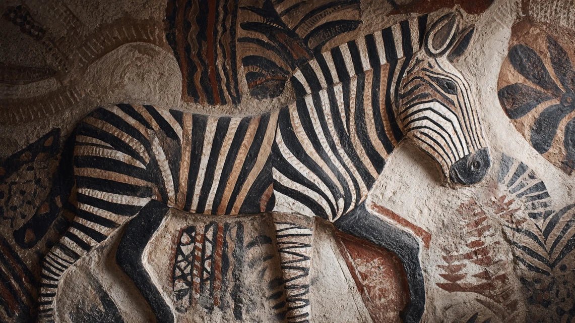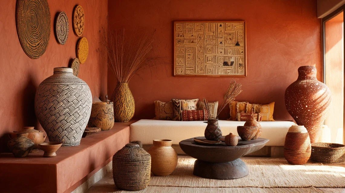
The first time I stepped onto the soil of Namibia’s Kaokoland, I understood that these warm hues blanketing the horizon were more than just a geological palette. These shades of ochre and burnt sienna told a millennial story, that of a fusion relationship between African man and his nourishing land. In the Himba villages, I observed how these colors transcended simple aesthetics to become a spiritual language, a bridge between ancestors and the living.
Here’s what ochre and burnt sienna bring to African decor: a deep connection with mother earth, a tribute to ancestral traditions, and an emotional warmth that instantly transforms the atmosphere of an interior. These shades don't just decorate, they tell stories, they envelop, they ground.
Perhaps you are looking to infuse your interior with an authentic soul without falling into caricatural folklore? You feel this magnetic attraction for African aesthetics but fear the 'ethnographic museum' side? I perfectly understand. After fifteen years of traveling across the African continent as an ethnologist specializing in traditional arts, I have deciphered the symbolic codes that give these colors their transformative power. Let me reveal to you how ochre and burnt sienna can transform your space into a warm sanctuary, full of meaning and contemporary elegance.
Red earth: when color becomes sacred ritual
In African cosmology, red ochre is never just a decorative pigment. Among the Himba people of Namibia, otjize - this mixture of ochre, butter and resins - represents the spiritual connection with ancestors. This tradition, centuries old, goes far beyond mere coquetry: it visually manifests belonging to the community and spiritual protection.
I spent three months immersed in a Dogon village in Mali, where every wall plastered with burnt sienna told a precise cosmological hierarchy. The darkest shades adorned the sacred granaries, while the lighter nuances dressed the daily living spaces. This chromatic gradation was never random: it literally mapped proximity to the divine.
The universal symbolism of earth pigments
Ochre colors universally symbolize the nourishing earth in African cultures. From the Sahel to the Ethiopian highlands, this shade embodies fertility, stability and generational continuity. In contemporary African decor, these values translate into a feeling of emotional grounding that few other palettes manage to create.
The Akan artisans of Ghana taught me that Sienna earth also represented accumulated wisdom. The deeper the pigment, the more it evokes experience and respect for elders. Integrating these nuances into your interior is symbolically inviting this millennial wisdom between your walls.
From natural pigment to spatial emotion: the magic of color
The fascinating particularity of ochre and Sienna earth lies in their ability to modify our thermal perception of a space. These warm tones unconsciously activate our primitive memory of home, the protective campfire, the secure cave. In African decor, this psychological dimension is never neglected.
During a renovation project of a colonial house in Zanzibar, I observed how applying a Sienna earth wash on coral walls radically transformed the atmosphere. The perceived temperature decreased by several degrees, while the atmosphere gained intimacy. This apparent paradox - a warm color that cools the space - perfectly illustrates the intuitive sophistication of the traditional African palette.
Modulating Saharan light
Berber architects have mastered the art of modulating the aggressive light of the Sahara for centuries thanks to ochre colors. These tones absorb excess brightness during the day while returning a soft warmth at dusk. This chromatic intelligence translates wonderfully into our urban interiors, which are overexposed to artificial lighting.
I experimented with this technique in a Parisian loft with large bay windows. By introducing ochre textiles and Sienna earth objects, we managed to naturally filter the aggressiveness of the light without sacrificing brightness. The space gained visual comfort and serenity.

Discover this inspiring artwork
The subtle nuances that make all the difference
Contrary to the preconceived notion of a monochrome palette, the range of ochre and Sienna earth in African decor displays an unsuspected richness. From Ethiopian saffron yellow to Masai deep red, each shade carries its own symbolic and emotional charge.
The Bamana dyers of Mali initiated me into their color classification system based on six variations of ochre, each associated with a moment in the solar and agricultural cycle. Yellow ochre evokes sowing and hope, while intense red terra di Siena celebrates harvest and abundance. Mastering these subtleties allows you to compose narrative interiors, where each room tells a different chapter.
Compose your personal palette
To authentically integrate these colors into your decor, think layering rather than uniformity. Ashanti master decorators proceed by successive layers of pigments, creating a vibrant depth impossible to achieve with industrial monochrome paint.
Start by identifying your dominant terra di Siena - the one that resonates with your desired emotional state. Then weave around it tonal variations: lighter ochres for bright spots, darker shades for visual rest areas. This organic approach reproduces the chromatic diversity of natural African landscapes.
Beyond aesthetics: the psychological impact of earthy tones
Contemporary neuroscience confirms what African cultures have intuitively practiced for millennia: ochre and terra di Siena colors activate brain areas associated with safety, belonging and well-being. These shades measurably reduce cortisol levels, the stress hormone.
In a meditation center I advised in Senegal, the exclusive use of ochre and terra di Siena reduced by 40% the time it took participants to reach a deep meditative state. This performance is explained by the resonance between these colors and our ancestral evolutionary programming.
Create an authentic emotional cocoon
In contemporary African decor, these earthy pigments allow you to create what I call 'emotional decompression zones'. Unlike saturated colors that stimulate, ochre and terra di Siena soothe without putting to sleep. They maintain a serene vigilance, an ideal state for creativity and interpersonal connection.
I applied this principle in my own home: my office bathed in golden ochre promotes concentration, while my living room dressed in deep terra di Siena invites authentic conversations. Guests consistently notice that they feel 'strangely at home', this instant familiarity provided by universal chromatic archetypes.

Discover this inspiring artwork
Integrate these sacred colors into your daily life
The common mistake is to overload the space with explicit African references. True elegance lies in subtle suggestion. A wall accent in burnt sienna, a few judiciously placed ochre textiles, an artisanal ceramic with earthy glazes are enough to radically transform the atmosphere.
During my interior design consultations, I recommend the 60-30-10 rule adapted to the African palette: 60% neutral natural tones (linen, ecru cotton), 30% of your dominant ochre or burnt sienna color, and 10% contrasting accents (indigo, dark black). This proportion reproduces the visual balance of traditional villages where earthy architecture dialogues with the sky and vegetation.
The materials that enhance these hues
Ochre and burnt sienna colors reveal their full potential when they are embodied in noble and tactile materials. Raw linen, fired clay, charred wood, felted wool: these supports amplify the sensory dimension of the African palette.
I discovered in Burkina Faso that Mossi weavers incorporate ochre threads into their compositions to create subtle visual vibrations. This 'light thread' technique can wonderfully adapt to our interiors via cushions, throws or rugs that capture and diffuse natural light.
Ready to invite African warmth into your interior?
Discover our exclusive collection of African paintings that authentically capture these ochre and burnt sienna nuances, true concentrates of energy and ancestral symbolism.
Conclusion: live with color rather than endure it
The ochre and terra di Siena colors in African decor go far beyond a simple aesthetic trend. They embody a philosophy of living where the domestic space becomes an extension of nature and a spiritual sanctuary. By consciously integrating them, you are not just decorating your walls: you are creating a vibrational environment that nourishes your emotional balance every day.
Start simply. Observe how natural light evolves in your main space. Identify the time of day when you feel best there. Then choose the shade of ochre or terra di Siena that corresponds to this quality of light. Let this color dialogue with your intuition before permanently installing it. You will know it is right when it gives you that feeling of 'coming home' even when you have never left.
FAQ : Your questions about ochre and terra di Siena colors in African decor
Won't these colors darken my interior which is already not very bright?
This is a legitimate but unfounded concern! Contrary to popular belief, ochre and terra di Siena colors have remarkable intrinsic brightness. Their pigment composition reflects light rather than absorbing it brutally as saturated colors would. In traditional Moroccan riads, these shades are actually used to maximize the diffusion of natural light in spaces with reduced openings. The trick is to choose nuances with warm undertones rather than grayish ones, and to combine them with reflective surfaces (mirrors, glazed ceramics) that multiply their luminous power. A golden ochre wall even captures the faint light from a north-facing window and returns it as ambient warmth. Also prefer matte or satin finishes over glossy ones, which create an inviting depth without visually weighing down the space.
How to avoid the 'too much' effect or ethnic disguise?
The key lies in sophistication through restraint. In authentic African decor, these colors are never flaunted like a folk costume but organically integrated into the architecture. My guiding principle: if the African origin is the first thing you notice, it's failed. The goal is to create a universally warm atmosphere whose African inspiration constitutes a discreet soul rather than a showy costume. Specifically, limit explicit references (masks, figurines) to two or three museum-quality masterpieces. For ocher and terra di Siena colors, prioritize their presence on architectural elements (walls, floors) rather than on accumulated accessories. Combine them with a clean contemporary base: furniture with simple lines, raw materials, uncluttered spaces. This minimalist approach allows the earthy tones to breathe and reveal their natural sophistication without falling into decorative overload.
What colors to combine harmoniously with ocher and terra di Siena?
The traditional African palette offers masterful lessons in color combinations. Ocher and terra di Siena colors flourish beautifully alongside off-whites and creams (never pure white too harsh), which create essential visual breaths. Deep black or ebony brown, used sparingly, structures the space and makes the earthy tones vibrate. For touches of contrast, draw from the African plant palette: the olive green of acacias, the indigo blue of Touareg fabrics, the terracotta of pottery. Avoid pure cold colors (steel gray, glacier blue) which would conflict with the fundamental warmth of ocher. My favorite association, observed in Kuba textiles from Congo: terra di Siena dominant, touches of bright ochre yellow, accents of graphic black and cream base. This combination creates a timeless sophistication that transcends trends while respecting the symbolic African heritage.