What artwork for a very sunny room: avoid reflections and fading
By Alexandre MARY
⏱️ Reading time: 8 minutes
You've just hung your new favorite artwork in your sun-drenched living room, and already you dread the worst: those blinding reflections that turn your work of art into an unusable mirror, and this nagging anxiety that the colors will gradually fade under UV rays.
Every ray of sunshine streaming through your large bay windows becomes a silent enemy. You can no longer admire your painting in the afternoon, forced to close the curtains or avert your gaze from these dazzling reflections that completely distort the artwork.
You may have already tried to change the location, tested different hanging angles, or even invested in additional lighting. But nothing works: either the reflections persist, or you still fear this gradual discoloration that will ruin your investment.
Rest assured, it's neither your fault nor the artwork’s. The problem simply comes from the fact that no one has explained to you the technical specifics of materials and supports suitable for very bright rooms.
By the end of this article, you will know exactly which types of paintings to choose, which materials to prioritize, and how to position them to transform this abundant natural light into a true decorative asset, without compromising on the beauty of your artworks.
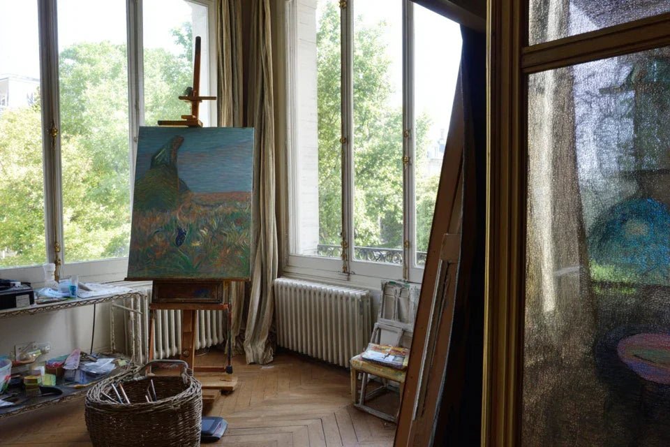
Why natural light can become the enemy of your paintings?
In a very sunny room, every minute counts. UV rays attack pigments from the first hours of exposure, and reflections can make your painting totally invisible at times when you enjoy it most. It's like having a television with a mirrored screen: technically perfect, but unusable when you need it.
📖 Customer testimonial: "My Van Gogh reproduction purchased for €300 had completely lost its vibrant yellows in just 6 months. Exposed to the south side of my living room, it now looked like a sepia photograph. I realized that specific materials were needed to preserve the intensity of colors."
💬 Conversation with a decor expert
"I'm afraid my new painting won’t withstand this direct sunlight..."
Excellent intuition! But it's not a fatality. With the right printing techniques and UV protection supports, your painting can even be enhanced by this natural light!
"But I was told to avoid sunlight on artworks..."
That's true for traditional techniques. But modern canvas prints and UV varnishes are revolutionizing the game. It’s the difference between a newspaper photo and a professional print!
The golden rule for sunlit rooms: It's not the amount of light that’s a problem, but the quality of the materials chosen and their specific resistance to UV rays. In just 2 weeks, you can already see the difference with a poorly protected artwork.
What really happens when your artwork “suffers” in the sun
Do you recognize yourself? Those annoying reflections that appear in the afternoon, that feeling that the colors already seem less vibrant after a few weeks, or even the frustration of having to close the curtains to finally admire your work correctly.
What happens is a double physical phenomenon: UV rays degrade the molecular bonds of pigments (like jeans fading in the wash), while the glossy surface reflects light directly into your eyes. The problem isn't your aesthetic choice, but the technical inadequacy of the materials.
Imagine wearing sunglasses backward: instead of protecting you, they concentrate the light. That’s exactly what happens with a glossy varnish facing the sun.
🔍 The true cause of dazzling reflections
Contrary to what one might think, it's not the colors that create reflections, but the surface texture of the artwork. A glossy varnish acts like a perfect mirror, reflecting 90% of the incident light.
It’s like the difference between looking into a calm lake (perfect reflection) and a choppy river (no reflection). The matte texture breaks this direct reflection by dispersing light in all directions.
You can no longer admire your artwork during the most pleasant times of the day, and your decorative investment loses all its emotional impact. You even unconsciously develop a habit of avoiding looking in that direction.
🧪 Quick test: Place a matte sheet of paper and a plasticized sheet side by side under a lamp. Observe the difference in reflection: it’s exactly what distinguishes a good artwork for a sunlit room from a standard artwork!
⚗️ The secret mechanism of UV fading
The fading isn't noticeable at first: it settles insidiously, color by color. Reds and yellows go first (6 months), then blues (1 year), leaving a dull and faded appearance.
It’s like a fire slowly consuming a book: you don't see anything in the first few minutes, but suddenly there’s nothing left but ashes. The chemical bonds of the pigments break one by one under the action of UV rays, irreversibly.
This gradual degradation sabotages the harmony of your interior decoration and turns your artistic crush into a source of daily frustration. You begin to regret your purchase instead of being proud of it.
🎯 The positioning error that amplifies everything
Many people place their artwork facing the window thinking “to illuminate it well”. That’s exactly the opposite you should do: this position turns your work into a dazzling billboard.
Ideally, you want lateral or angled lighting, like in museums. You benefit from natural light without the direct drawbacks. It's the difference between looking at the sun directly and enjoying its soft light.
This poor positioning deprives you of the daily pleasure of contemplating your artwork and creates a negative association between natural light and visual discomfort.
🚨 3 warning signs to watch out for :
Variable reflections depending on the time : If your artwork becomes "invisible" at certain times, it means the surface is too bright for that location
Squinting to look : Your eye is telling you something's wrong - listen to this immediate discomfort signal
Unconscious avoidance of looking : If you no longer naturally look at your artwork, there’s a technical issue to resolve
💡 The game-changing trigger
The deciding factor is the surface + UV protection combination. Like sunscreen that protects your skin while letting vitamin D through, the right materials preserve colors while revealing their beauty.
Your room is sunnier, the more critical this duo becomes. Easily identify it : a good artwork for a bright room should never dazzle you, even in direct midday sunlight.
The 3-second rule : If you can't comfortably look at your artwork for 3 continuous seconds under direct light, the materials are not suitable for your space.
❌ Misconception
✅ Technical reality
💡 Why it works
🎯 Concrete benefit
The brighter, the more beautiful
A semi-matte surface reveals nuances better
Soft diffusion without light concentration
Perfect vision at any time of day
Facing the window to "brighten" it up
Lateral or angled position is optimal
Natural light without direct reflections
Visual comfort and permanent enhancement
All artworks are the same
UV protection essential in a sunny room
Specialized varnishes and technical supports
Colors intact for decades
Close the curtains to protect
Choose the right materials from the start
Intrinsic compatibility with light
Fully enjoy natural brightness
The 3-step method for choosing the perfect artwork
Now that you understand the mechanisms, let's move on to the concrete solution. This method follows a simple logic: first secure (protection), then optimize (materials), finally sublimate (positioning).
Like building a house: solid foundations, adapted structure, perfect finishes. At the end, you will have an artwork that transforms your natural light into a true decorative asset.
🎯 Method Overview: Step 1 = Identify UV and anti-glare materials (safety) → Step 2 = Choose the appropriate support and printing (performance) → Step 3 = Optimize positioning and hanging (excellence). Logical progression from technique to aesthetics for a lasting result.
🛡️ Step 1: Secure with the Right Materials
Starting with protection means ensuring your investment retains its beauty over time. Like choosing good foundations before building: less spectacular at first, but essential for durability.
Once this step is validated, you will immediately feel the peace of mind knowing that your artwork will last for years.
🔬 Essential Protective Materials
High Protection UV Varnish: Invisible film that filters 99% of harmful rays, like ultra-performance sunscreen for your artwork. Look for the "UV-resistant" or "museum quality" mention. Absolutely prioritize over standard decorative varnishes which offer no real protection.
Lightfast Pigment Inks: Unlike classic liquid inks, these solid pigments integrate into the support fiber. Functions like a dye in the mass versus a surface paint. Look for the "lightfast" or "archival quality" certification that guarantees 100+ year resistance.
Museum Paper or Canvas Support: Base specially designed for bright environments, with neutral pH and long fibers. Provides dimensional stability and longevity that standard consumer-grade supports cannot offer.
Let's move on to practical verification of these criteria now:
✅ How to Validate These Protections Before Purchase
Verify technical certifications: Explicitly request the technical datasheet or certifications of the artwork. A serious seller always has this information for pieces intended for bright environments. This technical data is as important as a household appliance warranty.
⏱️ Time: 5 minutes | ✅ Success when: You have written confirmation of UV protection and light resistance | ⚠️ Attention: Beware of vague terms like "premium quality" without technical details - often marketing with no substance
Test the surface to the touch: Correct anti-glare gives a slightly grainy texture (like matte photo paper). If it's smooth like plastic, reflections will be inevitable. This tactile difference is an excellent indicator of quality.
⏱️ Time: 30 seconds | ✅ Success when: Soft and matte surface, without mirror shine | ⚠️ Attention: Do not confuse "matte" with "dull" - a good matte remains vibrant in color
Simulate lighting exposure: If possible, temporarily place the artwork under strong direct light (halogen lamp). Observe if there are any distracting reflections or if the colors appear faded. This simulation immediately reveals potential defects.
⏱️ Time: 2 minutes | ✅ Success when: No dazzling reflection, colors remain vibrant | ⚠️ Attention: A slight reflection can be normal, it's the glare that must be absolutely avoided
🔍 Validation of step 1: Your artwork should be able to be displayed under a desk lamp without creating a distracting reflection or appearing dull. If this is the case, you have the right protections. If in doubt, do not hesitate to request a trial period - professionals confident in their materials readily accept it.
OUR RECOMMENDED PRODUCTS
🎨 Step 2: Optimize the choice of support and printing
Now that you have secured the base, it's time for performance. This step determines how your artwork will interact with natural light: enhancing it or being affected by it.
It’s the difference between a standard camera lens and a professional one: same basic image, completely different rendering. You will immediately see the impact on visual quality.
📐 Optimal technical supports for sunny rooms
Premium canvas: Natural texture that diffuses light without reflections, while preserving the authenticity of a painted work. The grain absorbs variations in light like an optical sponge. Ideal for reproductions of classical art and traditional styles.
Matte Fine Art Paper: Ultra-smooth surface with no grain, perfect for fine details and photographs. Uniform diffusion that reveals every nuance without alteration. Particularly suitable for contemporary art and precise digital creations.
Dibond or brushed aluminum: Anti-reflective modern support with maximum durability. The micro-scratch texture naturally breaks up reflections while offering perfect rigidity. Excellent for large formats and very bright environments like bay windows.
🔧 Concrete actions to optimize your choice
Match the support to your artwork's style: Classical reproduction = canvas, modern photograph = Fine Art paper, contemporary creation = Dibond. This correspondence ensures optimal aesthetic and technical consistency. Like matching the right glass to the right wine.
⏱️ Time: 3 minutes of reflection | ✅ Success when: Support and artistic style complement each other naturally | ⚠️ Attention: Avoid mixing codes - a photo on canvas often gives an "artificial" rendering
Check compatibility with your lighting: The more sunlit your room is, the more you should prioritize matte surfaces. South-facing window = mandatory matte finish, dimmed light = semi-matte acceptable. This simple rule avoids 90% of reflection issues.
⏱️ Time: 1 minute evaluation | ✅ Success when: Matte level proportional to light intensity | ⚠️ Attention: Never underestimate the impact of direct sunlight - even 30 minutes a day requires matte protection
Anticipate your decor's evolution: Choose a versatile support that will adapt to potential changes (new wall color, furniture). Neutral supports offer more decorative flexibility. A more durable and evolving investment.
⏱️ Time: 2 minutes of projection | ✅ Success when: Artwork compatible with several decor styles | ⚠️ Attention: Avoid trendy effects that could quickly look dated
🎯 Step 3: Enhance through optimal positioning
This final step transforms a good artwork into an exceptional decorative element. You now master the technical aspects, it's time to reveal its beauty.
Like a theater lighting designer who reveals the magic of a play: same decor, tenfold emotional impact. The final result will surprise you with its visual power and the harmony created with your space.
🎪 Professional positioning techniques
Apply the "45 degree angle" rule: Position your artwork so that direct light hits it at an angle, never perpendicularly. This natural angling eliminates reflections while preserving optimal lighting. Principle used in all museums worldwide.
⏱️ Time: 10 minutes testing positions | ✅ Success when: Soft light on the artwork without reflection in your eyes | ⚠️ Attention: Check at different times of day - the position of the sun changes
Create a comfortable viewing zone: Place yourself in your usual position (sofa, reading chair) and adjust the height so that your gaze naturally falls on the center of the artwork. This visual ergonomics maximizes daily contemplation pleasure.
⏱️ Time: 5 minutes of adjustment | ✅ Success when: Natural vision without neck strain | ⚠️ Attention: Allow for 1m60 to the center of the artwork in a standing position, adjust according to your height
Harmonize with artificial lighting: Provide accent lighting for evenings that respects the color temperature of your artwork. Warm white LED (3000K) for classic works, neutral white (4000K) for contemporary art. Visual continuity day/night.
⏱️ Time: 15 minutes installation | ✅ Success when: Consistent color rendering in all conditions | ⚠️ Attention: Avoid spotlights that create aggressive contrasts
The ultimate validation rule: Your installation is successful when you can comfortably admire your artwork at any time of day, in all weather conditions, without ever wanting to close the curtains or look away.
You now master the three technical pillars that distinguish an amateur from a connoisseur in wall art. This expertise gives you a decisive advantage: transforming any sunlit room into a personal gallery without compromise.
🔥 Little-known pro tip: Create a "UV test" before the final purchase: request a sample of the material and expose it to full sunlight for 48 hours. If no alteration is visible, you are guaranteed real protection. True professionals always accept this test, which instantly reveals the quality of the materials.
💭 Frequent question from our readers
"I'm a tenant, can I still optimize the hanging without damaging the walls?"
Excellent question that reveals a very pragmatic concern! Rest assured, non-invasive solutions are numerous and often more flexible than permanent installations.
Use mobile rail systems or adjustable floor stands that allow you to test different positions without drilling. These temporary solutions even offer more freedom to optimize exposure according to the seasons.
It's like having a giant painter's easel: you adjust until you find the perfect angle, then you fix.
💡 Immediate action: Start by leaning your artwork against the wall in different places for a few days. Observe where you look at it most naturally - that's where it should be permanently installed.
⚠️ The 5 mistakes that sabotage your investment
Warning, these mistakes are particularly costly with sunlit pieces because defects quickly amplify. Better to know them now to avoid frustration and replacement costs.
🚫 Choosing only based on aesthetics: It's tempting to fall for the immediate visual rendering, but without checking UV resistance. Result: visible discoloration in 3-6 months that turns your crush into an expensive regret. First think durability, then beauty - both are compatible with good materials.
🚫 Underestimating the intensity of your lighting: "My room isn't that sunny"... until you discover the damage 6 months later. Even 2 hours of direct sunlight daily require professional protection. Better to overestimate than to repair.
🚫 Trusting vague marketing terms: "Light resistant", "superior quality", "long lasting"... without precise certifications. Always ask for exact technical references. True professionals have numerical data, not vague promises.
🚫 Neglecting the test period: Installing permanently without testing several positions for a full week. Light exposure varies depending on the seasons, hours, weather. A week of observation reveals all possible scenarios.
🚫 Saving money on UV protection: Choosing a €50 cheaper artwork without UV protection rather than a durable one. The initial extra cost (10-15%) avoids complete replacement within the year. Like neglecting insurance to save €100... and paying €5000 in repairs.
🛡️ Anti-error verification system: Before finalization, quick checklist: UV certification visible? Matte surface confirmed? Position tested for a week? Artificial lighting planned? If any "no", wait until you have resolved this point. These 4 criteria guarantee 95% long-term satisfaction.
Because you took the time to inform yourself, enjoy 10% discount on your first order:
ART10
⏰ Valid 72h after reading • Applicable to all our products
❓ Frequently asked technical questions
🕐 How long does it take to see discoloration without UV protection?
In a very sunny room (south-facing window), the first signs appear in 3-4 months on bright colors (red, yellow). Noticeable fading in 6-12 months depending on intensity. To optimize: invest in UV protection from the start, it's 20x cheaper than a replacement. Simple test: expose a sample for 1 week - if no change, you have 10+ years of peace of mind.
💰 What budget to plan for UV resistant artwork?
Allow 15-25% extra cost compared to a standard artwork, or €30-€50 more for a 60x80cm format. This difference pays off quickly: protected artwork lasts 10-15 years, a standard requires replacement in 2-3 years. Budget tip: better one quality artwork than two standard artworks that will degrade.
🔧 Can we treat an existing artwork against UV?
Technically possible with protective varnishes applied afterwards, but less durable than built-in protection from the time of manufacture. Cost: €40-€60 with a professional, 70% effectiveness of original protection. Acceptable solution for a sentimental artwork, but prioritize native protection for a new purchase.
🌅 How to manage changes in brightness depending on the seasons?
The angle of the sun varies by 23° between summer and winter, changing your artwork's exposure. Pro solution: test the position in December (lowest sun) - if it works then, it’s optimal year-round. Alternative: adjustable hanging system that allows for seasonal correction of 10-15cm without complete reinstallation.
🏠 Do the rules change depending on room orientation?
Orientation South = mandatory maximum protection (6-8h of direct sunlight). East/West = recommended protection (3-4h of intense exposure). North = optional but advisable protection for durability. Universal rule: if you sometimes close your curtains due to the sun, your artwork needs professional UV protection.
🌟 Your decorative transformation in perspective
In a few weeks, your gaze will naturally settle on your artwork at any time of day, without discomfort or frustration. This natural light that you used to suffer from becomes your most valuable decorative ally, revealing every nuance of your work with perfect intensity.
Your guests will immediately notice this luminous harmony which transforms the atmosphere of your room.
Beyond the decorative aspect, you will have developed an expert eye for materials and display techniques. This skill naturally transfers to all your future artistic choices, giving you the confidence of a connoisseur who invests intelligently.
No more doubts, no more hesitations: you know how to recognize quality and make the right decisions.
The hardest part was understanding the technical mechanisms hidden behind reflections and discoloration. Now that you have acquired this knowledge, your first step will be to check the exposure of your room and identify the necessary UV certifications.
This expertise will accompany you for all your future decorative projects, start now to transform your space!
🚀 Your success is within reach: You now have all the technical keys to succeed. Now it's up to you to take action and reveal the exceptional decorative potential of your sunny room!
📚 Deepen your decor knowledge
Now that you master wall art in a sunny room, discover our other practical guides: optimal painting maintenance, securing for family life, and placement tips according to the architecture of your interior.


