I remember this kindergarten principal who welcomed me to her school, confiding in me: “Every morning, I see my three-year-olds pointing at the pictures hanging in the hallway. Some smile, others seem lost. I always wonder if I've made the right choices.” This question has haunted me since my beginnings as a consultant for educational space design: how to transform school walls into true pedagogical allies?
Here’s what age-appropriate artwork brings: a stimulating environment that respects each age group's cognitive development, reassuring visual cues that facilitate learning, and an inspiring atmosphere that nourishes children's natural curiosity.
The problem? Too many establishments make mistakes: artworks too complex for young children, aggressive colors that disrupt concentration, unsuitable themes that create confusion rather than wonder. I’ve visited CP (first grade) classrooms covered in geometric abstractions that anguished the children, and colleges decorated like nurseries, infantilizing teenagers.
Yet, choosing artwork for schools is not rocket science when you understand the specific needs of each age group. After supporting more than forty school renovation projects, I'm going to share with you the principles that truly transform students’ experience.
The sensory universe of kindergarten: softness above all
In kindergarten, children discover the world through their senses. Their brains are not yet equipped to decode complex symbols or sophisticated compositions. Artwork for kindergarten must speak directly to their immediate experience.
Prioritize figurative illustrations with rounded shapes: familiar animals, recognizable fruits, scenes from everyday life. A well-drawn red apple, a sleeping cat, a smiling sun. These images become visual words that children can name, point to, and integrate into their emerging vocabulary.
The soothing color palette
Soft colors — pastel tones, powdery shades, natural hues — create a reassuring cocoon for young children who sometimes spend their first day away from their parents. I observed in a school in Nantes how replacing posters with garish colors with watercolor paintings in jade and sand tones had dramatically reduced morning tears.
Avoid violent contrasts, bright reds, dominant blacks. The format of the artwork also matters: works of medium size (40x60 cm), hung at children's eye level, create an intimate connection rather than a feeling of being overwhelmed.
The elementary school age of reason: awakening intellectual curiosity
From CP to CM2, children develop their logical thinking and narrative imagination. Wall art for primary school can now tell more elaborate stories, introduce more abstract concepts.
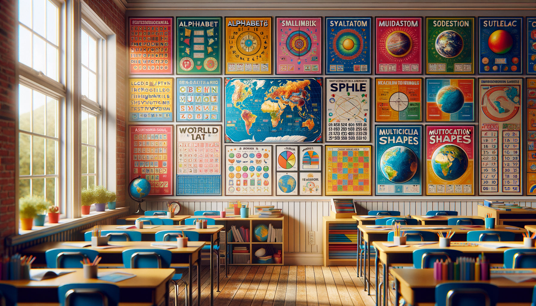
This is the perfect time for detailed illustrated scenes: a forest populated with animals to discover, an urban landscape with characters in action, a stylized world map. These images become discussion aids, triggers for educational projects.
The balance between education and aesthetics
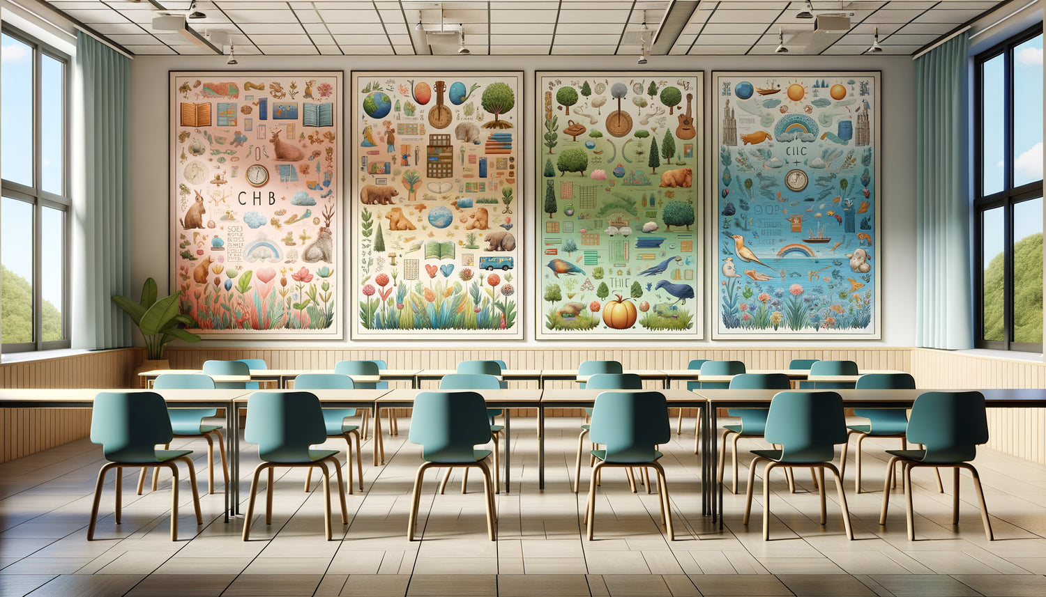
I worked with a CE2 teacher who had hung a series of wall art representing the four seasons in her classroom. Not documentary photos, but artistic illustrations showing the evolution of colors, lights, human activities. Her students spontaneously referred to them during science, French, and even math lessons when counting the elements represented.
Educational wall art works when it doesn't look like textbooks hung on the wall. Prefer illustrated infographics to rigid didactic charts, poetic representations of concepts to overly technical diagrams. An alphabet where each letter integrates into an imaginative drawing is better than a simple typographic frieze.

The middle school: the emergence of critical thinking
In adolescence, everything becomes more complicated—and so do decorating choices. Middle schoolers develop their abstract thought, their critical sense, and their need for identification. Wall art for middle school must respect this emerging maturity.
Forget childish illustrations that would make them feel infantilized. Instead, opt for artworks that pose questions rather than give answers: artistic black and white photographs, reproductions of street art, geometric abstractions, inspiring typography with quotes from personalities they admire.
The power of positive messages
In a Paris region middle school, I installed a gallery of portraits of scientists, artists, athletes from all backgrounds, with quotes about perseverance. Six months later, the teaching team reported that these wall art were regularly referenced during staff meetings, that students photographed them and quoted them.
Teenagers need role models and inspiration. Choose artworks that broaden their horizons without lecturing them, that celebrate the diversity of possible paths, that value effort and creativity.
Shared spaces: creating a collective identity
Corridors, cafeterias, libraries are not just places to pass through. They are shared living spaces where an institution's identity is built.
For these areas shared by all levels, focus on unifying artworks: works that speak to both the youngest and oldest students. A series of natural landscapes, contemporary floral compositions, soothing geometric patterns, representations of universal values such as mutual aid or respect.
I have observed how a simple series of three paintings representing trees in all four seasons — installed in the hall of a school from kindergarten to grade 6 — became an emotional landmark for the entire community. Little ones looked at them with wonder, older students analyzed them in science class, parents stopped by in the morning.

The technical criteria that change everything
Beyond the visual content, some practical aspects radically transform the experience of artworks in a school.
Resistance and safety
A painting for school must be unbreakable. Forget glass: opt for prints on canvas, on aluminum, or under plexiglass with secure wall fixings. In areas frequented by younger children, check that the frames do not have protruding corners.
Ease of maintenance also counts: washable surfaces, moisture-resistant materials, colors that don't fade over time. I’ve seen too many institutions invest in beautiful artworks that looked like rags three months later.
Aesthetic consistency
Avoid the patchwork effect by creating a visual guideline. This doesn't mean that all artworks must look alike, but that they share a harmony: a common color palette, a consistent graphic style, a thematic thread.
In a primary school in Lyon, we developed the concept of an "imaginary journey": each grade level had its specific artworks, but all evoked the discovery of the world — animals for kindergarten, landscapes for CP-CE1, stylized maps for CE2-CM2. This consistency created a visual progression that accompanied children's growth.
Ready to transform your institution into a place that inspires every student?
Discover our exclusive collection of wall art for School that accompanies the development of each age with accuracy and beauty.
Imagine this back-to-school transformed
Visualize your hallways on the first day of school. Kindergarteners enter with their parents, a little anxious. Their eyes catch a painting depicting a smiling bear cub in a classroom — "Look mommy, just like the one at home!" The tension eases.
Further along, CM2 students discover a new series of inspiring portraits in their class. "Madam, who is that?" You have effortlessly launched your first discussion of the year on extraordinary journeys.
Good artworks don't just decorate: they accompany, reassure, stimulate, and elevate. They create spaces where every child, regardless of their level, finds visual references adapted to their understanding of the world. Start with a single class, a single hallway. Observe how the atmosphere changes. Then gradually extend this transformation to the entire institution.
Because a child who evolves in an environment designed for them doesn't learn the same way. They thrive.
Frequently Asked Questions
How many artworks should be planned per class depending on the grade level?
The golden rule: less is more, especially for the youngest children. In kindergarten, a maximum of 2 to 3 paintings are enough to avoid overstimulation — a clean space helps little ones concentrate. Prioritize one large central painting (approximately 60x80 cm) with soft illustrations, complemented by one or two smaller works in reading or relaxation corners. In primary school, you can increase to 4-5 paintings, creating themed zones: a science corner, a language space, an inspiration wall. In middle school, the approach changes: rather than multiplying artworks, focus on larger and more impactful paintings (80x120 cm), 2 to 3 per room, which create real focal points. I have found that a room that is too cluttered distracts teenagers, while a few well-chosen works become powerful visual references. In common areas, space the paintings every 3 to 5 meters to create a pleasant visual rhythm without saturating the space.
What mistakes to absolutely avoid when choosing artwork for a school?
Mistake number one: choosing artworks for yourself rather than for the students. I have seen principals install reproductions of classic masters in kindergarten because they found them
How to involve students in the choice of paintings without losing aesthetic consistency?
Involving students transforms paintings into real tools for appropriation of space. My preferred method: present 3 to 4 pre-selected options (thus guaranteeing consistency) and organize a class vote. Children love this democratic process, and the chosen painting becomes